
Statistics
We looked inside some of the posts by kenghaokang and here's what we found interesting.
Average Info
Notes Per Post
3
Likes Per Post
3
Reblog Per Post
0
Reply Per Post
0
Time Between Posts
9 months
Number of Posts By Type
Text
15
Photo
2
Last Seen Tumblr Blogs


Fun Fact
Tumblr has a 66 index score for customer satisfaction in the US.
Text
📌 好久以前的訪談,重新被發現🙂🙃🙂
生活,遊走於藝術與時尚之間
耿晧剛訪談錄
時間: 2011/08/03
地點:KENG Studio
採訪者:The Brand Partner副創意總監Stephanie Shih
Stephanie(以下簡稱S): 哇,Ken我們認識好久了,從2004還是03?
耿晧剛(以下簡稱K): 03,你那時還是服裝編輯哩!
S: 謝謝你那時候幫了我很多的忙,還到過你家把你的名表收藏都挖出來拍照過,哈哈!大家都說你是最讓人感到溫暖的品牌公關了。今天也來聊一下你藝術的那部份,先跟我們分享你的背景,怎麼開始藝術創作的?
K: 我的母親從事當代水墨創作,父親是建築師,藝術是從小就有影響。外公也是國畫家,他在北京念美術學院,所以我們家族已經三代都從事於藝術方面。我本來是念東海美術系,到義大利的時候,因緣際會認識了一些台北時尚圈的朋友,我自己本身也對時尚、採購蠻有興趣的。從藝術家的眼光看時尚也許覺得膚淺,但真正去了解時尚的產業跟架構,又跟藝術不是那麼完全不同。
S: 所以你從義大利回台灣之前其實一直是走Fine Arts的路,你待的Brera那個區很棒。
K: 那時候帶我的教授活動力很強,他是當時在義大利做觀念藝術很強的一位,他很好奇東方人的背景與想法,也會帶我們四處看展辦展。我在東海就是作裝置、觀念的東西,在 Brera我念的這個學校很古老,不過從純古典到觀念藝術都抱持相當開放的態度。
S: 後來你又進了時尚的圈子,自己如何看待你與時尚、藝術三者的關係?
K: 這問題很大,我舉幾個例。蜷川實花在攝影、藝術、時尚跨界,但她結合得很微妙,不會讓你覺得彆扭;或像村上隆他把商業性、時尚性跟藝術作結合,有一些人會覺得他太商業、太卡漫或矯情,不過他跟高古軒的合作一起在市場上取得了很好的平衡。時尚的商業跟藝術的商業,當中存在很微妙的關係。像你看Yohji Yamamoto他的東西是很觀念很藝術,卻也一度破產。還有高橋盾也是跟很多的插畫家、artist合作,藝術跟時尚的合作已經密不可分,尤其在這個世代。
S: 一直很羨慕你能遊走於時尚與藝術之間,哪個你更鍾情些?
K: 我的個性比較像貓,有時近有時遠,對於市場跟學術,我是雙方面都會保持距離。在學校教的是實作,繪本、插畫跟動漫畫劇本創作,比較偏重觀念上的啟發。現在是個蠻多元的時代,還是兩種都要調劑一下。
S: 那有沒有什麼人曾經啟發了你?
K: 早期我非常欣賞義大利畫家Pisanello的動物習作,或是Piero Della Francesca出色的空間感,Piero Manzoni的物件概念。後來在歐洲看了很多當代的展覽,德國當代最重要的畫家,被稱為新萊比錫畫派之父的Neo Rauch,還有1961年出生於比利時,現居於瑞典的藝術家Carsten Höller,對於我的繪畫與觀念性作品有很大的啟發。
S: 很想知道你腦海中一個最難忘的印象或畫面。
K: 週末我喜歡去爬山,走到政大後山的步道,有一個坡可以看到台北市跟景美溪,尤其是秋天黃昏近傍晚,從坡上往下走,映入眼簾的台北是一個蜿蜒的南邊角落,在米蘭住了七年,也看過很多城市,現在一想起那個帶著微光氛圍的畫面,還是覺得真美。
S: 印象中的你總是很溫和,為什麼會以老虎為作品主題?
K: 你有沒有覺得我的作品裡面都是一些比較陽剛的東西?其實我的內心是比較有韌性的,也許是一種反射,很難說。小時候就喜歡看摔角,我也很喜歡德國表現主義的東西,醞釀後的爆發,極簡,單一純色,像是巴哈的曲子。我喜歡做一些人家不想做的,或是貌似平凡的東西,像是菜市場的阿嬤、工人喜歡的東西。別人可能把老虎當作一種俗氣的象徵,媽媽們喜歡穿隻老虎在身上,或是像Cartier的豹也很有意思。我喜歡通俗的東西其實帶有調皮的成份。
S: 所以你最近有一系列以Prada的東西放在箱子的作品。
K: 那是我在米蘭買的東西,我收藏的很好,在裡面放入我的橘色圓形的標記,我在跟收藏家開玩笑,如果我賣給你的價錢,把我當初買這些東西更便宜,那你會不會跟我買?答案是不會,因為你可能寧可它可以穿在身上,這跟藝術品的價值是不同的。不過真的有人買了一件。
S: 真的?你問了他原因嗎?
K: 他覺得那個時期對他很重要。價值是不能相比的,我想要找出這個矛盾性。那個系列我還有做版畫跟攝影,也有賣出,我裱了一個很精緻的框。
S: 感覺那件作品在賣出後才完成。
K: 對,所以說這是持續性,有點觀念藝術的東西。預計11月份在台北新苑藝術展出。
——————
Keng Hao Kang Interview
Time: 2011/08/03
Venue:KENG Studio
interviewer:Stephanie Shih,
The Brand Partner,,
Associated Creative Director
Stephanie(S): Wow, Ken, we’ve known each other for so long! Since 2004 or 2003?
Keng Hao Kang(K): 2003, you were a fashion editor at that time!
S: Thank you for being so helpful at that time. I remember we went to your house and dug out your watch collection for photo-shooting. ha ha! Everyone said that you were the warmest brand PR. Today, let’s talk about your creation. Firstly, let us start from your background and how you started in art.
K: My grand father is a Chinese painter who studied art in Beijing, my mother is a contemporary Chinese painter, and my father is an architect. Their achievement in art has influenced me since I was a child. I majored in fine art in Tunghai university. However, when i was studying in Italy, I incidentally met some friends from fashion industry in Taipei, and then i realized my interests in fashion and purchasing. Fashion might be shallow from artists’ aspect. But, when you learn more about the construction and the industry, art and fashion are actually not that different.
S: So, before coming back to Taiwan, you kept going the road of fine art. The area you live in Milan,Brera, is pretty awesome!
K: My professor is an outstanding artist of conceptual art in Italy who was very curious about the background and ideas of orientals. He usually led us to exhibitions and to make exhibitions. And these are basically what i did when I was in Tunghai University, I did installation and conceptual works. In Brera, I went to a school with long history, yet, it has an open attitude to all kinds of art, from classical art to conceptual art.
S: Afterwards, you went into the world of fashion. How do you see the relationship between fashion, fine art and yourself?
K: That’s a big question. Let me take some examples, Ninagawa Mika subtly combines photography, fine art and fashion, which is not awkward; Takashi Murakami integrates business, fashion and art. Although some people consider that is too cartoon-like and really commercial and hypocritical, he made a good balance in the cooperation with Gagosian Gallery. The commerce of fashion and that of fine art has a subtle relationship. As you see Yohji Yamamoto’s works, they are conceptual, and he went bankrupt for these; Jun Takahashi also cooperates with many illustrators and artists. In this generation, Art and fashion is inseparable.
S: I am envious that you enjoy yourself so much in the world of fashion and art. I wonder which one you love more?
K: My personality is cat-like. Sometimes I am near to market or academy, sometimes far. I keep a distance from both sides. At school, I teach picture books, illustration and comic script writing and emphasize on the inspiration of conception. In this diverse age, both of them should be essential.
S: Is there any person who inspires you?
K: In the early period, I extremely appreciated some animal practices of an Italy artist ,Pisanello, the outstanding sense of space of Piero Della Francesca and the object conception of Piero Manzoni. Afterwards, I saw numerous contemporary art exhibitions when i was in Europe, for example, Neo Rauch , The former is famous as the father of Neue leipziger schule, and Carsten Höller the latter is an artist born in Belgium and lives in Sweden. Their works strongly inspire my creation of painting and conceptual works.
S: I really like to know the most unforgettable scene or image in your head, would you describe it for me?
K: I like to go hiking during weekends. There is a hillside behind Chengchi university, in which you can see the scene of Taipei city and Jinmei river. Especially at dusk, you get to see Taipei as the winding corner when going down the hillside to the south. I had lived in Milan for seven years and seen many cities, but I still consider that the scene with shimmer is wonderful.
S: You’ve got a mild personality in my impression. I’m wondering how come you use tigers as your subject?
K: Don’t you think there’s something tough in my works? Actually, my inner characteristic is tough. Maybe it is a reflection. It is difficult to say. I like watching wrestling since I was a child. I also like German Expressionism, which is minimalism and the outbreak after brewing, just like Bach’s symphony. I like doing something other people dislike to do or something seems normal, like something grandma in the traditional market’s and workers would like. Some people might see tigers as a tacky symbol. A lot of mothers like to wear the closes with tiger’s image. The panther of Cartier is interesting, too. The tacky things I love share some naughty elements.
S: So, recently, you present Prada in the boxes as a series of work.
K: These products were bought in Milan. I have preserved them very well. I stuck an orange circle sticker inside, which is a joke to my collectors. If the price I sell is much cheaper than the price I bought, will you buy it? The answer is NO. You must prefer wearing them. The value is different from art works. But, actually I just had one sold.
S: Really? Did you ask what the reason is?
K: The collector considers the period of time to be very important to himself. The value is incomparable, and I would like to find out the contradiction. I also made block prints and photographs in that collection. Some are sold as well, so i put them in fancy frames.
S: It seems those pieces of works are actually completed after they are sold.
K: That’s right. These works are continuing and conceptual. They are planned to exhibit on November 2011 in Galerie Grand Siècle,Taipei.


0 notes
Text
耿晧剛 展歷 CV
Keng Hao-Kang Exhibitions
耿晧剛1969年生於台灣,自東海大學美術系畢業後,赴義大利米蘭布雷拉國立美術學院(Accademia di belle arti di Brera)就讀,跟隨Diego Esposito教授主修繪畫與裝置藝術,開啟了觀念藝術的思考。返台後曾於時尚流行品牌Hugo Boss任職數年,並於2008年起任教於東海大學美術學系與國立臺灣師範大學科技應用與人力資源發展學系,獨特的成長背景與留義經驗,讓耿晧剛成為不自限的創作者,不斷地翻新創作樣貌,從生活的體驗與敏銳的感知出發,反映於多元的作品中。耿晧剛作品曾展出於大阪藝術博覽會、台北當代藝術博覽會,並且為文化部藝術銀行、高雄市立美術館、台中市立美術館、台南市美術館及其他私人收藏單位所典藏。耿晧剛現生活與創作於台北。
主要學歷
2002 米蘭布雷拉國立美術學院碩士 義大利
1993 東海大學美術學系 台灣
主要個展
2024 「在那之後,」,臻品藝術中心,台中,台灣
2019 「快樂進行曲-耿晧剛創作展」,銘傳大學商設藝廊,桃園,台灣
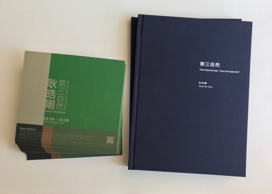
2017 「第三自然」,月臨畫廊,台中,台灣
2016 「長乘以寬 耿晧剛作品展1998-2015」,大趨勢畫廊,台北,台灣
2016 「三月・小甜心-耿晧剛個展」,恆畫廊,台北,台灣
2015 「清晨・奧爾維耶托-耿晧剛個展」,小畫廊,高雄,台灣
2015 「遠在咫尺」,臻品藝術中心,台中,台灣
2013 「差異之間 耿晧剛個展」,新苑藝術,台北,台灣
2013 「布里歐 日常」,彌留實驗藝廊,台中,台灣
2012 「未來‧進行式 耿晧剛個展」,貝瑪畫廊,台北,台灣
2011 「耿晧剛 近作與繪畫展」,新苑藝術,台北,台灣
2011 「雙重衝擊」,新苑藝術,新北市板橋區,台灣
2010 「Why so Serious? 2010」,雲林科技大學藝文中心,雲林,台灣
2009 「Why so Serious?」,中國科技大學藝文中心,台北,台灣
1999 「一幅畫」,代比流士藏書畫廊,米蘭,義大利
1998 「納歐詩」,布雷拉第四教室,米蘭,義大利
主要聯展
2024 「授粉 臺荷當代藝術」,耘非凡美術館 台南,台灣
2022 「非常態 亞洲國際美展會員展」,大新美術館 台南,台灣
2021 「2021台北國際藝術博覽會」,形而上畫廊 台北,台灣
2021 「藝流系譜學院之道」大墩文化中心,台中,台灣
2021 「第29屆亞洲國際美展」,九州,日本
2021 「如果有一天」形而上畫廊,台北,台灣
2020 「禽獸不如─ 2020台灣美術雙年展」,國立臺灣美術館,台中,台灣
2020 「老耿與他的藝術家朋友們」,臻品藝術中心,台中,台灣
2019 「有機體 臺藝東海-創作交流展」,國立臺灣藝術大學,台北,台灣
2018 「抽象九人聯展」,耘非凡美術館,台南,台灣
2018 「春花望露」,形而上畫廊,台北,台灣
2018 「以色為名」,東海大學藝術中心,台中,台灣
2017 「第十二夜」,形而上畫廊,台北,台灣
2016 「當代台灣 抽象精選展」,耘非凡美術館,台南,台灣
2016 「在天空仰望玫瑰」,形而上畫廊,台北,台灣
2016 「內在幻覺與現實符號」,東海大學藝術中心,台中,台灣
2015 「現代台灣的藝象」,銀座幸伸藝廊,東京,日本
2014 「伊通26週年慶‧一本初衷手稿展」,伊通生活空間,台北,台灣
2014 「萬花嬉春」,臻品藝術中心,台中,台灣
2013 「高雄藝術博覽會」,新苑藝術,高雄,台灣
2013 「天秤座」,臻品藝術中心,台中,台灣
2013 「加減乘除」,形而上畫廊,台北,台灣
2013 「台北國際當代藝術博覽會」,新苑藝術,台北,台灣
2013 「瞬間永恆,抽象繪畫的可能性」,臻品藝術中心,台中,台灣
2013 「台南藝術博覽會」新苑藝術,台南,台灣
2013 「從零開始,無限大的小」,形而上畫廊,台北,台灣
2012 「大阪藝博會」,新苑藝術,大阪,日本
2012 「台中畫廊藝術博覽會」,新苑藝術,台中,台灣
2012 「台北國際當代藝術博覽會」,新苑藝術,台北,台灣
2012 「府城藝術博覽會」新苑藝術,台南,台灣
2011 「台北攝影與數位影像藝術博覽會」,新苑藝術,台北,台灣
2011 「大阪藝博會」,新苑藝術,大阪,日本
2011 「台北國際當代藝術博覽會」,新苑藝術,台北,台灣
2011 「台中畫廊藝術博覽會」,新苑藝術,台中,台灣
2011 「「異」「想」軌跡 」,新苑藝術,台北,台灣
2010 「在世代之間」,蓽蘿藝術活動中心,台北,台灣
2010 「寄寓&溯源」,藝星藝術中心,台北,台灣
2008 「六人聯展」,天使美術館,台北,台灣
2006 「第19屆亞洲國際美展」,新加坡
2001 「華」阿投泰卡畫廊,米蘭,義大利
2001 「現代藝術的符號與象徵性」,現代展館,科摩,義大利
2000 「弩各」,皇室舊醫院,扣投扭,義大利
1998 「視覺的波浪」,救世特區,米蘭,義大利
1998 「國際池」,普其艾蕾放特空間,奧斯納構,米蘭,義大利
1997 「沙龍特展」,二十號畫廊,米蘭,義大利
1997 「與對角線的對��」,雷切市,義大利
典藏紀錄
文化部藝術銀行
國立臺灣美術館
台中市立美術館
高雄市立美術館
台南市美術館
國內外私人收藏
KENG HAO KANG
Keng Hao-Kang was born in 1969 in Taiwan. After graduated from Department of Fine Arts in Tunghai University, he studied under Professor Diego Esposito at Accademia di belle arti di Brera, Italy, majoring in painting and installation art. The life and the study in Italy inspired his thoughts and development toward conceptual art. Keng worked for Hugo Boss afterward, and has been teaching in Ming Chuan University and Tunghai University since 2008. The unique background of growth and study along with the work experience have influenced his diverse creative styles. Keng’s work has been showcased widely at Art Osaka, Young Art Taipei and collected by National Taiwan Museum of Fine Art, Kaohsiung Museum of Fine Art, and other important private collections. Keng currently lives and works in Taipei.
Education
2002 Accademia di Belle Arti di Brera, Milan, Italy
1993 Tunghai University, Dep. Fine Arts, Taichung, Taiwan
Selected Solo Exhibitions
2024 “after that, ” Galerie Pierre, Taichung , Taiwan
2019“Nothing but happy” MCU Department of Commercial Design Gallery, Taoyuan , Taiwan
2017 “The Third Nature-Daily Pattern” Moon Gallery, Taichung , Taiwan
2016 “Geometric Composition 1998-2015” Main Trend Gallery, Taipei , Taiwan
2016 “Pinup・March” Galleria H., Taipei, Taiwan
2015 “Orvieto Morning” Show Gallery, Kaohsiung, Taiwan
2015 “So Far So Close” Galerie Pierre, Taichung , Taiwan
2013 “The Difference Between” Galerie Grand Siècle, Taipei , Taiwan
2013 “Brioche-Daily” Me:Liu experimental Gallery, Taichung, Taiwan
2012 “Future-Progress KENG HAO KANG” Pema Lamo Gallery, Taipei, Taiwan
2011 “KENG HAO KANG - ” Galerie Grand Siècle, Taipei , Taiwan
2011 “Double Impact - ” Galerie Grand Siècle, Banqiao Dist.,New Taipei City , Taiwan
2010 “ Why so Serious? 2010 ” Yutech ,Art Center , Yunlin , Taiwan
2009 “ Why so Serious? ” CUTE , Art Center , Taipei ,Taiwan
1999 “Un Dipinto” Derbylius Libreria Gallery, Milan, Italy
1998 “NAOS” n.4 Aula of Brera, Milan, Italy
Selected Group Exhibitions
2024 “CROSS POLLINATION”Remarkable Cultivation Art Museum,Tainan,Taiwan
2022 “Abnormal AIAE by Taiwan Committee Members”Da Xin Art Gallery,Tainan,Taiwan
2021 “Art Taipei 2021” Metaphysical Art Gallery, Taipei, Taiwan
2021 “The 29th Asian International Art Exhibition “, Japan
2021 “One day in the future” Metaphysical Art Gallery, Taipei, Taiwan
2020 “Subzoology: 2020 Taiwan Biennial” National Taiwan Museum of Fine Arts,Taichung , Taiwan
2020 “Mr.Keng and his Artist Friends” Galerie Pierre, Taichung , Taiwan
2019 “ORGANISM” National Taiwan University of Art, Taipei, Taiwan
2018 “Minimalism-Cold Abstraction in Taiwan” Remarkable Cultivation Art Museum, Tainan , Taiwan
2018 “Dream Blossom” Metaphysical Art Gallery, Taipei, Taiwan
2018 “The name of Color” Tunghai University Art Center, Taichung, Taiwan
2017 “What You Will” Metaphysical Art Gallery, Taipei, Taiwan
2016 “Contemporary Taiwan” Remarkable Cultivation Art Museum, Tainan , Taiwan
2016 “Look up Rose from the Sky” Metaphysical Art Gallery, Taipei, Taiwan
2016 “Internal hallucinations & Reality symbols” Tunghai University Art Center, Taichung, Taiwan
2015 “Art Contemporaneity Taiwan” Ginza Kousin Gallery, Tokyo , Japan
2014 “Celebrating 26 years of IT park” IT ArtHouse,Taipei , Taiwan
2014 “Bloom with Multicolored” Galerie Pierre, Taichung , Taiwan
2013 “Art Kaohsiung ” Galerie Grand Siècle, Kaohsiung , Taiwan
2013 “Libra” Galerie Pierre, Taichung , Taiwan
2013 “+-x÷” Metaphysical Art Gallery, Taipei, Tawan
2013 “Young Art Taipei” Galerie Grand Siècle, Taipei , Taiwan
2013 “Moments of Eternity – the possibilities of abstract painting” Galerie Pierre, Taichung , Taiwan
2013 “Art Tainan ” Galerie Grand Siècle, Tainan , Taiwan
2013 “Start from Zero. small with infinitely large” Metaphysical Art Gallery, Taipei, Tawan
2012 “Art Osaka” Galerie Grand Siècle, Osaka , Japan
2012 “T-Art in Taichung ” Galerie Grand Siècle, Taichung , Taiwan
2012 “Young Art Taipei” Galerie Grand Siècle, Taipei , Taiwan
2012 “Art Tainan ” Galerie Grand Siècle, Tainan , Taiwan
2011 “Photo Taipei 2011” Galerie Grand Siècle, Taipei , Taiwan
2011 “Art Osaka” Galerie Grand Siècle, Osaka , Japan
2011 “Young Art Taipei” Galerie Grand Siècle, Taipei , Taiwan
2011 “T-Art in Taichung ” Galerie Grand Siècle, Taichung , Taiwan
2011 “Traces of Wandering Thoughts ” Galerie Grand Siècle, Taipei , Taiwan
2010 “Between the Generations ”Artpillar Gallery, Taipei , Taiwan
2010 “Dwelling Abroad . Dwelling on Home” Star Crystal Gallery, Taipei
2008 “Six 6” Angel Art Gallery, Taipei , Taiwan
2006 “ The 19th Asian International Art Exhibition“, Singapore
2001 “HUA” Gallery Artoteca, Milan, Italy
2001 “Simboli e Simbolismi nell’arte contemporanea: En Blanc et Noir” Space Shed Como, Italy
2000 “N.U.N.C.” Vecchio Ospedale Soave, Italy
1998 “Visual Wave” Space Societa Umaitaria, Milan, Italy
1998 “Water International” Spazio Pucinoelefante, Osnago,Milan, Italy
1997 “Salon Primo” Studio Venticinque, Milan, Italy
1997 “Linguaggio in Diagonale” Lecce Comune, Italy
Collection
Art Bank, The Ministry of Culture of Taiwan
National Taiwan Museum of Fine Arts, Taichung
Taichung Museum of Art
Kaohsiung Museum of Fine Arts, Kaohsiung
Tainan Art Museum,Tainan
Domestic and foreign private collection
0 notes
Text
平行與斜率 – 耿晧剛的第三自然
第三自然 耿晧剛個展
The Third Nature / Daily Pattern Keng Hao Kang
9.9 – 10.8 2017
月臨畫廊 台中
Moon Gallery Taichung
在新世代的抽象畫家中,耿皓剛是表現頗為傑出的一位,生長在藝術世家,結合父親建築師的理性建構,和母親的水墨抒情,耿晧剛在留學義大利的1990年代末期,和新世紀初期,已逐漸顯露個人在藝術創作上的獨特面貌:一種對外在世界好奇、探索,不斷吸納、映現、拼貼,甚至帶著強烈的、屬於年輕世代的時尚色彩。
1969年出生的耿晧剛,已經是屬於玩著機器戰警、打著電動玩具長大的一代;在東海大學美術系畢業之後,便前往歐洲古老卻也時尚的城市米蘭,進入布雷拉藝術學院就讀,主修繪畫與裝置,指導教授Prof.Diego Esposito更是一位強調觀念與思考的前衛藝術家。這樣的背景,讓初至異國的這位東方少年,學會了用心眼去觀看、認識、掌握、紀錄那個既古老又時尚的歷史名城;那曾經是歐洲文藝復興的故鄉,也是達文西、米開朗基羅這些偉大的曠世奇才生活、創作的地方……。
然而相對於那些古老而久遠的歷史,眼前櫥窗的擺置、琳琅滿目的商品色彩,乃至古老牆面馬賽克的幾何紋飾和質感,以及街道石塊排列的規律,在在更吸引了這位年輕人的眼睛和心靈;而這些視覺的元素,也自然而然地融入他的創作之中,成為畫面的一部份。
在西方風景畫的傳統中,大自然地景的高低起伏、尺度變化,曾是尼德蘭地區這些所謂的「低地國家」畫家最早關心、記錄的對象,因此,風景畫被稱作「Landscape」。等到近代,尤其是印象派的興起,市民階級的抬頭,工業社會初期正在形成的都市景觀,成為藝術家關懷的新課題,於是相對於最初的大自然之被稱為「第一自然」,城市景觀則成「第二自然」。
到了工業文明的極度成熟,人工的製造物、商品、印刷品、電腦圖像……等,又取代了城市景觀的街道、建築,乃有了「第三自然」的成立。
對於像耿晧剛這些玩著機器戰警與電動玩具長大的新一世代而言,「第三自然」顯然是他們生活中更親切、熟悉,足以互動、合一的內涵與課題。
耿晧剛對這些「第三自然」視覺美感的吸收與運用,初期並不納入完全理性的掌握或歸納,也不抒發成一種全然感性的情緒或發洩;毋寧說,他更像是一個行吟的詩人,以開敞、流動、適意的心靈,讓這些色彩、形式,乃至衝突、拉拒的語彙,依他們自有的溫度、個性,同時呈現在畫面之中。耿晧剛初抵米蘭的1998至2000年間,就有一批以有色墨水形成的紙上作品,往往以極簡拙的幾筆,捕捉某些湧現的靈感或意象,有時是一些反覆的平行線,有時是一些重疊的符號、筆劃,有時則是人體的勾勒……。總之,這些早期的紙上手稿,作為日後創作的參考,卻也記錄了某些閃現的靈光,基本上,反而更透露了藝術家在創作前期的思維痕跡與焦點。
而在壓克力彩的作品中,我們也可以窺見耿晧剛在色彩重疊上所投注的用心,往往看似平面的色塊中,其中有一些壓印、重疊的肌理,在淡亮的色彩底層,其實掩埋著多重層疊的暗沈色彩;這種猶如複寫紙般的層疊效果,既增加了畫面的肌理質感,也呈顯了歷史記憶的層累與呼喚。
此外,色彩也擔負著溫度傳達的任務,像幾件標題為〈熱帶〉(2012),或〈24度〉的作品,都可以看見藝術家對環境的敏感與掌握。有時,你會窺見某個建築古老的馬賽克拼貼圖案;有時,你會發現猶如方格玻璃櫥窗後繽紛的色彩;甚至,有些時候,畫面中就直接出現米奇、米妮、海綿寶寶,和超人、蝙蝠俠等等的卡通圖案;在2013年的一批作品中,則在幾何的圖樣中,出現斑馬、豹等動物的皮毛,耿晧剛的作品,充分反映一個多所關懷、凡事入心、凡物入眼的熱情藝術家的生命本質。
耿晧剛創作取材的範圍,顯然極廣,有時來自城市的壁面、櫥窗、市招、路石……,有時來自居室空間的小物件,如:信封、摺紙……等。幾件取名〈喬依斯(Joyce)〉(2012-2015),或〈梯〉(2014)、〈迷彩〉(2014)的作品,也顯示藝術家生活的片斷與接觸或閱讀的內容。
作為一位成功的藝術家,關鍵還不在對外在世界的感悟與捕捉,而是在如何將這些事事物物,安置、集中在一個有限的畫面中,而顯現出一定的意義或美感。明顯地,耿晧剛的成功,正在將這些原本獨立、片斷的物象或語彙,從自身的語彙脈絡中抽離出來,又併置、拼貼到另一個脈絡或文本中,形成新的意義或語境,增加了觀眾觀看、理解的空間,甚至不同的詮釋或感動;這樣的手法,其實就和裝置藝術的構成,有著相當雷同、流通之處。
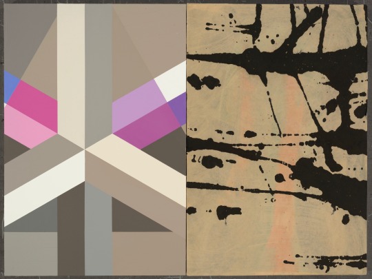
2015年的〈導航〉顯然是一個新的開端。這件畫在畫板上的作品,一反之前較具指事性或象徵性的半圖像構成,是採用完全平行與垂直的畫面構成;左半約近全幅三分之二寬幅的部份,色彩明度較低,從粉紅、灰黃、黑、藍、墨綠到紫藍,而右半約僅三分之一寬幅的部份,則作較小的平行分割,接近中間的幾個色塊,如純白、灰、橘紅等,明度較高(尤其由中間的一塊紫藍及左側的大塊黑色所襯托),成為全幅視覺的焦點,猶如具有〈導航〉的作用,一如在黑暗海面上,引領船隻航行的燈光。
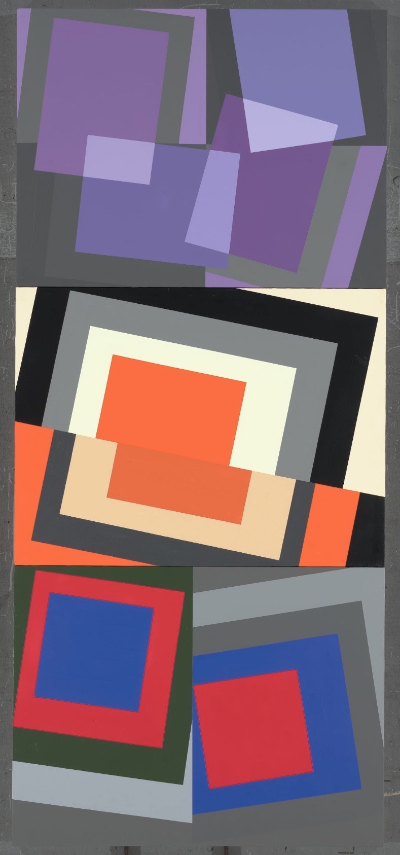
從〈導航〉出發,2016年即有一批名為《前進》系列的作品,這批畫在畫布上的作品,尺幅略小於2015年的〈導航〉,但在平行與斜率的畫面分割中,較低沈的色塊,給人一種優雅、內斂的感受。
而就在這種平行與斜率的構成變化中,亦發展出2016年的另一批作品,即:〈抽象-1〉、〈抽象-2〉、〈動力學-1〉、〈動力學-2〉、〈動力學-3〉、〈動力學-4〉,及〈紛-1〉、〈紛-2〉,和〈停泊〉、〈工作天-1〉、〈工作天-2〉、〈階梯〉等。這些作品,在平行與斜率的交織中,因色面大小的變化、因色相搭配的不同,更因彩色與無彩色的巧妙對照,讓畫面產生各種不同的視覺感受與心境風景;其中,尤以《動力學》系列,明度強烈的對比,加上線狀與面狀的斜率變化所產生的空間感,讓人對那些粉紅的色線特色留下深刻印象。
在2016年的這批作品中,〈動力學-4〉及〈階梯〉所構成的曲面空間變化,顯然為2017年的發展,作出了預告,如:〈成長〉、〈眼中的世界-1〉、〈眼中的世界-2〉,及〈登頂〉等,這是藝術家現階段最新的面貌,也是從平面與斜率發展的幾何性構成,最為成熟的發展;當中可以看到一些色面與短色線較複雜的變化。
幾何抽象最大的挑戰,即在如何維持藝術創作的思維特性,不致落入純粹設計的陷阱。耿晧剛的這批新作,明顯地發揮了他擅長的色彩掌握與畫面空間的深度感。那些交錯的平行線與具斜率的規律變化,正是建築物在陽光投影下最鮮明的印象呈現,但藝術家的色彩賦予,更塑造了濃厚的音樂性與空間感。
在2015到2017年的新作中,也可以發現幾件刻意加入書寫線條的作品,如:2015年的〈桃花〉、〈檸檬樹〉、〈海岸線〉、〈日光浴〉,2016年的〈是雲-1〉、〈是雲-2〉,以及2017年的〈工作天-2〉等,顯然藝術家在這個講究平行與斜率的主軸下,另一可能的嘗試。
作為新生代的抽象畫家,耿晧剛以強勁的創造力、辛勤的耕耘,再度向藝壇證明他的存在與努力,值得肯定、也值得期待。
蕭瓊瑞 《國立成功大學歷史系所教授》 台灣美術史學者

Parallel and Slope – The New Works of the Third Nature by Keng Hao-Kang
Of the abstract painters in the new generation, Keng Hao-Kang, born in a family of artists, is one of the best who combines the rational constructivism of his father and the lyric style of his mother. When Keng studied abroad in Italy between the late 1990s and the early 2000s, he had gradually revealed his personal unique taste of art creation whose works show strong and young colors of the new generation to express the curiosity towards the world to explore, absorb, reflect, and collage.
Born in 1969, Keng grew up with robot police toys and video games. After he graduated from the department of fine arts in Tunghai University, he left for Milan, an ancient and fashionable city in Europe, and studied in the Art Academy of Brera with is major in painting and installation art. His thesis advisor, Prof. Diego Esposito, is an avant-garde artist, who taught him to observe, understand, explore and record the historical city through his mind because Milan used to be the origin place of the European Renaissance and also the place where Leonardo da Vinci and Michelangelo lived and created the master pieces.
However, compared to the ancient history of the city, the deployment of store windows, various colorful products, geometric patterns and textures of ancient mosaic walls, and the arrangement pattern of paving stones were more attractive to him. And these visual elements have naturally blended into his art pieces, forming a part of the paintings.
In traditional western landscape paintings, the rolling hills used to the theme for the painting artists in low-lying countries such as the Netherlands, and this is also the reason why the landscape paintings are named as “landscape.” Then, with the rise of impressionism and citizen class, the urban landscape forming in the beginning of the industrial society had become the new topic concerned by the artists. Therefore, the Mother Nature is called “the First Nature,” and the urban landscape is called “the Second Nature.”
When the industrial civilization became mature, the man-made objects, products, printings, digital images…etc. have replaced the streets and buildings of urban landscape, forming “the Third Nature.”
Furthermore, for the new generation like Keng who played robot police toys and video games in their childhood, “the Third Nature” is obviously a closed, familiar, interactive and integrated theme in their lives.
In the beginning, Keng neither fully grasped nor concluded the ways to absorb and use the visual aesthetics of the Third Nature, nor he expressed the entire emotions. It is rather to describe him as a troubadour who presented colors, formats and words with open, flowing and enjoyable minds of their own warmth and personality on the paintings. When he first arrived in Milan during 1998-2000, he made some colorful ink paintings that used simple strokes to capture the ideas or images emerged suddenly, or some repetitive parallel lines, overlapping symbols and strokes, and outlines of human figures… These early manuscripts were served as reference for his creation in a later date but also recorded his ideas; moreover, these also revealed his thinking trace and focus in his early creation stage.
We can see his efforts on his acrylic paintings, where he overlapped colors to create imprinted texture of color lumps. He also painted light bright color on the lower layer, where actually covered multiple layers of dark colors. This articulating-paper effect not only increases the texture of the paintings, but also presents the layers and echo of history and memories.
In addition, colors also bear the mission to express warmth. As in some of his art pieces, such as “Tropical” (2014) and “24 Degrees,” we can see his sensitivity and management on the environment. Of which, sometimes you see the ancient mosaic patters of buildings, colorful square glass windows, and even cartoon figures like Mickey Mouse and Minnie Mouse, Sponge Bob, Superman, and Bat Man, while there are animal furs like zebras and leopards appeared in the geometric patterns in his art pieces in 2013 to fully reflect the nature of an enthusiastic artist who cares a lot of everything.
Obviously, Keng is inspired by various topics from both cities such as walls, shop windows, sign-boards, and paving stones and living objects such as envelopes and papers. Some of the named pieces like “Joyce” (2012-2015), “Stairs” (2014), “Camouflage” (2014) also showed the fragment that the artist’s life.
To be a successful artist, the key is to arrange and deploy these things and objects in a limited frame to present certain meanings or aesthetics, instead of the sentiment and capture of the external world. It is very obvious that the success of Keng is that he detaches the independent fragments and terms from his language context and collages and combines with another context to form new meanings and contexts, creating a space for audience’s viewing and understanding and even different interpretation. This kind of method is very similar to the construction of installation art.
The art piece “Navigation” in 2015 is a new beginning which is very different from the self-explanatory or symbolic half-image construction. The painting is comprised of completely horizontal and vertical images with the two-thirds of the left half painting by lower brightness including pink, greyish yellow, black, blue, blackish green, and purplish blue and with one-third of the right half separating by smaller parallel cutting and some high brightness blocks near the middle including pure white, grey, and citrus red (especially setting by one purplish blue in the middle and a big black block on the left side), serving as the visual focus of the full frame painting. The “Navigation” effect is like a spot light that navigates boats on the black sea.
Since “Navigation,” he further created a series of art pieces named “Moving Forward” in 2016. Although the size of “Moving Forward” is comparatively small compared to “Navigation” (2015), the parallel and slop splits of dark color blocks bring people elegant and introverted feelings.
Through the changes in parallel and slope construction, he developed another series of “Abstract 1,” “Abstract 2,” “Dynamics 1,” “Dynamics 2,” “Dynamics 3,” “Dynamics 4,” “Tangled 1,” “Tangled 2,” “Anchoring,” “Working Day 1,” “Working Day 2,” and “Stairs.” By parallel and slope intertwining, the changes in color field size with different color hue, the genius comparison between colors and achromatic colors produce various visual and spiritual feelings. Of which, the series of “Dynamics” have a strong comparison in brightness with the space sense created by linear and plane slope changes, leaving strong impression for the viewers on the pink lines.
The curved spatial changes constructed in “Dynamics 4” and “Stairs” in 2016 are served as the trailer for the development in 2017, including “Growth,” “The World in the Eyes 1,” “The World in the Eyes 2” and “Reaching the Summit.” These art pieces show a new appearance of the artist and they are also the most mature development of the geometric construction of parallel and slope development as seen from the comparatively complicated changes in color fields and short color lines.
The most challenging geometric challenge is to maintain the thinking characteristics of art creation without trapping by pure designing. The new series by Keng have expressed his ability to manage colors and spatial depth perception. The crossing parallel lines and regular slope changes is the most expressive presentation of buildings under the sun shining; however, the color painted by the artist gave the art pieces more musical and spatial senses.
We can also observed the calligraphy lines that the artist intentionally added into the art pieces from 2015 to 2017, including “Peach Blossoms” (2015), “Lemon Tree” (2015), “Coastline” (2015), “Sunbathing” (2015), “It is Cloud 1” (2016), “It is Cloud 2” (2016), and “Working Day 2.” These art pieces are another possible trial for the artist under his chief focus on parallel and slope.
As the abstract artist of the new generation, Keng uses his strong creativity and diligence to prove his existence and efforts to the art field, which is worthy of recognition and expectation.
Hsiao Chong-Ray, Taiwanese art historical scholar
Professor of the Department of History, NCKU,


0 notes
Text
吟詠第三自然-耿晧剛的時尚詩情 Singing the Third Nature ── Keng Hao-Kang’s Fashionable Poetry
文/蕭瓊瑞 《國立成功大學歷史系所教授》 台灣美術史學者
耿晧剛的創作,從1990年代末期開始,至少就可以分成三個主要的類型:一是繪畫作品,包括壓克力彩和許多紙上手稿;二是物,帶著些許裝置的意味;三是攝影,也包括一些噴墨的電腦合成創作。 耿晧剛似乎不急著為自己的創作類型定性,更不為「風格」的建立煩惱,顯然,這種不拘一格、不定一型的跨域創作型態,正是他做為新世代藝術家的一種特質展現。 即使單論繪畫,從1990年代初期東海大學美術系開始,耿晧剛就未曾在技法或風格上定型,在父親是建築師、母親是現代水墨畫家的家庭背景下,耿晧剛對幾何式的色面構成,或書寫性的心象表現,具有同樣的興趣與探討的熱情。1997年赴義大利留學之後,更加入許多觀念藝術的表現;他像一個不斷吸納的海綿,企圖將他所見所聞、所感所知的一切,都納入到創作的思維之中,也因此,在不同的階段,就有不同的表現與作為。 本文擬僅就2016年在台北大趨勢畫廊的個展「長乘以寬—耿晧剛作品展1998-2015」中的作品,作一初步的閱讀與詮釋。 相對於1964年前往米蘭、長居米蘭的霍剛,1997年前往米蘭布雷拉藝術學院留學的耿晧剛,同樣以帶有色面及符號的抽象繪畫,卻呈顯了兩個世代、不同面向的思考。如果說霍剛的作品是一種寧靜的、音樂性的、內在世界的探索,年輕整整卅七歲的耿晧剛,他的創作則是變動的、視覺的、外在世界的映現與拼貼。 外在世界,歷來是藝術家歌詠、發現、投射的對象,但對資訊化時代的新一代藝術家而言,外在世界不再是指上帝創造的大自然,也不是工業革命後人類建構的第二自然——城市,而是資訊氾濫之後的各種媒介、印刷與時尚、訊息⋯⋯,或可稱之為「第三自然」。耿晧剛,一個霍剛前往義大利米蘭五年之後,才在台灣出生的另一個世代的年輕人,玩著機器戰警長大、打著電動玩具長大的一代,在東海大學美術系畢業之後,便前往米蘭留學。這個古老的城市,有最具歷史價值的建築、街道,也有最時尚的櫥窗與視覺資訊,對這個來自台灣的年輕人而言,似乎充滿了好奇與想像,從櫥窗擺置的色彩,到牆壁馬賽克的質感,乃至街道石塊的紋理,在在地交融著歷史的歲月痕跡與時尚的新鮮美感,這種並置與對比,也就成了藝術家創作的基本結構與詞彙。 不過,耿晧剛對這些視覺美感的吸納與運用,並不納入一種理性的掌握或歸納,也不抒發成一種感性的情緒或發洩;毋寧說,他更像是一個行吟的詩人,以開敞、流動、適意的心靈,讓這些色彩、形式,乃至衝突、拉拒的語彙,依他們自有的溫度、個性,同時呈現在畫面之中;有時,你會窺見某個建築古老的馬賽克拼貼圖案;有時,你會發現猶如方格玻璃櫥窗後繽紛的色彩;甚至,有些時候,畫面中就直接出現米奇、米妮、海綿寶寶和超人、蝙蝠俠等卡通圖案;而在2013年的一批作品則在幾何的圖樣中,出現斑馬、豹等動物的皮毛,耿晧剛的作品,充分反映一個多所關懷、凡事入心、凡物入眼的熱情藝術家的生命本質。 做為一位成功的藝術家,關鍵還不在對外在世界的感悟與捕捉,而是在如何將這些事物安置、集中在一個有限的畫面中,而顯現出一定的意義或美感。明顯地,耿晧剛的成功,正在將這些原本獨立、片斷的物象或語彙,從自身的語彙脈絡中抽離出來,又並置、拼貼到另一個脈絡或文本中,形成新的意義或語境,增加了觀眾觀看、理解的空間,甚至不同的詮釋或感動;這樣的手法,其實就和裝置藝術的構成,有著相當雷同、流通之處。 值得注意的一點,就是耿晧剛留學米蘭布雷拉藝術學院時,主修的正是繪畫與裝置,而他所追隨的迪亞哥・埃斯坡瑟��(Diego Esposito)教授,更是強調觀念藝術的思考。耿晧剛初抵米蘭的1998至2000年間,就有一批以有色墨水形成的紙上作品,往往以極簡拙的幾筆,捕捉某些湧現的靈感或意象,有時是一些反覆的平行線,有時是一些重疊的符號、筆畫,有時則是人體的勾勒⋯⋯。總之,這些早期的紙上手稿,做為日後創作的參考,卻也紀錄了某些閃現的靈光,基本上,反而更透露了藝術家在創作前期的思維痕跡與焦點。 而在壓克力彩的作品中,我們也可以窺見耿晧剛在色彩重疊上所投注的用心,往往看似平面的色塊中,有一些壓印、重疊的肌理,在淡亮的色彩底層,其實掩埋著多重層疊的暗沉色彩;這種猶如複寫紙般的層疊效果,既增加了畫面的肌理質感,也呈顯了歷史記憶的層累與呼喚。此外,色彩也擔負著溫度傳達的任務,像幾件標題為〈熱帶〉或〈24度〉的作品,都可以看見藝術家對環境的敏感與掌握。 耿晧剛創作取材的範圍,顯然極廣,除了來自城市的壁面、櫥窗、市招、路石,也來自居室空間的小物件,如:信封、摺紙等。幾件取名〈喬依斯〉,或〈梯〉、〈迷彩〉的作品,也顯示藝術家生活的片斷與接觸或閱讀的內容。從耿晧剛2015年的作品判讀,藝術家正在逐漸告別那個曾經令他著迷、依戀的「時尚古城」米蘭,而回歸現實生活的取樣。 不同於那個數十年隱居米蘭深巷、聆聽二胡古樂的前輩畫家霍剛,耿晧剛的藝術,總是貼近現實生活的周遭環境;返台後一度從事時尚品牌經營的背景,似乎也讓他更敏感於如何掌握觀眾與作品間的互動。流動於現實物件與抽象畫面構成間的耿晧剛,在敍事、詠物與純色域的邊界間游移,提供觀賞者一種生活的態度和觀看的心情。

Hsiao Chong-ray / Professor at the Department of History, National Cheng Kung University / Taiwanese Art Historian
Ho Kan (1932- ), who migrated to Milan in 1964, and Keng Hao-Kang (1969- ), who went to study abroad in Milan at Brera Academy in 1997, both create abstract paintings with colored surfaces and symbols. However, while similar, their works manifest their own ways of thinking and presentation that differ between the two generations. If we were to say that Ho’s works are an exploration of the tranquil, musical, and inner world, then Keng, who is 37 years younger, features works that are the reflection and collage of a dynamic, visual, and external world.
The external world has always been something that artists sing about, discover, and project. Yet, for the generation of artists brought up in the information age, the external world no longer refers to the nature created by God, nor is it the second nature humans created after the industrial revolution – the city. Instead, it refers to various prevalent media, prints, fashion, and messages in the information age. Perhaps it can be called “the third nature.” After Ho lived in Milan, Italy for five years, Keng was born in Taiwan as part of another generation. Having grown up in an era of Robocop and video games, after Keng graduated from the Department of Fine Arts, Tunghai University, Keng set off to study abroad in Milan. This ancient city possesses the most historic buildings and streets as well as the most fashionable display windows and visual information. For this young man from Taiwan, this city seemed to be filled with curiosity and imagination. The colors of the display windows, the texture of the wall mosaics, and the grain of the stone streets all seemed to integrate the ages of local history and the young beauty of fashion. This juxtaposition and contrast has become the basic structure and vocabulary for this artist’s creations. He is more of a poet that positions colors and forms, as well as the conflicting and clashing vocabulary, according to their own temperatures and personalities among the pictures. Keng’s works are filled with the essence of life that reflects a passionate artist full of care, heart, and vision.
As a successful artist, the key does not lie in the perception and acquisition of the external world, but how to place and concentrate these things in a limited screen and show a certain meaning or beauty. Evidently, Keng’s success lies in pulling out these originally independent, fragmented images or vocabulary from their own vocabulary context and positioning and piecing them in another context or text, forming new meaning or context. This adds space for viewers to watch and appreciate, even presenting different interpretations or sentiments. This technique is actually very similar to the composition of installation art.
2016 「長乘以寬 耿晧剛作品展1998-2015」,大趨勢畫廊,台北,台灣 2016 “Geometric Composition 1995-2015” Main Trend Gallery, Taipei , Taiwan


0 notes
Text
三月 小甜心 Pin-up March 耿晧剛個展
三月。小甜心|Pin-up · March 耿晧剛個展 Keng Hao-Kang 3/5- 4/17/ 2016
自家中留下美援時代畫刊中甜心女郎(Pin-up Model)的圖像發想,耿晧剛運用當代藝術圖像挪用的概念,以單色水墨線條與不同材質與年份的紙本作為載體,結合微噴技術以誇張比例放大重現曾經風迷一時的時代圖像。原印刷品上不規則的紙邊、褶痕、咖啡漬和缺角,因變為巨大而從細節轉化成視覺表現的手段。藝術家將水墨作品與誇張放大的甜心女郎並置,抽象的墨跡或為應和、或為中斷甜心女郎圖像的浮華氣息,創造了一種詼諧而奔放的時代遙想。甜心女郎作為大眾文化符號的最盛期,與美國抽象表現主義時期重疊,耿晧剛採用了類似抽象形式,卻無意重蹈身體主導的自動技法,相對地從母體文化展開,憑藉自身對筆墨的熟悉,利用墨色滴流的過程與圖像對奕,在控制與不控制的收放間,讓畫面宛若草木蔓延生成,以此抽象創作方式將作品帶入了另一種歷史對照的脈絡,也將相對過時的全球化符號重新注入生命力。
Inspired by Pin-up images on the reserved post-war publications, Keng Hao-Kang applies the concept of appropriation in contemporary art to combine Chinese ink on differently ageing rice paper with magnified Pin-up models. It gives relatively outdated pin-up imageries a new life, which not only enhances a sense of flowing time in keng work, but also allows spectators to contemplate new values extended through newly-interpreted images—a symbol of contemporary culture.

-在本次展覽中,耿晧剛體現了達達主義與普普藝術的雙向精神與手法,��時結合了複製與自創、商品與純藝術、西方與東方、寫實與抽象—看似矛盾卻深具對話關係—的新作「三月,小甜心」系列,整體效果顯得輕鬆、活潑、揮灑自如、挑逗,與某種曖昧不明。他一方面利用現成物數位微噴的方法,將美國插畫大師Gil Elvgren(1914-1980)作品的小型月曆圖像進行放大,營造有如原作(巨幅油畫)般的視覺效果,強調現代科技印刷的強大擬真功能,模糊了原作與複製品的界線;另一方面,再將有如以美國行動藝術、抽象表現主義等手法完成的「抽象水墨」或「類書法」,配置一側,透過詭異而詼諧的比對、並置手法,藉由墨塊、墨線或滴流、噴灑的隨機組合,產生跨越語言溝通層次而直接訴諸視覺反應,時而隨畫中人物舞動,時而模擬其姿態造型,創造出宛若正在談心般的親密對話關係,以及潛意識般無所不在的流動感。由Gil Elvgren所創作的美女,外型姣好、體態撩人、穿著清涼、胸部豐滿,多半模仿夢露的裝扮及經典姿勢,例如〈瞄準〉中的金髮纖腰女郎,不僅臉型髮式相近,白裙飛揚、微露底褲及雙腿交叉的站姿更與《七年之癢》劇照如出一轍;〈玄機〉中的女郎手持X光片,彷彿夢露攝於黎巴嫩雪松醫院的胸部X光片翻版,簡言之,這些幾近完美的女郎們,簡直就是夢露的分身。耿晧剛利用這些二十世紀前中期廣為流傳的現成月曆美女圖像,搭配以時代接近的抽象表現藝術手法所完成的水墨作品,彷彿進行一場歷史重生的劇碼,將不同的美國藝術流派共陳並觀,加上東方水墨、書法媒材的相互穿透,跨越媒材、時間、地理及文化的隔閡,成功塑造出一種作者(Gil Elvgren)與觀眾(耿晧剛)「共演」的奇妙結果,改變了藝術史體制的常規。同時,透過夢露所象徵的影視奇觀,創造全新的對話機制,藉以懷念那個風起雲湧、百家爭鳴的不凡年代,並勾起曾經同時歷經菁英與大眾文化洗禮的那一代人的集體記憶。--節錄自白適銘博士專文《嗨,夢露與夢露女郎們!—耿晧剛與Pin-up Girls的談心時間》
-In this exhibition, Keng Hao-kang embodied the bilateral spirit and approach of Dadaism and pop art. Meanwhile his new work combined elements such as copy & original work, commodity & pure art, West & East, realism and abstraction – which seemed to be contradictory yet deeply connected to dialogues, the Pin-up March series. The overall effect is relaxing, lively, effortless, provocative, and with some kind of ambiguous. On the one hand, he used giclee to amplify a calendar with American painter of pin-up girls, Gil Elvgren's (1914-1980) work on it, to create visual effects similar to the original work (huge oil painting). It emphasized the powerful features of modern printing technology to make picutres as realistic as possible and obscured the boundaries between original works and copies. On the other hand, he put works of "abstract ink" or "calligraphy class" completed based on the ideas of American action art and abstract expressionism at one side, and through the strange but humorous comparison and apposition, expressed by the random combinations of ink blocks, lines, stream and spray to make it across linguistic levels and directly dedicate it to visual response. Sometimes they danced with the characters in painting, sometimes they simulated their poses and styles. It created a relation of close dialogue which appeared to be happening and a wherever existing sense of flowing like subconsciousness.The beauties created by Gil Elvgren, have good looking, nice physical shape, scantily clad, busty, and mostly of them are always imitating Monroe's dresses and classic poses. For example, the slim blonde girl in Aiming High, not only her face and hair are so similar, her blown white skirt, slightly exposed underpants, and the way she crossed her legs to stand are exactly the same as the scene pictures of The Seven Year Itch. The ladies in Inside Story are holding X-ray film and just like the other copies of Monroe's breast X-ray film pictured in Cedars of Lebanon Hospital. In short, these nearly-perfect girls can simply be Monroe's stunt women. Keng Hao-kang used these existing calendars with beauties which were widely spread before the 20th century, matched with ink paintings completed by abstraction in the near age to make it a possible rebirth scenario of history. The way he apposed and observed different genres of American art and mutually penetrate works with Oriental ink painting, calligraphy mediums made the output across barriers of materials, times, geographic conditions and cultures. Moreover, it successfully created a kind of amazing result were “jointly performed” by author (Gil Elvgren) and the audiences (Keng Hao-kang) and changed the convention of art history system. At the same time, through the wonder once existed in film & television industry that Monroe had symbolized, it created a new mechanisms of dialogue in order to memorize such intensive, extraordinary era of autumn, and sparkle the collective memory which people baptized in the generations of elite and popular cultures.--Excerpted from "Hey, Marilyn Monroe and the Monroe Girls! - A Spiritual Talk between Geng Hao Gang and Pin-up Girls" by Dr. Pai Shih-Ming

L’art est d’ailleurs 藝術在他方 恆畫廊成立於2011年,關注具前瞻而原創的當代藝術創作,重視以作品與當下時空環境互動,反映當代思維,期許作為一個國際藝術平台。為此,恆畫廊的展覽活動大致分為三個方向:長期經紀藝術家個展、國外代理藝術家個展、新興策展人專案展覽,比例各約佔三分之一。除了本身畫廊空間的展覽外,恆畫廊亦著重藉由國際藝術博覽會的參與,以及跨國藝術家交換或駐村的計畫,為藝術家創造多元作品展出機會。除了展覽活動,恆畫廊目前進行White Evening與Galleria 24H兩項具延續性的計畫,前者為一跨領域藝術分享活動平台,後者則是結合畫廊周邊街景的裝置藝術季節性展演計畫。恆畫廊不自限於一個「台灣的」或者是「華人的」畫廊,更是一個能夠和時代互動、交流的積極藝術參與者。我們期許成為自己畫廊中「他方」,不斷帶來新的思維、新的風貌、新的衝擊,一如每個時代的先行者。
Galleria H. was established in 2011 in Taipei as an international platform for experimental and original contemporary art. The gallery is concerned about the interaction and reflection of the contemporary context. From its inception, the gallery's aim has remained consistently into 3 parts: to represent the artists instrumentally, bring international artists to Taiwan, and curate the special programmes with emerging curators. In order to support the Taiwanese artists globally, apart from its own space, the gallery has extensively participated international art fairs, international exchange programmes and artists-in-residence projects. Together with exhibitions, the gallery is now running two special programmes ' White Evening' and 'Galleria 24H'. White Evening is served as a mixed platform for different medium of art, and Galleria 24H is a seasonal installation as well as performing arts in the surroundings area. Galleria H. is not associated exclusively to be a Taiwanese or Chinese gallery. The gallery continues its activities in very much to keep up with the current trend, and its ethos remains consistent: to promote great and innovative artists and to become an exceeding space to challenge and offer fresh ideas to the public. As it is said - a generational pioneer

1 note
·
View note
Text
臻品藝術中心「遠在咫尺」耿晧剛個展 - 通往昔日歧路花園的捷徑
The Shortcut to the Old Crossroads Garden - Keng Hao-Kang solo exhibition “So Far So Close” at Galerie Pierre Taichung
By Chang Li-Hao.
With the progress and convenience of the modern transport network, people have pretty much left their traces everywhere on the map. Travel has become an integral part of people's daily lives. However, the short and similar itineraries are often reduced to just passing glances, making it difficult to gain a profound link with the local culture. The adventure of travelling and the open meaning of understanding the world and others are gradually disappearing. However, the Grand Tour lets people reside in a foreign country for a long period of time. Under constant elutriating, many things become both familiar and unfamiliar. This drifting behavior hidden in the common human gene prompts the perception of body movement and past memories to unconsciously interact, integrating into something that is hard to describe, much like an embryo. After the incubation period of varying lengths of time, the shells break, revealing password-like messages that wait for others to carefully interpret.
This state of artists has becoming increasingly more significant. They dare to, or unconsciously get used to, uncovering the things that stay in a place for too long, letting the years draw circles of ripples that will rise again in a particular space and time. For example, Keng Hao-Kang entered Brera Academy, located in Milan of Italy, in 1995 where he majored in painting and installations. He stayed in that city, also known as the City of Fashion and Design, which was filled with boutique brands from various countries for eight years. This enabled him to observe the bustling crowd of the streets, opening up his thoughts on conceptual art and paving the way for his artistic process after returning to Taiwan.
His So Far So Close solo exhibition, which will be held at Galerie Pierre, can be regarded as his experience of the Grand Tour, as well as a record and evolution of how he let his past memories and the present regenerate an emotional link. Keng has always been interested in how to pick up outdated images that are like occasional buzzing noises in a TV screen as seen by the eyes of others, and give them a new vitality. Through the mutual echoing of planar paintings, installations, and other forms of media, Keng extends the connotations and meanings of objects in different time frames, and constantly pushes them toward the edge of familiarity. Thus, this forms a slightly aloof and endless dialogue amongst the artist, the inner self, and viewers.
In particular, the exhibition also features the works on paper completed during his studies abroad, and can perhaps be regarded as the key that gives the most concrete expression to the core proposition. Although the seemingly casual and graffiti-like drafts lack the detailed arrangement of backgrounds, they record momentary fragments of emotions. As for the rest, the viewers must fill in the many possible plot deductions into the blank spaces. For example, the back of a blue woman seems like a long shot taken by a camera, and much like Duchamp's Nude Descending a Staircase (No.2), it sketches out a continuous trajectory of a fluorescent human shape in movement. Keng also uses just two different colors to spot color a painting from the middle of the screen, interweaving abstract lines and vivid color points of different shades of ink to form an artwork. This once again reveals a strong fashionable personality, manifesting the daring attempts presently to break through the established framework.
For example, in Red House, the screen is horizontally cut into two sections. The top and bottom sections both contain an independent and corresponding block in the middle, which holds a bright red house. However, along with the random distribution changes of the color patches in the background, the viewers will seemingly and unintentionally generate the same confusion: Is the artist depicting the same house from a different view or distance? Otherwise, what is the meaning of the vertical juxtaposition? At this point, the originally conventional bright colors were no longer just an instrumental medium for spot coloring. Instead, they have transformed into independent objects, forming something that is similar to visual melody and rhythm. Because of the slightly different angles and color usages, it unfolds the circulation of the moon and stars in the night sky, as well as an image much like the captured scene of a kaleidoscope. Sometimes, the pictures form a somewhat humorous comparison to the photos of horses in a single-page black and white magazine. And later, the works even extend beyond the canvas. Like a vine, it climbed to the top of the polishing sandpaper machine and artificial skull manufactured in Makita, Japan. Then, it climbed back down, and with a bit of uncertainty, Keng added the words “quiet” and “immortality” to the objects, respectively. This lets people naturally think of how linguistics change with time. Only in this, it attached the arbitrary variations between the symbols and intentions, In addition to being a reflection of the rapid change of social phenomena, it also serves as the memory traces of the artist is not known to outsiders. These traces patiently meander and transform between different mediums, sometimes compressed and other times expanded, repeatedly testing the viewers’ established perceptions.
For viewers, these works not only serve as a shortcut to the old crossroads garden of the artist, they also lead them closer to an unexpected journey. People do not need to travel to distant lands, nor do they need to listen to the flashy stories to realize the true meaning of “so close and yet so far”. Then, they can begin to ruminate on the fact that they actually possess the kingdom of memories, and that it was just momentarily forgotten.

通往昔日歧路花園的捷徑
文∣張禮豪
隨著現代交通網絡的便利與發達,地圖上幾乎再無人跡罕至之處,旅行已然成為人們日常生活中不可或缺的部份。然而短時間均質性的行程安排經常淪為走馬看花,難以真正與當地生活產生深刻的連結。旅行所謂的探險、瞭解世界與他人的開放性意義已日漸淡薄。可如果是駐留異國他鄉多時的少年壯遊,有朝一日終於回到故土,許多人事物總在光陰不斷淘洗之下轉變成既熟悉又陌生的模樣。而此一深藏在人類共同基因的流徙表現,便會使身體移動的感知與過往的記憶不自覺地交互作用,雜揉成某種類似胚胎卻難以形容的狀態,在經過時間長短不一的孵化期後破殼,吐露出密碼一般的訊息,等待旁人得費盡心思來解讀。
如是的狀態在藝術創作者身上展現的往往益發顯著。他們敢於,或者說不自覺地習於去揭開那停留在原地過長時間的事物,讓歲月畫出的一圈圈漣漪在特定的時空再次泛起。像是耿晧剛於1995年起負笈義大利米蘭布雷拉藝術學院,主修繪畫與裝置。長達八年的時間,都在這個各國精品名牌林立、被譽為時尚與設計之都的城市渡過,讓他得以透過觀察街上熙來攘往的人群開啟了個人對於觀念藝術的思考,也為其返台之後的藝術進程埋下了深刻的伏筆。
此次將於臻品藝術中心推出的「遠在咫尺」個展即可視為窺看其少年壯遊之經歷,乃至於他如何讓過往記憶與當下重新產生情感連結的紀錄與演化。對耿晧剛而言,如何撿拾在他人眼裡看來如同電視螢幕裡偶爾會出現的細碎雜訊的過時圖像,並且賦予新的生命力,是他一直深感興趣的創作課題。透過平面繪畫、裝置等多種媒材的彼此呼應,將物件在不同時空挪移的內涵以及意義的延展不斷地向人們所熟悉的邊緣推去,進而形成創作者與自我內在,與觀者之間若即若離、持續擺盪的無止盡對話。
這其中,尤其又以展出的多件留學期間所完成的紙上作品,或許可以視為最能具體展現此次命題核心的關鍵。在看似隨性塗鴉的手稿描繪中,雖然缺乏了背景的詳實安排,卻紀錄了情緒生發收放的霎那片段,餘下則成為觀者得以自行填補眾多可能情節推演的大片留白。像是彷彿採取遠景鏡頭望過去的藍色女子背影,也有類似杜象《下樓梯的女子》一作,勾勒出連續運動軌跡的螢光人形;又或者從只是兩種不同色彩在畫面正中的點染構成,到由濃淡墨色不一的抽象性線條與鮮明色點所交織而成的組合,在在流露出強烈的時尚性格,更預現了如今更加大膽突破既定框架的各種嘗試。
舉例來說,在《紅屋》一件中,畫面被橫切而一分為二,上下兩個既獨立又對應的區塊中間,都矗立了一幢鮮紅屋舍,但隨著背景色塊橫豎分佈的改變,觀者似乎都會不期然地產生相同的困惑:藝術家所描繪的是否係同一間屋子,所差者只在於角度或距離?若果不然,兩者上下並置的意義為何?至此,原本慣用的鮮艷色彩不再只是被藝術家拿來描繪點染的工具性媒材,而是化身為獨立的物件,構成相類的視覺音律與節奏,而由於角度與用色的些微差異,竟迴繞出既像是夜空中星月的流轉,又彷彿萬花筒裡定格擷取的景象;有時,又與拍攝駿馬影像的單頁黑白雜誌形成略帶詼諧意味的巧妙對照,甚至後來還溢出了紙張畫布之外,藤蔓般地攀附到日本牧田製造的拋光砂紙機與人造骷髏頭之上再任意流淌而下,帶著幾分不確定的偶然,並分別加上「沉靜」、「永生」等字眼,讓人不免想起會隨著時間的推移而產生變化的語言學。只是在此,附著於意符與意旨之間的任意變動性,除了是面對社會現象快速變動的反映,更多來自於創作者不為外人所知的記憶痕跡,這些痕跡在他不厭其煩地在不同媒材之間的遊走轉換時而壓縮、時而膨脹,一再考驗著觀者的既定認知。
對觀者而言,這些作品不僅僅是通往藝術家昔日歧路花園的捷徑,或許更接近一次意外的旅程。人們無須遠遊,也不用聽取遊記般華而不實的流水陳述,便能清楚體悟「遠在咫尺、近若天涯」之真義,並且開始反芻自己其實也擁有,只是被我們一時遺忘的記憶國度。

0 notes
Text
漫遊者的旅行地圖─記耿晧剛「清晨‧奧爾維耶托」展
國立台灣師範大學美術系 教授
白適銘
對熟悉西方文化的人來說,義大利不僅是造就文藝復興三傑的藝術聖地,其保存完善的歷史古城、寺院建築、古蹟文物,反映兼具物質及精神文明高度的創造軌跡,成為輝耀西方美術史冊的不朽典範;同時,在時尚、觀光、休閒、音樂、戲劇及飲食文化等方面不斷推陳出新的多樣成果,更使其成為西歐現代文化創發之地的代名詞。而對於一個曾經旅行此地的異鄉人而言,不論其身分如何,成為其第一印象的,不外乎是那人文氣息隨處瀰漫的城市景觀,此種景觀更可謂造就其成為人類歷史中少數集體記憶城市的主因。精神分析學家佛洛伊德曾描述其漫遊熱那亞(Genova)的經驗說:
在一個陌生的義大利鄉村小鎮空無一人的街道上,我不知不覺地來到一個
街區……徘徊了一陣子之後,我突然發現自己又回到那條街上。……現在
的感覺,我只能用怪異來形容,並很高興地回到了剛才所離開的那個廣
場,結束了我的探索之旅。(1919)
歐洲古城多半具有迂曲���廻的羊腸巷弄,呈輻射狀的錯落街道最終指向位於城鎮中心的噴泉廣場,穿梭於歷史陳蹟與現代生活彼此交織的空間之中,宛如經驗了一場撲朔迷離的超現實之旅,反映其充滿冒險、恐懼、獵奇、窺探等的複雜身心經驗。
此種超現實感,來自於對週遭環境既陌生又渴望的探索矛盾,透過漫遊及不斷的路線重複,自身與異鄉城市之間的獨特連繫始得以完成。佛洛伊德所謂的「怪異」經驗,反映一種異鄉人漫遊行為中常見的無方向感、一次性及隨機選擇式的旅行特徵,既衝突又充滿發現。然而,有趣的是,此種有如深入夢境般的旅行行為,卻得以經過經驗積累,形塑集體身分、公眾記憶、地方認同,甚或是景觀美學,並成為其不斷造訪該地的動因。從此種經驗言之,如果說時尚之都米蘭的多年留學經驗,奠定了耿晧剛當代藝術創作的視覺性座標,那麼,義大利及西歐深厚幽邃及不斷再生的地理、人文景觀,無疑地則是涵蓋其位置所在的一張廣大行旅地圖,提供其深入歐洲文化心臟的探索幅員。
在近年創作中,耿晧剛透過複合媒材作品中不斷重組並強化其視覺性的幾何造型符號,反覆提煉此種來自旅居義國時所累積的特殊文化經驗。由各種歷經時間淘洗所殘留的斑駁色塊組成的幾何造型,彷彿義大利古城建築的石砌牆面、廣場街道的拼圖地磚以及充滿五顏六色的繁華市招,抽象卻滿溢著旅居生活中的私密回憶。此種極度符號化、幾何化且具時空文本性的景觀元素,已成為城市、建築(生活空間)與抽象造形創作之間的媒介,並使其三者融合為一,在理性秩序的堆砌中,包裹著溫馨感性及個人化的地方感。
色塊上刻意被製造的破損,除了象徵時間與生活的刻痕,反映人與城市之間的緊密連結之外,更凸顯了一種跨越種族、性別、語言經驗的公眾性立場,使得住民、異鄉漫遊者同時成為城市的主體,在消費的過程中獲得平等的現代文化景觀與視覺經驗。被刻意符號化、文本化的幾何造型、色塊組合,或有如建築物結構模具般的三叉立體單位,不論藉以代表古城區或新市街,代表耿晧剛當代藝術創作中的基本構件。由各種構件所形成的不同畫面組合,不論是對稱、對比或對立,譜出全然不同的對話關係,象徵作者與環境之間某種妥協式的平衡。
在這些作品中,立體與平面的界限既模糊又相互依存,空間必須以時間的方式被閱讀,所有具象的文化符碼都可以還原成抽象的幾何造型。此種看似矛盾卻合理的呈現方式,反映耿晧剛對種種人為刻意形塑的二元觀念─包括色彩與無彩色、西方與東方、古典或現代、剛硬與柔軟、定型與無定型、陽性與陰性、制約與激情、完好與磨損、和諧與衝突、正義與邪惡、出發或歸來、死亡或再生等關係的重新審視。不論是激進的對立,亦或是和緩的對話關係,在此種審視過程中,他嘗試透過平行共陳的手法,探索在世界各地旅行、漫遊過程中所有看似荒謬卻無所不在的現實邏輯。而此種過程,正反映其接受東西文化、新舊文明的多重洗禮後,對上述種種現實邏輯所進行的一種跨越式自我映射(self-mapping),並成為記錄其生命真實的一部超現實旅人日誌。

A Wanderer’s Travel Map—Keng Hao-Kang’s Solo Exhibition, Orvieto Morning
Pai, Shih-ming
Professor, Department of Fine Arts, National Taiwan Normal University
People who are familiar with the Western culture would know that Italy is not only the cradle of art that has witnessed the birth of the three Renaissance masters, its well-maintained historic towns, monastery architecture, as well as heritage sites and relics all reflect the creative past that has witnessed the height of the material and spiritual civilization, rendering it the everlasting model in Western art history. Meanwhile, in terms of fashion, tourism, leisure activity, music, drama, and cuisine, the country’s innovative spirit has yielded diverse and abundant fruits, making it the equivalent of the origin of Western modern culture. As for foreigners that have travelled to Italy, no matter their identities, their first impression would almost always be the cityscape permeated with a humanistic air. The cityscape could also be listed as one of the major reasons that has facilitated the formation of collective memory of cities in human history. Psychoanalyst Sigmund Freud once described his experience of wandering in Genova.
[T] through the empty and to me unfamiliar streets of a small Italian town, I found my self in a district….[A]after wandering about for some time without asking the way, I suddenly found myself back in the same street….I was now seized by a feeling that I can only describe as uncanny, and I was glad to find my way back to the piazza that I had recently left and refrain from any further voyages of discovery.[1]
The historic cities in Europe usually have meandering alleys and lanes, and the randomly strewn streets normally radiate outwards from a fountain piazza that is the city’s center. Wandering in such space encompassing simultaneously the historical past and the modern life is like experiencing a beguiling, surreal journey, a complex experience of body and mind that is adventurous, fear-inciting, novelty-seeking, and voyeuristic.
This surreal feeling comes from the contradiction that one feels unfamiliar with the surrounding environment but hopes to explore it. Through wandering and taking repetitious routes, one is able to form a unique connection between one’s self and the foreign city. The “uncanny” experience described by Freud actually reflects what is common to a foreigner’s wandering, meaning lacking the sense of direction and the singular and random choosing of routes, which is conflicting yet filled with surprising discoveries. However, the interesting thing is such a dreamlike travel activity could shape the collective identity, public memory, place identification and even cityscape aesthetics through the accumulation of experience, and becomes the motivation to continuously visit the place. Speaking from such an experience, if the studying years in the fashion capital, Milan, have formed the visual coordination of Keng Hao-Kang’s contemporary artistic creation, the profound history and constant rejuvenation of geography and cultural landscape of Italy and Western Europe are undoubtedly a large travel map that includes Keng’s position, outlining his in-depth exploration of the core of the European culture.
In recent years, through reconstructing and reinforcing the geometric-shaped visual symbols in his mixed media works, Keng has continuously refined this unique cultural experience accumulated during his time of living in Italy. All kinds of geometric shapes formed by blocks in faded colors as if worn off through time simultaneously remind the audience of the stone walls of buildings in the Italian old cities as well as the ground tiles of the piazzas and streets along with their colorful, motely business signs. They are abstract but brimming with private memories of the artist’s life abroad. This element of cityscape, which is rendered extremely symbolic, geometric and textual specific to certain time and space, has become the medium that connects the city, the architecture (living space) and the artistic creation of abstract forms, unifying them into one and emitting a feeling of warmth and a personalized sense of place amidst the construction of rational order.
The intentional abrasions on the color blocks not only symbolize the traces of time and life, but also reflect the close connection between the person and the city. In addition, they accentuate a public position that transcends the boundaries of race, gender and linguistic experience, allowing the residents as well as the foreign wanderers to become the subject of the city and are equal in appreciating the modern cultural landscape and visual experience during consumption activities. The geometric shapes and combination of color blocks that are intentionally transformed into symbols and texts, or the three-dimensional forms of three-way junctions that are reminiscent of the molds in architectural structures, whether they are employed to symbolize the old districts of the city or the new areas and streets, they all represent the fundamental elements in Keng’s contemporary artworks. Various combinations of images constructed with all kinds of elements, regardless of them being symmetrical, contrasting or opposing, have created dialogues that are completely different, indicating that the artist has achieved some kind of a compromised balance with the environment.
In these works, the boundary between the three-dimensional and the two-dimensional is simultaneously blurred yet co-dependent. The spatial must be interpreted from a temporal aspect, while all concrete cultural symbols could be restored back to abstract geometric forms. Such seemingly contradictory yet reasonable way of expression has reflected Keng’s re-examination of the dichotomy in different forms deliberately fashioned by mankind, including the colorful and the achromatic, the Western and the Eastern, the classical and the modern, the strong and the soft, the form and the formless, the masculine and the feminine, the conditioned and the passionate, the unblemished and the abraded, the harmonious and the conflicting, the just and the evil, the departing or the returning, the dead or the rejuvenating. No matter it is a radical opposition or a peaceful dialogue, in the process of examination and through means of juxtaposition, Keng attempts to explore the logic of reality that seems absurd yet omnipresent in the travelling as well as in the process of wandering. Such process exactly reflects Keng’s crossing self-mapping towards the above-mentioned different forms of reality’s logic after his embracing of the Eastern and Western cultures as well as his immersing in the new and old civilizations, forming a surrealistic traveller’s journal that has documented the reality of life.
[1] Freud, Sigmund. The Uncanny. Trans. David McLintock. London: Penguin Books, 2003, p 144.

1 note
·
View note
Text
差異與不同,美麗新世界 ! The Difference Between - What a New World !
文/ 廖潤珮 (註1)
我們也許常以耿晧剛在時尚界幾年的經驗解釋其華麗光鮮的用色與構圖,其實創作者從小就在家人各種不同風格的藝術畫風與實驗底蘊中成長,也耳濡目染親身參與台灣美術界與藝廊界期望和世界接軌的進程。 耿晧剛於1969年出生於台北,父親是建築師,母親為畫家,外公也是文人畫家,從小在書畫藝術作品圍繞的氛圍中成長,或多或少使耿晧剛後來決定走向專業藝術創作之路。 流動的風格與多元題材的嘗試明白宣示創作者不希望被定格與框限的意念, 創作自由的態度本是藝術追求自我超越的自然規則,也是尋求個人風格辨識度與獨特性真正的變幻動力。 如果歐洲跨文化與知識領域的學習與人文教育培養耿晧剛輕易跨界的設計創作風格與自由, 時尚工作時期的訓練則給予其創作時須具備的耐心與該增需簡的抉擇時克制嚴謹的一面。 如果回溯歐洲人文教育養成源頭的希臘古代雅典學院, 就會發現所有的知識學習本無分類,全人教育是種自然的學習,可以融會貫通,可以相輔相成,也就沒有跨界與否的疑問。 儘管創作可能出現其他的要求與材質限制,創作的本質其實並無不同, 當代藝術界就擁有很多於不同領域遊走自如與成功的例子。
耿晧剛從小接受嚴格的傳統技法訓練, 在1989年進入東海大學美術系至 1993年畢業前期間也接受其他歐洲歸國教師的影響 ; 透過蔣勳老師的啟蒙他發現了義大利畫家Pisanello (1395~1455) 的動物習作、速寫稿與其畫作中宮廷趣味及敘事的天賦,也讚嘆 Piero Della Francesca (1416~1492) 畫中數學計算般完整的形式與出色的透視空間感。所以藝術家在1992年間就已開始平面繪畫與空間裝置的多面向創作。 耿晧剛於1996年抵達米蘭, 1997~2002年期間就讀於義大利米蘭布雷拉藝術學院(Accademia di belle arti di Brera),跟隨Diego Esposito教授主修繪畫與裝置,開啟了觀念藝術的思考。 留學旅居義大利七年期間, 除了接觸歐美當代藝術, 也遇見許多出色教師與藝術家, 令其開拓更多當代藝術的前衛視野 ; 南歐明亮鮮豔、 開朗奔放的個性色系也在他的作品中處處可見。
義大利生活與求學期間,耿晧剛吸收歐洲教育環境所提供的多元文化,認識了如Piero Manzoni的觀念藝術、 物件概念、 貧窮藝術、 超前衛繪畫與米蘭設計極簡風格的潮流資訊,另外也接觸到歐洲早期設計方面的訊息,如1940~1960年代同時期瑞士新平面主義與具體派,他也欣賞德國萊比錫畫派畫家Neo Rauch 與原籍比利時 現居瑞典的藝術家Carsten Höller ,同時深深受到米蘭風格的影響與薰陶。 在義大利北方經濟商業之都、匯聚流行時尚與工業設計之強的米蘭, 視覺映像的衝擊非常頻繁, 耿晧剛除了應邀參加當地許多展覽之外,也擔任日本與台灣平面媒體的時尚攝影與採訪之工作,每季均參加大型國際時裝發表。 2003年自米蘭返台後從事德國Hugo Boss品牌行銷與時尚流行等相關工作數年,目前則從事專業藝術創作,並任教於台灣東海大學美術學系與銘傳大學商業設計學系。 特殊的成長背景及其留學與工作經驗影響其後的作品, 除了在繪畫上繼續以古典傳統題材為靈感,也結合現代思維的挪用與並置技法,在豐饒多變的圖象重組與解構中豎立風格,以創作簡潔與動感力量對比的作品。
耿晧剛的碩士論文專研在以色列出生、 於紐約學習、 曾留學法國、 於歐洲義大利等地講學、目前定居美國的藝術家史丹巴克 (Haim Steinbach, 1944- ) 的藝術理念與創作世界。 史丹巴克於七零年代開始就已經選擇平時日常生活的物件以處理再創可能的藝術視覺實驗 , 透過自然材質或物件可能的意義轉換以增加物件之間的相互作用與共鳴趣味性, 他也因此於其中醞釀孕育作品的結構與創造。 經由自然的、 平凡的、 藝術的或人種學的物件等的實驗,他嘗試探索物件屬於心理的、 非美學的、文化的、 儀式的面相,他也完全重新定義物件在藝術上的地位。 耿晧剛從對當代藝術大師的研究中收穫良多, 也滋養其後來的創作理念。
耿晧剛運用繁複網面與多層次的圖像重疊,以簡約與概念化的風格挑戰邏輯性的解析以激發自由延展的聯想 ; 在不侷限於固定的媒材與表達形式下勇於在充滿張力的具象與抽象興味之間游移、 探索其相互的作用與關係。 他從社會性、 文化結構、 城市現象等也許支離破碎的敘述與活動中尋找作品靈感,企圖透過各種可能的影像與符號的重整創造為圖像預設的速度節奏感, 也希望能展現個人精神生活的多元獨特意象。 藝術家同時嘗試善用類似印刷、 剝離、 拼貼、 刮擦、 渲染等現代技術解譯純粹的幾何概念, 結合如包浩斯般的極簡寧靜與搖滾撞擊似的混亂秩序, 在和諧與衝突中重新思考、 尋找古典與現代之間的辯證與平衡 。
然而當創作者完成作品後, 他們與作品間關係的第一階段似乎暫時終止, 作品在面對大眾的同時將走出屬於自身未來的道路。 以用心觀畫者的心情, 我們可以試著解釋分析所感所想,也擁有無限自由的空間去想像創作意涵的權利,建立與作品一對一的私密對話,感受如同無形的樂音對聽覺所帶來的喜悅;所有觸動的感覺、 突然浮現交織於眼前的影像都屬於個人,無關對錯也沒有絕對,所有的詮釋均能成立也都有存在的理由。 因為耿晧剛習慣的思維也天馬行空,不眷戀固定的表現形式,習慣轉換新的創作方式,更喜歡讓人跌破眼鏡。 他認為藝術的趣味在於藝術本身的真實與曖昧性, 在於挑戰觀者的偏見,甚至使其陷入一種不安狀態下的質詢與疑問。
包含繪畫、 物件、 攝影以及手稿一系列一共46件的作品,雖是耿晧剛從2011年至2013年近兩年多來的作品,累積的卻是留學歸國十年後走過時尚企劃行銷領域、 投身教育工作、 進入專業藝術創作的歷程與事業轉變後豐富多元的能量。我們也許可以透過他的作品嘗試捕捉一種個人直覺的感動與熱情,也同時經驗顏色力度、線條構圖、造型美感的衝撞啟發。
繽紛炫麗彩繪萬花筒 - Painting works 繪畫
在2013年的草原斑馬繪畫系列 (For Zebra 1-4, Animal Series, Geometric Composition) ,耿晧剛挪用2003年英國Financial times金融時報週末專刊的一家金融投顧資產管理公司的斑馬廣告 (註 2),以創作拼貼強調意識型態的衝突。以斑馬形象為代言的廣告來自一從英國和南非 (也原為英國殖民地)起家的企業,表達積極擴展國際版圖的可能與放眼全球的企圖心。 斑馬帶來的是非洲草原的印象與野性代表, 斑馬身上黑白相間的線條也具有種族和諧共存的意義; 牠也象徵勇氣,因為即使有獅子、 鱷魚等肉食猛獸的威脅, 斑馬依然每年大遷徙尋找牧地逐水草而居。 斑馬具有很靈敏的視覺與聽力, 也常被認為具有分辨顏色的能力, 雖然瀕臨絕種卻是跨界混血的野生品種,而基因學學者告訴我們混種基因物種因為抗體較強壯,也才能在艱困的過渡時期和險惡的環境下繼續生存。
但是人類卻是地球最強勢的征服者,善於利用或扼殺所有可能的動植物資源以席捲世界。 人類的發明經常如利刃兩面刀 : 跨國集團可以透過投資管理操控世界,資本的轉移、 逃稅天堂的存在、 工廠的遷建等都改變原本安穩的工作與生活環境。 而人們本來希望帶來生活上的安定與未雨綢繆的儲蓄,卻在金融保險衍生的包裝產品下成為另一種跨國際世界的殖民, 期貨、基金與股票市場的經濟海嘯不也是可以摧毀全球的病毒 ? 大眾迷信財團藝術投資的選擇也完全使藝術市場一團混亂,原本應該建立的長期人才養成、 在地與國際化藝術經營與管理經紀完全成為商業管理化下的商品模式。 投資考量殖民藝術市場,藝術的特殊單一性被炒作成大量繁殖的獎項與博覽會, 卻可能因此忽略罔顧藝術品質需要長期努力培養而非只由金錢即可瞬息推砌成功的美學教育、人文環境、 生活品味;當今所造成的藝術品投資亂象不也正如火如荼的展開 ? 美的欣賞是一種平等、 自由、 民主、 個人的生活經驗,無論階級貧富都可以在面對美好的瞬間剎那擁有感動;有些生命感受並非投資世界可以操控,有些自然的呼應對話也無關數字價格的引導決定。
或者,我們該輕鬆一笑,幽默以對地想起在 «馬達加斯加 » 動畫電影中和 Born Free歌曲一起現身的斑馬 ? 就像那隻被關在大都會中央公園卻成功逃離城市拘禁回到原始森林中的斑馬Marty馬帝(或其實取同音字 martyr 烈士之意 ? ) 一樣瘋狂又快樂,自在隨意又悠然於無憂的樂觀裏高歌快舞。 以草原斑馬的生命力在可能的規矩裏放任自由,從圈圍在線條方框裏似乎一成不變的生活中找尋差異與不同的出口。 草原綠是允許通行的綠色燈號,淡淡淺粉綻放無慮的人生, 黑白原生又混種的斑馬線條帶我們穿越生命交叉的路口,就讓控制的野性回應原始的呼喚,走向那稱為自由的創作彼岸與國度吧 !
蝙蝠俠Batman、超人Superman、鑽石超人Diamond – Superman 們從幽暗的冬夜天際衝出破曉、 閃現磷光,而超人的世界總是小男孩們涉世未深前崇拜的未來。 耿晧剛小時的童年是一個人玩耍胡晃,集一身寵愛的無憂時光,外公家台南鹽田的沙灘也是幻想世界與太空宇宙的起點。 應著家人的呼喚,趕著太陽西下第一顆星星昇起前快步回家的男孩,卻在漫不經心中遺留珍愛的玩具。 然而消失在沙丘上的超人,在成年後屢屢回到畫布畫面中找尋玩具的主人,拯救那就快要忘記自己的記憶。 晚霞虹光裡乍現的漫畫超人、 夜幕降臨後的黑暗騎士蝙蝠俠、 閃爍切割稜面下現身的鑽石超人服標誌,都在黑灰與色系交錯的潛意識中浮沉湧現。
在紅綠萬花筒系列Kaleidoscope – Red / Green,萬花筒隨著手中旋轉換動的角度, 三稜鏡中跳出透過玻璃看見的大千世界, 對稱幾何的魔幻彩寫迅時重組的宇宙。 多重繽紛的色調與彩點鋪陳遊戲似的大風吹,光學玩具下快速分合的色塊花紋與物像合成組合可以千變萬化,挑戰我們的視覺聚焦、 凝視重點與辨色能力。 菱格型的色塊卻讓人想起Commedia dell'Arte 義大利即興喜劇中丑角或弄臣服裝的布料,Harlequin、Pierrot、 Pulcinella、Scaramuccia等丑角人物隨著戲劇腳本與喜劇效果的不同也變換劇中角色的詼諧功能。 生命的調色盤、 我們腳步的回聲,不也因為我們選擇的角度方位、 職業生涯、 朋友、情人、 社會或家庭而改變身分組合嗎 ? 我們修改劇本嚐試扮演不同的角色,我們根據需求選擇大道或岔路,人生的機遇與緣份有如萬花筒變化無限。但是萬花筒裏聚焦中心位置出現的骷顱頭非關童年,卻問人生。 一切都在提醒我們榮華短暫,浮生若夢。
米奇系列Mickey承載著我們永遠年輕的希望,也喚醒我們遺忘的童年。 人生的第一個禮物總是回憶中的最愛,男孩時期的耿晧剛第一個難忘的玩伴不是別人,就是瘋狂小老鼠米奇。 不論是1928年與 «汽船威利號» 誕生的米奇,還是1940年在 «幻想曲» (Fantasia) 中梅林魔術師闖禍的學徒,米奇常常手足無措,米奇永遠年少輕狂,米奇也告訴我們要繼續保有赤子之心。 童心未冺的米奇不孤單,因為米奇的爹也早為他創造了穿著很flapper時代感,有著飄動點點蓬蓬裙又搖曳生姿的米妮。 條紋米奇裡米奇批裹美國星條旗面具與外衣宣示自己的出身地,綠色方格也讓人想起西部農場牛仔的格紋衫,小米奇正跨著他有名的跑跳步,向前邀請米妮在輕快的鄉村音樂中歡樂地隨著方塊舞擺動。
幾何抽象繪畫創作是耿晧剛的特色之一,也是增加其作品辨識度的標誌。 也許對一位創作者來說,形狀、 顏色、 直線、 曲線或幾何構圖並不抽象,沒有什麼比這些將成為畫面的基礎元素更來的具象的了。 我們不斷與生活中大大小及前撲後繼的影像交錯、 擦身而過, 有些回憶無法磨滅,有些紀錄無從可考。 創作者試著從自身經驗中尋找屬於個人的符號與意義, 以探討自我存在的反省 ; 經由平面或立體作品的意象完成過程, 在錯綜複雜的人文面貌與有時迷失的現象中辯解人生可能的對立與矛盾。
階梯 (Geometric Composition Drawings Ladder) 系列可能扒梳的是順流逆流的哲學 : 彩色的階梯上上下下,人生的起伏高高低低,有時明朗,有時黯淡,明朗黯淡都在一線之隔,一念之間。 有人往高處爬,有人往低處走,全是生命之必然 ; 高處可以不勝寒,低處也未必神傷。 有舞台的時候,登高遠眺,擁抱世界 ; 沒舞台的階段,沉潛備戰,蓄勢待發。 成功或失敗也並非篤定絕對,不過是視角眼界或微妙色差的變化而已。
追風箏的孩子放長了線, 跟著風箏系列 (Geometric Composition Drawings Kite ) 的菱形線條穿越劃破天際,幻想隨風遠颺, 看著色塊風箏彷彿也與其他同伴在空中自由飛翔,有時錯身而過打聲招呼,有時交會糾纏熱鬧吵嚷。 有時,跟著躺平的風箏,呼吸新割草坪的清新芳香,看看湛藍穹蒼飄過的白雪浮雲。 也好像以動力加速度在天空穿梭的還有畫作飛翔 (Geometric Composition Drawings Fly) ,彷彿渦輪式的直昇機螺旋槳或利用空氣動力學設計的回力鏢都是人類羨慕模仿鳥類起飛的象徵符號。
熱帶系列 (Geometric Composition Drawings -Tropical, Tropical-MIL, Ladybug-ROM) 在艷陽盛放的花園裏歡慶鮮麗的色彩盛宴 : 紫艷的蘭花和百香果花蕊散放優雅又內斂、 高貴卻低調的芬芳 ; 池塘裏的寬荷葉上水珠滾滾, 藍紫的睡蓮還是玫瑰淡粉的荷花在夏暑中隨清風輕輕搖曳 ? 紅��的木槿花上,同色的小瓢蟲藏身其中,只有昆蟲黑色頭部和背上的圓點幫助我們發現園裏暗藏的賓客 ; 椰子樹挺立尋蔭, 還有天堂鳥明亮纖細的身姿高調展示幸福。
選用深淺藍、 黃、 白方格的格子花呢布 (Geometric Composition Drawings Tartan) 與芭蕉葉和雞蛋花裝飾餐桌藝術,清涼多汁的紅西瓜與黃鳳梨等待配色上桌,幽白的野薑花傍水依依, 蕨類藤蔓修長的綠葉悠悠漫漫也延後繼續曼妙的午后。
萬花嬉春Singin'in the Rain 的畫名應是取材於1952出品的同名電影,由金凱利(Gene Kelly)與史丹利杜寧(Stanley Donen)合導的《萬花嬉春(Singin' in the Rain),即使在六十年後畫作創作的現在仍被公認是影史最偉大的歌舞片。 纖細的踢躂舞王金凱利在雨中獨行又輕歌曼舞,卻在遇見嚴肅警員後不得不收起原本在無人雨下的自在快樂;活潑生動的場面,被畫家滑稽捉狹地以狂放不羈的野馬與重量級的野生犀牛替代。 大大小小繽紛的彩點,如夏季清涼的涓涓雨絲正紛飛飄落,也是舞王在雨傘開開合合中傘上把玩的與舞步濺起的雨珠水花。 構圖中心的幾何色塊常見於耿晧剛的作品風格與構圖結構中,彷如色彩學的色票分析圖,也如彩色電視時代開始時電視機色像管似的初始停格畫面,記錄著許多和畫家同時代都經歷過的回憶,那從黑白電視進入彩色電視節目時代的新奇與興奮。而 “萬花嬉春” 這部影片不也正描述默片巨星在面臨有聲時代來臨時的事業危機與愛情難題嗎 ?
東方微風系列Oriental Breeze-1 (Traditional chinese painting fish & stone)畫名靈感來自耿晧剛於1996~2003年旅居義大利米蘭期間,往返歐亞各地時荷航東方線飛機上提供的一種調酒名稱。 歐洲人如何想像東方微風?大航海時代的荷蘭帆船曾停歇過淡水紅毛城的碼頭,也記得殖民地爪哇、印尼群島的豆蔻與丁香。水手們遠行的後代沒有忘記家族流傳的故事,旅途中繼續尋找、回顧、懷舊屬於傳奇的東方;而畫家參雜揉出鄉愁中發現西方的雀悅,讓巧合在空中、畫裡相遇交會。 空氣中的芳香是Dita荔枝酒的粉嫩 ? 還是Mojito薄荷的清涼 ? 有點Manuka Flip的蜂蜜淺棕,還是Kaluha的咖啡酒香,搭配馬丁尼杯緣的雪白細鹽,舞動的是Curaçao Blue的柑香藍色情迷,還是Bombay Sapphire孟買藍鑚琴音… 也停歇骷顱巖上吧!八大山人的東方飛鳥 ! 碟上黝黑的橄欖混搭檸檬橙綠與萊姆鮮黃,在飛機擺動中搖滾。也些許浮游水面吧!石濤藏身於清流岩石底的水中魚!隨著晨曦陽光初現的Tequila Sunrise橙橘幻彩,或是夕陽裏風中飄散的Piña Colada 熱帶鳳梨果香,迷醉、悠遊、微醺、陶然。
雞尾酒調杯裡搖出一抹東西方融合的細緻優雅與明朗清甜…
綠色殖民與甜蜜死亡 - Objects 物件
不間斷地遊走在繪畫與裝飾創作之間, 從抽象觀念與具象概念之間尋找構圖, 耿晧剛也希望透過物體架構人文追憶的對話與找到秩序的省思。 彷彿一個不帶任何策略與計劃的旁觀者角色, 讓自己與裝置創作行為間所產生的脈動關係牽動觀眾的聯想與詮釋。Colonial green is the color of will兩件2013年的作品, 可以視為對現代式帝國殖民主義的諷刺。 由十六世紀開始的佔地征服與帝國主義為延伸,殖民主義字義的使用應該是在十九世紀中期歐洲國家征戰擴張領土,對其他海外領土與其他國家宣示統治主權時開始。 殖民者對當地人民的統治可以是透過政治的、 武力的、 經濟的藍圖規劃與控管。 事實上, 希臘亞歷山大大帝時期與羅馬帝國的擴張已經是歷史上某種類似模式下進行的殖民; 歐洲國家在十六世紀航海大發現時期佔據無人開發處女地是佔領的延續, 二次大戰後殖民概念被視為對其他國族的不公與壓迫,戰後許多歐洲國家也因為戰後重建及原殖民國的獨立運動慢慢走向去殖民化的過程,但是襲捲而來的新世界式殖民卻並未中止。
Colonial green is the color of will將兩件代表殖民帝國的深綠色衣褲封箱組成 , 利用兩件兩個跨國企業的品牌商品呈現產品的同樣規格化, 卻可從製造標籤上看見衣物各自在較落後的世界生產。全球化下的商業殖民力量並不小於舊時代的武力統治, 殖民綠正代表一種控制征服的意志與慾望 。 壓克力箱裡的長褲源於美國德州的Dickies公司產品,在美國最近的商業殖民鄰國墨西哥製造;拉鍊夾克由Adidas品牌製造,Adidas是德國企業,卻也曾在財務金融問題中被以法國為主的大股公司收購過,產品則在原來屬於法國殖民地的中南半島的柬普寨生產。 透過被潑上顏料破壞後的商品,記憶第三世界低價勞工與被剝削童工鎮日與可能毒害的工業螢光染料為伍,透過裝置極簡的展示文化 (Visual Merchandising) 諷刺與反控新式的商業殖民與全球化經濟消費主義中的跨國企業既得利益者。
綠色武力殖民好像暫時被關進了歷史記憶的壓克力透明展示箱,但什麼時候我們能有足夠的反思與行動,重新佔領水泥的、工廠的、工業的都市商業叢林,還給大地子民心想寄望的無毒生活 ? 我們能不能以新世代的有機綠色革命翻轉地球的命運,重寫綠色殖民的新歷史與新定義 ?
兩件骷顱頭裝置作品For Now 與For Today則可以視為natura morta靜物畫傳統的現代延伸作品,想觸及的應該是這類型創作想探討的vanity 人世虛榮的主題 ,不過我們可以也許透過這兩件作品詮釋溫柔甜蜜的死亡。 義文natura morta (法文nature morte / 英文still life ) 可直接解釋為無生命物質的靜物畫,雖然好像是在十七世紀才真正成為一種繪畫類型,但以死亡象徵骷顱頭或殘敗的花卉等描繪人世短暫浮誇的 vanitas (拉丁文或法文 vanité / 英文vanity) 題材很快在虔誠的宗教信仰和道德勸世畫中成為不可或缺的課題。 因為舊約聖經詩篇早翻譯書寫並提醒世人“ Vanity of vanities ; all is vanity ” : 虛榮浮誇,人世一切皆虛榮浮誇。
如同文學中但丁的神曲 以創造走過地獄、 煉獄、 天堂來描寫詩人需走過從痛苦到圓滿的經歷,作家希望釐清生命與創作的關聯性,藝術家則希望透過靜物畫習作實驗中特殊的一項類別反思。 其實早在巴洛克時期的荷蘭,談及塵世虛無及人生短暫的思考就已經是許多如 Hans Holbein、Frans Hals、 Philippe de Campaigne、Luis de Morales等畫家希望呈現的畫題,vanity 圍繞的中心思想有關生死,期望表達俗世物質的浮誇、 人生瞬間的特質,也期盼某種永恆生命的復活。 作品多少都意圖傳達創作者發現在時間的稍縱即逝中,面對死亡時世上歡愉的無用與虛渡,一切都是空,萬事皆枉然。 或者我們還可追溯更早的年代,中世紀的宗教思想與之後的文藝復興都迫使藝術家不斷審視人文社會與生死問題,如何面對現在的人生與可能的來世以正視死亡的態度與哲學都成為許多創作中的重要思考和傳統主題。 時間與死亡的問題之所以不斷蠱惑藝術創作者,如果遙遠漫長的世紀以來他們仍然不斷探討這種美學的memento mori (死亡時刻),不就是因為他們企圖在不可能延續的人生中尋求留下及抓住難以掌握與短暫的片羽鴻光 ? 這是許多創作者不變的一絲希望與共同課題。
巴黎以北的亞眠城裏被列為世界遺產、雛建於1220-1260年間的亞眠大教堂(Cathédrale Nôtre-Dame d'Amiens) 裏也有一個非常特殊的作品可以略微呈現這類型的雕塑創作。 教堂裏由Nicolas Blasset創作於1636年有名的雕塑 l'Ange pleureur (哭泣的天使/ the Crying Angel ) 不同於一般我們習慣看見的可愛迷人天使, 雕塑扶靠著一個死者頭顱與時間沙漏悲泣,天使隸屬於由一個骷顱頭為首的陵墓雕塑牆面部分。 之後其他的畫家如塞尚、 哥雅或畢卡索等也有相關靜物、死亡或戰爭的作品,也都可視為這個主題的類似思考。
當代德國藝術大師Gerhard Richter (1932- ) 被法國Saint-Étienne 市現代美術館收藏的 1983 年作品Schädel也透過骷顱頭詮釋繪畫、 攝影與影像間的藝術關聯與不同性。瑞典藝術家 Erik Diet man (1937-2002) 於1985-86年創作也被法國里昂當代藝術館收藏的裝置藝術 (註3) 則利用空間場域將一群人頭置放在水泥或銅製底座讓 « 死亡 » 凝視空無、 凝視平等、凝視現代藝術。 法國龐畢度中心收藏的 Jean-Pierre Raynaud (1939 - )的作品 « Container Zéro » (歸零集裝箱,1988年作品) 也可一瞥大型集裝箱內的骷顱頭形。 登上時代雜誌封面的當代英國藝術大師 Damien Hirst ( 1965- ) 的作品 « For the love of God » 應該是世界上最貴的骷顱頭,鑲滿鑽石的骷顱頭應該也是最受到媒體宣傳的當代作品之一,頗有將虛榮浮誇的主題推向極限與淋瀝盡至呈現的企圖。遠離 Damien Hirst 與Jeff Koons這些當代藝術明星的路線,另一名法國藝術家François Riou 以在義大利 1960年代起源,由回收利用大眾消費社會的自然材質的貧窮藝術運動 (Arte Povera) 一員自許。他說明他名為 « 你在哪,在這兒 » 的貼滿手機按鍵的頭顱裝置作品創作於 2005年,比Hirst 2007年的作品更早。 他的作品詮釋承襲傳統,走在介於巴洛克時期警戒人類生命的短暫不安定性之浮華主題與十九世紀的動物式雕塑之間。 這些創作者讓自己與死亡面對面交鋒,透過凝視死亡的主題以提醒大眾人生苦短與珍惜現在的重要,了解人世與自身只是過渡 ; 在思考自己藝術角色的同時,也嘗試超越自己的短暫與人類處境下的創作。 這也是為什麼在眾多的文學作品與藝術表現中正視死亡並非一定沮喪悲觀,因為也只有正視悟透死亡才懂得真正擁抱生命。
耿晧剛置放在展示箱中的骷顱頭似乎是以微笑之姿歡喜面對觀眾,甜點瑪卡龍彷彿玫瑰花床,舖陳了一些粉嫩柔美的浪漫色彩,也透露著藝術家希望解放這個人生議題原有的悲劇性。 瑪卡龍Marcaron 由蛋白、 杏仁粉、 白砂糖和糖霜所做的法式甜點,是許多法國從南到北的區域都有的特產,每個區域其實也都有各自的特色調配法。 其實瑪卡龍最早可追溯自歐洲中世紀時期,有的人認為是八世紀時在一間修道院發明;有的認為是從義大利在文藝復興時期傳到法國,而且就是嫁到法國的佛羅倫斯的梅迪西家族的瑪麗.梅迪西讓十六世紀的法國發現瑪卡龍的。 愛美食有名的法國作家哈伯雷在1552年第一次於書中提及,十七世紀初期正式出現了說明的食譜。 當然之前食譜與作法都有不同的演變,不過甜點都曾出現在路易十四的婚禮或是路易十六與瑪莉.安東尼的凡爾賽宮庭裡。應該是在1830年代瑪卡龍搖身一變成為今日雙層夾心的瑪卡龍,於1880 年左右正式在巴黎城區開始出現。 原來的義式點心在法國師傅藝術美感的堅持與追求下衍生為今日國際知名的法式甜點,以瑪卡龍為專門招牌甜點的店家也各自爭奇奪豔,這種法式甜點的設計與創造也因此更繁複多變。 今日我們看到的各色多味的瑪卡龍是二十世紀研發出現的新口感調配,由於香料和食用色素的使用,使得原本簡單的蛋白杏仁餅乾的味道更多元。 而原本令人不寒而慄的死亡象徵因為粉彩甜嫩的特殊效果讓作品不再嚴肅,甚至可以十分輕鬆。 不過創作者還是有呈現生命短暫彷彿曇花一現,脆弱如蠟燭火光的意圖;也體悟到當最終人們步向死亡時,世間種種歡愉終將頓時成空幻。
十九世紀末歐洲殖民強盛時期的法國總統菲力.伏爾 (Félix Faure) 曾征服殖民馬達加斯加島,在滿四年任期後的1899年卻於總統府愛麗斯宮猝死情人懷中;當時所引起的喧然大波成為社交圈持續很久的社會話題。 人們也許之後不記得屬於馬達加斯加的征戰,卻不會忘記他的死亡之謎。 但世間又有什麼比溫柔鄉之死更迷媚誘惑,纏綿緋惻,動人心弦 ? 紅塵無需嚴肅以對,死亡之前也可以走一遭甜蜜情牽。 讓我們想像一下屬於另一個空間裡詩意的解脫與兩個人物的嘻笑對話,一種類亞當與夏娃的Kuso版現代警世錄,創世紀神話的再詮釋 :
亞當 : 就跟你說少吃點甜的吧,害我還得跟著妳和甜點瑪卡龍陪葬,讓人骷首Kuso示眾 !
夏娃 : 你都沒皮沒肉了,倒還能抱怨啊 ! 上帝創造你的時候,一定是讓你少了根筋,你的後代才會跟你一樣給女人添一堆麻煩。 而且,我看上帝根本是騙你的,祂應該很滿意創造了女人。 一定是為了安慰你,才跟你說女人是你肋骨做的。 用肋骨想也知道,那有肋骨那麼多變靈活的啊 !
亞當 : 說不過你 ! 可不可以停一停,讓我休息一下啊 !
夏娃 : 知道就好,讓你死的那麼甜蜜,你有什麼好抱怨的 ! 要休息啊 ? 你忘記你已經永遠在休息了 !
或者,是另一種憂鬱感傷又悽涼唯美的對話 ? 還是陰鬱虛無、 荒誕怪謬,卻又慵懶溫柔、 妖嬈媚惑 ? 人們啊 ! 未來的快樂死者 ! 臣服於只想今天不想明天的享樂哲思,安息腐敗於我永恆甜蜜的廢墟吧 ! 我們感性地懷想德布西 (Debussy)、 席沃瑞 (Sivori)、 李斯特 (Liszt)曾因感動而入曲的波特萊爾的十四行詩 « 情人之死 » :
« 我們將有滿載幽香的眠床,
深深沉陷如墳穴的長沙發,
裝飾架上,擺陳著珍奇的花束
在格外美麗的天色下盛綻。
我們將耗盡彼此最後的熱情,
兩顆心,燒成兩把熱烈的火炬,
在兩個靈魂的攣生鏡面上
映照彼此雙疊的光影。
玫瑰色與鉛藍色交織的神祕夜晚,
我們互換彼此唯一的閃光,
如一聲哀怨的嘆息,滿是離情別緒;
隨後,一位忠實的天使,
歡欣地推開了門扉,進來擦拭
黯淡無光的兩個鏡面,點燃寂滅的火。 » (註4)
原本代表死亡的骷顱頭結合了應該帶來生活舒適輕鬆感的粉彩下午茶甜點,讓物件原本屬於生命中的理性推理邏輯在刻意營造的視覺衝突對立中激盪出一種特意的幽默性。 多希望我們可以如同旅居生活過也深愛米蘭的法國作家斯湯達爾 (1783– 1842) 一般對生死淡然豁達, 在墓碑上他要求只刻留三個義大利文字 -Arrigo Beyle Milanese Scrisse Amo Visse : Henri Beyle (斯湯達爾原名)。 米蘭人。 寫過,愛過,活過。
真實虛幻的魅演世界 - Photograghs 攝影
Readymade概念最早由杜象 (Marcel Duchamp, 1887-1968) 在1915 提出, 他於1917 年的展覽中改裝以前購買的小便盆並為之命名為噴泉 (Fontaine); 這件作品在2004年被五百名重要藝術家遴選為影響二十世紀藝術的重要作品之一。其實早在1914年,杜象就以現成自行車輪改造製作盛酒瓶器( Porte-bouteilles或Bottle Rack),1919年加了鬍子的蒙娜麗莎也是他的驚人之舉;他的特殊性深深影響未來的超現實主義、達達主義與之後的裝置藝術。他自己說過,使用現有物件的選擇是針對大眾在視覺上的無感,同時對好壞品味完全缺乏的反應。 之後他決定要以消費社會裡大眾習慣的現成物品再創造、 重組,大玩破除對物品約定俗成的既有印象與使用目的。
耿晧剛此次的裝置藝術與攝影作品延續Readymade的基本精神,卻企圖在挪用、轉移、再複製物件的同時,伸展個人的創作概念並且影喻物件可附有的雙重含意。 除了使用已存在取得的現有品項組合成型的裝置物件外,再將斑馬繪畫、 殖民綠色系衣件裝置與人頭裝置原件拍照成為攝影作品,成為加強效果、 放大尺寸、 以數位藝術噴墨單一版大圖創作,放大的攝影作品也成為單一版畫輸出,成為Readymade of readymade ! 玩味的當然還有原件與輸出作品大小物件間的視覺差異效果、 大眾習慣的尺寸大小與價格高低間的迷思,攝影成為破除既有概念與挑戰視線焦點的手段,企圖讓觀眾留下物件放大後的深刻印象。
耿晧剛如此談及自己的作品 : “ 我想將很大很沉重的議題隱藏在弄得像小巧可愛卻又可把玩於股掌之間的現成物後面,但有時又透過放大數十倍的呈現處理觀看的角度與視野。 在大小之間與真假之間,也許可以延伸討論貧富之間、 強弱之間、 階級之間、 生死之間、神鬼之間的問題... 或終究還是回到思考差異之間... ”。 以裝置作品與放大攝影版畫輸出的對照與對比,藝術家希望處理兩者對立間模糊的大小關係,或者是為重申其實媒材的選擇牽涉到藝術家想分享的經驗 ; 攝影並不完全取代繪畫,攝影也可以再創裝置作品真實與虛幻間的魅影世界。
兩性和諧撞火星 : 無解- Drawings 手稿系列
畫冊中七件手稿作品分為Gender Harmony 與Mars Drawings兩系列。 Gender Harmony兩性和諧系列使用三零年代類似當時時報周刊的vintage舊雜誌專欄頁內稿為媒材,雜誌文章為兩性關係喉舌。當時的稿件話題不少來自外稿或翻譯,畫家的母親曾為華視電視週刊擔任美編工作,應該也碰觸過類似的專欄主題。 原文作者 E.V. Durling (1893-1957) 是美國第一批為好萊塢電影工業 Hollywood Motion Picture Industry寫稿的記者之一,後來成為國家型公會報紙專欄作家。文稿內容似乎討論當時的女性即使有智慧與學富五車還是須以外貌取悅人,或是其受喜愛程度遠輸於選美女性的怪態;也談及十五世紀中世紀歐洲騎士對仕女宣誓,以肩受劍封勛爭取光榮及對女性崇拜尊重傳統的流失;或是當時婦女漸漸失去兩性關係在家庭中溫柔主導的話題等。很諷刺的,今日一切如昔,相同的話題仍令現今男女針鋒相對,爭吵喋喋不休,兩性平等的努力與革命也從未終止。在現代社會轉型同時,男女所擁有的可能機會與能力互有消長,也各有不同的義務與要求時,兩性議題也有更多探討的空間。收藏的舊稿上的豔紅是畫家母親的朱墨,但也是義大利媽媽廚房裏揉麵糰時參雜飛灑的氣憤紅番茄,是西班牙佛朗明哥吉普賽舞者紅焰的飛裙與 Tapas裏醃製的熱情嗆辣椒,是葡萄牙酒館裡Fado 法朵歌手女伶紅脣下的憂鬱悲傷與櫻桃利口酒,也是法國小說家筆下 «茶花女»、 «卡門»、«包法利夫人»、«紅與黑» 的女主角們不顧世俗眼光勇敢追求的泣血愛情… 可以想像整個世界在紙上拉丁式的申訴屬於女人的憤怒與驕傲。
Mars Drawings火星繪畫 系列以另一種火紅戰事與黑色直線加速互映對比。 作品名稱令人想起另一位書寫兩性關係的作家John Gray與他同系列叢書 «Men from Mars, Women from Venus» (約翰.葛瑞,«男人來自火星,女人來自金星»)。在E.V. Durling 專欄寫作的多年後,1992 年出版的這本書中也有很多句子被引用來探討兩性話題 : “ 如同女人害怕接受,男人害怕付出”,“男人是充滿動機與力量的,當他們感覺被需要;女人是充滿動機與力量的,當她們覺得被珍惜”,男人像Mars馬斯戰神以火星方式思考行事 ? 女人像Venus維納斯女神終身以感情為圭臬 ? 因為我們雙方說著不同的語言,謎題才更加複雜難解 ? 也許有一天兩性能真正達成共識,世界既古老又現代的對話可以真正雙向交流,在接受與付出的同時可以毫無恐懼,如John Gray希望與期盼 :
“當男人與女人都能尊重與接受雙方的不同時,愛就會有機會開出花朵。”
耿晧剛強調幾何造形與強烈色彩的對比張力與反差,企圖在藝術表現理性思維的同時呈現具有柔性與人性的視覺符號; 媒材選擇可以多元, 描繪同類主題與個人中心思考的構想卻從未停止,他希望透過詮釋敘述屬於自己的角色與世代, 在對作品精準度與完整的要求下奠定屬於個人的風格與美學。 藏在層層疊疊的堆積與鮮明色調的和諧與混搭下,表面上看似色彩鮮艷、 飽和亮麗的圖像暗藏的是淺意識裏跳躍的文化圖騰與影像記憶 ; 利用多重色系與點、線、面切割的構圖重組挑戰我們的視覺辨識力, 同時也試著喚起那更深層的、 在成人理性世界與社會制約習性下漸漸磨滅的感性潛意識。 也許你我都在電視、 電影、 網路影像世界裡忘記了幼時記憶與童真, 那個與許多真實存在過的、 或是虛構幻想的、 造型立體的或只是著色紙上平面的動物與卡通人物相依為伍的日子,一個可能屬於回憶的快樂天堂。 在耿晧剛明艷照人與流動線條的圖像表面下,搶救的是我們永遠追悼與逝去的曾經,那無拘無束的過去、 也許野蠻恣意的青春年少 ; 質疑的卻也是現在瞬息萬變、 無可預測、令人憂心的年代與浮動不安的未來 ...
(1) 巴黎大學比較文學博士(Doctorat de littérature générale et comparée, Université Paris Est - Créteil Val de Marne),政治大學歐語系暨淡江大學法文系兼任助理教授。
(2) INVESTEC Asset Management,天達投顧。
(3) « 情人之死 » (« La Mort des Amants ») 收錄於波特萊爾(Baudelaire) 惡之華詩集( Les Fleurs du Mal), 本段翻譯採商周出版社郭宏安譯本。
(4) 作品原名 « art mol et raide ou l’épilepsisme sismographe pour tête épilée : mini male head coiffée du grand mal laid comme une aide minimale » 。


The Difference Between - What a New World !
By Liao Jun Pei
Doctorat de littérature générale et comparée, Université Paris Est - Créteil Val de Marne
We often attribute the glamorous and vivid colors of Hao-Kang Keng’s works to his experience in the field of fashion. Keng was exposed to art at a young age because he was born into a family of artists. He witnessed the forces of progress that connected the Taiwanese art and gallery scene with those abroad. In 1969, Keng was born in Taipei to a father who was an architect, and a mother who was a painter. His grandfather was also a literati painter. From an early age, he was surrounded by art, which, to a certain extent, influenced his decision to become an artist himself. The fluid style and diverse themes of his works serve as testament to Keng’s unwillingness for his art to become categorized or stagnant. Freedom in the creative process is essential for self-transcendence through the practice of art, while it is also the drive that pushes an artist to discover their own unique style. If a multicultural European experience allowed Keng to freely create works that span the field of art and design, then his experience in fashion taught him to be patient, succinct, and punctual.
Since childhood, Keng received rigorous training in the field of traditional art. When studying at Tunghai University’s art department from 1989 to 1993, he was influenced by European educated instructors. Through Professor Hsun Chiang’s teachings, Keng discovered the profound meanings and narratives behind the animal paintings and sketches by Italian artist, Pisanello (1395~1455), as well as learned to appreciate the precise paintings by Piero Della Francesca (1416~1492). This led Keng to start creating paintings and three-dimensional installation works as early as 1992. In 1996, Keng travelled to Milan, Italy. There, he studied painting and installation art under Diego Esposito at the Accademia di belle arti di Brera from 1997 to 2002. This experience opened the doors to conceptual art for him. During his seven years studying in Italy, Keng was not only introduced to Western contemporary art, but also made contact with many outstanding artists, which shaped his progressive perspective on contemporary art.
While living and studying in Italy, Keng soaked in the diverse cultures of Europe. He was introduced to the conceptual art of Piero Manzoni, the concept of objects, Arte Povera, ultra avant-garde painting, and the minimalism of Milan design. Situated in the economic center of northern Italy, Milan is not only known for its fashion and industrial design, but also as a city renowned for its visual aesthetics. Aside from participating in many local exhibitions, Keng also served as a photographer and interviewer for Japanese and Taiwanese fashion print media during major fashion events. After returning to Taiwan in 2003, Keng worked for many years in the field of fashion for Hugo Boss, a German fashion brand. Currently, he is a full time artist, and teaches at the art department of Tokai University and commercial design department of Ming Chuan University. His unique upbringing, foreign education, and diverse work experiences are all factors that have impacted Keng’s artworks. Aside from incorporating themes of traditional art, his works also imbue concepts of fashion. By reconstructing and rearranging a diversity of images, Keng has created a unique art style by juxtaposing minimalist elements with a sense of forcefulness.
Keng’s master’s thesis consisted of a study that focused on artworks by Haim Steinbach (1944-), an Israeli born and U.S. based artist who once trained in New York, studied in France, and lectured in Italy. Since the seventies, Steinbach began experimenting by imbuing objects of daily life with elements of visual art. Since the seventies, Steinbach's art has been focused on the selection and arrangement of objects, particularly everyday objects. Steinbach presents objects ranging from the natural to the ordinary and the artistic to the ethnographic, giving form to art works that underscore their identities and inherent meanings. Exploring the psychological, aesthetic, cultural and ritualistic aspects of objects as well as their context, Steinbach has radically redefined the status of the object in art. Studying works by Steinbach proved fruitful for Keng and enriched his later artistic concepts.
When an artist completes a work, it marks a temporary end to the first stage of the relationship between them and the work. Then, when the work is shown to the public, the work takes on a destiny of its own. With a bit of introspection, we can attempt to grasp the meaning and thoughts behind the works, while we let our imagination run unrestrained. This leads to the establishment of an intimate dialogue between the viewer and the artwork. It is as if one is listening to a pleasant tune. All sensations suddenly intertwine to form a visual persecution that is not absolute in terms of its correctness. Any interpretation has its legitimacy. Unrestrained in his imaginations and thoughts, Keng is not sentimentally attached to a particular form of art style. Rather, he likes to surprise people. According to him, it is art’s ambiguous yet distinct nature that makes it so interesting. By challenging people’s preconceptions, art provokes and questions.
This compilation includes a total of forty six artworks, including paintings, object art, photography, and sketches. Although most of the works were created between 2012 and 2013, they echo Keng’s experiences accumulated by working as a fashion marketing planner, an educator, and a full-time artist. Through these works, we can witness a passion and aspiration that stems from the artist’s personal intuition, as well as experience art that inspires with its colorful intensity, linear compositions, and aesthetic appearances.
Dazzling Kaleidoscopes of Color - Painting Works
For the Kaleidoscope - Red / Green series, kaleidoscopes reveal a boundless world through the rotation of a prism. Illusions of symmetrical geometric shapes serve as colorful and instantly reorganized universes. Multiple hues and points of color seemingly elaborate a game of musical chairs. Under optical toys, the rapid switching of color patterns and objects combine to form ever-changing challenges to our visual focus, gaze, and ability to identify colors. Quilted blocks of color are reminiscent of the jesters in Italian Commedia dell’Arte or the costumes of Harlequin, Pierrot, Pulcinella, Scaramuccia, and other clown characters that change according to theatrical scripts for comedic effect, which also serves as a clever function for transforming theatrical roles. The tone of life, the echoes of our footsteps...don’t our identities change according to our selection of perspective, as well as our career, friends, lovers, society, and family? We modify the script to try playing different roles. According to our desires, we choose to walk down an avenue or take the ford in the road. The chance encounters and fates in life are as unlimited as the changes of a kaleidoscope. However, the skull that appears in the center of the kaleidoscope’s focus is unrelated to childhood and about life instead. Everything reminds us that our time of glory is short, and that life is like a dream.
The Mickey series carries our desire for eternal youth, and also awakens memories of our forgotten childhood. The first gift of life is always memories of our greatest loves. As a boy, Keng’s first unforgettable playmate was not a person. Instead, it was Mickey Mouse. Whether it was his birth of in Steamboat Willie in 1928, or as the troublesome disciple of the magician, Merlin, in 1940’s Fantasia, Mickey often finds himself helpless in many situations. Always young and frivolous, Mickey reminds us to maintain a childlike innocence. Mickey is never lonely because his father had created Minnie, who wears a very flapper era-styled and swaying little tutu. Within the stripes of Mickey Mouse, there lie the American stars and stripes which serve as a declaration of his place of birth. The green checkers are also reminiscent of the checkered cowboy shirt of western farms. A small Mickey strides forward in his famous way and invites Minnie to square dance with him amidst lively country music.
Geometric abstract painting is just one of Keng’s unique features, which also adds a recognizable logo to his works. To an artist, perhaps shapes, colors, lines, curves, and geometric compositions are not necessarily abstract. Perhaps there is nothing more figurative than these basic elements that comprise the image. We continuously intersect and pass by images of the various things in life. Some memories are indelible. Some records are unable to be removed. The artist attempts to seek personal symbols and meanings through his own life experience. In this way, he reflects on his own existence. Through the process of completing imagery for planar and three-dimensional works, he justifies possible opposition and contradiction in life amidst the criss-crossing of complex cultural appearances and the occasional phenomena of being lost.
The Geometric Composition Drawings Ladder series may embody the philosophy of “Time and Tide”: the ups and downs of a colorful ladder, the highs and lows of life, sometimes clear, sometimes bleak. There is a fine line, a flash of thought, between clear and bleak. Some people climb up to high areas, while others head to lower areas. These are all inevitable parts to life. High areas can be cold and lonely, while low areas might not necessarily be depressed. When there is a stage, one can climb mountains and embrace the world. Without a stage, one calmly prepares and gets ready. Neither success or failure marks an absolutely certainty. They are just changes in perspective or subtle colors.
Children extend the lines of their kites along with the diamond-shaped lines across the sky in Geometric Composition Drawings Kite. Fantasy flies along with the wind. The colored kites also seem to be flying freely in the air with other companions. Sometimes passing each other along the way, they holler at each other. Sometimes they become entangled amidst a lively racket. Other times, the kites lie flat and breathe the fragrance of the freshly mowed lawn, while watching snowy clouds drift across the blue skies.
It also seems to be dynamically accelerating across the sky, like geometric composition drawings flying. It is like a turbine-powered helicopter propeller or a boomerang, which serve as symbols for people’s envious imitation of birds and their ability to fly.
The Geometric Composition Drawings - Tropical, Tropical-MIL, Ladybug-ROM series depicts a colorful, celebratory feast in a fully blooming garden: purple orchids and passion fruit flowers dissipate an elegant and grand yet restrained and subtle fragrance. Water droplets roll across lotus leaves in the pond. Is it violet water lilies or pale rose lotus that sway along with the gentle summer wind? Small ladybugs sit on top of red hibiscus. Only the black circular heads and backs of the insects help us find the hidden garden guests. Coconut trees stand straight to find shade. And, the bright and slim bodies of birds of paradise flourish a sense of happiness.
With checkered shades of blue, yellow, and white, Geometric Composition Drawings Tartan features dining table art consisting of a flowered decoration of banana leaves and chicken eggs. Cool, juicy watermelon and yellow pineapple wait to be served. White wild ginger flowers and its green leafs become the highlight of a memorable afternoon.
The name for Singin’ in the Rain comes from the 1952 movie of the same name co-directed by Gene Kelly and Stanley Donen. Sixty years later, this painting invokes the spirit of what is recognized as one of the greatest musicals in film history. Gene Kelly, an amazingly refined tap dancer, sings and dances by himself in the rain. Yet, after encountering a serious police officer, he has no choice but to put away his original carefree happiness under the rain. In an uninhibited manner, the painter replaces the characters of this lively scene with a wild mustang and a heavy rhinoceros. Large and small points of color are like the falling of a cool summer rain, as well as the splashing and spraying of raindrops across the playful opening and closing of the master dancer’s umbrella and dance steps. The geometric color blocks in the composition’s center are commonly seen in Keng’s styles and compositions. They are like the color analysis charts of chromatology, and the initial stop-frame imagery that began with the era of color television. These record many memories shared by painters from the same era - the sense of novelty and excitement that they must have felt with the transition from black and white to color televisions. And, doesn’t this film, Singin’ in the Rain indeed narrate the story of a silent film star facing a career crisis and romance difficulties with the coming of an era of movies with sound?
The name of the Oriental Breeze-1 (Traditional chinese painting fish & stone) series draws its inspiration from Keng’s time living in Milan, Italy from 1996 to 2003. Flying between Europe and Asia, he noticed that that this was a name of a cocktail served on his flight on KLM Royal Dutch Airlines. What were European imaginations of an “Oriental Breeze”? During the Age of Discovery, Dutch ships would stop at Fort San Domingo in Tamsui, as well as the colonial island of Java for Indonesian cardamom and cloves. Descendants of these sailors never forgot the stories of their ancestor’s travels. In their journeys, they continued to search, reminisce, and yearn for the legendary orient. And, the painter drew from this sense of nostalgia to discover a Western jump for joy, which enabled a coincidental encounter in the air of the painting. Is the fragrance in the air is fresh and tender features of Dita litchi wine? Or is it the minty cool of a Mojito? Is there a bit of the honey brown of a Manuka Flip, the coffee fragrance of Kaluha, the snowy white salt on the edge of a martini glass, the dancing citrus fragrance of a Curacao Blue, or the Mumbai blue diamond sounds of a Bombay Sapphire....or take a stop on Skull Rock! The eastern birds of Badashanren! The dark olives mixed with the bright yellow of lemons, limes, and oranges sway on an airplane together. Perhaps some float on the water surface! Shitao hides fish under the rocks of the clear water! The orange symphony of a Tequila Sunrise accompanies the early morning sun, or the tropical fragrance of pineapples, intoxication, roaming, tipsiness, and carefree sensations emanating from a Piña Colada breeze. From cocktail mixer cups, a East-West fusion of a refined and clear sweetness is shaken and created.
For the For Zebra 1-4, Animal Series, Geometric Composition series in 2013, Keng draws from a special weekend issue of Britain’s Financial Times newspaper, in which an ad for a financial investment consulting asset management corporation featured a collage of zebras1 to emphasize conflicts of ideology. This ad was used to endorse a business that started in Britain and South Africa (also formerly a British colony), expressing an active expansion of possibilities for an international map and ambition with a global perspective. Zebras bring up the impression of the African grasslands and a wild nature. The black and white stripes of the zebra also bring up notions of racial harmony. They also serve as a symbol for courage. Even with the threat of lions, crocodiles, and other carnivorous beasts, zebras still embark on an annual migration across the land to seek pastures. Zebras also have very sensitive visual and audible abilities, and long thought to have the ability to distinguish colors. Although zebras are an endangered and wild hybrid species, geneticists tell us that species with hybrid genetics have stronger immune systems. It is only in this way that they are able to survive in such harsh and dangerous environments.
Green Colonialism and a Sweet Death - Objects
Creating artworks that belong to the field of painting and to the realm of decorative art, Keng seeks to create artistic compositions that imbue both abstract qualities and figurative concepts. The goal is to achieve a dialog between objects and the humanities, and to explore a higher order of thought. It is as if an undiscerning bystander lets the dialog between themselves and the artworks dictate their imaginations and interpretations.
Colonial Green is the Color of Will are two pieces completed in 2013, and can be seen as satires about imperialistic colonialism. Since the sixteenth century, territorial conquests were driven by the desire to expand empires. The term, colonialism, became prominent during the mid-nineteenth century when European nations began ruling over the people of conquered territories. Colonists presided over their subjects through political means, the use of force, or economic control. In fact, during the era of Alexander the Great of Greece and the expansion of the Roman Empire, colonialism already existed. The age of discovery in the sixteenth century saw European nations explore new worlds in the quest of expanding their national interests. Post-colonialism during World War II referred to one nation’s oppression of another nation or ethnic group. After the war, many European nations lost their colonies due to a focus on post war reconstruction efforts and to the independence movements that occurred in colony states. Yet, a new era led to a new kind of colonialism.
Colonial Green is the Color of Will is comprised of a dark green shirt and pants, which are placed in a sealed box as a symbol of imperialistic colonialism. The clothing of two multinational apparel brands features the same standards and their label indicates that they were manufactured in relatively poor nations. Industrial colonization in the era of globalization is comparable to colonialism of the old days. Colonial green represents a desire to control. Within the acrylic box is a pair of pants made by Dickies, a Texas based company. The pants were produced in Mexico, an industrial colony of the United States. The other piece features a polo shirt by Adidas, a German company whose financial woes led it to be acquired by a French entity. The shirt was made in Cambodia, a form colony of France. The clothing ruined by paint splashes serve as a reminder to the low cost and child labor practices, and toxic fluorescent dyes that plague third world nations. This installation work satirizes visual merchandising and recriminates industrial colonization and global consumerism that have benefited multinational corporations.
Memories of a green colony are kept alive and displayed in a transparent acrylic box. However, when can we take action and take over the cement plants, factories, and commercial cities to create a non-toxic environment for everyone? Can this green revolution change the fate of our world to create a new chapter in the history of colonial green?
Two skull installation works, For Now and For Today, can be seen as a modern version of natura morta, still life. They prompt deep thoughts about vanity. Yet, we can also interpret them as a reference to a sweet death. Natura morta (French: nature morte; English: still life) means still life in Italian, or an image without life. Although such style of work only became prominent during the seventeenth century, the image of a skull, a symbol of death, or a withered flower was often an indispensable theme of religious art. It made reference to the notion of vanitas (Latin or French: vanité; English: vanity), echoing the old testament verse - “vanity of vanities; all is vanity.”
In Dante’s The Divine Comedy, hell, purgatory, and heaven were used to describe the various stages of a poet’s life. Dante wanted to draw parallels between the creative process and life. In this Keng’s case, the artist achieved something similar through the practice of still life artwork. In fact, as early as the Baroque period in the Netherlands, Hans Holbein, Frans Hals, Philippe de Campaigne, and Luis de Morales already used their artworks to ponder the transitory nature of life. The topic regarding vanity is one about life and death. Such works express the insignificance of material in the face of death and a desire for eternal life. The works convey the artist’s realization that all the joyous times experienced in life did not mean much when facing death. Perhaps, we can trace such theme to an even earlier era, such as during the Middle Ages or Renaissance when artists regularly explored themes related to death. As a result, philosophies that touch up such topics have become an important part of culture and art. Questions about time and death continue to bewitch artists even today. Was it taht artists of the past pondered the aesthetics of death, memento mori, because they were attempting to attain a short lived enlightenment before death nears? This might be what make all artists alike.
Amiens is a world heritage site located north of Paris. There, Cathédrale Nôtre-Dame d'Amiens, where was built between 1220 and 1260, is home to many unique artworks that are similar in nature to Keng’s works. It also features Nicolas Blasset’s famous l'Ange pleureur / the Crying Angel, an angel statue that was created in 1636. This angel is not the lovely kind we are used to. Rather, it is weeping next to a skull and a hourglass. The work is part of a mural that is part of a tomb.
Later, artists such as Cezanne, Goya, and Picasso all created similar works that revolved around the theme of death or war.
Schädel, a work by renowned German artist, Gerhard Richter (1932-), that was purchased by the Museum of Modern Art of Saint-Etienne, highlights the difference in skull themes in painting and photography. An installation work created between 1985 and 1986 by Swedish artist, Erik Dietman (1937-2002) and now collected by France’s Musée d'art contemporain de Lyon, features skulls placed on cement or copper bases. It symbolizes that death scrutinizes void, equality, and modern art. For the love of God, a work by British contemporary artist, Damien Hirst (1965-), who was once featured on the cover of Times, probably feature the world’s most expensive skulls, as they are covered with diamonds. Aside from tracking attention, the work is the ulitmate expression of vanity. Unlike celebrity artists, such as Damien Hirst and Jeff Koons, French artist, François Riou once used recycled consumer goods to create the Arte Povera movement in the 1960s. Another works of his was a skull that was covered cell phone buttons. The works was created in 2005, much earlier than the 2007 piece by Hirst. François Riou’s works have their roots in more traditional art forms, and like the animal sculpture of the Baroque era, warned people about the transitory nature of life.
With this work, the artist confronts death. By staring right into the eyes of death, Keng reminds people to cherish life and realize that life is transitory. Aside from pondering the purpose of his artworks, Keng strives to transcend his own transitory existence through the practice of art. This also explains why only literary and art works that explore the topic of death do not necessarily evoke a pessimistic perspective, because only by understanding death can one truly embrace life.
The skulls, which Keng placed in the display cases and on top of a bed of macaron, seem to be smiling back at the viewers, adding a romantic and tender quality to the work. It also revealed the artists wish to relief himself of thought about death, a tragic aspect of life. Macaron is French dessert made from egg white, almond powder, sugar, and icing. It is a treat that can be found all over France. In fact, macaron’s roots can be trace to the middle ages. Some believe it was invented in a monastery during the eighth century. Other believe it was introduced to France from Italy during the Renaissance when Marie de' Medici of Italy married Henry IV of France. Macaron first appear in literature in a book written by, La Pléiade, a gourmet loving poet from France, in 1552. Later, during the seventeenth century, the first first macaron recipe appeared. Of course, the recipe has changed and evolved over time. Furthermore, this dessert was featured at the wedding of Louis XIV and at parties held by Louis XVI and Marie Antoinette at their Palace of Versailles. It was probably during the 1830 when today’s sandwich-style macaron was invented. And, around 1880, it was available for purchase in Paris. This originally Italian dessert was transformed by the French culinary tradition into a world renowned dessert. With competition rising amongst macaron makers, the dessert became more elaborate. The many flavors of macarons we see today were mostly developed during the twentieth century. By placing this joyous dessert alongside a skull, a symbol of death, the work is made more cheerfully and less melancholy. In fact, it is rather relaxing to look at. Nevertheless, the work still alludes to the transitory nature of life, as life is fragile like a flicking candle light that can go out at anytime. When a person dies, all joyous times of the past die with them.
During the end of the nineteenth century when Europe’s colonial empires were at their peak, French president, Félix Faure, led France to conquer the islands of Madagascar. Four years into his presidency, Faure died suddenly from apoplexy in the Élysée Palace while engaged in sexual activities in his office with his mistress. This became a topic that was heavily debated. Ironically, people forgot his military campaign that conquered Madagascar, but did not forget his mysterious cause of death. Then, what can be more pleasant than a sweet death? Death is not only doom and gloom, as it sometime can be a pleasant affair. This let us imagine a poetic comic relief that belongs to a different world. It is like a kind of kuso (parody) in the form of a modern version of Adam and Eve, a new interpretation of the Book of Genesis.
The skulls, which used to symbolize death, combined with the dessert-like colors create clashing visual effect that is contradictory on a logical level and yet humorous. It is the artist’s hope that we all can hold an indifferent mindset towards life and death, just like the French writer, Stendahl (1783– 1842), also happend to fall in love with Milan. In his dying days, Stendahl requested that his grave be engraved with the following Italian phrase: Arrigo Beyle Milanese Scrisse Amo Visse : Henri Beyle (Stendahl’s original name). In English: Milanese who wrote, loved, and lived.
The Charming World of Real and Unreal – Photography
The concept of readymade was first proposed by Marcel Duchamp (1887-1968) in 1915. At an exhibition in 1917, he adapted a previously purchased urinal, which he named “Fontaine”, by adding a bearded Mona Lisa and a readymade bicycle wheel (Porte-bouteilles, 1914). To his surprise, this deeply influenced the future movements of Surrealism, Dadaism, and later installation art. He said himself that his choice of readymade objects served as a response to the public’s lack of visual sense or even a sense of good or bad taste. Afterwards, he became determined to re-create, re-organize, and shatter the conventional impressions and intended usage of objects commonly found in a consumer society
The installation art and photography featured by the artists continues the fundamental spirit of readymade, yet also attempts to divert, transfer, and then copy the objects at the same time. This not extends his own creative concepts, but also echoes the double meanings that can be attached to the objects themselves. In addition to acquiring and using readymade items for the purpose of composing installation objects, the artist also transforms paintings of zebras along with a colonial green series of clothing and human busts into works of photography. The resulting effect is enhanced and the dimensions are magnified. Through digital art, a work consisting of a large image is created through the spraying of ink. A magnified work of photography is also outputted as a single edition print that becomes a type of “readymade of readymade”! Of course, what is also interesting is the contrasting visual effects invoked the original objects and the various-sized objects outputted by the work. The public is accustomed to the myth amongst dimensions, sizes, and price levels. And, photography has become a method for getting rid of the focus of attention on both concept and challenge, as it attempts to leave a deep impression on viewers with magnified objects.
In a description of his works, Hao-Kang Keng said that: “I want to hide very heavy subjects behind compact and cute readymade objects that can played with in the palm of one’s hand. But, sometimes, they are magnified several times to handle the perspectives and visions of observation. Between big and small, and real and unreal, perhaps the discussion can be extended to cover issues between rich and poor, strong and weak, social classes, life and death, gods and ghosts.... or eventually be returned to a process of contemplating differences.” With the juxtaposition and contrast evoked by installation works and magnified photography, the artist hopes to process the blurred size relationship between both opposing sides. Or, perhaps it is a way to reaffirm the selection and involvement of media into experiences the artist wishes to share. Photography does not completely replace painting, and it can also recreate the charming world between the real and unreal through installation works.
Keng places much emphasis on the tension and contrast between geometric shapes and strong colors in an attempt to present flexible and humanistic visual symbols through rational expressions of artistic thought. The selection of media can be diverse, depicting how similar themes and personal ideas of central thought have never stopped. Through interpretation, he hopes to describe his own role and generation. And, with a demand for precision and integrity, he establishes a personal style and aesthetic.


.
0 notes
Text
The Difference Between
A Solo Exhibition by Keng Hao Kang 2013
Duration 2013.09.27-10.25
Reception 2013.09.27 Fri 19:00
Venue Galerie Grand Siècle,Taipei,Taiwan
After nearly two years, Keng Hao Kang will hold a solo exhibition at Galerie Grand Siècle to showcase his newest works. The exhibition, named The Difference Between, will be held from September 27 to October 25, 2013. The exhibition will feature a wide range of works, including paintings, visual art, and large scale digital works, and revolve around the three themes: G.S.Z. “G” stands for “Green colonialism (or colonial Green)”; “S” is short for “Skull” - symbolic of a sweet death; and, “Z” is the abbreviation for “Zebra” - symbolic of the vitality of a zebra. The artworks echo the artist’s thoughts on issues that lie close to his heart, including “overcoming desires,” “mankind’s vanity,” and “ideological conflicts.”
差異之間
文/王琳筠
所謂差異,之間共存的可能性有多少?是僅一線之隔、還是如馬里亞納(Mariana Trench)的鴻溝?又或是世界上最遙遠的距離,不是生與死,而是我就在你面前,你卻不知道我愛你?藝術家耿晧剛這次透過將差異,甚至是衝突的觀念元素並置,進一步以Readymade of readymade的手法,將大眾熟悉的現成物放大或縮小製成陌生的尺寸,造成一種既近又遠的似曾相識,模糊了刻板印象,卻又單獨成立成新的物件,如此虛實之間,也被翻轉。
什麼是G? Green colonialism綠色式殖民主義
綠色代表環保、和平、有機,而殖民在過去是一種血腥、征服、剝削,這是一個很嚴肅的歷史議題,但耿晧剛透過轉化的手法輕巧地提出新世代的看法,綠色的Dickies運動短褲及Adidas運動夾克,這些跨國企業大品牌的商品,透過壓榨第三世界的廉價勞工,在全球化市場下獲得巨大的利益,如今卻被藝術家改製封存進壓克力展示箱中,暗諷他終將成為歷史巨瀾中的一點展示遺跡,在這些階級之間、強弱之間掙扎已久,而接下來,新世代能否以有機綠色革命翻轉地球的命運,重寫綠色殖民的新歷史與定義?

什麼是S ? Skull-Vanity or Sweet Death溫柔甜蜜的死亡
這是一個缺乏集體信仰的時代,因為人人都有自己的神,人人也皆可為神,當《暮光之城》裡的吸血鬼已成為全球少女的夢中情人,骷顱頭成為潮流的時尚icon,電腦遊戲中你可以重新復活100次,死有什麼可怕的?生死之間、虛實之間,本該一翻兩瞪眼,但當死亡的形象越是甜蜜,兩者之間越是曖昧模糊,耿晧剛的骷顱頭裝置作品,挪用古典靜物畫的元素,並透過潮流商業化的手法表現,讓人不得不重新思考何謂生命。
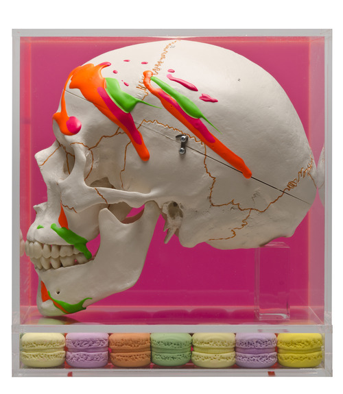
什麼是Z? Zebra草原斑馬生命力
這系列作品是耿晧剛將十年前從英國Financial Times時報週末專刊中,剪下的一則金融投顧資產管理公司的斑馬廣告來做拼貼,透過攝影再製,放大縮小等不同手法,點出種族之間、貧富之間,甚至攝影與藝術之間長久以來的矛盾情結。斑馬身上的黑白交錯的條紋就是差異之間最好的象徵,這些黑白條紋,從他出身到死亡,都分明共存著,僅在他們快速奔跑時,在視覺上有種瞬時的交融,也象徵著只有透過旺盛的生命力,我們才能拉近,甚至抿除這些差異之間。而藝術家與他的作品之間,以及我們與藝術家之間,在新苑藝術現場等待觀眾自己的接近。

【差異之間:耿晧剛個展】@新苑藝術 2013年9月27日~10月25日

1 note
·
View note
Text
耿晧剛 KENG HAO KANG in tumblr.com
http://kenghaokang.tumblr.com/

0 notes

Text
Keng Hao Kang in Wordpress
http://kenghaokang.wordpress.com/

Batman 2013
72 x 40 cm
Acrylic on canvas,emulsion on board,Mixed media
0 notes
Photo

Group exhibition: 2013.0504-0601 Moments of Eternity - The possibilities of abstract paintings Galerie Pierre,Taichung,Taiwan
0 notes
Photo

Brioche - Daily
A solo exhibition by Keng Hao Kang
2013 5.11- 6.8
Me:Liu Gallery,Taichung,Taiwan
0 notes
Text
KENG HAO KANG Saatchi online
http://www.saatchionline.com/profile/360543

0 notes
Text
KENG HAO KANG flickr
http://www.flickr.com/photos/52797615@N04/

0 notes
