
Don't wanna be here? Send us removal request.
Statistics
We looked inside some of the posts by kennismccourt and here's what we found interesting.
Average Info
Notes Per Post
0
Likes Per Post
0
Reblog Per Post
0
Reply Per Post
0
Time Between Posts
2 days
Number of Posts By Type
Text
17
Last Seen Tumblr Blogs


Fun Fact
The average Tumblr user visits about 67 pages every month.
Text
References
Attitude (2023) September/October
Cosmopolitan (2023) August/September
Cosmopolitan (2023) June/July
Daniel Rodgers Dazed (2022) ‘FUCK FIFA’: Hattie Crowther wants to see football lads in femme corsets Available at: https://www.dazeddigital.com/fashion/article/57594/1/qatar-world-cup-hattie-crowther-queer-football-corset-england-migrant-workers [Accessed 25th March]
Emma Hruby, Just Women’s Sports (2023) Four ACL Tears In Six Months: Arsenal Becomes Face Of Injury Epidemic Available at: https://justwomenssports.com/reads/acl-tear-arsenal-womens-soccer-injury-epidemic/#:~:text=Four%20ACL%20tears%20in%20six%20months%3A%20Arsenal%20becomes%20face%20of%20injury%20epidemic,-Vivianne%20Miedema%20and&text=Arsenal%20have%20suffered%20another%20blow,Monday's%20Champions%20League%20semifinal%20loss [Accessed 30th May]
Ernst & Young LLP (EY), The FA, UEFA (2023) UEFA European Women’s Championship 2022 Post-Tournament Report Available at: https://editorial.uefa.com/resources/0283-186cff205f72-b18d4799cb75-1000/uefa_women_s_euro_2022_post-tournament_report.pdf [Accessed 8th May]
GRAZIA (24th July 2023)
GQ (2023) December 2023/January 2024
Hattie Crowther (2023) About. Available at: https://www.hattiecrowther.com/about [Accessed 25th March 2024]
Lynne Cameron- The FA/Getty Images (2022) [photograph] Copyright ©Lynne Cameron
Molly Ashman (2022) Molly Ashman CV Available at:
https://www.mollyashman.com/cv [Accessed 6th April]
OOF Magazine (2024), OOF Magazine About Available at: https://oofgallery.com/about-oof-magazine [Accessed 24th May]
Sam Blitz, Sky Sports (2024) Project ACL launched with aim of reducing anterior cruciate ligament injuries in women’s football Available at: https://www.skysports.com/football/news/11095/13125844/project-acl-launched-with-aim-of-reducing-anterior-cruciate-ligament-injuries-in-women-s-football [Accessed 30th May]
Shan Purdy (2022) Hattie Crowther, FUCK FIFA [photograph] Copyright ©Shan Purdy. Photo: courtesy DAZED Magazine
Sky Sports (2023), Inside The WSL: Why are ACL injuries so common in women’s football? Available at: https://www.skysports.com/football/news/35730/12748748/inside-the-wsl-why-are-acl-injuries-so-common-in-women-s-football [Accessed 30th May]
Sophie Tolhurst, Design Week (2023) Typographic Arsenal project seeks to build deeper connection with fans Available at:
https://www.designweek.co.uk/issues/16-20-january-2023/typographic-arsenal-stadium-artworks/ [Accessed 8th April]
Sports Pro Media (2024) WSL attendances up 43% for 2023/24. Available at:
https://www.sportspromedia.com/news/wsl-attendance-2023-24-arsenal-emirates-stadium/[Accessed 8th May]
Sports Pro Media (2024) WSL breaks cumulative attendance record with six rounds to go Available at: https://www.sportspromedia.com/news/wsl-cumulative-attendance-record-2023-24/# [Accessed 8th May]
The Gist (2024) WSL attendance is on the rise as clubs continue to break records Available at: https://www.thegistsports.com/article/wsl-attendance-is-on-the-rise-as-clubs-continue-to-break-records/[Accessed 8th May]
Tifo Football (2023)Why do women suffer more ACL injuries than men YOUTUBE, 24th May 2023. Available at: https://www.youtube.com/watch?v=qwRW7S0F348 [Accessed 30th May]
Tom Chambers, ESPN (2024) Average Arsenal WSL crowd bigger than 10 Premier League Clubs Available at: https://www.espn.co.uk/football/story/_/id/39664597/average-arsenal-wsl-crowd-bigger-10-premier-league-clubs [Accessed 8th May]
Wieden+Kennedy (2022) Nike: You’ve never seen England like this Available at:
https://www.wk.com/work/nike-youve-never-seen-england-like-this/ [Accessed 6th April]
Women’s Health Magazine (2024) March 2024
0 notes
Text
Evaluation
During this project, I wanted to create an informal but educational zine that could be handed out to fans at football games to keep them informed about issues in Women’s Football. I also wanted to raise awareness for Women’s Football.
For my research, I investigated zines/magazines, fonts of different football teams, stylists/designers catering towards football and photographers. All this research was necessary for the development of my visual language and creativity in order to create a zine that was streamlined and unique.
To respond to my research, I experimented with different layouts and font choices to create the foundation and rules for my zine.
I feel like I have acquired new skills throughout the whole year. This module gave me an opportunity to develop my practical skills with photoshop and InDesign. I believe that I have excelled with these skills in this module, to create an outcome that I am genuinely proud of. In order to improve these skills next year, I will continue practicing them and learning new techniques in the software that I have not yet explored. InDesign skills are the ones that I find easiest. I feel like I have adjusted to the software and the skills have become second nature to me.
I think that the production of my zine went smoothly, this is because I had a strong idea of what I wanted to create and what I wanted it to look like from the start. The photoshoots were my favourite part of the process. I found it fun to be creative with my friends when shooting. I also believe it was the most important part as the visuals are what readers tend to focus on. I enjoyed all the research for the articles. This is something I have always been good at doing, and writing is something that comes easy to me. I liked that I got to develop my writing skills and my knowledge of topics such as ACL injuries.
Something that I struggle with was putting together different layouts. At the start of the module, I did not have much creativity with my layouts, which made it hard to create pages that looked different. However, after extensive research into different magazines/zines, I was able to develop this. In the end, I was able to create a zine that had variety but also looked like a collective magazine.
The printing process was also a struggle. The first time I got it printed, the binding was not great and some of the double pages were not printed straight together meaning faces got cut up or sat weirdly together. I got it reprinted a second time, and it looked much better and the double pages all fit together perfectly. However, I did not proofread meaning one of my boxes for page spacing was still left in.
I think my final outcomes were something that I was incredibly proud of. This subject matter is extremely personal to me, and one of my passions in life, so to make a zine about it that ended up looking this good, was something I was very proud of. To improve, I would proofread everything before getting it printed and explore the options of printing before getting it printed.
0 notes
Text
Colour Board
In order to create my colour board, I took two images from Spurs Stadium and Camp Nou (Barcelona) and used the eyedropper tool to highlight the important colours.
The green came from the grass, the blue came from Spurs Stadium, the yellow and red came from Camp Nou.
These helped to become the block colours for my zine.

0 notes
Text
OOF MAGAZINE
OOF MAGAZINE is a bi-annual magazine based in London. The artists aim to ‘peel back the layers of meaning in this obsessive sport’. They want to unravel the link between football and art. Their covers are set in an art style. This is something quite unique and different to the other zines that I have looked at.
I want to take the artistic style into my zine, I thoroughly like the idea of viewing football as an art. As a reader, you can tell that the team put a lot of work into what they are trying to show- I think this would definitely be something that I would aim to involve in my work.


0 notes
Text
Barcelona Fonts
Expanding on from my research of Rudnick's Arsenal Fonts, I decided to explore some of my favourite clubs and what fonts they used. I settled on looking at the different years of the FC Barcelona Fonts and how they have developed. They essentially use the same typeface throughout their timeline, but just with slight changes.

I chose this to be my body text throughout the zine as I thought it was simple and easy to read but also was recognisable by fans as being from FC Barcelona. It also worked in many different colours, which was something necessary when creating my zine.
The font family I downloaded online included many different styles of the font, which added depth and dynamics to my zine.

I decided to use FC Barcelona Light for my body text, FC Barcelona Light Italic and FC Barcelona Semibold Italic for my subheadings.

0 notes
Text
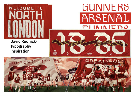
David Rudnick- Arsenal
I intended to research different fonts relating to football and decided to start with David Rudnick who created a custom typeface family for Arsenal FC entitled Northbank- named after the iconic stand in the Emirates stadium.
The piece I liked most, was the 1886 design. This was described by Rudnick as drawing on a ‘black letter, Old English Style’ to take the ‘historical voice and make it as contemporary as everything else in these murals’. I liked this because it solidly mixed history and present.
I want to use some typeface like this in my zine so that the readers feel like they are reading a football zine the whole way through.
0 notes
Text
Block Colours- Cosmopoliton lionesses

To further develop my inspiration for the zine, I specifically focused on Cosmopolitan’s spread on the Lionesses. There were many elements I liked about this. The main two were the block colours as backgrounds and the use of arrows that look like tactic boards. I felt that the block colours help break up the two pages, and the arrows help to amplify the idea that this is a football zine.
I used both elements in my zine. I used block colours on a lot of pages throughout my zine. These colours were all colours taken from the colour board that I created. I liked how the colours added variety to the white pages and helped to break the different sections up. I used them in my intro pages and my interviews.

I also used the arrows in one of my photoshoot spreads. These took a while to perfect as I wanted them to be colours that came from the mural shot. When I wanted to colour them in, the texture was then taken away. To solve this, I colour-overlayed the image and then changed the opacity of this. In the end, I was able to create ‘x’s and arrows that fit the aesthetic of the page spread.

0 notes
Text
Unique Elements
These two sketchbook pages focused on elements that I thought were unique and interesting to use. I highlighted in a yellow circle the ones I thought were particularly interesting. I liked the use of name tags, shown in the right image on the first page and the top left on the second page, and thought that I could use them to further show the model’s personality. I also liked the idea of collaging outfits, shown in the bottom left on the second page. I thought this was effective as it made the reader focus on certain elements.
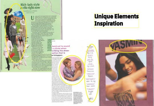

In my final zine, I did not use many of these influences. They did not visually fit with my grid-like, clean layouts. However, I do believe that this research did help expand my visual creativity when creating my final piece.
0 notes
Text
Intro Pages
Something I really wanted to incorporate into my zine, was intro pages for each person that I was interviewing or each topic that I discussed. During my research, I found three pages I liked. Some of the aspects that I would take from these are the different text styles to reflect each person’s personality, displaying one photo on a two-page spread, and including smaller text to provide a further introduction.

I used these quite a lot in my zine. Some examples are below. I did not include text on the photos of people, I wanted the reader just to focus on the image by itself. Instead, I introduced the person fully at the start of the interview. Before my two articles, I had two lots of text in the font ‘Vibro’. The ACL one helped to introduce what topic I was going to address. The date the Lionesses won the EUROS intro helped to focus on one piece of information.


0 notes
Text
Collaging

Another aspect of the magazines that I looked at was Collaging. I found four spreads that I really liked because they all engaged people in different ways. For example, the top left spread focused on just one image, drawing the eyes to the text. Whereas the bottom right spread focused on multiple images rather than text. I believed that using these spreads in my zine would create variety and help break up the different pieces of information, allowing people to read the entire zine at once.
In my final zine, I did not use many of these influences. This is because I wanted a cleaner, grid-like visual on my pages. However, I do believe that this research did help expand my visual creativity when creating my final piece.
0 notes
Text
Page Layouts Inspiration

I wanted to experiment with different ways of combining text and images, which was something I really struggled with at first. I particularly liked the four images put together on the top left but when I put this into my zine, it did not work fully with my aesthetic. I was able to adapt this into my zine on the first page of Amelia’s spread, where I had one image at the top and text at the bottom.

Another layout that worked well in my zine was the top right and bottom right. I liked how the text was broken up by the imagery, making it easier to follow and read. This was effective on Amelia’s second page. If I were to improve my own spread, I would put the photo of me and her in the bottom right to help break up the text, as sometimes the text was overwhelming.

0 notes
Text
Sketchbook Pages- Magazine Inspiration
I spent time exploring and expanding my sources of inspiration, by looking at many different magazines that I had collected over the years. For six of my sketchbook pages, I explored different elements of that magazines that I liked and potentially wanted to include in my zine. These include page layouts, collaging, intro pages, unique elements, block colours as backgrounds.
0 notes
Text
Birmingham Photoshoot
For my second photoshoot, I took a lot of the same processes from the first one but also wanted to add some variety.
I took some of my photos at the Birmingham City Stadium, this was something I felt was missing from the Lincoln shoot, so I wanted to add this into the Birmingham shoot. We took photos in front of the ticket stand and the Jude Bellingham Mural. I also took photos in front of a pink mural in Digbeth. When I moved here, I was very intrigued by this area of Birmingham and its art, so I knew I definitely wanted to take photos here. There was also an advertisement board for the new England kit, which went perfect for my Lionesses article, and conveniently matched the England Women’s World Cup shirt that I was wearing on the day.
When selecting my models for this shoot, I knew that I wanted to use my friends- Kimran, Tanysha, and Simar. They were comfortable enough with me to pose the way I wanted, and I felt at directing them. Unlike the Lincoln models, I didn’t interview these three for my zine. They are not all football fans, and more significantly, not women’s football fans. This meant that they were all crucial to the visuals of the zine but could not always contribute to the discussion aspects.
The styling for this photo shoot was more formal than the previous shoot, but they were still showed each girl’s individual personality. The process of styling was different this time around - instead of me picking out outfits from their wardrobes, the girls showed me what they wanted to wear, and I selected out of these options. While Ellie and Amelia had matching outfits (both wearing cargos), the three Birmingham models all wore different types of clothing. They didn't look like a collective group, but there were still connections between their outfits. Simar wore a white Real Madrid shirt, with a black skater skirt and white legwarmers. Kimran wore a red Man United jacket, with a black tennis skirt, and white legwarmers. Tanysha wore an Aston Villa shirt, and black trousers.
On the day of the shoot, I took photos on my phone instead of using a professional camera, like we did in Lincoln. However, due to the quality of my phone, the results were still good. The poses were more editorial and deliberate than the ones taken in Lincoln. I think they still were candid and showed the emotions I wanted them to.
When deciding what photos to include in the zine, I wanted to create two different spreads based in the two different locations.
For the blue Birmingham City section, I included a photo of Simar leaning against the wall; a photo of all three models standing together; and a photo of Kimran posing in front of the wall. I also included a photo of the entire mural as the background. For the pink Digbeth section, I used a photo of Tanysha doing a classic footballer pose normally used in pre-season shoots (arguably my favourite photo of the two shoots); a photo of me against the wall; a photo of Kimran posing with her hands on her hips; and a photo of Simar posing against the wall. Again, I used a photo of the whole mural as the background. I liked the way, that in both spreads, I set the images up in frames with the background. The photos worked well together, as they really highlighted each girl’s individuality- something I was aiming to achieve throughout my project. If I was to improve these two spreads, I would use more candid photos, like I did in the Lincoln shoot.
There were some photos that I was not happy with. This was shown in my sketchbook with the red ‘X’.

Below are two different images that I decided to not include.
I decide not to include this one in my zine as I felt like it did not match either of the two sections visually. I also did not like the poses, as it ended up with awkward and not pleasing shots. However, I did like how candid it was. To improve it, I would not take photos mid action.

I decided not to use this photo because I did not like how far away the angle was even when it included the whole billboard. I felt like it did not focus on the elements I want it to such as the football shirt. I feel like I improved this through later shots on the pink mural. A positive of this shot was how you could see the whole outfit.

Overall, this photoshoot added to the foundation I built from the Lincoln photoshoot. I enjoyed the whole process of planning and executing the photoshoot. I think that this photoshoot added variety to my zine and allowed for multiple sections within my zine.
0 notes
Text
Lincoln Photoshoot
The first photoshoot I did took place in Lincoln, my hometown and where my love of football originated. I took care in selecting the locations for my photos. I knew I wanted one in the city of Lincoln and one in the outskirts where I grew up. Knowing this, I decided to pick the brick walls of Steep Hill (arguably the most iconic place in Lincoln), and a goalpost in the middle of a field where I used to play growing up.
When choosing my models, I decided to use my friends, as I feel most comfortable around them and they are who I have shared this love of football for, for a long time.
I chose Ellie because she is the most sporty of all our friends. She plays rugby and that was something she was known for amongst our year at school. We have had in-depth discussions about the culture around women’s sports in the past, so I knew this was something I wanted to explore further. I chose Amelia since I have been friends with her the longest, meaning she was perhaps the most educated about women’s football. She is also extremely sporty and very photogenic, meaning it would be easy for me to take photos of her.
For the styling, I kept it true to what the girls would wear on a day-to-day basis. I knew that when going into both photoshoots, I wanted it to be a relaxed and casual setting, although the second photoshoot turned out dressier than this one. I went into both of their wardrobes and chose pieces that I thought would work well as a collective.I dressed Amelia in black cargos, with a red 2019 England Women’s jersey (known amongst my friends as the lucky jersey), and a blue denim jacket to go over the top- this was taken off between some takes which gave dynamics to the photos. Ellie was dressed in brown/beige cargos, with a vintage Liverpool jersey. I thought that the trousers matched the top with the golden text and stripes. I was overall happy with the styling, it was true to the girls, whilst also linking the two together. I also thought it was efficient, as many fans wear similar outfits to football games.

When taking the photos on the day, I aimed for casual and candid (inspired heavily by Naomi Baker, referenced earlier in the blog). With the help of Ellie, who captured many of the photos on her camera, I believe we achieved this. The day went smoothly, and the results turned out great. I avoided over-editing the final images, as I wanted to show the natural emotions and felt that if I edited them, this factor would be removed.
I selected a photo of Ellie on the brick wall, slightly posing, to be the front cover. I thought it was simple and would work to attract readers to the title instead of the image. I aimed to use a mix of photos from her collection. I used a photo of her walking down the street; a photo of her leaning against the goalpost; and a photo of her closeup chest to highlight the top. I felt that these photos worked as there was variety to them, they were similar enough that they complimented each other but also highlighted different things. If I was to improve Ellie’s section, I would add in some photos of her showing joy, as in these photos she has a stern face.


For Amelia’s section, I chose a photo of her smiling, standing at the wall; a photo of her and myself jokingly posing in the same brick background; and a photo of her posing on the brick wall. I was pleased with how the mix of these photos showcased different emotions that felt true to the reader and made the reader feel the same emotions when viewing the photo. To improve the spread, I would take photos of Amelia in different locations to add variety, as she was unfortunately not able to make it to the grass location. If I had more days with my models, I would take her to that location on a day she was more available.


There were some photos that I was not happy with. This was shown in my sketchbook with the red ‘X’.

The photo on the left below was a photo that I was not happy with including. The exposure and the flash washed both me and Amelia out, creating a result that did not fit in with the colours of the other photos included. Amelia and I both mutually agreed that the poses were not something that we liked.
I also disliked the photo on the right below. This was for the same reasons as the one on the left. The flash was now off but the exposure from the sun made Amelia look very pale. She also was midway through a laugh- this was the very start of the shoot so she felt a little bit uncomfortable.


Overall, this photoshoot turned out great and gave me a solid foundation for what I needed in my zine.
0 notes
Text
Brief- ‘The Rise of WOSO (Women’s Soccer)’
This project aims to create an informal but educational zine that would be handed out to fans at football games to help keep them informed about the issues around Women’s Football. It would also cater to people trying to get into the game, by raising awareness for Women’s Football.
The zine will feature, interviews with friends/fans to gain different perspectives on the issues and what can be done to solve them; photoshoots of people wearing football shirts in public, in attempt to show many different ways of how they can be styled; educational articles that will raise awareness for the problems surrounding the game e.g the epidemic of ACL tears.
My objectives:
To create an informal, educational zine to promote the game.
To inform myself of all the facts surrounding the issues I want to discuss, in order to efficiently educate others on these issues.
To show the game through many different fans, to be diverse and include a wide range of people.
To create visually appealing photoshoots that draw people in.
0 notes
Text
SEASON Zine
SEASON Zine is a football and fashion platform launched in 2016. It aims to counter ‘the male, pale, and sometimes stale state of modern football culture’. They showcase, celebrate and empower female fans and marginalised communities. They create bi-annual zines that are a cross between a football fanzine and fashion magazine.
I feel inspired by the merging of fashion and football- a key aspect of my zine. I also like that they aim to make political statements and change the way the football community is set up- this is something significant to my values and therefore the values of my zine.
However, I would aim to make my zine more informal, cheaper and more frequent editions.


0 notes
Text
Naomi Baker
Noami Baker is a sports photographer who captures lots of different sports. She works very closely with the Lionesses in all of their camps and matches.
I feel very inspired by the way she takes her photographs. They are candid and show the raw emotions of what is happening at the time. I will aim to take candid photos of people and avoid over-staging them.
I also like the way she edits some of her photos into black and white- it highlights their significance. I will aim to test this on my photos and see if it is something that could work within my zine.


0 notes