
Statistics
We looked inside some of the posts by kgraebnersvad-gd and here's what we found interesting.
Average Info
Notes Per Post
1
Likes Per Post
1
Reblog Per Post
0
Reply Per Post
0
Time Between Posts
19 days
Number of Posts By Type
Text
17
Last Seen Tumblr Blogs


Fun Fact
Mobile Tumblr US users spend an average of 4.04 minutes per session on the app.
Text
Adobe Fonts!

As a design student who has now taken multiple typography classes, I was super pumped to hear about Adobe Express's Type Trends for 2023. Check out some of the great stand-out fonts that are taking over. My personal favorite is The Centered Self-pack & Oscine.
0 notes
Text
Blog Response Arts 245: Week 15

This was it! The final week of Arts 245. I am so proud of the final presentation I gave on Monday. The theming of the presentation itself even fits with the Dungeons and Dragons league. I hope everyone enjoyed viewing the presentation as much as I loved sharing it. I think I've improved a lot throughout the course of the semester. This project shows my development and the hard work I put in. The objective to create a badge design for a team of teachers really was unique. I had to push the boundaries of my imagination and play with color a bit more than I normally like to haha. I also loved that we got to work with mockups as it was my firs time learning how to work with a premade template file. Can't wait to add this to my portfolio. Thank you for an amazing semester!
0 notes
Text
Blog Response Arts 245: Week 14
This was our last week with thanks giving break and final presentations right around the corner! So proud of all the work I’ve put in. Can’t wait to share next week in class! I have already developed my PowerPoint so I’ve just been practicing and putting the final touches on everything. I think this will be a great way to wrap up the semester. Hopefully the class likes what I present. This has been an awesome class and I feel like I’ve definitely learned a lot. I even ran a half marathon last week so an eventful semester for sure.

0 notes
Text
Blog Response Arts 245: Week 13

This was our last week before presenting our final projects. I loved getting to develop my presentation and refine all of the mock-ups this week. I cannot wait to share more about my process in the presentation and really give everyone insight into my creativity.
Hopefully everyone likes seeing the journey from my mood boards to full mock-ups and sticker designs. I plan to send my stickers over for print this week so I can test them out in advance. Hopefully the colors turn out okay!
0 notes
Text
Blog Response Arts 245: Week 12


This week we worked on our mockups. I wanted to create a few different items other than the wallpapers, stickers, and t-shirt so I made a deck of cards! This was honestly a real challenge. Not only did it take me a while to make, but the pattern did not seem to line up. I want to keep working to make the box look crisper over time. Next week is our last week before thanksgiving so my last opportunity to edit the pieces before putting them into our final presentation. I hope to develop a great PowerPoint showcasing my process on this project and in this class.
Cannot wait to see what everyone else came up with for their unique mock-ups and designs. The presentations are going to be amazing!
0 notes
Text
Blog Response Arts 245: Week 11

This week we worked on our final badge designs. They were due on Monday the 7th online and also printed for review. I found it very difficult to convert it to greyscale/ black and white because of the mix of light colors! Though I believe in the end the side-by-side turned out pretty nice. After the critique, I might have to edit some of the colors to adjust this. Then Wednesday we worked on creating a final style guide for the project.
I enjoyed these two critique days a lot because we had to opportunity for feedback before we start mockups next week. I have a few plans to add to the mock-ups other than the typical phone wallpaper, desktop computer, and merchandise. Maybe I will incorporate some DND-themed merchandise as well! Overall I am really enjoying this project and look forward to continuing to develop my badge design. It's going to look amazing on the merchandise!
0 notes
Text
Blog Response Arts 245: Week 10
This week was mostly a work week where we developed our sketches to turn in the next week. I continued to play around with my lettering as I had been struggling with it quite a bit. I loved getting to see the class's creative journey and how they have been editing their pieces. As we go into next week when the final art is due for review I am especially interested to see how they all turn out. I was sick last week so I missed some of the reviews which will make this an even more exciting experience!
Can't wait to share my progress as well. in the image above I have my weekly progress and I might make a few changes before Monday. Hopefully, everyone loves it as much as I do.
0 notes
Text
Blog Response Arts 245: Week 9

This week we developed our sketches and designs for the final project. I have been struggling with laying out the words to fit in the spaces I have in the die shape. I hope next week in class I can get some guidance on how to angle or move them so they fit a bit better.
After seeing everyone else's progress, ideas, and concepts I am excited to try and put my own vision to the page. I also finally thought of an excellent idea for the team name! Assassin is a type of class in DND and since my team is a team of yoga teachers... Assas-ZEN's get it haha! I think it's cute. Looking forward to hearing what everyone else thinks!
0 notes
Text
Blog Response Arts 245: Week 8

This week we began our final project for this class. I am super excited about this project because we get to use mock-ups! Mock-ups are when you place your design on sample products such as t-shirts, Cups, bags, etc. Our project focuses on a type of design that looks like a badge. I am still debating on my team name but I Want to have the Yoga teachers who play pickleball or DND. This project is absolutely going to be my favorite of the class and I can not wait to see how it turns out in a few short weeks. I think one of the best parts of the project, is how much time we will have to develop our designs and ideas to really make a perfect product. Again I am looking forward to how this turns out and will keep updating my blog to reflect the progress.
0 notes
Text
Blog Response Arts 245: Week 7

This week in Arts 245, we wrapped up and sent our work to the print lab. I was ultimately very happy with how it turned out. The black of my lettering looked crisp, and I felt both pages flowed together perfectly. Based on the time I spent on this project I do not think it would have turned out any better. On Wednesday we also did our in-class critique where we went around and gave tips/ advice. I tried moving some things and changing the colors of the letter forms but in the end, I loved it just the way it was. Cannot wait to turn this in! The sooner I turn it in the sooner I get it back to have in my portfolio. I attached some pictures from critique day just so everyone can see how it went and what class looks like here at the university of south Carolina.
0 notes
Text
Blog Response Arts 245: Week 6

Our class spent week six working on the Making Type project. I've enjoyed this project the most so far. After watching others in the course design, I decided to redesign my piece. I attached two images here for reference. One letterform I designed referencing Adobe Baskerville and the other with Asap. During the in-class work time, I slowly developed my two spreads.
The first spread took a ton of manual manipulation. To get the text to sit around the letter just right, I adjusted the textboxes by adding points and curves to the exact letterform. I am still adding in some details for imagery and labels. For now, I have left the second spread with lots of space to include what I still need for the assignment requirements. I am looking forward to finishing up this piece and moving to print next week! The next and final project is going to be even better I just know it.
0 notes
Text
Blog Response Arts 245: Week 5

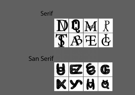
This week in class, we wrapped up project 3: recycle it and began project 4: Making Type. I started with the initial assignment of creating eight new serif and eight new san serif letters. I started this process by exploring new fonts on adobefonts.com. I tried to find pieces of type that I liked merged together. I initially used Los Feliz and Pinecone. Then I made the complete set of 16 digitally and translated them into sketches for the assignment. Then, after watching what outstanding letters everyone else created in class, I wanted to try something new. Changing up my fonts, I think I found a very unique and whimsical letter for the serif and a bulky yet direct letter for the san serif. Overall I am happy with how it is turning out. I cannot wait to convert my designs into vectors on Monday in class. The next steps for this project are going to be so fun!
0 notes
Text
Blog Response Arts 245: Week 4

This week we continued worked on project 3. I really enjoyed creating these small flyers/posters each design was a little different but equally challenging. It was also super neat to see what everyone in the class came up with!
I first wanted to make this project all vertical work but realized I found it much simpler to divide and create a hierarchy through the horizontal page. I drew inspiration from the colors I found in life such as my orange-ish yellow shirt. Then based most of my design on the text itself and of course as this is a typography course it made complete sense! Once I found inspirational header don't I was on a roll. I hope everyone thinks my designs were as successful as I do.
Cannot wait to see what the next project has in store for us! I already feel like I'm learning so much.
0 notes
Text
Blog Response Arts 245: Week 3

I spent half of week three working on project 2, Anatomy 101. While I struggled with this project, I feel as though the outcome was pretty good and much better than the one I did in Arts 246! The more you trace, outline, and replicate type, the easier it gets. Definitely would have helped to have a straight edge though haha.
After finishing project 2, we also began work on the third project on Wednesday. Project 3 is Recycle it! Although we are not allowed to use any graphics or art since this is a type-only project, I have a few ideas I think that will make this assignment fantastic! My first idea is to make the words expanded/ stretched out into shapes. So not boxes or shapes but the word recycle forms an arrow or the classic recycling logo. Still have to work a bit over the weekend to find out if this is doable, but it could look great! Another Idea I had was to stretch the type to have it wiggle or look like natural things. The more I explore with type, the more I learn. This project is definitely going to be awesome.
0 notes
Text
Blog Response Arts 245: Week 2

This week we continued to work on our Wild Type projects. I brainstormed for a good portion of it and finally came to a conclusion. Because I didn’t have access to the pieces and materials I want to add, I will have to find another way to create my vision. So I went through the few art supplies I pack for the semester and found my fine point pens!
The fine point pens were perfect I was able to add a lot of details that I hadn’t expected to put into my project. Now that I am done I’m really excited to get it back after grading. I plan to keep adding on to this project and put some of the game pieces onto the piece later as I had originally planned.
Now we are also starting on our next project which is a practice with the history of typography and the actual curning of letters. I’m looking forward to the future projects and implementing what I’ve learns so far!
0 notes
Text
Blog Response Arts 245: Week 1

This week we began the Wild Type project. I am excited about this project because it allows for much creative freedom. It took me a while to figure out my concept because there are so many six-letter words! First, I thought puzzle or escape would be great, and then, I considered create. When struggling to decide, I searched a giant list of six-letter words and found settle. Although this word has duplicate letters, I imagined a pretty well-thought-out concept and immediately knew it was right! Now the concept for my piece is settlers of Catan themed. I hope to make the game pieces and forms emerge from the letters on paper to immerse the viewer in the land of Catan. I wanted to order the actual game to implement in my design 3-dimensionally; However, the pieces will not arrive in time. Now I've decided to create a digital version and print it out!
0 notes
Text
Blog Response: Week 13/ Final Post

This class was one of my favorites so far at the University of South Carolina. I found myself learning and growing outside of the classroom just as I did through lectures and classwork, if not more. I found this class has inspired me to pursue a career more focused on design. I am excited to see how my style continues to evolve in future design classes at UofSC.Typographic design II was a fantastic bridge to the possibilities that design and art can provide. I hope to incorporate my passion for art in every way possible. For our final process book, I chose to have a theme of plants and nature to show the growth I found in this course. I would recommend this class to my fellow students if they are interested in design.
1 note
·
View note