Last Seen Blogs
ponypinkuwu
Artist Pink

livingemotion-blog1
LivingEmotion
notesonthemodernspectacle
Notes On The Modern Spectacle

autumnbounds
I Told The Stars About You

abcsupercorp
Teddy
Text
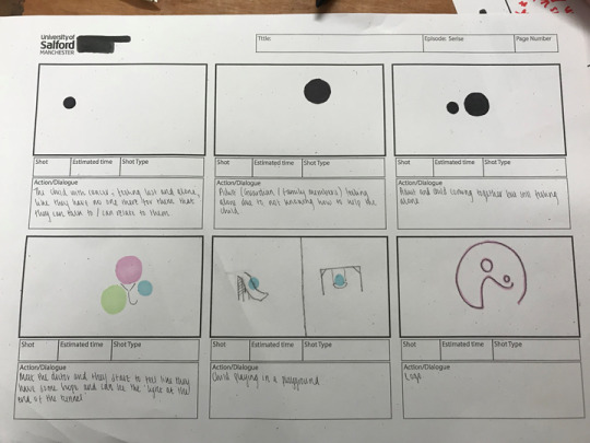
Final presentation
We did our final pitches to Kidscan today to show all of our finalized work to Kirsty and Mark. From the last presentation we knew that we needed to have a more concise idea, and we needed to link our three individual projects together into one.
From the presentation, they seemed to like our work, but they did say how they thought that the posters could've had a more 3D aspect of them seen it would've like it to the 3D environment that Glenn did more. However, we did think about this and when I tried it out on the posters we didn’t like the look of it, as most posters you see are a flat surfaced poster, we felt it was easier to read and was more approachable than it would've been in 3D, so we were still happy with the outcome of the posters as we know that everyone can have different styles and things they like and don't like so it was inevitable that some people wouldn't like the concept.
I feel as a group that we worked well, we all did an equal share of the work and we communicated well as a group if we needed help with anything or if we felt that their needed to be something changed then we were able to discuss it as a group.
If we were to do it again then I think that I should've experimented more with the character design and the posters to see what other things could've possibly looked better. I also really wanted to develop the snapchat filter as I think it would've been a good asset to our brief but down to budget we couldn't. I think I should've tried to be more involved in the other elements of the brief so that I could expand my skills in other areas like 3D and motion, rather than just sticking to what I know as working in a group Is where you can take advantage of learning from other people as you might not get the chance again otherwise.
Final presentation.
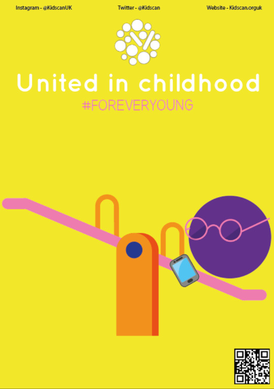
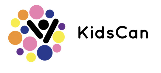
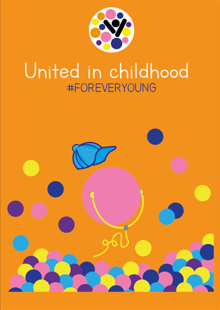
We kept the same colourways as we originally presented in the half way presentation, keeping the original kidskin colourways but also adding our own colors that we thought went well with our theme, we needed more than just two colors to make it be bright and playful like we wanted.
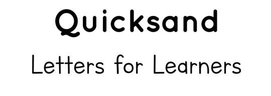
We changed the font so that we were using the same typography throughout the whole thing, a small way to link it all together.
The ‘Quicksand’ font is easily readable so if you see it in public then you'll be able to read it clearly, and the ‘lettres for learners’ font resembles the sort of font that you would see in children books, meaning it is easy to read and reflects childhood which the brief is obviously all about.
We also developed a colorful logo and a black and white one so that I could use a black and white one on the posters as using the color one would mean that some colors would blend into the background of the poster as we used the same colourways.
0 notes
Text
Social media campaign
I kept the same colourways as the rest of the project to keep it the same and create some continuity through our work. the bunting is used to celebrate celebration, as we are trying to encourage people to celebrate childhood and emphasize how everyone has a childhood and can be a ‘child’, rather than people looking at it in a negative way where it would make them feel guilty to not donate.
0 notes
Text
Week 10
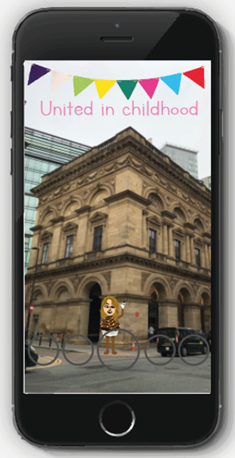
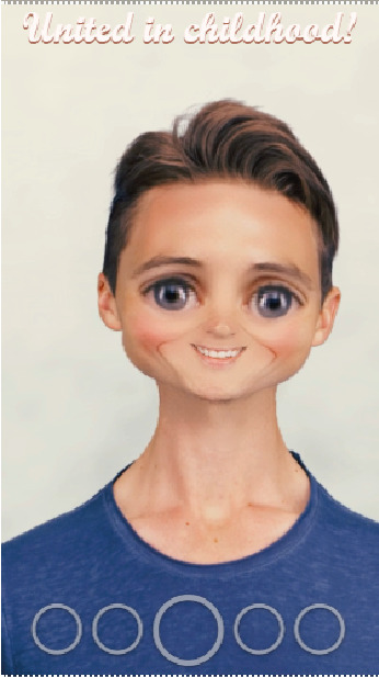
Today I started to look at the snapchat lens and the snapchat filter I could make. For the snapchat lens we thought it would be a good idea to create a lens that turns your face into a baby or child's face, we thought this would be a funny concept for audiences to use which they might share between their friends.
This was the sort of idea that we were thinking of, but we want to maybe include something like a dummy to make it obvious of what it is, and we want something like a hashtag or the location to also come up when you are using the app.
For the snapchat filter we thought it would be cool to have a filter where you can only use it when at one of the locations, where you hold it up to the swing/slide/apparatus and it shows your bitemoji using that piece of equipment. It would use the location so that if people share it with their friends then they will know where it is.
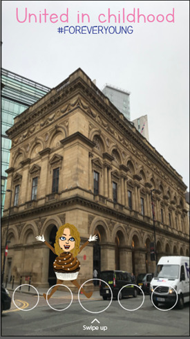
There would be a ‘swipe up’ feature where it would take the user to a donation page which is quick and easy to use so that it won’t take up too much of the users time.
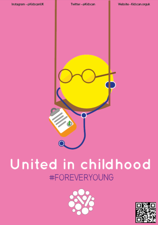
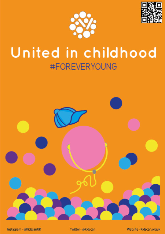
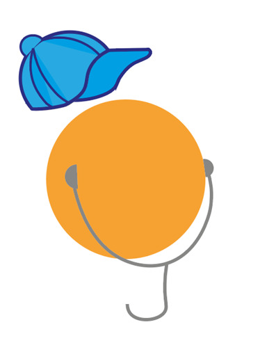
We also changed the concept of the posters as we didn’t like the idea of the balloons and we thought the other design was a bit too plain and boring and their was no way that it linked into the playground. We wanted to include the playground into the posters like having the doctors on a swing or the child in a ball pit, as it shows that everyone has a childhood.
Doctor.
Child.
Adult.
0 notes
Text
Week 9
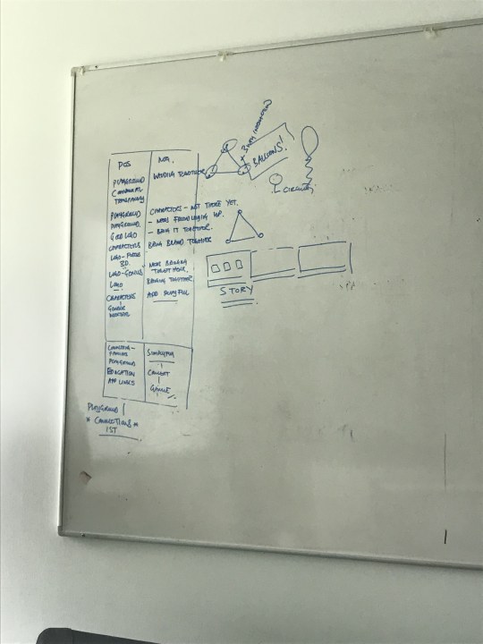
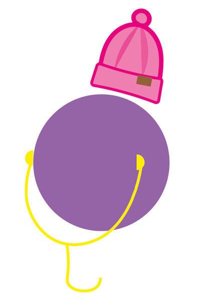
In our lesson today me and Matty spoke to Mark about what we have done so far for this brief. Mark gave us a suggestion for the posters where we could represent the circle shape of the characters as balloons, to imply a childlike and fun aspect to the brief, and represent freedom. Although, I tried out including this in the posters and me and Matty didn’t like how it looked and we also didn’t know how the balloons could link to the playground idea of the brief and we want to make sure that all the different parts of the brief that we are working on seperatley will still link together when they are presented.
This is an example of how the poster looked with the balloon theme, the idea was that the earphones were resembling the string of the balloon, the stethoscope wire would resemble this for the doctor, and a phone wire for the adult.
Me and Matty also discussed what we could do for our social media campaign, we carried on with the idea of using snapchat at the social media platform as its used by a wide audience and is the most used platform for communication between a younger generation. We thought that it could be a filter that you can only access when you are at the playground, so that it is exclusive to only a smaller audience so it feels more rewarding to be able to use it. We thought it would be a good idea to use the bitemojis included in Snapchat, so when people use the filter, it’ll show their own bitemoji in the park, going down the slide or swinging on the slide. This makes it customised to the person using it and also makes it interactive, there will be a hashtag included in the filter so that other people can research into the playground, and there will be a ‘swipe up’ link so it can take audiences straight to donating.
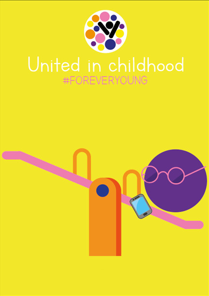
We also wanted to refine the idea of our playground because this was the part of our idea that Kidscan seemed to really like as they wanted an interactive environment. We did that that instead of having a full playground, there could be parts of a playground (slide, swing, see-saw etc) incorporated into normal things in day to day life, like a slide next to a set of stairs or a set of swings instead of seats at a bus stop. We thought that this could be a better idea so that it wasn’t just children that would be using the playground as its unlikely that adults or older children would decide to go to a playground. We wanted to make it so that it was something that all ages would use, as its the older audiences that will actually donate to Kidscan and want to find out more information rather than children. Having parts of a playground scattered around town would make it a more fun and interesting thing to do for people, plus if we do this then it can become a sort of trail for people to follow to find each piece of playground equipment. This is where the app can link in as it can have a ‘trail’ section where consumers can unlock different places once they’ve been and can unlock a reward or something that will make them want to carry on.
We have also thought about having some sort of art piece located either near the play equipment or in random places in town, this is where people could scan there app to prove that they have been to this location and unlock their next location. Plus, there will be QR codes and contactless payment where people can download the app or donate to Kidscan.
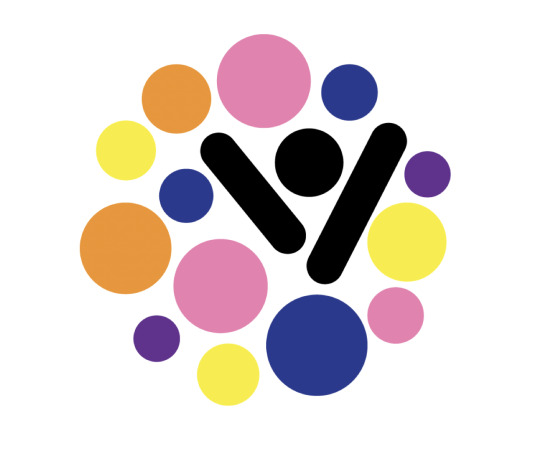
Matty also made a suggestion of a different logo we could try using.
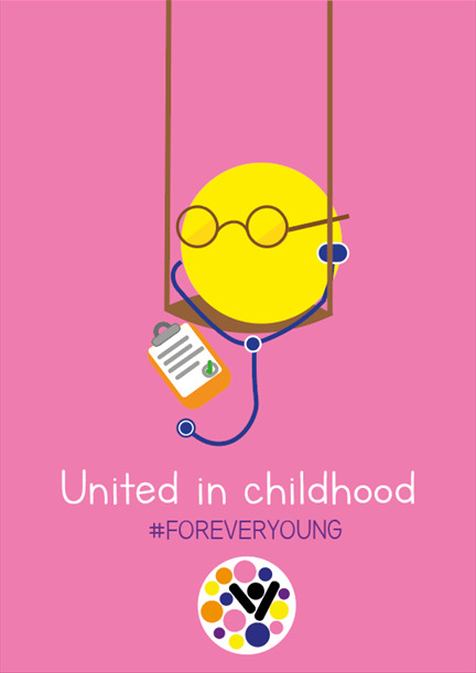
The dots are supposed to represent the characters, and people coming together like a community. It symbolises how people are not alone in this and they aren’t the only person this is happened to and that there is people they can talk to. The black shapes in the middle are meant to resemble a person celebrating, showing that there is an end to look forward to and they shouldn’t be scared. Mark really liked this logo, he thinks the colours work well and that it makes a link to the characters that we have made which he also seems to like. He says that he likes the colourways on the posters too, and likes that the colourways throughout the whole project have stayed the same.
After trying out the ‘balloon’ idea for the posters and not liking it, we thought that maybe we could try putting playground equipment on the poster, like the child character playing on a swing or the adult on a slide, but after trying this out I also didn’t like the way it looked and felt like there was too much going on on the page which made it look crowded which may prevent the audience from reading or looking at the poster.
0 notes
Text
Week 8
This week I've been looking at examples of social media campaigns. I noticed that a lot of campaigns include a hashtag so that it is easily shareable and to spread the word.
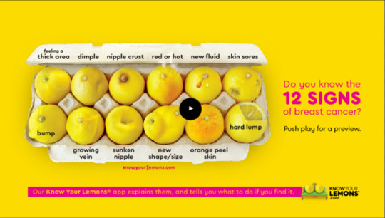
One example was a campaign called ‘Know your lemons’, created by worldwide breast cancer for Facebook to encourage survivors to share their personal stories and spreading awareness by sharing lesser known symptoms. It worked because they took a serious topic and made it lighthearted by using playful hashtags, the humour also provides comfort which makes people want to share their stories and get involved.
X-Men did a massive takeover on Snapchat on May 23, to help promote the release of the new X-Men: Apocalypse movie. They didn’t just create one sponsored filter, they created ALL of them. Every filter, for the entire day on Snapchat, was related to X-Men.
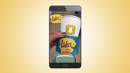
Gilmore Girls is launching four new episodes exclusively on Netflix in a few weeks. To build awareness for the launch, Netflix printed cups from the show’s fictional “Luke’s Diner” and distributed a total of 10,000 cups to a group of 200 coffee shops around the country. Each cup had a snap code which would pull up the image below when scanned. The logistics behind a campaign like this can be complicated, but there are great lessons to learn here. A campaign with a smaller budget can still produce similar results with targeted geofilters around brick and mortar locations.
I think that doing a social media campaign that links to Snapchat would be good because it is a social media platform that even younger audiences use, rather than Twitter which may be used by an older teen+ audience or Facebook which I feel isn’t used as much by this generation or a younger one. Snapchats also only last a few seconds which could reflect how children’s lives can be hugely impacted in only a few seconds or how it only takes those few seconds to donate and help children with cancer.
Maybe the Snapchat filter could try to feature the characters in some way, or make a character personal to the person using the filter, like they are one of the characters from our work.
0 notes
Text
Week 7
This week I have been focused on designing characters for our Kidscan brief that are fun and playful, to entice audiences to look at the posters and make them want to see what it is about.
After playing with the idea of having two characters on each poster, one female and one male, as a group we decided that three characters that are gender neutral would be a better technique to use seen as it doesn’t portray to audiences that our brief is aimed at one gender, or that cancer only effects one gender. Its also about ethics and the way that consumers may interpret there only being two genders.
I have designed the characters in various ways in order to see what I liked the best. I also changed the layout of the poster, making the ‘fact’ less emotive, so it doesn’t make the audience feel guilty for not donating or not trying to help more.
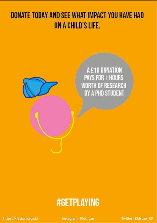
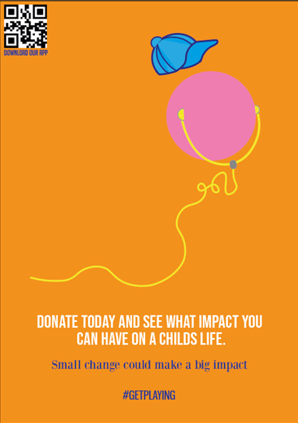
I also added the hashtag ‘Get playing’, this means that people can use this hashtag on social media like Instagram and Twitter, meaning that it is shared and spoken about so that people start to talk about it and it spreads awareness. Also the social media links and website means that people can easily find out more information if they want to.
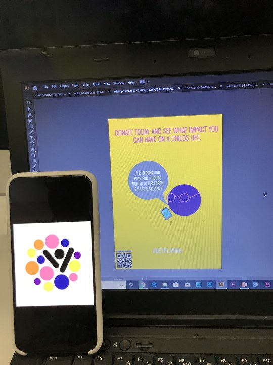
I am also going to add the (new) logo and a QR code for people to scan, when people scan the QR code it could take them to the app or for them to download it.
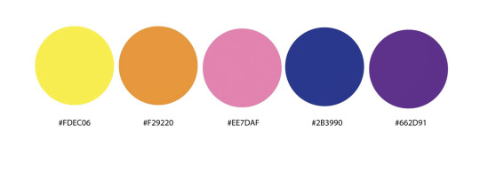
We decided on a various colourways that we are going to use in all of our designs, including the app, 3D designs, posters and characters, to ensure it all links together and creates continuity throughout the whole thing.
The yellow is to represent the golden ribbon, the purple is being used as a continuation from the old branding of Kidscan that is used due to the purple gloves/clothing in chemo wards, the blue is to symbolise ‘boys’ and the pink to symbolise ‘girls’
In our session this week we presented pitches on our Kidscan brief to the class and two Kidscan workers. We presented our ideas and development of our ideas to everyone, then they gave us feedback of what they liked and didn’t like to give us an idea of what audiences would think of it in the real world, seen as everyone likes different things, so although we may like what we have created other people may not like it as much and we needed to get this feedback so that we could try to please everyone.
People really seemed to like our idea of having a playground that kids can go to, and having this designed in ways that represent cancer cells and molecules. They thought it was a great way to interact with kids as this is something that the majority of kids love to do, and if we can try to educate them about childhood cancer at the same time then it could be really effective and work great.
Although most people liked the characters that I designed and how they looked on the poster, one person did say that they didn’t like the way that they looked and didn’t understand them, so I need to try to develop them more in order to make them attractive and approachable to everyone. People also mentioned that they think the three sections of our project (3D, app, posters/characters) were good and had good concepts behind them, they thought we needed to link the whole thing together better.
We created another list of things that we felt like we needed to improve or work on;
Group
Colours
Fonts
Consistent theme
Bubbles
Needs welding together - Connect the three ideas
Needs an identity for it all - Bring it together into a named campaign
Engage people through fun into a serious matter
It didn’t pull together – the PowerPoint
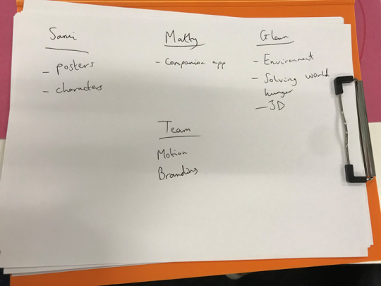
Sami
Social Media Campaign
Campaign Name
Characters
Colours, purple and blue?
Matty
App needs to be more friendly
Logo colours
Connect the three ideas
App more playful
Liked the connecting families idea
Where does the educational part exist? Make it more prevalent
AR/VR App with playground
Glenn
Interactive playground?
AR/VR App with playground
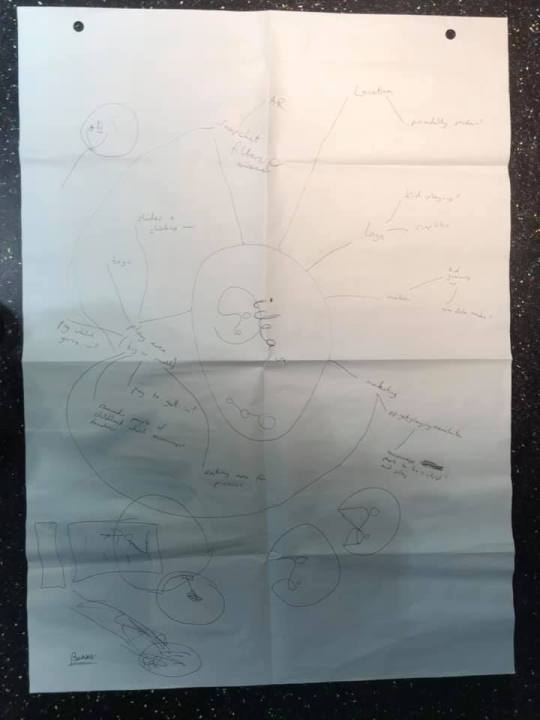
I’ve been given the task to create a social media campaign as we think it will create more awareness if people can speak about it on social media as its such a big platform, with so many different audiences.
I create a mindmap to help me begin to design the social media campaign.
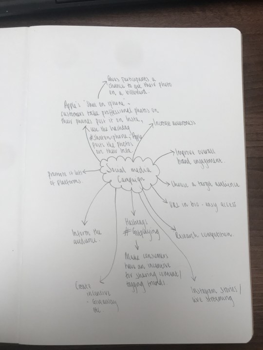
I was thinking of a snapchat filter that people could use, perhaps it can be used around the area of where the playground is, people can use it when they are there, if they put it on their story then other people will see it and be intrigued.
0 notes
Text
Week 6
Today we started to plan out presentations for the 14th of March, where we will presenting all our ideas and research so far for this brief, and presenting some prototypes of these ideas or rough copies. As this is a group project, we discussed what will go on each slide and the jobs allocated to each person so that there was no confusion or overlapping of work, this is in order to keep us organised and to make sure we can get enough done as possible.
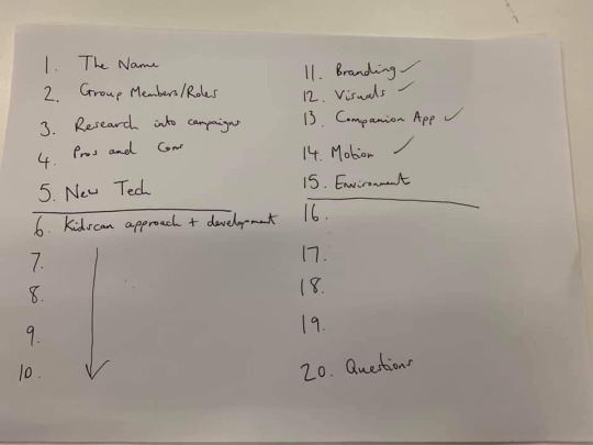
What we need to include in our presentation;
1. Group members and the roles of each member, what each member has contributed to the brief.
2. Research into other charitable campaigns, pros and cons of these campaigns and what we liked or didn’t like.
3. New tech introduced in campaigns recently.
4. Our Kidscan approach and development - logos / style sheet / research.
5. Branding / visuals / companion app / motion / environment.
6. Questions.
After discussing the basics of what we needed to include in the presentation, we started to refine our ideas for each element so that each member of the team knew what they needed to do with no confusion.
As my contribution was the character design and posters, we discussed how we wanted the posters to look.
We thought that a flat background of one colour would be the most effective, as this doesn’t distract from the posters content, plus a flat layout is the most common layout of posters at the moment.
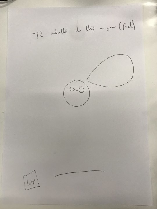
We sketched out a rough design of what we want the posters layout to be. At the top there will be a short fact, in the middle we will have the character of either the child, adult or doctor, and at the bottom there will be a call to action and the logo. The poster is simple but we think it will be effective, as the public won’t feel overwhelmed with information and if they want to find out more then there will be links on the posters for them to do so. We also decided we wanted to use bright colourways as this is more appealing to a younger audiences and will catch the eye of the public, we also think that the cartoon like characters are more fun for the younger audience and by representing each one as either the child, adult or doctor, it makes the pblic be able to relate to one of them.
I started to create these characters so that I could also start developing the posters.
First I tried designing a character that could be used for the ‘adult’.
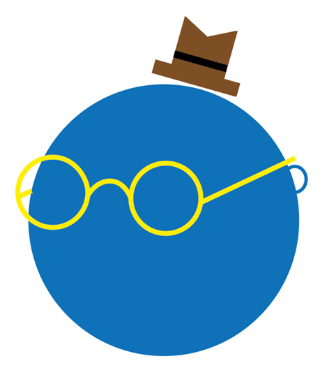

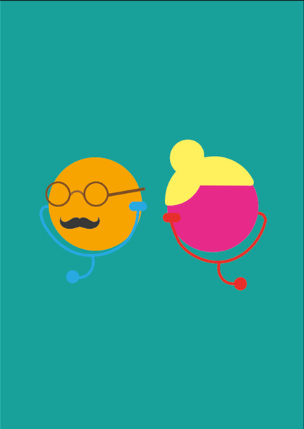
I quite like this design for the adult, it is very simple yet it is effective, I think the use of different colours makes the character stand out and will look good when its on a poster. I think that you can tell that this character is meant to represent the ‘adult’ due to the hat and glasses, although anyone can wear this, I think it just makes it look more mature and initially you would associate it with an adult, epsecially once it is compared to the other characters on the posters.
I did try out other colours with the adult but I thought that these colours were best suited and looked the best together.
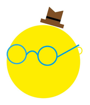
This was another colourway that I tried but I think I prefer the first approach.
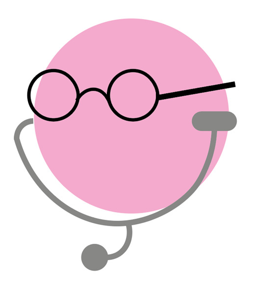
After this I designed a character for the ‘doctor’, this design was pretty simple and easy to develop as we already knew that we wanted to include a stethoscope to represent that it was actually a doctor, I included glasses in the design of this character too because I thought it would suggest a continuation throughout the characters and show that both these characters are adults.
For the ‘child’ character I found it a bit more difficult because I wanted to portray that this character is younger than the adult and doctor, plus I needed to show the child as the more vulnerable one.
This is what I ended up coming up with for the ‘child’ character.
After speaking to my classmates, I tried to develop the characters, making them a little more detailed but still being simplistic.
I thought that all the characters gave the impression that they were male, so I wanted to create a ‘female’ character so that the posters don’t seem inclusive to just a male demographic, and to not make females fel excluded or that it doesn’t apply to them, as if it is just male characters then the public may think it is to do with male cancer or something that just effects or applies to a male demographic.
Me and Glenn thought that one of the posters could feature a male and female character, for example a male and female doctor, to show the community and unity element to the charity.
I tried this out and think it works quite well, I also developed the ‘male’ doctor a bit more.
I think the idea of having the ‘male’ and ‘female’ characters on each poster representing the adult, child and doctor would work quite well as it means it is reaching an exclusive audience, rather than people thinking it is for one gender or a specific audience.
It might be hard to represent which is the male and which is the female specifically other than the use of stereotypical colourways to represent male and female. For example, blue/red/green for males and pink/purple for female.
I also tried out the technique of having a male and female character on the same poster with the ‘child’.
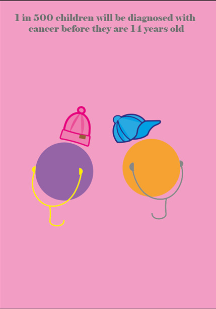
I got the fact from the Kidscan website to ensure that it was genuine.
0 notes
Text
Week 5
Today we had a full day of brainstorming ideas for our motion piece that is a requirement of this brief. Me, Matt and Glenn all agreed that we wanted to keep the motion piece simple so that it was understandable for children and adults as one of our aims is to create something for this brief which is relevant to and captivating to both demographics.
One of our ideas was that we could design some sort of interactive board that would have an animation of our logo, where the point of it is to not let the circle connect, as this would signify an end to recovery or a journey. The idea was that the public could donate to stop the circle making a full circle and connecting back up, and when they donate cancer cells would attack the circle when they donate and eat it away so that it doesn’t connect. We were inspired to make this design when we saw the Melanoma Institute campaign where the cancer cell got bigger and smaller the more that the public donated, which we thought was a good way of interacting with the public and getting them involved.
We wanted to incorporate this idea into our motion piece but we thought coming up with some sort of story line for our motion piece would be good as it may be more relevant and connecting for children. We thought that using cartoon-like characters would make it seem less emotive and negative and more like it is telling a child's story. If it was a motion piece using real life people it may be triggering for some people and harder for the younger audiences to understand, but this is the demographic that we want to entice in so we wanted to try out using cartoon characters like they would normally watch on the TV.
We looked at a motion piece called ‘Nuggets’ which is meant to raise awareness of drug use. In this piece it shows a cartoon animal called ‘Kiwi’ who eats a golden nugget (meant to symbolise the drug) and likes how it makes him/her feel, at first this nugget makes Kiwi feel amazing which makes Kiwi want to eat more. After a while of constantly and consistently eating the nuggets, it starts to show Kiwi getting more and more miserable and how the ‘nuggets’ are ruining his/her life. They show this through the colourways, music and how they have made Kiwi look.
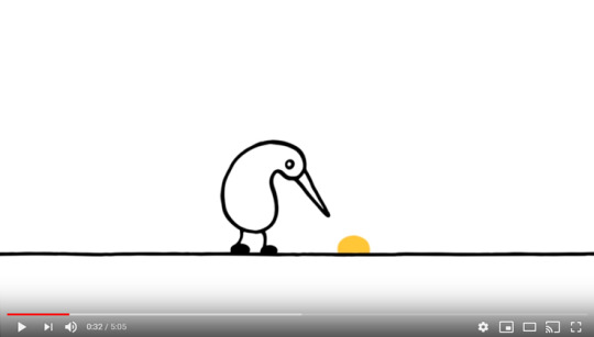
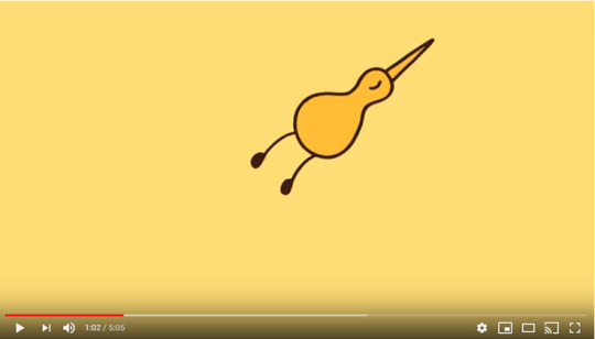
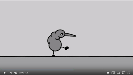
https://www.youtube.com/watch?v=HUngLgGRJpo&fbclid=IwAR19XrXyB3WyVVKhNS9XX0LS_lJpYXx5gX1-JjPxGRRig42kCBDFizcw3zI
We liked this motion piece as we thought it easily and simply emphasised how drugs and a drug addiction can slowly ruin your life.
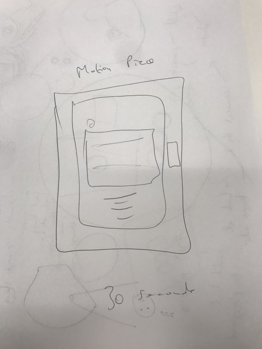
We came up with the idea of starting off our motion piece with an alone children (resembled as a small black dot), then an alone adult (bigger dot), then both of them come together, confused as to how they can help eachother, the doctor then comes in and they both change colours in order to signify hope and the ‘light at the end of the tunnel’, the next motion will be the child playing in a park to show how the child can still be ‘normal’ and doesn’t have to limit themsleves just because they have cancer, it then turns into an animation of the logo where it could do the donation method that was suggested before.
1. The child with cancer, feeling alone, like they have no one there for them that they can talk to/can relate to them.
2. Adult (guardian/family members) feeling alone as well due to not knowing how to help the child. The adult in these situations can also suffer from mental issues as they may find it hard to come to terms with something so heartbreaking and life changing happening to someone they love.
3. The child and the adult come together but they still don’t know how they can help each other and feel as if there is no hope, they feel scared.
4. they meet the doctor and they start to feel more optimistic that they know that something could be done to help them, and the doctor reassures them. They change to colour here to symbolise a positive experience.
5. The child playing in the playground.
6. The logo.
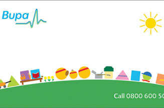
The characters are meant to be simplistic, like the characters out of the Bupa TV adverts where they aren’t intricate in detail but it is still recognisable of what they are and are meant to imitate.
We thought that our motion piece could be shown in a variety of places. Showing it at bus stops would be effective as younger children like teenagers may be around this area if they can’t drive yet, if they are waiting and bored then it may be something that catches their attention. We also thought about it showing before/during YouTube videos as it is extremely common for children and teenagers to watch videos on YouTube these days. We also thought about it being showed somewhere in shopping centres, perhaps on a screen, as this is somewhere all ages will go.
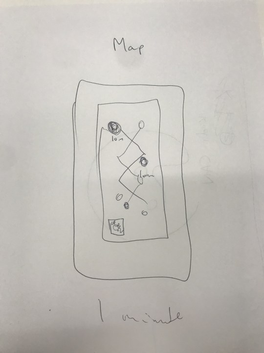
We also thought that after the motion aspect is shown, it could pop up with a map that the public would have to follow (not knowing where it will lead to), either taking a picture of it to follow along or it could use something like airdrop to send it to peoples phones, this would then lead them to the playground where adults could take their children to play. It helps link all the aspects together and advertise the playground to the public that may have otherwise not known about it and never come across it.
We thought that the characters in the motion piece could also be used in the posters. Each poster could represent the three people that are usually effected most; child, adult, doctor. We were thinking about having a simple yet effective poster where there is a picture of the ‘character’ in the middle, perhaps introduced with a name to make it more personal, and a little fact at the bottom and a hashtag to spread the world and to try to get it more recognised and to raise awareness of children cancer, as people may see the hashtag and try to find out more.
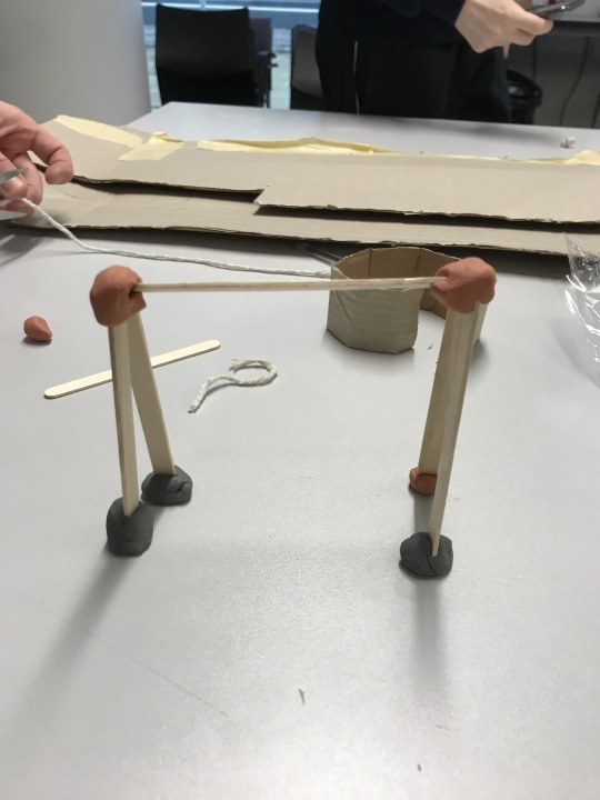
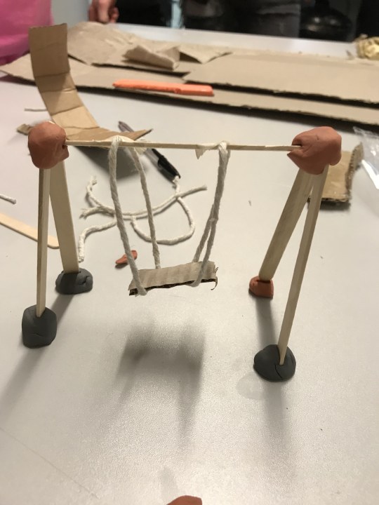
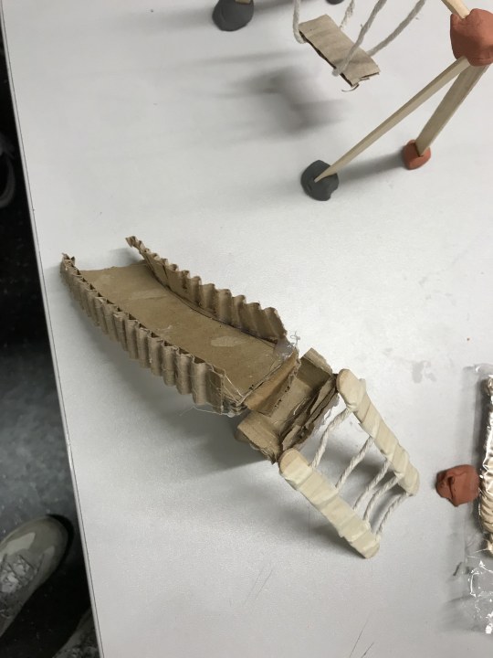
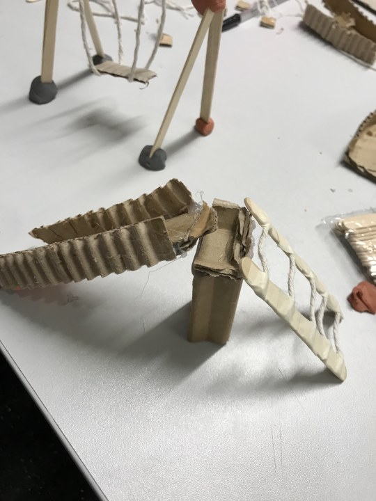
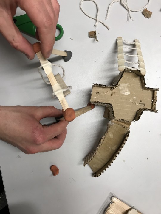
Later in the day we went into the MakerSpace to start to bring our ideas to live. We started to prototype what our playground would look like, making some of the apparatus into 3D models, with a variety of materials.
0 notes
Text
Week 4
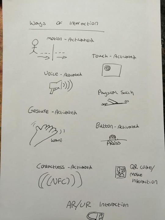
Today we started to develop ideas for what we could do for the Kidscan brief. Initially we all looked at what sort of things we had presented in our pitches the other week, including using the idea of snapchat filters that could promote whatever event or interactive piece we create.
We looked at different ways of interaction so that we had a plan on what things we were most interested in using in our designs.
We started to focus on the idea of creating a play area for kids, this would just be a regular play area in the eyes of children, but there will be spots in the play area where adults can donate to Kidscan and interactive designs that could inform the public on what Kidscan does, facts about cancer and other information about the charity and the kids suffering from cancer. We want to include the adults as well as the children in the play area.
We also thought that some of the things in the park could relate to cancer, for instance, there could be a climbing frame that resembles cells, or a cancer cell. This would just be so that its more obvious that the play area is designed primarily to make people more aware of cancer and who it can effect. The idea of the play area is good because most kids won’t be able to walk past a play area and not go on it, therefore it should engage a lot of people. We were also thinking about having benches in the play area that could be interactive in some way for the adults, as they would probably be sat waiting for the child whilst they play, meaning they would have time to quickly donate or find out some more information about Kidscan. This could be something like an interactive screen, or we were also playing with the idea of screens that were fitted in the middle of picnic benches so that it was right in front of them when they were sat down.
By having a play area, the adults will be watching their kids which may make them feel more open to donating to Kidscan as they can literally see there children playing and having fun, whereas children with cancer may not be able to enjoy there young childhood to this extent anymore, emphasing the impact that cancer can have on a child's life.
Whilst brainstorming our ideas, we toyed with the idea of whether or not we should have a gate as the entrance, so to get in you would have to give some sort of donation. We thought that this would be an effective way of ensuring that people who go to the play area will definitely donate in some way. But, by making people pay to get into the park, it may make the donation seem like a hassle and like they have no choice but we want the public to feel rewarded for donating and that it is there choice.
If we decide to have a donating system where there is a screen that interacts with the user, we want want to tell or show them where there money is going to and how it will help Kidscan so that the public don’t feel as if they don’t know what they are donating towards. Perhaps there could be a companion app where the public can see whats happening with there money, or they could sign up to a newsletter type of platform where they can get emails about whats happening.
We also want to rebrand Kidscan, like the logo and colourways, as we think the branding at the moment is a little childish and doesn’t portray the right message for the brand, especially as its difficult to even know what the name actually is.
Matty came up with a new logo design for the charity. The idea of this design is meant to resemble a parent and child, its supposed to show the support system that children have even when they have a life changing illness like cancer, Its not a full circle so that it emphasises that the journey will end, even if it feels like it won’t be over at the moment.

We will want to experiment with colour eventually but for know we wanted it to be tested in black and white to ensure that we liked what we had come up with.
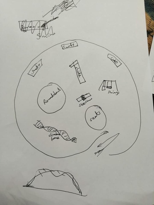
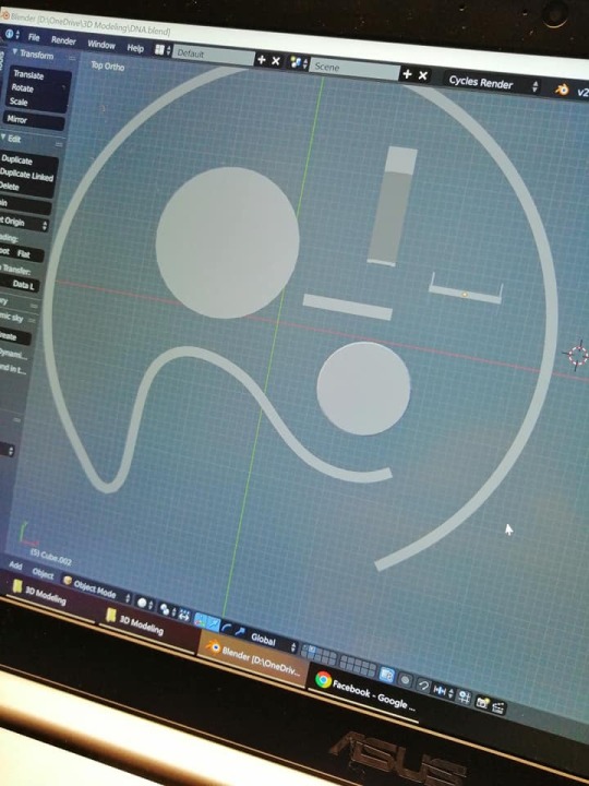
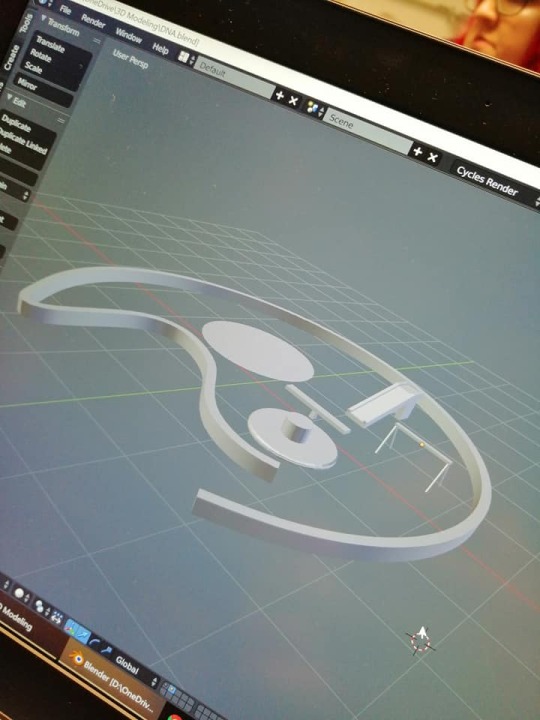
We thought that we could incorporate the logo into the play area to create continuity. One idea was that the outside of the play area could be in the shape of the outside of the logo, then the two faces of the parent and child could be something like a picnic bench and a roundabout to play on, and then there would obviously be other things in the play area, but from a birds eye view, you would be able to see the outline of the logo.
Glenn started to prototype how this would look.
At the end of the lesson we came up with a plan on who would do what job so that we could keep ourselves organised and get everything we wanted to do done in time. As a group, we will create a style sheet, a motion piece and a 3D prototype. Glenn is going to work individually on a donation system, Matty is going to work on an app/UI journey, and I will work on the print aspect of the brief, most likely to be posters promoting the play area.
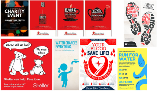
In regards to the design of the posters that I need to create, I started to make a mood board of other charity posters to see what things I liked and disliked and to get ideas for what I think would work well for our design. I noticed that a lot of the posters used a red colourway, this may be used to evoke emotion as the colour red is associated with strength, power and determination, as charities are usually dealing with sensitive topics, they will want to connote positive messages that stress the recovery and journey of their charities. Red is also an eye catching colour that will make the public want to read it and entice them into the poster if they see it in public, rather than if they were to use black or white.
Most of the posters that I looked at used iconography that was innovative to their charity. This creates a recognisable icon for there charity that they can use throughout their campaigns to make themselves symbolic.
0 notes
Text
Week 3
Today we presented our pitches that would ultimately decide what group we were put into for this brief. The idea of the pitches was to see what skills each person had and what things they could develop and work on, this is in order to widen the skills of everyone by putting people together that can learn from each other.
The first part of my presentation was the brief and what the brief was asking for. In this part I also included research into the charity ‘Kidscan’ to give myself a better understanding of the charity itself to help me in the long run and give me a better idea of what exactly the charity is about and what message it whats to relay the audiences.
In the next section of the presentation, I researched into existing charities campaigns. I researched into this so that I could see what techniques other charities, that may have more success or a bigger name than Kidscan, are doing to get their name and brand out there to audiences to get people to donate and create an awareness of them.
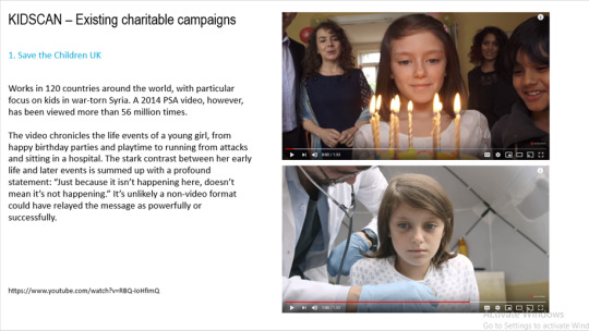
Save the children was an important charity to look at in comparison to Kidscan as its a very well known charity by a lot of people. However, Save the Children do use a lot of emotive videos in order to attract an audience, almost making audiences feel bad or guilty and making them feel like they have to donate, rather than doing it out of there own will. I don’t think that this is a very good approach when you’re trying to get people to donate to charity as I feel like donating your own money to help others should be something that you should do and feel good about yourself afterwards rather than feeling as if you were pressured into it. Therefore, I wouldn’t want to use a motion piece like this for Kidscan, although the video is effective at raising awareness of the charity and probably does get people to donate.
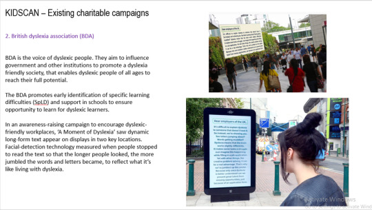
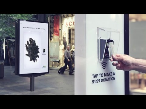
I really like this campaign done by British dyslexia association where screens were located in various places with long form text on. Using facial detection technology, the screens measured when someone stopped to read text so that the longer people looked, the more jumbled the words and letters became in order to show the public what it is like for people living with dyslexia. I think this interactive design that shows people what its like from a dyslexics world is very effective and is more likely to get people involved with the charity as they’ve had an actual experience with it that may make them feel more willing to donate rather than if they had just read the information from a poster or on a website.
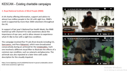
I also think that this motion piece for the RNIB is effective as its also showing the audience what its like to experience it from another persons point of view that is dealing with the illness.
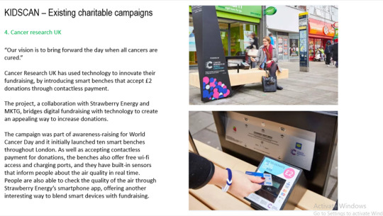
This is also an effective method as its a quick easy contactless payment that the public can use in seconds. Also, seen as the public can use WiFi and charge their phones from the bench, they would probably feel bad not to give something back. I think the idea of the bench telling people what the air quality is like in the area is also useful and effective as its raising awareness to the public which they may have not known before.
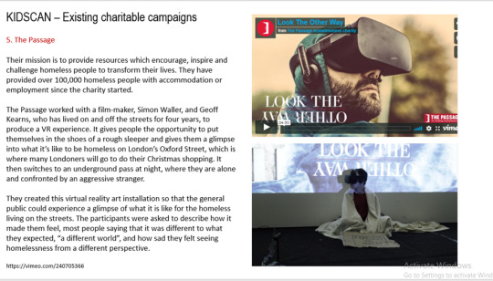
The final charity that I looked into was ‘The Passage’ which is a newer charity for homeless people. They showed the public a virtual reality experience of what its like being homeless and the things that they experience on a daily basis, this is an extremely effective method at raising awareness of homelessness as people probably wouldn’t have any clue on what it was like unless they had experienced it themselves, coming to the realisation of what its like for homeless people would probably open the public's eyes and make them more inclined to help out the homeless and probably donate to the charity.
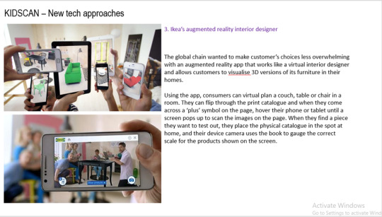
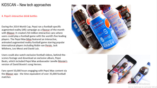
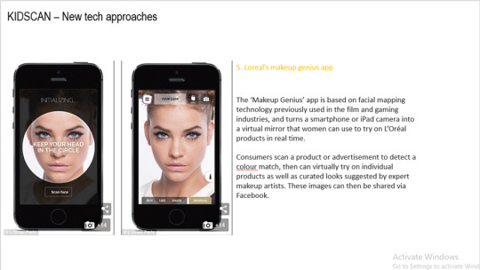
Next, I looked at new technology approaches that had been used in campaigns or by brands outside of charities. I did this so I could see what ways brands were promoting their own brand in new innovative ways.
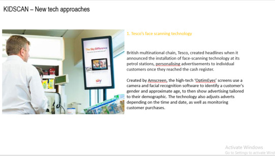
Even though some of these promotional campaigns were by big brands, I still think some of them are ineffective and don’t work. After presenting this to my class, we agreed that campaigns like the Tesco face scanning are not a successful way at promoting the brand, we felt like it was invading the public's privacy and they may not consent.
Then I started to come up with some of my own ideas of approaches that we could take in creating an interactive solution for Kidscan that would encourage the public to donate.
Idea 1: Charity app
An app that encourages users to raise money for charity everyday by walking, running, cycling as part of their usual exercise routine. The app can track the distance that the user has done and then donates a certain amount of money according to this. The app is easy to use and processes the payment automatically as long as you are tracking your exercise.
The app also benefits consumers by motivating users to exercise more. By using the app to encourage users to exercise more, the app is also helping to try and prevent these users being at risk of cancer as exercise has been linked to lowering the risk of various types of cancer.
Idea 2: Snapchat filters
A Snapchat filter perhaps used on world cancer day, where people can use the filter and once its posted or sent to someone else, a link can come up with the Snapchat that uses the filter, it can transfer the person receiving it to a page to donate to Kidscan.
The filter could include a different fact or piece of information about childhood cancer for each user. Therefore, if people are posting with the filter, people are finding out more information from each Snapchat, raising awareness of childhood cancer.
Idea 3: Interactive touch screens
A touchscreen display in public where people can interact with the board to find out information about cancer like treatments/cures, side effects, symptoms so that people can have more of an insight into childhood cancer.
The screens could be placed in places that parents or families may go so that it reaches out to that specific demographic (supermarkets, shopping centres etc).
Idea 4: A virtual reality experience
A lot of charities and campaigns seem to use the idea of giving people a virtual experience of what its like to deal with things that can effect certain people.
Perhaps Kidscan could use a VR experience to show what having cancer as a child is like, it could show how their life has changed from before they knew they had cancer to what their life is like now.
Kidscan also helps with children living in poverty so the virtual reality experience could show what it is like for these children, as it would show people how their life is so different to these children's life and how lucky they are, this may make them want to donate to the charity so they can help in some sort of way as it may be quite emotive for some audiences, especially parents.
After everyone had presented their pitches, each person in the class was put into the category that they had the most strength and skills in. These categories were ‘UX and UI graphical development’, ‘Motion’ and ‘Strategy’, I was placed in having the most skills in strategy, meaning I can come up with the ideas behind the project. From this I was put into a group with Matty and Glenn, I think we will work well as a team as we are all well organised and keen to get the job done, plus we all have different skills that we can bring to the project and teach eachother whilst doing this.
0 notes
Text
Week 2
Today we were given the task of making a pitch for the kidscan brief. This presentation needs to be 20 pages long, with four different sections. This includes;
1. Understanding of the brief and what it is asking (5 slides)
2. Research into present/historic campaigns in relation to not for profit (charitable organisations). (5 slides)
3. Research into 'new tech approaches of engagement' (5 slides)
4. Five 'possible' approaches and themes... 1 page for each.
Once we have presented these pitches, teams for this brief will be put together based on each individuals skill set.
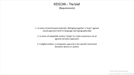
Once our teams are picked, we are expected to design an interactive solution that encourages the public to donate there and then using contactless technology. This solution also needs to help raise awareness of childhood cancer.
Interactive ads are a great way for marketers to really engage with consumers directly. Interactive marketing as a whole and interactive ads are a great way for brands to tell stories, enhance word of mouth, and get personal in ways that they just haven’t been able to do before.
Whilst researching the uses and benefits of interactive advertisement, i came across various interactive marketing strategies.
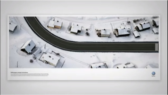
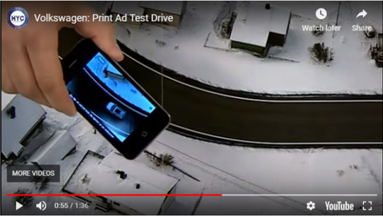
1. Volkswagon - the German car company embraced the interactive marketing technique recently when they released a magazine that had a fold out road on it, with this magazine users were asked to download an app which would allow them to test drive the car. The phone would vibrate when the car got too close to the sides of the road, and had lights that would follow the curve of the road.
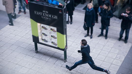
2. ReeBok - ReeBok created an interactive campaign that allows anyone to get invloved with. They installed a combination speed cam and a shoe display in the center of town. Then they told people that whoever ran past the display the fastest would get a free pair of shoes.
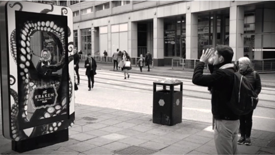
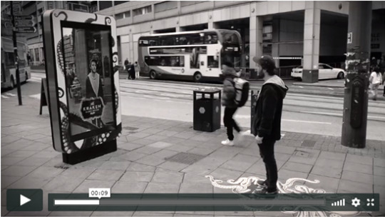
3. The Kraken - launching an interactive out-of-home campaign using augmented reality (AR) to invite people to star in their very own advertisement with the mythical sea beast. All six screen units are wrapped with the brand’s distinctive creative, with associated floor vinyls inviting the public to release the Kraken. When people stand on the vinyl, the screen becomes a mirror stream.Utilising augmented reality, the Kraken’s tentacles appear from all sides of the screen, dancing and then engulfing the participant as they disappear in a cloud of ink, the moment swelled by the sound of the beast’s victim being pulled into the murky depths.The idea is that participants will share their dramatic on-screen moment on their chosen social channels, stimulating brand awareness and intrigue for the League of Darkness, a secret order where special offers, gifts and discounts for the black spiced rum can be redeemed.
0 notes
Text
Week 1
This week was an intoduction to the brief. The fianl components needed for this brief includ;
1. a series of print based materials. (Bringing together a ‘team’ agreed visual approach both in language and typographically)
2. A series of adaptable motion ‘stings’ to create awraeness via an agreed narrative approach.
3. A digital aretefact, a companion app and a site specific interactive donation device or system.
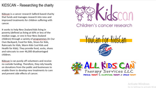
Kidscan
Kidscan Children’s Cancer Research is a Salford-based charity that funds and manages research into new and improved treatments for children with cancer. Cancer is the leading cause of death in children in the UK. 25% of children diagnosed won’t make it to their 30th birthday. Many of the children who do survive, suffer life-long, life-limiting side effects caused by the treatments used to cure them.
Kidscan receive no statutory funding, but with the contributions from the public, volunteers and businesses funds research to develop new treatments that not only cure children with cancer, but also prevent the side effects of current treatments such learning difficulties, mobility issues and infertility.
Goals and objectives;
• Curing all children diagnosed with cancer
• Improving the current treatments for children with cancer
• Developing new, targeted treatments to treat specific cancers in children
• Using research to influence policy to overcome the obstacles to the introduction of new and existing drugs to clinicians
Acheivements;
Since 2002 we’ve funded over 35 research projects. Our development of a treatment obtained from complex sugars derived from Irish Sea shellfish is currently undergoing preclinical evaluation. We have also proven how manipulation of amino acid Methionine can affect the proliferation of cancer cells, as well as helping to discover a way of allowing healthy cells to take charge of cancerous cells.
0 notes