king-wyrmwood-art
Wyrm
artist, writer, and Minecraft fan
tag: #wyrmwoodart
Support me on Ko-fi: https://ko-fi.com/kingwyrmwood
24 posts
Don't wanna be here? Send us removal request.
Last Seen Blogs


voncon
Little Cosplay and Otome Things
jyrg0n
me and my dumbassery against the world
murdockparker
multi-fandom trash

atrewida
Bad bitch
Text
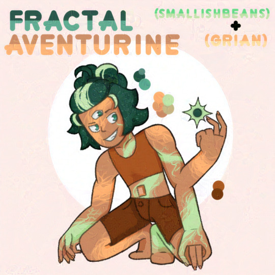
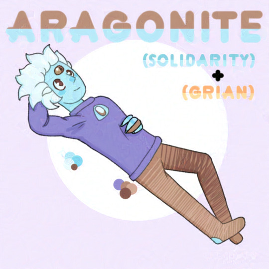
Bad boy fusions! I haven't finished the Greater Bad Boy™️ yet but here's their fusions with each other
(Once again, credit to @chrisrin for creating the gemcyt AU!)
73 notes
·
View notes
Text
I don't think people realize that critiquing the media you enjoy is fun too.
21K notes
·
View notes
Text

that’s my not streamer
8K notes
·
View notes
Text
inspired by boop day, reblog this post if its ok for people to send you random asks and interact on your posts with no judgement. i want to talk to people.
57K notes
·
View notes
Text

Real life doodles from memory


1K notes
·
View notes
Text
Braiding Besties!
Pjs shapes inspired by real sets!
3K notes
·
View notes
Text
Big B for the soul :)
(Close ups under the cut)
I have no idea how to draw backgrounds •-•
122 notes
·
View notes
Text
hey so i might be doing a little something ^-^
2K notes
·
View notes
Text

a wonderful collaboration illustration i got to with @boxbug for @bdubszine !! i sketched and inked, he coloured! it came together so well, and so did the whole zine!! :D
454 notes
·
View notes

Text
Is a sneak peek to my next post boop-able?
14 notes
·
View notes
Text
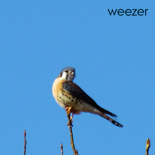
I'm both sorry and not
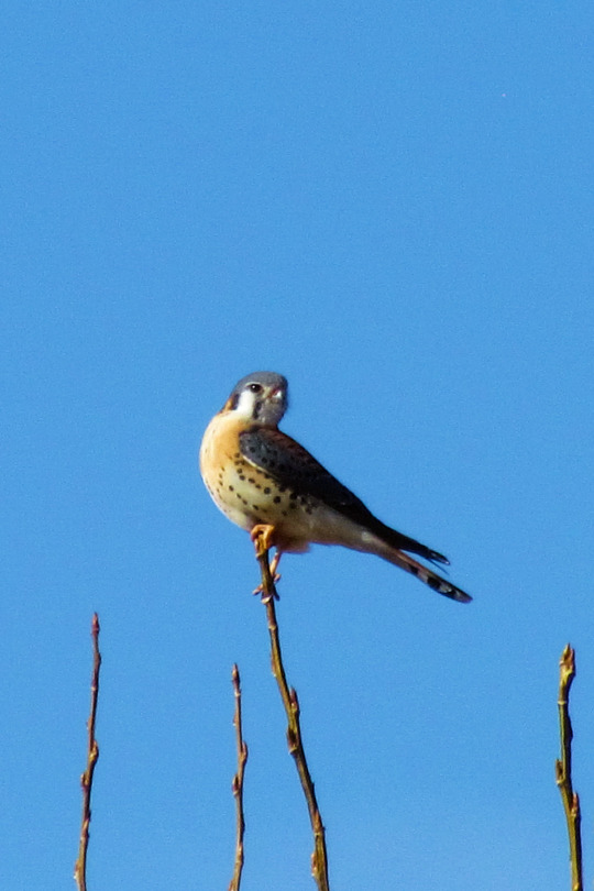
American kestrel. Arapahoe County, Colorado. Photo by Amber Maitrejean
126 notes
·
View notes
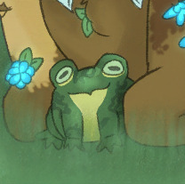
Text
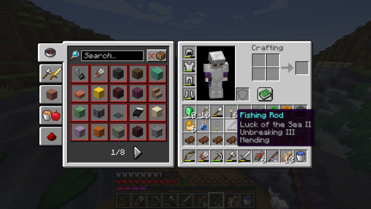
Huh
Of course my first fished treasure is this glorious fishing rod to feed my newfound fishing problem. This fishin' business is easy, dunno what Grian was stressing about.
22 notes
·
View notes
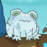
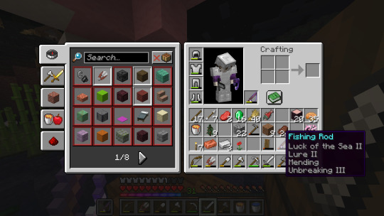
Text
Of course my first fished treasure is this glorious fishing rod to feed my newfound fishing problem. This fishin' business is easy, dunno what Grian was stressing about.
22 notes
·
View notes
Note
Just wondering, Do you have a particular way of going about an art study of someone's style?
I usually try to look at the shapes that make up their style first; much like developing your own style, it starts with the basics.
For my study on @/kitsuneisi, they have sketches posted online, so it was much easier to find a good reference, but if you're studying a finished piece, splicing the art into pieces can help you focus on one thing at a time.
Usually I end up studying everything (art is interesting lol), but if there's one specific thing you're interested in, you can separate it from the rest of the drawing (ie. While studying the sketches/lines make it monochrome or colour picking to a blank canvas to study colour).
Picking many different references can help as well, but it's best to start with just one to not get overwhelmed.
Hope this helps :)
2 notes
·
View notes
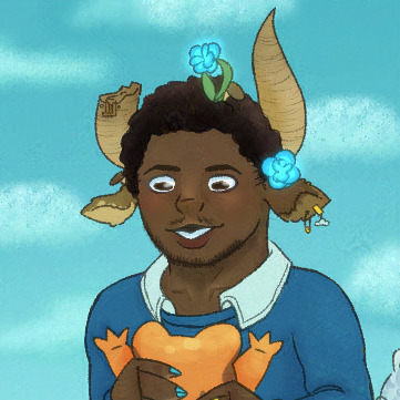
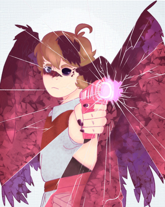
Text
Kitsuneisi Art Study!
This is an art study of @kitsuneisi, using mostly references from their tumblr. I wanted to do an art study and was super excited for the new DDVAU update so woo!
I've written some notes in the margins of each drawing and would love to go more in-depth about both our styles and the general process, but this post would be so incredibly long so I'll refrain for now. (I might break it up into separate parts and turn this into a master list one day).
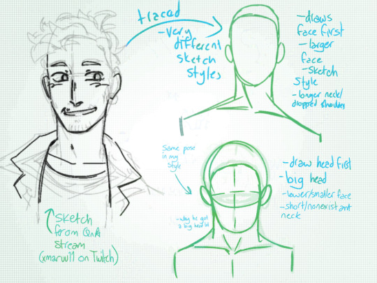

This first three are the base of any art study: leaning the proportions and sketching style of the artist! The first image is from @xmaruu11's first Twitch stream, which I discovered a few days in my study and watched to get a sense of Kitsuneisi's sketching style.
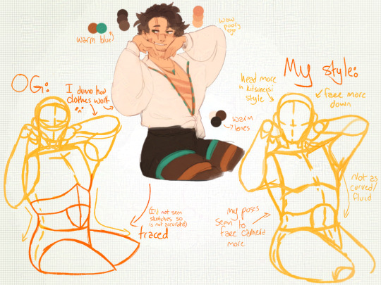
The main difference between our styles is that Kitsuneisi's poses are more fluid and they draw the face first, whereas my poses are stiffer and I drawn the head first.
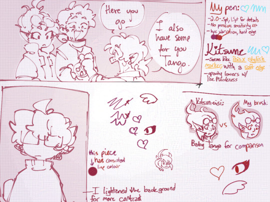
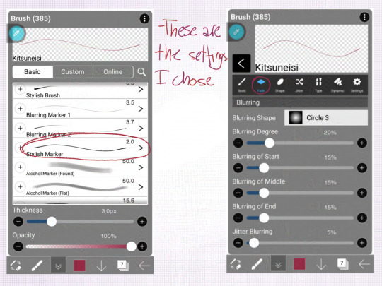
Kitsuneisi and I use different drawing programs, so I couldn't quite make a brush that matched theirs; from looking at their Valentine's comic (which I chose so that colours wouldn't distract me), I noticed the line variation lent a lot to the fluidity.
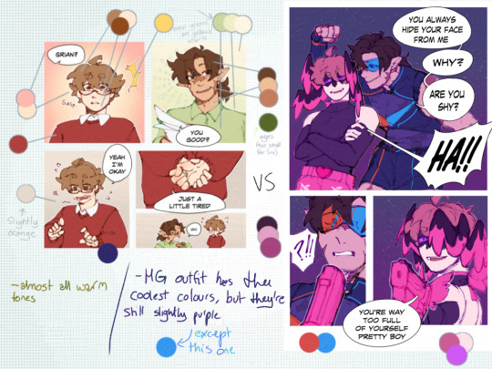
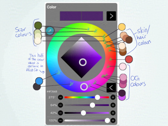

Colour theory my beloathed! While I was laying out the colours for the Scar drawing, I noticed that the blue Kitsuneisi used was very warm-toned. In almost all of the light-hearted scenes, they use warm colours or warm-tinted colours, while the more serious scenes use darker or cooler tones.
The lighter, warmer backgrounds in the office scenes/G being a simp give a more wholesome feel, while the darker backgrounds in serious moments give a more intense atmosphere.
Now, all that's great, but it's time to put it into practice!
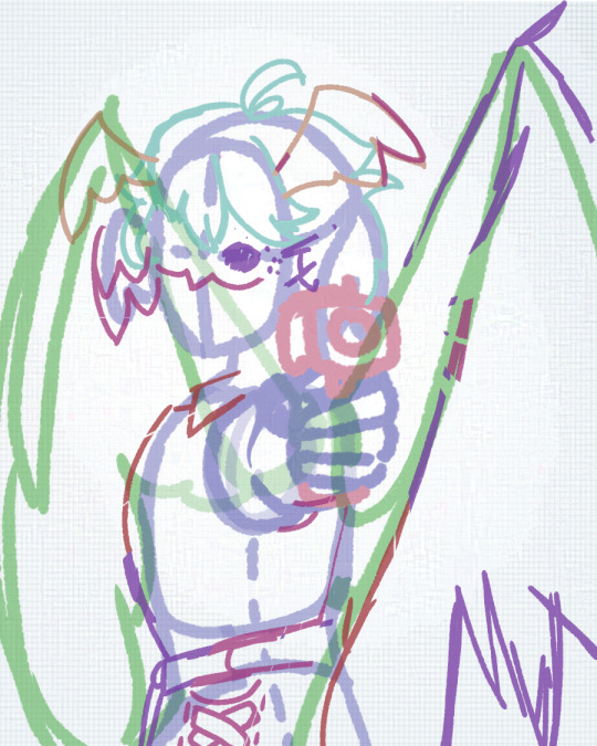
For my sketch, I tried to use a more dynamic pose and focus on making the face a focal point.
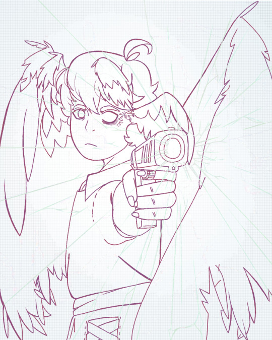
In my lineart, I tried to vary my line thickness.
For the flat colours, I used mostly warm tones and tried to match the colours used in the comics, but my love of cool tones took over the Mother Spore wings. I think it makes a nice contrast, at least.

And the final image! (I'll be posting it separately). The background adds a better contrast and helps Grian stand out despite how dark some of the colours are. I'm honestly very proud of this piece and hope both Kitsuneisi and Maru like it too. :)
955 notes
·
View notes