
Don't wanna be here? Send us removal request.
Statistics
We looked inside some of the posts by kjadeart and here's what we found interesting.
Average Info
Notes Per Post
24
Likes Per Post
17
Reblog Per Post
7
Reply Per Post
0
Time Between Posts
9 days
Number of Posts By Type
Text
13
Last Seen Tumblr Blogs


Fun Fact
Tumblr was named as a finalist in Lead411’s New York City Hot 125 in Aug 2010.
Text
I really enjoyed the scumbling technique we learned in class for this painting- It really helped me look at light and shadow in a different perspective. I’m not used to painting using only white to create highlights in the piece. It took me some time to get used to working color into the piece by layer - I’m so used to mixing the color and then applying it straight from mixing. Towards the last few layers of the painting, I applied paint mostly opaquely. Much less medium was needed.
2 notes
·
View notes
Text


For my warm/cool painting study, I wanted to create a feeling of joy and fun. To do this, I included items and characters from my childhood. I was very lost on what colors to use to convey this mood, but I was taught about Hilma af Klint’s piece titled “No. 7, Adulthood”. This painting conveys a very fun and playful mood, which is what I was going for with my own painting. I decided to take inspiration from her use of pastel warm and cool colors. In my own piece, I notice that the warm colors helped pull the focal point of the painting forward and draws the eye’s attention to it. I used a pastel blue against the purple for the fairy to have her kind of blend in, but be able to be noticed when it’s really looked at. I found making the initial collage somewhat challenging because it’s not something that I do often. I also found choosing what colors to use in this piece challenging at first.
2 notes
·
View notes
Text


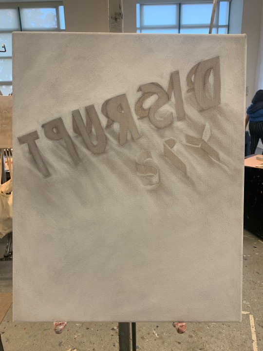
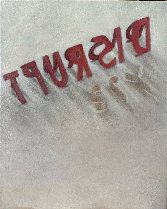
For my maquette, I decided to use the words “Disrupt” and “Spy”. The two words are somewhat random, but I wanted two words that contrasted each other. I decided to reflect the two different moods of the words with color and how they were set up. I wanted to create a bold and confident feel for the word disrupt. I had the word standing up, creating a very bold and dramatic look. The use of red helps draw the eye’s attention to that part of the painting. For the word spy, I wanted to create a sense of blending in and a feeling of secretiveness. I used the same color as the base of this piece to create the word. This creates an effect where it can only be seen from its shadows and highlights, resulting in it kind of blending into the piece.
1 note
·
View note
Text


I found the cellophane activity really fun and somewhat challenging. I had to figure out how to layer stronger and softer colors to achieve a certain shade of a color. The blues and reds were very strong. To make an orange color, I had to layer lots of yellow layers over one red layer. I really like how you can see how the grayscale layers underneath the color layers impact the value of color.
1 note
·
View note
Text
Low contrast / High contrast

"Vetheuil in the Fog" - Claude Monet
Claude Monet used low contrast in his painting titled "Vetheuil in the Fog" to create an eerie yet peaceful feel to a landscape. He was able to accurately depict what a foggy landscape looks like because fog creates a blur and a softness to whatever it covers. The use of pastel colors creates this effect.

"David with the Head of Goliath" - Caravaggio
Caravaggio used high contrast within this piece to create a sense of drama and sadness. The figure and head in this piece are painted with a dark background surrounding them. This allows the focal point of the piece to stand out against the darkness. The harsh shadowing is responsible for creating the dramatic feel.
1 note
·
View note
Text
"What do you notice about opaque application that is different from transparent?"
I noticed that opaque application is much more smoother than transparent application. The oil paint blends and adheres to the canvas much smoother than transparent painting. With transparent painting, you are constantly using your rag and paint thinner to create highlights by scrubbing the canvas. It was much harder to control the highlights of the painting with paint thinner, meanwhile with opaque painting all you had to do was apply white paint to create highlights. It blended seamlessly and didn't require as much effort.
1 note
·
View note
Text
Creating black
- To create black with just primary colors we had to mix cool tones and warm tones to make a mid-tone of the colors. For example, light and dark yellow to make a mid tone yellow. Then did the same with the blues and reds. Then @kjadeart and I started to add all of the colors little by little to form black we then figured out we needed more blue and red to darken it. Since when adding some white to part of our mixture, the black was more of a cool tone and light. Then once achieving our final color we then added our black onto the canvas with the rest of the other groups’ blacks. Once dried, there is more of a yellowish tone to the black that we created.


2 notes
·
View notes
Text

The tonal value of the swatches

Temperature swatches

Boundaries line, our group chose hard boundaries lines. It was difficult to as we had a lot lighter tonal swatches compared to the darker ones. Playing around with it we were able to get some harsher lines.
4 notes
·
View notes
Text

This was not my first time using oil paint, however I’ve never painted using only one color with solvent/medium. I really liked the glowing effect it resulted in! I found it a bit difficult to continue to work on the piece after it dried for a bit because the paint would start to rub off too much. I was able to kind of combat this with adding more paint on top.

I found working opaquely with oil paint was much easier than the transparent oil painting. You had more control over the lighter areas because you were able to add white, while for the transparent oil painting you had to add more solvent. The solvent would sometimes end up taking the paint off too much. Also I noticed that this painting is much more smoother looking. I definitely prefer opaque painting!
1 note
·
View note
Text
What is the difference between acrylic and oil paint?
Acrylic paint can be mixed with water, while oil paint cannot. Also, the drying times of the two types of paint are drastically different. Oil paints dry much slower than acrylic paint.
How to stretch a canvas:

Put your stretcher bars together. Make sure the angles are exactly 90 degrees, and then staple the covers to secure it.
Lay out your canvas material and place the frame on it.
Leave three fingers of canvas space on each of sides of the frame, and start and fold the canvas material onto one side of the frame. Staple the material down a few times, leaving three fingers of space between each staple.
Stretch the canvas material over the opposite side of the frame using the canvas stretching tool, and staple.
Stretch the canvas on one side of the frame that isn't stapled yet, and proceed to staple the same way.
Use the canvas stretching tool to stretch the opposite side and staple.
Create bunny ears with the excess canvas in the corners and fold it over. After it's flat behind the canvas, staple the fold down.
Do the same for all four sides.
1 note
·
View note
Text
Unconventional Art
Meret Oppenheim Object Paris,

"Object" at the MoMA is a teacup, saucer, and a spoon covered in gazelle fur. The material of the objects and the fur are resistant- I think this piece will last a long time. Fur has been used by humans for centuries for warmth, shelter, and clothing. It's durable and useful. I've seen this piece in person before, and the thought of drinking out of it freaks me out.
1 note
·
View note
Text
Intro
Hi! My name is Kira, I'm majoring in Studio Art. I love creating art, sewing, and crocheting in my free time. Im interested in exploring new painting techniques and finding ways to be a better artist. Im really looking forward to this class!
2 notes
·
View notes
Text


In our group we choose monochrome and decided to use a nice bold color for the painting, getting random things in our bag we set it down to do a still life painting
to our amazement this red really is diverse because some shades look even purple
5 notes
·
View notes