
Don't wanna be here? Send us removal request.
Statistics
We looked inside some of the posts by knightdesignspecialism and here's what we found interesting.
Average Info
Notes Per Post
0
Likes Per Post
0
Reblog Per Post
0
Reply Per Post
0
Time Between Posts
1 day
Number of Posts By Type
Text
16
Video
1
Last Seen Tumblr Blogs


Fun Fact
Tumblr has been providing a Korean-language service since 2013.
Text
Final Report
Overall, I believe that this brief went was as it gave me an insight into three different digital media specialisms, with social media marketing and animation being the two that I wouldn’t of looked into without them being a chosen specialism. The social media marketing specialism was a highlight even though I didn’t choose it as my final specialism as it gave me an in-depth insight into the what the process are in creating a successful social media campaign.
On the other hand, the animation specialism was a part of this that I didn’t enjoy doing as the techniques that were taught were extremely simple and ones that I already know how to do based on my work that I produced in the previous year. Furthermore, what I produced for the brief section of this was pretty poor as it didn’t contain any of the advanced techniques an animation should have for it to look good. An improvement that I would have made for this would be adding more micro animations to the scene such as the moving of the wheel with the movement of the car and smoke coming out of the exhaust of the car, the latter improvement would have been using a more advanced technique than I included in my animation.
The biggest positive to this brief was undoubtedly the website development specialism as this is a sector of digital media that I am thinking of going into as I enjoy designing and coding websites, also based on my current skills it is the specialism out of three options that suits me more. Even though what I learned in the 2 week briefs was relatively simple it helped to concrete the knowledge that I have so I need less help to create basic parts of a website. The setting up of the files is something that I learned that I have already used in my enhanced digital innovation and technologies as this has helped me quickly access my design documents and find the location of the coding files I need to edit.
Finally, the 6 week brief went very well as I found this to be most beneficial part of the project as it allowed me to use my current knowledge and search for new parts such as making a website responsive to create a website based on a design which is similar to a real scenario. Furthermore, I am happy with the outcome of this as the final look of the website looks similar to the design with only a few minor differences in the look, these minor errors could have been fixed by editing the images to fit the needs of the design. For example, I could have edited the leaf file so it is by default rotated to the angle it was but I didn’t go that as I didn’t see this as a major problem.
In conclusion I have found this 12 week brief to be beneficial in showing me the different types of digital media specialisms and has helped me identify a specialism that I would like the look into more over my time off university and improve my skills even more. Also, it has helped me identify that animation is not for me and I won’t be looking into this anymore.
0 notes
Text
Thoughts on 6-week Brief
Overall I thought that this 6 week brief went very well as the final website looked like it should according to the design that was provided, except for some small parts such as the positioning of the icon. The leaf icon should have been rotated but I didn’t rotate this as it didn’t look right and messed with the layout of the table that contained the images. Also, I believe that the experiment of using tables throughout my code was a pretty good as this new code that I learned and implemented into my good helped with the design on several occasions. However, the first table I created with the two side by side images could have been more efficient as I had an invisible box to act as a separator when instead I could have added padding to both of the images to give the same effect. This is something I will improve upon if I encounter the same problem in my future projects.
Furthermore, this 6 week brief has helped me further develop the basic coding skills as I can now create a basic websites with little aid from the internet. This will undoubtedly aid me in my other brief this year and in my final year of university as for my dissertation I am creating a website and I will be using some of the code that I have used for this brief.
0 notes
Text
Thoughts on 2-week briefs
Social Media
This design specialism was good as it gave me an insight to the process of creating a successful social media campaign as well as the goals that a campaign must have in order to become successful in the first place. I thought my project went okay as I thought it was a good idea to warp the reality of a child imagination and the real life scenario, but I thought there was more I could have developed given that this was more than a 2 week brief such as further developing the mock-ups into versions that could be used on a campaign. Furthermore, I think the illustrations bottlenecked me as it is not one of my strengths and with better illustration skills I could have created a more convincing quick mock-ups. This is something that I may consider doing for final 6 week brief depending on what the choices for the brief are as this is an area I can see a benefit in looking into more and are skills that are transferable to many different areas of digital media.
Animation
I don’t think this 2 week brief was extremely beneficial to me as the social media one was as I don’t see myself doing anything animation related in my studies in my final year of university and in my future career. The animation that I created was extremely simple to do with the main technique being the movement of the cars that is used on all of the cars as well as the background. However, I could of improved my animation by adding a smoke effect that comes out of the exhaust of the cars as well as make a spinning effect on the car wheels to make the cars more realistic. Overall this specialism wasn’t that great as the techniques that was taught were ones that I already know how to do and implement into my animations. In conclusion, this is a specialism that I won’t be doing for my final 6 week brief as I don’t see myself gaining anything from creating an animation for final 6 weeks and my lack of skills in animation will make me create something that I wouldn’t like to submit.
Website Development
This is the specialism that I wanted to do when I first found out about the three specialisms, this is because this coding and website design is an area that I am interested in and an area that I may want to further develop in my professional career. These two weeks on this specialism has been beneficial to me as it has helped me have a better understanding of how to set up the files in a professional manner, the setting up of the files in this way has already helped me in one of my other projects as the quick access to the design files has helped me to save time going through files to look for my the design of my website. Furthermore, I think that the coding went well as I didn’t have any difficulty in understanding what each aspect of the code does and how to combine the code I have learnt to aid in the creation of my other project.
Overall, I think that this is going to be the project that I take forward to do as the 6 week project as I see this as the option that is the most beneficial to me as the new techniques that I learn in the 6 week will aid my in the development of my dissertation as I am creating a website for that. I also think this will help me as the continuing of coding will help me cement the knowledge that I have already learnt as all of the code that I have learnt will be transferable to the 6 week brief.
0 notes
Text
Personal Training - HTML & CSS

This HTML & CSS used for the placement of the image and the text is the same as it is in the pages where the image is also on the left and text is on the right.
To make the text I decided to make two seperate tables to handle the each set of text. With the first one holding ‘£100 / £200′ and ‘per month’ with the second one holding ‘4 / 8′ and ‘1 house sessions per month’. Again I practiced the use of tables and seeing how they look which was the same as it is the design.


This body of text is a sequence of different styles of text to give the impression of a header with text underneath it. The CSS I have used is almost the same as the other pages with slight differences. For example: text-style is also used in the nutritional page.

Sets background colour of the <div> to light grey.

This is the style of text that is used for the headings that is above the text.


This is a table that contains the heading for the next section of this page. As the tables looked good I decided to use it again for the heading.

This is a simple combinations of paragraphs with an image at the bottom of it, using the same text style I used throughout all of the pages to ensure consistency. The image size is changed in the CSS as it is too large by default.
0 notes

Text
Nutritional Page - HTML & CSS
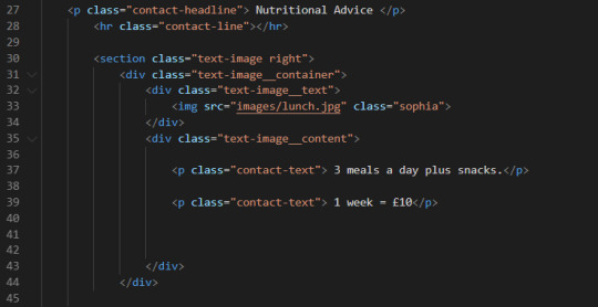
I have used the same tags for the headline, golden line and the text as the contact page in order to keep the style of the pages consistent to each other.
This layout is the same as on the other pages with image on left and text on the right, meaning that the CSS is also the same as the previous ones. The main difference is the text that is displayed.

This is just a simple text layout that holds the main body of text on the page. I have made individual <p> for each paragraph to give the look of actual paragraphs.
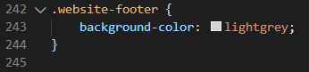
Sets the background of the <div> to light grey.
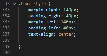
This is the style that the main body of text is going to have. I have added padding to both left & right of the text to contain it is a smaller space than the whole width of the page, making it look like the design. The text-align: center; aligns all of the text to the center of the <div> that it is placed in.


This is the div that contains the image of the woman in the gym.
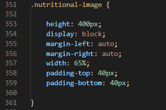
This is the CSS for the sizing of the image.
0 notes

Text
Footer - CSS & HTML

This is the HTML used for the creation of the footer as this is not a complex footer their is little code involved in it with only the email adress, phone number and two social media images.
This sets the background of the footer to light grey.

I used this to increase the size of the footer as the default size it had was not as big as the footer in the design. Therefore, I added padding to the top and bottom of a <div> to give the footer more height.

This is the CSS for the styling of the Facebook & Instagram images. The first thing I did was to drastically reduce the size to what it needed to be which is 25x25 pixels.
Furthermore, on line 261 & 269 I changed the vertical-align to the middle this places the images in the middle of the lowercase letter of the parent.
I also I set the left margin of the facebook icon to be 950px to make it be on the right of the screen where it is suppose to be. The margin of the instagram icon is 5px to the left to give a gap inbetween the two images.

This is the styling for the text that is in the footer the style of the two are the same as well as the left margin both being 90px. The only change being that in the email it has a bottom padding of 30px, this is so the text is not located at the bottom and gives distance from it to the end of the page.

Along with the navigation bar this will be at the footer for all of the other pages and the HTML & CSS for it will not change.
0 notes
Text
Contact Page - HTML & CSS
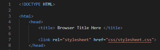
Setting up of the page, this is the same as the previous page as the CSS in the stylesheet is needed and is universal for all of the pages that I am creating. For example, the navigation bar is the same throughout the pages so it is more efficient to use the same stylesheet.
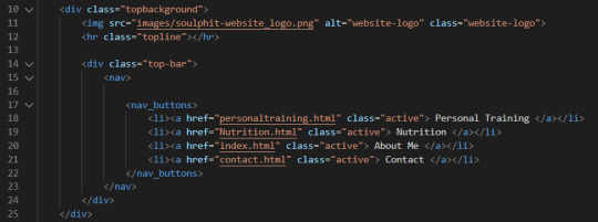
Same navigation bar as the previous page along with image at the top. I won’t be looking into the CSS of the navigation bar as it is the same as in the home page.

This is the code used for the main section of the contact page that contains the image being on the right and the location details on the left. The HTML and the CSS for the positioning of the map is the same as it is for the other images on the Homepage, so I won’t be going over the CSS for that.
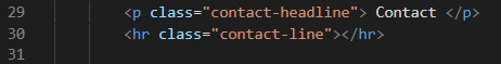
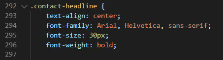
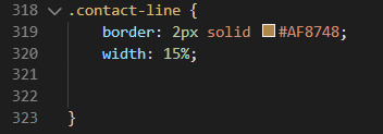
This is the HTML & CSS for the heading of the page as well as the golden line. All of this code is code I have used before in the previous page, as the headline belongs outside of a div I can just use text-align: center that will align it perfectly in the middle and I dont need to use padding/margin for it. Furthermore, the 15% width of the contact line places it in the middle of the page and at the length that I want it to be.

This is the HTML used for the text that sits next to the map. I have decided to used a combination of <p> (paragraphs) and table to make it look like the design and experiment with the combination of both of them. The table is similar to the one I used to make the images go side by side in the homepage, but in this I only have one column and 3 rows to make all the text go ontop of another and be at the distance that is set in the design.

This is the style of the text that is on the contact page, the font style of the design is that of bold text so I set the font-weight to bold and changed the size of the font until I found one that look like the design.
0 notes

Text
Behind SoulPhit - HTML & CSS

The code above is for the first part of the section where the text is on the left and the image is on the right. The tags for this are the same as the previous text and image combo. With the only the only change in it being the different tabing direction as the placement of the image and the text has changed. In this HTML the tabbing of the text is now on the left as the placement of it has changed as well as the image where the tabbing is on the right of the image. However, the amount of tabbing stays the same to keep the look consistent and keep the a straight line going through the ends of each of the content. Furthermore, the images has changed but the sizing of the image has stayed the same.

The code above is for the text being on the right and the image on the left, this code is almost exactly the same as the other version of text on left and image on the right. The only change being that the image is a different one as the size of the image stays the same.
0 notes

Text
CSS & HTML - Services


To make the images go side-by-side and align at the center I decided to put them into a mini-table alongside with the captions that go underneath the images. This is because in a table the image and the text can be easily manipulated to what they should look like according to the design given.
The table is simple as the image and lines of the caption are on different rows and are aligned to the center of the column so they are lined up as they should be.
CSS

Sets the background of the section to lightgrey.

This changes the style of the text that is displayed each of the two images.

Changes the style of the <hr> line that is underneath the heading.

This changes the size of the two images as the default size of the images given are too big and are different sizes, so in the CSS i changes the size of these images to be consistent to each other and look like the design.
I added a margin at the top and bottom of each image to give the gap on each side that is seen in the design.

Problems
The main problem with this is how i set up the table as to make a space between the two images i added a column inbetween the two that contained a shape the size of the gap that I wanted to create. This does make it look the same as the design but I could of done it a different way by adding padding/margin to each of the components of the table to create the gap.
Another problem is due to the images given as they were way too big and neeed to be resized but without the actual sizing of the design it wont look 100% like it does in the design.
Furthermore, the leaf doesnt look like it should as on the design it is rotated, i tried using ‘transform: rotate(xdeg)’ but I couldn’t find an angle that look good so I left it without the rotation.
0 notes

Text
CSS - Image and Text
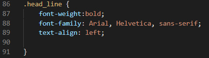
Changes the style of the headline text ‘About Me’
Line 87 - Sets the weight of the font to bold
Line 88 - sets the font family
Line 89 - aligns the text to the left of the div it is placed in.
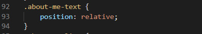
Line 93 - Sets the position relative to its normal position/layout.

Changing the style of the <hr> line.
Line 96 - changes the look of the border setting it to 2px, a solid line and the colour to #AF8748 (golden yellow).
Line 97 - sets width of line to 150px
Line 98 - margin at top of the line to 0px
Line 99 - margin at bottom of the line to 50px creating space betweem the line and start of the text below.
Line 100 - positions the line relative to the nearest anchor
Line 101 - aligns the content to the left
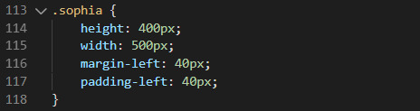
Changes the size, margin and padding of the sophia image.
Line 114 - sets height to 400px
Line 115 - sets the width to 500px
Line 116 & 117 - sets left margin and padding to 40px creating a tab effect from the left of the screen.

Line 122 - align the text to the left of the div.
Line 123 - sets the colour of the font to black
Line 124 - sets the font family to 500 value which is weight
Line 125 - sets size of the font to 20 pixels

These made all of the content that uses this class tab into the page sticking to the style in the design both are the same but flipped. Except from the text-align: right that is used to edit some text on a different page.

The code above is used to make the image go on the right of the screen as well as making the content responsive to the resizing of the web browser and being viewed on different platforms that have smaller screen sizes.
The responsive change happens when the page hits a minimum width of 700px and the placement of the content change to make the image go on top of the text instead of on the left of it. This code is seen from line 149 to 167.


0 notes
Text
HTML - Image and text

I put all the code inside a section that I didnt need to classify as their was no need to change background as by defaults it is white and it is meant to be white.
Line 29 - Start of div which will hold all of the code for the design as well as creating a class that will determine the whole style of the section.
Line 30 - Div that holds the image of sophia and creates a class.
Line 31 - image tag holding image and class that reduces the size of it
Line 33 - div opened to hold the headline as well as another div that holds golden line and text
Line 34 - heading that creates the headline ‘About Me’ as well as class to change look of font
Line 36 - Div that holds the golden line and the paragraph
Line 37 - Golden Line places under the heading
Line 38 - <br> inserts a break point line, creating space
Line 39 - <p> creates a paragraph to contain the text class for the paragraph class ‘tab-right that tabs in all of the text from the right.
0 notes