
Don't wanna be here? Send us removal request.
Statistics
We looked inside some of the posts by kvb227blog-rcchen and here's what we found interesting.
Average Info
Notes Per Post
1
Likes Per Post
1
Reblog Per Post
0
Reply Per Post
0
Time Between Posts
19 minutes
Number of Posts By Type
Text
7
Last Seen Tumblr Blogs


Fun Fact
Tumblr’s website traffic is steadily declining.
Text
Experimentation #7
OCs series - Digital Art Projected
Research:
Makoto Taniguchi
Taniguch's practice is mirrored paintings.
On an acrylic panel, there is a messy and unclear painting of a figure from the perspective of the one viewing it.
However, within the mirror placed on the opposite side, it is revealed through the mirror that it is a depiction of a cartoon portraiture in a kawaii fashion .
The facial expressions are soft and delicate with the portraiture barely taking up any space on the acrylic panel.
It gives the sense of mimicry or a shadow, hidden meanings and messages.
On the surface bright and happy but the shadow and lack of light juxtaposing this.

Untitled, 2013
Yoshitomo Nara
Multidisciplinary artist who's contemporary and signature art style displays emotional complexities of children
Explored introspective freedom of the imagination.

Light My Fire, 2001
An acrylic, fabric, and wood sculpture by Yoshitomo Nara, depicts a little girl standing with her arm outstretched as a ball of fire is placed on her hand.
Uses minimal and soft colours with a child-like style
Nara aims to tell a narrative in his works without words (Nara, n.d.) while subverting the Japanese ideologies around the concept ‘kawaii’.
His works are not unconventionally outrageous or unique with materials and compositions as well as doesn’t necessarily provoke the audience to think on heavy world problems.
Instead, Nara aims to create works that invoke thoughtfulness, reflection, beauty and the present (Pace, n.d.).
Brainstorming:
Seeing these works that embrace concepts and idea through cute and delicate portraiture. It brought me back to when I constantly drew my own original characters (mostly women) since as a child using traditional practices until I decided to use digital process to create them.
I wanted to return to this medium as if I am returning myself to a simpler and better times.
The process that I will take will be improving on the spot, drawing characteristics of the character when they come to mind and see how far I can take my imagination within a digital setting.
I also want to project these works on the wall from a distance. they will be sized to match a normal human size so that the audience will be able to see themselves within the characters. However, with the noticeable distance between the projector and projected, it will force the viewers to walk in front and shadow the work.
This was to specifically make the audience consciously worry about the presentation of the work while sub-consciously mimicking the idea of how a child would not know that this is wrong due to having no spatial awareness.
Creating:

OCs series, 2024
Digital art projected
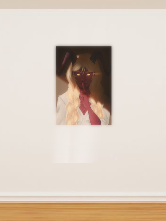

Silence from OCs series, 2024
First of the three, I immediately thought of a person who lied and began to depict a woman with her finger up to her lifts to gesture the word 'silence'.
I somehow thought of religious contexts where those who lie are demons and devil that are convincing and manipulating people to follow their own personal wants and needs. As a result, I drew horns and made her skin red.
The blonde hair came to min as a way to both compliment yet constrast with her skin.
I then added the final touch with the rendering and the shadow covering half her face to solidify her mischievous nature to the audience.


Shine from OCs series, 2024
Following Silence, Shine was to continue with the shadow effect. However to drift from the previous rendition within this series, I aimed for this character's skin to be green to hint at their overall good nature.
Another difference can be seen with how I purposefully made the character look up and away from the audience rather than looking at them dead centre.
I then chose to use elongated ears to represent the sense of old and unrealistic expectations, intriguing the audience in wanting to know non-human creature.


Solitude from OCs series, 2024
The last work from this series.
I immediately started off on a different canvas size for this piece. I chose to divert from the different coloured skin and embrace more humane skin colours.
I then had the idea of creating and personifying the night sky and the moon as a person.
This was why I used a soft yet stern face, reusing the elongated elf ears and striking beauty to present to the audience a creature that is undoubtedly is not from this world.
I also linked this work to the others through casting a shadow around her, erasing the areas around her figure to give off the effect that she is glowing similar to the moon.
Time Lapse:
Reflecting:
These works were able to bring back the joy I use to have when creating digital works.
Instead of feeling as if I am making works that have to lead towards university, this process was enjoyable and made my forget that it was towards an assessment.
However, due to how late I made these within the semester, I was unable to project and present them during class time. This was why I provided and made a mock image to display how I would have aimed it to look.
Doing this process also intrigued me in possibly making these works time-based for a multi-media rendition for future works.
I will be returning to this medium for the next semester and explore how fair I can take this medium and style within a contemporary manner.
0 notes
Text
Experimentation #6
Overlap Series - Manipulated Photos
Research:
Iris van Herpen:
Designs made to reflect and embody the large and environmental world we live in.
Rather than creating clothes to wear, it provides a purpose to send a message, mixing art and design with biology and engineering.
Works are otherworldly, unique and visually interactive.
Despite the chaotic and seemingly impossible wearability, many celebrities have worn van Herpan’s works to events.
Grand works that expand from the wearer themselves. Provides a sense of movement and life.

Hydrozoa dress, from the ‘Sensory Seas’ collection 2020
Anne Donkelaar:
Flowers on string dancing and moving in cold water, silent image of a dance.
Gives the sense of a flower field underwater, unnatural, dream-like, tied down, no matter how they move they won't be able to escape the string.
Practice is using real flowers into constructions that are both delicate and feminine, Otherworldly, time-consuming and small works.
Being placed under water, the movement within the water would manipulate and sway the strings of flowers, creating the sens of life and a mind of their own.

Underwater ballet, n.d.
Brainstorming:
After creating many works that revolve around the idea of childhood. I began to think of the concept of movement and displaying and experimenting this within my work to give myself time to breathe from the constant work around girlhood.
Also being a little tired from working with ready-made sculptures and turning them into something new, I though of taking photos of my previous works and manipulate using the platform Procreate located on the Apple store.
I thought of cutting and lassoing parts of the image before stretching, manipulating and effecting the colour to create an entirely new work of art.
Creating:


Overlap series, 2024
Manipulated photos
I began with Arts & Craft, taking C.W & Me from my Nurture series and pulling it apart. I then stretched it and layered them together to form bursts of moving energy throughout the screen, expanding past the edges of the canvas itself. I also made sure that parts of the pictures I manipulated were blurry to give the impression that it was captured by a camera that focused specifically on the middle-ground, passing through the foreground.
I then experimented with intensely layering the same image within a specific spot of the canvas, mimicking the style of futurism for Flight. Doing this experiment allowed myself to create what appears to be similar to fly wings as a camera 'capture' them mid flight. I also specifically contrasted the dark and light parts to continue that intense appearance.
Lastly, Ribs specifically targeted the change of colour and drastic changes in form in a similar futuristic manner. The end result ended up looking deformed ribs frozen in movement as the blood streams cover it.
Reflecting:
These works allowed myself to rest as it was nearing the end of term by creating simple pieces that only needing the process of manipulating images on a digital platform.
The end results produced were contemporary and each image after the next became more unrecognisable which was the intention for doing this experiment.
I can definitely see myself combining this process with the multi-media video and whether I can create works that are both chaotic and unconventional.
0 notes
Text
Experimentation #5
Boy Toys series - Ready-Made Sculpture
Researching:
Readings:
Look Again: Girlhood: Exploring “The Girl” in Art:
Investigates the depiction of girlhood in art throughout the years.
From the silent and submissive nature of traditional depictions due to patriarchal narratives in history to the contemporary lens where young girls are expressing their messages and themes widely, occasionally using uncomfortable means.
Also discusses the connection of both girlhoods being represented in visual culture and how girls grow with it.
Nostalgia Makes Us All Tick: A Special Issue on Contemporary Nostalgia:
Discusses how nostalgia is interwoven with both media and culture such as art, history, television and even politics.
Expresses that nostalgia is both personal and intimate that is also an emotion that revolts against time’s progression.
This can be caused through art that can recollect or reconstruct past times or spaces that can be invested with grief or melancholy.
Portia Munson
Known for her contemporary and multidisciplinary works (maximal, grand),
Heavily works with the consumer market and industry (closely works with the use of colour and what that represents within the industry as well as who targets them.
Lots of works that relate to the concept of girlhood and feminines male dominated industries.
Enjoys providing her audience with a mix of appealing visuals with an overwhelming and chaotic feeling.
When creating 3D works, she heavily uses arrangement and form within the work (a feminine trait).
There are clear feminine touches throughout her works, making her feminine audience to relate and be intrigued by her practice and processes.
She puts in a lot of time with her works, almost as if there is no time limit to her works as she piles on new additions to her installations.
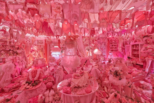
The Pink Bedroom
Similar to previously stated information, she displays a unique and visual timeline of the female marketing.
the installation has a collection of pink products found given by family and friends as well as public spaces like the sidewalks and bins over the course of 40 years.
Munson visually investigates her realisation on how the colour ‘pink’ is associated with the female audience, becoming a defined part of Munson’s life and personality (Stahl, 2023).
Munson provides insights in explaining how products are irrelevant as long as they fit the stereotypical standards (boy get blue toys while girls get pink toys).
It is also clear when looking at the product closely, many products are not necessarily feminine but since it is pink, it is counted.
Munson encourages the viewer to reflect on their own personal relationship with colours and products.
Munson skillfully arranges her collection in a controlled yet chaotic manner similar to how a little girl with too many little things are able to arrange their space neatly despite the overwhelming amount of stuff.
The Pink Bedroom makes the audience realise how toys within the mass-producing industry subconsciously affected many people.
Daddybears
Another artist that stood out to me was Daddybears.
Female textile artist and sculptor exploring and reverting to childhood imagination, a method to escape this world.
A range of sizes and forms.
Delicate renditions of pre-existing objects within a feminine way.
Heavily relates back to the idea on how weaving, sewing and embroidering are linked as feminine traits and occupations within history.
This can also be considered as taking a fantasy, nonsensical and feminine approach to the construction and building industry by embracing feminine traits.

Romance Bridge
A small textile fairy bridge made of baby pink satin plush fabric with embroidered patterns.
Rather than create a functional bridge, Daddybears focuses on expressing her personal imagination and manipulating the concept of reality to become a nonsensical and fantasy-like idea.
She actually displays a secret part of herself, introducing the audience to a glimpse of the imaginary world she escapes to which she courageously presents to her audience.
Size is perfect for a child to play with.
Demonstrates Daddybears’ definition of girlhood being connected to sleepovers, the bridge itself a symbolism of the connection and intimate bond between girls (Mulieris Magazine, 2024).
Expresses a testament to women’s meditative labour of work, care and love rather than functionality (Bradford, 2024).
Brainstorming:
Wanted to express my personal negative memories that stuck with me that happened within my childhood. Being told I could not play with toys because they are made and produced for 'boys'.
Grew up with two brothers, no sisters and a mother who grew up with five brother and no sisters. This resulted in my becoming quite the tomboy and wanted to follow and play with what my brothers were interested in. Yet, I was still denied to enjoy or play with boy related products.
I originally thought of purchasing nerf guns (I was originally told that I could not play with nerf guns). However, I thought of the in how I could create a highly interaction work the encourages the audience to get involved and play.
Purchase about 5 cars that are clearly target to appeal to boys.
Buy and use materials linked to girls (pink paint, ribbon, rhinestones, stickers etc.)
Creating:

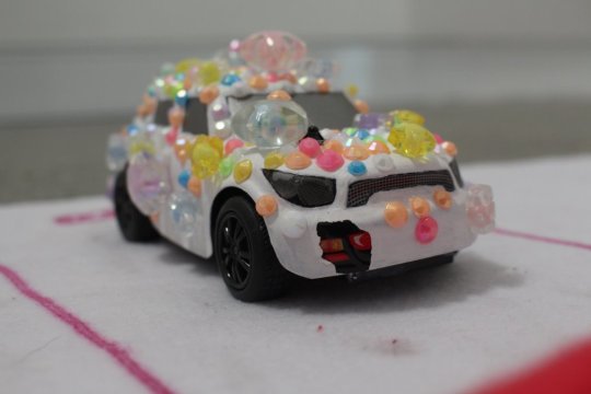
Pinkgatti, 2024
17 x 10.2 x 12.7 cm
This was the first car I created for this series. Stuck to the general shape of the car and didn't drift too far from its form.

Flowerri SF90, 2024
22.5 x 12.7 x 12.5 cm
Next car, experimented with a white base as primer before cutting fake flowers and arranging (another feminine trait) on top of the car. I played around the removing the recognisable figure of a car as it gets overrun by flowers (feminine overtaking and rewriting what is defined as masculine).

Glitterati, 2024
18.2 x 10.3 x 10 cm
Continued with the white primer base. I didn't want a cleanly and fully covered glitter car. I wanted to provide the visuals of a young girl that couldn't play with these types of toys so had to make it suit herself in an arts-and-crafts way.

Mclaren Sticker, 2024
14.5 x 10.2 x 13.1 cm
Using stickers came from the idea on how many people put stickers on their car for a number of reasons so I experimented on how sometimes people go over board and cover something they love with another material (stickers on cars, waterbottles etc. or covering self with multiple tattoos).
Lambeadgini, 2024
14.5 x 10.2 x 13.1 cm
Continued using the white base and arranged and bedazzled the car object using beads and rhinestones. This related back to my use of beads previous with my Nurture series as well as relates back to activities I once did as a child that was considered either creating or making art.

My City Rug, 2024
150 x 150 cm
I was initially going to buy the original city/road rug for the exhibition. However, after much thought, by creating a knock-off and not very well-made version of the rug would embrace that arts-and-crafts and child-like feel. This was the correct decision as it ties together the other cars as well as relates back to when I was little and would use make-shift anything when I was playing with dolls. It also provides a sense of intimacy and personalisation.
Documentation:
Exhibition:


Reflecting:
I am extremely happy with both the results of the process in creating this series as well as how the exhibition went.
Process:
The process in creating each car in their personalised and unique way slowly became a way to express and display a forgotten part of an interest I was obsessed with as a child.
Each car is specifically personal to be, however, I noticed that they related to my classmates as they expressed what type of car they wanted to control.
The actual creating for the cars themselves were very long and time-consuming. However, the results that I produced was both complex and clean when exhibiting. I can definitely see myself to either expand from this specific work or create similar works that follow the same interactive element as well has the same intimate and personal qualities.
Exhibiting:
The interactive element was extremely successfully in making the audience insert themselves into my personal safe space that allows them to relax and just play.
The viewers' reaction upon seeing my work specifically and realising that they are able to control it themselves brought a sense of pride and happiness with myself as they looked and talked amongst each other on what car they would want to drive.
I would say that I monopolised and overtook the exhibition away from the other works from my fellow artists which is a thought to be kept for future exhibitions.
A possible thought could be handing out the remotes at the end rather than at the beginning to not take away from the viewers experiences with the other works present.
1 note
·
View note
Text
Experimentation #4
My Living Room? - Ready-Made Wire Sculpture
Prompt: Create a work revolving around the idea of the studio or workspace.
Brainstorming:
Thinking on the prompt, I became to start consciously think on where I actually create artworks and see if there was a connection to the styles and quality of works to where I make them.
I usually create works at my desk in my bedroom, putting on a video on either YouTube or a streaming platform and create work at the same time.
This was when I started to get back into drawing on my iPad as well as creating small sculptures made from objects found in my home or room (this can be seen with previous works where I only used childhood objects so make it easier on myself financially. I have also got back onto traditional drawing or painting as well, not necessarily for work to be presented for KVB227 but just in general within my spare time.
However, I started recently creating work in the living room will watching The Rookie on Netflix with my parents. I am re-watching the show while my parents have not seen it which creates a sense of family and community as I found myself constantly stopping my art process to talk about what is happening within the show.
After creating the Flower Sculpture, I had left over wire and began randomly coiling them into square shapes.
This brought on the idea on creating a simplified version of my personal living space, re-imagining the cough, speakers, TV, and tables by just their overall shape.
Creating:
I began by taking and unraveling wires before re-coiling them into shapes. I used a variety of floral wire as well as thicker wire to provide contrast and exaggerate features.
However, the more I created these shapes, I thought of the idea in creating a abstract version of my living room instead of a simplified shape.
I wanted to create a space that looks insane or unrecognisable until someone notices and points it out before realising what the work is depicting. Thus, a sense of critical thinking and audience interaction is embedded within the work itself as they investigate and think of what I was trying to depict.
The repeatedly coiled sculptures began to take shape and exhibited controlled chaos and intense and concentrated points within space, allowing for the work to play around with both negative and positive space.
By the end of it, I came up with the idea of not creating the couches. I thought that removing it would allow the work to become my personal perspective on my living space, resulting in forcing my own lens onto the audience for them to figure out what I see. This then also goes into the idea on how when I get comfortable within a space, it becomes so familiar that I stop seeing it as an environment and rather just an extension of my own self.

My Living Room?, 2024
24 x 25 cm
Wire
Regina Chen.
Reflecting:
Even though the process of constantly and consistently wrapping wires together, the end result was rather mediocre.
I actually struggled to create something using the prompt provided for some unknown reason. Everything I thought of ended up being done by other classmate, making myself feel like I couldn't do it due to some honour code.
If i were to redo this task, I would like to play into the girlhood concept and create a doll house living space that mimicked by living room space.
I would possibly add doll figures to represent myself and my parents as well as place them in the positions that they sat as we watched the show together.
I might have also thought about re-creating and re-imagining my bedroom (or at least my desk setup) as well.
Possible ideas could be: recreating my desk space that mimics a digital space (I like to game and go on my computer) or possible sculpturing using clay either spaces.
0 notes
Text
Experimentation #3
2 Sides - Multi-Channel Video
Brainstorming:
The videos taken from the first class of semester 2 will be taken into Adobe Premier and create the multi-channel video.
Rather than playing the same video on two screens, I will try and use two videos that might juxtapose yet still talk to each other. Depends on the types of video recorded.
Might use sound to elevate or juxtapose what is visually happening within the video.
Will either manipulate the video to become completely different and unrecognisable or simply add filters over the top/ make slight changes to be able to distingush the two.
Little nervous in working with time-based art but am excited and intrigue to experiment with the process.
Creating:
Videos taken using the tripod were unstable and unclear due to the weight of my phone being too heavy to stablise the camera. This created unique and chaotic videos that actually captured myself and a fellow classmate's disappointment and embarrassment.
There was also a moment that the phone almost hit myself in the face.
Despite everything going wrong with recording footage for this task, I will still use it the create a side by side and experiment how playing two different films can either work well or contrast each other.
I utilised filters and layers different ones on top of each other to clearly show and mimic what the video's vibe is.
I lined up the videos to occasionally play alongside each other and appear to connect within the middle (Tripod stick on the left matches with the phones appearance on the right, etc.)
I used a song found on YouTube and manipulated the pitch and speed to create a sense of urgency and further elevate the originally chaotic videos.

2 Sides, 2024
00:57 seconds.
Digital Video.
Regina Chen.
Reflecting and Researching:
There were many issues rising throughout the entire process of making this multi-media experimentation. I felt like I problem-solved significantly more than actually creating and experimenting with the medium.
Though the video did not come out the way I intended, I will definitely take this medium into consideration for future works either by itself or expanding and developing other experiments further. I can see myself using the skills learnt and unique features only with time-based works to create pieces that flow and connect with the concepts I find myself exploring (girlhood, nostalgia, etc.)
With a bit of research, I found artist Morgan Hogg who explores indigenous identity and perspective within the Pacific Islands and the relationship and impact of modern day.
She specifically specialises in digital practices like installations, films and visual representations of these issues. Also emphasis on how works are installed, use these as examples for possible future digital works. Visual and verbal, overlapping and editing, short cuts mixed with long single shots.
I enjoy the overlapping of both visuals and sound combined to create an immersive and engaging experience. I can see myself using similar method to communicate my own concepts as well as return to making sound-scapes/ music that I originally did in the first year of Open Studio. This will also provide an excuse to return to making music and incorporating two of my favourite disciplines into one.
Readings:
Loneliness, Art and the City:
Art can be used to combat loneliness within urban city life.
Art provides a sense of joy alongside finding ways to shatter social and emotional barriers, allowing relief from the overwhelming nature of city life.
Focusing on creating the sense of nostalgic joy, how can this be done through both the use of materials and process to achieve similar emotions from the audience.
Statues can be focused on, make explicit, and aggrandises ordinary experiences of urban space, the mundane and general experiences of urban spaces and crowds, which leads to the common feeling of loneliness.
Public sculptures help urban residents reflect on the complex texture of city life.
In Japan, many deaths are committed through dying along or citizens losing social contact and never leaving their homes.
Loneliness in health issues, chronic loneliness, it has an impact similar to high blood pressure, obesity, and a bad smoking habit.
Economic cost to consider with loneliness, low economic crisis etc.
Cause of these dislocations and disconnections are complex and shift on who is lonely and the location of where they feel lonely as well. This can be seen in the fissiparous (inclination to stray away from groups) quality of modernity. There is lack of community, seen in lack of knowledge of the neighbourhood and who they are. Based on how self-directed and rational self-interest, this leads to people only getting to know their community based on the things they need rather than to actually form those bonds.
Japans use of robots that mimic cute animals are used as a 'cure' for loneliness, offering a companion in the lonely times.
Report in Australia that states that there is strong evidence that people should partake in a certain level of social interaction and connect to maintain a healthy well-being.
City life was also discussed to cause mental loneliness rather than actually being lonely. This information make me reason a concept found in 2 Sides that could be interpreted as either two sides of contrasting mental states or even how one presents themselves within a public setting verse their mental state.
They are calm on the outside but have an on-going and chaotic nature within.
0 notes
Text
Experiment #2
Nurture Series - Ready-Made Sculpture
Researching and Brainstorming:
Going off of my last experiment, I found inspiration after looking through Pinterest and found multidisciplinary artist, designer and author Rachel Burke. Numerous works from Burke are made of vibrant and bold materials that are usually associated with feminine culture and girlhood.
multidisciplinary artist - craft based, ready made sculptures.
Brisbane-based and has exhibited works in gallery spaces across Australia (The Museum of Brisbane, Saint Cloche Gallery and the Australian Centre of the Moving Image). Has also published numerous books.
Worked with Harry Styles, Cate Blanchett, Disney, Lego and Barbie.

From Burke's Fairy Portfolio
I grew intrigued by Burke's extremely feminine and textile elements produced in her works.
Works revolve around Bright vibrant colours, girlhood, feminine, themes of identity, memories and obsession. Wide range of works collages, paintings, installations. Believes her workspace reflects into the creations she makes as it fuels her inspiration, as if someone is entering the pages of her visual diary.
Visaya Hoffie
Many works contain child-like features, ready-made sculptures, craft-based.
Hoffie after much research became a key figure within this experiment.
The enchanting microplastics.
Wants to provide a freshness to the work, have the work already refined rather than refining them in photoshop.
Humour is also an important starting point to her work.
Each character on their own little island (like the Little Prince) facing their own trials and tribulations. In the Little Prince, they begin to see an imaginative capacity that goes beyond the limitations of the rational.
Rather than focus on solely creating meaning for a theme or concept, there should be room for the viewer to think beyond from strictly what is in front of them.
Art goes through several processes of art that tries to tame and control it which rids of the wildness that it originally contains and has.
Targets the everyday as a theme and make them prevalent and bring up new conversations on the topics she's trying to bring light to.
As a disarming way to represent her work, chooses to work in a humourous and child-like way that seems simple and inoffensive on the surface, The Enchanting Microplastics used high-key colour palette and visually alluring surfaces to invite the viewer in to engage with the work.
Although titles and forms are all throw-aways fragments from the edges of everyday culture, they are mirrors of the times we are living in, and glimpses into my personal world
Instead of alluring to wealth and privilege, they reflect aspects of popular culture, the production of which everyone takes part.
This inspired me to work on the idea of girlhood and what can mean to girls at a young age.
themes of friendship, loss, growing up and losing friends
Idea of creating plants made of friendship beads, other plants withering or tipped over while others grow

A Girl For Every Gun
Asking how when a weaponised girl takes a gun that it affects her visual image rather than as an agent
Girl with a gun is a metaphor as someone who is pushed against hegemonic visual culture to do violence to its forms.
Girl changes the signs and symbols around her to create new subversive meanings.
Girl 'appropriates' what was never meant for her.
This was conceived as a space for mythological experimentation and destruction of oppressive imagery.
Girls are able to rework signs and symbols of patriarchal culture, images and text of girlhood that are available to them and create new and subversive meaning.
For Driscoll, girl culture developed for actual girls is marked by an unresolved tension between agency and comfortability.
McRobbie – cultural spaces craved by girls are ambiguous, necessarily drawing on and reproducing hegemonic ideas about femininity at the same time.
Girls make use of the malleability and indeterminacy of the images they are called on to embody against the pressure to conform to these images. Not only emulate but creatively engage with them.
Ideas on how girls are connected to capitalism, not only as ideal consumers but also ideal endlessly transformable commodities.
When Tiqqun tries to speak on the matters of girlhood, they are interrupted by girls internally. Even when asked to be anyone they refuse.
'Hacking' the system/ taking over the internet or social medias (that are male dominated or run by patriarchal members). This can be seen by fictional figures or apps like sailor moon, Buffy the Vampire Slayer, Tumbler. Their self-fashioning and transgression appropriations of hetero-sexist cyber-culture, these figures have re-calibrated computer and digital technologies in ways that have mobilised them as 'prosthetic feminised weapons for girls.
Nakeya Brown A Delicate Knot: Photographing Black Girlhood and Womanhood talks on the idea hair plays in girls transitions from girlhood to womanhood for black women. Due to their unique hair texture, when styling it with eg. A hot comb, that is being done in the privacy of their own homes. An invisible experience.
The idea of consent, girls are culturally coded as perpetually unable confirm or deny consent, and ideological exemption that has remained a necessary prop for the maintenance of heterosexual patriarchal order.
Girlhood Studies: An Interdisciplinary Journal:
Heavily focuses on visual culture revolving around girlhood. Provides insights that target to seek beyond previous foundational work through both feminist theory and biography that investigates the nature of girlhood in both art and cultural frameworks. Explores themes of empowerment, vulnerability, and identity as the journal focuses on the anti-oppressive approaches in viewing girlhood in media.
Researching these inspired to create beaded flower sculpture in glass vials. This idea came from the concept of how friendship bracelet symbolise and become physical object that represents a bond between friends.
Creating:
Flower 1:
individually made the strings of beads before placing them into the glass vial
no extra loose beads in the glass vial, just the ones on the wire

C.W & Me, 2024
Flower 2:
Did the same as Flower 1 however, added extra loose beads into the smaller vial

J.C & Me, 2024
Flower 3
raveled the floral wire in a ball/oval shape and placed it into the vial. Added minimal beads on a string into the vial after with the wire sprouting out of the glass without any beads on them

S.S & Me, 2024
Flower 4
Decided to not add any beads and only coiled the floral wire and stuff into the glass vial, only one flower bead placed on top of the coiled wire to mimic a flower

D.D & Me, 2024
Flower 5
created a sculpture without beads, the wires are coiled and bursting out of the vial in the shape of a bud or even a bonfire

L.V & Me, 2024
Flower 6
I layered the wires and beams simultaneously so that the glass vial is full of beams as well as the string, this made the weight on the wire heavy to not allow it to hold the beams and droop.

C.G & Me, 2024
Reflecting:
The shapes and colour and the swirling and weaving came out great, with the flower shaped beads on top really gave that idea of a plant or flower
The sculpture was not secured as much as I liked which allowed for the wire to move over time. This made it difficult to move and transport this series of work.
This series was extremely aesthetic, I enjoyed the end result and how bright yet soft the sculptures are from a distance.
The overall process of making them was extremely fun and enjoyable as well, I can see myself continuing with this style or work as well as continue to investigate the idea or girlhood and friendship.
0 notes
Text
Experimentation #1
My Drawing - Layered Glass Art
Research & Brainstorming:
Looking through Pinterest for quick inspiration, I found Shade by American painter and graphic artist Robert Rauschenberg. Shades is a layered glass artwork made up of numerous lithographed images taken from newspapers and magazines printed on each panel to create the shape of a cube. There is then a light that us directed onto the back of the work, shining through and giving the sense of colour despite the monochrome colour scheme. All these qualities combined provides a futuristic emotive as the layering creates negative and positive spacing, the density and spacing between the images evolving into a dream-like and unrealistic artwork. (reference).
I was initially intrigued by the medium of layered glass art and how images plastered onto glass panels can create moments of negative and positive space with the images overlapping each other. Brainstorming around the idea of using this medium for my experimentation, I thought of the idea of expanding and evolving an existing work of mine that was originally 2D into a 3D artwork. Further to this, with the overarching theme of this semester being 'Value', I began to investigate the idea of valuing simpler times in a person's childhood before realising the complex nature of adulthood. As a result, I wanted to capture a child-like atmosphere similar to what a child would draw. This is why I chose to use oil pastels as the main material aside from the glass panels from frames. I wanted to create an image that mimics a drawing made by the use of crayons that is messy and possibly unrecognisable to anything.
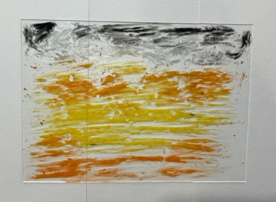
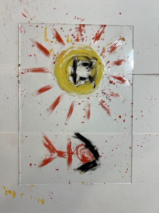
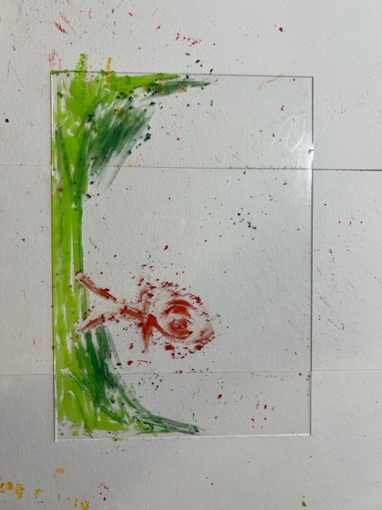
To further build on the idea of 'value' and 'simple vs complex', I tried to find a drawing that I made as a child that used crayons (or anything similar) but couldn't. As a result, I chose a drawing that I created when I was in prep using acrylic paints that depicts a sun with a face and two people placed in a grassy field. Not only would this piece be easier to divide into fore, middle, and background, it will be easy to recreate in a child-like sense due to the work already being created by myself as a child.
Creating:
Planned out what features of the old work can be placed into the fore, middle and background.
Background: sunset colours (yellow and orange) going horizontal on the glass panels. Grey and black circular streaks at the top to act like cloud. the clear and non-blended effect will allow for 'movement'
Middle Ground: this section will contain the sun on the left (with a smiley face) and the female stick figure on the right in red
Foreground: along the bottom has the different shades of green curving up along the sides as grass. Similarly to the background, the grass will be non-blended to give the impression that the grass is blowing in the wind or there is an element that gives the audience a story or narrative. Quick heavy pressure streaks to drive that crayon style.
Through the process of making this work, I wanted to make sure to reenact my previous child-self and her thought process when making it (I can surprisingly remember when I made it).
Reflecting:
Finishing this work, I was surprisingly disappointed with the results.
Despite the oil pastels being said to be able to be used on glass materials, it was actually extremely difficult to apply the pastels in a nice and even layer of colour. They also began to flake and go everywhere, somehow sticking back onto the glass and not come off.
Even though I aimed to have messy and non-blended streaks, due to how hard it was to apply the pastels to even show up, it would actually peal and remove the original strokes of pastel.
The end result was pretty good, however, I do not think I would be using this style or process again. I was getting frustrated and the process did not click with me. It began to feel like a chore rather than creating work. However, I am glad I tried and experimented with it.
I enjoyed recreating old works into a more nuanced and improved manner. As a result, I will continue to find my old drawing from childhood and recreating them in possible unconventional ways to show growth and how life gets more complex the more you grow up.
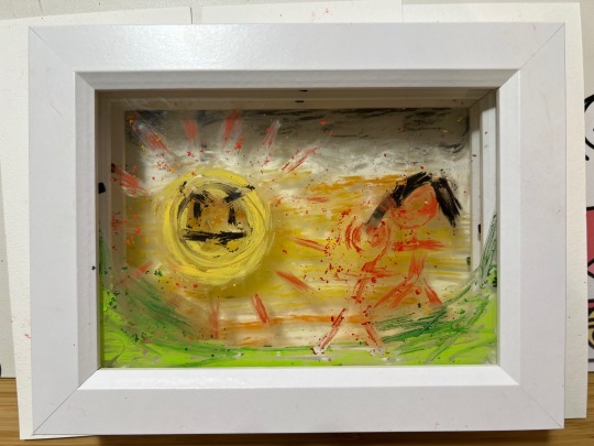
My Drawing, 2024
10 x 15 cm
Oil Pastels on Glass Panels
Regina Chen
0 notes