Statistics
We looked inside some of the posts by l-gabi-52-blog and here's what we found interesting.
Average Info
Notes Per Post
50K
Likes Per Post
33K
Reblog Per Post
17K
Reply Per Post
118
Time Between Posts
6 hours
Number of Posts By Type
Text
3
Photo
5
Last Seen Tumblr Blogs


Fun Fact
Forty percent of Tumblr users are between the ages of 18 to 25.
Text
Design Thinking
Lizette Gabino
Imaging 1302
Mihyun Kim
Design Thinking
In the everchanging landscape of technology and design, new obstacles and challenges are bound to arise, each one more complex than the last. To keep up with the demands and the needs of the people, designers use design thinking to provide solutions that satisfies the users and keeps up with the changing society. Design thinking is often described as solution-based thinking. Design thinking is also a human centered design process that keep its users in mind. Design thinking is not just a tool for graphic designer, but a good number of big corporations have adopted this approach as a “strategy for innovation”.
IDEO was one of the first companies that adopted and popularized design thinking in the business world. The CEO of IDEO believes that it is a useful way that “integrate(s) the needs of people, the possibilities of technology, and the requirements for business success.” This approach is a very important tool in a designer’s kit. So, what exactly is design thinking? Design thinking, as defined by the is a five-step process that is user-centric and effective. The five steps are empathize, define, ideate, prototype and test in that particular order.
In the article “5 Stages in the Design Thinking Process”, they break down the process and go in depth. The first step is empathize. As mentioned before, design thinking is a human centered process. In the first stage empathize, we push aside our own assumptions and try to understand the problem in an empathic perspective. We collect information from the users and understand their needs and problems. A lot of information is often gathered in this stage.
Once enough information has been gathered, we then move on to the second stage, define. During this stage, a problem statement is created to define the challenges and problems that need to be solved in a way that ultimately benefits the user. During the Define stage, it allows designer to gather ideas and different ways to approach the problem where it inevitably leads to the next stage.
The next stage to follow would be Ideate. During this step designers start creating and collaborating with one other to form new ideas and alternate ways to view the problem. Anything and everything are allowed during the beginning of the ideation stage. Designers proceed to think outside the box, and everything is flushed out until, ultimately in the end they begin to narrow down their solutions. This leads to the prototype.
In the prototype phase, experimentation is bound to happen. In this experimental phase, collaboration is also often done. The prototypes are tested out and often they are accepted, improved upon, or completely scrapped. At the end of this stage designers will have a deeper understanding of how it will benefit the users and how the users interact with the product.
After the ideate stage, the solution is then set for the Test stage. The product is tested and observed on how it solves the problem. This in itself is the final stage, but it is not set in stone. The results from the Test stage can be used to reflect further on the solution itself, provide more information for the empathize stage, redefine the problem and even create more ideas during the ideate stage.
Design thinking is not a rigid and linear process. It is flexible and can often jump around, allowing designers to improve and understand the users experience/ needs. It promotes creativity and keeps a human centered approach during the process, never once forgetting about their users.
Citations
Dam, Rikke, and Teo Siang. “5 Stages in the Design Thinking Process.” The Interaction Design Foundation, https://www.interaction-design.org/literature/article/5-stages-in-the-design-thinking-process.
“Design Thinking as a Strategy for Innovation.” Creativity at Work, 8 Oct. 2019, https://www.creativityatwork.com/design-thinking-strategy-for-innovation/.
0 notes
Text
I gotta get this out of my system because my artist/graphic designer self is screaming and needs release. I WILL COMPARE THE LOKI SERIES LOGO WITH THE NEW THOR ONE BECAUSE… BECAUSE I CANNOT BELIEVE THAT MARVEL/DISNEY WOULD SPEND MONEY ON… ON THAT.
WARNING: lots of capslock.
BAD LOGO DESIGN:

‘QUICK’ POINT FORM OBSERVATIONS:
Did Loki take the whole cut out letters from a magazine as a ransom note/blackmail letter a little too far by actually using 3D letters? Did he just go around the universe stealing random letters from signs? Are some poor independent businesses missing a letter?
LOKI THE TV SERIES: WINGDINGS REVENGE
The ‘K’ is the thing that immediately draws your eye too first. The ‘K’ alone should not be the focal point of the entire logo.
HOLY HELL THE ‘O’ IS TOO DAMN DARK AND MUDDY.
THE L LOOKS LIKE PIGEONS SAT ON TOP OF IT AND TOOK MULTIPLE SHITS ALL OVER.
The L looks like someone with the skill level of Microsoft word art did that and printed it out for a mom and pop… idk, tile, stone, and granite shop? Something you’d pick out for a tile in the 80s/early 90s for a mall or office building?
The ‘I’ is all gem like and more mystical which is in tune with Loki. Is this a promo for Bejeweled the movie?
DO THE SQUINT TEST. If you squint you should still be able to read/see things fairly clearly. YES, YOU CAN STILL READ IT WHILE YOU SQUINT, BUT THE O ALMOST DISAPPEARS AND THE L JUST TURNS TO MUSH.
THE FONTS OH MY GOD THE FONTS WHY DO PEOPLE ALLOW SUFFERING. COMIC-SANS OR PAPYRUS WOULD HAVE BEEN BETTER. AT LEAST HAVE CONSISTENCY. SYMMETRY. SOME KIND OF FLOW BETWEEN THE LETTERS. I get they want to convey that this is Loki hopping around time or whatever, idk, but THERE ARE SO, SO MANY WAYS TO DO THIS BETTER. DO NOT MIX FUCKING BLACKLETTER WITH MORE MODERN SAN SERIFS. OR IF YOU DO AT LEAST MAKE THEM CONNECT SOME WAY WITH SIZE, COLOUR, SPACE, NEGATIVE SPACE, SOMETHING I DON’T KNOW. JUST NOT THIS.
The overall colour palette is dull af. The I is the only thing that pops colour wise because it has that deep emerald colour.
IT’S TOO DARK. HOW IS THAT L AND O GOING TO REALLY POP AND CATCH THE EYE? The O is just disappearing within the rest of the letters followed by the L.
The K is my favourite because it at least has a personality with the different shapes and angles to it. It’s the most fun of the bunch.
WHOEVER APPROVED THIS NEEDS TO HAVE THEIR FUCKING EYES TESTED.
While yes I am aware that the logo may tie into the show more and we could get more context this is not how it should be executed. There could be multiple different ways to tie it in.
WHY!?!?!?!
GOOD LOGO DESIGN:
Imma compare the new Thor: Love and Thunder logo because it fits within the MCU universe and also with Loki ect ect. While it may not be everyone’s cup of tea and yes it isn’t perfect, it is far superior BECAUSE:
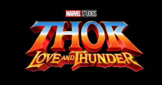
BAM! THUNDER CA- THOR: LOVE AND THUNDER IS A GO! IT KICKS YOU IN THE EYEBALLS WITH CAMPY AWESOME RETRO I-NEED-THIS-AIRBRUSHED-ON-THE-SIDE-OF-A-VAN KINDA WAY.
‘THOR’ is what grabs you right away. That alone is far superior to the Loki one because you already are presented with the character, brand, franchise in one look.
IT’S BRIGHT. IT’S ORANGE AND YELLOW AND BLUE. IT POPS MORE THAN A KARDASHIAN SPRAY TAN.
It’S FUN. Look at that fun, bright, eye-cathing retro 80′s sci-fi/fantasy vibe. All that’s missing is Thor in a tiny chain mail bikini and a fluffy white tiger.
ALL THE FONTS CONNECT. While Thor and then Love and Thunder are slightly different shape-wise they are still similar enough that they fit together and give you the same overall message of FUN, ACTION, SCI-FI, FANTASY, ELECTRIC, POWERFUL, AND POSITIVE.
NOTHING IS MUDDY AND LOST! The bright Cheeto orange, the yellow/gold that is Smaug’s wet dream, the sky/mirror blue is all vibrant and breathes life into it all.
THE SQUINT TEST. You can still read the key message that is Thor very well. Even if you have trouble with Love and Thunder you will still know it is Thor.
THIS IS GOING TO BE A LOVE STORY FULL OF LESBIANS, CAMP, THUNDER, FUN, HEART, AND SOMETHING THE RUSSO’S COULD NEVER.
This logo is so fun and cheesy (literally in colour and aesthetic) that you immediately know what you’re in for right away. It gives you a clear message upfront without giving anything for certain away. THIS is good logo design. While it may not be everyone’s fave, it is clear for what it stands for and represents. The Loki logo is all over, unbalanced, and isn’t cohesive like this.
LOVE AND THUNDER, MOTHERFUCKERS!!!!!!!!!
3K notes
·
View notes
Photo

In order to make the pictograms comprehensible and universal, the animals were stripped down to their identifying characteristics and to their basic shapes. In doing this, it helps the audience from being confused by the animals. To keep the composition unified, the pictograms are displayed standing on their side profile while facing each other. To add balance to the composition the tiger and the panda were placed in opposing corners to make them asymmetrically balanced. The positive and negative space were used to place emphasis on the animals by creating the illusion of a parent and a child resulting in the final outcome.
1 note
·
View note