
Statistics
We looked inside some of the posts by laravulic and here's what we found interesting.
Average Info
Notes Per Post
30K
Likes Per Post
13K
Reblog Per Post
17K
Reply Per Post
32
Time Between Posts
6 hours
Number of Posts By Type
Text
13
Photo
3
Video
1
Last Seen Tumblr Blogs


Fun Fact
Mobile Tumblr US users spend an average of 4.04 minutes per session on the app.
Text
There is no such thing as perfection. Sometimes the more you work at something for example an artwork, thinking that it’ll reach this “perfect” end product, you’ll eventually realise you’ve been working away way too much that it becomes a blur and not what you hoped it would be. Not saying this is true for everything necessarily. Sometimes you do know when to stop. But I definitely agree with Dalí on an artistic level. I’ve been there, done that!
“Have no fear of perfection, you’ll never reach it.”
— Salvador Dalí
2K notes
·
View notes
Photo
I absolutely love Elli’s Ask Me Anything subject! The whole layout and outcome of her presentation is really nice and I’m loving the minimalistic vibe that’s going on. Apart from the aesthetics, I love your questions that you’ve decided to ask - very clear and detailed. Good work!!

Assignment 3: Ask Me Anything outcome
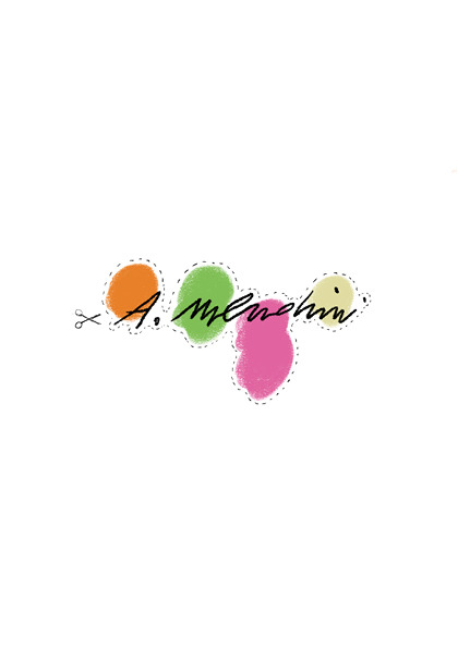
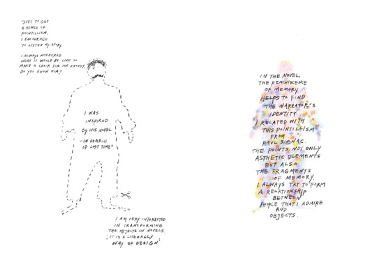
In this project, I focused on how to reflect Mendini’s identity in the magazine.
As Mendini enjoyed decorative and handcrafted things, I decided to make this interview zine into decorative objects.
The die-cutting line enables readers to engage in communication with Mendini.
Each image is related to the question and answer.
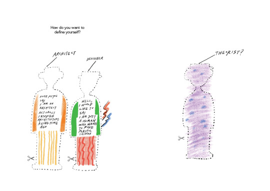
1. How do you want to define yourself?
: I chose this iconic corkscrew called ‘Alessandro M’, which resembles him. I put different patterns for expressing his decorative style.
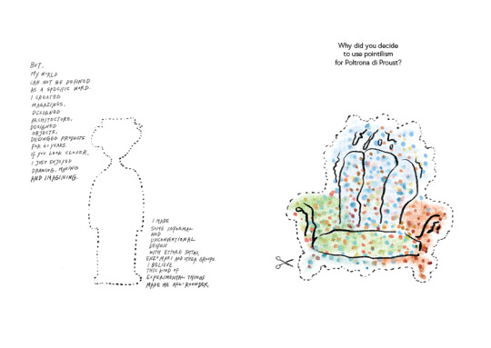
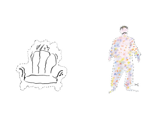
2.Why did you decide to use pointillism for Poltrona di Proust?
: This Proust chair is one of his best-known pieces. I referred to his drawing and exaggerated dot for delivering pointillism more strongly. Also, I put the image of Proust with the referring image of him. He had a strand of hair and mustache. The outline shape is based on Mendini’s other hand drawing.
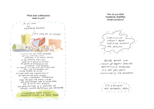
3. What does collaboration mean to you?
: I chose the Groninger museum to answer. It is his representative collaborative work. Each section is designed by other designers by Mendini’s direction. If I were him, I told this story for giving clues for the answer. This part was really hard to express. I was obsessed with putting sentences on the museum illustration, but it interfered with readability. So, I just wrote down under the illustration. I found that I should not be obsessive about my preference for readers.
4. How do you think hopelessly simplified modern products?
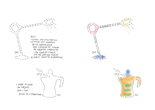
: I used his playful lamp and coffee maker. I thought it can deliver his philosophy. It looks simple but has a refined decorative shape. It is more than simplicity.
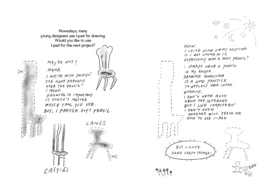
5. Nowadays, many young designers use I-pad for drawing. Would you like to use I-pad for the next project?
: I referred purely to his drawing on these two pages. I tried to make these two pages giving a sense of his purity and passion for drawing. Also, I didn’t use any colors for these to deliver the mood for a pencil he loved.
In these projects, I could reflect his passion for creation. I want to follow his passion and enjoy creation with my background and new technology. As he did, I will enjoy my future practices!
6 notes
·
View notes
Text
Was very nice being in a class with you guys even though it was hard to talk properly without being in face to face classes, it would have been lovely seeing all you guys :( Hopefully we’ll catch each other around next semester though!
P.S I’m loving this All Good Things Must Come To An End poster, just not loving how it’s all come to an end in real life. 😪

Time sure does fly by fast when you enjoy what you’re doing. I can’t believe that I’m done with my first semester of university. At first, I was really nervous since I never took art classes before. To my surprise, the class was actually beginner-friendly and everyone has been so helpful and supportive. Having to attend online classes was not what I was expecting but it wasn’t bad at all, it was easy to adapt to the new way of studying.
Communication design was something very new to me. This course helped me dive into heavy topics like discrimination and even the lighter ones like the use of emojis. I found new ways to design, this is where I designed my first website, made my first font, and also first time exploring digital collage.
With the help of all the teachers, I gained more knowledge and confidence in myself. Shayna kept encouraging us to do better every single week and to not forget build connections with each other. Through this tumblr assignment, I was able to connect with students from other classes by reblogging, liking, leaving comments on each other’s posts and get feedbacks on my work. Seeing the work of others also inspires me and made me learn from different perspectives. Overall, this semester has been so enjoyable and I couldn’t ask for a better class and teachers!
Image source: https://pin.it/3bGBguB
17 notes
·
View notes
Photo
MoMA Exhibition 2018
Where I was inspired by Andy Warhol and Salvador Dalí’s works for my Ask Me Anything Assignment.


Isamu Noguchi, Ellsworth Kelly, Agnes Martin, Lyubov Popova, Matisse, Le Corbusier, Barnett Newman, Louise Bourgeois, Alexander Calder, utopian cities, vinyl covers, space invaders - great fun at NGV’s MoMA exhibition.
11 notes
·
View notes
Text
27th May - 8th June, 2020
FINAL ENTRY & CLASS!
Today is our final class for Communication Design Studies (GRAP2199)! I’ve really enjoyed the whole vibe of our class, the content we’ve been learning and the assignments we’ve been given to work on, allowing our creativity to shine through.
During the Communication Design Studies class I’ve been able to:
- Identify and describe key movements and periods in the histories of Communication Design through watching Andy and Karen’s lectures. They have given me in depth insight in to many aspects of Communication Design.
- Describe the roles that social movements and social contexts play in the development of Communication Design through lectures and workshops taken by my teacher Shayna aswell as identify key design movements and examine their influence on the practice of Communication Design.
What has this course been about? What have I taken away from my first semester?
Ultimately, Communication Design Studies has introduced me to communication design theory and history throughout a global context.
I’ve explored the history of communication design from pre-print culture, through the print revolution and into the digital age. Every week discussed a significant time in communication design and the history that follows.
I’ve been able to develop skills in descriptive and reflective writing as well as investigation and analysis through my 3 major assignments (1: Hello, my question is..., 2: Online Reflective Journal and 3: Ask Me Anything!).
This course involved a lot of individual and group work, activities/workshops, project work, lectures, tutorials and class discussions. Although most of this semester has been from home, we were able to make the most out of it as a class. The first two weeks were very engaging and fun, being able to physically attend classes and work within groups for activities. I’ve learnt a lot about my work habits, goals I can set for myself and a lot about Communication Design in general.
I will certainly miss my first semester Communication Design Studies class and my very lovely teacher Shayna!
Because I was voted for my “What creatively inspires me?” object which was my collage of adventures, Shayna digitally drew me a picture as my prize.
I chose my cat Mr. Tibbles who sadly passed. Her work is amazing and I thank her very much! It’s a lovely little momento to take away from our special little class 😊


Signing Off,
Lara Vulic
0 notes
Text


Assignment 3: Ask Me Anything!
An interview with The Persistence of Memory artwork, exhibited at MoMA New York City.
The contrast of the “serious” brochure layout, text and funky, dark imagery helped create a vision for the end product. Colours are similar to those from the artwork itself, blue, yellow, brown and white. I wanted to keep it as serious as I could while still trying to incorporate imagery and graphics. The Persistence of Memory to me has this “very proper” attitude about it, so I wanted to show that through the exhibition brochure as if it was from MoMA.
Inspirations for brochure designs by MoMA are shown above. They gave me great insight into the types of styles and layouts MoMA uses within their brochure and hand out designs.
1 note
·
View note
Text


WEEK 11 LECTURE - WHAT’S NEXT FOR DESIGN?
What will we be discussing today?
- Generative design
- Parametric design
- A.I. design
- Machine learning
- Robotics and design
Quick Summary:
In this lecture we look at parametric and generative design practices, data visualisation and how communication design in general is transforming through emerging technologies like machine learning and A.I.
It’s humanly impossible to observe everything uploaded on the internet. Today, design is all about trying to visualise this data in a more consumable way.
Jason Salavon’s work was an example of this shown with layering of magazines and school photos.
Generative Design
The generative design process is defined by applying boundaries, constraints, and specific goals to a project and then exploring all possible design options through an exhaustive series of iterations. The use of AI and supercomputers is very helpful to speed up and optimize this iterative process.
Parametric Design
Parametric design is a process based on algorithmic thinking that enables the expression of parameters and rules that together, define, encode and clarify the relationship between design intent and design response.
This Person Does Not Exist
https://thispersondoesnotexist.com was a website shown during today’s lecture which I thought was pretty creepy. The website generates a persons face that doesn’t exist. Every time you refresh the page a new “person” is generated. It’s scary to think where A.I will be taking us in the future, but it’s also somewhat interesting 🤔.
0 notes
Video
A little more inspiration to end the day off with.
Artwork and Audio by Jack Vanzet
Jack Vanzet
374 notes
·
View notes
Text


WEEK 10 LECTURE - WHY DESIGN? DESIGN ACTIVISM
What will we be focusing on today?
- Art and Design Activism
- Ethics and design
- ‘First Things First’
- 1990s
- Adbusters
- Colours Magazine
- Computers and design
Quick Summary:
In this discussion we move onto art and design activism from the 1980s (such as can be found in Colors and Adbusters magazines) to contemporary strategies of "culture jamming".
Design activism is about using your talents as a designer to create a positive impact in the world. It means using your talents tohelp non-profits establish their identity or offering to create a logo for an organization run entirely by volunteers.
We spoke about conceptualism and how it would be considered the starting point for design activism. Design has developed from being an essential service to a way of expressing ones thoughts and social/political issues.
Ken Garland’s ‘First Things First’ (1964) manifesto was discussed. It was backed by over 400 graphic designers and artists and also received the backing of Tony Benn, radical left-wing MP and activist who published it in its entirety in The Guardian newspaper. It was one of the first times that designers were ‘openly asking for design to be something more than a means for proving profit.’
0 notes
Text


WEEK 9 LECTURE - PUNK & POSTMODERNISM
What will we be focusing on today?
- Punk design
- Collage
- Situationist International
- 1960s - 1970s
- Counter-culture and design
Quick Summary:
The “end of the future", as seen through the eyes of 1970's U.K. Punk Rock, the 1980's Memphis Design movement (from our old home, Milan) and some influential 1990's design publications that resulted from this break from Modernist traditions.
Our week 9 lecture spoke about the fall of modernism and how it all came to an end.
Metaphors of the fall of Modernism:
- Yamasaki’s 1956 high rise apartment buildings were demolished in 1972 (had been built for 16 years).
- The 9/11 terrorist attack on the Twin Towers that took place in 2001. Yamasaki had been involved in the designing of these towers.
- Conspiracy theories around Princess Diana’s death and the way media was portraying the incident.
Andy stated ‘Modernism ended because many artists/designers decided it wasn’t the track they wanted to follow.’
PUNK CULTURE/MOVEMENT
The punk subculture includes a diverse array of ideologies, fashion and other forms of expression, visual art, dance, literature and film. It is largely characterised by anti-establishment views, the promotion of individual freedom, DIY ethics and is centred on a loud, aggressive genre of rock music called punk rock.
The punk movement was a time of great music and that of which design had been heavily influenced. Some examples of design within the punk culture include the Sex Pistols “God Save The Queen” poster.
The movement were against the monarchy and the traditional ways of newspaper, print and general modernist styles within design.
0 notes
Text


WEEK 8 LECTURE - WHEN DID THE FUTURE BEGIN? FUTURISM!
What will we be focusing on today?
- Russia
- Constructivism
- Futurists
- Marinetti
- 1920s - 1940s
Last weeks lecture focused on Bauhaus. This weeks lecture brought us to a new subject, Futurism. We talked about the different work and ideas that were involved within the movement.
It was an artistic and social movement that originated in Italy in the early 20th century which was around the time of the World War II. It emphasised speed, technology, youth, violence, and objects such as the car, the airplane and the industrial city.
Futurism was invented and predominantly based in Italy, led by the charismatic poet Marinetti. The group was at its most influential and active between 1909 and 1914 but was re-started by Marinetti after the end of the First World War. This revival attracted new artists and became known as second generation Futurism.
The Futurists published a huge number of different manifestos, using them to communicate their aesthetic, political and social ideals.
#rmitcommunicationdesign #tumblrjournal #futurism
0 notes
Text


WEEK 7 LECTURE - WHAT WAS THIS BAUHAUS ANYWAY?
What will we be focusing on today?
- Bauhaus School
- Walter Gropius
- Herbert Bayer
- Kadinsky
- Albers
- Schlemmer’s Triadic Ballet
“The map is not the territory. Shaping context & connection is an act of architecture. A new form of space requires a new form of architecture. Space made of information requires information architecture.”
— Alfred Korzybski (1879-1950)
Images above: Some notable work within the design school.
This weeks lecture was an introduction into Bauhaus “House of Construction”, an art and design school built in 1925-1926 within a city called Dessau, Germany. Many other design schools have been influenced by this particular approach to teaching design and was also a school in which major designers worked and developed theories around design that would later spread into other parts of the world such as North America and Switzerland. Many of these notable artists and designers have influenced movements throughout the 20th Century. The founder of the Bauhaus was Walter Gropius.
“Architect, sculptors, painters, we must all get back to craft.”
— Walter Gropius, founder of the Bauhaus.
20th Century artists and designers feel they have an impulse to return to other forms of artistic expression and exploration of materials.
The main colours that associate with Bauhaus are red, yellow and blue. Geometric shapes are very distinctive and have a huge influence on in modern design and architecture.
Bauhaus is bringing together tech-style workers, craft workers, product designers and communication designers. Holistic approach to teaching, not a specific skill but a combination of a number of artistic activities that use materials as forms of expression through built and natural environments.
1 note
·
View note
Text


29th April, 2020
WEEK 8 WORKSHOP
Online Class Activity
Reflection:
Week 6 Lecture and Activity was based around the topic of ‘Grids’, but due to laptop failures during that week we were unable to take part in the shapeshifters activity. Today we tried again and this time successfully completed the activity as a class.
We were each given a letter to create letterforms out of our triangles we cut out ourselves. I was given the letter ‘G’ and found 3 ways of recreating the letter within the time given. I found everyone’s creations interesting and unique. Our class is very good at thinking outside of the box!
0 notes
Text


WEEK 6 LECTURE - WHAT IS GRID?
+ Activity: Shapeshifters
PAGESPACE AND BEYOND
In the previous lecture we were discussing the industrialisation of print from Western Europe and other regions of the world after Gutenberg’s invention of movable metal type and the printing press that uses it.
Jan Tschichold
Designer Tschichold was fascinated in the way that medieval books and early print books were organised in their design and just like so many other typographers from the early 1500’s, Tschichold in the early 20th Century became fascinated in finding the kinds of mathematical proportions through grids, symmetry and systems that would create certain types of layout that he beloved were superior.
He wrote The New Typography which was a manual for typographers, teachers even students that really advocated for the kinds of practices he believed indicated a modernist conception of communication design — moderist ideals that were being bought forward and referring to spaces used and not used by type (empty space and balancing the two). The book is found in many libraries, perhaps even our RMIT library!
“The grid system is an aid, not a guarantee. It permits a number if possible uses and each designer can look for a solution appropriate to his personal style. But one must learn how to use the grid; it is an art that requires practice.”
— Josef Müller-Brockmann
Lecturers Andy and Karen presented their own book they had produced called Nava Stampatori A Milano for a printing press in Milan. They attempted to look at typography and space but also trying to make it three-dimensional by cutting away at the pages. Very similar to Tschichold’s book with the block colour on one side and type on the right. By cutting away it creates that empty space with the shapes of the serifs. They also contrasted the type and materiality of the paper with images from historic archives of the actual press used.
Questions to explore:
Relationships between Human and Machine, Abstract and Figurative approaches, Mathematical and more human approaches between the Tangible and Conceptual ideas and books.
“Our business is to design things which are suitable for a machine to make.”
— Eric Gill
An Essay on Typography, 1936.
We work with machines. Typewriters are an example of this.
“There is nothing to writing. All you do is sit down at a typewriter and bleed.”
— Ernest Hemingway
He is connecting the human organic life to this machine as if the tool has become an extension of his own body.
Emojis can change our mode of communication and meaning that we generate. 😀😁😗😕😩😤😬
If we WRITE IN ALL CAPITALS what message does it send? Is there more meaning behind the words themselves. It changes the meaning of the word.
Today we considered ancient, present and future modes of inscription.
1 note
·
View note
Text


WEEK 5 LECTURE - INDUSTRIALISATION OF PRINT
+ Keep posting to Tumblr (aim for 4 minimum a week)
The Bible was the first major book printed using mass produced movable metal type. The type faced used within this first printed movable book is Blackletter also called Gothic Script, Gothic Minuscule or evening Textura. Formed from a hybrid of Carolingian and Capitalis.
Carolingian was too time consuming and used too much of the medium as it was spaced out while Blackletter was more efficient and didn’t take up too much page space.
“Press” comes from the print shop in which ink was pressed down onto the paper. European books become an industry.
The spread of the printing press after Gutenberg’s invention happened relatively quickly and more so from the 1500’s where Christopher Columbus and Vasco Da Gama opened up trade routes around the world and wherever the trade links happened the printing press was introduced until it was available in other regions around the world.
Expansion of letterforms: (Image Above)
Old Style c1500 - Almost leaning back, strong contrast in letterform.
Baskerville 1750 - Becoming more regular and symmetrical.
Bodoni 1800 - Not so symmetrical, becomes more oval shaped.
Sanserif 1816 - Geometric, looks more modern.
You are able to see the decline of impact of pen writing through this timeline.
Grid:
What is a grid?
We can picture it as a repeating pattern to create a more efficient use of that space.
What are it’s origins? (Images Above)
Luca Paccioli was an Italian Mathematician who attempted and experimented to find a reason for the combination for lines and shapes within letterforms. (1509).
Francesco Torniello uses a compass to draw the capital letter ‘A’. Instead of handwriting it was more a machinic form of writing or print. (1517). His work is shown above.
Typographers wanted to find a rationalisation for mathematical principles to help determine the letterforms that are now being reproduced through Gutenberg’s press.
Albrecht Dürer also tried to find those mathematical principles for proportions and applying those to letterforms. (1525). His work is shown above.
Around the 1700’s Grids became popularised in all official documentation and printing.
Around the 1800’s steam powered printing press has remained similar principle up until the present day.
What are it’s functions?
A grid system is a set of measurements a graphic designer can use to align and size objects within the given format.

Overall, I really enjoyed learning about the industrialisation of print and how it came about throughout history. Watching the changes of letterforms also interested me and now I feel I have a lot more knowledge!
1 note
·
View note