
Don't wanna be here? Send us removal request.
Statistics
We looked inside some of the posts by laurafong and here's what we found interesting.
Average Info
Notes Per Post
2
Likes Per Post
2
Reblog Per Post
0
Reply Per Post
0
Time Between Posts
17 days
Number of Posts By Type
Text
12
Last Seen Tumblr Blogs


Fun Fact
The “We are the 99%” Tumblr blog became the slogan for the Occupy Wall Street movement.
Text
WOII SUMMARY
Throughout the semester of WOII, I’ve developed a deeper understanding of how design functions not only as a visual tool, but also as a medium for communication, interpretation, and experience. For week 5 & 6, I learned to break down design using key components like process & purpose, subject matter & meaning, medium, form, and context. This helped me learn how to better communicate and analyse a design work.
Engaging with design theories such as post-structuralism, phenomenology, and semiotics challenged me to think beyond aesthetics and question how meaning is created, interpreted, and shaped by context. I learned that design is not always about clarity—it can be abstract, symbolic, and even ambiguous, depending on how it’s experienced by others.
Through exercises, critiques, and class discussions, I became more confident in articulating my ideas and more open to experimentation. Whether it was creating conceptual visuals, exploring themes like time and memory, or reflecting on the works of others, this module taught me to approach design with curiosity, intention, and critical thought. It’s made me more aware of the role of design in shaping perception, and more motivated to push my own creative boundaries.
WORD COUNT: 190
0 notes
Text
WOII Compulsory: Week 5 & 6 — Design Analysis and Field Trip.
For this class, I brought in my ring, necklace, and mirror. I placed my ring and necklace under the theme of “Memory” because of their strong emotional significance. My ring was handmade during a workshop, and my necklace was a gift from my boyfriend, which is why I treasure them deeply.
In terms of medium, both are made of metal, and the craftsmanship adds to their value. They’re not just accessories, but objects tied to important personal moments. Their small scale and intricate detailing also contribute to why they feel intimate and special.


Ameerah shared a handmade fan from overseas, also under “Memory.” I noticed that many memory-related items tend to be handmade, possibly because the personal effort or story behind them makes them more meaningful.
This exercise made me realise how objects can hold meaning beyond their function, especially when viewed through their context, material, and emotional significance. It gave me new perspectives on how design can be understood through various lenses as well.

During my trip to Kampong Gelam, I spotted a poster at Haji Lane advertising a $10 photobooth session. I felt it related to the theme of “Materiality” as it used glossy, textured paper that stood out visually. The typeface and playful layout made it eye-catching, designed to grab attention.


While walking further into Kampong Gelam, I came across an info board about the Kampong Gelam Mural. I felt it related to the theme of Transformation, as it highlights the area’s social and historical changes over time. As referenced from The Straits Times, the mural depicts what life was like in Kampong Gelam in the past. It focuses on how Kampong Gelam has evolved, and the purpose was to educate and inform visitors about this transformation. It seems to have used a sturdy, maybe wooden block material and had a clear layout with images and text to engage viewers effectively. The context of the piece adds to its meaning, as it reflects the cultural growth and shifts within the area. WORD COUNT: 334
References: The Straits Times - Mural artist gives Kampong Glam a glam ups by Shintaro Tay
https://www.straitstimes.com/singapore/mural-artist-gives-kampong-glam-a-glam-up
0 notes
Text
WOII WEEK 1 | Phenomenology
I chose to interpret the idea of “time” through a series of images and went beyond the school to capture photographs. With the keyword “memory” in mind, I took a photo of a nearby clock and used Photoshop AI to generate two versions of the same location – one representing the past, and the other the present. For me, this was a direct and literal way to visualize time: capturing change through a clear contrast of two moments at the same place.


However, during the class presentations, I began to reflect more critically on my approach. I noticed that many of my classmates explored time through more abstract or symbolic means, like photographing leaves to represent growth and the natural passage of time. It made me realise that my interpretation, while visually effective, was more straightforward compared to the conceptual layering in some of the other works.
Seeing how others approached the same brief in more abstract ways made me reflect on how design can go beyond just visual representation. It can suggest ideas, spark thought, and leave room for interpretation. It made me more aware of the different ways “time” can be felt or symbolised, not just shown. This activity reminded me that there’s value in both clarity and ambiguity, and that pushing myself to think less literally can open up new possibilities in how I express concepts visually.
WORD COUNT: 227
0 notes
Text
WOII WEEK 11 | Post Structuralism
For this activity, I took photos while Jun Hua collected text. We weren’t entirely sure what the task was about at first, but we followed the instructions and went around campus collecting content.
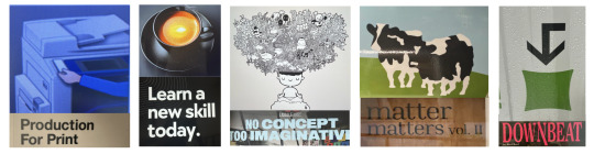
“Production for print” was an easy pairing since our photos and text happened to align in meaning. For “downbeat,” we used an image of a downward-facing arrow as it felt direct and obvious. I paired “matter matters” with the cow, thinking it made the most sense visually. However, Edmund pointed out that “no concept too imaginative” might have been a better match, and I understood his perspective, there’s room for interpretation beyond the literal.
This activity was interesting because it showed how meaning can shift depending on context and personal interpretation. I found it insightful to see how different people perceived the same image or text in completely different ways.
In relation to post-structuralism, this exercise helped me better understand how meaning is never fixed. Post-structuralism suggests that meaning is constantly shifting, depending on how we interpret signs, symbols, and language. Through this task, I realised how text and image can be reassembled to create new meanings, none of which are necessarily “right” or “wrong,” just different. It pushed me to be more open to ambiguity and reminded me that design is just as much about interpretation as it is about intention, just like Roland Barthes argued in The Death of the Author, the meaning of a work isn’t defined solely by its creator, but is shaped by the interpretation of the viewer or reader.

Reference: Interesting Literature - A Summary and Analysis of Roland Barthes’ ‘The Death of the Author’ by Dr Oliver Tearle
https://interestingliterature.com/2021/10/barthes-death-of-the-author-summary-analysis/
WORD COUNT: 258
0 notes
Text
WOII WEEK 12 | Art Ecosystems
The design communication and experiences discipline plays a big impact in shaping how we perceive the world around us. Design goes beyond just aesthetics, it helps bridge ideas with audiences in a meaningful way, making us as a designer highly influential. A few examples that highlight the impact of design include the use of infographics to present complex information in a clear and accessible way, or road signs that we encounter daily, often overlooked as “design,” yet carefully crafted by designers to convey critical information efficiently.


When visiting the design showcase, I saw work from a BA student that really stood out to me. She redesigned different Asian currencies and incorporated cultural elements into each one. It really made an impact on me, not just because it was visually appealing, but because it felt very personal how she clearly took the time to research each culture and thoughtfully bring those details into her designs. It was something I hadn’t seen before, and it really stuck with me. There are countless other examples that show just how deeply embedded and impactful the design communication discipline is in our lives. In a fast-paced society, strong design communication ensures that messages are not only seen but felt and remembered by others.
An area I hope to make an impact in is challenging conventional visuals by encouraging more open-mindedness and experimentation in design. Through our studio classes, I’ve come to appreciate how design is constantly evolving, it’s not just about making things look good, but about provoking thought and emotion. I want to create graphics that encourages people to see familiar things from a fresh perspective. Ultimately, I hope my designs can connect with others on a more emotional level, and inspire curiosity and new ways of seeing.
Reference: InkBot Design - Graphic Design’s Impact on Society by Stuart Crawford
https://inkbotdesign.com/graphic-designs-impact/
WORD COUNT: 294
0 notes
Text
WOII WEEK 11 | Postmodernism
For this class, my partner Wooju and I chose to create an advertisement poster featuring my Coach wallet. This project presented a unique challenge, as leather goods brands like Coach typically adopt a minimalist and refined aesthetic in their advertising. In contrast, the objective of this assignment was to produce a postmodernist poster, an approach that intentionally subverts conventional design norms.
We began by photographing the wallet and importing the image into Photoshop for editing. Guided by the key concepts of “Surface of a Subject,” “Play,” and “Combination,” we explored ways to reframe the object beyond its typical representation. Initially, I applied visual effects using Illustrator’s effect gallery. However, the resulting composition felt overly simplistic and failed to capture the layered, experimental essence of postmodernism.

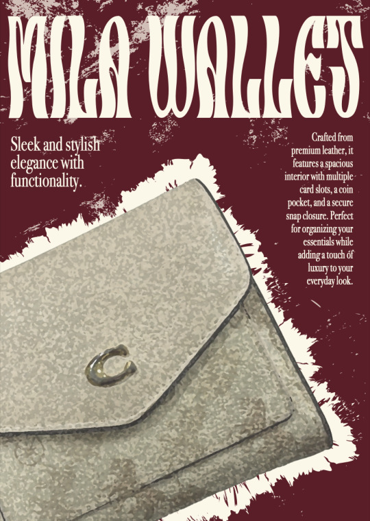
At that point, Wooju proposed incorporating a brush effect to create a dynamic border around the wallet. Building on this idea, I added various background textures and experimented with a more vibrant, unconventional color palette. We also selected a more playful and expressive typeface to further move away from the minimalistic aesthetic typically associated with luxury leather brands. These combined adjustments brought a stronger sense of visual complexity and spontaneity to the composition, ultimately aligning the poster more closely with the postmodernist aesthetic we aimed to achieve.
I believe this activity helped me step out of my comfort zone, encouraging me to think more critically and creatively about design. It pushed me to move beyond familiar approaches and explore more layered, expressive visuals using the tools and principles I’ve been taught. This experience has shown me the value of experimentation and collaboration, and I feel more confident in applying conceptual thinking to future design challenges.
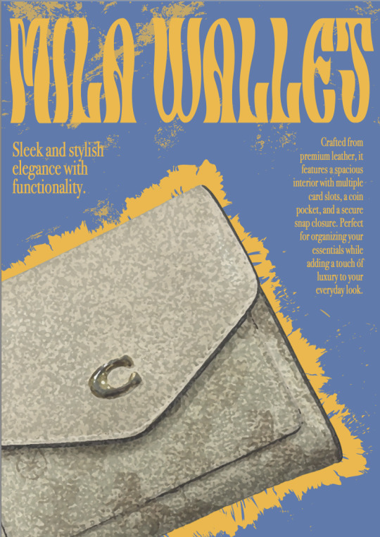
Final Outcome^
WORD COUNT: 280
0 notes
Text
CTS WEEK 10 | Compulsory Question 1

One of the key takeaways I’ve gained from the CTS module is how it fosters the development of a strong mindset—enhancing problem-solving skills, critical thinking, learning, and collaboration. Over the past few months, I've learned to cultivate a more positive attitude toward both my work and my interactions with others.
My personal favourite session was when we created a mindmap around the question "What is CTS?". It was interesting to see how everyone had a unique interpretation of critical thinking, with diverse insights and key takeaways from each individual. While working on the Lego mindmap as a group, I realised how our different strengths contributed to the overall success of the project. Chaemin excelled at drawing, while Yeonu and I took charge of the writing. By leveraging our individual strengths, we were able to successfully complete the mindmap together.
I believe one of the key benefits of working in a group is the opportunity to get to know your teammates and understand their strengths and weaknesses. What may be a challenge for me could be a strength for someone else, and vice versa, which allows us to complement each other’s skills and contribute more effectively to the group.
Another valuable aspect is learning how to collaborate with others and making connections. As designers, we often work independently, focusing on our own projects. However, I’ve come to realise that working closely with others and embracing their perspectives can provide valuable insights and inspiration. For instance, I may have a solid idea during a group project, but a teammate could offer a fresh angle or expand on it in ways I hadn’t considered.
One thing I wish I had done better is being more articulate when sharing my ideas and thoughts. I tend to hold back in group settings, often waiting for others to speak first. However, I’ve realized that I need to be more proactive and confident in sharing my own ideas, rather than waiting for the right moment to speak up.
WORD COUNT: 331
0 notes
Text
CTS WEEK 11 | Compulsory Question 2

In the various modules, I’ve applied some lessons from CTS A into my creative process. For example, during my Studio Type & Language assignment, I hit a mental block while working on the grid assignment and felt creatively drained. However, after learning about emotional intelligence and growth mindset in CTS A, I was able to refocus and push through the frustration. This mindset helped me stay productive, and I eventually came up with several layout options.

For my Animal Abstract assignment in Craft Workshop, we learned to break down images into abstract elements. I began by sketching a simple penguin face before transitioning to the pixel blocks. At first, it felt challenging to move from a recognizable image to something more abstract, but as I continued to experiment and refine my design, I learnt that this experience reinforced the idea of stepping out of my comfort zone and developing a growth mindset.

For my photography Typologies assignment, I decided to visit a goat farm, which turned out to be a really fun yet challenging experience. At first, it was difficult to capture the goats' faces in portrait shots, as they moved quickly and were hard to keep in focus. I also had a few failed attempts where the portraits were out of frame (as seen in the second image). Similar to my Time & Movement assignment where we had to play around with shutter speed and lighting, it was difficult for me to get the right camera settings for my images. Despite these challenges, I enjoyed the process and was able to select several strong images for my final submission. This experience taught me to embrace imperfections and adapt in order to achieve the results I wanted.


With some prior experience using Illustrator and Photoshop from ITE and my work, Digital Skills wasn’t entirely new to me. However, over the past three months, I’ve learned many small tips and techniques that I hadn’t encountered before. These new insights have helped me refine my skills and improve my workflow.


WORD COUNT: 305
0 notes
Text
CTS WEEK 12 | Compulsory Question 3
I would be interested in partnering with fashion students. I would like to create a styling catalog or magazine that showcases their clothing designs, to help promote their work on social media.


One example that inspires me is May Wu’s InkBlot Fashion Zine, which showcases her unique style and talent. Strong presentation is key for designers, and with the right styling and layout, it could significantly enhance their visibility and impact.
I would also be interested in working with performing arts students. I would collaborate with students to create posters that promote their performances. Effective communication is crucial in design, and this could not only enhance their audience engagement but also help showcase their talent.
A final project I want to work on is Animal Cruelty. I would create a social campaign called “hamcare”. My designs could include a series of collaterals such as infographics, posters, brochures and social media posts specifically promoting proper hamster care. I feel strongly about animal welfare, and given that hamsters are small and often overlooked pets in Singapore, owners underestimate the care they need and do not research on providing proper environments for them. This campaign would aim to raise awareness and educate the public on creating better living environments for these animals.

For example, this is a quick and simple infographic poster I created to illustrate how I would present this campaign.
SPCA is a community that I would like to work with, for the same purpose as my final project. I would design fundraising advertisements for their events, as well as create posters and brochures to support their efforts and raise awareness.

I am also interested in collaborating with Yellow Ribbon Singapore, where I could contribute by designing achievement awards for ex-offenders, as well as creating posters to advocate for the hiring of individuals with previous convictions.

I'm interested in pursuing careers in Brand Advertising and Digital Marketing, where I can leverage design and visual communication to build strong brand identities and create meaningful interactions across platforms. I believe that CTS A will be highly beneficial in developing essential skills such as collaboration, assertiveness, conflict resolution, and fostering a growth mindset. These skills are crucial for success in the professional world, whether it's maintaining a positive attitude towards failure or learning to work effectively with colleagues in the future. WORD COUNT: 330
Links: https://www.behance.net/gallery/211029891/InkBlot-A-Fashion-Design-Zine
0 notes
Text
CTS WEEK 5 | Growth Mindset

For this class, we explored the campus vicinity to capture images of store logos we often visit or products we tend to overlook. Then, in groups, we chose one logo to redesign with 15 sketches using our non-dominant hand. My group decided to IJOOZ – the orange juice vending machine we see around often. At first, I was feeling anxious and had doubts about having to sketch with my right hand as I’ve never actually tried it before. However, I surprisingly actually really enjoyed this activity. I liked how we were forced to push ourselves to create 15 logos in a limited timeframe, especially while using our non-dominant hand. I believe this experience has changed my perspective of challenges and led me to be more creative and think out of the box, allowing me to step out of my comfort zone to do what makes me uncomfortable. As we learnt in class, a growth mindset is keeping a positive attitude towards taking on challenges and trying new things.
I was only able to create 10 logo sketches for this exercise, and my approach was to incorporate oranges into the designs since it's an orange juice brand. Throughout my thought process, I focussed on exploring different ways to depict an orange while experimenting on how to integrate the word IJOOZ into the designs. I think my personal favourite sketch would be the round orange on the top right corner of the paper as it looks most appropriate as a logo, and I like how the letters fit nicely into the orange. My least favourite would be the logo with the letter I as the orange juice cup. I feel that was a failed experiment and it ended up looking odd.
WORD COUNT: 288
0 notes
Text
CTS WEEK 3 | Emotional Intelligence
From Felipe Cervera’s Video on Emotional Intelligence, I learnt that being emotionally intelligent is having the ability to understand, use, and manage one’s emotions, as well as having empathy when responding to the emotions of others. I think my greatest strength would be empathy, I am usually able to grasp how others are feeling and respond with compassion. My greatest struggle however, would be self management. As referenced in Felipe Cervera’s video, emotional intelligence is not only being able to understand another’s emotions, but also having the ability to control your own impulsive feelings and behaviours, managing emotions in healthy ways and being adaptable to change. A challenge I face is having to deal with intense emotions. When I am experiencing strong feelings, I am unable to act clearly and tend to lash out on the people around me.
For this lesson, my group had to do a skit based on a scenario, and ours was “... there’s a student whose comments about other students’ works are simply rephrasings of what the lecturer has already said.” From this scenario, my group portrayed a skit of 3 students and one teacher, and the image attached to this post is my classmate acting as the “Teacher’s Pet”, commenting on classmates’ works and mimicking a lecturer, while I was the role of the lecturer. This experience made me recognise the connection to social awareness and relationship management. The “Teacher’s Pet” in the skit had no understanding of his classmates’ perspective and was not attuned to the social environment, causing him to not have a good relationship with his peers.
WORD COUNT: 265
References: Emotional Intelligence (with Felipe Cervera) https://www.youtube.com/watch?v=_v-JVYvF4DE

0 notes
Text
CTS WEEK 2 | Collaborative Skills

For this lesson, my group decided to construct a monument based on peace and love – The Love From Astronaut. This was one of the first few groupworks we did at the beginning of the semester, and I had just met my new classmates and hadn’t warmed up to them yet. I think one of my weaknesses is not being able to speak up about my suggestions in front of a bunch of people, and worried that my ideas would not be beneficial to the group – especially when I have not gotten to know them before. However, I think my strength is being able to listen to others’ opinions and asking questions about others’ ideas first instead of insisting on my own, while also giving suggestions when necessary. An improvement I'd like to make would be to speak up and be more collaborative with my group mates in terms of providing ideas.
Our monument has 6 bars going downwards and a round platform at the bottom with a flower. To me, peace represents serene and nobility, but when doing my research about peace monuments around the world, I realised an important factor – a lot of the monuments are memorials from war and genocide. A few examples would be the Hiroshima Peace Memorial, from the remnants of destruction from the Hiroshima Bombing and the Monument Against War and Fascism and for Peace. If I had more time and an unlimited budget, I would research more on the history from around the world or Singapore, which is something I missed out on due to time constraints when making our monument. The physical and design aspects I may add for this monument would be placing real flowers at the bottom for memorial purposes, and instead of normal round bars I would maybe use some large music chimes. I would definitely also use more sturdy materials such as stone or marble.
WORD COUNT: 316
References: Research on peace monuments from The Guardian https://www.theguardian.com/culture/2015/oct/30/ten-best-peace-monuments
2 notes
·
View notes