
Don't wanna be here? Send us removal request.
Statistics
We looked inside some of the posts by leelewishnd2c and here's what we found interesting.
Average Info
Notes Per Post
6
Likes Per Post
5
Reblog Per Post
1
Reply Per Post
0
Time Between Posts
4 days
Number of Posts By Type
Text
17
Last Seen Tumblr Blogs


Fun Fact
If you dial 1-866-584-6757, you can leave an audio post for your followers.
Text
Creative Carbon (Post Production)
For my post production on the images which made up my series of 10, I kept it quite simple, boosted my whites, kept the highlights to a minimum as there was a few reflective surfaces in my images. Dropped my blacks a little. Essentially just enhanced the texture and contrast of the subjects but in a subtle way to keep it tasteful. These were consistent for all my images but with minor changes due to change of lighting.
As for my still life, It was lit using daylight so I wanted to keep it consistent, so it honestly doesn’t vary much from the image above specifically, considering they were shot in the same room. I did have the left side facing the window though which gave me the subtle dynamics which I’d desired.

In terms of my advertising board, I picked the square crop of the still life to put on the merchandise, because it was far more graphic than any of the shots I’d taken. The business card and the calendar were easier, essentially just had to drag and drop, keeping an eye on the proportions for taste.
In terms of the mug, I had to use the warp tool to curve the edges slightly to fit with the perspective of the mug. I tried a few different ways to do this, including the bloat too and puppet warp, but had to resort to youtube to find the fix as I couldn’t nail it on the first try.

0 notes
Text
Creative Carbon (Development)
I shot 254 Images at the time documenting a whole day at the tool library, so I wasn’t able to really show my selection process as there would be a around 10 or so contact sheets on this post alone. However, I have listed below the 10 images which I selected for my series and I’ll talk a little about how I got there.
Essentially there were 3 kinds of photos I could take without repeating myself too much:
Portraits of the Volunteers
Pics of volunteers working
pics of the space
I tried to get an even amount of these and so I would have a rough narrative, that the viewer could piece together what roughly goes on there through the imagery. I unfortunately did get a lot of repetition of these themes as it’s quite a small space especially considering the amount of shelves with tools on them. But having narrowed them down I’m pleased with my ratio of, volunteers, the space and the working shots. I did find it quite challenging at first as you can literally see and touch most of the space, I had to stand against the opposing walls when using the 50mm, 85mm wasn’t a viable choice so I’m glad I had my 15mm fisheye.
I chose black and white for these images as I wanted to enhance the texture in the items, not only that but the fluorescent top lighting wasn’t the best look so I wasn’t willing to keep the images in colour. Furthermore, I wanted to push the industrious idea with the tools and black and white fit that mood a lot more.

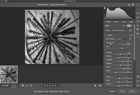
In addition to my series of images, there was also my still life which I was required to do, I walked in not knowing what I’d produce, however, knowing the tool library would have plenty material for me to create from. I then saw the drill bits which you can see on (second row, left) my contact sheet above.
There was plenty access to dust sheets and other set-building apparatus so it wasn’t a hassle to set this up, I had an idea which was inspired by a Carcass album cover when I saw the drill bits.

So this is the inspiration image, but I wanted something a little more rustic of course, so I decided to put folds in the sheet, then arrange the drill bits similarly. I also wanted to utilise a square crop, for not only this reason, but to make sure there was nothing such as the edge of the table or the wall in my shot.
With that said, find below my contact sheets for the still life:

I’ve marked in orange the problem areas for these shots as you can see there’s certain formats which doesn’t work, the portrait shows too much of the floor and not enough of the items itself, so I really had to stand up high with the 50mm to get enough space to crop a square in. As I needed a bit of give and take around the tools themselves to crop in.
See below the final image:

0 notes
Text
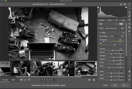
Something Told (Post Production)
So for post production on this image I mainly wanted a slightly softer painterly finish with the B&W edit, I was after a high contrast “Shaft of light” look too, so b&w was the natural choice for that.
As you can see below, I’d did some rough edits in camera raw. I did my usual high contrast work with the basic sliders in raw, then dropped both dehaze and clarity to give a little softness to the edges of the surfaces.
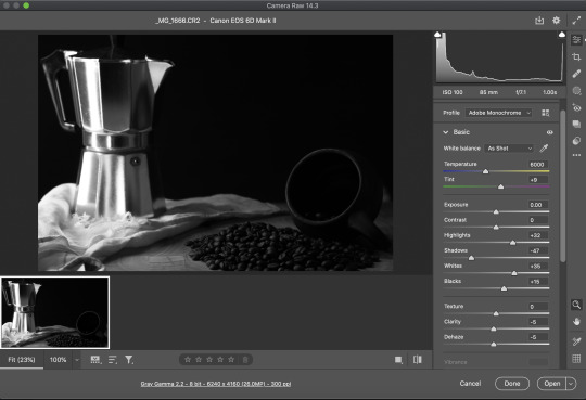
Once I’d opened the image in photoshop I was then able to apply the dodging and burning to give just enough light to the coffee beans + Cup. Then to burn around it to define a shaft of light. coming from its original source like intended. I had Caravaggio listed as one of my influences in my research as I loved his work and it’s utilisation of light sources (Both still life and other works). I personally found this to really make the photo sing and bring my vision to life.

Here is my blend mode info and brush patterns for my dodge and burn.

0 notes
Text
Something Told (Development)
For this brief I wanted to do some coffee themed still life as there were plenty substance for my story in that field. In addition to this, I have plenty of the apparatus around, since I drink it a lot.
As far as my narrative goes for this brief, I purchased a 9 cup Bialetti moka and drank its entire contents every morning without being aware that it was 9 shots of espresso. This of course made me nauseous, to which I just thought I was working out too hard. So, with this being said I wanted a dark composition which displayed two themes, one of the Bialetti being villainous in some way and the subject matter conveying Nausea.
I decided to do this by using the L composition trick. This would be easy with my idea for the composition anyways, due to my Bialetti being tall and vertical, then for my coffee cup to be in the base of the L. This was also a great vessel to have my coffee beans spilling out of, ticking the box of conveying nausea. This also paired with the correct lighting, I could then highlight the key factors of the composition which I’d like to guide the viewers eye to.


As you can see, that was achieved by having two large wooden table tops as flags which I would move to adjust the amount of light hitting the coffee cup. This worked incredibly alongside some dodging and burning, which I will cover in the post production post.
The kit I used for this was both a 50mm and 85mm prime. which I think I prefer the 85mm, for the compression of the longer focal length.

A per the contact sheet above my decision process was based on the lighting and focal length, the top left taken on a 50mm to show the composition (which I couldn’t really move closer on nor did I want to) It simply showed a little too much than I wanted and preferred the way the objects sat a little closer on the 85mm without the need for any further cropping. The only adjustments made were to level out the geometry of the shot.
0 notes
Text
Saikou Apparel (Location)
Having previously shot my studio session with neon lighting and that almost “Bladerunner” purple look. For the location sections of this brief I wanted to try my hand at something different. It would still be colour of course, but I would shoot something a little more commercial fashion, for a webstore or something similar.
I shot these on a 15mm sigma prime, Canon 6Dmkii with a Canon speedlight ontop. I believe it was a 430exii, this was used as direct flash. The location was the main glasshouse in Kelvingrove’s Botanic Gardens. Which was a first for me.

Above is the series which I’d narrowed it down to, I intend to submit all of these but may possibly cut it down as the range is a series of 6-10. The Amber ratings are for obviously very similar photos, the greens are what I feel are the stronger of the similar photos which are next to them, in addition to the possible issues caused by the direct flash (see top right) where there was an imbalance, partially due to how wide the fov is on such a short focal length.
I’m pretty happy with the product that I ended up with, it was great to shoot in botanics which was unexpected, as the original plan was to shoot on the subway. If I’m honest though I was glad to have the curveball as they turned out fantastic. I doubt I’d do much differently other than have brought a reflector or another person to assist.
See Below, my series:


2 notes
·
View notes
Text
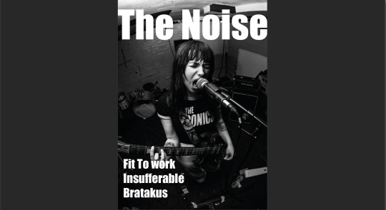
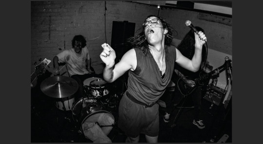
Zine (Development)
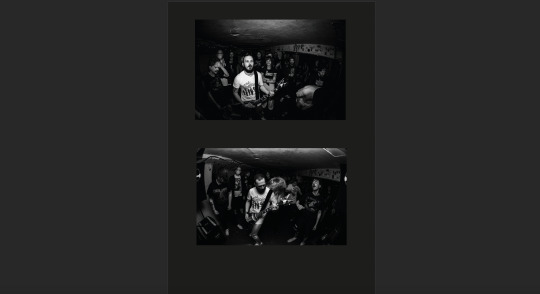
So with the previous post considered, I chose to do a music based zine. I covered all the bands on a particular lineup. I chose this gig at the 13th note which features 3 bands I was shooting that night:
Bratakus
Insufferable
Fit to work
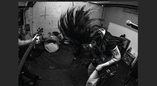
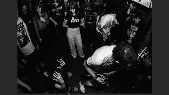
This was the perfect setting as I take photos at a large amount of gigs, so I’m already acquainted with a lot of the bands in the underground. So I had plenty possibly subjects for my zine.
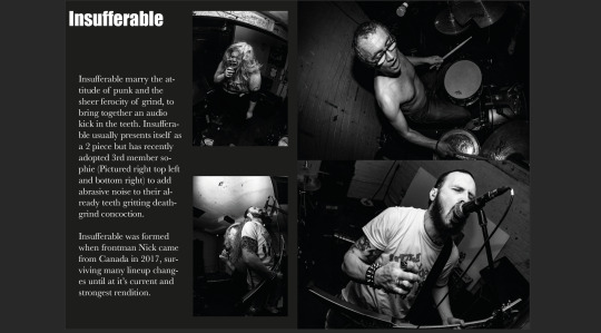
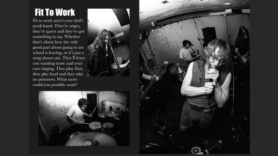
I put this together in Adobe Indesign, I found it user friendly once Alex had explained the basics to me. I wanted to follow a formula of this layout.
Front Cover
Double spread
Bio
Double spread
bio
Double Spread
Bio
Back
In terms of font, I chose Impact for the Header of each page and the front cover. I wanted something bold and chunky to not only fill up space, but to be impactful (For lack of a better term). Eye catching text with high contrast to the imagery. In terms of body text I went for Baskerville, it’s not as formal as times new roman but still retained some elegancy, for that professional finish.
All that was left was to draft up some bio’s, then overlay the text on my images. The layering was strange, as you can’t directly change the background of your canvas to black, so you have to do the text first, invert the colour, then lastly use the rectangle tool to drag it over your page. Once set, you can send it to the back, which is how I got my set up.
See below my finished Zine:

0 notes
Text
Lighting up the dark (Post Production)

For this brief I lit the scene with a large LED panel, as mentioned in my equipment list in the prior post. Here it is again just to refresh the memory:
Equipment List:
Canon 6Dmkii
Tripod
Sigma 15mm prime
Large LED panel w/ barn doors
I was able to, in turn with my longer shutter speed light a far greater area than I would have with say, a flashlight or phone torch. Which would have taken hours to be done right.
So this image consists of 14 different layers, in addition to the 2 adjustment layers which I added on to improve the image aesthetically. Justifying my use of black and white would come down to the following reasons:
I wanted to lean into the gothic aesthetic present in necropolis
I wanted to have a darkened look with the sky, being as dramatic as it is regularly paired with b&w edits such as this. (See edit below)
I wanted to bring out some contrast and enhance the texture of the stone work
lastly, the colour of the stonework when under the light was a sickly yellow and personally felt it wasn’t a good look
With that being said, in terms of the editing itself, I used selections and inverse layer masks. I used a mixture of painting with white to bring out details and 50% grey for when I liked factors of 2 different images and the pieces lit were identical (For example to merge the texture and light of 2 images, lit from different angles)
Lastly I used adjustment layers on top of the layers, very minimal contrast as the whole image features a lot of it due to how it was lit. It was essentially to even out any imbalances in the tonal range.
On top of that I made sure and darkened the sky just to make the subject pop a little more, once again evening out the tonal range of the image.


0 notes
Text
Lighting up the Dark (Development)
The development for this stage was quite simple, as I didn’t have to sort anything out in bridge, all I really had to check was if these photos were able to be overlayed on top of another. in addition to this, it also allowed me to view the separate components easily, which allowed me to take exactly what I needed for the photo.
I admittedly shot a little too much for this, but It was my intention to have options, I knew what sort of shot I was looking for but with light painting it’s quite hard to visualise something which hasn’t been created yet, or at least the finished product.
I shot firstly the sky, while it was still blue hour and then proceeded to light each of the different elements in the photo. I tried to keep an acute angle to bring out the texture in the walls, as it was pretty self explanatory that I’d be doing black and white while shooting in a graveyard. So with that in mind I shot angling the light and lighting certain elements in ways which black and white would make it shine. That and also there was a horrible yellow cast from the stone, so B&W seemed the far better choice purely from a technical standpoint
Equipment List:
Canon 6Dmkii
Tripod
Sigma 15mm prime
Large LED panel w/ barn doors


0 notes
Text
Glassware (Post Production)
The post production for this shot was simplistic, I’d nailed essentially everything in camera bar a few tweaks that I’d agreed to dodge and burn. This includes both labels on the neck and the bottle, then a further slight adjustment of the highlights on said bottle. I’d attempted to use the burn on the background to create more of a vignette effect, but I’m happy with the finish I achieved in camera. My experience in doing backgrounds like that isn’t enough to make it convincing either.
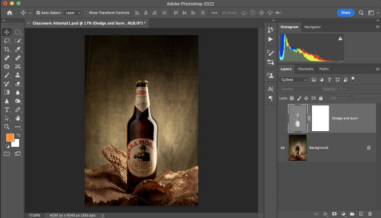


This is for reference to see the exact areas of whites and greys which I’d used to blend the effects of the dodging and burning. (See above)

This is my final image, I’m very satisfied with the finish I was able to achieve, there’s the obvious highlight on the side of the body yet the softer reflected lighting present on the left side of the bottle, there’s a warm glow which also compliments the earth tones of the composition as a whole.
1 note
·
View note
Text
Glassware (Development)
Set up 1:
I only had two sessions unfortunately as I was sick for the first session of the glassware project. So I had to really hone in on the kind of photo I wanted to produce on this brief. I love rim lighting and side highlights on my subjects, so I thought trying this reflective set up would be a great. I tried different set ups with flags and reflectors but unfortunately couldn’t get the results I’d liked with the single light set up, so I scrapped it and went back to the drawing board.
The pros of this shoot were the rim lighting and the tasteful minimalism, I wanted more light on the label and possibly some mist. However, I had to be pragmatic with the time I had and didn’t forsee the set really suiting the beer bottle. I then opted with something a little more rustic, as that set was more befitting of some whisky or vodka I feel, perhaps some male fragrance.


Set up 2:
As you can see by my lighting diagram and the picture that I snapped during set up, there is a 2 light set up, right off the bat I’d switched the barn door on the left for a snoot which gave me a far better pool of light to hit the background, separating the bottle from it.
I also attached a strip softbox to the light on the right, which then gave me the full length highlight I was after, this was then able to be reflected to cast a tasteful amount of light onto the label without having a whole other light. I feel the use of my white card was a great way to have the sense of directional light but also an even lighting all over.


These are the development shots for both sessions, which showed the stages of achieving my final shot. as you can see on the bottom they are marked red for the reasons above. They were unfortunately not working, but they did provide some lessons in reflecting and getting used to the bottle, which I was then able to apply for the shoots above it. As for shoot 2, it went anti-clockwise from the top right. So firstly I applied the backlight properly to the subject, then sorted out the side highlight the way I wanted, then, toyed with the reflector and aperture until I got the shot marked as green.

0 notes
Text
Creative Carbon (Research)
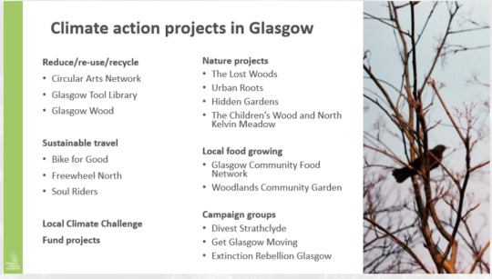
For my sustainable organisation I opted for the glasgow tool library (Shown second from the top in the reduce/re-use/recycle section). Not only did I find the idea of such a place great, but thought it was a great opportunity to have lots of different items to work with in the one place. In addition to the tool library I also emailed Glasgow Wood, but unfortunately never heard back from them.
checking the website I was able to see they’d formed 5 years ago in 2017, in addition, through a phone call with the owner prior to the shoot I was able to gain some more background info. It’s ran by a man named Gary and was founded by him and his wife a few years ago. They’ve gotten into a small space on Maryhill Road, but were running it out of a shipping container prior.
However, the service operates much like a library would, there’s many shelves of second-hand tools which can be booked out via their systems and paid for as you go. In addition to this service, they also offer a yearly subscription of around £20 and you can essentially have up to 10 tools at a time at no cost, provided you bring them back of course.
The main ethos of this place is bringing the community together, through the sharing of these tools. There are a few volunteers which I will no doubt be introduced to during my stay, who help keep the place running in addition to Chris.
Sources:
https://glasgowtoollibrary.com/info/
0 notes
Text
Zine Project (Research)
Zine’s and Magazines are often synonymous with one another, but they do differ. Magazines are produced via publishing companies, whether that be for fashion, music or lifestyle. Zines on the other hand are almost always DIY either produced by say, a band or other music related body, photographers, or political groups.
Being involved in the underground music scene for a lot of punk and metal bands, I wanted to produce something which showcased images which I took in my free time, as I really enjoy working at gigs. The style of photography lends itself well to the style of zine I would be replicating.
I wanted to have a simplistic design with the same vibes as the grunge zines of the 90′s, but with the lettering of a more minimalistic magazine such as Kerrang! I wanted a more bold lettering, with simplistic contents of the zine, without too much noise or graphic design since my abilities in the latter are lacking. I essentially wanted the photos to take the focus. I’ve included some pics of Kerrang! below in addition to some grunge zine’s from the 90s.


In terms of it’s origin, the technology of the 70s and the popularisation of “copy shops” allowed the masses to produce zines far easier at a fraction of the cost of professional printers. This was then adopted through the 70s and 80s by the Punk scenes of London, New York and LA, zines such as slash and the UK’s Sniffin’ Glue covered bands such as The Clash, The Ramones and Joy Division. It was an inexpensive way to get the word out about something you were passionate of. The Aesthetic was gritty and bold, the methods were DIY and it allowed those who were passionate of the genre to interview those who would go onto become big names in the genre before hitting their fame.
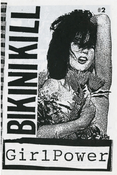
Zines were popularised again in the 90s with the Riot Grrl movement, it served as an alternative to the male saturated punk scene. It encouraged young girls to go out and start their own band, make their own zine and have their own voices heard. It was not only a genre of music, but a feminist movement too.
Bands which composed this movement were: Bikini Kill, Heavens to Betsy, Bratmobile, L7 and Sleater-Kinney. Often the members of these bands put out their own zines, Bikini Killer put one out under their own name, Tobi Vail in the same band had her own popular zine under the name of Jigsaw. Both Bitch and Bust both started out as Riot Grrrl adjacent zine’s in the 90s and have further flourished into their own Magazines.

Sources:
https://blog.flipsnack.com/what-is-a-zine/#:~:text=While%20magazines%20are%20often%20produced,bold%2C%20strong%2C%20revolutionary%20ideas.
https://www.mentalfloss.com/article/88911/brief-history-zines
3 notes
·
View notes
Text
Glassware (Research)

Photographer: Marco Mazzini
I lifted this image from Marco Mazzini’s page, he seems to dabble in a few genres, commercial being one of them. I liked this image due to the sense of texture which is present in beer advertisements, in addition to my intention photograph this as my chosen subject. I’m also aware from my knowledge of photography up until this point that this is more than likely a composite due to the fine details present which couldn’t (without great stress) be achieved so easily in-camera.
I feel like in this picture alone there’s plenty to talk about, I briefly touched on the sense of texture, but due to the beers brown hue it is complimented by muted greens and adjacent earth tones, it also is a nice touch to add ingredients in like hops and such. The tree bark just adds some nice dynamics to the already wood heavy composition.
In terms of the glassware itself, a popular technique with bottles is to have the highlights stretching the length of the bottle, the photographer has most likely taken the shot with 2 strip lights due to their similarities. It seems he has done the same with the chalice but with bigger softboxes, that or either the same strip lights but the light is reacting with the glass in a way to give the illusion of a bigger source.

Photographer: Marco Mazzini
Another technique is having it on a reflective surface or to have a sheet of clear plastic placed over the base of the set, under the subject. This is something I intend to explore too, which paired with the highlights will most likely yield an incredible result! The only drawback which i will take into account is that it doesn’t lend itself to a complicated set and it excels when there’s a singular subject, hence why the photographer has misted the bottle to add something compelling to the viewers eye.
Sources:
https://www.marco-mazzini.com/portfolio.html
0 notes
Text
Graded Unit (Inspirations)
Instagram
Apart from the fashion photographers which I draw influence from, there are a few contemporary photographers which helped refine my concept. The idea of the dialogue the models and I had, making the way into the images via text was brought about by a few I found through my searches of instagram, personally taking part in their projects for some.
@Geloyconception

California based artist Geloy Conception operates through the mantra of #thingsyouwantedtosaybutneverdid, taking the medium of portraits and turning it into a project which is very profound. He works in a way where it can be done remotely, via a google forms you can submit a note and answer a few other questions. Further, the note will follow the photographer to search personally through his archives for a picture which fits and then go through the process of making the photo anonymous, it looks like he writes down the note on his own choice of paper and then using masking, puts the note into the image.
This was the main influence for my project, in terms of the layout. I’d have the text that I had the models write down on the shoot overlaid on the image, although instead of anonymity I’d display the images with the model’s answers, in addition to their face and the content of the answers themselves, it’d also be in their handwriting. I feel this adds a sense of intimacy to the work, a level of trust and also far more personality than just having an interview style zine.
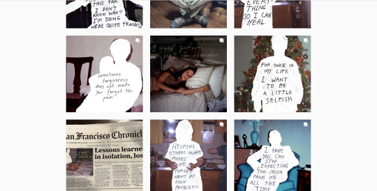
@tofeelhealed

Greg Hall is a mental health and illness content creator, he has been shooting his mental health project prolifically, since following him for a couple of years on my own instagram I finally got involved as the 127th person to be involved in his project. He will soon be having an exhibition for his work in Edinburgh, in late May.
His process is location based much like my own, which made it appeal to me right away. He does a number of shots in said locations, often chatting away to the models with some coffee, then forwarding the questions after the shoot to reply. Once the answers are given he then puts together the shots in a collage format, placing the text over them on his instagram stories, then further in the text of his instagram post.
He keeps things short and sweet asking only 2 questions:
“What does mental health mean to you?”
“Why is it important to look after yourself emotionally, like we do physically?”
This creates a really interesting insight into the subject’s headspace. Especially in a climate where it is becoming less and less taboo to be open about mental illness and speaking up about it. The format and the questions paired with Geloyconception’s method of overlaying the text is what inspired my concept of asking models questions, then overlaying answers on the images themselves.
Sources:
https://linktr.ee/geloyconcepcion
https://www.instagram.com/geloyconcepcion/?hl=en
https://www.instagram.com/tofeelhealed/
https://www.greghall.photography/contact
0 notes
Text
Something told
Research (4)
Rembrandt Van Rjin

Rembrandt Van Rjin, a painter most synonymous with the lighting style which creates a sense of drama in the face. Often from 45 degrees or more, creating shadows and often pools of light on the face. He isn’t well known for his still life work but it is undeniable that they are gorgeous.
Rembrandt (1606-1669), also from the golden age and is considered one of, if not the most important visual artist in dutch history. He was born the son of a miller in the town of Leiden, his family earned enough to live comfortably and Rembrandt was able to attend the latin school in Leiden in his adolescence. Further he was then able to attend university in the same town, which was unusual for a miller’s son at the time.
Rembrandt however, did not adjust well to the academic life and dropped out shortly after starting. Further, he didn’t follow the advice given to most young artists at the time and didn’t travel to study art in Italy first, he remained in his native land as he felt there was plenty to learn. Due to the protestant reformation, the church was hard on artists as they didn’t provide grant funding for artists for religious works as they used to, Rembrandt had to then focus on getting commissions privately. This is most likely a contributing factor for him being so prolific in portraiture, rather than works such as Caravaggio.

In terms of the imagery of this piece, there is a lot which lends itself to the theme of wealth. Peacock was an expensive and mostly a rich man’s food which was turned into pies, the rich colours within the peacock’s feathers subtly hint towards this too.
In addition to the former, the imagery of dead birds in a work are a little more literal in their symbolism of death. This is often paired with other elements in a painting, a lot of the still life’s which represent the death of christ through various items contain dead birds strewn through its composition. Albeit this piece seems to strip it back for it’s simplicity, I can also appreciate the addition of a human figure in the background, which can be cause for debate in whether it makes it a still life or not.
I also love the softness which Rembrandt has to his brush strokes, there’s something so smooth about the finish of his work, which is adopted more in his later years, however preserves the sense of realism in the image. In addition to this, there is a lovely warm glow which works well with the techniques.
Sources:
https://www.nationalgallery.org.uk/artists/rembrandt
0 notes
Text
Something Told
Research (3)
Rachel Ruysch
1664-1750
Rachel Ruysch is a Dutch painter, born in The Hague. Ruysch’s Father was a Botanist, physician and anatomist, which most likely what inspired Ruysch’s very botanical subject matter in addition to the style which she had pioneered. Ruysch became the first female artist in the artist society, present in The Hague, working there from 1701-1708. Further, Ruysch went on to become court painter for the Elector Palatine, Johan Willem in Düsseldorf.
Ruysch’s inspiration (as per 1680) was a painter named Otto Marseus Van Schrieck, who painted dark fauna and flora with various wildlife detail. When looking at work of both knowing this, it is blatant how much Ruysch was inspired by this man.

This is the painting by Van Schriek

And this is the painting by Ruysch, it is very similar in terms of lighting which both seem to adopt a low key approach. Ruysch’s work seems far more crisp in detail, less of an almost pastel tone yet you can see from the layout and shape to the lighting where the inspirations have come from.
Analysis
I’ve selected these two paintings of Ruysch’s due to the parallels between her and Van Shriek’s work, low key lighting, both flora and fauna with various prompts from the code which is often in still life, dutch especially. Most notably however, is the addition of the insects, which seems to be a heavy lift from Van Shrieks work, almost a nod to it. In addition to placing it in a nature scene, in the case of the second image.
It can be assumed that because Ruysch was part of the Dutch movement in still life, that there is a code of sorts when observing elements within the composition. Firstly, in the first image there is both a bee and a butterfly, the former has been known to represent that which is industrious or to represent our struggles against destiny. Further there is also a butterfly present, in both of the images, this is usually representative of the resurrection of christ and there is also further some ants on the white flower which I’d missed initially. This also represents hard work similarly to the bees, whether this is all code or just simply a nod to van Shrieks work I’m unsure but I adore the aesthetics of each, there is a softer quality of light unlike Caravaggio’s work.


Sources:
https://www.nationalgallery.org.uk/artists/rachel-ruysch
https://www.sothebys.com/en/buy/auction/2019/old-masters/otto-marseus-van-schrieck-still-life-with-flowers
https://www.toledomuseum.org/about/news/mar-4-art-minute-rachel-ruysch-flower-still-life
0 notes
Text
Something Told
Research (2)
Caravaggio (Michelangelo Merisi)
Caravaggio is known for his unique brand of chiaroscuro and religious works, the harsh contrast in his work being utilised to highlight chosen details by the painter which he desires the viewer to be drawn to. Whether that’s a gesture, a limb or the facial expression of a figure, he is known for this process of creating harsh light sources.
He is also known for his somewhat troubled life, spending the later parts of his life on the run from justice due to murder. A notoriously hot blooded individual who’s crimes of violent assault and murder followed him as he creates most of his great works on the run.
However, we will be focusing on the content of his still life work rather than his dramatic religious work, impressive as it may be. Further, there is still evidence stylistically that it is Caravaggio who created it, from the subject matter to the signature lighting present.
Analysis
Especially in the first image, yet not unlike the second. There is a strong contrast present which draws the viewers eyes to certain elements in the composition, Caravaggio naturally has a great grasp of representing light which is present in his more well-known works. This light helps carry the viewers eye towards the composition, which if you simplify the work is essentially an “L” composition, of the vase on the left which trails right along the fruit.
In terms of the symbolism, There’s lots of imagery which suggests fertility, life and boldness. I feel like there are some sexual undertones in the work, due to the burst open and ripened fruit appearing so much in the works, across both of these images.
The second image especially in this case, there’s peaches, pomegranates and all of the little signs of a “Good health and Fertility” theme. Everything is ripe and full of life. In addition to the subject matter, the lighting is gorgeous, whether it was really golden hour or perhaps simulated as such, it looks incredible.


Sources:
https://www.britannica.com/biography/Caravaggio
https://fineartamerica.com/featured/still-life-with-flowers-and-fruit-by-master-of-the-hartford-still-life-caravaggio.html
https://www.messynessychic.com/2019/04/05/the-secret-language-of-still-lifes/
0 notes