
A different approach to all things Mid American Conference
Don't wanna be here? Send us removal request.
Statistics
We looked inside some of the posts by lightscameramaction and here's what we found interesting.
Average Info
Notes Per Post
1
Likes Per Post
1
Reblog Per Post
0
Reply Per Post
0
Time Between Posts
19 days
Number of Posts By Type
Text
1
Photo
12
Last Seen Tumblr Blogs


Fun Fact
The total number of visits Tumblr.com received during January 2021 is 327 million.
Text
Top 10 Toledo Rockets plays of the decade (2010-2019)
With a few honorable mentions listed as well, these are my top 10 plays of the decade arranged by moment, rarity and pure amazement.
(HM): In 2013 Alonzo Russell makes a tremendous one handed catch sporting the short lived grey uniforms vs. CMU in Mount Pleasant.
https://www.youtube.com/watch?v=EYVLLyhFVEA
(HM): In 2016, Toledo tries a two point conversion down 51-52 at BYU. Logan Woodside drops the snap, but finds his trusty TE Michael Roberts in the endzone. The raw emotion is captured by Roberts, as the crowd goes silent and he yells in excitement. If the outcome were different, this play would crack my top 5.
https://www.youtube.com/watch?v=EbCBFCNwG-g 6:53
(HM): In 2019 the Rockets got BYU at home, and this play features an interception late in the game by Kahlil Robinson, returned to the one yard line. The roar of the crowd after Toledo climbed back in is a feeling I want to relive over and over again.
https://www.youtube.com/watch?v=9qwN-uiqXlA 1:35
(10): In 2015 Toledo played #21 Temple in the Boca Raton Bowl. Corey Jones played an exceptional game, and was extremely slippery in this TD catch and run.
https://www.youtube.com/watch?v=P5y24dbkk08 0:41
(9): In 2015 there were lots of big moments against very good teams. The team down south had one of their best teams in their history, and this play was the first from scrimmage on the defensive side of the bowl. Toledo native Cheatham Norrils with the tip INT.
https://www.youtube.com/watch?v=B4gpIr8M96w 0:12
(8): In 2014 Toledo sported “Glass City” uniforms on a cold weekend night vs. their rival BGSU. Kareem Hunt had his longest run as a Rocket this night for a 92 yrd TD, which proved to be the difference in the game.
https://www.youtube.com/watch?v=xIat8mEwq 0:35
(7): In 2011 Toledo opened with a brutal schedule facing Ohio State, Boise State, and Syracuse out of conference. This 67 yard TD vs. Ohio State put the country on notice when Eric page took this screen the distance to go up 15-7 at the Horseshoe.
https://www.youtube.com/watch?v=EPCfnkrviH8 2:58
(6): In 2013 Toledo defeated many bowl teams including Navy in a 2OT thriller at the Glass Bowl. Future NFL OLB Jayrone Elliott made some noise with this strip 6 take back on that rainy Saturday.
https://www.youtube.com/watch?v=5fvGgW4gMLA 0:26
(5): In 2011 Toledo’s amazing offensive season was capped by a Military Bowl appearance vs. Air Force. The defense had lots of takeaways in 2011, and this may be the biggest of all. Jermaine Robinson’s first mention on this list was a familiar site during his playing days at UT.
https://www.youtube.com/watch?v=zPbqtW0vMAY 1:40
(4): In 2012 Toledo hosted then Big East member #19 Cincinnati on a Friday night in the Glass Bowl. The game featured all defensive and Special Teams points for the Rockets that day. UC QB Munchie Legaux will not forget this play as Jermaine Robinson zig zags his way into the endzone after the coverage INT.
https://www.youtube.com/watch?v=0jZYuBqIBWg 1:09
(3): In 2013 Toledo found themselves in another dogfight with the team down South. The eventual MAC Champions didn’t get over their recent struggles with Toledo though, and this TD late in the game by Alonzo Russell was the difference.
https://www.youtube.com/watch?v=Z6sFVFq1xmU 3:06:51
(2): In 2017 Toledo found themselves down by 21 points in the first half to AAC member Tulsa. Lots of things had to happen for the Rockets to comeback, but this PAT block and run back by Josh Teachey was the most spectacular thing of the night. Saturday nights in the Glass Bowl is where magic happens...
https://www.youtube.com/watch?v=tEZ5fzxrkLA 6:30
(1): In 2018 Toledo recorded one of the top College Football plays of the decade. This seemingly impossible punt block was the talk of the country for one whole week. Cody Thompson...take it away!
https://www.youtube.com/watch?v=zm_8v8Q_xEs
0 notes
Photo
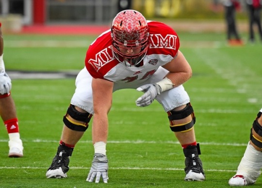
These jerseys are an every game worn jersey so it might take the cake for the worst uniforms in the conference despite it’s MAC Fashion Don’ts rating of 8/12. Miami does a good job at looking Ivy league, but football is one of the few places that looking Ivy league doesn’t help you much. This odd form of branding takes away from a long history of successful and notable Miami football teams.The edgy Block M on a white helmet was a MAC staple along with the Block M of Marshall, the BG falcon thing, and “Toledo” script with the Rocket above it. The Redhawks helmet seen above has every digit of pi. and the entire articles of confederation on it. To each smarty pants is their own I guess. Shoulder pad branding has not yet caught on, and I won’t hold my breath that it does. Miami should go back to what was working in 2003. A large quarterback, born in a school, who allegedly did things in a bar, while not wearing a helmet.
0 notes
Photo
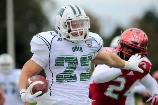
Ohio has a snazzy recognizable brand in the MAC. For these to be the worst uniforms they’ve had, isn’t too shabby. This jersey series was created for their “Battle of the Brick’s” game with Miami. Personally I think the numbers look like that reflective foil cardboard you put in your 1996 Mazda Miata to keep the leather from burning your ass when you get back in. Something aerospace related perhaps? I sort of see the bricks in the numbers, but do you know what I like to see in the numbers? Numbers. Let’s remember that these are Russel jerseys, and this jersey is still above the threshold most would assume Russel has for their few remaining sponsored schools. 3/12 on the MAC Fashion Don’ts (12/12 is the ugliest)
0 notes
Photo
These Northern Illinois uniforms are, wait for it....Corny.
AF
For a team with an awesome, visible sports brand, this idea was a ye ol’ swing and a miss. Dekalb is apparently known for corn... So is all of the Mid-West. This jersey idea was a half stolen page from Nebraska’s book. NIU did have the last laugh though as the Huskies took down the Cornhuskers a few years later. NIU also blew out Presbyterian during this game 55-3. You can’t blame NIU for doing inventive things to get their fans out of Chicago and into Huskie Stadium. Maybe scheduling the Blue Hose in the first place was the real issue.
I hate the red pants with these uniforms. I hate the Gold outline of the Huskie. I hate that the Huskie is the primary logo on the helmet, and not the one with the “NIU” inscription underneath. I hate pretty much everything about these! Especially because NIU doesn’t need to spruce up a top notch color combination and mascot. Fool me once shame on you. And it’s only been once...so shame on you! 12/12 MAC Fashion Don’t EVER FRICKIN EVER WEAR CORN ON YOUR STUPID UGLY JERSEYS. (12/12 is the ugliest)
0 notes
Photo
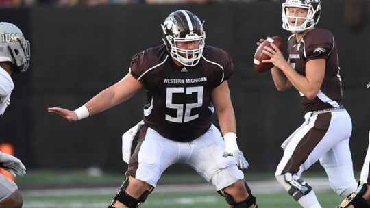
The Western Michigan Bronco’s! Hail the Brown, and White, and Gold, and Yellow, and Black, and Silver, and Vegas Gold, and Oars, and... WMU has done a lot of changing over the years. From mediocrity, to 1-11, to the Cotton Bowl and back to mediocrity once again. These jerseys are very bland. That typeface is garbage. Especially because WMU embraces the Western typeface that connects them with you know, the West. The Broncos sported some super ugly jerseys during the end of the Fleck years but those teams were so good that I won’t dis the woodland camouflage or oars on the shoulders. When I look at the jerseys above I think of a Russel athletic or Asics designed practice uniform. The helmet logo itself is one of the best designed in all of FBS. It’s big, mean, and unique to WMU. Besides those other ones who play in Boise. The helmet helps these save face and the MAC Fashion Don’t score for these brown things is a 6/12. (12/12 is the ugliest)
0 notes
Photo
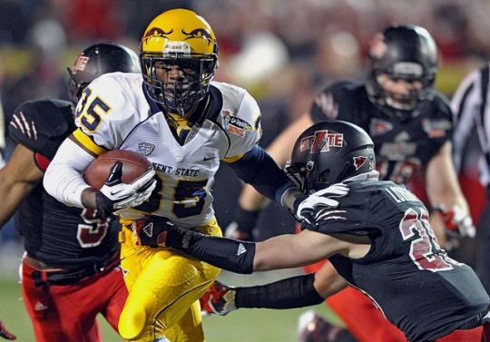
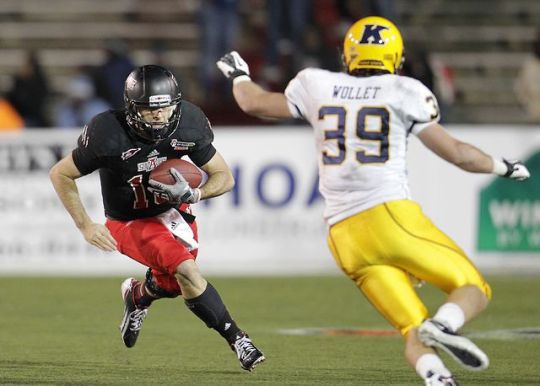
Two photo’s are included in this edition of MAC Fashion Don’ts so every reader could see the Kent State “block K”, which was supposed to only be seen by Arkansas State defenders as the Golden Flashes were scampering into the end-zone. To be fair neither team scored a bunch as the Red Wolves won this consolation game 17-13 in the 2013 GoDaddy.com Bowl. I say consolation game half seriously because I doubt Kent State really wanted a piece of Florida State in the Orange Bowl.
Let’s start with the helmets. There’s a mustache on the front? No...Two Egyptian Tortoises kissing? No...eyes? Those are frickin eyes!? Could have fooled me! The Golden Flashes gold color is already an eyesore so this was the last thing they needed to do on a national stage. You had one chance Kent State! It’s been a while since KSU has gone to a bowl game. Most likely because whatever demon animal’s eyes those are condemned them to the deepest depths of the MAC East. 10/12 Mustache score. (12/12 is the ugliest)
0 notes
Photo
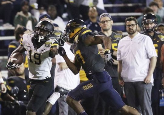
It’s tough to see here, but that’s a Toledo player chasing another Appalachian State player into the end-zone. What’s also tough to see is that those jersey tops are grey and the pants are midnight blue. How hard is it to pick a home jersey combination with 4 or 5 solid jersey colors? Also, just because you have lots of jerseys doesn’t mean you have to match all of them together once per year...ESPECIALLY IN A BOWL GAME! Those faded helmets have since become a relic and really only shined twice when the helmets were paired with a gold jersey top that they were supposed to fade in to. I never understood why the Rocket on the side of the helmet wasn’t colored in either? I’m a fan of the team and get confused who is playing half of the time. Toledo had some style issues with Nike in the first two years since going away from Under Armour. In 2019 the Rockets will break out a new style. Fingers crossed that this abomination of matching is put in the past, and this MAC Fashion Don’t score sits at a blistering 11/12. (12/12 is the ugliest)
0 notes
Photo
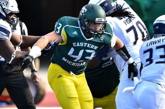
I was actually watching Eastern Michigan when they wore these and I had to turn it off because it looked like highlighters running around on a black and white printed photograph. The motivation behind these uniforms is unknown to me. Plenty of bad jerseys are created to pay homage to a historical team or city attribute. The EMU Huron’s primary colors were also green and white though so this color swatch should have been avoided at all costs. Since the grey field was put in Rynearson Stadium, EMU has ran with the Grey Diamond Plated look. Metallic Green has been an excellent accent to it and has become a staple for the Eagles. In another list the new jersey style will be featured in a not so negative way. That doesn’t take away from this pitiful attempt at being an alarm clock? That block E is also extra small. Probably so you keep the eye on the huge numbers located between the direction and the State in which the Eagles fly. 7/12 for originality on the MAC Fashion Don’t list. (12/12 is the ugliest)
0 notes
Photo

Do you remember this WNBA looking logo and jersey style for the Buffalo Bulls? The jerseys are a 2005 combination of the Indianapolis Colts and the Minnesota Vikings. I’ve never been a fan of helmets with variations of horns coming out of them. This logo choice was one of the first debacles the Bulls have had in an ever-changing brand war. From a “UB” logo that looks like Kentucky’s “UK,” to using “State University of New York at Buffalo,” to the outline of a symmetrical bull that looks best fit for a leather biker jacket. Let’s just say UB is finally finding their swag. The new color scheme is unique to only Buffalo in FBS, and their clean combo’s have been doing their job bringing in recruits. Now they need to scrap the track around their field so their fans can see those clean combinations through the November MACtion Blizzards. I don’t have much else to say about these as they score a 4/12 on the MAC Fashion Don’t List. (12/12 is the ugliest)
0 notes
Photo
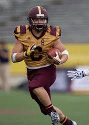
Central Michigan is home to the Chippewas, but in the case of this 2013 mid-season squad, the “C’s!” Honey mustard and Sweet Baby Rays barbecue sauce may be a delicious cracker topper, but advertising on the fronts of jerseys is more of a soccer thing in my opinion. I don’t blame CMU for mixing it up and using a 1940′s jersey throwback or whatever, but yikes! Antonio Brown must have been giving Steelers trade secrets to the Chips for this one. CMU does not have very good looking uniforms in the first place...more of a ketchup and mustard condiment combo though. To add insult to injury, CMU got dusted wearing these uniforms and Toledo’s Alonzo Russel posterized a CMU defensive back for an ESPN Top 10 one handed grab. I do think the Chippewas need more innovation in their uniform department. Since this monstrosity, black uniforms have been featured and I think it’s a step in the right direction. Sorry Mount Pleasanter’s, you just don’t have a lot to work with, and for that you get a MAC Fashion Don’t score of 9/12. (12/12 is the ugliest)
0 notes
Photo
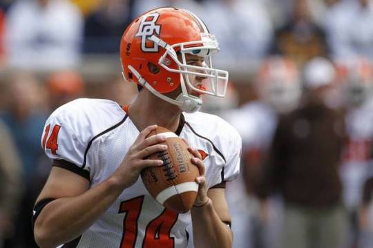
Up next is Bowling Green State University, known for the some of the ugliest colors in college football! So ugly in fact that the Cleveland Browns borrowed their colors and didn’t give them back on the count of shit being their franchises theme for the next 70+ years. This MAC Fashion Don’t isn’t as bad as it could be. I mean, Wyoming might have worse colors, right? BGSU has had a plethora of eye sore uniforms, but I don’t think it’s because of the style. The jersey above was chosen because the helmets seen there were a prototype re-brand for all of the University’s sports teams. They used to feature a pretty cool falcon looking thing pre 2006ish. The “BG” script seen above eventually evolved into having a falcon head peaking out of it. That jersey top itself is just kind of boring. Lately the Falcons have been using a metallic finish to their brown and orange lids. The jersey style changes every few years to have a new version of stripes, feathers, or patches on the shoulders. Overall I don’t think these uniforms were a mistake, but making the best out of a bad...very bad situation. 5/12 (12/12 is the ugliest)
0 notes
Photo
If I am going to rip on Ball State it might as well be from their spectacular 2008 season where they started off 12-0, were upset in the MAC Championship game, then lost their head coach before getting destroyed by Tulsa in their bowl game... Ball State’s uniforms really have not changed a ton in the past few decades. They’ve been associated with Nike for a while now and kind of stay under the radar in the college football world. My biggest criticism with Ball State’s uniforms is that the school chose to be red and named the cardinals. But after that? They are fine. The Robo-Cardinal is pretty unique compared to most cardinals in the sports world, and their jersey combinations make sense with the schools nickname and color scheme. Ball State tends to use a “Ball State” typeface now on black or red lids which is, well, fine? There isn’t a lot more I have to say besides, these are my least hated uniforms in the MAC Fashion Don’ts Series. 1/12 (12/12 is the ugliest)
0 notes
Photo
This uniform from the late 2000′s and early 2010′s takes the cake for the worst Zips uniform in recent memory. It’s actually not nearly as bad as some of the others on this list, but com’on? It looks like a ripped tank top that you only wear to Planet Fitness. Possibly a cut off that you wear to your buddy’s lake to show off some side ab. The helmet design was rather smashed together so a casual fan would have a tough time figuring out who was even playing. On the contrary the letters and number style were larger than life, so the old folks in the rubber bowl could read them.
Akron has improved its branding since, and sport some shiny gold lids as well as matte navy ones with the “z” featured on them. Overall I give these uni’s a score of 2/12 on the MAC Fashion Don’t scale.... (12/12 is the ugliest)
1 note
·
View note