
Don't wanna be here? Send us removal request.
Statistics
We looked inside some of the posts by lilydhphotography and here's what we found interesting.
Average Info
Notes Per Post
0
Likes Per Post
0
Reblog Per Post
0
Reply Per Post
0
Time Between Posts
2 days
Number of Posts By Type
Text
17
Last Seen Tumblr Blogs


Fun Fact
When “GIF” was named word of the year in 2012, Oxford Dictionaries U.S.A. credited Tumblr for pushing the word.
Text
Was an insightful article on Ellen Von Unwerth and her work and includes some examples of fantastic photography she has done in the past.
0 notes
Text

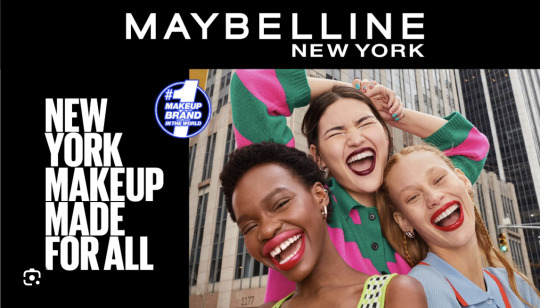
Here are some other examples of eye shadow advertising that use very bold colours and I love what the artist has done with the blending and shimmer. I looked to these images at times while going through the creative process and wanted my eye shadow campaign's makeup to stand out nearly as much as this.
I reached out to a couple of people who could do makeup, but unfortunately couldn't get them to help me out due to their own lives being very busy. In the future, I would like to expand my connections further and reach out to even more people, and maybe even go to a makeup school. I thought about doing this, but then ran out of time and felt a bit nervous asking people to commit their time to a project that largely consisted of me learning throughout the process and not always knowing what I was doing half the time.
I attempted to apply the makeup myself and experimented with blending and bold colours. I didn't want the makeup to be applied badly or look scary due to my limited knowledge/skillset in this area so this caused me to play it a little safe at times and perhaps limited my overall outcome.
0 notes
Text


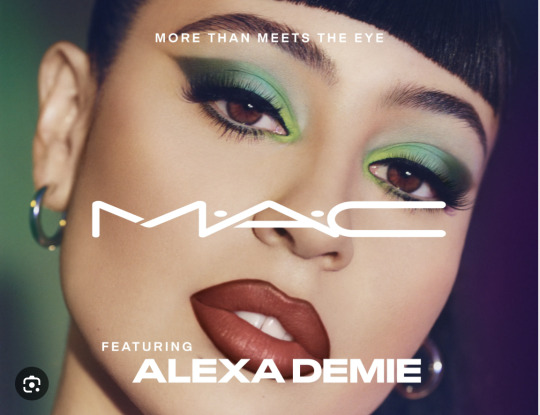
Although Maybelline is a makeup brand that has clearly been guilty of monoculturalism in the past, things have changed a lot. I was captured by these three makeup campaigns and inspired by their take on fashion/commercial photography. Not only is there imagery a lot more diverse, but their language has become very inclusive also, using the "for all" at the end of the tagline in the top image. The contrast between the above set of images and the last Maybelline series from the 50s/60s is unreal an it is evident that the world of beauty is moving in the right direction.
I wish I had tried a few more of these crazy and fun eyeshadow looks for my project. This would have allowed for my idea and concept to be expressed and developed further.
0 notes
Text


I have been doing some research on eye shadow campaigns from the past and have discovered that American advertisements are extremely monocultural and are very westernised. Old makeup campaigns appear to embody racism, sexism and are extremely non-diverse. This is something I wanted to avoid with my project. Maybelline has certainly been guilty of all of this, as clearly seen in the images above.
0 notes
Text
New title idea
After doing some thinking, I thought I would change my campaign name to "Sugar." Part of the reason for this is that I like the look of the macaroons as well and if the title doesn't specifically have the word candy in it, then it allows for me to have more freedom with my visual choices. I still like the concept of eye candy so I thought I would include that in my small copy which would accompany the title, "Eye candy for all. Find your colour." Or something along those lines. Eye candy is just used to describe something an individual is drawn to, so I feel using it somewhere in my copy is still valid.
0 notes
Text

Here are some mock ups of experimentation where I have tried to combine the eyeshadow and the sweet things. These are more spelled out visuals that summarise my idea and message. I will keep playing with these ideas and see what else I can come up with, but so far I feel they get my idea across pretty well.
0 notes
Text
Stop motion/animation is something I have never tried before so I have absolutely no idea how to do it. This is the only way I knew how ti get my idea across, but I thought it would be cool to make a moving image version of my makeup palette where the eye shadow circles changed colour. Ideally the colours would be pastel to tie in well with my other chosen colours throughout the campaign. I would also want the lollipops to go round and round swirling around. I think this would be a cool way to show the idea of "finding your colour" and self exploration through the use of makeup and colour. This would be something I would love to try for this assignment, but if I cannot work it out in time, definitely in the future.
0 notes
Text


Here are my top pics from the series. My next goal is to edit them and play around with copy ideas to help advertise the made up eye shadow brand.
0 notes
Text

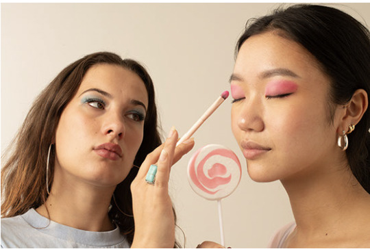
Here is my recent week 10 shoot. A while ago we had a chat about applying the eyeshadow to exactly match the lollipops so this is what I wanted to attempt in these photos. I went and brought these blue and pink lollipops from look sharp and thought it would be cool to have one model all in pink and the other all in blue to get across the idea of "finding your colour." I also thought it would be good for my campaign to have some variation and not only consist of images with one model as a lot of fashion shoots have multiple models to create dynamics, levels and new shapes.
0 notes
Text
Week 10 - blurb
This body of work explores self expression and captures the power that eye shadow can have on an individual. It's called "icandy." The title plays on how when a person sees another person they find attractive, they can be described as "icandy." The eyes are usually the first feature we are drawn to on another person, so the title icandy taps into this as well. Candy is also associated with childhood and youth. This use of the word "candy" in the title, is intending to tap into the idea of reminding teenagers and young adults to never loose sight of their creativity and playful side. This campaign is meant to be fun and remind young adults to keep having fun with their self expression and not to let adulthood and the responsibilities that come along with it, completely consume them.
0 notes
Text
Week 10 - working titles
Eye Candy
icandy
ikandi
ikandy
icandi
eyecandi
0 notes
Text
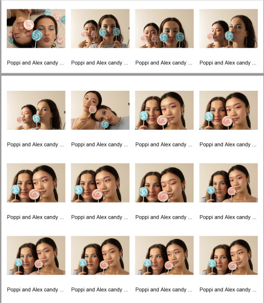
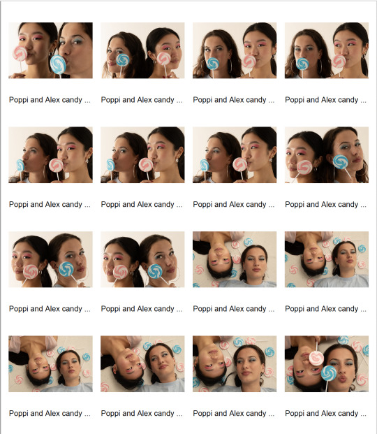
Week 10 - Hero Images
I still am unsure which images I like best, but this hasn't really changed from last week. I did another shoot yesterday, but haven't had a chance to look at the images, go through and select yet.
But so far these are my favourites that I feel work together either as a set or just on their own.


I need to look through my new images and play around with these in terms of editing and layout - that is my next goal. I am still not 100% set on the layout of these, but I think they are the strongest as of yet.
0 notes
Text
Week 10 - Skills
list the key photographic technical skills you wanted to improve with this campaign/project
Creating a cohesive campaign through imagery
Studio lighting and portraiture
Using selected props to curate a visual story
Create an aesthetic and professional, but also fun and playful set of images
2. comment on your progress: what have you specifically learned or improved this semester?
Directing people in the studio is something I have never done before so that was a really good challenge for me
Choosing the right lighting set ups for my objective which I am still struggling to do, but feel I understand it a lot more
Creating set ups and working out where to position things best in order to achieve the best outcome
3. next steps: what else do you need to learn or do?
How to photoshop everything in an effective and professional way in order for all the images to work as a set
Get better at selecting final images and just making a decision on this
0 notes
Text


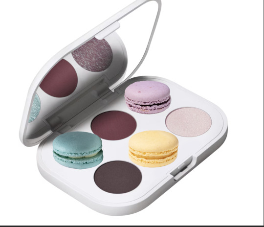
Here is some Pinterest inspiration behind my work. The macarons was where my idea began and then the more I researched my idea and concept, I came across these lollipop ones which helped me find my way. I originally thought of Chupa Chups before doing any research and then became inspired by these big lollipops, as I think they photograph well and really get across my concept in an effective way.
0 notes
Text


I have been playing around with some logos ideas for my eye candy campaign. I thought about having the logo placed somewhere separately on the image, but then just thought that looked messy and out of place so tried incorporating the eye into the letter and just attempted to make it into a lollipop and felt this was the most effective. I also feel this modern font looks more effective with the I'm sticking to this for now.
0 notes
Text
Week 9 - best images so far


The first set I temperature corrected and the next set I haven't yet, but I feel these ones were the strongest. I'm not sure if they all work together as a set though, I'm still trying to decide how best to get my idea across.
0 notes
Text

I have been trying to work out what kinds of images to include in my campaign set. Obviously it is en eye shadow campaign so it will mostly consist of faces, eyes and the candy. I was wondering if I could have a few that were of the makeup products themselves (more still life) like above, but heavily photoshopped in a fun way.
I don't really think this image above (obviously incomplete) gets my idea across in a strong enough way and is maybe too confusing with the macarons, but I liked the idea of turning the candy into makeup or the makeup into candy, which was why on one of my image drafts, I used the circular eye shadow from a makeup palette to be the lollipops and I wanted to tap more into this idea in some way.
0 notes