
Yapping all the time about ZeldaFather of Young Link he is my CHILDAbsolutely in love with Ravio
Don't wanna be here? Send us removal request.
Statistics
We looked inside some of the posts by link-to-the-random and here's what we found interesting.
Average Info
Notes Per Post
948K
Likes Per Post
404K
Reblog Per Post
538K
Reply Per Post
365
Time Between Posts
8 hours
Number of Posts By Type
Text
16
Note
1
Last Seen Tumblr Blogs


Fun Fact
28.6 is the average number of monthly visits per US mobile user.
Text
Thoughts time! Southeast Basement Part 2
Sky’s dialogue at the end was quite interesting. He wasn’t afraid to joke around a little after Twilight got hit. He didn’t panic either, he just asked “you alright?” and accepted Twilight’s response without question. Sky’s smile makes it clear that he is not genuinely concerned for Twi’s safety, since he knows Twi is fine.


The others, especially Time and Legend, are a lot more protective:


You know that phenomenon where if a baby trips and falls and the parent freaks out, the baby will start crying even if they’re fine? But if the parent stays calm, the baby will also calm down?
More evidence for why Sky and Twi get along so well. Sky knows when to be serious and when it’s okay to relax. And I think he’s indirectly influencing Twi in that way, just like in the baby and parent situation.
okay that was my main point, a little extra stuff under the cut!
ALBW armos? maybe? It’s my best guess, and since typing this, I’m pretty confident in it.

and finally, it looks like all that goron wrestling paid off :)


166 notes
·
View notes
Text


South East Basement 2
<<Previous Next>> (coming soon)
ComicArchive / About / Linktree
3K notes
·
View notes
Text

I'm not sure if I told the story here or not, but if I did, you guys are getting it again!
I saw Shrek 2 in theaters a few months back when everything started to reopen at a tiny local movie theater, and these kids came in, and it was their first time seeing the movie, which was adorable.
Now I wouldn’t have known that except for when human Shrek came on the screen, they all went: AHHH WHERE’S SHREK/WHERE DID SHREK GO???
34 notes
·
View notes
Text
Never got tagged but who cares, right?
Ok I love them ALL but if I had to rate it...
Legend (He is my boy, my heart, my love. Super hot))
Time (He's my favorite adult baby brother)
Wild (Love his games and his cloak)
Four (I love Minish Cap and its one of my favorite games!! He's also a smol boy)
Sky (He is my favorite sleepy boi. Looks very much hug shaped)
Hyrule (Hes a big softie and sooo cuteeee)
Twilight (Stronk boy.)
Wars (Literally perfect (in looks))
Wind (My favorite gremlin (besides Wild)
No pressure tags: @hyruledwarriorr, @mirensiart, @smilesrobotlover, @matcha-squid
Gonna try and start a tag game, so let's go!
We've all got our favorite Links, but I wanna know how ALL the LU Links rank for you.
I'll start! And just to note, I've only played Sky, Wild, and Twilight's games so far.
1. Sky- My favorite Link, though his game is my second favorite
2. Wild- Second favorite Link, but his games are my favorite
3. Warriors- Haven't played his games, but @crazylittlejester has made him one of my top three
4. Time- Gives big Dad vibes, he's just trying to keep his children out of trouble
5. Twilight- Absolutely the big brother
6. Legend- Not as bitter as I often see him portrayed. He's just a (older) kid whose been through a lot
7. Hyrule- Played his games a LONG time ago, never made it past the first dungeon. I don't really have much to say about him though
8. Wind- Cute kid, I like him but don't have much to day about him either
9. Four- I unfortunately don't know anything about him beyond LU, sorry Four!
Tagging:
@skyloftian-nutcase @crazylittlejester @skyward-floored @sprite-and-the-bunnydragons and anyone else is welcome to join as well!
157 notes
·
View notes
Text
WHY DO I LOVE THIS SO MUCH
(@technicallya1manband @tortilla-of-courage @sky-squido)
in reference to the chain fic
just realized that when Ravio returns home to find the door gone and multiple items missing from Legend’s house, it’s going to look like some one robbed the place
3K notes
·
View notes
Text
Literally nobody asked, but I really like the idea that Hyrule was the first of the chain to be brought into the whole adventure.
I know a lot of people hc that Wild is the last to join the group, and my brain adores the symmetry of having Hyrule be the first link in the chain. Because his game was the first released and Wilds game is the last.
3K notes
·
View notes
Text


Every Zelda has a favorite Link, excluding their own. Sun’s is Wild.
< Prev | 30 | Next >
Masterpost
1K notes
·
View notes
Text
85K notes
·
View notes
Text
Oh fuck I'm gonna be in trouble soon, arent I?
tell me on anon what you'd never tell me off anon
342K notes
·
View notes
Text
Why is that so real
the group chat when i ask whos available to hang out next week
274K notes
·
View notes
Text
You know what’s some crazy $hit?
This fabulous bitch
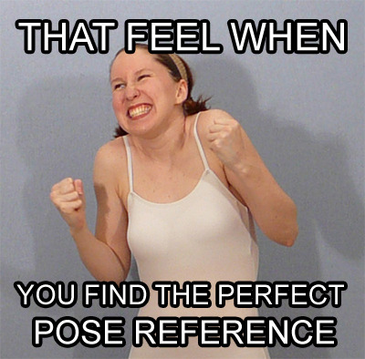
She makes a shit ton of poses (like 16,000 or some crazy nonsense). I used this lovely lady to draw so much as a teen. Whether it was some nerdy pose for my Mary Sue as fuck OCs
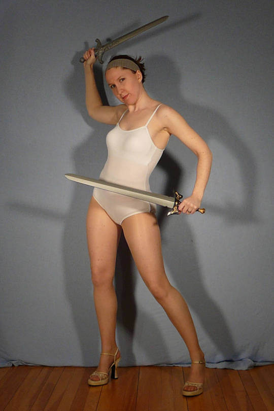
or for full on fight sequences
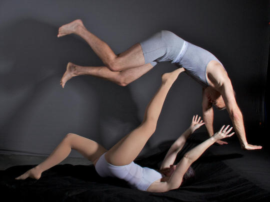
or for tragic deaths of my OCs in the arms of a totally OOC main protagonist.
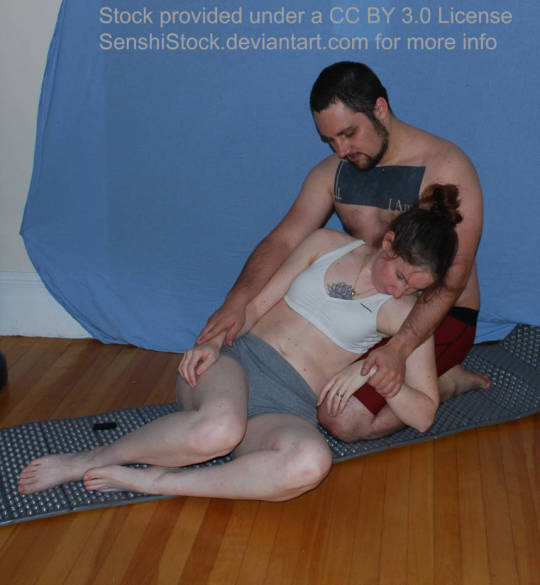
this bitch hooked me up.
And with the wildest, craziest stuff that you could see in your head but had no way or resources to reasonably draw like
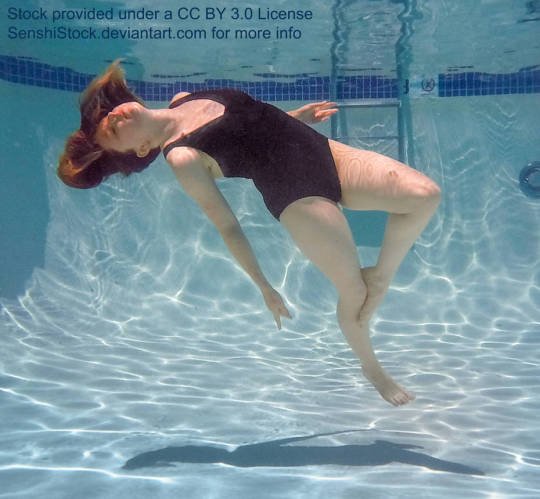
or this
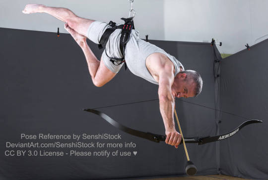
or this
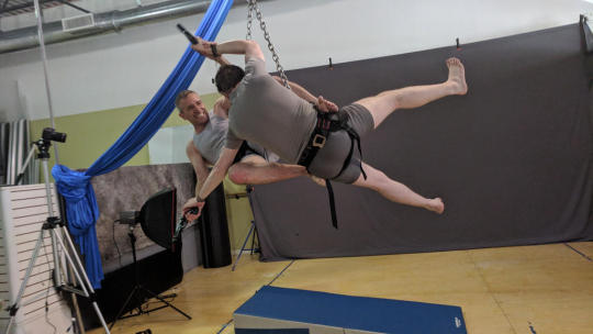
DUDE! INASNE SHIT!! So I was using her for a pose reference and decided, you know what, I owe this bitch some cash. Lemme dole it out for her. BUT then, I looked and saw she only has 286 fucking patrons!! This chick gives out free shit and spends countless hours arranging these shoots and setting this stuff up.
I’ll fork up the cash, SenshiStock. You’re worth it.
Check out this amazing woman’s stuff, and get knowledged: https://www.deviantart.com/senshistock
231K notes
·
View notes
Text

girls with short hair & guys with long hair >>>>>>>>>>>>>>
706 notes
·
View notes
Text
Well damn.
There's no power in my house
I miss light
We're using a single candle for illuminance
Help
306 notes
·
View notes
Note
...what do you mean again???
holy FUCK i mean fuck mr beast but i interpreted him as a concept rather than as a person again and called him "it" (i mean it/its is a valid set of pronouns but as far as i know he only uses he/him pronouns)
Mr Beast is Satan
132 notes
·
View notes
Text
Yeah right, we've all been framed! I didn't run away 6 times. @little-apricot-orchard didn't steal a BMW.
"you tried to eat a stapler?" GOD FORBID I have an iron-rich snack
2K notes
·
View notes
Text
A BASIC GUIDE TO DIGITAL ART ON PROCREATE
okay so i joined the digital art scene about a year or so ago and it has been a total whirl! there’s so much stuff that’s so confusing and hard to understand at first. And that’s okay! A stupid amount of what constitutes as “good” or “complex” art is to do with layers, patience and experience.
and because literally every tutorial on here is for Paint Tool Sai i thought it might be useful for those of us using Procreate! because i don’t have sai and i have a relatively shit laptop by comparison to my Ipad.
so without further ado - here is how to make a KICKASS piece of art on procreate
1. REFERENCE + SKETCH
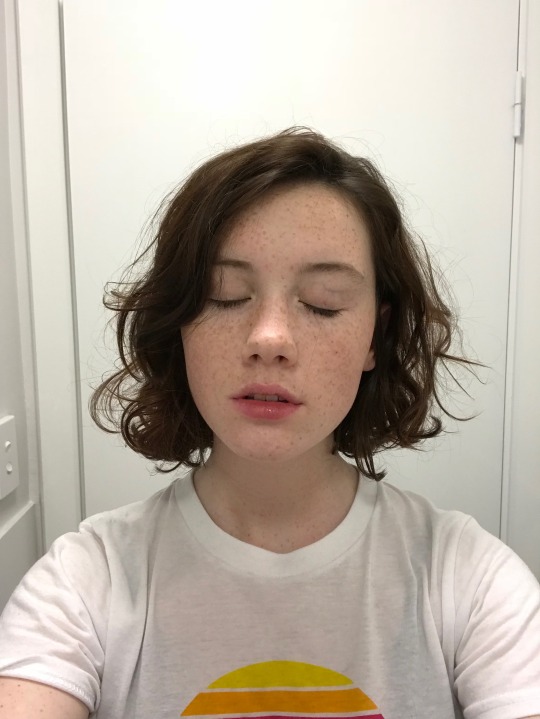
the first thing you’re gonna wanna do is collect any references you need for thing youre tryna make. you can collect references by finding stock images, using other artists work (i use these mostly for colour refs cause i SUCK at finding good colours). however when i make art nowdays i usually just snap a selfie and use that. for this work i did the last option (see below)
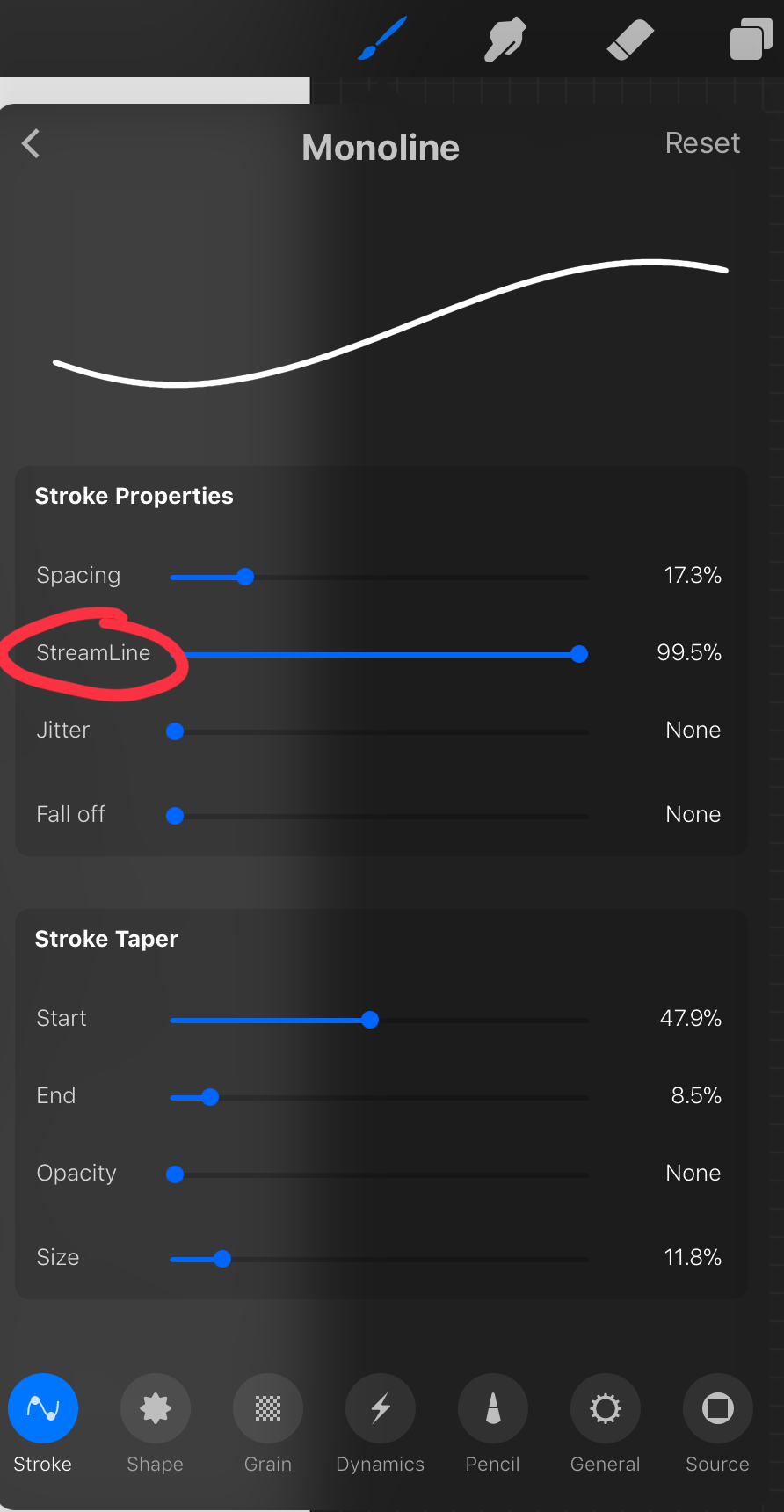
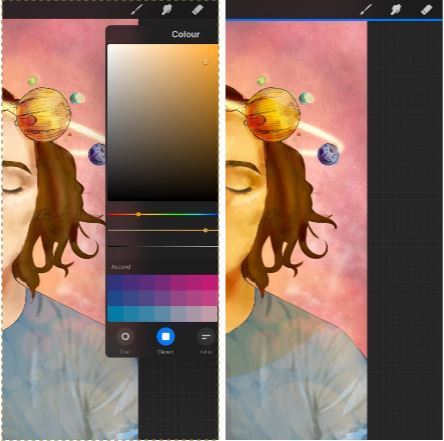
after grabbing my reference i decide on the style i wanna use. for beginer artists what i suggest doing is just pasting the image onto your canvas, opening layers and adjust the opacity to around 20% by clicking on the little N on your layer with the photo. then once thats done add a new layer by clicking the + and work over that
for more experienced artists experimenting with style just stick that bad bitch reference in the corner, then open a new layer and sketch in your own style.
when it comes to sketching i usually do little flicky lines. i do this with a mid grey (like 50% white 50% black) i recommend the “Narinder pencil” which you can find by clicking the little brush at the top, selecting sketching and then selecting that bad boy. you can adjust size and opacity using the sliders to the side of the screen.
when sketching you just wanna get a rough idea of where you’re gonna do your eventual lines - don’t worry about it being smooth or anything just get down where everything goes
once you’re done you might have something like this:
this brings us too…
2. LINE ART
for beginners - lineart is just a sexy word that means a clean drawing with hard lines so you can colour it easier and it looks prettier. you want to do this on a new layer so you can delete the sketch one later.
your goal with lineart is to make it three things: 1) its gotta be seamless so you can select the insides, don’t leave little gaps between lines 2) its gotta be smooth! jagged lineart isn’t NEARLY as sexy as smooth curvy lines 3) this one is more of a tip - but lineart generally looks better if you do thinner lines inside your shape with a slightly thicker border line. again this isn’t essential but i find it looks cuter
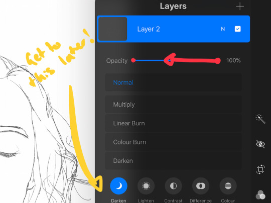
the way i get my lineart all cute is by using the monoline brush (found in calligraphy). sometimes i use my own modified version of the Technical Pen (found in Inking) but mostly monoline is pretty neat. You can use whatever brush you want but mostly you just wanna ensure that its nice and smoooooth. you can do this by selecting the brush and then clicking it again. this will bring up a popup menu like this:
most of these brush settings are complicated and stupid and i’ll do a big post about it later. the only one that really matters here is streamline. if you wanna use a different brush for lineart just wack that slider up between 80-100% and you’re set.
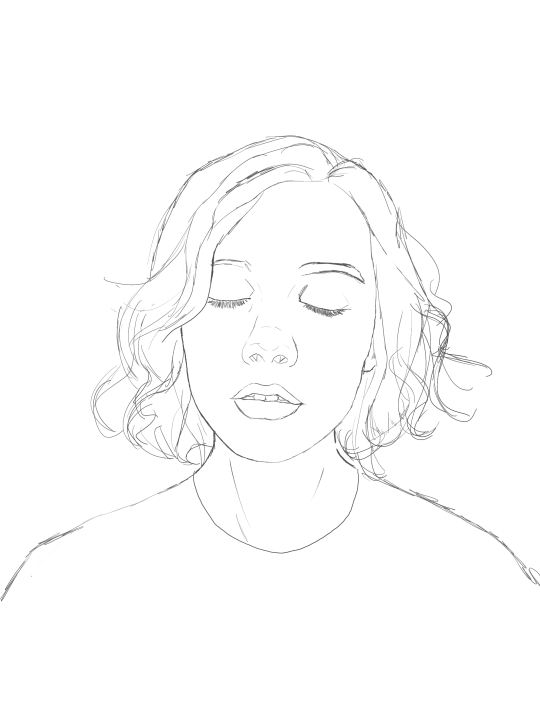
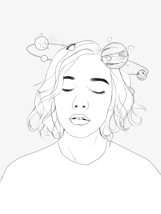
once your lineart is finished on a seperate layer go to your layer menu and unselect the little tick on your sketch layer. you should be left with something like this.

3. ADDITIONAL DETAIL LINEART + MONOCHROME BASES.
once your focus lineart is done you can add detailed lineart by repeating the same process with sketching and lineart i described above. i like to do details separate because if i dont like it i can just delete the whole layer without destroying my focus.
what i find important in these now is using my favourite fuckin tool in this whole program. you can find it here:
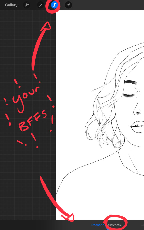
Only start using this once youre 100% done with your lineart. once thats done - make sure youre on the lineart layer and click that weird little s at the top of the screen. go to the bottom and click automatic. then select somewhere INSIDE your lineart. it should do something like this:
don’t freak out! what that blue stuff means is that you’ve just selected the inside bit of your lineart. continue selecting until your subject is 100% coloured in.
MAKE SURE THE BACKGROUND/STUFF OUTSIDE YOUR LINEART ISN’T SELECTED. ALSO MAKE SURE YOU’VE SELECTED THE LINES THEMSELVES. THEY WILL TURN WHITE ONCE THEYRE SELECTED. if u fuck up and select something by accident that’s all g, theres a little undo button on the bottom. if you click on the paint brush or another tool and you cant add stuff to your selection you can reload the mask by holding down on the weird s and the selection will reload. If there are certain bits of your work that you’re struggling to select with automatic selection that’s also not an issue. just click the “freehand” setting next to the automatic setting on the bottom and you can now use your stylus to draw around what you want to select.
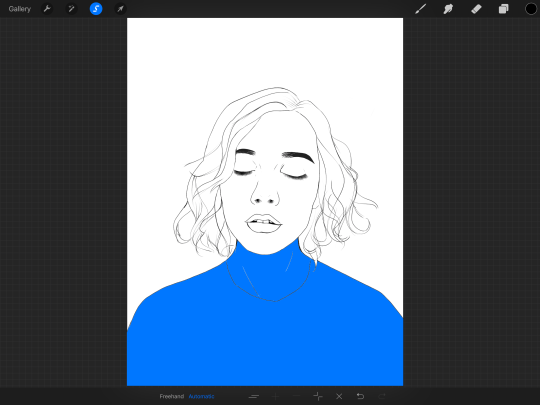
once you’ve selected your foreground in its entirety - THEN click the layer button. insert a new layer underneath your lineart layer. Using literally any brush (works best if you get one from the painting section) colour EVERYTHING white. just get round brush and colour all of it. you wanna keep your line art layer separate over the top.
once all of it is coloured hold down on the weird s tool until it reloads the selection. then look along the bottom of the screen and click the little button that looks like 2 arrows pointing at each other. THIS INVERTS YOUR SELECTION. Open a new layer and make this entire thing a grey. THIS IS WHOLE STEP IS OPTIONAL BUT ITS SUPER USEFUL AND THE SELECTION TOOL IS SUPER HELPFUL FOR GOOD ART. DOING THIS WILL BE SUPER USEFUL WHEN YOU COLOUR STUFF LATER.
once you’re done it should look something like this:
4. BASE COLOURS
okay so this is where shit starts to get real. The goal of putting down base colours is to make is easier to add eventual shading to your piece and decide your colour scheme. This is where the white layer you just used is gonna become your BITCH.
you wanna start by duplicating your white layer you just made. You do that by opening your layer menu and swiping that thot to the left. this is what should happen:
click duplicate. Select the top duplicate you just made and select our favourite weird s tool. click inside your shape and the whole white shape should go blue (become selected). next, open a new layer on top of the white layer. colour in your base colours and now none of it can go outside the lines. you didn’t even have to do a billion selections. you just select inside the white blob on the layer we made the step before, opened a new layer and started colouring. fucking superb. so much time saved. DO YOU KNOW HOW MUCH I USED TO SUFFER BEFORE I THOUGHT OF THIS. HOW LONG I SPENT SELECTING AND RESELECTING I CANNOT
A TIP FOR PEEPS NEW TO THIS PROGRAM - if you use your finger and hold down on a colour you’ve just used it acts like an eyedropper tool so you can pick up any colour you want. like this:

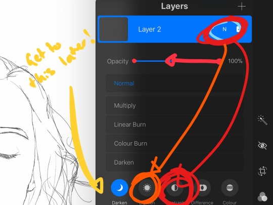
once you got your base colours done you can either: 1) go to your grey layer you made in the last step and select the tick next to it. once you’ve done that scroll to the bottom of your layers and select background. it will open a colour wheel. pick your background colour. 2) you can use my second favourite tool from this program! go to your grey layer you made in the previous step. click on it, then click on it again. (not the little n just click the whole layer) this menu should pop up:

oh MAN okay so. “alpha lock” pretty much means that it locks whatever is on the layer. when you get another brush and go over a layer with alpha lock turned on you can only paint over what you have previously put on the layer before turning on alpha lock. Its like automatically selecting everything on the layer. its fucking brilliant. anyway. scribble over your grey layer (once alpha lock is on) and boom you have a base for your background.
NOW YOU KNOW ABOUT ALPHA LOCK YOU GO BACK TO YOUR LINEART LAYER. SELECT ALPHA LOCK. COLOUR IN YOUR LINES ROUGHLY 2 OR SO ISH SHADES DEEPER THEN YOUR BASE COLOURS
(minus eyes i like to keep the lines around them black.) this will make your art like 100000000 times nicer (majority of the time)
once you’re done you should get something like this:
this brings up to…
5. SHADING!!!!!!! this is my favourite step tbh.
what you wanna do is chuck on a new layer over the top of your base colours. and go into your brushes. pick up your basic bitch “round brush.” this is (in my opinion) the best painting brush in the program. Its the thing you can do the most with. so what you wanna do it get a slightly deeper colour from your colour wheel by yeeting your colour selection slightly more saturated and slightly more dark. dont just make it blacker move your colour selector on a diagonal to get a nicer colour. (i’ll eventually do a colour theory ref but today is NOT that day.)
i like to do colouring in short, light strokes. DON’T PRESS TOO HARD. you wanna get that cute little gradient.
A THING FOR BABY ARTISTS: on every art program i have ever used, the blending tool SUCKS. it makes paintings UGLY AF. (wow another tutorial i have to do at some point. i HATE the blending tool. SO HERE IS HOW I COLOUR MY ART TO MAKE IT LOOK, YKNOW, GOOD:
Unless you’re drawing something SUPER freaking smooth like a bubble or some shit. when you wanna blend colours what you gotta do is: 1) put in your darker colour. 2) use your finger to bring up the eyedropper tool to select a mid colour of the colours your blending together - a mix between your lighter and darker colour. (remember that tool? it looks like this)

3) Paint the colour you just made in the middle of your lighter and darker shades. REPEAT THIS PROCESS ON EITHER SIDE OF THE COLOUR YOU JUST PUT DOWN TILL IT LOOKS GOOD. The result is an WAY sexier piece of art.
once you’ve put in all your shadows repeat the same process with highlights.
FUN TIP: if you decide you dislike a colour or want to change the colour you already did all the shading for you can change the colour without any major drama. You can do this by select ing the colour on your colour wheel you would like to change your already shaded work too. (make sure you’re on the right layer.) then hold down on the colour dot on the top bar (next to your layer settings) and drag it to whatever you want recoloured. let go of the dot and it should recolour your work (including all the shading you’ve done granted that its on the same layer) like this:
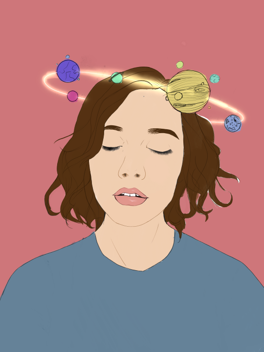
once you’ve got all your shading done it should look something like this:

6. background and pretty bits
so! youve got this kickass work but nothing surrounding it. lets fix that.
In procreate there is SO MUCH you can use to spice up a work. a SCARY amount even. this is when layer settings are gonna start to come in handy.
ill do a masterpost on procreate brushes for backgrounds later, but for this piece what im gonna do it head over to the Luminescence section and pick up a “nebula brush”. this makes a complex galaxy kinda design in a randomised stamping pattern that is frankly SEXY AS ALL HELL. Select a layer below your base colours but above your background colour. IMPORTANT NOTE: this brush’s blend mode is autimatically set to “add” (ILL DO ANOTHER POST ON THAT LATER)which means if you go over the same spot heaps of times it will eventually go a bright white. This can be nice, but its not really what i want cause its kinda intense. to make this thing go glowy but not ~too~ glowy im gonna lower the brush opacity (the bottom slider) to around half way. i set my colour to a light yellow and a darkish pink and put in some nebulas!!!! once that was done I wantd to add some more colour variation so i popped open a new layer - selected the lightleak tool and lowered the brush opacity using the slider to around 20% just to spice some shit up
you can kinda do whatever you want for your background. sometimes its nicer just to go into artistic, select a random brush and draw a square underneath what you were doing. backgrounds can be super detailed or super easy it doesn’t really matter to be 100% honest.
THE PART 2 OF THIS STEP WILL ADD HEAPS OF DIMENSION TO YOUR WORK AND MAKE IT SUPER PRETTY: adding light effects over the TOP of your main subject often creates a more realistic sense of depth. In simple terms it just makes the thing look more 3D and nice. to do this, get a random brush with a nice (preferably light) colour. i picked up a “bokeh brush” from the Luminescence section. make this pretty big. sprinkle your brush across the page on a NEW LAYER above all of your work so far, including line art! Then open your layer menu and click that little n in the corner again. Remember this one:
click the little n. then go down to the bottom and select a layer setting from either of the 2 groups circled (i normally like overlay for this type of thing) you can mess around with layer settings and opacity till you find something that looks super nice. My piece now looks like this:

pretty cool right. now we’re gonna make it EVEN COOLER.
7. LIGHT FILTERS
this is something i picked up from artists like softmushie and cryptidw00rm. (not gonna @ them here cause they probs dont wanna get tagged in my shitty tutorial thing but yeah i owe so much to those two especially)
for those unsure of what im talking about: light filters are layers you add over work to make the lighting on it seem more natural and pretty. you do this by colouring over your natural highlights and shadows with different colours and then messing with the layer settings to make it seem like its being hit by sunlight. these layers go BELOW your foreground stuff (the bokeh lights from step 6) but ABOVE your lineart.
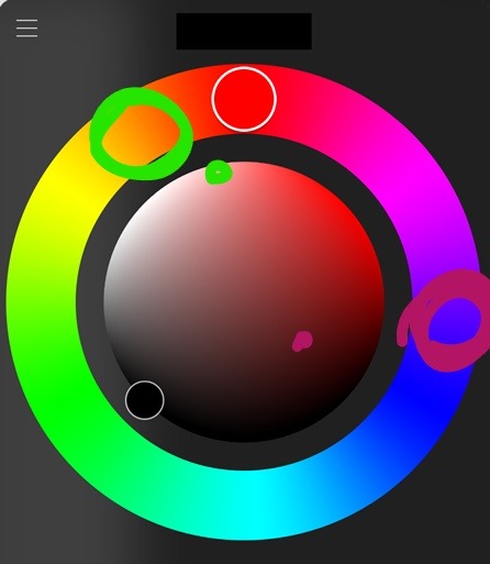
start by opening a new layer. select a colour similar to where the green outlines are here:
now on this layer paint over anywhere where the sun or other light source would be normally hitting (like cheekbones hair etc.) this can be kind of like shading. dont worry if it looks shit at first we’re gonna change it.
open a new layer beneath the one you just made. Using a colour similar to one circled in purple above colour over all the shadows in a piece. it should now look like this:
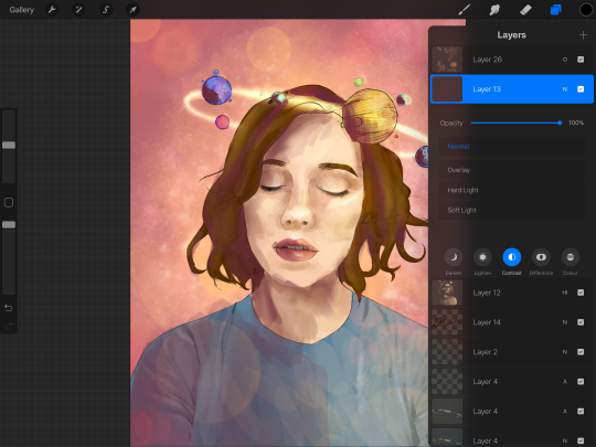
now open your layer settings on the purple/darker layer by selecting the N like we did with the foreground layer before. you can play around from here by setting the layer mode to anything from the “darken” or “contrast” menu. For this work i chose overlay. I then lowered the opacity until it looked nice.
Repeat the step above with the lighter highlight layer. when adjusting this one make sure you set the layer mode to anything from the “lighten” or “contrast” menu. For this work i did hard light.
your peice should now look kind of like this:

AND YOU’RE DONE!!!!!!!!
look at that sexy thing you just did. Congrats on creating an awesome peice of art!!!!!!
if you guys are interested in more tutorials like these or have any reqs for similar stuff send me a question or a dm to my blog @plasticbattleaxe
if you create anything by following tutorial that you want me to see don’t hesitate to tag me or submit it to my blog!!! i love seeing y’all make art
also - i know it’s annoying - but reblogs > likes. thanks for your support
i hope someone finds this useful!!!!!
1K notes
·
View notes