Don't wanna be here? Send us removal request.
Statistics
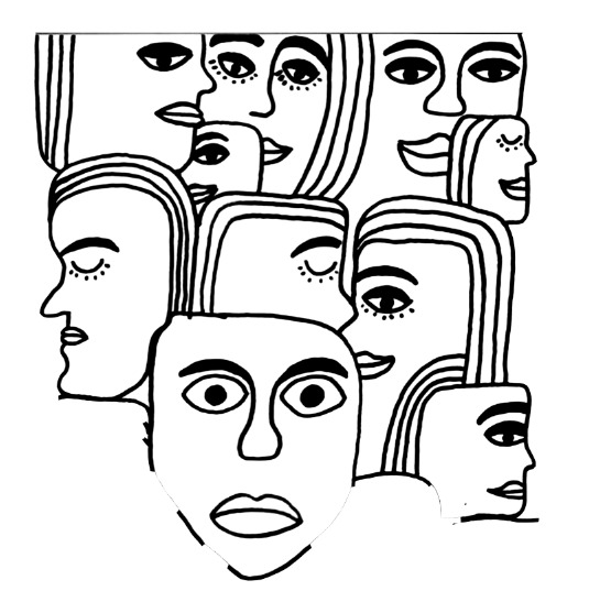
We looked inside some of the posts by lmterm1project and here's what we found interesting.
Average Info
Notes Per Post
0
Likes Per Post
0
Reblog Per Post
0
Reply Per Post
0
Time Between Posts
23 hours
Number of Posts By Type
Link
1
Text
16
Last Seen Tumblr Blogs


Fun Fact
Forty percent of Tumblr users are between the ages of 18 to 25.
Link
Above, is my overall evaluation for the entire project. I mention all sorts of things, such as, what I’ve learnt, what I would improve and the artists that I was inspired by.
0 notes


Text
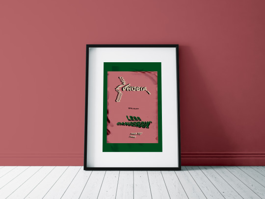
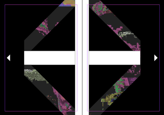
Poster Mock-Ups
I am now completely happy with my poster and postcard designs, that I will be placing the final pieces in a mock-up template. I’m doing this because it looks more professional and when designs are selling a piece of art, they will present it better.
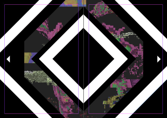
Below, is a screenshot showing one of the setting tabs from the side of the page. To get my work into the template, all I need to do is to double click the first layer which is called ‘place poster here’. This would open up a new page where you would then get rid of the image that is on the page and then replace it with your own work. You would then place your work onto the page by going ‘file’ and ‘place embedded’. Next you find your work and select it. Now you click the cross on that specific page and select save, you will then find that the work has been placed into the template. I then changed the colour of the walls which you can do by double-clicking on the layer called ‘wall colour’. This brings up a colour palate where you can chose. Also when you drag your mouse of the colour tab there will be a pipet that comes up and you can then select a specific colour from your work.

Below, I have started by choosing a light pink. I chose a light colour because I thought that if I had a darker colour if would attract your eyes to the wall more than the actual piece of work. To get this colour of pink, I think, I used the ‘pipet tool’ to chose one of the pinks from the purple colour of the text and then adjusted it slightly so it was more of a tint. I think also moved it more so that it had a pink element to the colour as well as purple. The reason I chose to try this pink/purple colour was because I thought that this then shows a mixture of two of the colours that are featured in actual piece.
I then chose a colour that was a purple colour but without the pink aspect. I kept the shade quite light again


0 notes
Text
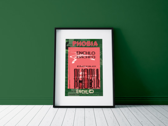
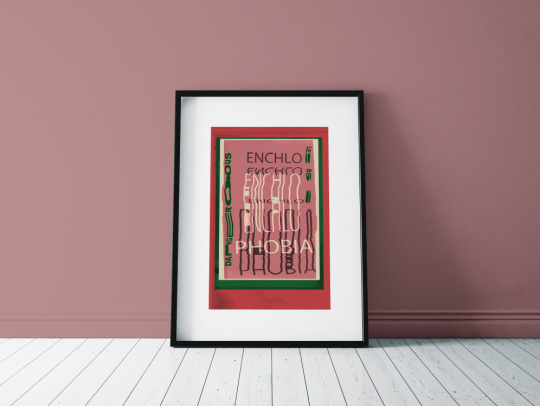
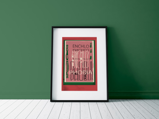
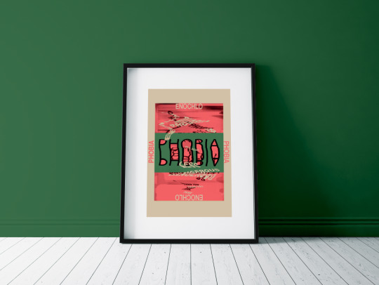
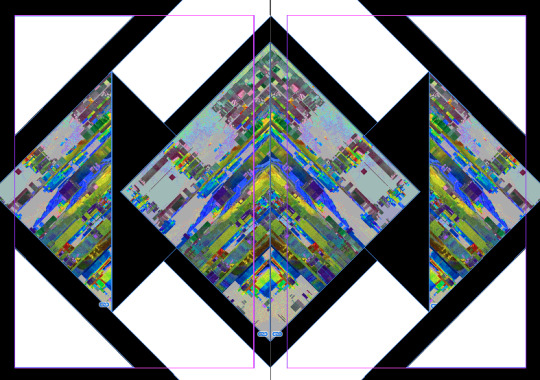
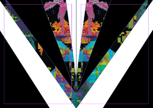
Development Of My Poster - Front Design
I have now focused on the other side where I have taken the same idea which I had before for the front design. Although this time, I have slightly changed it. I have used scans where these are slightly distorted with small waves in them. The original scan was like last time, where the word was halved so to make it one long line for the word, I just placed the ‘enchlo’ and ‘phobia’ together. Now I’m looking at this screenshot, it isn't noticeable at all which means that the viewers won’t be able to tell either. Again, I have made the words two layers like the other side of the poster. I decided to do this because it makes them look more uniformed. In this text, I wanted the coloured layer to be at the back again with the white in front. I did this because I thought that this order, overall looks better. The two colours I chose here are very similar to the original front cover colours, however, I have slightly changed them. The pink on this side is the same as the other with the extra colour of red on this side which wasn't on the other. I chose to have red instead so that I have used all of my colour palette colours. I wanted to do this because it then brings the stickers into the design more because they have red which the postcards don't have.
Here, I have now just decreased the opacity so that is it the exact same as the other side of the poster. I was going to keep the opacity from the previous screenshot but felt the two sides would compliments each other more if they were the same. Doing this, now means that the typography is only really readable on the green section. This is also the same on the other side.
Overall, I’m very pleased this poster design as now that I have two successful sides of the poster, it will look really effective.
0 notes
Text
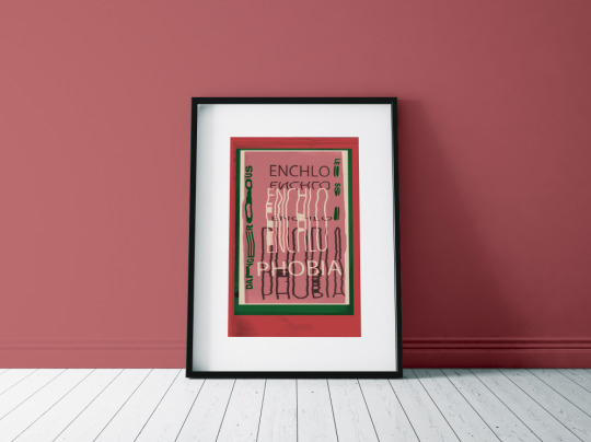
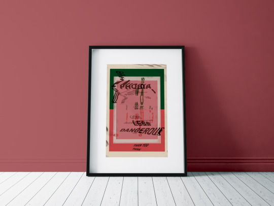
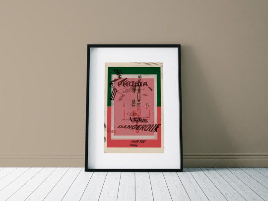
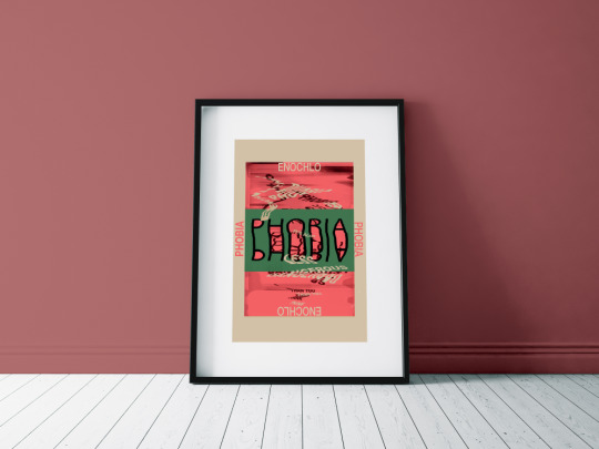
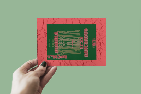
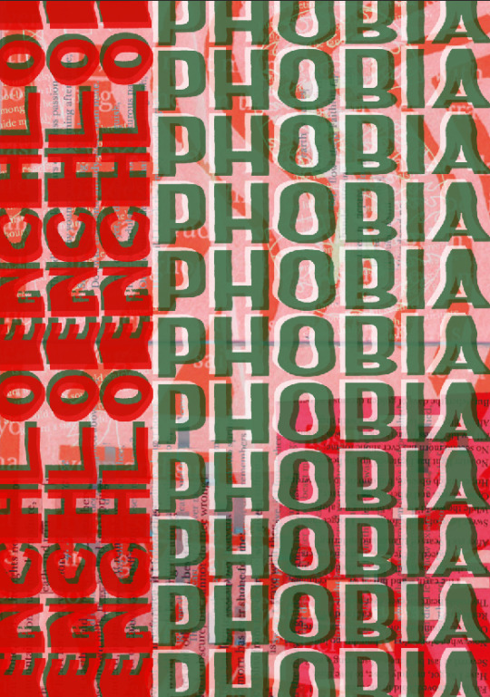
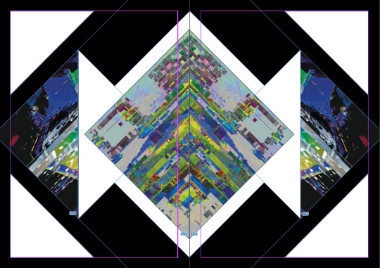
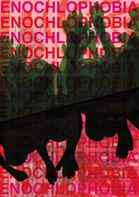
Development Of My Poster - Back Design
I’m now going to redesign my front cover of the poster that I have been design in some recent posts. I am also hoping to create a back to the poster as well as I have been trying to come up with effective and striking designs. However, none of the designs so far, are as I hoped. As well as this, I want to create the poster so that it matches or has elements from the postcards. I think doing this would then present a pack that links together well.
Below, I have opened a Photoshop file that has this same background with the silhouettes of the people. I decided I still wanted to use this as I still think I could use this within the design. Last time I was improving my poster design, I played around with the idea of repeating typography all the way down the page. I still think I could use this idea but, this time, I could slightly improve the idea. The main reason for wanting the improve the design from last time is that, I wanted to have repeated scans of the type that I produced using the scanner. I think including this in the design instead of just text which I typed straight onto the design. The reason for this idea is that this will link the postcards and this poster design together. Previously, I was really drawn by the transparency effects that I used on the type that I want to do this again. Also, the reason that I’m now working on Photoshop whereas last time, I was on Illustrator is because there were certain tools that I needed on Photoshop that Illustrator didn’t have. I was going to use Photoshop just for these certain tools and then switch to Illustrator after but I found that this didn’t work.
As you can see below, I have duplicated the work ‘phobia’ and placed each word in different places on the page. I’m not entirely sure what the idea I had was but I then changed the colour to one of the pinks in my colour palettes. I found that this colour was a bit too pale and didn’t really show up very well when it was on the background section.

I then tried to change a setting so it lays different on the background. Doing this, made the words a darker pink but I wasn’t sure this idea was going anywhere.

Next, I decided to find a new scan which I haven’t used on any of the postcards. I found this scan where the type wasn’t very distorted but did have a slight indent in places. I also really liked this font that I used so I decided to use it. I firstly had to use the ‘magic wand tool’ to get rid of the white background. I then used the ‘rectangle marquee tool’ to mark around the word ‘enochlo’ where I then copied and pasted it. Next, I did the exact same thing but with the word ‘phobia’. I had to do them separately so I could then have them on separate layers. I then had the idea of repeat the same word where the word ‘phobia’ is going horizontally down the page. I also had the same word underneath the green which I wanted to be white. I got this idea from when I previously did this. I then copied (CMD C) and the two white and green layers to then do CMD J. Doing this makes the words paste in the exact spot that you copied the words. This was useful because it meant that I only had to nudge the words in the direction I wanted. To nudge all you do is press the arrows on the keyboard. I then had the idea to have the word ‘enochlo’ on the side but repeated again. I got this idea from when I originally placed this type before I even scanned it. I had it so the ‘enochlo’ was vertical and the ‘phobia’ was horizontally.

You can now see I have repeated the word now for the word ‘encholo’. I made this a darker green because it then clearly shows it’s a different word. I did this by increasing the opacity.
I have now changed the whole left side words to red because I wanted a different colour rather than them both being green. I thought that I could try different colours because when I previously was looking for the best colour combinations, it took a few arrangements to figure out the most effective one. I think this red blended in with the background too much so I dint standout like the green does.
I then increased the opacity of the red but also changed the white layer to green. There were a few things wrong with this design now. Firstly, being that the red almost seems to harsh now and doesn’t fit in with the red that it in my colour palette. Another problem being that the red and green together almost give a Christmas vibe which is not what I want.
I decided to get rid of the green layer behind and change it back to white. I then increased the opacity of the red slightly along with the white layer behind it too. I thought doing this would make the red standout more compared to the previous screenshot.

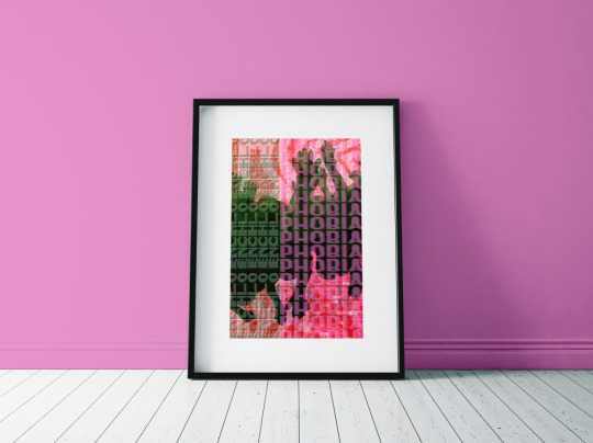
I have now tried changing the colour to pink which this pink isn’t one from my colour palette as I figured out that both of the colours are too similar to the background. I chose this pink colour which is similar to the pink I previously used in the other poster design. I thought this colour worked well before so I wanted to try it again. After adding it, I now think the design works a lot better and although I knew this poster still wasn’t finished, it has definitely improved. In this screenshot, I have increased the opacity of the pink and decreased the green. I did this because I wanted the pink to standout enough and I didn’t want to overpower the green.
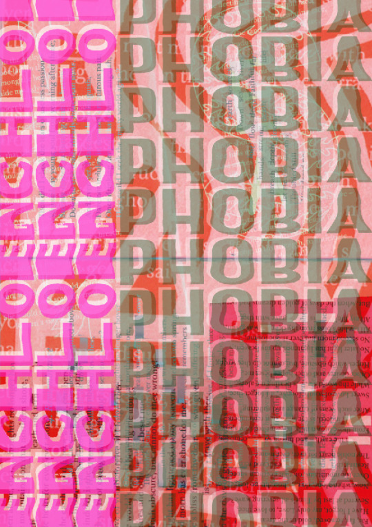
I have now decided to switch the two colours around to have the green on the left and pink on the right sided words. The screenshots don't show but when it was the other way, the words ‘enochlo’ was getting a bit lost in the background. This way you can now read both of the words.

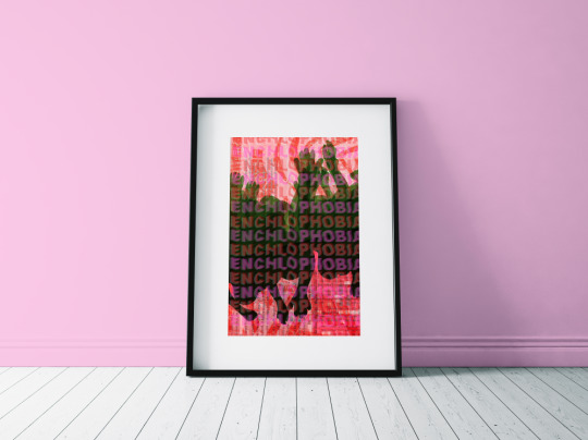
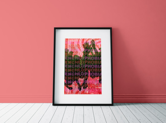
I then added the extra silhouettes behind because I felt it seemed a little boring before. I thought this worked a lot better as the typography stood out more. This screenshot above and below has also changed as I have just noticed that I have swapped around the white layer of text and the coloured text. I didn't mean to do this at the time but now looking I much prefer. Doing this means that the white layer in front has toned down the brightness of the colour that is actually behind tis.

Here, I have now decreased the opacity of all the typography which I think is more effective as it is still showing mainly on the green background. Another positive of having the text dimmed is that it then more clearly shows the people behind.

I then decided to add more type to what I have already created on the page. I did this by again doing CMD C and CMD J and then nudging the copied element into place. I did this because I wanted to match the sizing of the text to a similar size as the other side of the poster. I also moved some of the words apart so they were easier to read. When you compare the other poster design to this side, I feel they now work better together.

Overall, I am very pleased with this final result of the other side of the poster design. I feel this is a massive improve from the last time I was trying to improve it. I think this simple use of typography which are include on both sides helps to bring the two together. I think even thought you cant really read the typography when it it on the pink and red background, it still works because the green section is where it pops it.
0 notes
Text
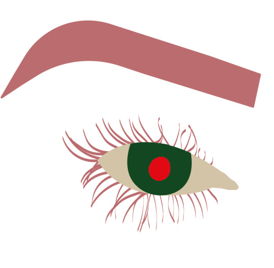
Don’t Panic Sticker Design (Six)
I'm now on the last sticker design which I chose to be the effect, crying. I did think this could be confusing as I have already drawn the water droplets from the idea of sweating so I needed to come up with another way show showing this idea. I found this image below which I thought would work as it is clearly showing an eye with teal drops.
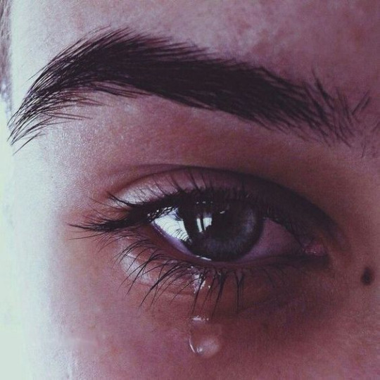
I only wanted to use this image to draw the main features of this picture as it had to fit in with the rest of my stickers. I used the ‘pen tool’ again in Illustrator to trace around. I then used the ‘5pt flat’ brush to draw the eyelashes. I did this to get a better effect. I chose this brush to be flat because I could then easily create a thicker root and as it went further away from the eye it got thinner. This happened because it depends on the direction to move it.
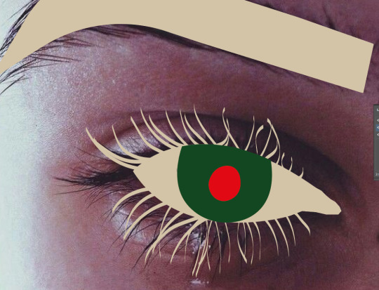
Here, I then started to play around with the colour arrangement. I changed it so the eyebrow and eyelashes are now pink with the centre part of the eye still being the same place as before. I think especially changing the eyelashes has made a massive different. This now makes the eyelashes and the actual eye standout a lot more because there is now a different in colour.
I then added the tear drop which I traced. I felt the tear drop doesn't look as effective as the water drop from before. I made this tear drop a slightly different shade of pink so you could still se the eye lashes over the tear drop. I also added a shadow and highlight to the object because I thought it might help the overall effect of a tear drop. Now adding the other aspects to the tear drop, I’m not sure it looks very effective. I think this because it doesn't really look like anything.
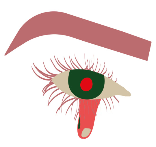
I decided to move on, for now, as I wasn't really sure what to do with it at the time. I wanted to swap around some of the colours, because the pink eyelashes didn't standout enough against the other pink colour from the tear drop. As you can see above, I have made the eyebrows and eyelashes red. I think doing this has improved the overall effect and has made everything pop out more.

Here, I have now transferred the drawing to Photoshop where I have put a stroke and outer glow onto it. As you can see doing this has made the colour of the eyelashes disappear. This has happened because the thickness of the stroke has joined from each side of the marks I created. I feel this was actually a good thing as now I wont have a problem with the eyelashes not showing.
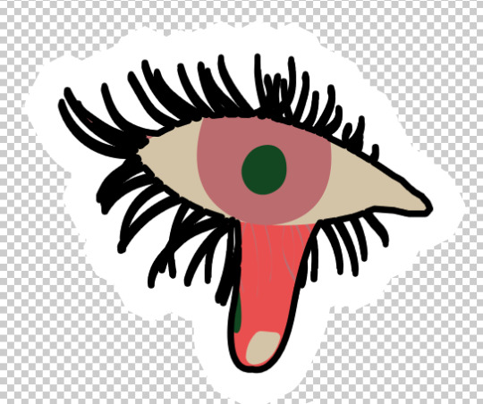
I thought I had finished with this design above although I then wasn't sure on whether to include the eyebrow in the design or not. The eyebrow makes the overall sticker bigger but then again the eyebrow isn't pat of the effect meaning it doesn't have to be included.

I decided to place both of the stickers onto the sticker pack to see which would look more striking. Here, I have placed the eyebrow one, where it does look effective because of how brightly coloured the red stands out against the rest.

I then placed the sticker without the eyebrow where I ended up deciding on this as the eyebrow wasn't necessary and didn't add anything to the idea of crying.
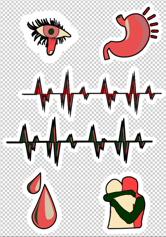
This is what the final stickers ended up looking like. Here, I have printed my design onto sticker paper where I have then cut around them leaving a little but of white still showing. This image of the stickers isn't showing the true colours properly but they were brighter than this in real life.

In the end, I think these stickers look very striking and I feel doing something different was a good idea as if I feel it shows quite easily that they are the effects of my fear.
0 notes
Text
Don’t Panic Sticker Design (Five)
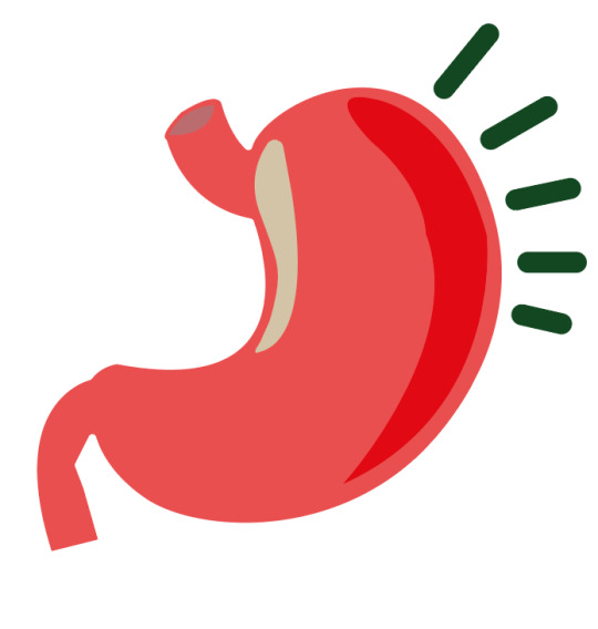
I am now moving onto my third sticker design where this time the effect will be stomach ache. I decided to just look up stomach onto Pinterest to get a shape that I could trace around. I would have traced an actual image of a stomach but I found that the shape of a real one wouldn’t show the viewers the shape that everyone thinks of. I then realised I had to get an illustration which kind of feels like I’m cheating but I only used it for the main shape and after that I took it away.

Here, I have traced the shape out and used this dark colour pink from my limited colour palette. I thought this was basically the perfect colour for this object so I went with it. I then decided to show pain that I wanted to draw some lines which I think gets across something is wrong. I have done this by drawing one rectangle using the ‘rectangle tool’ and then curving the corners but moving the little dot in the inside of the shape. I then duplicated this shape five times to then rotate and place around the right side of the stomach. I was going to leave it like that but I then wanted to decrease the size for each rectangle so that it created a more interesting shape and almost curved around with the stomach. I thought this idea looked a lot more effective than before.

You can now see I have drawn some other elements on the page to show highlight and shade again. I have drawn a small shape in the left side to show the highlight. I used this colour again for the same reason as the previous drawing. I then used the other shade of pink for the shadow which I drew on the other side of the stomach. Lastly, I drew I shape to show the inside path of the stomach.

I have now just swapped around the colours to see if another arrangement would work any better. I have made the rectangles around the sides green with the shadow of the stomach red which I did because red is a colour that is more associated with your insides. Green is definitely not a colour that is related to the body. I then had the small shape on the left as the other pink shade. I didn’t think this colour stood out very much as the two pinks were quite similar.
In the end, I decided the previous screenshot wasn’t as effective as the first one so I went back to the original colour arrangement. I also thought that these drawings aren’t real life colours anyway and the viewers will be able to see this so the red colour doesn’t have to be placed inside the stomach. Here, you can see I have transferred the design to Illustrator to lastly add the ‘stroke’ and ‘outer glow’. This is the final sticker design where again in this design, I didn’t add a stroke to the aspects in the middle.
0 notes
Text
Don’t Panic Sticker Design (Four)
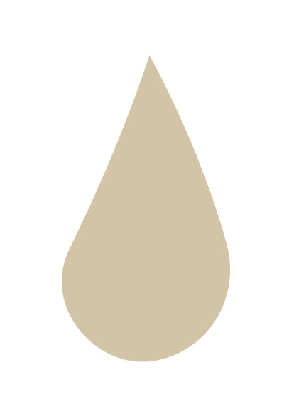
I’m now going to create the second design to which another effect is sweating. For this idea, I chose to just draw two simple water drops. This image below, is a reference I had. I didn’t trace this image but I chose to just have it on another screen so that I could look back on how to create the shape. I chose to have this image as reference because it was a cartoon drawing of a droplet which I thought would fit in with the rest of my drawings.

Here, you can see I have started by drawing the general shape for the droplet. To do this I used the ‘pen tool’ in Illustrator. I gave certain parts of the shape a slight curve. As you can see, I have worked quite big on the page, which I did because I think this is the easier way to work to achieve and accurate drawing.
I then decided to change the colour of the droplet to pink as this colour was more powerful and vibrant on the white background. Next, I drew some detail inside the shape to show a highlight which I wanted to be the off-white colour as this is the colour that is the most relatable to a highlight colour. I then used the ‘pen tool’ to draw another aspect on the page which is smaller this time and on the other side of the droplet. This time, I chose the colour green as it’s the darkest colour in my limited colour palette. I did try the other pink colour that I could have used, but it didn’t really show up too well as they are both pinks but just different shades.
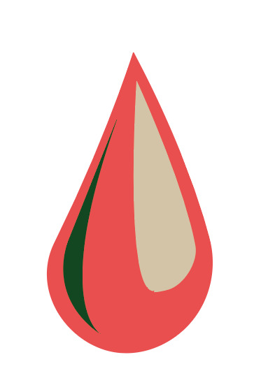
I have now drawn another droplet which I have placed next to the original but slightly higher up on the page. I did this by copy and pasting the other drawing. I then just decreased the object in size and slightly rotated it so that it is showing it dripping down in a different direction.

This is the final drawing which I created on Illustrator. I now need to move it over to Photoshop to add the ‘stroke’ and ‘outer glow’. As you can se from this screenshot, that I haven’t added a stroke all around the different parts of the droplets. I chose to do this on purpose as the sticker before needed the inside strokes for it to look effective although, this time I think it works a lot better without it. I did try adding the strokes at one point, but when I did so, it lost the effectiveness of the droplets.

Here, you can see I have now added the stroke and outer glow which I have repeated from last time. I have done the exact same settings with the stroke being 15px at 100% opacity. I will probably end up doing the same thing for all the stickers for them to all look the same. Overall, I’m pleased at how this minimal drawing ended up and even though it is very simple, I think once it is presented with all six of the other stickers, it will work well.

0 notes
Text
Don’t Panic Sticker Design (Two And Three)
I’m now going to draw a heat beat which will probably end up being very simple as this is to show the idea of a high heart rate. I found this image on Pinterest where I was going to use the bottom image. I only needed this image for the lines, which now looking back, I could have just drawn it by hand.

Here, you can see I have traced the image where I have used the ‘pen tool’. Using this tool meant I could add a stroke and fill to the lines and that’s how the red is showing in certain parts. I thought this looked really interesting as its an extra detail compared to just a normal line. I chose to keep the stroke black as it contrasts well with the red but also makes the line striking.
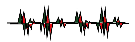
I then tried to overlay two of the lines which are the exact same as each other but I have just changed the colour to green instead. As well as this, I went into ‘windows’ and clicked ‘transparency’ where I tried the different options. I though doing this could give a different effect rather than just having two layers on top of one another. I tried to off set this other drawing but I dint quite line up how I wanted.
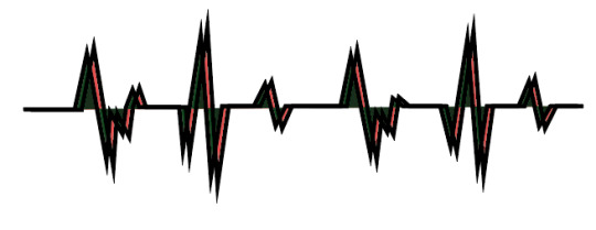
I then slightly increased one of the drawings so they were more similar to one another. I also changed the colour to this pink just to see what difference it would do.
Here, I have now changed the red colour to green which I felt was worked really well with the pink as they complimented each other well.
In the end, I think I’m going to use the last two designs are two separate designs. I am choosing to have two of the same designs in my sticker pack as I am really interesting the shape, they create around the edges but also because I think they will look effective to have two of the same designs but in different colours too.
0 notes
Text
Don’t Panic Sticker Design (One)
Here, I’m going to produce six sticker designs so that I can use for my Don’t Panic packs. I started by going onto Pinterest so that I could so ideas on what I could draw for my fear. I started looking, but I found it hard to find anything that I could turn into stickers. The reason for this was because stickers don't have to be too detailed as they are very small meaning lots of detail isn't the key to a successful design. Below, you can see I have scanned in my drawing which I have previously drawn, and I have then cut out a certain part of it. To do this, I used the ‘magnetic lasso tool’ in Photoshop. This tool meant that I could drag my mouse around the lines that I have already creates and the tool will go round them. As you can see from below, that there are some gaps where the tool didn't quite go where I wanted it to go. This didn't really matter because I could use the ‘pen tool’ to fix the gaps. However, I wasn't sure that I liked this design as although it is an interesting shape, I don't think it looked as effective as I was hoping.
I then tried to create a circular shape as I thought it might look more professional with a neat shape. I created this sticker by, placing the whole scan onto the page where I then used the ‘elliptical marquee tool’ to create a circle in the size that I wanted. Next, I moved the circle in the exact place which I chose the be the centre where you do this while you’re still on the ‘marquee tool’. Lastly, you would then copy and paste it. I think this did improve the overall effect; however, it almost seems a little too boring now.
I then tried to use the drawings from when I was previously drawing them for the designs. I found out that because the size that I drew the stickers onto the paper, that it is now pixelated because I have tried to increase the drawing in size. I was worried this was going to happen. I now couldn't use this sticker or any of the other stickers I drew on the page from before.
I then decided to look back on Pinterest to find any other ideas that I might have missed before. An idea came to my mind that, when I researched into my fear from quite a while ago, that I listed some of the effects from this fear. I looked back on this research to which I realised that I could draw some of the effects of the fear as my stickers. This could work because my drawings won't have to be too detailed. I then generates some ideas that I could draw for the effects of this fear (https://www.pinterest.co.uk/Libbym220/crowd-ideas/).
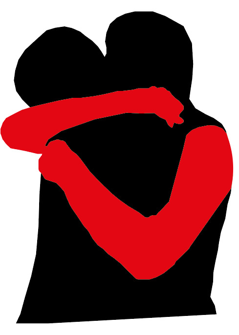
I thought for my first sticker that I could draw someone hugging someone else because one effect is clinging onto someone. I found this image below, where I thought I could just draw the hands because that's the main part of this idea. I went onto Illustrator to use the ‘pen tool’.

This is what it ended up looking like. I didn't draw any shadows or highlights from the arms or hands because as this is sticker, it doesn't need to be that detailed. I also thought that the arms would standout more and get the message across easier if it was all just one colour. I felt this was alright but I don’t think it really captured the idea very well.

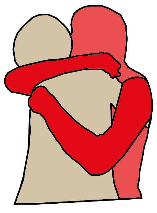
I then decided to keep this previous design but I wanted to see if there was anything that was a bit more effective. I found this image and started drawing around the main parts of the people.
This is what it ended up looking like. At first, I thought that having the hands and arms a different colour from the rest would clearly show what aspect of the drawing it is trying to show. I found that this didn't work as well as I wanted because the two bodies joined together and then looked a bit confusing on it is actually is.
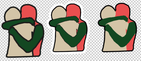
I then decided to add a stroke to all the elements that I have just drawn with the colours being the colours I used for the poster and postcards. I think splitting the objects up a bit more helped to make it less confusing.
I then brought my design over to Photoshop where I added a stroke and outer glow to the design. Doing this then gives the professional look of a real sticker design. To do this, you go into, the bottom right settings and click on ‘stroke’. This will then bring up a tab where you are basically controlling how much of a stroke you want on the edge of your drawing. The only negative of this setting is that it only does the outer edges of the drawing and not anything in the centre. For this drawing, this setting would have been handy. I chose the ‘size’ to be 15px with the ‘position’ on ‘centre’. You can look at the left side of the tab and there are loads of different option but now you go onto ‘outer glow’. I then had to play around with the settings at first to understand what they actually do but I ended up having the opacity on 100% with the size around 100px.
Below, you can I have tried out different methods of presenting my design. The first design, I have made the strokes quite thick. I had to do this on Illustrator as it wasn't possible to do it on Illustrator. I felt this thickness was a bit too much as it didn't need to be that thick. I also knew that if I made this sticker thick then the rest of them had to be the same for the whole design to work. The second one, I mad the stroke around the edge thicker than the centre lines. I did this by making the thin lines like that on Illustrator and the thicker one on Photoshop. I then decided to take away the stroke completely from the middle and just have the outer edges. I wasn't too sure about this the actually drawing doesn't standout out as much.
I ended up with this as my final design for the first sticker to which I think worked the best. This is similar to the centre design above but I increased the stroke slightly. I also decided on these colours as I felt they stood out more compared to the previous colours I chose. I only changed the arm colour to green but I feel it made a massive different because the colour is darker than the red which I what made it attract your eyes.

0 notes
Text
Finishing My InDesign Photobook
I am now going to do the last finishing touches to my InDesign photobook. This will be the last session I need and at the end of this I will order my book to be printed. I realised I needed this last period of time because I had to finish the last page that I didn't get to finish before. Below, is showing where I left the page which I felt I could use this design which on the page now and add a few more elements for it to become something.
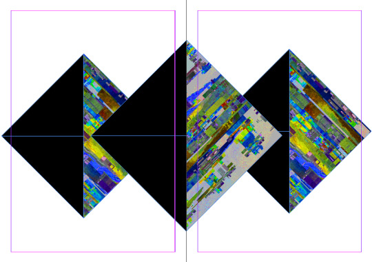
I then thought of drawing these two triangles (with the ‘pen tool’) which in this screenshot are the left two top triangles where one of them is black and the other is of my work. I was going to draw them on the left sides of the page too but I ended up duplicating these two shapes (CMD C and CMD F) and placing them on the opposite sides of the page. This idea of drawing these two shapes came from the idea of shattered glass as it kind of reminds me of that. You can then see there are still the the shapes from the previous screenshot which I decided to use but in a different way from what I thought I was originally going to do.
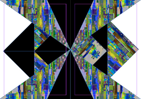
You can now see I have changed both of the outer triangles to black which I did because from looking at the previous screenshot, the black contrasts a lot more. I then arranged the centre two triangles/square so that it was brought to the front of the page. I then also changed the middle triangle/square to all black instead of being only half black.
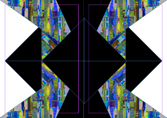
Here, I have just swapped around some colours so that the two sides are black now. I did this by drawing a rectangles to cover the whole page and changed the colour to black. You would then arrange the shape so that it was sent to the back of the page. I then changed the outer triangles to white and the top and bottom shapes white too. Doing this would then still have some contrast on the page. I think I prefer this layout of the colours to the previous as it seems more interest now.
All I have done now, is I have clicked on the two white triangles from the bottom and top of the page and brought them to the front of the page. This then shows that they are triangles now, unlike before.

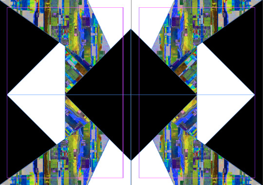
I then created another two pages as I thought that this page needed to be filled as well. However, later on, I was about to order the book and realised that I 14 pages in total which wasn't the right number. This meant that I either had to get rid of one page or produce another two pages. I decided to come up with another two pages as this meant I could have a few more pages included in the book. Anyway, I have started with the same concept of the three triangles which I’m not sure why I wanted to use this triangle/square idea again but I wanted to use them but to create something different before. I then drew a triangle in one of the corners and duplicated so I could put them in the other corners too.
I then duplicated these triangles again where this time I decreased them in size and changed the colour to white. Next, I changed the central black triangle to have my work in it instead so there wasn't too black parts joined together because this wouldn't really show when it gets printed.

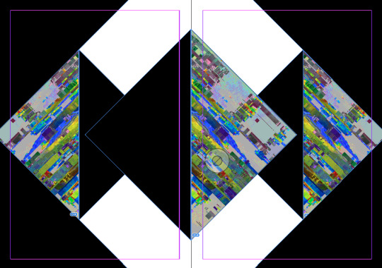
Although, I found this didn't really work so I changed it so that it was the exact same as the other side. It know looks like it is reflecting into one another. After that, I have created a square shape going around the middle square. I thought the centre needed another aspect.
I then felt that doing that didn't have enough effect on the whole piece and decided to place a rectangle that filled the whole background space. I then also swapped around the black and white so they were the opposite from that I just put them as. I kept the white triangles around the corners white. However looking back, it will only be those triangles showing and not the larger ones as I didn't change them for some reason.

Lastly, I have just changed the two outer tringles with a different piece of my work. I chose to do this because previously it seemed a bit boring with them same design in each of the shapes. Doing just the outside triangles means it has a bit of a different effect.
Next, I wanted to slightly edit these two pages as I don't think they have the same effect as the rest of the pages. It seems to be a bit boring.
I decided to increase the size of the middle black triangle so that it was closer to other shape. I then drew two triangle which weren't the same size or shape as the one behind. I then clicked ‘file’ and ‘place’ to put the same piece of work in the shapes at the exact same place so they look like they are reflecting again. I chose to do the same work because I thought that once I increased the size of the black triangle it shew a lot less of the work.
Here, I have finally added the last triangle shape which I wanted to be very small and thin so there was still some work showing behind. I wanted to have it white as there wasn't much white on the page so far. I decided I wanted to put this last shape in the gap because felt it just finished it off.
From this screenshot below, it doesn't show but I also deleted all the triangles because the points on the left side didn't stop at the edge of the page. What I mean by this is that the triangle stopped so it didn't show the points. While doing this, I also decided to add the start of another triangle at the top of the page so that it shows this triangle pattern continuing. I also did the same thing at the bottom where it shows the top of the triangle. This then creates the illusion that it carries on.

This is the last two pages that I needed to do. Although, the reason I had to do these was as I have already mentioned that I realised I didn't have enough. I needed to create these two pages to make up 16 pages. I started by creating a triangle in the corner of the page but I made sure that the shape was long enough so that the sides of them could touch the other triangle. I then created a larger triangle in the centre with the ‘rectangle tool’ and I held down the ‘shift’ key so that its a square. I then rotated it on the side. I have then drawn two long rectangles so that it made a cross section in the centre. I then copied and pasted these shapes and places them at the left and right side corners. I made these shapes black so it blended in with the others.
I have added another white section to the piece as I felt there wasn't enough before. I did this by copying and pasting the the black triangle and decreasing the size. I then had to copy and paste again and decrease the size even more this time. This was to cover the white so now the white section only shows a small section.

Lastly, I got rid of the cross in the centre and replaced it with this rotated square. I decided to do this to mimic the outer parts of the page. I felt this worked so much better.
As a result, I think I’m now ready to print my book. One thing I have realised when producing this book is that you eyes almost look at my design in different ways. This means that each person will look at the shapes different which I think is a really interesting effect. They can almost viewer it how they want. I realised this when I creating the book because my eyes would change the way I saw the shapes. I also think that as the viewers don't know what shapes I used to create each page that they might think I have done it differently to what I actually have done. In the end, I think this book has ended up as a successful piece and I’m hoping that when it gets printed it will look just as effective.
0 notes
Text
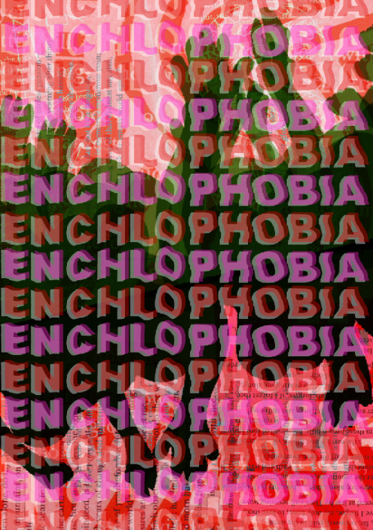
Improving My Poster Design
As you can see below, I have gone back to my poster design. I decided I wanted to tweak the design slightly as I felt before, I wasn't completely happy with the outcome I had previously produced. I though that the seemed a little bit boring for a poster. This design might be good for a postcard size but I felt it was lacking in interest for a poster design. I have also realised from previous research that for the A3 size, it needs to have some detail and attract.
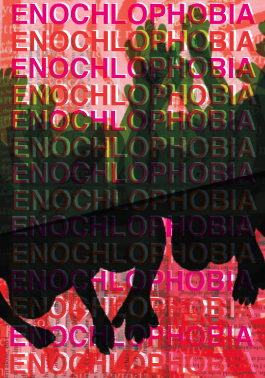
Below, you can see I have changed the layout of the text. Previously, I felt the text wasn't a very interesting part of the design and was holding back the whole design behind. I have now used the font style, ‘Helvetica Bold’ instead. I felt this is still a simple style of text which I thought worked well as when I duplicated the writing (CMD C and CMD F), it didn't need to be very specific. The reason for this is because once it was duplicated and I had covered the whole page in this text, it looked effective by just doing this technique. By the screenshot below, you can also se I have switched the colours between red and pink. I decided to place red in this design as firstly the background of this poster has some red occurred within it but also because I wanted to have one different colour in this design than the postcards. I thought doing this would then show a slight different between the two designs and could be more attractive. I then chose to improve the text by going into ‘windows’ and clicking ‘transparency’. This then gives you options on different effects of the text. I selected the whole text and chose the ‘darken’ option. I thought this was the most effective out of them all because the colour still shows up well especially against the background but when the text is over the green silhouettes, it acts different which I was drawn to.
I then wanted to look on Pinterest get some inspiration for ideas on how I could present this typography. I created a board with similar ideas which related to the direction I was going (https://www.pinterest.co.uk/Libbym220/typography/). The type of thing I wanted to recreate was something similar to this image below. I felt I could produce this from the elements that I already have on my design. This typography includes the transparency setting along with text that has been slightly off set from the other writing. I was interested in this text as its kind of similar to the silhouettes of the people that is already on the design. I felt this could look really effective where the text and another aspect of the poster relates to one another.

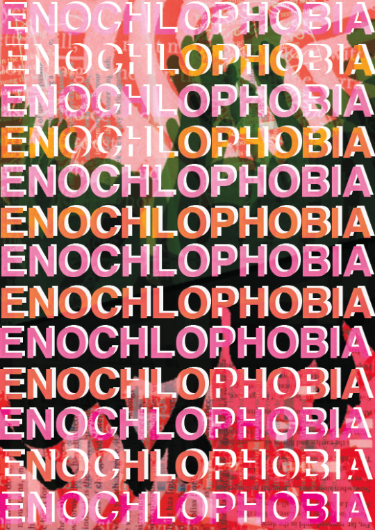
This is what I ended up producing from the inspiration I found. I ended up slightly changing around the ideas where I have put a trancy effect on both of the layers of text. I did this because I felt the previous text that I had where the colours changed when it was placed over the green parts compared to the background. I was drawn by this because the text so that it wasn't too in your face when you would look at it. This other layer I have added I made white with the ‘overlay’ effect. I decided to have a slightly different effect because it reacted different to the background.

After that, I wanted to try some other effects on the layers of text just to experiment to see if there are any layouts that are more effective that the first one. Here, I have some what changed the effects of both of the text to ‘colour dodge’. Doing this, made some of the sections have these black splodges which happened when the background was very dark and that darkness shew up on the text. I didn't like this effect as it didn't really look like there was even an effect on most of the typography but also the black sections wasn't very impressive.

Next, I changed the white layer of text to ‘normal’ with the front coloured text to ‘lighten’. This created these pastel colours where that were different depending on what colours were behind them. Although the colours are quite effective, these colours are not what I wanted as I decided I was going to keep with a limited colour palette. I also think that because of how pale they are, they almost blend in with the background in certain places.
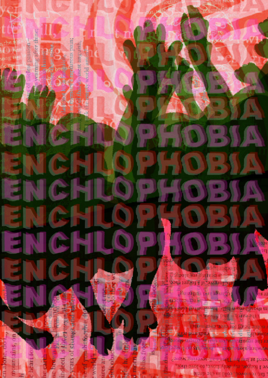
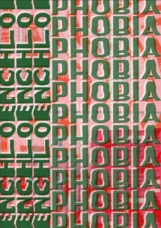
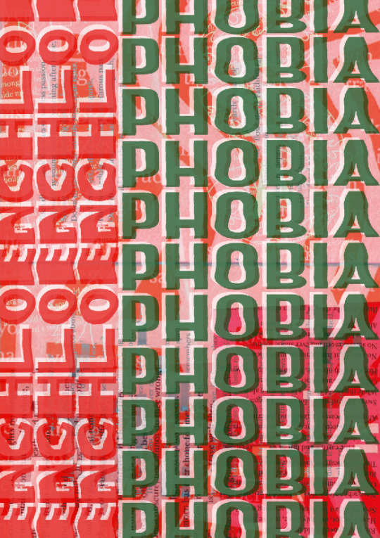
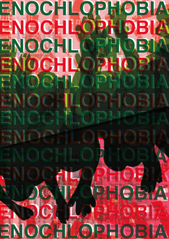
Next, I went back to the first design with the same settings but this time, I changed the red colour to a green. I did this because I wanted to see if I could improve the original one but just changing one colour. As you can see, the green colour doesn't standout as much because it blends in with the silhouettes that are already one the page.

I then changed the pink colour to red. I knew this properly wouldn't improve the design as the green is still in the same place but I tried it anyway. I think this poster is not a bit different to the first design with the simple change of the colours. I could actually use this design as the back of the poster. I am thinking that just with the change of the colours, it could be a simple change to the back design.
After that idea, I decided to try something else just to see if there was anything more successful than the designs I already have. Below, you can see I have changed the settings so that rather than the centre part being coloured the opposite part has been made black. In my opinion, I would have preferred to have the black the green colour instead but I found this wasn't possible to change. Looking back, I could have used the pen tool on Illustrator to go round this stencil that I have just made.
In the end, I don't think I am going to use any of these ideas for the final design as I didn't think any of them were effective enough to use. Although, In this session, I did print out what I thought was going to be my final poster design for both of the sides. I printed out the first design that I came up with along with the design that was very similar but the writing was the two colours, red and green. I thought these were going to be the final poster designs but once I printed them out and placed them next to each other, I found that there wasn't enough different between the two. I have kept them both but I feel I could improve these ideas.
0 notes