
Don't wanna be here? Send us removal request.
Statistics
We looked inside some of the posts by lrussellconceptart and here's what we found interesting.
Average Info
Notes Per Post
3
Likes Per Post
2
Reblog Per Post
1
Reply Per Post
0
Time Between Posts
3 days
Number of Posts By Type
Text
17
Last Seen Tumblr Blogs


Fun Fact
There were a total of 171.5 billion posts on Tumblr in 2019.
Text
Monster Brawl - Time to reflect
As I look back on the project I see how far I have come and how much I have gone outside of my comfort zone. I knew I wanted to push myself and create things I have never even done before. Humans are not my favourite thing and before this, I had never drawn a character before. However, knowing that the forefront is in high demand for character artists I knew that I needed to test my skills with characters. I feel my execution was very well done, the anatomy and clothing styles were very fun to create, and with this skill, I definitely want to continue to create more. I reflected on my work from the beginning of my course and felt I wanted to show my skills in varied styles. I chose to move away from realism and try my hand at a more cartoonish style.

Throughout this project, I knew I wanted to take some time to try and create some 3D. 3D skills are very important for a concept artist and being versatile appears more employable. I am very pleased that I gave myself time to include some 3D and after this project, I wish to continue testing and playing with 3D. However, it would have been nice if I had given myself time to try and create two headpieces. I also extended my hand to try an environment that I have never done. What I have learned about myself is that I am capable of creating more than I know. My skillset has definitely increased since doing this project and makes me want to explore more styles and what I can do. My creative decisions throughout this project I feel have been a mixture. I have critiqued my own work when I knew it wasn't right, such as when I experimented with colour choices for Zaylock the first time around. The designs where the belly is darker than the body colour, this is not accurate as animals will normally have a pale belly compared to their body colour. My anatomy choices have been questionable and what I have learnt is that I should not be afraid to refer to references all the time, this allows for more accurate creature creation. I do admire my ability to take constructive criticism and I feel the feedback I received has improved my way of thinking about my own work and makes me question my work myself.


0 notes
Text
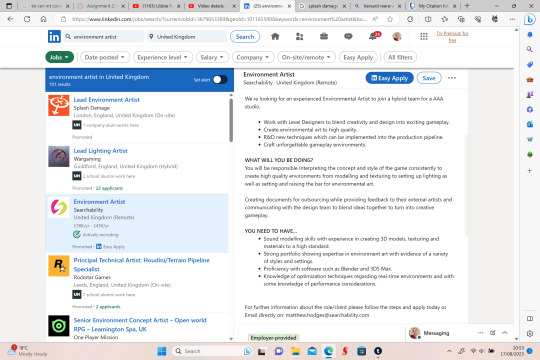
Forefront Identification - Environments
As I have researched before about the demand for jobs in the concept art industry, it is apparent that Environment artists are also in high demand as well. As we can see from this screenshot of LinkedIn (typed in environment artist) this job for Splash damage requires an artist that can build assets in 3D as well as understands Unreal engine 4. As seen below Splash damage create shooter and SciFi games which will require future employees to understand creating apocalyptic environments such as there game Gear Tactics.

This is another search on LinkedIn from the company AAA trying to find an environment artist presently. Once again requiring excellent 3D knowledge and skills and an excellent understanding of lighting. With games released such as God of War and Monster Hunter Rise, you will be expected to design for more fantasy-based environments.
Due to environment artists being in demand, I want to expand my skills and try and develop some of my own environments. As I am inspired by games such as Monster Hunter and Horizon zero dawn, I a more drawn to the fantasy side of things. Researching the forefront is very insightful because it allows artists to keep improving their skills and creating works in current demand to impress employers.
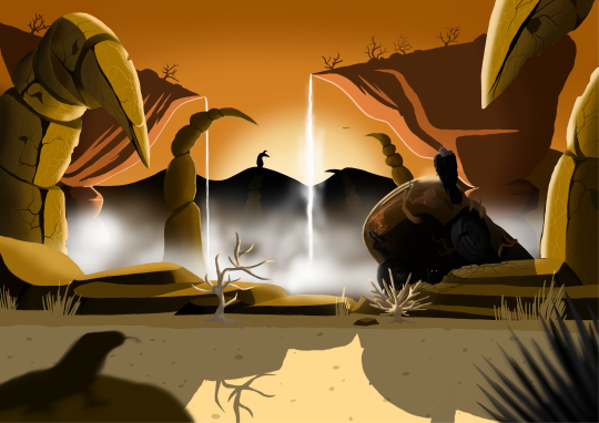
Image referencing:
Image 1: Screenshot taken from LinkedIn with results for environment artist
Image 2: Студия-разработчик gears tactics анонсировала новый эксклюзив для stadia - outcasters (no date) 3DNews. Available at: https://3dnews.ru/1015727/studiyarazrabotchik-gears-tactics-anonsirovala-noviy-eksklyuziv-dlya-stadia-outcasters (Accessed: 17 August 2023).
Image 3: Screenshot taken from LinkedIn with results for environment artist
Image 4: Black, T. (2023) 19 best AAA Games of 2022, Gameranx. Available at: https://gameranx.com/features/id/290692/article/18-new-aaa-games-of-2022/ (Accessed: 17 August 2023).
0 notes
Text
Monster Brawl - Environment
Finally, for my project, I wanted to design an environment in which the characters would battle. I have never done environments before and wanted to push my skills. I was inspired by the artist Phillip Sue. His style is simplistic yet detailed, it has a cartoonish effect to it which is what I want to aim for.

I wanted to do a dessert environment with an animalistic quality to it with rocks looking like scorpion tails. I also wanted to add water as it adds a nice mist quality to the image which gives depth and layers to it. The mist hides the base of the rocks which shows the depth of the canyon and how deep it is. My original design (the left) felt fine, however, I was shown that the left half of the image would be complete if on its own and that the left side was missing depth, it still fell a bit flat. To improve this I added an old car with a vulture sat on top of it. With the landscape seeming very surreal and fantasy-based, it also has a human element to it. I really like how this turned out and I am glad I added in the car. To enhance the time that has passed I added in some dry vines that have grown through the car along with a hidden resident within it. I also did a rough sketch of what the interface could potentially look like. I was also advised to enhance my monster book to add some sketches and the process of how I came to this design. It also contains the original portrait sketch which was scrapped as my game is played landscape it would of be inaccurate to design it as portrait.


I want to reflect on how my time management has been. Overall for my first major project, I feel it went well and I was able to achieve my newest goals. However, If I was to have kept my original plan I believe I would have never made the deadline. I am a little disappointed with myself and I wish I had made a second environment and did a little animation. I was able to lightly sketch up a potential interface design but this would have not been presented polished. I feel I really need to time myself better and stay dedicated to my plan. On the other hand, you have to account for everyday life alongside your projects which I felt I was fair to both the project and my time out of the project. I did have to work through some of the weekends to push more work for the project but I felt that made up for any days I missed during the week. I feel if I was to re do this project I would aim to achieve a few wishlist items and have used my time more productively.

Image referencing:
Image 1: Philip Sue: 21 draw (2022) 21 Draw | Be a better artist with 21 Draw. Available at: https://www.21-draw.com/artist/philip-sue/ (Accessed: 15 August 2023).
0 notes
Text
Monster Brawl - Neural Link
The next part of the project was designing the transmitter that allowed humans to connect with their monsters. I wanted the design to look very metal-like and shiny. I did research and aluminium is the lightest yet sturdiest metal I felt was the best fit. As the monsters are specially designed for their humans, I wanted that element to carry through to the transmitter. It is designed for the whole ear to be able to sit inside it nicely and snugly. It wraps around the head allowing for the other side to sit lightly on the other ear for support. Louisa's design is based around Zaylocks webbing, which also gives her an aquatic look for her natural love of water. Jade's design is inspired by Tkar's ear and has some added quills which also gives her an edgy look.

I was inspired by the film 'Big Hero 6' where the character Hiro Hamada wears a Neurotransmitter and controls microbots. With this, I wanted to create something similar but only have the band go around the back of the head.

To enhance my portfolio I wanted to try my hand at a 3D piece. I used Zbrush to make Louisa's Neural Link. I used an already-made head to be able to show how the design would sit on a human head. This design is made with aluminium to show off exactly how it would look in the material. I always want to expand my skills and I feel that my first go at 3D went very well. What I would want to do differently would understand the software better and the polygons. I feel the band having fewer polygons works better as it gives it more texture than just being smooth and round. Adding a blue wash to the aluminium gives it a colour identity to match the monster and humans design.


youtube

Image references:
Image 2: Me BC big hero 6 won Best animated feature film and feast won best animated short film.: Big hero 6, big hero, Hiro Hamada (2018) Pinterest. Available at: https://www.pinterest.co.uk/pin/10344274128810389/ (Accessed: 15 August 2023).
1 note
·
View note
Text
Forefront Identification - The future of gaming
Games have been around for many years, allowing players to immerse themselves in another world. Games can transport players to space, alternate dimensions, enchanted forests, and many more. With the popularity of gaming constantly rising it is now bigger than movies and sports put together. What comes next? The popularity of gaming will only increase culturally. But how will new technological advancements affect the gaming experience and how will they shape the future of video games?

Despite several obstacles along the way, tech and gaming businesses are hard at work attempting to progress the industry by spending a lot of money on creating VR technology and games. Over the past few years, businesses like Meta, Valve, PlayStation, and Samsung have all entered the VR market (Koss, 2023). With interactive experiences, viewers may become more engaged in the plot and a part of more complex and immersive storytelling in the future. Although it might sound far-fetched right now, it is really rather close to reality (Digital, 2023). However, this may still be distant from the future as despite the release of Quest Pro and other much-awaited VR gadgets, Segal said that there are other variables at work in the US VR sales downturn. He suggested that a market correction following COVID-19 or a recession may be to blame for the dip (Mileva, 2023). Following on from Covid this would result in fighting for social gatherings and people wanting to go to the movies or festivals. However, companies such as Sony are creating all-new VR headsets; and the competition amongst other companies pushes for better production.

A new degree of immersion in gaming is now possible for players owing to augmented reality (AR) technology. As a result, there can be a blurring of the lines between the virtual and actual worlds, which would enhance the realism and interest of games. For instance, AR technology is utilised to create a virtual environment that appears inside the player's actual surroundings in games like Pokemon Go and Ingress (Quarks, 2023). It has been mentioned that there is a vision of AR being used for laser tag or hide-and-seek. The most well-known AR games are played on smartphones, but tech giants like Meta, Snap, and Magic Leap are also developing AR spectacles. The flexible, glasses-style headgear from Magic Leap is designed primarily for business applications including healthcare, design, and manufacturing (Koss, 2023).
Image References:
Image 1: Maher, M. (2022) The Best VR Movies (so far) ranked, The Beat: A Blog by PremiumBeat. Available at: https://www.premiumbeat.com/blog/the-best-vr-movies/ (Accessed: 04 August 2023).
Image 2: Speicher, M. (2022) What is augmented reality, anyway?, The Conversation. Available at: https://theconversation.com/what-is-augmented-reality-anyway-99827 (Accessed: 04 August 2023).
Digital, T. (2023) Exploring the future of VR Gaming & Entertainment, LinkedIn. Available at: https://www.linkedin.com/pulse/exploring-future-vr-gaming-entertainment-teamleasedigital (Accessed: 04 August 2023).
Koss, H. (2023) What does the future of gaming look like?, Built In. Available at: https://builtin.com/media-gaming/future-of-gaming (Accessed: 04 August 2023).
Mileva, G. (2023) The future of VR: What’s next for the world of VR gaming?, ARPost. Available at: https://arpost.co/2023/03/20/future-of-vr-whats-next-world-of-vr-gaming/ (Accessed: 04 August 2023).
Quarks (2023) The Future of Augmented Reality in gaming: Exploring the ... - linkedin, LinkedIn. Available at: https://www.linkedin.com/pulse/future-augmented-reality-gaming-exploring-potential (Accessed: 04 August 2023).
1 note
·
View note
Text
Forefront Identification - Current Concept Artists
There are many great people from many countries working in the expanding subject of concept art. To guide creative teams and motivate the upcoming generation of artists, great concept artists have led a new era of digital art. Below will be just a few concept artists in my current field.
Feng Zhu is arguably the most well-known concept artist who also teaches. He started off in the 1990s working on vintage PC and PlayStation 1 games and gradually rose through the ranks. Feng now owns and operates the FZD School of Design, a concept art school. It's a 12-month course with a distinct emphasis on concept art and game/movie illustration. If you're interested in learning more about FZD, check out our exclusive interview with a former student (Staff, 2021).

Noah Bradley is a 2D concept artist. He never wanted to be an artist but in fact a games designer. Somehow throughout his life, he always had that gut feeling that he wanted to be a concept artist. At the time he specialised in environments as everyone else was designing and creating characters. Fast forward to him now, Bradley is teaching art at an art camp; as well as writing a book on how to paint figures better. Bradley also taught the art of freelancing and where to begin. It seems he has battled with his art career since school and now he is helping other people who are probably going through the same thing.

At the moment, Andy Park is employed by Marvel Studios as a concept artist and visual development supervisor. Thor: Ragnarok, Ant-Man & the Wasp, Captain Marvel, Avengers: Age of Ultron, Guardians of the Galaxy, Thor: The Dark World, Iron Man 3, and The Avengers are just a few of the Marvel movies Andy has contributed to (Conceptartworld, 2017). He was a top concept artist on the critically acclaimed God of War video game series (God of War 2, God of War 3, God of War: Chains of Olympus, and God of War: Ascension) at Sony Computer Entertainment of America (Andy Park, 2020).

Oga spent nearly ten years working for Sony Computer Entertainment and Square Enix, two Japanese video game businesses. Spending the next six years working for himself. Oga served as the series' primary concept artist (as of 2019). Oga has contributed to films, video games, and science fiction books (Oga, 2023).

I aspire to get to the level of detail these artists have. Similar to Zhu, I want to push myself to draw from the demand of my industry.
Image referencing:
Image 1: Animationforce (2015) The digital concept art tutorials of Feng Zhu, Tumblr. Available at: https://www.animationforce.art/post/115049222940/the-digital-concept-art-tutorials-of-feng-zhu (Accessed: 02 August 2023).
Image 2: Bradley, N. (2022) How I became an artist, Noah Bradley. Available at: https://noahbradley.com/how-i-became-an-artist/ (Accessed: 02 August 2023).
Image 3: Conceptartworld (2017) Andy Park, Concept Art World. Available at: https://conceptartworld.com/artists/andy-park/ (Accessed: 02 August 2023).
Image 4: Oga, T. (no date) Artstation - attack on Titan novel ‘Garrison girl’ cover illustration, Art Station. Available at: https://www.artstation.com/artwork/9egYWa (Accessed: 02 August 2023).
Andy Park (2020) About, Mysite 2. Available at: https://www.andyparkart.com/about (Accessed: 02 August 2023).
Conceptartworld (2017) Andy Park, Concept Art World. Available at: https://conceptartworld.com/artists/andy-park/ (Accessed: 02 August 2023).
Oga, T. (2023) Artstation - Takeshi Oga, Art Station. Available at: https://www.artstation.com/takeshioga/profile (Accessed: 02 August 2023).
Staff, C. (2021) Top famous professional concept artists, Concept Art Empire. Available at: https://conceptartempire.com/famous-concept-artists/ (Accessed: 02 August 2023).
0 notes
Text
Forefront Identification - Job requirements
As I browse through the many listings for jobs to do with concept art I always come across the same things. There is high demand for 3D skills along with an understanding of unreal engine. As a 2D artist myself, this is quite daunting as I have no knowledge of either of these things. The argument here is that as artists we are always having to improve our skills and keep them up to date with the demand of today. Below is a screenshot of a search I did in LinkedIn with results for concept artist. Character artists are in high demand with this being the most common role that comes up. Within the descriptions, there are requirements for 3D skills with specific softwares listed along with Adobe software. As I was new before joining my Masters's course I had not drawn anything to with it. As I am nearing the end and started looking for jobs I wanted to improve myself by drawing things that are in demand so I could show my skills off. Within my final project, I wanted to include people as I have never done humans before.

As for 3D I want to learn and expand my knowledge towards that. I had done a little experimenting with the dog model in ZBrush to make it look like my hellhound design. Based on the high demand it is clear that you are more employable in the field with 2D and 3D experience. If we look at the artists of today we can see that character art is the most commonly seen along with environments.


Image 1: Screenshot of LinkedIn Concept art jobs
Image 2: My own work
Image 3: Screenshot of Artsttaion Concept art
0 notes
Text
Monster Brawl - Jade
I further developed Jade's character with her main outfit and a potential informal outfit. I wanted to include a few spikes in her outfit to show her connection to her monster, as well as have a hood made of the quills Tkar has. A feature that also connects Jade with her monster, is the wraps around her arms. As Jade is a punkish type character I wanted to give her a dark outfit with big leather boots. I also wanted to include fishnets, however, I did not want to go over the top with them all over her legs. Her leather jacket has a claw rip through the back to show the strength and sharpness of her monster. An improvement I had to make was her cargo trousers. I made them too baggy and had to allow the material to fall down to the start of the boot where the material bunched up. I am learning that when it comes to designing people little is better in terms of Jade's design and how she connects with her monster. The subtle detail of including spikes in a little amount and the use of fishnets in a small area instead of all down her legs. Being new to character design, I am still learning how to show a character's personality through their outfits and their facial expressions. Overall I am quite proud of myself for stepping outside of my comfort zone into something I never draw. With how it is going I want to explore more into what people I can create.

I also decided to sketch her in a few different poses to show her independence and her attitude. Alongside these sketches, I drew out a few hand poses with jewelry that she would wear. As my previous page layouts have a specific thing that is personal to them such as the quills of Tkar. I wanted to give Jade her own thing which shows her style and gives her more detail for her character and the type of person she is. After being told about rim lights I have really enjoyed adding a smidge of colour to enhance my drawings. I added blue to contrast her opposition. I chose to pose her with her arms crossed to show that she is a closed-off and private person who doesn't want to be bothered.


I want to reflect back on my chart. I feel I am behind schedule now as my original plan was to have at least 3 weeks before the deadline to polish anything and get some wishlist items done. With the environment and the headpiece (with 3D) still needing to be done I feel I will be pushing it close to the deadline. I need to also take into account any other blog posts that need writing about the forefront. I am not beating myself up about it, I feel I need eat into my weekends so I am able to stay on track.

1 note
·
View note
Text
Forefront Identification - The importance of colour
In the movie and game industry, choosing the correct colour palette can make all the difference to the experience that the audience receives. Complex stories are made simpler by colour. We tend to think of early films as being in black and white, but colour has really been present since the beginning. It took until 1932 for colour to reappear when Technicolour developed a method for applying dye to film. Technicolour pioneered many of the colour methods still in use today, even as cinema transitioned to digital, including high-profile blockbusters like The Wizard of Oz (1939) and Gone with the Wind (1939). Colour in films can create the ambience, however, it does more than set the atmosphere, it sparks emotions (May, 2017).
RED: Love, Desire, Violence, Aggression, Power.
ORANGE: Warmth, Enthusiasm, Friendliness, Happiness, Vibrance.
YELLOW: Madness, Illness, Insecurity, Obsessive, Wisdom, Betrayal.
GREEN: Environment, Immaturity, Corruption, Ominous, Darkness, Envy,
BLUE: Cold, Depression, Loyalty, Peace, Passivity, Calm,
PURPLE: Fantasy, Ethereal, Erotic, Royalty, Mystical, Power
PINK: Innocence, Sweetness, Femininity, Charming, Delicate, Beauty
Colour reference: Deruvo, J. (2019) Creating emotion with color in cinematography, No Film School. Available at: https://nofilmschool.com/creating-emotion-color-cinematography (Accessed: 26 July 2023).

An example of a particular colour is Delores Umbridge's choice of the colour pink to disguise herself as a wicked high inquisitor in Harry Potter and the Order of the Phoenix was made all the more striking by the false front of sweetness she puts on. It made her cruel punishment of Harry Potter all the creepier (Deruvo, 2019).
Colour is a very powerful tool and should be used with careful consideration. With characters such as Umbridge, the outfit was also plagued with pink to enhance her character. We can get a feel for a movie just from movie posters. If we look at DC Comics recent production of 'The Flash', it uses reds and dark shades of black. The red represents the flash and his speed as he rips through the poster. The darker shades represent Batman's collaboration with the Flash. With the red representing Power, there is a contrast with the black representing rebellion and fear. It can also represent Batman's mourning for his parents and how he has a dark and depressing nature.

If we compare Marvel's 'Guardians of the Galaxy Volume 3', the colour palette is very different. With splashes of purple representing fantasy and mystery; and orange conveying warmth and happiness. The colour palette perfectly represents the group's love for each other and how they are more of a family than a group of troublemakers.

Something very recent that has become a very creative business, is turning your favourite movie into a colour palette on a canvas. This really shows the power of colour. Each strip represents a movie's scene which is also a very good way of displaying how a film's emotions started to how it ended and the development of the colours throughout.

Image referencing:
Image 1: The flash (film) (no date) Batman Wiki. Available at: https://batman.fandom.com/wiki/The_Flash_(film) (Accessed: 26 July 2023).
Image 2: Guardians of the galaxy vol. 3 (2023) IMDb. Available at: https://www.imdb.com/title/tt6791350/ (Accessed: 26 July 2023).
Image 3: Frome Co: Canvas Movie Art & Artwork (no date) Frome. Available at: https://www.frome.co/ (Accessed: 26 July 2023).
Deruvo, J. and Hellerman, J. (2019) Creating emotion with color in cinematography, No Film School. Available at: https://nofilmschool.com/creating-emotion-color-cinematography (Accessed: 02 August 2023).
May, K.T. (2017) How color helps a movie tell its story, ideas.ted.com. Available at: https://ideas.ted.com/how-color-helps-a-movie-tell-its-story/ (Accessed: 02 August 2023).
0 notes
Text
Forefront Identification - What is classed as art?
The public, whether or not from an artistic background, were given the chance to comment on Robert Ryman's artwork 'Bridge'. Interestingly, there were some amusing interpretations such as "I would use this for my floor tiles". People argue that white art can not really be classed as art, as anyone can slap white paint on a canvas. However, not just anyone can sell their idea. White art comes into the minimalistic movement and has been created many times over. What makes white art art? Once again it seems to be open for interpretation as not all art is the same to people. With a close enough view, one could see dots, stripes, splashes, or even droplets.
youtube
Creativity, ingenuity, physical attractiveness, and emotional strength. Those are strong words, open to interpretation in both conscious and unconscious information processing. A subjective definition that, in our opinion, alters the significance of the term "art" as an association. This begs the question: Does art have limitations defined by definitional criteria, or is it just a depiction of our own theory? Platforms like YouTube and Instagram have provided a venue for artists to create, share, and grow, especially for individuals without a formal education in the arts or links to the business. Although the phenomenon of art combined with technology has been a source of debate for years in the fourth industrial revolution, it does not lessen its aesthetic worth (Vane, 2020).
It is thought that art needs emotion to be classed as art. These standards are frequently not met by modern art. Many works in this genre are abstract and do not express particular thoughts or feelings. They are made specifically to stand out or stir up controversy. Modern artists frequently lack the same degree of expertise as traditional painters, too. Many works of modern art are meaningless scribbles or chaotic forms, which serves as evidence of this. When money is involved it becomes a different view. There are many opinions on this subject. The idea that everyone should have access to art, regardless of socioeconomic background, is a crucial one. Another rule is that, even if money shouldn't define art, it might affect how much it is worth.

These types of art: traditional, modern, and contemporary, all need to convey an emotion to be classed as art. However, when it comes to concept art it is very different. As concept art is the birth of an idea, it needs to convey a certain look for the type of style and genre of the brief. Being used for film and games, it must convey the vision and tone set for the whole thing. Being the starting point it is a way of setting the referencing for the progression of the project (Fitzgerald, 2019). With concept art, there are no limits to the creation of characters, creatures props, and environment. With the aid of references from real life, they are able to twist and manipulate them to create this whole new world.

Image referencing:
Video: Schaffer, E. (2019) The great debate: What’s art and what’s not?, Medium. Available at: https://medium.com/@elisejschaffer/the-great-debate-whats-art-and-what-s-not-e84f3d8108bf (Accessed: 25 July 2023).
Image 1: Eden Gallery (2021) Modern art vs classical art: What’s the difference?, Eden Gallery. Available at: https://www.eden-gallery.com/news/modern-art-vs-classical-art (Accessed: 25 July 2023).
Image 2: What is concept art? (no date) RSS. Available at: https://www.vanas.ca/blog/whats-concept-art (Accessed: 25 July 2023).
Fitzgerald, R. (2022) What is concept art?: Job role & salary expectations: CG Spectrum, What is Concept Art? | Job Role & Salary Expectations | CG Spectrum. Available at: https://www.cgspectrum.com/blog/what-is-concept-art#:~:text=Concept%20art%20is%20a%20visual,creatives%20working%20on%20the%20project. (Accessed: 02 August 2023).
Vane, J. (2020) What is considered art and who decides?, Medium. Available at: https://medium.com/@jeanette.vane/what-is-considered-art-and-who-decides-ee9fa39fd5d (Accessed: 02 August 2023).
0 notes
Text
Monster Brawl - Jade
I am now moving on to creating the human character that goes with Tkar. I started off by aiming to make Jade's face more sharp to contrast with Louisa's round and soft face. As Jade will be a punk-like female, I varied the hairstyles to suit the cut of her face, as well as sporting some shaved and spikey designs. At first, I was set on the mohawk as I felt it matched with Tkars quills. However, even though the mohawk works, and does communicate what I am going for, I felt I needed to do some research into more punk-ish looks and what it means to be a punk.

There are many associations with the word punk, such as the love for a type of music, behavior, and outfit choices. As found in Collins Dictionary:
Punk: A punk is a young person who behaves in a rude, aggressive, or violent way.
Punk is a way of thinking, but it's not always that way. Although it's an attitude, not all punks have the same one. It may be expressed simply by someone who doesn't accept all that people say to them and still has different opinions. As well as, Punk's have differing identities that do not always represent their attitude, more so expressions of their taste in music or their outfit choices.
With punk characters, it seems that mohawks and spikes are the go-to design choice. It shows that it works and clearly communicates the punk style. There are always excess piercings, nose rings, and hefty boots. After seeing the Mohawk be used too often I turned to Nimona for inspiration. Even though she has shaved parts on her head, her look reminded me of a mullet with her shaggy fringe. Mullets seem to be very popular for 2023, so to improve Jade's look I went for a mullet style but added side pieces that hung down similar to Nimona (look back at top image).


Image referencing:
Nimona: Robinson, T. (2023) Nimona’s creator wanted one crucial thing unchanged in the Netflix movie, Polygon. Available at: https://www.polygon.com/23759647/nimona-netflix-comic-changes-nd-stevenson (Accessed: 17 July 2023).
Punk spiderman: Poisuo, P. (2023) Across the spider-verse: How spider-punk gets his powers (and the coolest ones he has), Looper. Available at: https://www.looper.com/1303327/across-the-spider-verse-spider-punk-powers-explained/ (Accessed: 17 July 2023).
Bebop: Paur, J. (2023) Fan made teenage mutant ninja turtles bebop art and animation created by Viktor Berendeev, GeekTyrant. Available at: https://geektyrant.com/news/fan-made-teenage-mutant-ninja-turtles-bebop-art-and-animated-created-by-viktor-berendeev (Accessed: 17 July 2023).
0 notes
Text
Monster Brawl - Tkar
I received feedback from not only a concept artist's perspective but game artists as well. This was interesting as it was nice to get feedback from other disciplines that are not mine. I chose these colours as the orange and red design was favoured the most as they stood out. With this in mind, I used them together to create these colour choices. I wanted the stripes to be red as it can also represent war paint as well as show a link to his human.
With the colour choices being a success there were some design elements that were queried. The lower jaw did not make sense as the teeth matched the jaw's colour and did not make anatomical sense. With this, I went in with tusk-like teeth, similar to that of a hog. However, I personally did not want them thin and fine as I feel that goes against the brute look. I made the nose ring bigger, which sat better in the nose, and made it hang lower in the nose. Even when referring to my bear references, I made the claws on the hands and feet too different. With the claws on the hands curled and looking scarier, I changed the toes to have more of a curl to match. Finally and interestingly, it was pointed out that the heel on the left foot (to us) was too rounded and inwards. I needed to make the heel go back so it looks more like he's stood balanced.
With all this feedback in one go, I was very overwhelmed and felt a bit defeated. It gave me instant art block and made me hate what I was doing. However, once I pushed myself to make all these changes, I knew what they had said was for the best. I got outside feedback on which design was preferred and the new design worked best. Especially the teeth. I need to learn that even though I will love what design I make, there are always ways to push them more.


Once I was happy with the final design I went on to create the additional elements for the art book. Like Louisa's page, I felt Tkar's page would benefit from showing detailed attributes that make him who he is, such as the quills design. As well as the addition of the turnaround and some body sketches I feel Tkar's character is very strong. The only tricky part I had was designing the page. With Tkar being very big and wide it was a lot of trial and error with the positioning of him and his former sketches. However, overall I feel his page is well placed.


A few things have changed in my Gantt Chart such as: the removal of the island environment, the interface and the animated environment. Seeing where I am (13th July) I feel I am still on track with getting my proposed work done, however, I wanted to push for at least a few wishlist items which I now feel I may not have time for. I feel it was the correct decision to remove a few items from the Gantt chart, which has allowed me to add more assets to each character and monster than I had planned. At this moment in time, I am feeling confident in my decision and my progression.

0 notes
Text
Monster Brawl - Tkar
My next mission was to start the boss monster Tkar. I wanted to go for the opposite of sleek and agile, like Zaylock, for something more brutish and muscular. I sketched up some ideas that showed specifically referenced animals such as Bulls, Skunks, Bears, and porcupines. I felt the top-right sketch gave off the look of what I was going for the best. As I was sketching the design up I wanted a punk-ish element to it and used the nose ring from a previous sketch. As the design was coming together I was struggling to get the legs right, so I looked up Nicolas Morels video on the bear's anatomy. As a bear can stand on its hind legs, I wanted my design to be able to stand as well as run on all fours. I needed to also think about how my design would link to his human; I decided on leg wraps (which his human will also wear) as I felt the design was missing something on the bottom as it has so much going on on the top.


As I was happy with the overall design I then experimented with different colour variants. The leg wrap colour will match his humans, however, as I have not yet decided on pink or red, I varied the colour choice. As one of my inspirations was a skunk, I added in a few colour stripes of fur that made sense around the quills. I also gave the creature design paw pads to show that it can be on all fours as well as its hind legs. What I feel I am slowly learning is that I should always be referring back to my references, wether that is animals or already made creatures.

Image references:
Image 3: Nicolas Morel (no date) Digital Grizzly Anatomy Atlas for, FlippedNormals. Available at: https://flippednormals.com/product/digital-grizzly-anatomy-atlas-for-muscles-simulation-554 (Accessed: 13 July 2023).
0 notes
Text
Forefront Identification - AI, the opposite of art

At the beginning of this year, an article written by the Guardian brought up issues with art being produced by AI. For most users, AI art generators may offer five minutes of entertainment, but the blurring of ethical and artistic lines has many artists furious with the technology. Companies such as MidJourney, Stable Diffusion, and Deep Dream Generator (DDG) are among the most important participants in AI. They're free to use up to a certain point, which makes them appealing to individuals who just want to test them out. There's no doubt they're entertaining, but a deeper look at the visuals they generate reveals some abnormalities (Shaffi, 2023). Artists have expressed worries about the legality of AI image generators and how they can diminish the ability to draw as part of the internet movement #NotoAIArt. AI generators use repositories of previously published text and art to produce pictures from prompts.
With this becoming a concern in the art industry, this pressures upcoming and current artists to keep an online presence by posting or producing new works, which evidently affects the forefront from expanding. To improve this fear there is an argument that any website that displays art should have defined, constrained AI categories, tags, or locations, and art awards are no exception. It is seen as very unfair that one could compare works of art in a competitive context and determine one is "better" than the other.
Image references:
Image 1: Helen (2021) The difference between art made by humans and by ai, USA Art News. Available at: https://usaartnews.com/art/the-difference-between-art-made-by-humans-and-by-ai (Accessed: 10 July 2023).
Shaffi, S. (2023) ‘it’s the opposite of art’: Why illustrators are furious about ai, The Guardian. Available at: https://www.theguardian.com/artanddesign/2023/jan/23/its-the-opposite-of-art-why-illustrators-are-furious-about-ai (Accessed: 02 August 2023).
0 notes
Text
Forefront Identification - Online presence
Interstingly, what is an online presence? Artists need or want to be able to display their artwork for many people to see. People who can appreciate art, like what they do specifically, or even employers and companies. Having an online presence feeds the artist no matter how little or large recognition they get. However, I also felt that looking at certain portfolio sites would be interesting to see what exactly is at the forefront of concept art currently. I chose to go onto Art Station and see what imagery comes up from searching 'concept art'. From what I can see, character art seems to be the art that plagues Art Station, followed by a few environment designs and the odd creature design. Arguably, this reveals that character art is the most shown skill and the most used in the art industry.

However, with that being said this was purely a result of just 'concept art'. With that being the main forefront of concept art, narrowing the search to 'creature concept art' can reveal what style of art is used along with creature style. As seen below from the search it is revealed that no design is similar or the same, suggesting a wide variety of originality. On the other hand, it is very clear which style is seen the most, realism and plain backgrounds appear more frequently than cartoonish, playful styles. However, I find it interesting that there is a selection button to turn off/on the 'show studio and pro member artwork first', this allows viewers to see firsthand which studios and pro artists are creating what, which will show current projects amongst the forefront. Amongst all the pro artwork there is an even balance of 3D and 2D work. On a personal level, I also find inspiring artists on Instagram as well as Art Station, however, Linkedin may not be the best place to keep a portfolio of work, but is a great place to keep up with the forefront in companies and employment as you are able to see what is currently being worked on the field.

Image Referencing:
Image 1: (No date) Artstation - explore. Available at: https://www.artstation.com/search?sort_by=relevance (Accessed: 10 July 2023).
Image 2: (No date a) Artstation - explore. Available at: https://www.artstation.com/search (Accessed: 10 July 2023).
0 notes
Text
Forefront Identification - The importance of posing
The value of posing cannot be emphasised. It's one of the essential elements that characterises art forms in terms of presentation, appeal, and narrative. Fundamentally, poses should be viewed as a shape-based visual representation of a concept. The role shape-based visuals play is very important for the stage of storyboarding your characters. The essential plot poses, which would be discovered by thumbnail sketches and notes, are what establish the skeleton of the scene, therefore must first identify the appropriate, most fundamental expressions that describe them. This is essential for animators as they aim to find the most expressive shapes that define emotion and physicality as well as the story (Animated Spirit, 2021).
Posing characters with various character qualities, skills, and body types in various circumstances and emotions is a new task every time. Ignoring the fact that many fundamental concepts regarding arcs, anticipation, timing, and spacing can be learned and implemented without much thinking. Excellent character posing has the ability to convey many aspects: action, emotion, body type, appeal, and storytelling. All these aspects are important but also skillful to be able to convey all these in just one pose. This argues that posing is what gives a final design the approval and finishing touches. This also suggests that without the perfect pose, the final detailing of a character means nothing.
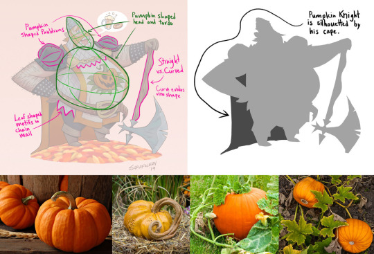
As a concept artist posing is essential. However, if it does not make the right silhouette then the pose means nothing. For example, the image above is of a large medieval pumpkin knight, created by Kyle Sarafolean. The artist uses pumpkins as his inspiration for the shape of his character, giving him a rotund belly and round shapes. The artist has also spaced out his arms so they are visible and don't blend in with his body. Shapes can also tell a character's personality such as round shapes give a soft and jolly nature to this character.

Another example from Sarafolean is his three pirates. They all have obvious and distinct features as well as varied shapes to make the bodies. As a whole, they are a band of pirates, as individuals they are still recognisable from their shape choices. The image results in a lineup of three distinctive and engaging figures whose designs convey the tale of the Prisoner's capture by highlighting the contrast between their sizes and forms and by selecting positions for each one that emphasises their reaction to this scenario (Sarafolean, 2020).
Image references:
Image 1 and 2: Sarafolean, K. (2020) Using contrast and pose to tell a story, Concept Art World. Available at: https://conceptartworld.com/training/using-contrast-and-pose-to-tell-a-story/ (Accessed: 10 July 2023).
Animated Spirit (2021) The power of posing, Animated Spirit. Available at: https://www.animatedspirit.com/the-power-of-posing/ (Accessed: 02 August 2023).
Engländer, F., Taback, J. and Riki, J.K. (2015) Perfect posing - 1 - listen to the character... and to physics, Animator Island. Available at: https://www.animatorisland.com/perfect-posing-1-listen-to-the-character-and-to-physics/ (Accessed: 02 August 2023).
0 notes
Text
Monster Brawl - Louisa
After I was given feedback, I had a few changes to make. The first change was getting Louisa's jaw right. I knew it looked a bit off myself, but I left it, whereas instead I should have followed my gut and altered. However, I am glad it was brought up because it made me need to change it and I am glad I have corrected it. Another update was I made the leg too long on the surfing pose which I need to keep more of an open eye to these details when presenting my work, as it can really make my work look rushed. The final correction was the anatomy of Louisa's final design. Her ear was too far from her head and gave her face far too much skin than it needed. Bringing the ear closer to her facial features made her head smaller but more realistically sized. Her right arms hand looked more like claws, and I was advised to use her hand from the pose for the varied clothes. Over all what I have learned from these corrections is that I need to start being more on top of things when I know they do not feel right. I need to really look more closely into human anatomy for my next human character and make sure I understand it more.

I wanted a similar layout to Zaylocks page to show that they are a pair and of similar interest. The colour scheme shows their love of water. A personal development of mine is that I am not leaving everything till the end. As I go through the project I am building these pages which means as I gather many image at the end of the project I am not having to stress on which images I use in the book.

0 notes