
Statistics
We looked inside some of the posts by lucy-illustrates and here's what we found interesting.
Average Info
Notes Per Post
24
Likes Per Post
22
Reblog Per Post
1
Reply Per Post
1
Time Between Posts
3 days
Number of Posts By Type
Text
17
Last Seen Tumblr Blogs


Fun Fact
69% of Tumblr users are millennials.
Text


NEW YORK SS24
Kate Barton
For my final piece, I chose to replicate the styles of Francesco Scognamiglio and Blair Breitstein for a green garment created by Kate Barton for NYFW. I chose to position my figure in a similar manor to Scognamiglio, by elongating and reducing the proportions. I also used the facial features and art style of Breitstein who applies her media in a chaotic way. For this piece I used the media of Pro Markers as I rarely choose this media and thought it would work well for my artists. I began on the faces, trying to emulate that of Breitstein through the makeup and skin tones. I slowly moved onto the garment creating a solid lime green base layer of which I then worked into using different shades of green to create the highlights and lowlights. I then made dots on my garment using my pro markers to try and replicate the sequins on the dress which I think turned out very well, I then went into it using acrylic paint to create the shine of the sequins.
1 note
·
View note
Text

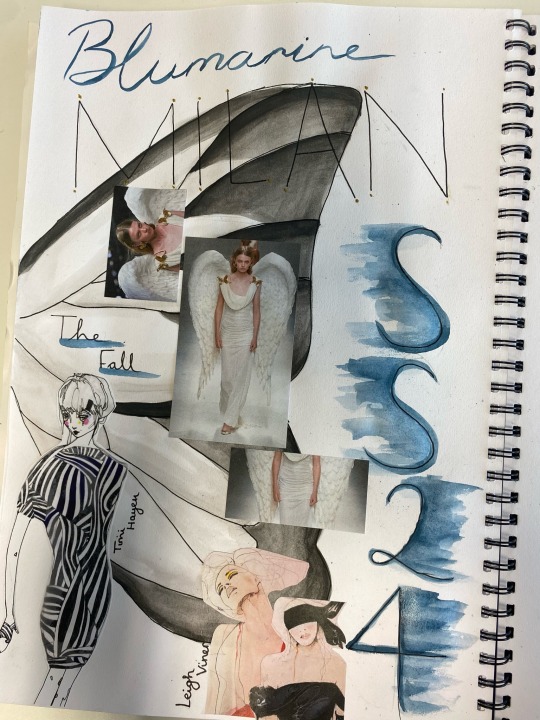

MILAN SS24
Blumarine - The Fall
My next piece was for Milan fashion week. I chose an angelic garment by Blumarine as i loved the wings and the way the dress fell. My starting point was to sketch out the garment in the style of one of my artists Timi Hayek. I then used a fine liner pen to really replicate the style of Hayek. Due to the garment being all white I had to try to capture the movement of the dress as i could not create shadows or shading with the fine liner pen. For my next step I worked into my illustration using watercolour paint in the style of Leigh Viner for the face and flesh. I focused on the face and replicated the makeup of Timi Hayek’s illustrations. I then used my paintbrush to flick paint at my paper in the way that Viner does in their illustrations. I really enjoyed creating this piece as as I have never used fine liner as my main media and I was nervous that it would appear underdeveloped.
#fashion illustration#fashion#watercolour#ink art#fine liners#ss24#blumarine#angel#fallen angel#milan fashion week
7 notes
·
View notes
Text


PARIS SS24
Mugler - Underwater Elegance.
For my Paris piece, I chose this enchanting garment from Mugler. In this piece i used both art styles from Inna Somova and Maria Kleinschmidt. I combined both Somova’s positioning of the models with the media of Kleinschmidt, watercolours. My starting point was sketching out both my figure and close up face. I then began painting my face first, as it is positioned behind the figure, lightly coating watercolour onto my page and letting it dry before applying more in order to build the tones and create depth in my skin. Then I moved onto my figure, mixing together my colours until i had a pale violet-blue which matched the garment I was replicating. However, I found it difficult to build my layers without some areas becoming slightly too dark, so in the future I will use lighter layers of watercolour to be extra sure that no areas become too dark. After it became dry I used white acrylic paint to create the sequin details on the garment which I felt gave it a good effect. As watercolour paints are usually my go-to media I enjoyed creating this piece as I felt I was able to better my abilities an make this my favourite watercolour piece yet.
#fashion illustration#fashion#watercolour#mugler#ss24#runway#catwalk#fashion show#underwater#elegance
0 notes
Text
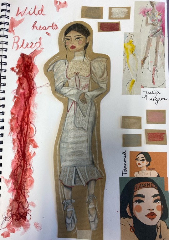


LONDON SS24
Dreaming Eli - Wild hearts bleed.
I originally began by sketching out my figure freehand while mixing both styles of Totanmed and Julija Lubgane. I had combined them using the shape, length and pose of Lubgane and the facial features and graphic art style of Totanmed. Then, using a light box, I traced my image onto brown paper, as due to the garment being mostly white I thought that I would be able to capture more of the tones and movement of the material if it was on a darker coloured surface. The media i had chosen for this piece was pastels as I really enjoyed using them in the past and hadn’t used them a lot in my work. I then, starting with my base colours, began to steadily build my layers of colour and enhance the creases and shadows using a variation of grey tones. Overall, I think that this piece went very well and was very fun to create using the pastels.
#fashion illustration#fashion#pastels#ss24#dreaming eli#wild heart#grotesque#london#fashion show#runway
1 note
·
View note
Text


MET GALA
Nikki de Jager
I first drew my centre line and measured up my proportions before I began my sketch. After i had made an outline of my figure I went into it using a light layer of watercolour from which I built up my skin tone and facial features. I then moved onto the dress, using a teal watercolour paint i created a base layer for my dress and moved my paintbrush in the direction of the dress which was from left to right at an angle which followed the curves of the body. I built layer upon layer of watercolour adding layers of a pale yellow to represent the lighter colour tulle that was used. When I was satisfied with the layers I had created I began on the smaller details such as the flowers, crown and the large bow again using watercolour. I worked into them many times to really build the colour and make them pop. In the future, to improve my work, I will use less water on my paintbrush to gain more controlled lines and sharpen my facial features to make them look more accurate and true to the photo. To finalise my piece, I went into it using yellow and blue inks to replicate that of the artist by flicking the ink at my page and moving it in different directions to create a messy yet controlled look.
4 notes
·
View notes
Text

Media experimentation
Pro-marker
I found this piece particularly hard to do as I feel that the pro markers were hard to control and also mine had sort or dried out at some points so they became scratchy and untidy. I started with the legs and worked my way up. I enjoyed the movement of the pro markers but i feel that most of the colours didn’t match such as the skin colour, which was quite frustrating. I used large strokes for the trousers and shorter faster strokes for the top to give it a different shape and feel.
1 note
·
View note
Text

Media experimentation
Pencil
I started by creating a light sketch of my figure and began to work into the skin first. I then began to do the base of my jumper using a grey pencil, this took me the longest as there was more details in the pattern and it took time to shade to make it accurate to the picture. I then created the trousers and really struggled while colouring them as because the legs cross over in the centre my dimensions were a little off so they look a bit odd. I then moved onto my second image which I enjoyed making more as it was a side on profile that was easier to draw. I again started with the face and worked my way downwards. I struggled a little with the feet as they don’t really look the same on both models as they do on the picture as I couldn’t get the right tones and shades of brown.
1 note
·
View note
Text

Media experimentation
Watercolour
I then moved onto my watercolour piece, I really enjoyed creating this one as I found it easy to control and was smooth to apply. I started with a simple sketch of the figures which I then began to use a burnt orange colour to go into the skirt while trying to keep straight edges and maintain control of the media. I then carefully made my outline ensuring that it stayed sharp and neat. I then went back in with varying tones of yellow and reds to create the shape of the dress. I overall think it came out pretty well as it looked very similar to the picture I was recreating.
Edit: I recreated my layout and added some fun details to decorate my page.

0 notes
Text
Media experimentation
Collage
I began by creating a background for my illustration using paragraphs of writing from vogue magazines. I then began creating ruffles out of a red piece of a magazine which I found difficult as it was hard to create pleats and stick them all down in a way that was smooth and accurate to the photo. I then worked into the dress using watercolour paints so it was a light and translucent media that enabled the writing of the magazines to still be shown through. I then outlined everything with a black fine liner and then created the dark areas using a berol colouring pen. I didn’t really enjoy making this collage as I feel collage work isn’t my strong point and I am not very good at it so it is something I will work on in the future.

Edit : I changed my title as I feel this one fits it much better and I also hated the one i had before.

Edit 2: I again changed my layout as I was still not satisfied, but I feel I am now.

0 notes
Text

Media experimentation:
Ink
I really enjoyed using this media as I found it really easy and effective. I started by sketching out something simple and then going in with my first layer of ink. I then dried it using a hair dryer and added a second layer. Ink is a very messy and hard to control media so it was easier to capture the movement of the image using it. I added my final layer of ink and proceeded to throw ink at the page in order to really accentuate the untidiness of the whole image, then I outlined my figure using a fine liner to give it definition.
2 notes
·
View notes
Text

Media experimentation
Pastels pt. 2
I then moved on to a second piece which was monochromatic which required less time for me to create. I began with a simple sketch then worked into it using a charcoal pastel. I coloured all the skin first and then moved onto the dress which was mainly black, then I used white to highlight and finish the dress. I again enjoyed creating this one as it was easy to do and I liked the media I was using.
1 note
·
View note
Text

Media experimentation
Pastels pt. 1
My starting point was to sketch out my figure using a pencil on brown paper, I did this freehand as I felt it would be easier for me to mimic the movement of her dress. I then used dry pastels to work into the skin first using a dark reddish brown colour and hints of yellow and black to create depth and then using white for highlights.
I then began to go into the dress starting with the shoulder strap which used mostly blue and green tones which juxtaposed the warmer colours and tones of the bodice part. I then moved down the skirt with long strokes of the pastel to show the movement and I mixed many different colours together in order to gather the effect I wanted. I overall really enjoyed creating this figure as i liked the movement of the pastels and i found them nice to work with.
1 note
·
View note
Text


Stylised face
ALL ABOUT THE FACE pt. 3
I really enjoyed creating this price as I found the model I was painting, Carmen Dell’Orefice, to be extremely elegant and beautiful so I wanted to try and capture her beauty in my work. I created a basic sketch and base coat of watercolours then I began to do thick layers of bright colours for the hair to try replicate the artists work. I struggled a lot with the hands and symmetry of the face but in the end I think it turned out pretty well.
1 note
·
View note
Text


Stylised face
ALL ABOUT THE FACE pt. 2
I began by sketching out my face, which took me an extremely long time due to his face being positioned at an angle. I then drew many curved shapes across his face to accentuate the contours of his cheeks and nose, I then used touch markers to fill them in. I used a dark palette to keep his dark skin tone and I incorporated bright colours of lilac and red to make key areas pop. I really disliked drawing this picture as I found it really hard and I don’t think it is my best work overall. I also struggled with his hair as this was my first time drawing dreadlocks, I also look back on my work and realise I probably should have moved the eyes further apart from each other as I find they are too close.
1 note
·
View note
Text


Stylised face
ALL ABOUT THE FACE pt. 1
My starting point was the eyes as they are the focal point of this piece. I wanted to draw all attention to the top half of the painting so I did little-to-no detail on the bottom half of the face in order to make it less eye catching. I really enjoyed creating this piece, I did not like it at the beginning but after I started adding the details of the eyelashes and strands in her hair I found it really came together well. At the end I wrote “mesmerise” on her collarbone as I find her large eyes to be quite mesmerising and captivating.
1 note
·
View note
Text


Cassandra Rhodin
I began by roughly sketching out my figure with pencil. I went for a very messy look that I feel added to the overall effect of the piece. Then, using a berol colouring pen, I outlined my sketch. I then began to go in with water on a paintbrush and bleed all of the black lines creating my own kind of shading which began to give it some depth and make it look very effective. Finally, I coloured the background a vibrant scarlet-red colour which I feel makes my art really pop.
1 note
·
View note
Text


Stylised alien face
I began with my angled face, I drew all images freehand and I found it extremely frustrating in making the eyes even, I feel it is definitely a skill I must spend more time practicing. I then moved onto my face-on face, I found this one easier to an extent but I still could not make the eyes very even as I think I placed them too high up on the face. I finally moved onto the side profile face. I struggled creating the nose as I kept making it too pointy and high up but it was my favourite to make. I then added shading to them all to create more depth.
1 note
·
View note