
Don't wanna be here? Send us removal request.
Statistics
We looked inside some of the posts by lucymachen and here's what we found interesting.
Average Info
Notes Per Post
0
Likes Per Post
0
Reblog Per Post
0
Reply Per Post
0
Time Between Posts
5 days
Number of Posts By Type
Text
11
Photo
1
Last Seen Tumblr Blogs


Fun Fact
Tumblr is available in 18 languages.
Text

Lost and Found - (29/11/22)
As it’s coming to the end of this project, I've worked thoroughly and at a consistent pace. I unfortunately, haven’t found time between animating to document my journey. With this being said, I've struggled to find a suitable pace and balance between other work and this module, let alone my free time. I do believe I could’ve started the animation process earlier than I did, but even with that in mind, I know I would’ve struggled regardless, since timing wasn’t the only issue I ran into. I don’t think this end project was overall a very good idea, especially this early on in the course. There was a lot of room for interpretation for the individual, but that meant it also left a lot of room for uncertainty. This was a project for an animator with a confident understanding of basic software and its properties. Respectfully, that hadn’t really been taught to us yet. I feel strongly there was just an assumption on this knowledge, but personally, that wasn’t the case. In order to even remotely succeed at this module, I've had to completely scrap an entire scene to prioritise the chance of it being finished on time. I had to choose the scene that would’ve taken most of my time. Even with this deduction, I haven't been able to create a piece that I'm fully proud of or a piece that is the best of my creative ability. I think this is due to a lot of small reasons, some out of my capability, but add up to one large fault. I do hope I learn from this experience for my future projects.


0 notes
Text

Lost and Found - (22/11/22)
Story 3: This was one of my first ideas that I had initially scrapped but brought it back as I thought of all the possibilities that came with it. It begins with two friends relaxing in a bedroom. Friend 1 is playing a pixel game on their phone, while Friend 2 is sitting opposite them, examining a strange glowing orb. They somehow trigger it, and Friend 1 vanishes in a bright flash. Friend 2 is confused, looking around for Friend 1, when their phone starts making strange noises. Friend 2 inspects the phone to see Friend 1 inside the game they were playing. Friend 1 freaks out in game format, and Friend 2 looks for a way to free them. They once again trigger the orb, but both vanish out of the scene. Cuts to real time, and Friend 1 is stuck in a paper stop motion “art-verse”. Next to them is Friend 2, stuck in a comic book “art-verse”, being read in real time. They interact then once again, transported to another art-verse. This time, it's again in real time, but in the same art-verse. It’s in place of Raphael’s Portrait of Agnolo and Maddalena Doni from the Uffizi Gallery. They exchange glances and are transported yet again. The last art-verse jump is that of a Disney art style. They examine their surroundings and find themselves in a forest opening and towering over them is a terrifying dragon in the classic Disney art style. Friend 1 freaks again and tries grabbing the orb from Friend 2, which is triggered by both of their touch. They are finally transported back to the real world. Friend 2, in excitement, wants to go again. Friend 1, in a silent rage, throws the orb out of the window. The storyboard below is my first storyboard concept.
Taking into consideration my little knowledge on how to properly animate, I thought of a way to use real-time references and crossovers as well as a change in method of animation. The more I studied this idea, the more it grew on me. I saw the exciting benefits to choosing this concept, from the various art style opportunities I get to animate, and the expansion of knowledge this comes with it. This is unlike anything I've ever done, so whether it becomes a complete disaster or not, it will be an intense learning journey regardless.


0 notes
Text

Lost and Found - (22/11/22)
Story 2: This story is relatively like story 1 regarding its principles, just different approach to characters. A man walks through a snowy path in between forests and mountains. He walks past the snow-covered mountains and sees an out-of-shape mountain at the corner of his eye. To his shock, finds it’s a giant snow-covered sleeping cat. He fears it at first, but when it awakes, finds him curious and looks eager for his help. He believes it must belong to a giant, so curiously, helps it find its way back home. They gain trust in each other and eventually find a cabin in the far distance in a forest opening. From afar, looks like a normal-sized house, until the man approaches with the excited cat, to find that it is in fact the cat’s home. But the cabin is even smaller than the man, making him look just as giant as the cat looks to him. Tiny people come outside in glee to see their cat back home. The man watches in both awe and confusion.
I liked this concept for a sweet story, but again, it seemed like a simple take on the theme. This was my second choice between the three in using for the final animation. I took inspiration from Magical World of Giant Animals by Artist Mono Kubo.
0 notes
Text

Lost and Found - (22/11/22)
Story 1: I went with an easy and safe approach at first, a typical “Lost and Found” arc. To make this more interesting, I included a simple but enjoyable plot twist to end it with a sense of purpose. It opens with a gloomy man walking through equally gloomy streets. On his way home, he sees something twinkle at the corner of his eye. The intensity intrigues him. He pulls back a bush to see a star shaped glow flickering on the floor. He’s not sure what to do, but he can’t bring himself to leave it. He puts it in his pocket and walks on at a swift pace. As the sun slowly sets, the light glows brighter in his pocket, alarming the man and those around him. He picks up the pace and eventually gets home at sunset. He places the light at his table, and he studies it. As the night draws in, it glows at its brightest and something draws him outside. He takes the light with him, and he looks up at the sky, seeing an empty space among the stars. The light flickers and slowly floats up above the man and into the empty space in the sky. They all shine and the colours in the world seem as bright as ever.
I enjoyed this concept a lot, but looking back, it seems a little too simplistic. I wanted a slight challenge and as interesting as it seems, I would look back and wish I did something else.

0 notes
Text

Lost and Found - (08/11/22)
My new project is a 1-minute animation centred around the theme of “Lost and Found”. This at first was daunting, and I had no clue where to start. I began by using online AI websites to visualise a concept around “Lost and Found”. A lot of examples were of two figures in a “deep forest” setting. This gave me a few starting points with my stories and wanted to create two protagonists to centre my story around, one “lost” and one “helping the lost”.
I also didn’t want to stick to this initially, so I created three storyboards of potential stories around the theme. I did, however, stick around my favourite theme in any sort of media: fantasy. This ensured that I would enjoy whatever I chose to create.


0 notes
Text

Introduction to Creative Play - (25/10/22)
This week, we explored the principles of storyboards and how to effectively lay them out. These were individual tasks, and we were given a few story prompts. My favoured option was “New family move into haunted house”. My mind instantly went down the horror-route but remembered the principle of appeal in animation. With this influence, I decided on a more “Casper the Friendly Ghost” route, still on theme for the prompt but with a light-hearted element.
The baseline concept for storyboards is six panels of keyframes with room for notes for direction and context, setting out the scene and noting all the important moments and significant changes in the scene, and dramatic movement changes in characters. After seeing the scenes in my head, I tried to compile them into six, but recapping, I realise it would’ve been a more effective storyboard if I had expanded the amount of keyframes rather than compress them. I would’ve absolutely been able to put my story across the way I wanted to, but I still believe it was compressed the best possible way.
My story followed a lonely ghost that resides on its own in an old basement underneath an abandoned house. This is my first frame, setting the scene in this large, dark room with a sad ghost hunched over in the centre of the frame. I attempted correct staging for this effect; to make its surroundings large and bare to indicate and represent its significant loneliness. The second frame pans closer to the startled yet intrigued ghost that hears a noise above the floor panels, shining a ray of light through and onto the ghost's face. I enjoy symbolism in all kinds of media and tried to use that in my own interpretation (the ray of light). For the third and fourth keyframe, I tried my luck at using anticipation, and adding that subtle horror element in place where, in this context, wouldn’t have been expected. Keyframe 3 jumps to a loud and quick bang open of the basement door, displaying what appears to be a heavy-footed silhouette standing at the top of the staircase. The ghost reacts in fear. Following the fourth keyframe, the ghost quickly flies to the safest place out of sight as the footsteps get heavier and closer down the stairs. The ghost hides behind a wall further in the basement and slowly peaks its head around the wall to see what scary creature is in its house after being alone for so long. The fifth keyframe shows the silhouette to actually be a young girl, excited and wide-eyed and looking around her new home. The fear breaks down in the ghost as it pans to the sixth and final keyframe, where the ghost hears one of the little girl’s parents call for her back up, and as she obliges, the ghost looks in relief and awe to its potential new best friend.
I really enjoyed this exercise; there was a lot of wiggle room, and it was open to interpretation on our end. I was able to really apply a lot of general principles of animation to my storyboard and will enjoy any future use of this exercise.
0 notes
Text

Introduction to Creative Play - (18/10/22)
This week was a big step into a new animation format; using new software and a new type of animation style, puppetry. For this, we had a 2D model of Finn and Jake from animated TV show Adventure Time, along with a background from the show with parallax properties. Luckily, we weren’t thrown in at the deep end, and were shown step by step how to achieve a walking Finn puppet. Starting small was an appreciated call.
We were using Adobe After Effects for this, and upon opening the software, it was incredibly daunting and confusing, but with each step it was easier to navigate. Even with the correct steps, it sometimes felt irritating and pinpoint about what was needed for the smallest things to work, but luckily, we were more or less just playing around with the controls. The puppetry function was actually very interesting and fun when done correctly. We were given references for the motion of walking, and how arm movement differs from legs, as well as how the torso moves during this sequence. This is, of course, basic knowledge of human anatomy, but to have it quite literally put in front of you was incredibly helpful in making the walking motion correct and precise in motion as well as timing.
I did, of course, struggle at times. The composition of the torso was difficult to animate in the motion of walking and was sometimes tedious to move. Additionally, the pinning of the joints would sometimes make them disproportionate in motion. I’m still unsure if this was due to the puppet or my placement of the pins. Through this, I was still able to enjoy this task.

Learning terms such as pinning, pivoting and parenting was very beneficial, since this will be needed for any future puppet pins to animate in After Effects. This is definitely a type of animation that I want I expand my knowledge of and create my own puppets with.
0 notes
Text

Introduction to Creative Play - (11/10/22)
This week we were tasked with creating a stop-motion production with miniature figurines and LEGO. In groups, we picked out a few figurines and worked our story around them. We picked out a small model of Bender from Futurama and a LEGO character of a mad scientist. This instantly drew us to a sci-fi theme and eventually a sci-fi horror theme. Our inspirations were drawn from 30’s and 40’s horror films like Frankenstein (1931) and Dead of Night (1945).
Our final story was concluded, and we wanted to incorporate real features for contrast. With this, I drew scars and stapled sections with pen onto our teammate’s hand, to remake our own “Frankenstein monster”. We used this as our main antagonist and creation-gone-wrong of our scientist. We wanted a dark setting to go with these themes, so we set up a black background made of black Styrofoam and paper and set our scene with the scientist interacting with her “robot companion”. She pours her concoction onto this large hand, and it eventually becomes mobile. It does, however, become hostile and attacks the scientist and her robot, before turning to attack the camera.

It was a simple story with five scenes in total, and we achieved this with cooperative direction and lots of great cinematic suggestions. It was fair in production and collaboration and honestly, we all had a lot of fun creating this. Once shot and in post-production, we compiled the scenes and added effects and filters to really pull in its themes of noir horror. The result was grainy and deeply contrasted and honestly looks amazing. This was a very successful production.
0 notes
Text

Introduction to Creative Play - (04/10/22)
Part 2
Our second task was similar in nature, but with parallax scrolling in the background. We were tasked to use block colours to create any stop motion in any style while applying a parallax effect on the background. My attempt turned out to be a rabbit running through the forest at night. I had two models for the rabbit’s body, taking reference from its form when running at a fast speed; its body extends out with limbs reaching opposite angles, and with contact with the ground, tucks its legs cross and under its body. I took these two key motions and made a model, with a separate head model to keep the consistency clearer. I kept the body in its place and moved the background features to play the illusion of movement. As for the parallax, I wasn’t able to find time to create layers for the background, which I believe I could have succeeded at.
0 notes
Text

Introduction to Creative Play - 04/10/22
Part 1
Second week into our creative play and we further explore the art style of South Park, due to its paper “puppetry” and stop motion methods. We explored the animation styles of the show and noted that the art style remained despite changing from 2D stop motion to using the style of stop motion in animation software.
We kept to the traditional style for this task; we created our own character using the basic shapes and models of a South Park character. We had to think about movement and what to separate to find easy movement in our character, such as eyes, pupils, head etc. I sketched out each separate section for the character, and ended up making a body, separate head shape, open eyes and closed, separated pupils for eye movement, and two mouth shape options. This gave me my character.

Using the Stop Motion Studio app, we were tasked in creating a small stop motion video with our characters. My version was first used with a phone tripod, which at first was difficult to get the hang of. The attempt below was my second, frames taken by hand. This result was slightly rougher in the finish, but the movement I chose for the character in this version was clearer and more direct.
0 notes
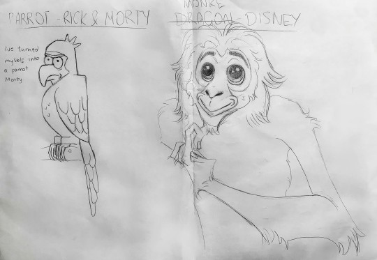
Photo

Introduction to Creative Play - 27/09/22
Our ease into the course and to get our creative juices flowing started with a way to expand our illustrative knowledge. We did this by starting off with a list of popular art styles in the media, such as South Park, The Simpsons, etc., and a list of different creatures and people in our lives. An online wheel spin would determine what combination, then create and design what we’re given. This was an exciting task, considering my personal love for many of these notable character designs, as well as my love for trying new things.
My first combination was a parrot in the style of Rick and Morty. When taking visual reference, I noticed the illustration uses quite soft shapes for the character's features and simple details. I also noticed how unrefined the outlines are, giving an accentuated feel for the chaotic themes of the show. My attempt was heavily reliant on the character features of Rick, the mad scientist and grandfather of Morty. His main plotline is using his scientific abilities to transform himself and Morty into various creatures, to which I applied this theme to my creation. I tried to mirror the illustration type and simplify the features to keep it on the theme. I think this was a good first attempt.
My second was a complete 180. It was a monkey in the style of Classic Disney. Since references for this were quite easily given (Abu from Aladdin, The Jungle Book, Rafiki from The Lion King, etc.) as well as the range of breeds of monkey, I decided to reference a type of ape that Disney has not illustrated before, a Gibbon. This was possibly my favourite attempt since I've always enjoyed Disney-style illustrations. The proportions are warped, and expressions are dramatized. There’s also the use of appeal, especially in anthropomorphized animals.
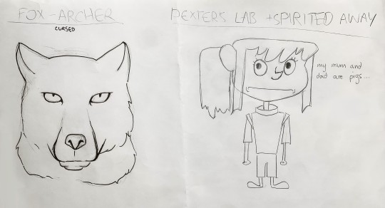
The third was quite an easy creation; a fox in the style of the animated sitcom Archer. I went with referencing a Tibetan sand fox. The art style is very comic-like and heavily reliant on sharp shadows and thick lines. The proportions are quite realistic, so when applying the style, all it really included was enhanced outlines and block shadowing. This in itself wasn’t entirely challenging; I believe this art style can only be recognized by applying it to people rather than animals.
My fourth and final combination for this task had a twist; take two art styles and combine a character from one into the style of the other. My two were Dexter’s Laboratory and Studio Ghibli’s Spirited Away. I was drawn more to the style of Dexter’s Laboratory since it was much more visibly cartoon-like and proportionally bizarre. Dexter’s Laboratory heavily relies on geometric shapes to create expressions and proportions that represent the character’s identity: small feet and long bodies for adult female characters to give the light-footed feminine touch, whereas male characters have sharp and lanky features to portray a sharp-witted and sharp-minded disposition. I used this knowledge on the protagonist of Spirited Away, Chihiro Ogino. I kept her features softer to appeal to her age and a smaller proportioned body for her nimble character. I also tried to keep to the TV shows geometric concepts.
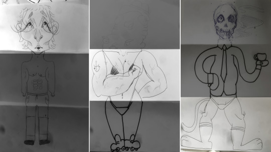
Our last task to finish our creativity off was a game of Exquisite Corpse, with three different pass-around for the head, torso, and legs. I kept my attempts similar in approach and wanted to portray a very caricature-like style. I enjoy this type of portrait illustration a lot, which is great for creating games like this. Let it be known that these creations were completely off the top of my head. I started off with the head, wanting to portray a lot of emotion, and was happy with its outcome. My torso also told a story of sorts. My proportions were slightly off, but it wasn’t something I relatively cared for at the moment. As long as I was successful in what story I wanted to tell. I got slightly more creative with the legs since I decided at the last minute to make it less human and more rabbit-like. I tried to be clear about the shapes and apply what I learned about with the previous challenge; accentuating features is what make caricatures more stylized and portray emotion and story quicker to the audience. All in all, this was my favourite task by far. It was a great way to customize our own characters and our own styles, after expanding our minds with the art styles we had previously studied. Below are my three attempts at Exquisite Corpse, highlighted are my creations.
0 notes