lutaviacosplay
lutavia
they/them, cosplay educator maker from yeehaw land sharing cosplay tips, tutorials, mishaps, and more! current builds: hilda [#lutavia_build_hilda] lebkuchen [#lutavia_build_leb]medicine seller[#lutavia_build_mononoke]
29 posts
Don't wanna be here? Send us removal request.
Last Seen Blogs

Text

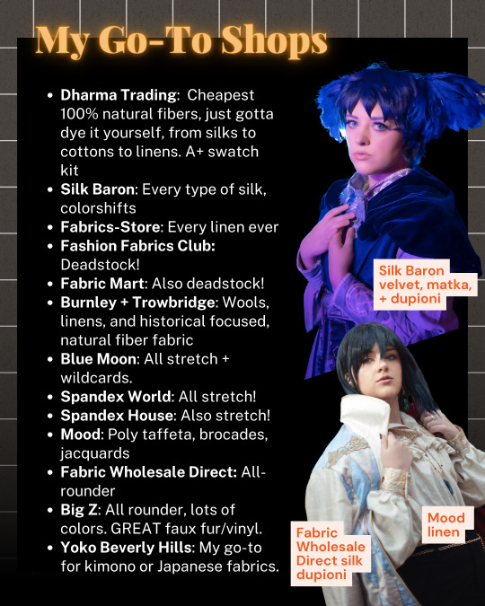

FABRIC STORE MASTERLIST [REVISED]
many of you may remember my original, OG fabric store masterlist -- and now i'm BACK, with a much more visually nice, updated list, with a few new items and examples of some of the fabrics!
enjoy! <3
19 notes
·
View notes
Text

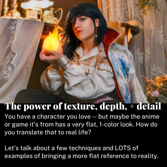


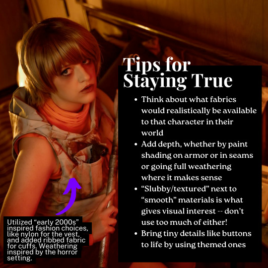


a cosplay tutorial on how to translate 'flat', 2D designs into real life, while adding your own unique touch as a cosplayer
13 notes
·
View notes
Text


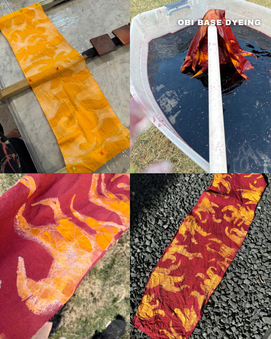
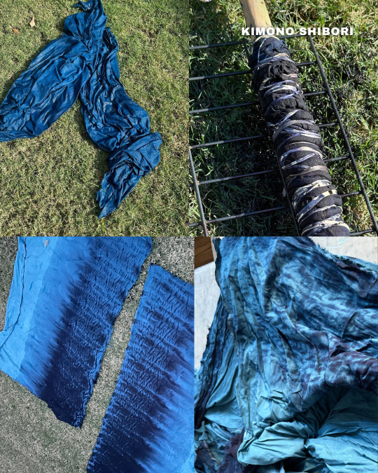
Medicine Seller (Mononoke) Progress - Kimono + Obi: How I Made It
👾 SLEEVES 👾
These are entirely made of damaged or used kimono — and every piece is also dyed to be a similar shade/tone, so the whole thing has deep colors and is cohesive! I got my kimono from Tangerine Mountain kimono and Yoko Beverly Hills primarily; anything not cut or unused was donated to others. All patches are fused with mistyfuse, then sashiko’d on by hand. Fun fact: all the sashiko patterns are tied with the earth or spirits, with the Seven Treasures of Buddhism for the purple, waves of grass for the green, and ocean waves for the blue!
👾 KIMONO FLOWERS 👾
The white flowers were stenciled with Jacquard textile paint in white, before I mixed sodium alginate (a dye thickener) with Dharma Trading Co ’s Teal Blue fiber reactive dye and blended the outlines, making it look a bit more “worn”.
👾 OBI 👾
This was, by and far, the most challenging thing I’ve ever done. I decided to batik (or wax resist) the obi. I started with white raw silk, dyed Golden Yellow with fiber reactive — vinegar has to be added for it to stick better to silks. I then applied the Jacquard wax by brush (all 4 yards of fabric, bless Dharma Trading Co for their amazing brushes), and then — to prevent the yellow from going orange — did another HEAVY wine colored dye bath (Burgundy dye with a touch of Deep Space), LOTS of salt and vinegar to overwhelm the yellow, and it WORKED! I did over 15 different dye tests for this and it WORKED!
👾 KIMONO 👾
This started as the rayon/linen blend fabric from Dharma Trading Co in white. The whole thing was dyed with their fiber reactive dye in Teal Blue, then, I did arashi shibori, or pole-wrapping shibori, with the dye in Navy and Deep Space.
13 notes
·
View notes
Text
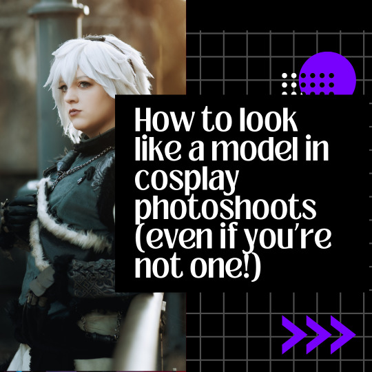
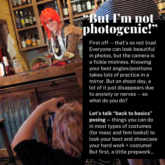
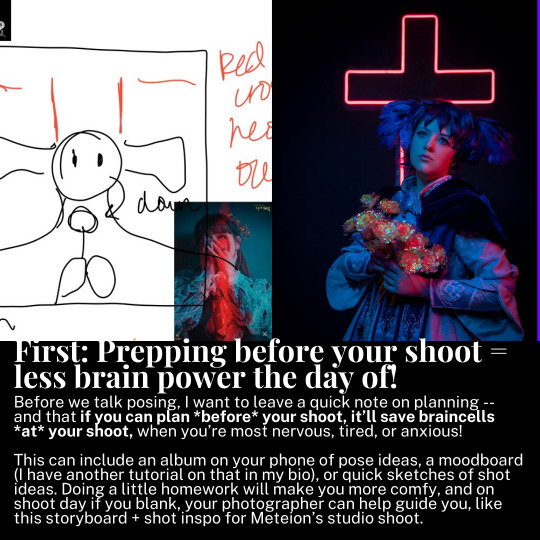
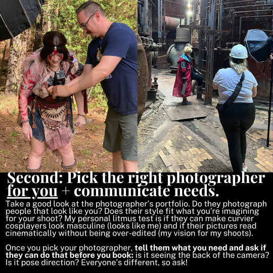

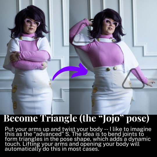

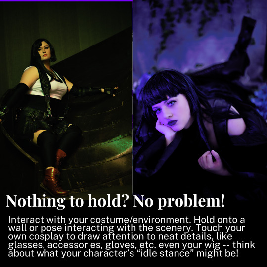
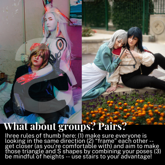
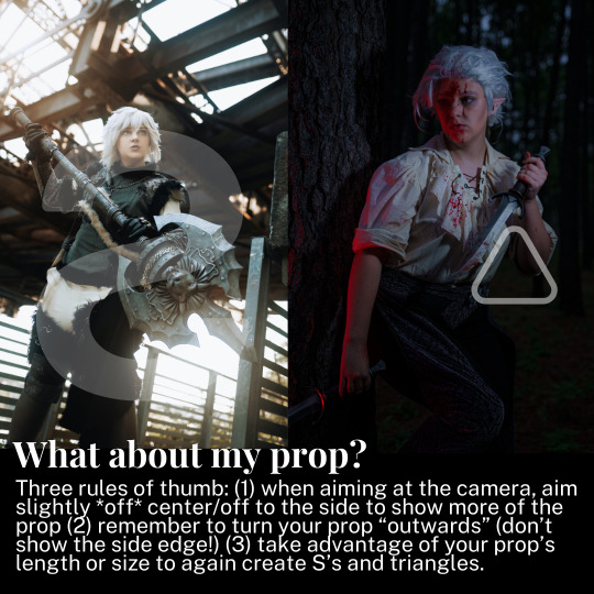
A cosplay tutorial on how to pose for photoshoots, no matter what you look like and what you're wearing -- with example shots to help guide you along.
213 notes
·
View notes
Text
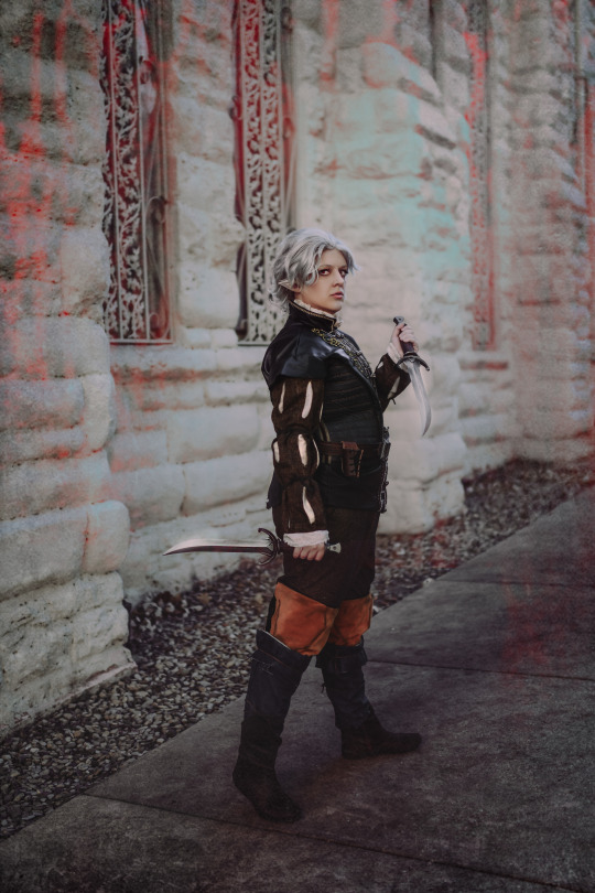
"You want to just team up with some blood-stained killer? Because I'm fine with that."
Cosplay made + worn by me
Photo: allisonthephotographer (IG)
Dagger + Belt Kit: @dangerous-ladies
Wig: omgitsbarri (IG)
Embroidery files: EmissaryOfWind (IG)
16 notes
·
View notes
Text
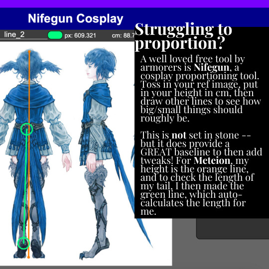

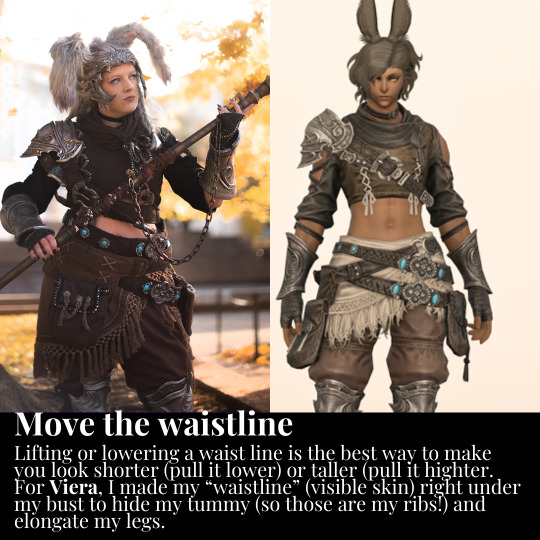


Tutorial on how I proportion cosplays on my very short body!
941 notes
·
View notes
Text
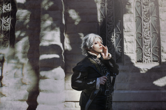
"I don’t need a reflection to know this looks fabulous.”
Cosplay made + worn by me
Photo: allisonthephotographer (IG) || Wig: omgitsbarri (IG) || Vest Embroidery Files: emissaryofwind (IG) || Dagger STLs + Belt Kit: @dangerous-ladies
17 notes
·
View notes
Text
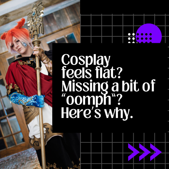
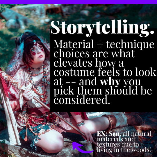
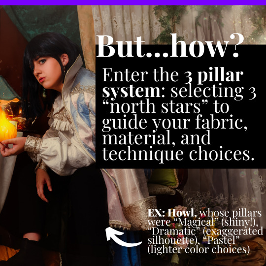

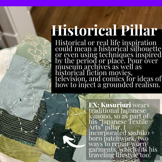

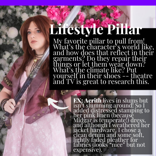
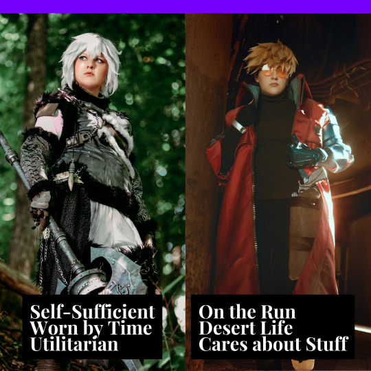
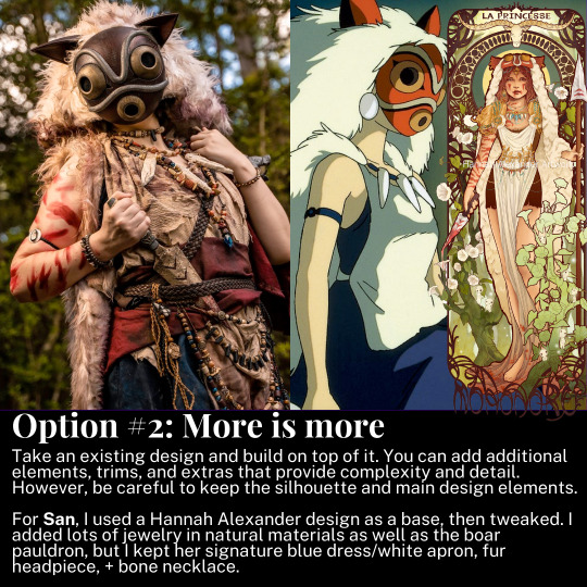
A tutorial on how to make cosplays feel less like cosplays, and more like real garments, using my 'three pillars' technique.
I use this for basically every single costume I ever make -- give it a try for your next project.
68 notes
·
View notes
Text
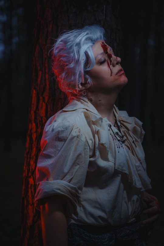
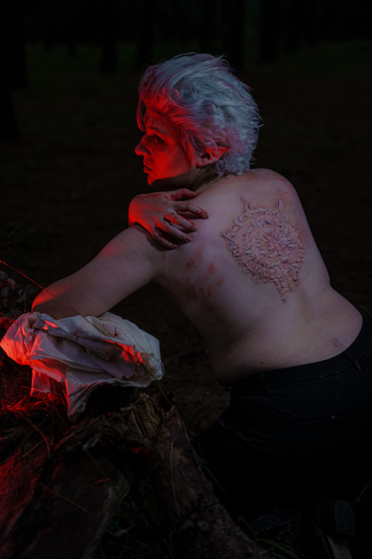

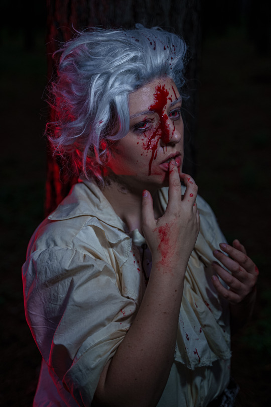
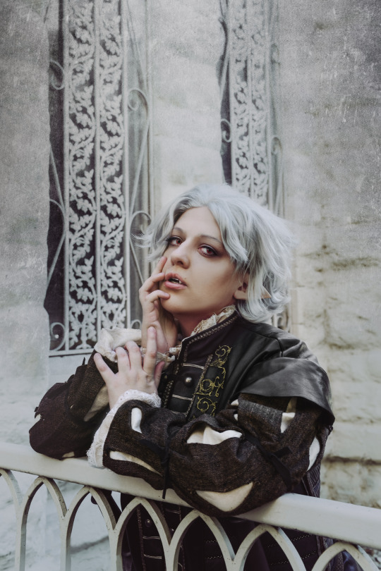
"Thou shalt not drink of the blood of thinking creatures."
Made + worn by me, using patterns from grangertales (IG)
Photo by j.a.vilches (IG)
Wig styled by @silencedrowns
15 notes
·
View notes
Text

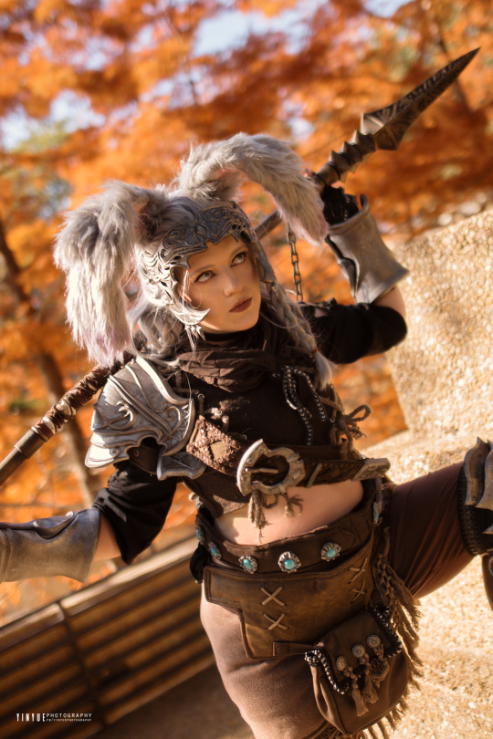
"Go forth, my child, and be as a beacon of hope for Eorzea and the lands beyond, through all the days of thy life."
Warrior of Light/Male Viera made + worn by me! | Armor STLs from @isomoart (IG) | Spear STL from @leeleethebunny (IG)
Photo by @yinyueify
19 notes
·
View notes
Text
Help the Dangerous Ladies Keep Creating!
Hello, it’s been a while! Unfortunately, we’re coming back under less than ideal circumstances.
Our Etsy shop, our main source of income, has been recently suspended due to copyright claims. At the behest of our supporters, we have started a Gofundme to help keep the lights on.
Help Us Out at our GoFundMe
If you don’t know us, we’re a small woman owned and operated, LGBT-friendly costuming company that has been cosplaying together for a decade and providing resin kits, patterns, textiles and other accessories to the community since 2013. We’re based in Toronto, Canada.
To date, we have shipped more than 26,000 kits, prints, files and other resources for cosplayers. This business is our livelihood and came to fruition through hard work and effort. Everything we make is from scratch, with our own hands and our own machines, in small quantities, to order. Our digital files are all made in-house, individually, using no official assets. We are not a factory mass-producing wholesale goods, nor do we dropship other people’s products. We are a committed little business that has loved being on Etsy, and truly believe we are the very artists that Etsy should want to platform –– our goods are handmade, unique, and often the only resource of their kind!
We work hard for our high ratings, but agents operating on behalf of certain companies occasionally send take-downs, and then do not reply to us when we try to work it out with them. It’s complicated, but the reality is that we’re creating projects in the realm of transformative work and are by no means taking away profit from the creators of these properties, as our cosplay kits are one-of-a-kind creations with no official analogue.
We also feel very strongly that cosplay is an incredible form of free advertising for companies producing video games, anime, tv shows and movies. Cosplayers put in a tremendous amount of labour, time and money to make their costumes, which they wear and display all over conventions, the internet and social media. We know from experience that companies enjoy and engage with the fruits of this labour; the very companies that inspire us to create kits sometimes hire us (and other cosplayers) themselves to represent their media after having seen our store! We’ve had the distinct pleasure of working for media companies large and small, and they know what we make and allow us to keep the rights to our files and associated assets. These companies also regularly post on social media with cosplayers using our work. However, Etsy does not know who or what companies choose to allow the sale of fan art and goods. To them, a report is a report, even if it is erroneous or mistaken.
This has been a crushing blow to us as a small business. We’re a very month-to-month, low-profit business after we pay the bills and our team. Currently, Dangerous Ladies employs eight staff members and operates from a rented studio space. Both our staff and our space are an integral part of our business and allow us to be able to operate at our current capacity, providing cosplay resources to creators all around the world. Without support, we will have to scale back dramatically, if not close entirely.
While we work to appeal with Etsy, we realize that there is a chance we may not see our platform flourish there again, so we are working diligently to bring you our new website, and welcome you to visit our Storenvy in the meantime.
We started this Gofundme Although orders are very important to us right now, we understand that some of you may not have the need to order a kit, print, or fabric at the moment, but still wish to support us through this trying time.
For this, we want to say thank you from the bottom of our hearts.
Sincerely, the Dangerous Ladies Jenn, Christine, Shazz, Aubree, Nicole, Gabi, Syd, and Jules <3
Can I see more of what you do?
Of course! While our Etsy is down, you can visit us on Storenvy or subscribe to our newsletter. You can also find us on Twitter and Instagram!
#cosplay resources#one of the best groups out there#show them some major love#I wouldn’t be cosplaying without them!
133 notes
·
View notes
Text

"I see no point in living if I cannot be beautiful."
Cos made + worn by me | Shirt/jacket pattern from @marquisecubey
Photo by allisonthephotographer (IG)
122 notes
·
View notes
Text
Things to do before you cut into fabric:
Iron it. Listen to me. Look me in the eyes. Are you listening? Iron your fabric. Don’t be an idiot and waste a solid yard of material bc you were too lazy to do it right the first time. Ask me how I know. Velvet is possibly the only exception.
Expanding on the ironing, make sure your grainlines aren’t skewed. When you buy fabric, 99% of the time it will be cut crooked and you cannot rely on the cut edge to lay your fabric out straight. If your fabric has a woven pattern, you can use that as a reference, but printed ones aren’t reliable either. I draw a thread an trim off the slanted excess.
Lay your fabric out on a flat surface with straight reference lines that can be used to align the grain. For me this means my hardwood floors.
Yes I am way more obsessive than the average hobbyist tailor but getting your grain aligned is so important.
7K notes
·
View notes
Text
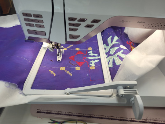
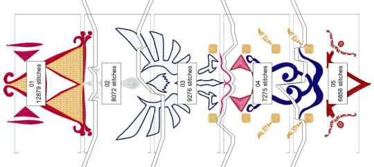
An absurdly and unnecessarily over-the-top and thorough breakdown of using my embroidery machine for a cosplay piece.
Part 1) The piece:
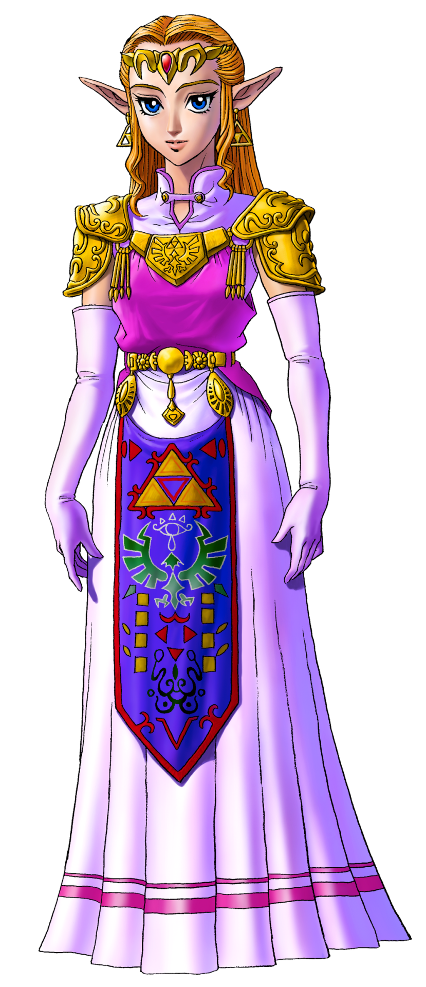
Many iterations of Princess Zelda from the Legend of Zelda series has this tapestry front piece. I've looked for a technical name for this piece as well as extant examples of it from our history, and my research is indicating that it's just a fantasy piece and doesn't have a name.
So we're calling it an apron. IDK. "Heraldic apron," sounds fancy enough.
One of the things that's been a bitch through all cosplay of all time is custom textiles. Since the early days of cosplay, we've been looking for ways to handle this at home. Back when I got into cosplay and took it really seriously, Worbla hadn't been invented, there was no Friendly Plastic, Wonderflex had to be purchased in 15-yard lots, the Glowforge and home 3D printing was just a fantasy, and Cricut machines ran off cartridges and couldn't design from your computer. Also, when I was cosplaying seriously, I was a college student with no job and a $100/month allowance for food (which I spent on cosplay, mostly). We didn't do fancy shit. You know what we did?
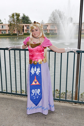
We had fuckin' hand-traced and hand-cut stencils. Mother fuckin' freezer. Paper. Stencils. Now, this version of Zelda that 2009 Me is cosplaying up there does have a much simpler heraldic apron than Ocarina of Time Zelda does. However, since I've gotten access to embroidery machines, I've had this great need to remake this sort of concept with adult me's current budget and skill set.
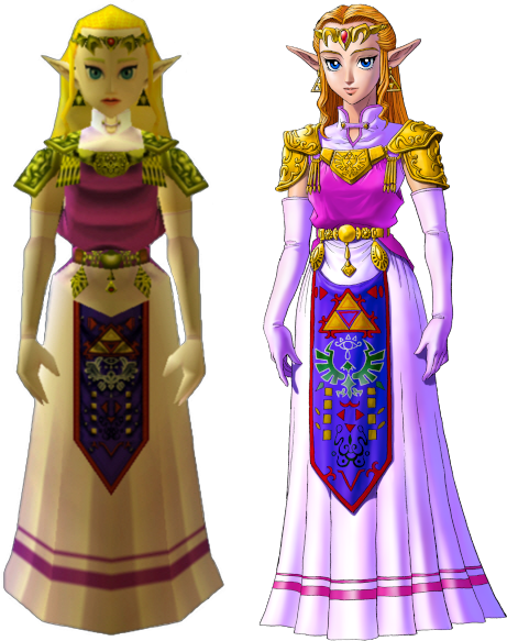
Now, there's a few issues from the start about making this. The notable one is that the in-game textures for the apron do not completely line up with the official artwork. When you start looking at the 3DS remakes, they re-textured the apron, giving us yet a third canonical way that this thing might be laid out.

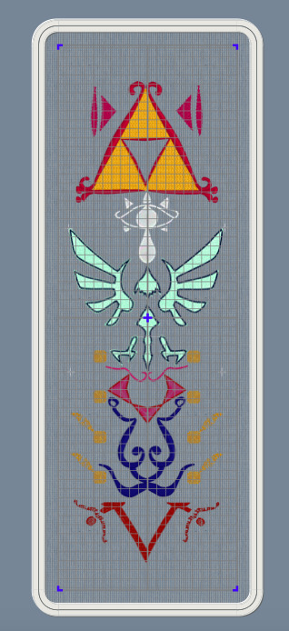
Obviously, the easiest thing to do is to get several references, and then to slap them next to each other and compare. I've got GIMP pulled up here, and have several versions here. I adjusted color levels until the pattern in the garment was as clear as I could make it. There's horizontal guide lines going across to divide the apron into sections. We'll call those sections thusly, top to bottom: Triforce, Eyeball, Bird, 8 Rectangles, and V.
***
This is going to be long and boring. I have my reasons for writing a long and boring post, but sadly, I'm not able to share them without becoming un-boring, thus defeating the purpose of this work.
***
I forgot to label them, so that reference image is, from left to right: N64 screenshot, 3DS screenshot, N64 character model, small inset at the bottom is 3DS, official artwork that was released alongside the N64 game, a heraldic tabard, some official rendering of the Hylian crest, and another 3DS screenshot.
Some are pretty self-explanatory, and some are more open to interpretation. Notably, let's take a look at the Bird section. The official artwork and the 3DS remake both distinctly have the Hylian Family Crest there. The N64 version has a very distinctly different bird thing.
So, I had to decide, which one do I put on my apron? I had to consider several things, but one of them was the process of how game textures from the N64 era were made. Textures for this game were very small image files, smaller than your 2009 cosplay.com forum avatar. The reference art would be made and then other people would be in charge of turning that art into a usable texture file, so there was artistic license involved in adapting that. This game was released before the Hylian crest had been used in multiple places across several games. Therefore, we can justify making the assumption that the texture artists didn't have an understanding of how important it was to keep this part the exact shape it was, and turned "stylized bird" into "stylized bird" in a way that would read clearly on screen at 45x100 pixels. We can assume this to be the case, because, when Grezzo did the 3DS remake, their texture artist used the Hylian crest instead of the OoT bird thing.
***
Sorry for all the embroidery stuff in the past few days. I've attracted the attention of a couple people online and embroidery seems to bore them, so we're doing that for a little bit until I stop being interesting.
,***
Cosplay has a spectrum of screen-accuracy to full-nonsense. In some things, you can do screen accuracy very well. Screen-Accurate Princess Leia from EpIV is pretty easy to make look good. Sometimes, you can do full nonsense pretty well, too. Princess Leia, but in if Star Wars was steampunk, also pretty easy to make look good.
Some things aren't as easy to make look good when you're doing screen-accurate. Sephiroth's hair in most of the Final Fantasy games stands up off his head by like 30% the height of his face. If you math that out, you have a wig with 5" antennas swooping up in the front. When you put that on a head, it looks silly. Do you want your Sephiroth to look silly? No? Then you need to do something about that hair.
My cosplay rule that I try to stick with is this: If you need to make a decision between what is "accurate" and what looks good, you pick what looks good. As long as the character reads as the character when you're done, it's better to look good than to be accurate.
And this is why, instead of just tracing any of these aprons in my embroidery software, I broke out a pen and drew the whole thing out.

Actually, I drew half of it out. The left half to be specific. I know that I'm going to mess with this later on my computer, and I know that I want the thing to be symmetrical, so let's save everyone (mostly me) some trouble and just do half of it.
Why was it important to me to draw it full size? Remember, that texture we're referencing is less than 100 pixel wide. The final piece is going to be full size, so there's a lot of things that just don't scale up easily. We're basically going from a texture the size of my thumb nail to something that has to be more high-def than 8K. This basically meant that I needed to redraw it from scratch to get that resolution. Lots of little details are going to have to be added, and I'm much better at adding them with a pen than I am just guessing while I'm digitizing the file to embroider.

So, I took it, pulled it into GIMP, and made some adjusting. I mirrored it so that I have both a left and a right side to work with. I changed the contrast so that I could see the lines better. I didn't like the Hylian crest that I drew so I just plopped the official SVG onto it and dragged it around until it fit.
And then, and this is kind of important, I cropped the image so that it's the exact proportions that I want the final thing to be. My whole design is in this file, and there's no outside image. This is important, because I'm going to use this as a template to trace in MySewnet, and the easiest way to get the background to behave properly is to pre-set it to the exact size you need in another program. Good thing this software isn't stupid absurdly expensive, or else the fact that you needed to do that would be really annoying.
The digitizing process:
Okay, so the first thing that I do is to make a custom hoop the size of the finished project. There's no way that I can actually stitch this out this big, because a 25" long hoop doesn't exist anywhere, but it's way easier to design all of it and then split it up than it is to design in pieces and then fit them together. I open the hoop in the digitizing software and load my template as the background.
Digitizing from a technical viewpoint is really simple: you click points all around the area you want to make a shape, and then you hit "make this thing", and then it renders the thing. You can then give that thing a different kind of fill or line. Easy.
So instead, I'm going to go into the art part. Because yes, I've already drawn this whole template, but I haven't figured out how to fill each of those shapes. This isn't like a coloring book where I can just fill a shape with color. Embroidery means that I have to pick how exactly I fill all those areas.
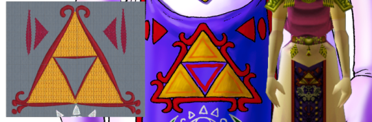
First up, I have the legendary Golden Triumph Forks. The Magical Eating Utensils. I wasn't super sold on how this was rendered in the official art. We can vaguely see how, in the game art, it looks a little more like a red outline with corner flourishes, rather than what we got in the artwork. I probably should have looked up some historical flourishes from time periods in world history where technology matched the apparent technology of the world of the Legend of Zelda, but I just kind of picked a random frilly shape.
The Triforce is one of the most important symbols in Zelda, so I knew that I wanted it to be a bright shape. This meant that I wanted to fill the shape with stitches in such a way that none of the purple backing is showing through. In embroidery terms, this usually means either a full pattern fill, or an applique. I picked applique, because this is an easy shape to applique. I knew from the start that I was going to use metallic tissue lamé. Lamé's great for a lot of things, but it's weak and shows creases. To avoid that, I wanted to put in a fill stitch to support the fabric and prevent damage, as well as hiding any big creases. I picked a big and open motif fill that will still show a lot of the applique fabric.
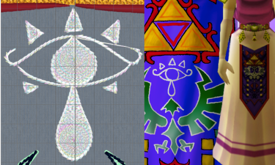
Eyeball:
So this is, specifically, the Sheikah Eye. It's an important symbol in the series. The Sheikah stick this eye on pretty much everything. However, it's not a fancy, gaudy, ostentatious symbol.
I grabbed a motif line at random from the list of motif lines, and happened to like it. It's a very heavy stem stitch that goes over each stitch 4-6 times, making a big, raised area. To make sure the eye was visible, I filled in the iris, teardrop, and eyelashes. I picked an opaque spiral fill, because it's a circle and these general shapes are circles. A while back, I bought some metallic white "iris" thread, and thought that a subtly-iridescent white would fit nicely.
Those little eyelashes at the bottom that aren't there in the art? Well, there's there in the game render juuuuust a little bit, and also they fall into "if it looks better that way, it's the correct way" mentality.
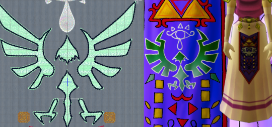
The Hylian Crest.
Fuck this thing.
All you need to know about this is two things: 1) I just traced the SVG that I found on the Zelda wiki, and 2) I didn't plan on stitching it out with black outlining. That black outline is just there to confuse my software into doing what I want.
Since this is as important as the triforce, I knew I wanted to do it in silver lamé. That means all of this is an applique. Quick tip: if you're going to be breaking a design into smaller segments, don't do any applique so big that it has to be spread over two segments.
Ask me how I know.

I originally had this filled with the same chain stitch that I used on the Triforce, but it made things look very samey and very mushy. I later switched it to a triangle-shaped spaced fill. I selected the triangle as the correct shape by clicking every shape one at a time and seeing what they looked like. Since this was going to be a running stitch on a shiny applique background, the fine details don't really matter. You actually can't see them normally, which is why I had to change the color here.
The outline there is the same stem motif that I used in the Sheikah eye. I found that it's wide enough to cover an applique edge without having to look like a satin stitch.
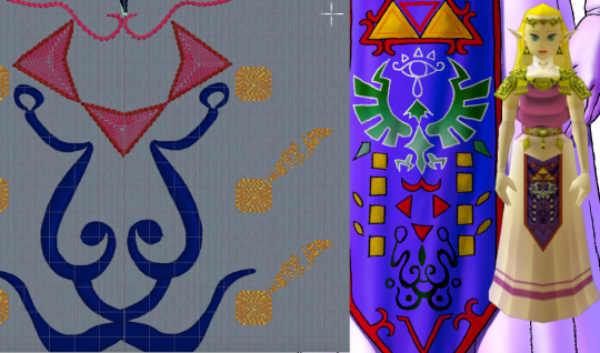
Squares, Triangles, and the Face Thing.
I have no idea what that face thing is supposed to be and apparently neither did anyone else on the internet. Since it just kind of looked like a scribble, I just rendered it as a scribble. I used a satin column so that it could have line weight similar to a drawing with a paint brush, and the shiny satin line would look like wet ink. Also known as phoning it in.
The triangles are filled with a contour fill that just traces the edges of the shape. I left some space between the lines so that the purple background can show through. This gives is sort of an optical illusion of movement. The outside of this was originally that same stem motif line from before, but after I stitched it out, I realized ti was too heavy. The final version had the same motif, but smaller, and with fewer repeats of the stitch.
I'm so damn proud of those fucking gold boxes. Okay, so, let's look at the design. Why are there gold boxes? What do they do? What do they mean? Do they represent the eight dungenons in the original game? Nope, because there were nine dungeons in the original game. Are they the eight sages? No, because there's seven sages. Is it what happens when you average the number of dungeons and sages out? I don't know. Anyway, they looked stupid just being little gold boxes, so I gave them blunted corners. I did another contour fill because I wanted them to lie flat on the finished apron and not draw any attention to themselves. As for the little tail, folks, I discovered a technique and I'm FULLY READY to abuse the heck out of it. So, I traced the lines with a satin column, ready to try to mess with the spacing to see if it'd lie flat with enough work. I hit "convert to tapered motif" by complete accident, and it was kind of cool. So, then, I went through the various motif options, found some cool looking scrolls, hit "fit to line" and slapped those in there. And I think that the little tails being written in some weird language I can't understand is SO COOL. I love how this part looks and I will not be taking other opinions on it at this time.

The V.
I didn't like how either of them looked in the original, so I just kind of winged it. I was getting bored at this point so I took a pattern fill that was supposed to be linked chains, and then I twisted it around until I was the least bored I could be with it. Again, I went with the smaller stem stitching on the outside.
Those little tails on the circles there are also filled with the scroll as tapered motif thing. If you go for this, don't forget to run the "delete short stitches" filter or else there'll be like 1100 unnecessary tiny stitches in your motifs. Ask me how I know.
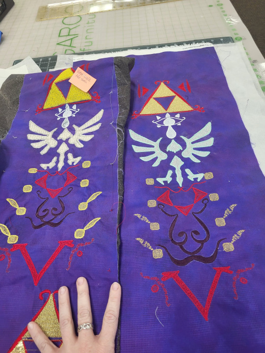
Now, we learn by making mistakes, and the best way to make mistakes is to just jump in and wing it. On the left, we have the first version of this that I tried. On the right, we have the second version, which is the one I'm going to use. I've made a couple of adjustments to the file since that final version, so if I make it again, that'll be just a hair better.
So, for starters: backing fabric. I liked the movement and texture on this subtle dot tonal better than a solid purple, so i used that for both my test and my final project. The main drawback with using a printed tonal instead of a dyed solid is that the back of the printed fabric is still white. On some things, specifically the area around the satin stitching on the ink face thing, you can see subtle white haloing where the stitching's displaced the background. I don't like it. No one else seemed to notice or care.
I knew that I'd be doing this in my endless repositionable hoop, but I hadn't taken into account that I'd be doing it in the endless hoop sideways. The endless hoop expects you to go from top to bottom, and my design goes left to right. This means that I have to fight the fabric around the clamp of the hoop. The endless hoop also doesn't hold things as tightly as a regular hoop does. Because of the way the fabric is moved through the hoop, a fusible or sticky stabilizer has to be applied to the fabric before, instead of being hooped with the fabric. All of this meant that I just didn't get the support that I needed on the first go around. You can see this in the way that the fabric has bunched up around the 8 boxes. For the first round, I used some fusible no-show mesh stabilizer. It wasn't wide enough, so I had to cut it in chunks and apply it sideways. For the second round, I used two layers of Power Mesh (same stuff but different brand) as well as a layer of light+tacky paperless sticky tear-away. I really hate that light+tacky stuff so ti's exciting to finally use it up.
My first trial was mostly to see if I could make the endless hoop work like I wanted it to. In this trial, I learned a lot of things. I kept the computer nearby to make changes as I noticed them. When I was done, I looked at what I'd made. I didn't like all the proportions in all of the design, so I dragged some stuff around in the file. This was when I realized that the heavy stem stitch motif everywhere was looking clunky, and reduced or removed it from several places. I changed the fill of the Hylian crest to the triangular fill. shout out to anyone from That One Anonymous Message Board who made it this far in this post to try to prove how deranged I am. You've got a lot of time on your hands, don't you? I completely changed all of the instructions to tell the computer how to do the applique on the Hylian crest (which I STILL got wrong), and added some aligment stitches to help with the applique process. This was when I changed the color of the outline in the software. Ideally, you should now be able to lay the applique down as one fabric, let the machine sew the whole thing, and then trim it. This is important, because that applique spreads out over two hoopings, so it's kind of a mess. The secret to making this work is for hooping #2 (eye and top half of crest) to stitch out the eye BEFORE the applique, so that the whole fabric can be placed over the completed eye. We learn.
Once it was all combined and digitized, it's important to render all the digitized elements as stitches, and then do a bit of cleaning up.

Notably, I really needed to take those tapered motifs and run the stitch optimizer program. The stitch optimizer's job is to remove stitches that are too short to stitch out nicely. When looking at the 3d views in the software, I can't tell which of the samples is the before and which is the after. If I zoom up really close in illustration mode, I can see it, but remember that this is like a 1" wide strip of stitching. The basic rule is that any time the software wants to remove 3300 stitches and you can't see the difference in the stitch-out, you REALLY WANTED to remove those 3300 stitches. That's not 3100 stitches from all over the design, BTW. That's just 3100 stitches from that one section.
I go over my test swatch, section by section, and make sure there's nothing that I forgot to put into the software. I also just delete every jump cut and then make the software add them all back in. The program that adds cuts automatically tends to be more judicious wit them than the digitizing program is when you make the design, so it's a way to make a design stitch out a lot smoother with just two clicks.
So, once all of that is done, we can just run the design splitter program. The design splitter says it has "intelligent splitting" settings, which is an absolute joke, but I use inteligent setting anyway. It's not necessarily any better at picking where to split than a straight line is, but our eyes are trained to see straight lines. The allegedly-intelligent splitting does at least split at random points, making it harder for your eyes to pick out what's a splice and what's a continuous line.

So, in addition to "intelligently" splitting the design apart, the program adds two color blocks to each split piece. One is before the stitches, and it's four stitches long. This just does one stitch at each corner of the design area.
The second block it adds is at the end. This block stitches a corner marker at each corner in the design. In this picture, the before line is green and the after line is red. I offset them by a little bit so that you can see what's going on, but they do happen directly on top of each other.
This is important, because you're trying to lay your design out so that every section of the split design lies perfectly next to the other ones. When you re-hoop your fabric, you can step through the first four stitches. If you've placed your fabric correctly, then those stitches should perfectly touch the markers that were sewn in the previous blocks. If they don't line up, you can just re-hoop over and over and over and over until it lines up.
In theory, you can line up an entire design just using these markers and the alignment stitches. You can just keep rehooping forever until it lines up. It's great. On the other hand, if your embroidery machine has literally ANY KIND of design placement setting onboard, that can help a whole lot. The astute observer will note that, on that picture way up at the top, that machine isn't my Topaz 50. That's because the T50 has some nice basic design positioning that will let you place within a certain range, but it won't let you tilt the design if you hooped it crooked. I did the first attempt at this on my Topaz, and it was fine, but there was a lot of re-hooping. So I might have taken this to work, to do this on the machine that's a step up from mine. (While I was there, I used a sit-down Bernina longarm to "hand"-baste the stabilizer on. That's not the intended use of the machine, but if you set stitch regulation to like 1 stitch per inch, and then you just pull the fabric straight through from the side, you get perfectly straight basting lines. If you're not feeling like dedicating an entire room in your house to having a free-motion machine just to baste straight lines, most mid-tier sewing machines have a fake hand-basting setting in them somewhere). Anyway, if you don't already have a bunch of hoops from HV, you can get that kind of positioning setup on Brother and Baby Lock for much less than the cost of the machine I was working on. If doing big multi-hoop projects like this is a priority for you, ask your salespeople about machines that make this really easy.
You now also have the great trade-off: the smaller the hoop, the tighter the design will hoop, and the less stabilizer you'll need. However, the bigger the hoop, the more you can shift the design around in the machine without hitting the edge. The tighter the hoop grabs, the less stabilizer you need, but the harder it is to shift the fabric that's already being held in the hoop to get it where you need it to go.
I handled this by just fucking throwing a shit ton of fucking stabilizer at it like there was no tomorrow. There's three layers on this bad boy.
You might be saying "Why didn't you just use a heavier cut-away?" and you'd be right, except for two things. 1) if I use two lighter layers, then I can trim the stabilizer away in layers, avoiding the stabilizer showing through and 2) my store didn't have any wide fusible cut-away in stock so
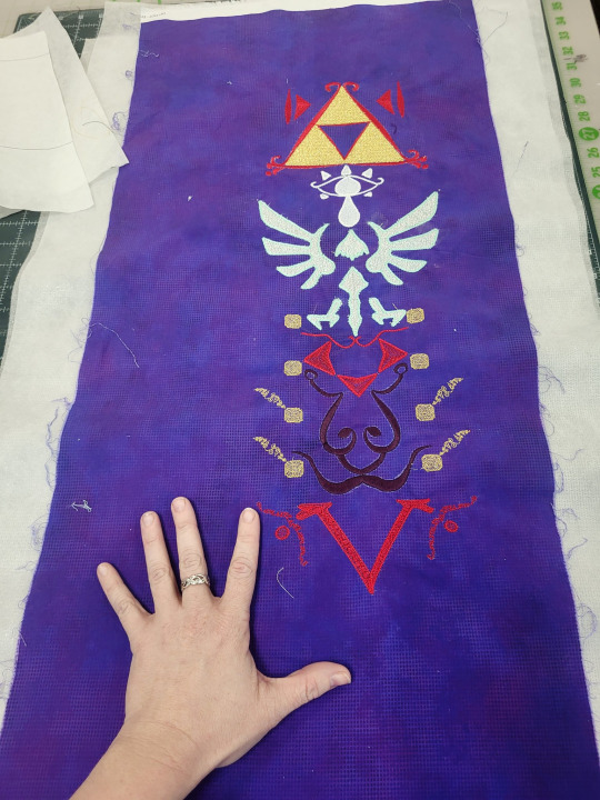
Anyway, here it is, time to make it into the actual apron. I'm very excited for this project. I'll probably break out the repositionable hoop again to do a border on the outside of the completed project, but I don't know for sure exactly what that'll look like.
108 notes
·
View notes
Text

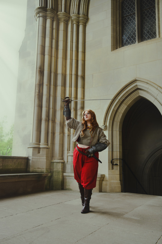
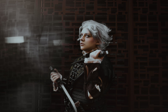
"I'd sooner die on my feet than on my knees."
"You would die on the backs of others."
Photo: allisonthephotographer (IG)
Cos made + worn by me | Sword STL from Dangerous Ladies, borrowed from @sola-heikacosplay
#lutavia build catiua#tactics ogre#tactics ogre reborn#video game fanart#cosplay#video game cosplay#cosplay photography
74 notes
·
View notes
Text
✨ Want beautifully blended subtle ombré? ✨
Another tutorial, this time for how I dyed my diamonds for Howl! Hope it helps folks out! 🖤✨
56 notes
·
View notes
Text

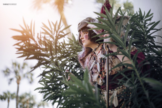
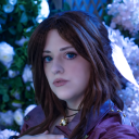
"Ugh, I smell like a human."
San: @lutaviacosplay [Mask/Dagger STLs from JarmanProps, Skull from EnviroSkulls]
Photo: @yinyueify
40 notes
·
View notes