Don't wanna be here? Send us removal request.
Statistics
We looked inside some of the posts by maclediumzeyheri and here's what we found interesting.
Average Info
Notes Per Post
13K
Likes Per Post
10K
Reblog Per Post
4K
Reply Per Post
11
Time Between Posts
14 days
Number of Posts By Type
Text
17
Last Seen Tumblr Blogs


Fun Fact
Tumblr is available in 18 languages.


Text
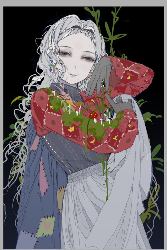
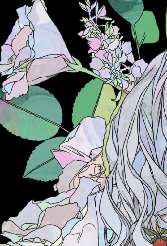
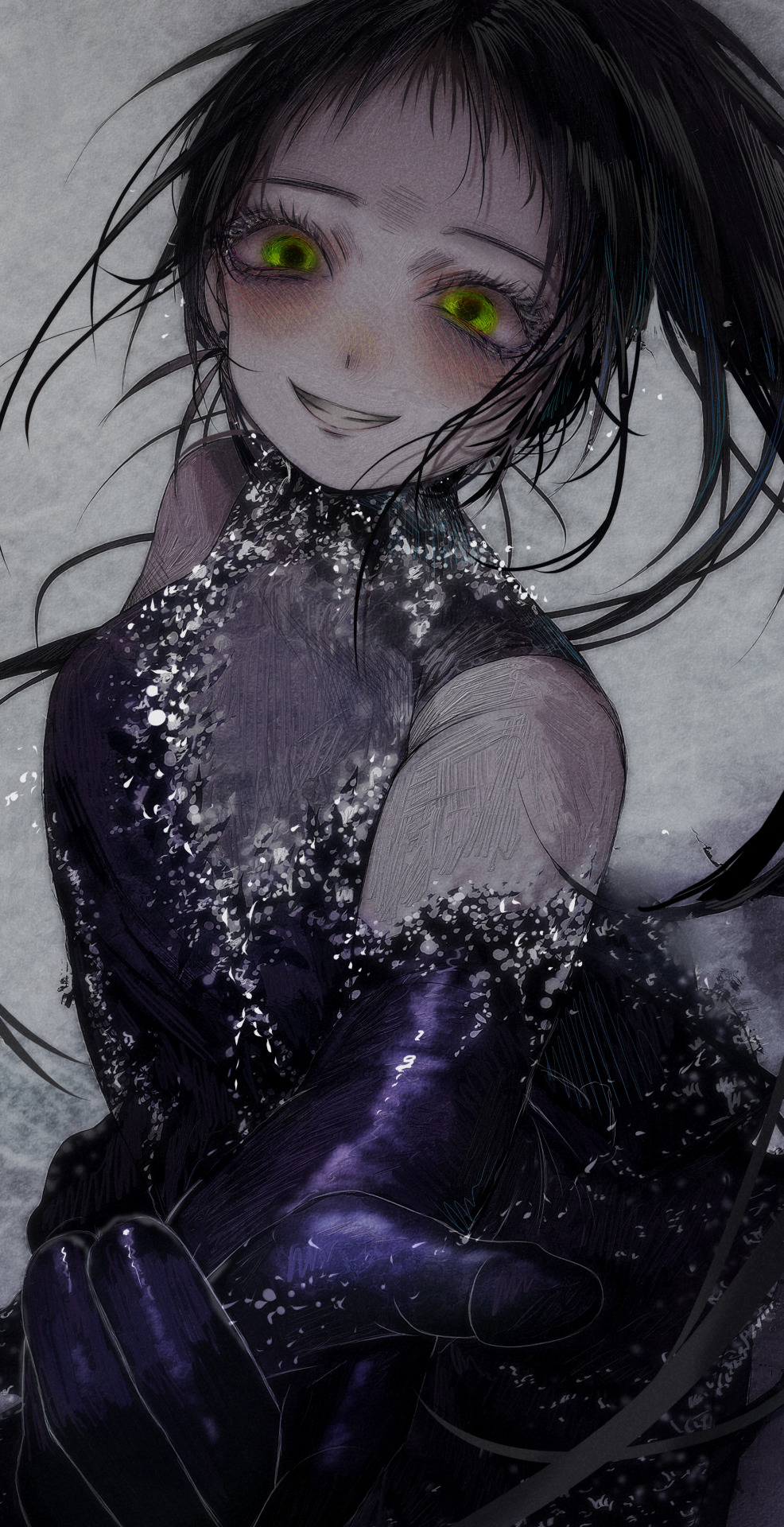
How I Draw: PART 2
I’m currently a poor college student battling through final exams — and as if that wasn’t enough, one evil professor is making us undergrads write a full research paper on top of it all. So yes, it’s been a rather painful time... which sadly means I haven’t been able to draw much lately. But! Once June is over, I’ll finally be free! I’m hoping to dive back into drawing a lot more then.
Anyway, thank you so much for all the love on my last art post. It’s honestly been years since I wrote a post like that, so it was a pretty fun experience for me too! Today, I thought I’d continue the series — this time diving into the highlights of my process: coloring and post-editing!
…So, in my last post, I covered everything up to laying down the base colors. Now, it’s time to add some shadows!

When adding shadows, I only use Multiply layers. I usually pick low-saturation colors for this step, pretty much the same way I do when laying down the base colors. If needed, I’ll also use a watercolor edge effect.
To be honest, there’s really nothing too special about my process. After all, I’m not someone who’s formally trained in art. So no fancy, elaborate techniques here when it comes to adding shadows! (As for considering the direction of light… well, I sometimes try to think about it when adjusting the overall colors later on. But most of the time, I don’t bother too much — and this particular piece is one of those cases.) I simply go by instinct and paint the areas where shadows feel right.

Anyway, that’s how I go about coloring the clothes as well.

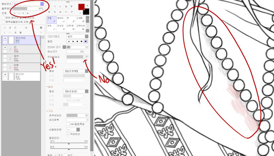
There was a little something special when it came to coloring the gloves. To give them a slightly transparent look, I added a light layer of green.

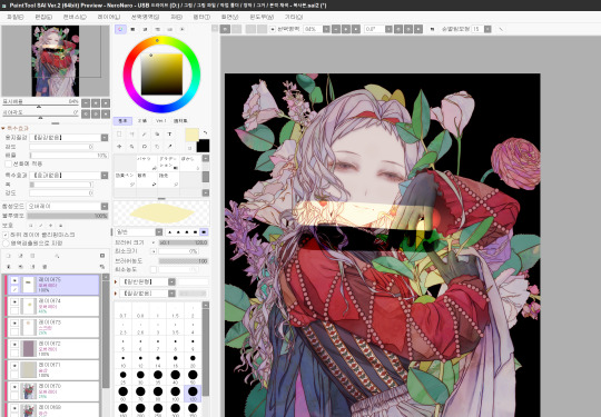
Once I’m done adding all the shadows, I move on to adjusting the line colors. Well, anything looks better than plain black lines, after all.
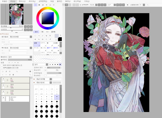
So at this point, this is what the piece looks like. Now, let’s move on and make it even prettier.

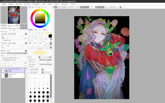
Use Ctrl+A and Ctrl+C to copy the entire coloring layer. Then, paste it and apply a blur effect to the copied layer (this is a feature available in SAI 2).

Now, copy the blurred layer as well. Set Blurred Layer 1 to Multiply, and Blurred Layer 2 to Overlay.
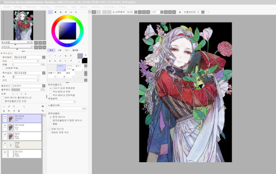
Then, adjust the opacity of these layers to your liking. This creates an effect where the image looks slightly soft, yet the colors become more vivid at the same time. It’s a technique often used to give artwork a bit of a retro vibe.

Next, use the Multiply and Overlay layers to adjust the overall color tone. With Multiply, you can create a darker, moodier atmosphere across the whole piece. And with Overlay, you can tweak the color tones to get the look you want.

(That’s right — just changing the color on the Overlay layer can completely change the color tones of the piece.)
For the finer details, keep using Overlay, Multiply, and Screen layers to refine the look.
-If you want to brighten certain areas, use a Screen layer. -If you want to adjust colors or add light and atmosphere, go with an Overlay layer(The image above is an example of this). -And if you want to deepen the shadows, a Multiply layer is your friend.

After that, I do some additional color adjustments in PaintShop Pro(If you have Photoshop, that would actually be an even better tool for this step).
In my case, since I was planning to lower the saturation later on, I intentionally boosted the saturation a bit during this stage. And don’t forget — before moving on to the next step, it’s a good idea to add an overall paper texture to the piece(Of course, this is a built-in feature in SAI).
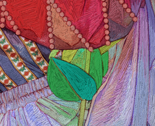
From here, I use Corel Painter’s Thick Paint feature to add visible brushstrokes. The process of picking colors with the pipette tool and painting over them takes quite a long time.
In my experience, if you carefully paint with the smallest brush size (1.0), it gives the piece a texture that feels almost like embroidery. On the other hand, if you use a slightly larger brush and paint more loosely, it ends up looking more like an oil painting.
And if you duplicate the layer where you used the Thick Paint brush, you can get some really fun effects during the editing process.
Then, it’s really a matter of lowering the saturation, adding layer effects where needed, and repeating this process until you’re happy with the result. As I always say — I don’t have any strict rules for this part. It’s all based on personal satisfaction. For this particular piece, I went through even more steps (and a lot more second-guessing!) than usual.
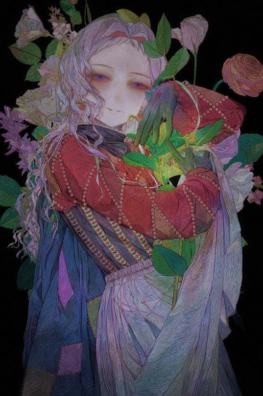
And that’s it — the piece is finished! Thank you so much for reading all the way through.
As I was writing this, I realized that a lot of my process is based on instinct, so this post might not have been all that helpful in a step-by-step sense. But if there’s any part you’d like me to explain in more detail, please feel free to ask anytime!
44 notes
·
View notes

Text

Beauty is Relative: An Ideal That Can Be Approached but Never Fully Attained
104 notes
·
View notes
Text


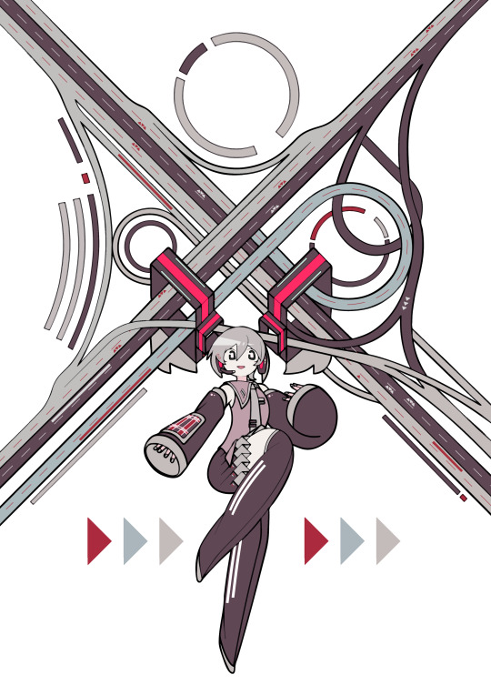
The deadline for the Yuki Miku 2026 competition is tomorrow, and I only found out now. I don't think it's an electable design anyway....but at least I loved it so much that I scribbled it!!!
142 notes
·
View notes
Text
How I Draw: PART 1
Hello, this is Zeyheri. While I was happily drawing, I suddenly realized, "Oh no, the new school term is coming! Once I start going to school, it'll be hard to draw! And my promise to share how I draw will be delayed so much!!! (I'm doomed!)“
...So, even though I haven't finished my drawing yet, I thought I should at least upload a post to prevent my trust from shattering into pieces.
I’ve noticed that authors always include words of gratitude in their book prefaces (so I’ll imitate them!). I sincerely thank the two people who’ve helped me a lot in writing this post and who will continue to help with many questions in the future. I also love all the users who constantly take an interest in my drawings!
As you probably know, I’m not a professional illustrator. The only formal art training I’ve had was at an art academy in elementary school! So, it’s probably not a great idea to expect to learn much from my writing. However, anyone can enjoy drawing even without formal training. "The act of appreciating art" is an even more accessible field to enjoy. If you read this and felt intrigued or inspired to try something experimental, then that is exactly the purpose of this post, and I will be happy.
-
(1) Tools & Programs

I use three programs to draw: PaintTool SAI2 / Corel Paintshop Pro / Corel Painter. Oh, I almost forgot-The tools I use are the love-hate Surface Pro 8 and the Huion Kamvas Pro 16 (4k).
-Rough sketching, inking, base coloring, adding shadows, and initial corrections: PaintTool SAI2
-Adding paintbrush effects: Corel Painter
-Other corrections: Corel Paintshop Pro
(*If you're wondering why I don't use Clip Studio, it's because my beloved Surface laptop might die from it! "Then how do you use Corel Painter?" you ask? The moment I open Painter, lag starts, and the fan goes crazy. If you value your laptop's lifespan, take my advice and avoid it!)
In fact, about 70% of the process happens in SAI. So, in this post, you’ll only see me using PaintTool SAI2.
(2) Rough Sketch & Line Art
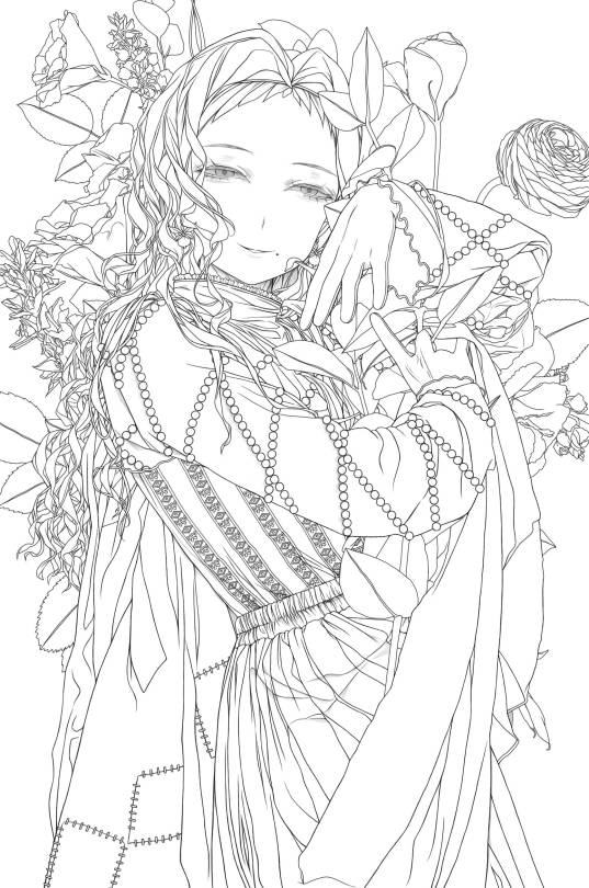
Rather than creating a detailed rough sketch, I prefer to draw lines while adding rough sketches when needed. The first image is proof of that! For me, the rough sketch stage is less of "the first step in drawing" and more of "getting the atmosphere right."

For the lines, I use the SAI pencil, adjusting the brush density to around 75-85. Other than that, it’s probably set to the default settings, at least as far as I remember. (It's Korean, but I believe you can understand what it means by location)
If you look at my line art, you might notice faint shadows sometimes. This isn’t because I adjust the brush density; I adjust the layer opacity instead.
(2-1) Drawing Hair
Now, one of you asked me a question: "How do you draw hair?" I’ve created a simple resource to explain!

As always, there are exceptions, but when I draw hair, I tend to make the shapes angular. This way, the hair looks solid, almost like stiff RNA strands.
After that, I add lines following the flow of the hair, giving it a fuller look. I usually add these lines when I’m refining the inking stage.
Sometimes, if I’m feeling it. I add thin strands of hair around the edges to give it a more "hair-like" appearance.
(2-2) Drawing Eyes & Coloring
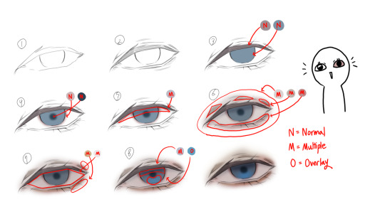
There was also a question about how to draw eyes. I’m not the type to add sparkling glitter for a glamorous look, so my approach is very simple.
In the picture, I’ve divided it into several steps, but honestly, it’s a very quick process. Start by shaping a hexagon and keep adding multiply layers while coloring. The key point is in the 6th step, where you cover the entire eye with a light pink multiply layer. Doing this creates a much more eerie, painful, and melancholic look! (I was really excited when I first discovered this! Yay!)
(3) Coloring


Now it's time to add color. Typically, I would choose colors that fall within the left square area, but if a highly saturated color seems more fitting, I use colors from the right square area. If you ask me why I choose these colors, I'm not sure. I just feel like I like low chroma colors.

Be thorough in coloring, and once you're done, apply textures lightly to finish it off. (You’re asking what texture I use? Well, since I’m not a texture creator, I don’t think it’s appropriate to talk about it publicly. But if you send me a private message, I’ll answer you secretly. I think it was over $30.)

While coloring, using an Overlay layer to test can help when adjusting the color tone later on.
-
Thank you for reading. Please look forward to our next post as well! Feel free to let me know if there are any awkward expressions or anything you would like me to add to the content of this article!
45 notes
·
View notes
Text

I’m planning to write a post about the process of creating my artwork. (*But it’s still a long way until the drawing is finished!)
If you have any questions, feel free to leave them in the comments or ASK, and I’ll try to include them in the post!!! Thank you as always!!❤️❤️❤️
59 notes
·
View notes

Text

Hikaru Doodle
159 notes
·
View notes
Text


Collection of Doodles with Strong Textures
205 notes
·
View notes
Text
Hikaru Kamisaki
278 notes
·
View notes


Text

Suomi
38 notes
·
View notes