
maddie-longson
Design 5
Just another architecture student who had to make a blog of their work
94 posts
Don't wanna be here? Send us removal request.
Last Seen Blogs


Text
Storyboarding the Submission
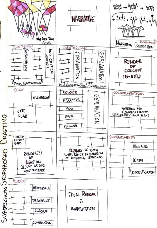
In drafting the storyboard, we realised what would be necessary to fully design this concept and what a good order would be to present it. We dedicated a page to each of the main aspects of our design - colour, light, narrative, as well as pages for development, construction, sustainability, details and budget. The order of the pages hopefully presents a story of the design, from formulation of the concept to how it would be built and what it would look like on site. Then taking it down to more detailed decisions that have made up the design and aren’t clear immediately from looking at it.
4 notes
·
View notes
Text
Sustainability
Choice of materials and sourcing
We could use recycled timber, which is more environmentally conscious than buying new timber, but our budget may not allow it as it’s hard to gauge whether recycled timber would be more or less expensive.
Using new timber, we would likely be able to get a deal through Zain so it would be more cost-effective, but not as sustainable.
Since we plan on painting it, the colour of the wood won’t matter too much. The things to consider in wood type would be locally sourced, its durability outside and its ability to be reused after this project. Assuming that we aren’t going to be using engineered timber, these are some options:
Douglas Fir, Kahikatea, Kauri (from Fiji), Larch, Lawson Cypress, Macrocarpa, Radiata, Saligna and Vitex (from Solomon Islands).
Consideration of waste during construction
(Can we reduce waste and then dispose of it sustainably)
As we are planning to make our panels out of slats of timber instead of cutting them from sheets, there will be less waste.
In theory, there would be very little waste during the construction of all of the timber-related parts of the design.
The concrete could be a different story. As we have to pour foundations and the base of the ponds, there could easily be waste concrete in the process. Apparently the easiest and most economic method of getting concrete to the site is with a mixer truck, so estimating how much we need as accurately as possible will avoid there being too much excess.
Deconstruction and what will happen to the materials
Can they be reused or recycled after dismantling?
To do that, no glues that will make the wood unusable. Instead we’ll stick our panels together with removable screws around the edge. These panels could remain as such and be reused as coffee tabletops, potentially making money back for the project after its deconstruction. Otherwise, the panels can be deconstructed and the slats that are left over could be donated to the UoA school of architecture to provide students with modelling materials.
Dismantling the concrete is a less reusable resource, though perhaps we could find a place that would take it to make aggregate for new concrete, or else it could remain on site, if Brick Bay was happy to keep the ponds as a permanent feature (unlikely).
3 notes
·
View notes
Text
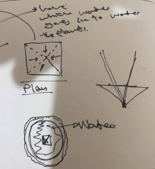
A Social Space
Using the form of the inital concept, I developed a few different ways that the space could become more interactive. Some suggestions were seating, a picnic setup, gardens, fountains, ornamental forms and the provision of drinking/garden water.
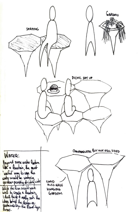
We decided that the seating and the gardens were enough, since we didn’t want to clutter the area with too many of these shapes. With the use of water, we struggled to figure out exactly what we were going to do with it. The original concept collected water and we wanted to be able to use that in some way, but we felt that there would be too much plumbing involved if we did something like a fountain, or a system where the water was purified to be consumed.
After much consideration, we determined that collection pools at the base of each “flower” was the best idea. This would be a passive system that doesn’t need to be used or drained away in any way. It is intended to contribute to the natural themes of the design.
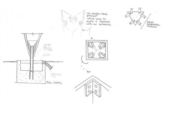
Zain’s original sketch:
Calem’s developing details:
2 notes
·
View notes
Text
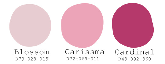
Colour
Since we’re trying to draw the parallel between our concept and flowers, but our form is abstracted, we decided we needed to make that connection clear in other ways such as colour. We settled on three potential palettes - orange/red, white/yellow and white/pink.

We then came to the conclusion that the design would look much more cohesive if the “bunch of flowers” were the same type of flower, ie. the colour was the same across the whole roof structure, rather than using all of the palettes on seperate “flowers”. Of our three palettes we settled on the white/pink palette. Looking at the Resene paint options, we chose this as our final palette.
2 notes
·
View notes
Text
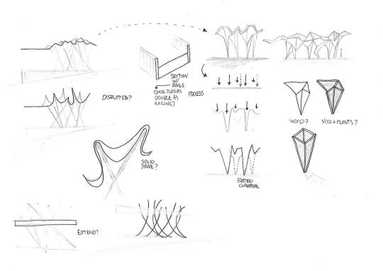
Narrative (version 1)
Linking the abstract flower appearance of the design to some of Calem’s initial concept sketches and the additional developments we’ve been making to that design, this is the first version of our pavilion’s narrative.
We Are the Ants
Our design explores an ambiguity of scale, invoking a sense of inconsequentiality within nature in visitors. The phrase “We Are the Ants” refers to that feeling at universal scale and this design offers a place to congregate and contemplate one’s smallness in the world. The pavilion takes the abstracted form of a bouquet of flowers, giving just enough of a sense of the floral appearance to allow visitor’s to apply their own interpretation on top of our original intentions. Sunlight filters down through the petals above, highlighting the human-scale floral forms that provide seating around the pools forming at the base of each flower. This pavilion intendeds to create a tension within visitors by implying a philosophical question, and immediately diffuses that tension through its tranquil and peaceful atmosphere.
Calem’s initial sketches:
My interpretation of the development, taking the narrative into account:
The central question to the development of our pavilion was how we could best represent an organic form that balanced the feelings of inconsequentiality and peace. The former we decided could be achieved through scale and a more static and angular interpretation of an organic form. The latter involved our choices for colour and focus on light-play, as well as providing comfortable space for visitors to sit and take in the pavilion.

2 notes
·
View notes
Text
For D5, we are designing a pavilion for the Brick Bay Folly competition. Individually we came up with concepts, and then we were grouped into threes to continue with the strongest design. We decided Calem’s was the best.
brickbaysculpture.co.nz/brick-bay-folly-2020
Calem’s Original Concept

Calem’s original concept was the one our group chose to progress with. He described it as an ambiguous organic form that could be interpreted by visitors however they wished. He proffered one interpretation as a collection of jurassic plants, dwarfing the people that wandered beneath.
Zain and I felt that the form was strong, as was the consideration to construction (as seen in the details below), but there were several ideas from our own concepts that we were interested in developing into this design.
I was particularly interested in how we might develop the social aspects of the space, making it a place that people wanted to visit and explore rather than passing it by as one would a simple art installation. I also wanted to develop the narrative behind the form, giving us further context to continue subtly tweaking it. Finally, I was interested in the sustainable elements that were being provided by the design such as water collection and the potential for including gardening.
Zain wanted to take the element of shadow and light-play from his own design and somehow incorporate that into this concept. He also suggested that there be varying heights in the structures, more-so than already exists in the roof form.
Keep reading
2 notes
·
View notes
Link
0 notes
Text
Media Week 9
A storyboard to inform next weeks animation.

0 notes
Text
Media Week 8
The second analytique, showing the final design in plan and elevation.
0 notes
Text
Media Week 8
The final elevations, collaged to match the axo.
1 note
·
View note
Text
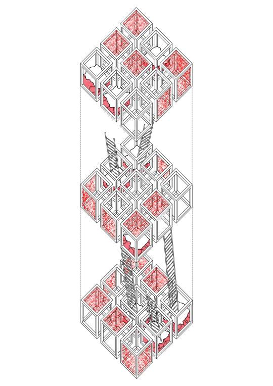
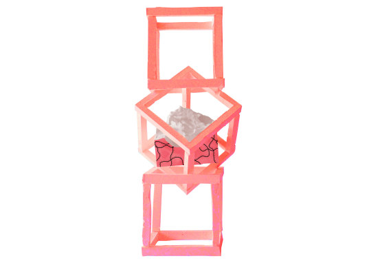
Media Week 8
Collaged exploded axonometric. This image shows the final layout and circulation path of the design.
1 note
·
View note
Text
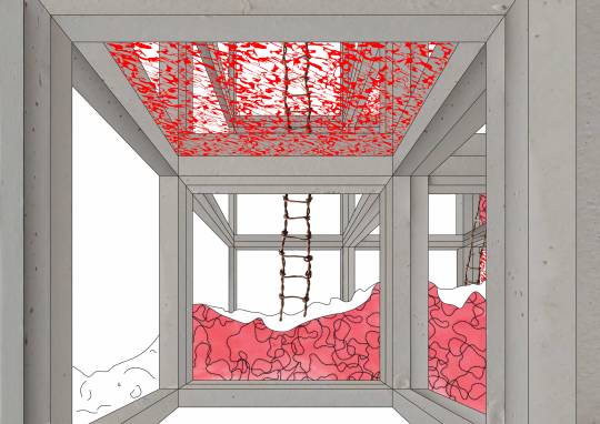
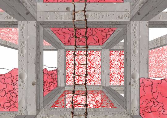
Media Week 8
Collaged interior perspectives.
0 notes
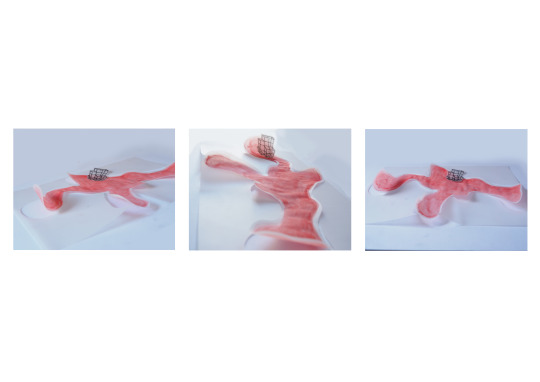
Text
Media Week 8
Applying the texture to the models to make them visually cohesive with the images. I counted it as a collage.
0 notes
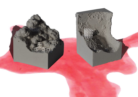
Text
Media Week 8
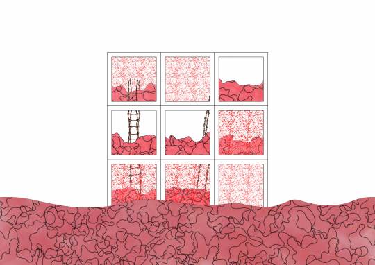
Visual representation continued. These use a texture from week 2 that came to mean sectioned earth.
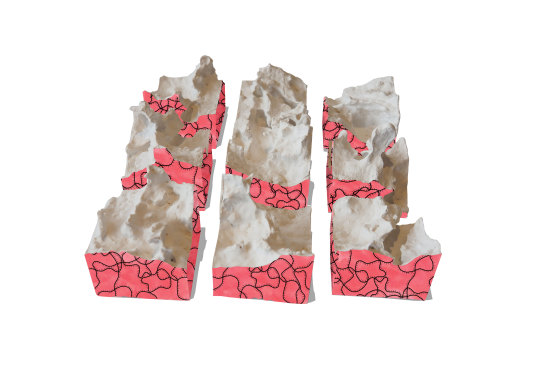
1 note
·
View note
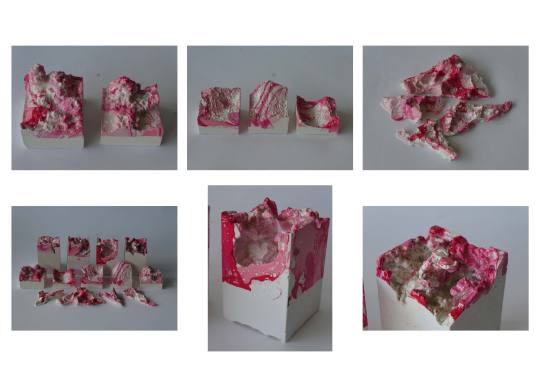
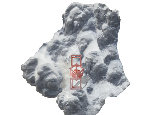
Text
Media Week 8
The second area I explored through collage was visual representation and creating meaningful textures. Below is the process of creating what became to be used as a stained glass texture from the posturised red gradients of the models.
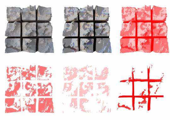
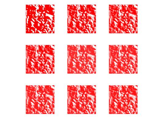

1 note
·
View note
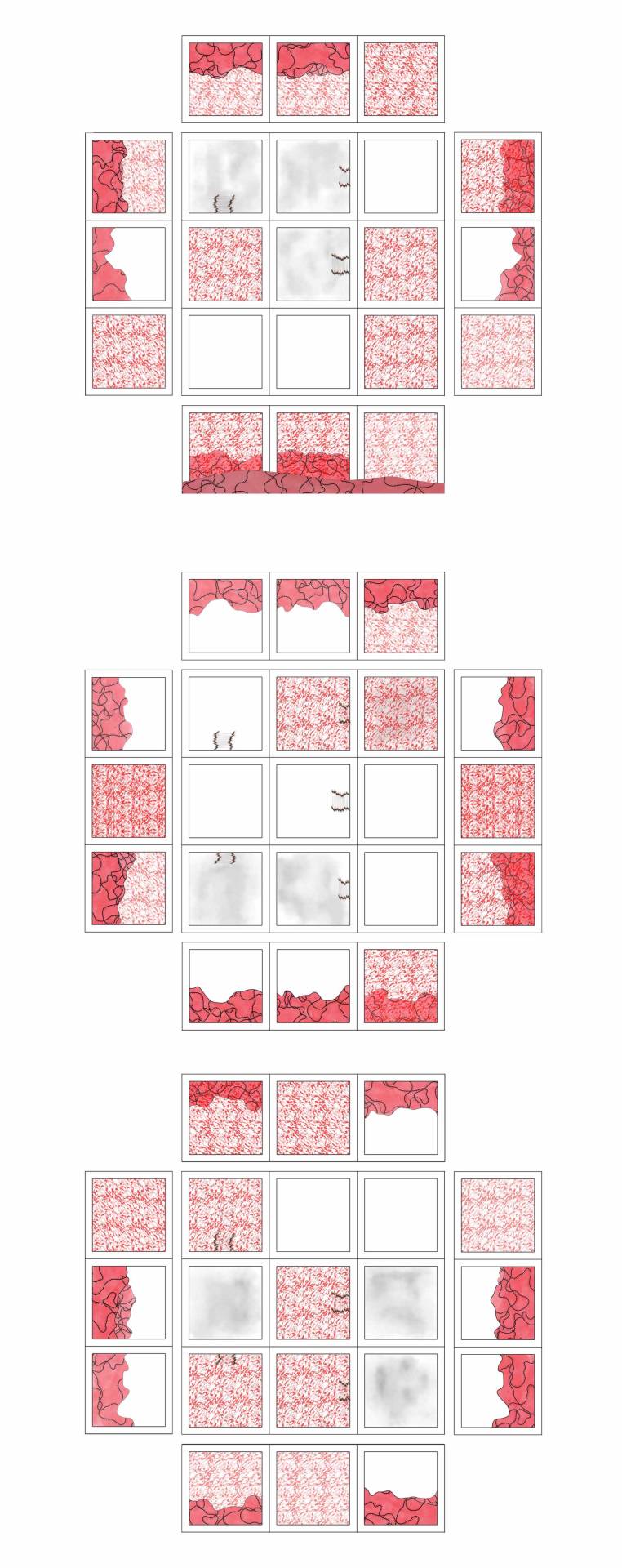
Text
Media Week 7
Continuing the site development, I did a few alternative media collages.
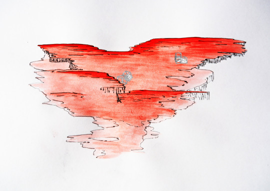
2 notes
·
View notes
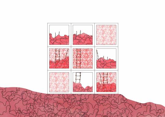
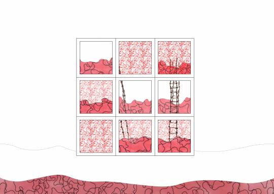
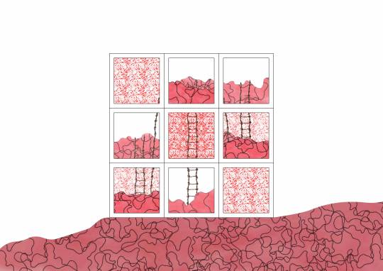
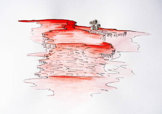
Text
Media Week 7
Week 7 and 8 required we do a ridiculous number of collages. I don’t think that doing collages at this stage of design is particularly useful, but I figured out a few areas that I could develop with this method. First I looked at siting.
These ones were specifically using the terrain models to inform and create the site around the model.

1 note
·
View note