this is a blog about stopmotion and traditional animation. kofi.com/gurdythesnailboy
Don't wanna be here? Send us removal request.
Statistics
We looked inside some of the posts by magicmattie and here's what we found interesting.
Average Info
Notes Per Post
370K
Likes Per Post
179K
Reblog Per Post
191K
Reply Per Post
84
Time Between Posts
21 days
Number of Posts By Type
Note
1
Video
1
Text
15
Last Seen Tumblr Blogs


Fun Fact
Tumblr has a 66 index score for customer satisfaction in the US.
Note
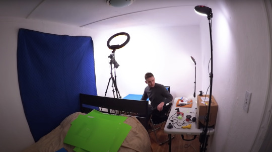
I recommend you just start with the Stopmotion Studio app on a smartphone, it’s free- and if you are thinking of a dslr and pc setup, get the cheapest one that’s compatible with whatever software you decide on. Use the kit lens, nothing special. It will be absolutely fine and enough for most homebrew stopmotion. By the time you get to the point where you need better equipment, you will know exactly what your current kit is lacking- but I doubt it will be for a long time. Stopmo is surprisingly undemanding in equipment.
Especially if you want to do destructive and „messy” stuff like @unibrawn does, any flaws or kinks in the lighting and camera setup will only add flavour to the end result. Just do your best to block out natural light and stabilise your gear.
Is there a particular dslr/any other equipment you'd recommend? I used to use my schools stuff to animate and since I graduated I'm thinking of getting my own but the technical side of things is not my forte
not in particular! dragonframe has a list of compatible cameras on their website, i happen to use a canon eos rebel t6 i got as a gift, and have two random ikea lamps to the side for lighting. i also use a tripod instead on an actual downshooter, which is less than ideal (it's not exactly parallel to my table), though you can rig your own lofi one pretty easily with cardboard/a stack of woods/whatever
dragonframe has an edu discount if you can get a friend in education's id lol. it's a perpetual license, and you can order a keypad with it for $10, or it also allows support for game controllers for shooting controls if you have a ds3 or something like that!
having a battery powered lightpad has been a huuuuuge boon for working, i can treat animation like i treat my sketchbooks and do it on the go now! i just grabbed one off amazon
i also rec a 3 hole punch pegbar, the acme punches are so, so expensive :tear: i have made my own from wooden dowls before, or there's 3d printed ones on amazon. wrap the pegs in tape if there's any jiggle room, so you can get tight registration
i am otherwise pretty low tech and try to keep most of my work in the drawing itself
9 notes
·
View notes
Video
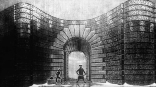
The animation on these is incredible, though. They are weird as fuck but then again, isn’t opera? Here’s a link to watch Rigoletto:
youtube
tumblr
why does this whole scene look & sound like a YTP
370K notes
·
View notes
Text
youtube
Sinking of the Lusitania
Winsor McCay
USA, 1918
(originally silent, here with a score by HESPERUS)
On May 7th 1915, in the midst of World War One, the British ocean liner RMS Lusitania was struck by a torpedo shot from an Imperial German U-boat. Germany had issued warnings that ships sailing under UK banners would be treated as hostile in the maritime warzone, and would be attacked to enforce the naval blockade, but evidently the risk of an ocean liner transporting civilians to the USA becoming a target was considered low enough for the Lusitania to set sail.
The Germans made good on their word. More recent research reveals the Lusitania may have been carrying ammunition as well as passengers, thus making it a military target, but it is hard to argue that the lives lost were of no consequence. 761 people survived out of the 1,266 passengers and 696 crew aboard. 123 of the casualties were American citizens.
At the time, the US had not yet joined the war. Propaganda offices seized this opportunity to rally for it: the public was understandably disgusted by Germany’s attack on what was ostensibly a ship full of civilians. The author of the Little Nemo comic strip and celebrated animator Winsor McCay was deeply struck by the story and the loss of life. He poured his outrage into what may be considered the first animated documentary .
And he did so on his own time and dime- his current employer, wealthy businessman William Randolph Hearst (the inspiration for Citizen Kane) was opposed to the US joining World War One, and so preferred to placate public opinion rather than embrace their horror. He had hired McCay to illustrate anti-war cartoons and propaganda for his newspapers, not rouse people against „the Huns”.
McCay rebelled, and set to work on the Sinking, financing it out of his own pocket. It’s worth noting that even in this heartfelt patriotic production, he does not miss an opportunity to tout himself as the „originator and inventor of Animated Cartoons,” a title he frequently applied to himself. It was not true, but it might have felt so for McCay. He was one of the pioneers.
Using all techniques available to him including the brand new method of painting on transparent cels, McCay created an animated account of the tragedy in a form much resembling a newsreel of the time. The film begins with a live action sequence showing him researching the incident, consulting with August Beach (a reporter who had been the first on the scene) and studying a scale model of the ship. McCay evidently took pains to ensure his retelling was as accurate as possible, even as he made it strikingly emotional. It took him over two years to complete, assisted by friends and working in his off hours while still obligated by a contract with Hearst.
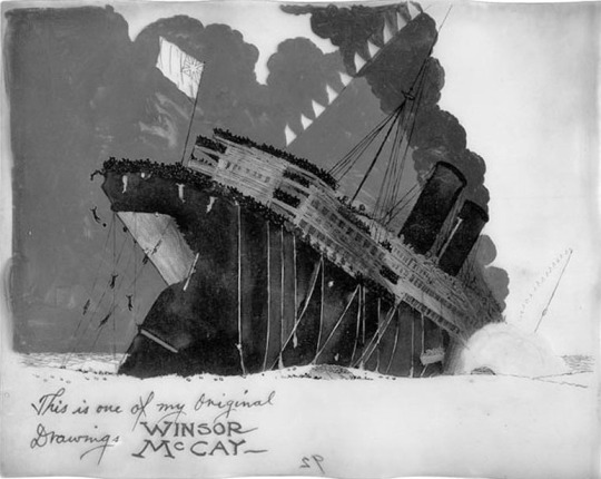
This was still the silent era, so facts about the ship and a play by play were printed on the intertitle cards, with McCay’s smooth, sombre animation showing the ship’s doomed voyage. The film lasts twelve minutes- at the time, the longest animation ever produced. It took the Lusitania eighteen minutes to sink. Fittingly, the animation feels at once slow and excruciating, and unexpectedly quick. Blink, and you will miss the moment the ship goes down, but McCay’s art rends the heart. The waves and smoke billow, the water laps around the vanishing hull in terrifying silence. Lifeboats and bodies float in the sea.
I chose a version of the film with an appropriately grieving score, because in 2022, silent films are harder to focus on. Still, you can turn it off at any time. Maybe play ambient sound instead, a hushed audience holding their breath around a rattling old projector.
6 notes
·
View notes
Text
youtube
What on Earth!
Les Drew and Kaj Pindal
Canada, 1966
This animated mockumentary from the sixties is yet another short that asks 'are humans perhaps a little bit too obsessed with cars?'
Ostensibly produced by The National Film Board of Mars, it's an alien report on planet Earth and its apparent inhabitants. You get two layers of laughs with this film- one nervous, as you realise that perhaps the alien's mistake in identifying Earthlings is not without cause, and the other lighter as you see the ridiculous conclusions Martian scientists come to by following an erroneous thesis. Silly scientists.
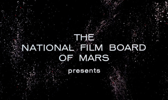
"Earthlings have done away with the stresses and untidyness of sex!" declares the narrator as we watch a...rather mechanical Earthling reproduction scene. It still manages to be disturbing.
And animation plays its trick on us, dupes us just like the aliens!- the cars are barely antromorphised, but still...you just can't help but feel empathy for them. I mean, look at those sad eyes...er, I mean, headlights...
1 note
·
View note
Text
youtube
The Monk and the Fish (Le Moine et le Poisson)
Michael Dudok de Wit
France, 1994
Why a monk? Because the shape felt like it would be nice to animate, according to the author. A monk is a blob, just a robed round blob, with not much backstory aside from being a monk. "He's not trendy, he's not sexy" says Michael Dudok de Wit.
The story seems like it's an old fable, but it all came from that shape- the initial sketches were done years before the film came to be. The result is a simple, wordless slapstick chase that escalates into a mystical ending.
The whole thing was painted with ink and watercolour, with a synchronised score by Serge Besset based on the classic La Folia music theme. The music is playful, but the baroque instruments add an elevated, pompous atmosphere. This suits the blobby, caricatural monk- he's just a little round dude, really, he's cute and funny, bouncing around to the winds and strings- not at all a serene and enlightened Man of God. Even the other monks think he's a bit silly.
While the music is Western, and the monastery could easily be on some European coast, the author admits inspiration by the aesthetics and philosophies of the East. It is seen in the negative space and the dark ink strokes on watercolour backgrounds, and the Zen-like ending. One of the inspirations for the film's progress and resolution were the Ten Ox Herding Pictures from Buddhist tradition.
Michael Dudok de Wit took a fairly quick six months to complete the film using only traditional methods (not that any others were available at the time). He painted dozens of watercolour backgrounds in search of the perfect selections for his animation.
The video above contains the complete film as well as a behind the scenes look and interview with the author.
7 notes
·
View notes
Text
youtube
Hmmmm. I am annoyed, the video from the other link is slightly better quality, but it refuses to embed >:( This one and the one below are...kinda okay...
youtube
The one on Vimeo that isn't flagged as mature works...but the quality isn't much better:
vimeo
There's another one on youtube with really good quality of image, but someone has added their original music to it and while I wanna say, you do you!... it's not the same film then, is it. >:(
youtube
And the one I always go to just will not embed. It refuses:
I guess it's the account owner's settings or something, I am peeved. I'm thrilled these films are available online AT ALL, even if most of them are posted without permission, because where are you gonna watch that stuff, at some retrospective that may or may not happen in another country?
But I am peeved that I can't show you these films in their original quality- or, heck, see them for myself without the compression bullshit. When you get a really good quality copy, you can reverse engineer the film, and THAT is the best fun in stopmotion. I have THEORIES and only a chat with the authors (I guess Svankmajer might have an email but he's a million year old deity and I am a smol creacher) or a clean copy of the work can help me confirm them.
#admin post I guess#look this is important okay#I have a system if the system starts breaking down then I risk losing momentum#Youtube#Vimeo
3 notes
·
View notes
Text
Darkness, Light, Darkness (Tma/Světlo/Tma)
Jan Švankmajer
Czechoslovakia (present-day Czechia) 1989
The Czech filmmaker Jan Švankmajer is known for weird and creepy animation that mixes man-made objects with organic matter and turns everything into an unnerving, surrealistic mess. Darkness, Light, Darkness is probably not his most celebrated work, but it's my favourite due to its cleverly contained subject, sparse materials and a visual metaphor that is so full of meaning, you could write a different interpretation every day for a week.
In this one, Švankmajer takes us on a trip deep into the uncanny valley. Using the exceptional sculpting skills of his lead animator and frequent collaborator Bedřich Glaser, he shows us a quite literal 'self-made man'. There's a bit of Alice in Wonderland here, the scary bit. There's a reconstruction of a deconstructed Everyman, bald and naked as the trope dictates. There's a penis joke, and some really nauseating sounds to accompany the grey sculptor's clay which makes up our main character. There's definitely a chicken or egg question, too, except with limbs.
I've watched it dozens of times at this point, and I'm still not sure whether it was the man who turned out the light, and how to determine if it was.
Spoilery trigger warnings:
realistic genitals, raw meat, dentures.
13 notes
·
View notes
Text
youtube
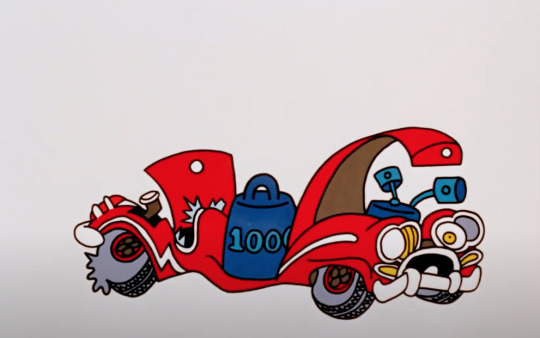
Automania 2000
John Halas and Joy Batchelor
UK, 1963
Another married couple making excellent films, Halas and Batchelor started out by making war information and propaganda shorts for Great Britain during WW2, and later made the famous animated adaptation of Animal Farm. More on that some other time- in this post I want to show you Automania 2000.
The year 2000 has come and gone- look, some of you are Noughties Kids, but I remember the fantastic dreams and predictions for the millenium. Everyone would have flying cars! We'd live on the moon!
Unfortunately Halas and Batchelor's anti-consumerist satirical prediction turned out more accurate. Well, it's not quite as bad as they drew it...yet. But if it seemed like cars and wasteful consumption of superfluous goods were starting to become a problem back in 1963, then 2022 is so much worse.
H&B make their point about reckless supply and manipulated demand using excellent graphics. The film artfully mixes the textures of paper cut outs and painted backgrounds with the clean colours of cel animation. Every frame is a little masterpiece of graphic design.
The dystopia is horrifyingly beautiful.
7 notes
·
View notes
Text
youtube
Birth of a Nation
Kamil Polak
Poland, 2001
No, it's not THAT Birth of a Nation- although the title is a reference, so let's start by a recap of the film it calls back to. If you haven't yet heard of the 1915 movie by D.W. Griffith, the basic facts are that it was a horrifically racist drama depicting the birth of the Ku Klux Klan as the true national identity of the US despite the South losing the Civil War. Trigger warnings for everything anti-black, from slurs to blackface. It's a white supremacist's favourite film.
(again, not THIS film.)
The thing Hollywood does not like to admit is that Birth of a Nation was significant in shaping cinema as much as anti-black racism was significant in shaping society. Just check out the reviews on Rotten Tomatoes- they're all carefully worded paragraphs about how the topic is unforgivable but the movie is unforgettable. Troubling masterpiece. Epic, but controversial.
So, with that in mind, what's going on with the same title for this animated short? Is it a tribute? Is it also racist?
No, you can watch it without worrying about that- and while perhaps part of the experience of this film is to be concerned about the title, I'm happy to put you at ease straight away. Polak's 'Birth of a Nation' uses the title mockingly, and his choice of graphic and sound design for the characters emphasises the joke.
"Design for the characters?" yeah, I hesitated with that phrasing, you're probably worried to hear that, too, since the film touches on racism. Oh no, what does that mean?
Trust me, it's fine. Just watch it. To be honest, if I didn't give you the preface or translate the title, you probably wouldn't have even thought twice about it. Make sure to turn the sound on- it's one of those movies where it's absolutely necessary.
Oh, one more note. This is early computer animation, created by a film student with very limited resources and barely sufficient processing power. This has definitely influenced the design. It doesn't make the minimalism any less clever, though.
5 notes
·
View notes
Text
youtube
Frank Film
Frank Mouris with Caroline Mouris
USA, 1973
This film is both torturous and relevant for anyone with an attention deficit disorder. It is not enough that the screen fills with thousands of images, as if someone had opened a floodgate of magazine clippings, but the soundtrack is doubled. On one track, the author’s voice explains the origin and creation of the film and gives an autobiographical account. On the other, the same voice lists numbers, items and phrases in a rhythmic monotone. It could be an inventory, free association- or a person trying to ground and calm themselves down with a mindfulness technique.
It is extremely difficult to discern a single image on the screen, and equally difficult to follow the author’s story. But if we do, a curious thing is revealed. While our eyes are bombarded by fast-moving multitudes, the narration that accompanies them is…slow and boring. Generic. Frank Mouris tells us about his life, but it is unremarkable. He was born, he grew, he went to school. Do we miss the interesting details because of the distracting second soundtrack, or is it there that they are hidden?
Then, when we think about it, the images that appear on screen are just as generic as the life they illustrate. Perhaps even more so when we see them in such ridiculous numbers. Surely, Frank did not own this many televisions, chairs, refrigerators, surely he has not had a thousand pets. Why not show us just one picture of a dog, the dog he really owned, instead of filling the screen with anonymous magazine pooches?
Ask Frank. Maybe one of those dogs was his, only we would never know. We can’t possibly spot him- the frame is already brimming with something new. Cars. Houses. Hands. Dishes.
Then, darkness. A period of uncertainty, depression. Ironically, if the narrator is suffering his darkest moment, this is when the viewers can rest. When the image returns, Frankenstein’s monster is Frank’s proxy, new ideas driven into his head via pipework. Is this the author saying he is a product of everything but his own creation? Is this why he takes all these pre-existing, disposable images and moulds them into something original and new? Like Adam, he wrestles for control over his existence.
His film finally arrives at the present day, the very moment of his work on the film we are seeing. Now, Frank’s narration seamlessly enters the future. You can easily miss it the transition into future tense if you get distracted by the second soundtrack. Frank talks about the awards he might get, the fame and success in animation he wishes for. Maybe fate, too, will lose track of what was and what might be. Frank has cast a complicated spell to confuse it, even as he is, nomen omen, frank about the mundaneity of his life. But he does have a passion…
There are metaphors in this film for the unreliability of memory, for endless race against time and multitudes, the lack of originality in life and the way commercialism, media saturation and first world abundance (Critic Andrew Sarris said the film was „a nine minute evocation of America's exhilarating everythingness”) are an inescapable, overwhelming reality. The secret truths are there to discover only if we pay close attention, if we watch the film again, pausing, watching a different corner of the screen, listening to each soundtrack separately.
One thing is certain: Frank Mouris had been collecting the images that made up this film for 6 years. Even with the help of his wife Caroline, he must have spent hundreds of hours cutting them out, sorting and then placing them under the camera for the exposure of each frame. The extreme speed and chaos we see in the final product was a slow labour- even though there are practically no original drawings in the film, and the animation itself was minimal.
Try flipping through magazines and cutting out enough photographs of eyes to fill an entire page two dozen times over. You’ll have approximated one second of Frank Film.
1 note
·
View note
Text

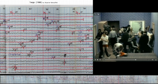
Tango
1981
Zbigniew Rybczyński
Link to video (I can't embed it because it's age restricted due to nudity and a sex scene) https://youtu.be/lo8O8lYDzIU
The first Polish Oscar winner shows the hypnotising dance of everyday people in an everyday, tiny apartment. Too many by far for such a small space, these characters wear the uniforms of all social classes and professions. We see a schoolgirl, a militia officer, a thief, a housewife, a student, a drunk...
They crowd in the tiny space to give viewers a condensed glimpse into life in the People's Republic of Poland, a satellite state of the Soviet Union. In real life, in addition to rationing and poor or no access to necessities and commodities, people would often have to endure overcrowding in small, modest apartments with the exact furniture as the animated film depicts.
The work astounds even more if you have a minimum understanding of how animation is produced and what the actual technical boundaries of production were in 1981.
Since it’s 2022 and we are used to an entirely different toolset, let’s make sure those are clear.
Tango did NOT have:
-digital recording technologies (they didn’t exist)
-digital post-production or retouching (idem)
- live preview of the sequence (impossible when shooting on film without video-assist)
-layered editing or compositing (no such computers and programs existed)
Tango did have:
-analog photography
-double projection techniques
-hand-cut masking
-meticulously calculated dope sheets
-madness
There are errors in the film which reveal some of the technique, and make the feat even more impressive. These errors remain in the final version because the only way to remove them would be to shoot the entire sequence again.
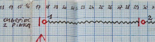
With more than 30 characters moving through the frame and narrowly avoiding each other in their mundane dance, Zbigniew Rybczyński had to plan the production of this short film with extreme precision. He used a dope sheet- in animation terms, this is a sheet of paper on which the animator can plan out his film frame by frame.
Dope sheets can look daunting, but with a little patience and concentration they are not too difficult to parse. There are traditionally 24 frames in a second. When an action happens, the animator may want to mark a specific frame as containing a specific moment in that action. If he would like, for example, a boy to spend exactly six seconds climbing through a window, then frame 1 would mark the beginning of the ingress, while frame 144 would be the one where both his feet are firmly on the floor inside. Twelve seconds or 288 frames later, the boy has retrieved his ball and disappeared again outside. And the cycle begins again.
In addition to the classic dopesheet, Rybczyński also made a detailed action plan showing the room from above- a viewpoint never seen in the film itself.
Why write this down instead of just winging it? Well, when you have more than one moving element in your animation winging it can mean your meticulously planned animation is completely out of sync. It is difficult enough to keep track of the characters in Tango as a viewer- imagine the task of the animator!
If you want to see the dope sheet for Tango and follow along with the film in real time, check out the fantastic Data Driven Drawings website. The site is a collection of the practical work included Juan Camilo González's PHD dissertation. It features Tango alongside its dopesheet, and several other notations for animated films. Thanks to Juan Camilo González, we can see the behind the scenes madness of Tango much more clearly.
17 notes
·
View notes
Text
youtube
Begone Dull Care (Caprice en couleur)
1950
Norman McLaren with Evelyn Lambart
Scottish animator Norman McLaren worked in many techniques, but the most interesting may be the one used for the above film. Unusual, time-consuming, finnicky and with results that are an acquired taste, it is one of those methods of animation which will never find itself commercialised. It lends itself well to the auteur imagination. To make such a film, you must come closer to the material than ever.
The technique is non-camera animation. As the name suggests, it is indeed a type of animation that forgoes the use of a camera in its creation.
How? Is it not an absolute basic necessity to have a camera in order to create a film?
A trick question. Let us consider it from a modern perspective; knowing there are tablets and computers which allow us to make and project digital images without ever going through the process of recording the film with a camera lens, we can answer the question: yes. Technically, any computer-generated animation is a non-camera movie.
We wouldn’t apply the term, though, as it is reserved for another kind of method. Begone Dull Care dates from 1950 and predates graphic imaging software, but it was indeed created without the use of a camera: by making marks directly on the film stock.
The marks may be made by scratching, painting, inking, stamping. The stock, if exposed to light beforehand, turns black. Scratching it may reveal layers of colour emulsion. If fixed without exposure or removed from the production process before emulsion and filters are applied, the stock becomes transparent and can be drawn or painted on, with a translucent effect.
McLaren's work is, at first glance, chaos and noise. But the noise quickly reveals a rhythm- it is jazz played by the Oscar Peterson Trio. The trick to this film was that the soundtrack was recorded first. McLaren transcribed it frame by frame onto a dope sheet, divided the film stock into lengths that matched pieces of the music, then took to it with his inks and tools.
Begone Dull Care is a synchronised, dancing chaos. Would it surprise you to learn Norman McLaren was a synesthete?
#Youtube#synaesthesia#Norman McLaren#begone dull care#Oscar Peterson Trio#Evelyn Lambart#scottish animation
13 notes
·
View notes
Text
youtube
"Terry Gilliam has turned the spare bedroom of his modern Putney flat into a miniature animation studio, and that's where he puts the animations together." begins the narrator in this video explaining how to make cut-out animations.
This is encouraging for anyone thinking of trying out stopmotion - hey, you don't need a proper studio! Gilliam of Monty Python fame is only one of many animators who constructed a studio at home. He had a whole room to work with, but that's luxury. You might only have a table, or a corner of the bedroom, that shouldn't stop you.
Many modern stop motion animators certainly work this way. Kevin Parry seems to have no problem squeezing a set into his bedroom:
Still taken from https://youtu.be/3vPAwEYc6FM
And here is David Daniels, taking over the living room table while family life goes on around him:
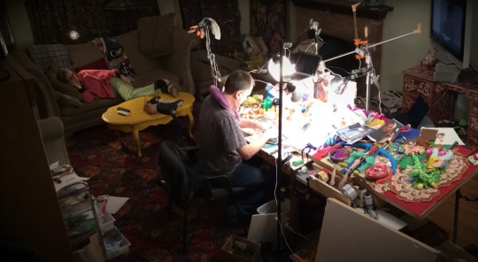
Still taken from https://youtu.be/-g3RJiR1rm0
Even the first post-WW2 stopmotion film in Poland (In the times of King Krak) was shot in the author's flat, located in one of the few buildings spared in the bombings. And in those days, cameras were huge! Still, a warning is due. Yes... you can do this at home. But should you find yourself properly encouraged by the above tutorial, you must also take a look at another one, shot by Terry Gilliam for The DIY Film Animation Show a few years later.
"Terry", asks the dreadful lifesize cutout of host Bob Godfrey, manned by Gilliam like a ventriloquist puppet, "what advice do you have for people out there who want to make film animations?" "Well, Bob," Gilliam replies, "Don't. Keep well away from it, it's dangerous, nasty stuff." Hmmm.
youtube
16 notes
·
View notes
Text
youtube
Divertimento No.3 ‘Brushwork’
Clive Walley, 1992
"I was determined (all by myself!) to save painting from it’s eclipse by TV, cinema and commercial graphics [...] it had to show wet paint still active and open to change on the screen if it was to do this. The problem was obvious, obviously. Stop frame animation, is very stop and go, and yet was the only way to make clear what I meant the paint to do. You can throw it around, (very popular nowadays in slo-mo). You can run it down slopes, [...]but you can’t really make it seem intentional, like paint is under the hand of a painter. For that I had to cut the darling “process” up into little bits and get over it."
Clive Walley in a 2015 interview with Edwin Rostron https://clivewalley.uk/film-work/
The obvious problem Welsh artist Clive Walley mentions is at the heart of understanding how stopmotion animation works, and every first-time filmmaker must face it. Stop motion is not motion at all, after all, but the illusion thereof, a reconstruction of a fragmented movement which must begin with the deconstruction of our perception of that movement. We have to sit down and imagine the effect we want to achieve, and then imagine it again, chopped up into 24 frames per second.
Fluid motion in animation is what impresses, perhaps because achieving fluidity with constant pauses is very difficult. The old joke is that animators get paid by the second, only they may take hours or days to create a single second of footage. How can that be married with the fluid, free motion of a painter working close to the abstract?
We've all seen hypnotising timelapses from digital devices, where the hand and tool are invisible and only the strokes they make remain. To create that effect in traditional media means that instead of simply painting as they normally would, the artist has to pause and consider each mark they make on the canvas as part of a sequence. There was, indeed, a lot for Clive Walley to 'get over'.
His short films put painting first in a remarkably avid attempt to communicate the process to an audience who may have never held a paintbrush.
"[...] I was interested in imaging the process of painting rather than the results, because in much analysis of modern painting process is a key idea. The problem is that people who are not painters have no feeling for what 'process' might contribute to the meaning of a painting, so Brushwork was an attempt to use the extra dimension of time in a moving image to emphasise it."
Clive Walley quoted in Art in Motion, Animation Aesthetics by Maureen Furniss.
The Divertimento series is created in pure stop-motion, with no digital interference or enhancement. Oil paint- a favourite among animators due to how long it remains wet- is applied to panes of glass layered on top of each other, filling with images as the camera zooms out, creating an infinity effect.

Clive Walley's rig, as featured on https://clivewalley.uk/
The 'Brushwork' film starts with an easel that is instantaneously transported onto the rig- to the viewer, it may appear as if they were transported into the artist's subconscious, to ride that nearly imperceptible moment between inspiration and canvas, where the paint seems to apply itself, following an unspoken idea to its visual conclusion.
Finally, the original canvas reappears, and the last brushstroke is wiped clean. We have seen painting happen, yet nothing has been painted. There is no image, no evidence, except the film itself. And though we may not take that final, static frame and hang it on our wall, we may return at will to any point of the animation and relive the process. This is something a completed painting does not allow.
This kind of stop motion created directly under the camera, where each frame is destroyed by the creation of the next and no repetition is possible is sometimes called modified-base animation, as in contrast to cel style animation where many images are drawn and substituted to create the effect of motion, this technique requires a single base image which is modified constantly as shooting progresses.
7 notes
·
View notes
Text
You know pinscreens, right? A box of tightly packed pins or nails blocked off with a piece of glass or transparent plastic on one side, moving freely back and forth on the other. You press an object into the sharp end of the pins, and a creepy 3-D impression appears on the other side. If you're brave, you can press it against your face. They come with plastic, colourful pins nowadays.
While the pinscreen as a novelty office toy appeared in the 80s, the pinscreen as a canvas for art was invented in the 30s, in larger scale, by American artist Claire Parker and her Russian husband Alexandre Alexieieff.
Parker was an engineer as well as an animator. If society insists on pitting liberal arts and sciences against each other, then Parker and Alexieieff's work is a wonderful marriage of the two: impressionist art created via a precisely engineered mechanism.
Their pinscreens ranged from small 'baby screens' to huge vertically-mounted grids which could contain as many as a million sliding metal rods. To obtain an image, you used it much like you would the office toy- you pushed the pins in or pulled them out.
In this animation technique, 3-D imprints are not the goal in themselves, just the method by which Parker and Alexieieff obtained different patterns and strokes in their pin painting. On their board, he pins are black, and the surface they are placed in white. As they are pushed in or pulled out, the shadow they cast changes, creating different images of unexpected nuance.
The effect and method are somewhat similar to pixel art, mosaic, or cross stitching, or any method where the artist painstakingly adjusts the smallest possible element on a grid in order to create the nuances of a larger image.
Claire Parker collaborated with her husband Alexandre Alexieieff on six animated films made with her pinscreens. Only six films in 50 years- because the pinscreen technique is incredibly difficult and time-consuming. The screens themselves are complicated to make, expensive, and heavy.
youtube
Night on Bald Mountain, 1933
An image from the static prologue to The Trial directed by Orson Welles, made by Parker and Alexieieff on the pinscreen.
10 notes
·
View notes
Text
youtube
Where are Ü Now
videoclip for Skrillex and Diplo feat. Justin Bieber, 2015
Directed by Alex and Ben Brewer
The brilliant and simple idea behind this video never ceases to impress me. As is often the case with stopmotion, the process is of equal significance to the end result. When access to behind the scenes information is crucial to appreciating a film, animators often leave behind clues to their handicraft, or present the making of footage outright as part of the work.
This is the case here: we begin in an art gallery, where apparently identical photographs of Bieber's recognisable silhouette hang on the walls. The gallery soon fills with people- fans, passers-by, perhaps even haters among them? They are allowed to interact with the art in a typically forbidden way: markers and paint are provided for them to alter the photographs. In any way they please.
They are recorded in timelapse as they move about the room, defacing and enhancing Bieber's face with miniature graffiti.
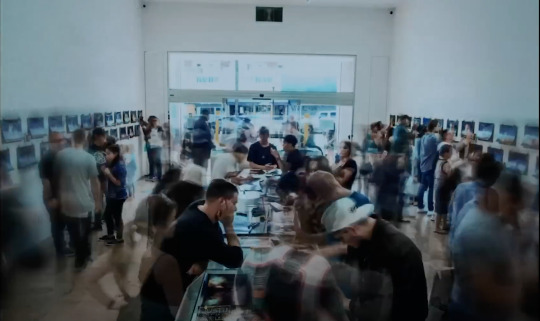
Mid-video we are presented with the result of this collaborative work. Each photograph was a printed frame from the video. Now put back together, they become a community created stopmotion film. The frames flash by too fast for us to discern any particular image, but in the age of youtube, pausing is not a problem. This, too, would have been considered in designing the video. Anyone could leave a secret, subliminal message- and perhaps upon the clip's release fans would tell each other 'Look at timecode 1:56, see what I wrote.'
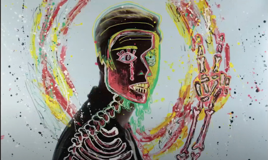
The base layer of the video is, by design, unremarkable. A well-shot, but fairly boring sequence of Bieber moving over black or white backgrounds.
Letting the public loose on this canvas has created a multi-layered, wonderfully meaningful work of art. "We all do this for you, respect that you put us here and it’s Ü that made the video.” - JACK Ü writes in the video's description.
1 note
·
View note
Text

Signum
directed by Witold Giersz
Poland, 2015 A particularly interesting work by the nonagenarian animator, invoking prehistorical cave paintings and the titular signs people leave behind them on natural and man-made walls.
The mixed media film's most notable technique is drawing in pastel directly on slabs of stone. Giersz finds inspiration in the shapes of the rock as he erases and redraws the pose after each frame. The final frame of each shot remains painted on the rock, a movement frozen in time much like the original cave paintings that inspired the film:

7 notes
·
View notes