
Statistics
We looked inside some of the posts by maines and here's what we found interesting.
Average Info
Notes Per Post
394K
Likes Per Post
222K
Reblog Per Post
171K
Reply Per Post
303
Time Between Posts
19 hours
Number of Posts By Type
Text
17
Last Seen Tumblr Blogs


Fun Fact
130K people were victims of a chain letter scam that affected Tumblr in May 2011.
Text


@giftober 2024 | day 27: blue ➛ brokeback mountain (2005) [insp]
2K notes
·
View notes


Text


ULTIMATE SHIPS CHALLENGE - Hugs [1/10]
383 notes
·
View notes


Text

if anyone is ever mean to her ever again i won’t respond for my actions
9K notes
·
View notes


Text
Only been watching The Pitt for a few days but Mel King is THE best autistic character ever written in a medical drama. She doesn't "make connections no one else can" or "just see things differently" or any other Savant with Special Abilities stereotypical bullshit, she's a resident physician who's exactly as intelligent and capable as any other resident physician in the same year. She hates unnecessary yelling because it's loud and annoying, not because she's completely incapable of handling conflict. She usually keeps her stimming subtle enough to hide but sometimes she can't. She loves having a furry critter to pet. She accommodates an autistic patient by lowering the lights and closing the doors because she understands the sensory nightmare of an active medical setting. She speaks in a straightforward and honest way but she isn't an overtly rude inconsiderate asshole. She misses some jokes and takes things too literally on occasion but she does have a sense of humor and she is funny. She speaks up against misinformation and parent panic about autism and other developmental disabilities. She has emotions. She looks at a video of a lava lamp on her phone to chill. Doctor Mel King you have my entire heart
14K notes
·
View notes


Text


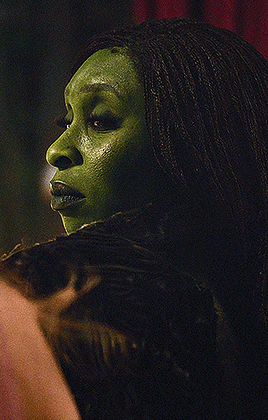

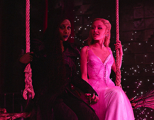


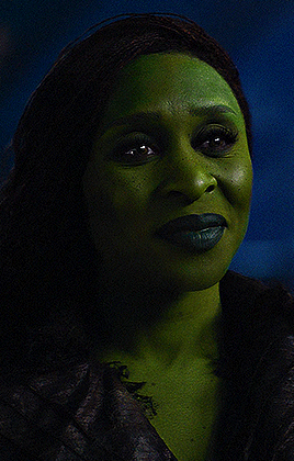


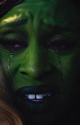
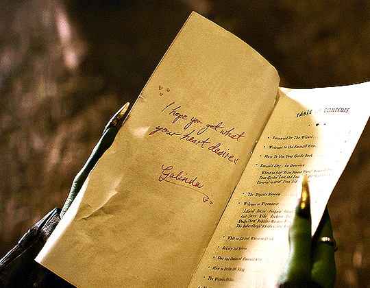
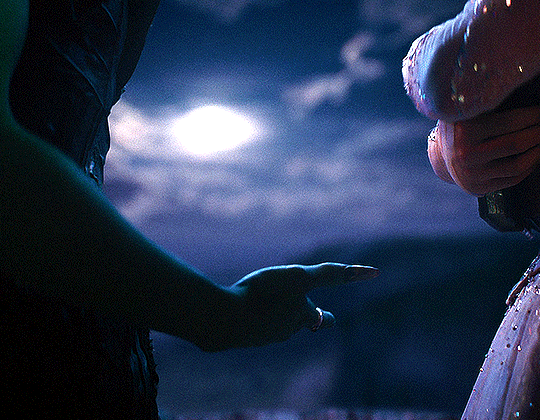

Gelphie — Wicked: For Good (2025)
3K notes
·
View notes
Text

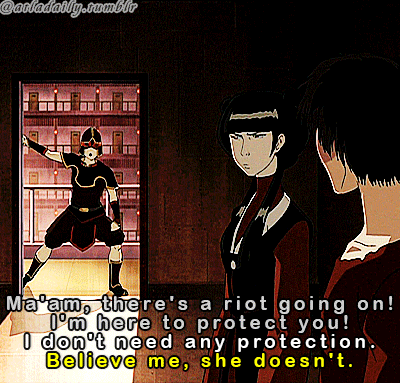

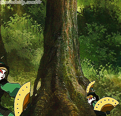


MAI IN AVATAR THE LAST AIRBENDER
168 notes
·
View notes
Text


@pscentral event 39: pride ↪ portrait of a lady on fire + pride flag
328 notes
·
View notes
Text
100K notes
·
View notes
Text


PRIDE AND PREJUDICE (2005) dir. Joe Wright
3K notes
·
View notes