
makingitstinky
art stuff
[reblogs your post] hehehehehe
5 posts
Don't wanna be here? Send us removal request.
Last Seen Blogs

the-nerd-of-life
I got no JAMS!
pedropascallme
Resident Damien Girl

lvespn96-blog
"I was tryin to protect you... keep you safe."

jakextom
and I dream of an absolution..

cupofsoju
Moon🌙 Child
Note
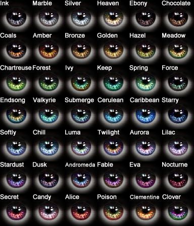
Yo you got any tips on how to pick out good color schemes and stuff? Youre really good at it, i swear looking at anything you post i just "ooh soft,, pretty colors" (if not thats chill, somethings ya just just can't explain)
Imma make ya a lil tutorial ;)

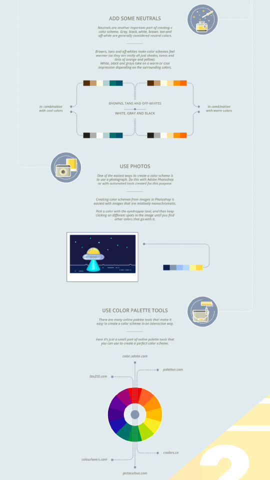
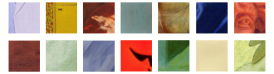
Picking colours has a lot to do with ~Colour Relativity~ also known as Value.
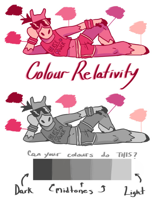
It doesn’t matter what colours you end up picking, you’ll need to start with this kind of balance. Use the KISS method; Keep It Super Simple. Too many colours can make your image muddy and/or confusing.
How to pick an awesome palette? Take a look at this cool shit.
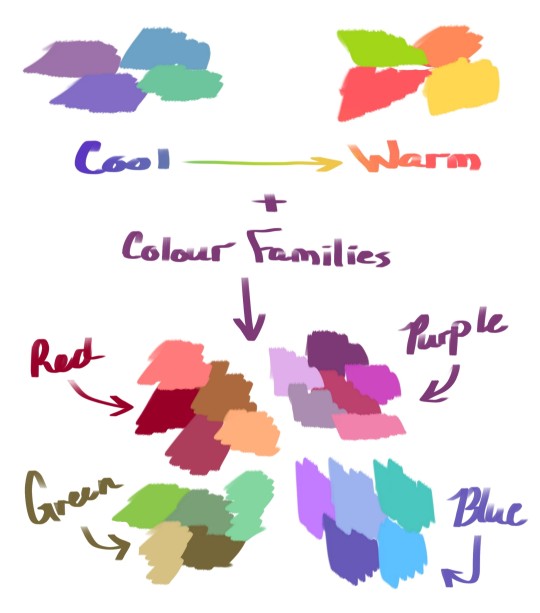
Colour families can give your image a sense of unity. They’re also really handy for setting different moods. Warm colours are usually associated with high energy, big feelings like happiness and love! Cool colours are more subdued and carry heavier, slower connotations like sadness. Or just a KICK ASS AESTHETIC pic.
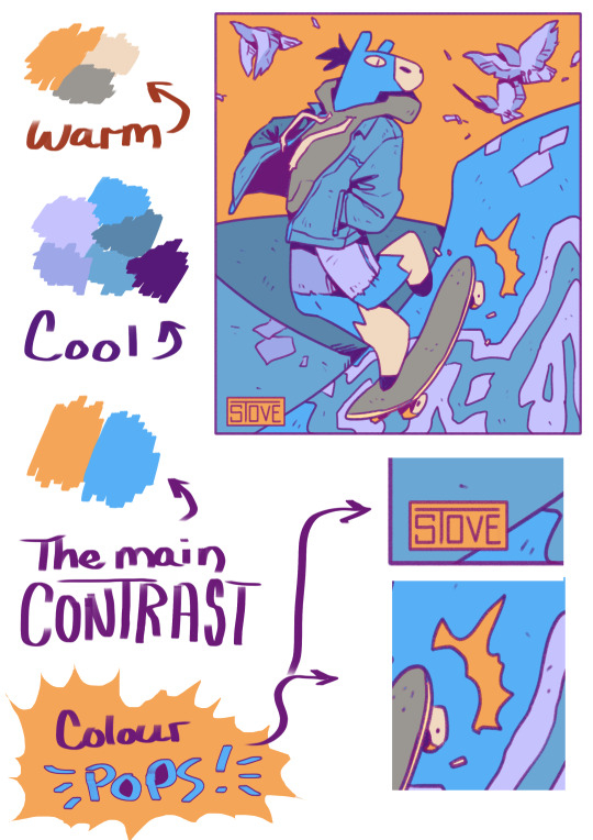
Bold colours are very fun to use but too many of them can hurt.

TL;DR:
Have dark, light, and midtones in your palette
Pick a colour & use colours similar to it
Limit your use of hyper-saturated colours.
13K notes
·
View notes
Text
Color References in Writing
These are a few Color References I use when I’m writing
Reds - Simplicable
Blues - Simplicable
Yellows - Simplicable
Blacks -Simplicable
Browns - Simplicable
Whites - Simplicable
Grays - Simplicable
Greens - Simplicable
Purples - Simplicable
Oranges -Simplicable
Pinks - Simplicable
125 notes
·
View notes
Text
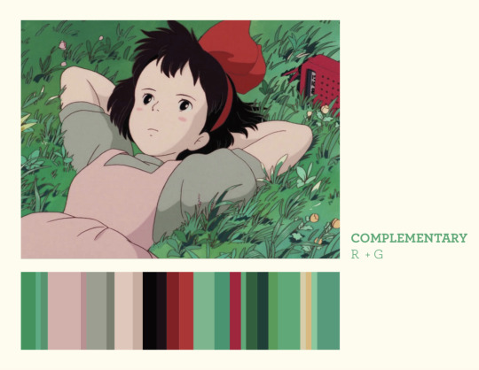
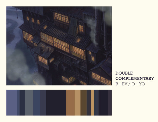

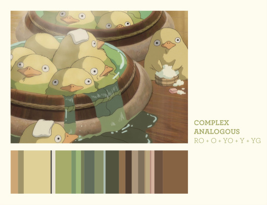
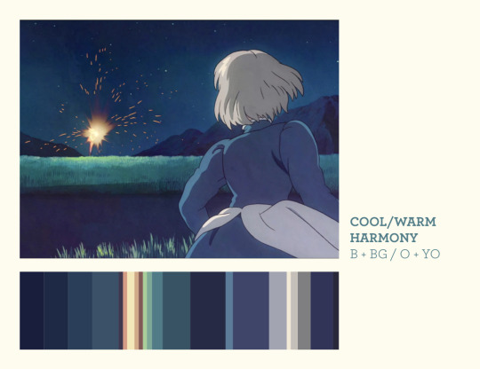
ghibli stills + color harmonies
old assignment from my color theory class that i thought came out nice
3K notes
·
View notes
Text
cannot stop thinking abt the paris review’s essay series on the history & significance of certain colours, hue’s hue:
Periwinkle, the Color of Poison, Modernism, and Dusk
Eau de Nil, the Light-Green Color of Egypt-Obsessed Europe
Marian Blue, the Color of Angels, Virgins, and Other Untouchable Things
Incarnadine, the Bloody Red of Fashionable Cosmetics and Shakespearean Poetics
Jonquil, the Light Yellow of Early Flowers, Mad Painters, and Dust Bowl–Era Pottery
Scheele’s Green, the Color of Fake Foliage and Death
Lilac, the Color of Half Mourning, Doomed Hotels, and Fashionable Feelings
Hooker’s Green: The Color of Apple Trees and Envy
Blaze Orange, the Color of Fear, Warnings, and the Artificial
Chartreuse, the Color of Elixirs, Flappers, and Alternate Realities
Living Coral, the Brutal Hue of Climate Change and Brand New iPhones
Mustard, the Color of Millennial Candidates, Problematic Lattes, and Aboriginal Paintings
Russet, the Color of Peasants, Fox Fur, and Penance
Verdigris: The Color of Oxidation, Statues, and Impermanence
(also, tag yourselves, i’m russet)
26K notes
·
View notes