malifiquemakes
Haunted by the narrative
Agonising over fictional men since 20forever | check pinned for fic & art🔞
458 posts
Don't wanna be here? Send us removal request.
Last Seen Blogs
zestupidart
ZeStupidArt's Tumblr
heliorite
Never Going To Be Normal Again

goroakxx
michael

mydogisgaytoo
Untitled
mando-abs
Wait. So I Can Put Anything On Here?
Text
My Favorite Cheap Art Trick: Gradient Maps and Blending Modes
i get questions on occasion regarding my coloring process, so i thought i would do a bit of a write up on my "secret technique." i don't think it really is that much of a secret, but i hope it can be helpful to someone. to that end:

this is one of my favorite tags ive ever gotten on my art. i think of it often. the pieces in question are all monochrome - sort of.

the left version is the final version, the right version is technically the original. in the final version, to me, the blues are pretty stark, while the greens and magentas are less so. there is some color theory thing going on here that i dont have a good cerebral understanding of and i wont pretend otherwise. i think i watched a youtube video on it once but it went in one ear and out the other. i just pick whatever colors look nicest based on whatever vibe im going for.

this one is more subtle, i think. can you tell the difference? there's nothing wrong with 100% greyscale art, but i like the depth that adding just a hint of color can bring.
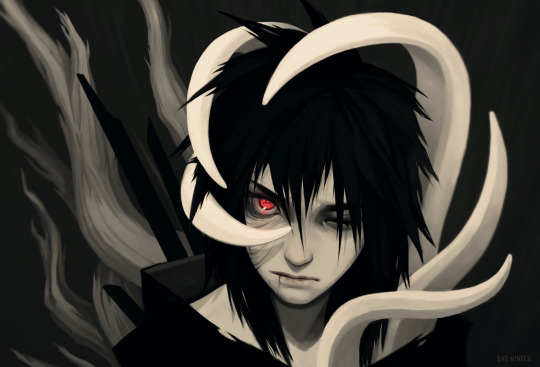
i'll note that the examples i'll be using in this post all began as purely greyscale, but this is a process i use for just about every piece of art i make, including the full color ones. i'll use the recent mithrun art i made to demonstrate. additionally, i use clip studio paint, but the general concept should be transferable to other art programs.


for fun let's just start with Making The Picture. i've been thinking of making this writeup for a while and had it in mind while drawing this piece. beyond that, i didn't really have much of a plan for this outside of "mithrun looks down and hair goes woosh." i also really like all of the vertical lines in the canary uniform so i wanted to include those too but like. gone a little hog wild. that is the extent of my "concept." i do not remember why i had the thought of integrating a shattered mirror type of theme. i think i wanted to distract a bit from the awkward pose and cover it up some LOL but anyway. this lack of planning or thought will come into play later.
note 1: the textured marker brush i specifically use is the "bordered light marker" from daub. it is one of my favorite brushes in the history of forever and the daub mega brush pack is one of the best purchases ive ever made. highly recommend!!!
note 2: "what do you mean by exclusion and difference?" they are layer blending modes and not important to the overall lesson of this post but for transparency i wanted to say how i got these "effects." anyway!
with the background figured out, this is the point at which i generally merge all of my layers, duplicate said merged layer, and Then i begin experimenting with gradient maps. what are gradient maps?
the basic gist is that gradient maps replace the colors of an image based on their value.

so, with this particular gradient map, black will be replaced with that orangey red tone, white will be replaced with the seafoamy green tone, etc. this particular gradient map i'm using as an example is very bright and saturated, but the colors can be literally anything.

these two sets are the ones i use most. they can be downloaded for free here and here if you have csp. there are many gradient map sets out there. and you can make your own!
you can apply a gradient map directly onto a specific layer in csp by going to edit>tonal correction>gradient map. to apply one indirectly, you can use a correction layer through layer>new correction layer>gradient map. honestly, correction layers are probably the better way to go, because you can adjust your gradient map whenever you want after creating the layer, whereas if you directly apply a gradient map to a layer thats like. it. it's done. if you want to make changes to the applied gradient map, you have to undo it and then reapply it. i don't use correction layers because i am old and stuck in my ways, but it's good to know what your options are.

this is what a correction layer looks like. it sits on top and applies the gradient map to the layers underneath it, so you can also change the layers beneath however and whenever you want. you can adjust the gradient map by double clicking the layer. there are also correction layers for tone curves, brightness/contrast, etc. many such useful things in this program.
let's see how mithrun looks when we apply that first gradient map we looked at.

gadzooks. apologies for eyestrain. we have turned mithrun into a neon hellscape, which might work for some pieces, but not this one. we can fix that by changing the layer blending mode, aka this laundry list of words:

some of them are self explanatory, like darken and lighten, while some of them i genuinely don't understand how they are meant to work and couldn't explain them to you, even if i do use them. i'm sure someone out there has written out an explanation for each and every one of them, but i've learned primarily by clicking on them to see what they do.
for the topic of this post, the blending mode of interest is soft light. so let's take hotline miamithrun and change the layer blending mode to soft light.

here it is at 100% opacity. this is the point at which i'd like to explain why i like using textured brushes so much - it makes it very easy to get subtle color variation when i use this Secret Technique. look at the striation in the upper right background! so tasty. however, to me, these colors are still a bit "much." so let's lower the opacity.

i think thats a lot nicer to look at, personally, but i dont really like these colors together. how about we try some other ones?

i like both of these a lot more. the palettes give the piece different vibes, at which point i have to ask myself: What Are The Vibes, Actually? well, to be honest i didn't really have a great answer because again, i didn't plan this out very much at all. however. i knew in my heart that there was too much color contrast going on and it was detracting from the two other contrasts in here: the light and dark values and the sharp and soft shapes. i wanted mithrun's head to be the main focal point. for a different illustration, colors like this might work great, but this is not that hypothetical illustration, so let's bring the opacity down again.

yippee!! that's getting closer to what my heart wants. for fun, let's see what this looks like if we change the blending mode to color.

i do like how these look but in the end they do not align with my heart. oh well. fun to experiment with though! good to keep in mind for a different piece, maybe! i often change blending modes just to see what happens, and sometimes it works, sometimes it doesn't. i very much cannot stress enough that much of my artistic process is clicking buttons i only sort of understand. for fun.
i ended up choosing the gradient map on the right because i liked that it was close to the actual canary uniform colors (sorta). it's at an even lower opacity though because there was Still too much color for my dear heart.

the actual process for this looks like me setting my merged layer to soft light at around 20% opacity and then clicking every single gradient map in my collection and seeing which one Works. sometimes i will do this multiple times and have multiple soft light and/or color layers combined.
typically at this point i merge everything again and do minor contrast adjustments using tone curves, which is another tool i find very fun to play around with. then for this piece in particular i did some finishing touches and decided that the white border was distracting so i cropped it. and then it's done!!! yay!!!!!
this process is a very simple and "fast" way to add more depth and visual interest to a piece without being overbearing. well, it's fast if you aren't indecisive like me, or if you are better at planning.

let's do another comparison. personally i feel that the hint of color on the left version makes mithrun look just a bit more unwell (this is a positive thing) and it makes the contrast on his arm a lot more pleasing to look at. someone who understands color theory better than i do might have more to say on the specifics, but that's honestly all i got.

just dont look at my layers too hard. ok?
1K notes
·
View notes
Text

Sneaking a peek
#I'm firmly on my rarepair bullshit#Jiraiya is an asshole and a perv but he's also HUGE#don't worry kakashi your grandsensei is totally not going to take advantage of you#Once again put too much effort in this but really happy with how the clothes turned out!#jiraiya#hatake kakashi#jirakaka#malifique art
33 notes
·
View notes
Text
Sooo @badninken has infected me with the Blade of the Immortal brainworms and I spent my vacation day smashing out a fic. No regrets!
This one's a lot darker than my usual, please check the tags and curate your own experience.
Read it here <3
#thank you buddy for squealing over horrible men with me <3#and for the history lessons!#eating that dead dove broke my writing drought#thank you sicko vibes#don't like don't read#Blade of the immortal#my fic
14 notes
·
View notes
Text

凶戴斗 - Magatsu Taito
#HIM!! The guy!!!#my silly little meow meow who looks best taking a beating but never gives up#this is such a cool aesthetic op!#he's such a little punk in every way#i love this T_T
64 notes
·
View notes
Text

posting this to everyone on tumblr can see it too
25K notes
·
View notes
Text
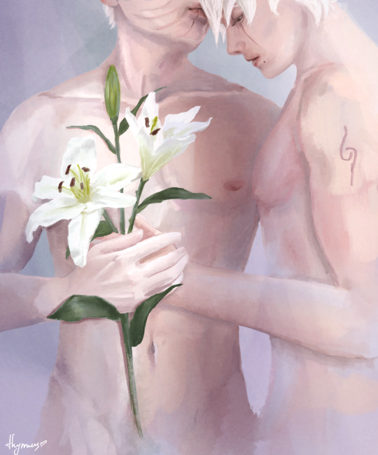
He’s left Kakashi waiting for an answer to his question for too long. He brushes his thumb over the top of his hand.
“I’ll make sure they don’t wilt, too.”
Some melancholy flower erotica inspired by "It's not so bad, and I can't see at all" by @obkkfkr
143 notes
·
View notes
Text
All of @badninken's excellent Blade of the Immortal posting has got me thinking about my favourite villain of the series: Shira
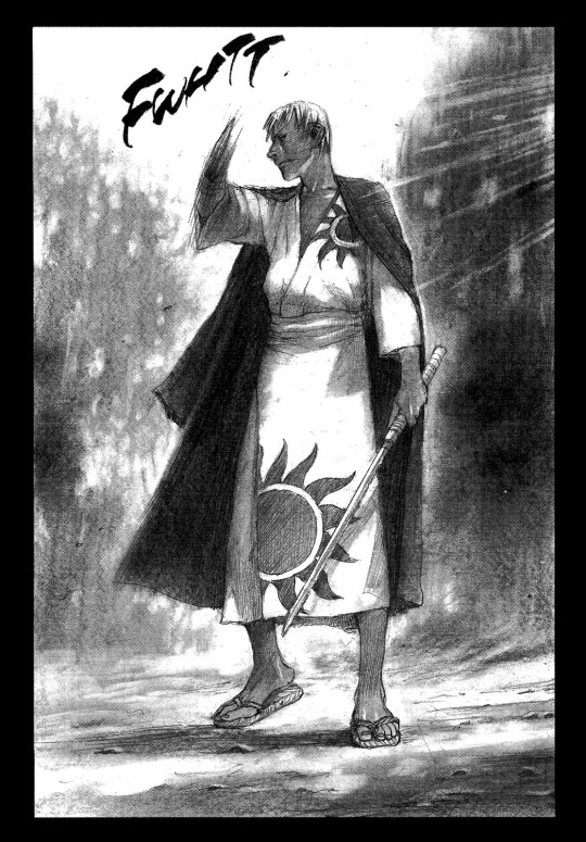
There's something thrilling about a well written, irredeemable bastard, and Shira is all of those things and more. He is a skilled fighter and a true psychopath who rapes and kills with obvious, vocal relish.
At one point Manji slices off his arm, which just makes him worse. Here he is fighting Magatsu with his new improved bone sword:
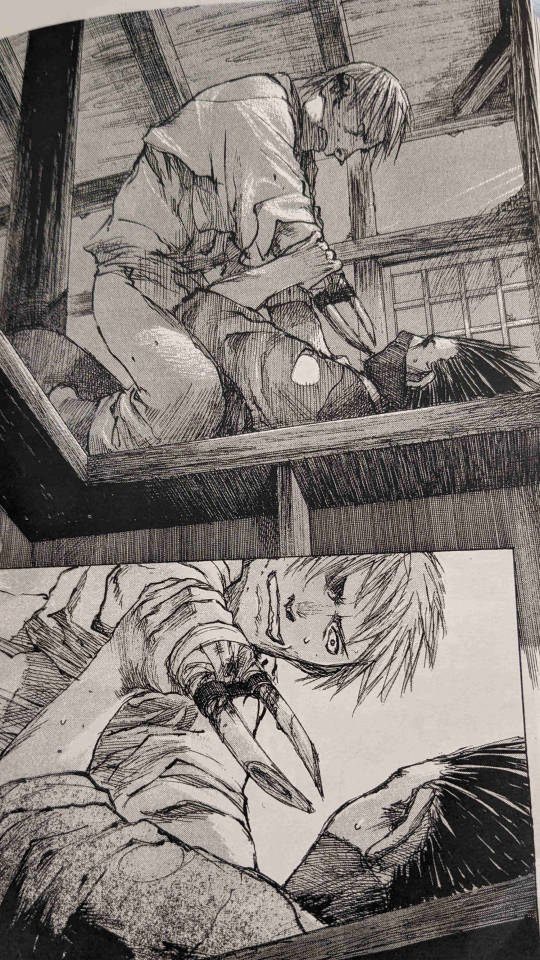
That's right, he fashioned his arm bones into daggers. He even says that stabbing someone hurts him as much as it hurts the victim, but that is in no way a deterrent. Gotta admire a man who's never not having fun!
#getting into his head enough to write a half way decent fic is proving to be a fun challenge#he tickles my villain fucker tendencies just right#plus he's huge and likes tossing Magatsu around like a ragdoll <3#blade of the immortal#shira#gore
18 notes
·
View notes
Text
This timelapse is a bit messy but my goal was to record some of my rendering process to show the way I paint. It's not a tutorial but it might give an idea of how I push my pixels around.
The video starts after the rough sketch is already in place and then there's a BIG gap somewhere in the middle where I figure out all the trees and tentacles. I thought the face might be the most interesting bit to focus on anyway. The video is little over three minutes but the entire process probably took closer to six hours, not counting the looooong breaks.
There isn't a lot of color in this and I painted almost all of it with a gradient map adjustment layer on top of everything, colorpick set to "current and below". I start painting above that at the very end when working on the eye. Other tricks used in this is a tilt-shift blur filter to add some depth, a final color balance adjustment and a high pass layer for final sharpness.

He so sharp <3
340 notes
·
View notes
Text

My personal headcanon on their physiques. An anatomy study that got a little out of hand ;)
Full pic here.
#warning for lovingly rendered dick and balls#do not open at work!#unless your coworkers are very cool#beefcake obito truther#Kakashi will have his whole junk out but still won't show his face lol#obkk#kakaobi#hatake kakashi#uchiha obito#horny hours#malifique art
39 notes
·
View notes
Text


king
226 notes
·
View notes
Text

On the clock.
Full pic here ;)
#The ANBU definitely used honey trapping#it's the Other kind of wet work#that uniform is made for sin#warning for full dick in hole#learning anatomy is fun when it's horny :D#hatake kakashi#ANBU Kakashi#horny hours#malifique art
53 notes
·
View notes
Text
"This person has a secret onlyfans!" "This artist does NSFW commissions!" "This author writes porn on the side!" I cannot begin to tell you how swag and awesome that is.
64K notes
·
View notes
Note
seeing you post about Naruto and Blade of the Immortal got me thinking: do you think Kishimoto based Zabuza and Haku off of Manji and Rin? It just clicked for me that Haku's use of senbon might be based off of Rin's throwing weapons. Their relationship is also somewhat similar: some old guy and a kid he picked up. I love your analysis posts so I'm curious what you think about this!
Oh hiiii! I love you so so much for asking ^.^ <3
I have so many thoughts and I'll start by saying: Yes, I totally agree with your observation.

I think it's super interesting to see the ways Kishimoto has been influenced by Samura. I'm going to point out a lot of similarities so I want to clarify that I don't think Kishimoto is plagiarizing. His characters are his own, not carbon copies. It is obvious though, that he cut the pages out of Blade of the Immortal and used them as wallpaper so that he could study Samura's art panel-by-panel while he was still in university. When you're that dedicated to studying someone else's art it will show in your own, whether it's on purpose or not. He has confessed to Samura himself in interviews though so it's not like it's a dirty secret. I think a lot of these things are tributes rather than Kishimoto copying (it's a lot of tributes though)
Moving on...
Haku and Zabuza have a very different sort of relationship and story compared to Rin and Manji. Manji protects Rin and essentially lives to keep her from harm while Zabuza uses Haku as a tool for his own protection. We still see Rin throwing herself in front of blades to shield Manji in battles I guess, so... Yeah.
Then we have the whole "killer of 100" thing, where Manji killed 100 corrupt cops and Zabuza killed over 100 classmates. They also both use apples for rehab purposes!

I think the most obvious character influenced by Samura's work is Itachi.
The mature-beyond-his-years boy genius and clan heir who end up committing acts of extreme violence. The enigmatic villain who the protagonist has sworn to kill to avenge their family. The cold and merciless pretty boy who's supposedly evil but suddenly gets a lot of screen time and a back story that makes you sympathize and root for him despite the war crimes. The guy that ruined the protagonist's life but it's fine because look he's kind of cool and smiles sometimes :)
Yeah that's Anotsu Kagehisa and Rin
and also Uchiha Itachi and Sasuke


I have no idea if Kishimoto did this on purpose or not, I just found the Itachi stab panel by accident while looking for pictures for this post.
Anyway, I can't not mention my boys Magatsu and Kakashi while we're at it. Look at them! <3

The mask makes it obvious of course, and they both have hair that defies gravity as long as they are alive and conscious but might droop if they get really sad or knocked out. Love guys with moody hair <3
These two are fun to compare because if they ever met they'd have to try to kill each other. Magatsu's only goal is to destroy the ruling class and their servants and Kakashi's goal is to protect his fellow servants of the ruling class. BUT! They'd probably get along if it wasn't for that. They are both loyal, laid back nice guys seemingly without sex drive and they both enjoy eggplants! Magatsu grew up on a farm and fights for his people (peasants and the working class in general) and Kakashi is vaguely farm-themed with his name and all so that's cool.
Once they were done being pleasant to each other they would fight and Kakashi would win with ninja magic.
#fascinating comparisons and great analysis#thank you op for the lesson 🙏#Magatsu and Kakashi can totes be bff if they never talk about work lol
38 notes
·
View notes
Text
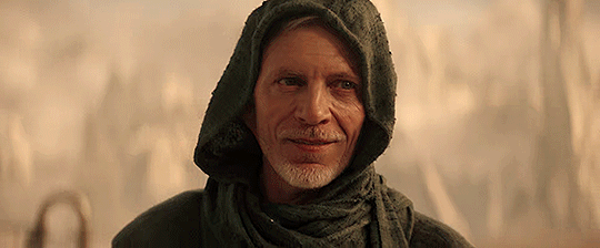


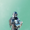
CALLUM KEITH RENNIE as Captain Rayner in Star Trek: Discovery
479 notes
·
View notes
Text
for all the artists out there, here are my favorite resources i use to learn!
Files
The Complete Famous Artist Course
Art Books and Resources
Art, Anatomy, and Color Books
PDF Files of Art Books
YouTube
My YouTube Playlist of Tutorials
How to Draw Facial Features
Drawing and Art Advice
Drawing Lessons
Art Fundamentals
Anatomy of the Human Body
2D Animation
Perspective Drawing
Websites
Pinterest Board for Poses
Another Pinterest Board for Poses
Reference Angle
Figurosity
Sketch Daily
Human Anatomy
Animal Photo References
Humanae - Angélica Dass
Fine Art - Jimmy Nelson
Character Design References
CDR's Twitter Account
iamagco's Twitter Account
taco1704's Twitter Account
takuya_kakikata's Twitter Account
EtheringtonBro's Twitter Account
Drawabox
Color Wheel
Color Palette Cinema
Free Images and Pictures
Free Stock Photos
FILMGRAB
Screen Musings
William Nguyen Light Reference Tool
Animation References - sakugabooru
Animation References - Bodies in Motion
15K notes
·
View notes
Text


344 notes
·
View notes
Text
Reblog for a larger sample size!
No "show results", if you're not a fanfic writer just be patient.
I saw a post about an anon saying it was embarrasing to have an ao3 account in your 30s (it's absolutely not), so I want to do a poll and see what the age range actually is.
#the best fics tend to be written by people with more life experience#trying to describe being drunk as an early teen who has not touched alcohol was fun lol#it's okay to have hobbies as an adult!#in fact it's vital if you want to stave off The Horrors#never stop having fun and block the naysayers#also kinda scared about having under 10s free roaming on Tumblr#writing fanfics at whatever age is fine but kids stay off social media that shit will kill you
19K notes
·
View notes