
Don't wanna be here? Send us removal request.
Statistics
We looked inside some of the posts by mariastoyanovablog4 and here's what we found interesting.
Average Info
Notes Per Post
0
Likes Per Post
0
Reblog Per Post
0
Reply Per Post
0
Time Between Posts
18 seconds
Number of Posts By Type
Text
17
Last Seen Tumblr Blogs


Fun Fact
China blocked Tumblr because of pornography and censorship problems in 2013.
Text
Practice 2 - Reflection
In this project I explored another new field of art which is vehicle design for the motorbike. I followed some tutorials to get a good idea of the right shape. The tutorials also helped me fill in the blanks on parts of the bike I wasn’t sure how to approach. I mostly struggled in the planning and sketching stage of the bike but I felt more confident when doing the paintover as I already had a good idea of the colour scheme based on the character design. I was aiming for the bike to match her colours and futuristic design.
I also further developed my knowledge on perspective as I wanted to create a cool city tilted angle action frame, where the character is on the motorbike zooming to the next location. It was a challenging angle to achieve at first as I couldn’t quite figure out where the perspective points meet. A useful trick I learnt from Leo, is to use my reference against a large canvas to better visualise the perspective lines by extending them until they meet. Where they meet is the deciding point of perspective. I will continue to use this method anytime I want to recreate a complex perspective scene.
0 notes
Text
Practice 2 - Artwork
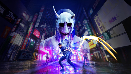
Character Design
To match the neon aesthetic I came up with a cyberpunk-like character with a sword that glows like a lightsaber. She has a brave-thrill chaser personality but is also independent and serious. She had special training to pursue the role of fighting crime in the city. She is able to do that using her blade which cuts through anything and her motorbike to get around quickly.
The design of this character was very fun for me as I was able to take advantage of the bold neon colours and create interesting outfits. I went with a purple and neon green colour scheme, the purple to match with her night time crime fighting and the neon green helps perfectly break down the purple. I believe the two colours clashed but in a fun and chaotic way. I also decided to give her light clothing to fit with her agile ninja playstyle and movement. Furthermore, I aimed to make the clothes feel futuristic to match the city.
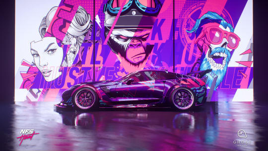
Motorbike
With a cyberpunk city environment I wanted to have an attempt at vehicle design, at first I considered a futuristic car but then I thought that a motorbike would fit the main character more. I started off with some sketches and then the final render. I also settled on a purple colour scheme to match the character.
Environment Art
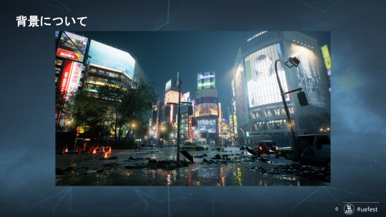
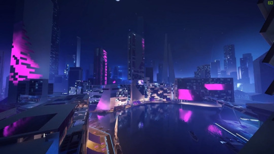
Unlike the previously developed work, this part of the assignment focuses on environmental art, allowing myself to explore other fields in concept art will push me to become a better artist and a more desired artist within the game industry. The light and shadow task focuses on how lighting affects the scene and creates a certain mood for the audience or the player. My Light and Shadow task was based around fluorescent, neon lights in Tokyo, Japan. For this I designed a simple street focusing on a vending machine that perfectly captures this neon lighting at night. To further develop this project I decided to take my focus into, what would the environment look like outside of the still frame on the vending machine. I created three different viewpoints of the city still keeping in mind the aspect of neon lights. Throughout each environment piece I try to include neon signs or neon lighting reflected on buildings. The first angel of the city focuses on the highest buildings and their neon lights and some distant buildings. The second art features the main character looking down at the city from a fence next to a cat. I did the character and the cat as silhouettes because I didn’t want them to pull away from the focus of the city. This angel is a little lower and we can see a little deeper into this futuristic city. The final artwork for the environment is an action shot with the main character speeding off on the motorbike. For this I used a two point perspective while the horizon line is slightly tilted to the left. With this one I wanted to showcase the city from a ground level point of view. This final artwork also nicely combines my art for this developed project, by including the main character, the motorbike and the city in the background.


0 notes
Text
Practice 2 - Inspiration, Artists, and Other influences
As mentioned in previous blogs Ghostwire:Tokyo is a big part of my inspiration for a futuristic Japanese environment, as I am further developing this environment and it’s characters I refer to some other game references. The first being, Ghostrunner, a game set in a cyberpunk, dystopian future, and it follows a cybernetic ninja warrior known as the Ghostrunner, who awakens in a crumbling megastructure called Dharma Tower. The objective is to reclaim the tower and restore order, the Ghostrunner must ascend the tower, and unlock the truth behind his own creation and purpose. Using the character of Ghostrunner helped me picture how my own ninja warrior with a futuristic samurai blade would look like and what would be her purpose in this world.
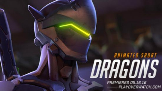
Other possible references to similar character designs would be to look at Genji, a hero from Overwatch. With its diverse, popular and very recognisable cast of characters I often study character designs from Overwatch. And Genji as a character has similar personality traits to my character. He lives a more carefree lifestyle and his design also reflects that, his body is made up of advanced cybernetics, turning him into a cyber-ninja. Through studying his concept art I got a good idea on how to structure the shape language of my character using his slim silhouette and ninja/samurai stance.
Given that I had the idea for my main character to have a motorbike, I was researching games with motorbikes. One in particular was Trials Fusion and Trial Runner, a series of physics-based racing platformer games developed by Ubisoft RedLynx.These games involve navigating challenging tracks filled with obstacles and pitfalls, requiring precise control of a motorcycle to reach the finish line. The core gameplay involves mastering acceleration, braking, and rider positioning to overcome the course's unique challenges. This game was the perfect reference for motorbike artwork as it had a lot of variety and options for customization which can further adjust the shape and look of your bike.
If there was gameplay to this project, I had the idea to go for the Roguelike genre and Beat Em Up style. The main aspect of the game is that the main character gets around the city with her motorbike to fight crime and protect the innocent. She is the hero at every crime scene, which is familiar to a game I recently finished. This style of gameplay really reminds me of the story and combat from the Spider Man games. Not only the main story but also most side missions have an objective to go to a crime scene location in New York and defeat a wave of enemies. From playing the game and doing my own research I can confirm this is a very engaging style of gameplay especially when a leveling system and unlocking new abilities is introduced to the character. I like this formula of gameplay and I wish to pursue it for this project.


References:
ArtStation. (2024). Maria Yue💡. [online] Available at: https://www.artstation.com/xiaowantou.
2. ArtStation. (2025). Javi Skau. [online] Available at: https://www.artstation.com/javiskau [Accessed 20 Jun. 2025].
3. ArtStation. (2025). Ray Z. [online] Available at: https://www.artstation.com/rz3d [Accessed 20 Jun. 2025].
4. ゲームづくりの最新情報やアイデアを紹介!|ゲームメーカーズ. (2022). いかにして『Ghostwire: TokyoTM』の渋谷は構築されたのか?本作のプログラマー 奥川 剛氏が魅力的な都市を表現する方法を解説【UNREAL FEST 2022】|ゲームメーカーズ. [online] Available at: https://gamemakers.jp/article/2022_06_24_9134/ [Accessed 20 Jun. 2025].
5. Bethesda.net. (2025). Ghostwire: Tokyo | Official Website. [online] Available at: https://bethesda.net/en/game/ghostwire-tokyo [Accessed 20 Jun. 2025].
6. Overwatch EU (2016). Overwatch Animated Short | ‘Dragons’ (EU). [online] YouTube. Available at: https://www.youtube.com/watch?v=559tgF2--4g [Accessed 20 Jun. 2025].
0 notes
Text
Practice 1 - Reflection
This project mostly combines all my strengths of anime character designs, creature art and cute small friends. The challenge here was trying to keep consistent artstyle across all the artwork and consistently to be able to draw the same character but in a different pose while still keeping the correct anatomy.
Looking back on the project the rendering could have been improved especially in the final artwork of the character. The shadows and lighting seem a bit blended in the clothing. Furthermore I could have experimented more with shape language and size on the companions, this would give me more varied sketches which inturn would give more opportunities for a creative final design.
0 notes
Text
Practice 1 - Artwork
To start off the Developing Skills assignment, I decided to Creating Concepts artwork. I was a huge fan of how this artwork turned out, and even back then I was already thinking about how I could further develop these designs. This was a task that gave me so many ideas on what else I could create and add to this fantasy world. Originally my three words were fantasy, adventure and cute, and I would say I definitely continued to express my art within these words. I aimed for every artwork in this project to be part of and exist in, the same fantasy world.
Firstly, in this blog I would like to cover the main character. For this assignment I decided to do a redesign on her, this includes her entire outfit and hair. This new look definitely lines up more with my vision for her as a magical girl and a young witch who is destined to save the kingdom. I enjoyed her outfit before but I thought I could push it even further by adding more detail and magic into her dress. The first step to improving her design was to make her outfit very layered on fabric, this includes having a ruffled skirt and ruffled sleeves. Additionally I introduced a lot more detail throughout each clothing. For example, I added ribbons on the sleeves to match the bow on the hat and added striped patterns to her socks. This makes her design as a young witch a lot more believable, and I feel confident when saying that I am pleased with how her design turned out now.
I also made changes to the hair, I didn't experiment a lot with different hairstyles as I had a clear concept of what I wanted to achieve. I had in mind a big hairstyle, long hair which is super curly, a very dramatic look compared to her simple hairstyle in the initial artwork. Before the simple hair worked with the more soft and simple outfit. So I knew that the old hairstyle wouldn’t match very well with the new outfit.
Along with her new hairstyle and outfit I explored four different colour schemes. In the original design the colours are more on the soft side and almost pastel, for the first colour scheme I was interested in seeing my character in dark hair with some dark tone colours in the clothes as well. This one definitely supported the witch aspect of her personality but it seemed more like a character dressing up as a witch on Halloween. I can conclude that the colour scheme was interesting to explore but it didn’t work well for the character. The second colour scheme of mostly blue tones with brown hair was my favourite. I thought going with a starry sky blue shade matches well with the magical powers I imagined her to have, but more on that further down on this post. I experiment with very girly shades for the third colour scheme. It was to my surprise, a very cute colour scheme with vibrant colours that compliment each other. For the fourth colour scheme I was thinking about nature type magic, due to this I decided to try making the dress green and her hair blond. Once again a very interesting combination of colours but I think this pushes the design more into a forest fairy look.
Moving on to weapons, I designed a few with careful consideration on how she attacks and what kind of magic she uses. From the start I was set on magic staff as her weapon and I planned attacks and VFX used around that concept. All weapon designs had some features in common such as; hearts and stars. After some debating I liked the idea of stars, galaxies and energy being part of her spells and they could also have a flashy cosmic VFX. This also matched the blue tones of the outfit.
To showcase her new design I created a key art illustration that features every detail of her outfit while she is casting an energy ball. With this key art I wanted to bring her into a 3D space outside of the character sheet. The illustration also shows how her hair would behave when she is casting spells.
Companion 1
Companion 1 is the little mushroom guy, I would say he is also the original companion as he was the first design I came up with. You can find the initial sketch for him under Creating Concepts artwork. At first, I was a little unsure if I should include him with my character as I thought that her new re-design wouldn’t match having a mushroom friend. However, I remember he made a big impression on everyone in class in the first week so I thought I should still develop his design and see where it takes me. I came up with ten more ideas on how he could look, ranging from different body shapes to different and unique facial expressions, allowing him to have so much more personality. From the start his role was to be a little poisonous buddy, and this time I took this aspect even further. I experimented with his design by adding poison smoke clouds around him, and poison dripping but it acts more like a slime texture. For the final design I really leaned into the poisonous gas that follows him around and I chose the design where he is holding the poison bottle. I thought the original idea with the poison bottle works very well with his role alongside the main character. He is still helpful, friendly and charming but can be described as deadly to touch. To further develop his character I kept his cute smile but made him actually a lot more sinister towards the enemy.
Companion 2
While I developed the already existing concepts, I wanted to push myself to add even more original characters into this fantasy world. I created a second companion, but this time with a different task compared to the little mushroom guy. Companion 2 is a little floaty friend that I named Seelie. Seelie has the opposite job of mushroom friend, while he inflicts a negative status on the enemy with poison, Seelie on the other hand uses magic to support the main character. He applies a positive effect that improves battle stats, giving the main character an advantage over the enemy. With Seelie in the team, the main character travels on adventures with two companions which can be summoned in and out of combat.
Enemy Creature
With everything so far being cute and colorful I really wanted to push myself to create dark and deadly. As already mentioned above this half of the assignment is more about exploring creature design for me. I have covered the cute, and friendly pets and now I want to move on to the threat the main character needs to face. I had a few ideas in mind that I couldn’t choose from but I was set on doing a dragon. The setting and all the characters are in a fantasy world so I thought it would work well to have a dragon as the biggest threat in the kingdom. For the design I wanted the dragon to have elemental powers. Some of the ideas I had; Poison/Toxic Dragon, Tidal Dragon, Cosmic Dragon and Inferno Dragon. After careful consideration I was set on a classic fire breathing dragon so the name Inferno Dragon seemed fitting. However, as I was working on the design, shape and colour scheme, one of my friends suggested calling him Crimson Dragon. So this is how Crimson Dragon was born.
I wanted his design to be spiky and sharp, more specifically I was interested in making the tail and the wings with spikes. Through my research I learnt that oftentimes sharp designs on characters and monsters mean dangerous or evil. A good way the game industry and film industry have used to help the audience or player identify the villain. Along with the spikes on the tail I added fire burning with the idea that if his attacks were to be animated, I thought it would be cool if he slams it on the ground setting the battle field on fire in a certain area. The spiky wings also needed a deadly and intimidating look. I chose to make the wings with an alternating pattern between reds and blacks, making them really draw your attention almost in a hypnotic way. I have always believed that the wings of a dragon determines how scary and intimidating they can be, due to this I was going for a very dramatic and end of the game boss fight look. I am confident that the design I have chosen achieves this. The spikes further continue throughout his body and they form the two horns on his head.


0 notes
Text
Practice 1 - Inspiration, Artists, and Other influences
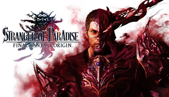
My references for the companions and the enemy creature come from the MMORPG Final Fantasy XIV and Stranger of Paradise which is also a game in the Final Fantasy universe but with different artstyle. Both games offer a wide range of artwork for boss designs and pet/companions. In particular I was looking in depth into boss fights Nidhogg and Shinriuy Final Fantasy 14 also has impressive boss arenas, some developed with large scale battles in mind for up to 48 players and some are smaller designed for a party of 8 players to resolve boss mechanics in sync.
The arena of a boss is always good to consider while designing a boss due to getting the right scale for the room and correct perspective boss and camera perspective for the player. Final Fantasy 14 has a difficulty known as Savage, in this difficulty most bosses have a phase 2 which they usually transition into with a cinematic cutscene. Sometimes even the boss arena can transition to signifying the player has reached phase 2, this is done by a wide area of effect damage which is usually white and flashy or too dark to see anything, and as the attack vfx fades out the arena is already different. This got me thinking of possibly doing a phase 2 for my enemy creature and how I can show it to the player that it has occurred.
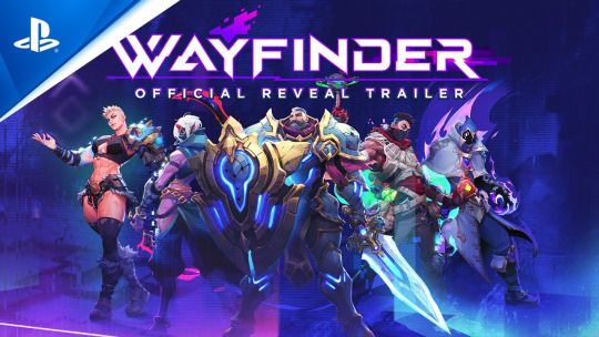
For the artstyle I am looking for, I wanted a high fantasy open world game. Some good references for this are Legends of Zelda: Breath of the wild and Wayfinder. Both take the fantasy theme, but use two different and unique art styles. Wayfinder uses the recently very popular stylized look also seen in Valorant and League of Legends Arcane. And Breath of the Wild uses the classic anime cel shaded art.
The magical girl character takes inspiration from shows such as Sailor Moon and Winx. Both are known for high budget outfit transformation sequences and recognisable looks for each character. Often the hairstyle and color scheme are also different and unique which ties in with the magic powers they can do. When creating this character I want to focus on a theme and follow through on this theme when it comes to the outfit, attack abilities and weapon.


References
STRANGER OF PARADISE FINAL FANTASY ORIGIN | SQUARE ENIX. (2022). STRANGER OF PARADISE FINAL FANTASY ORIGIN | SQUARE ENIX. [online] Available at: https://www.square-enix-games.com/sopffo/en-gb/ [Accessed 20 Jun. 2025].
Galizio, J. (2025). Final Fantasy XIV’s new Chaotic Alliance Raid is yet another feast for well-fed raiders. [online] Rpgsite.net. Available at: https://www.rpgsite.net/feature/16718-final-fantasy-xivs-new-chaotic-alliance-raid-yet-another-feast-for-well-fed-raiders [Accessed 20 Jun. 2025].
Marks, T. (2019). Every Art Style Zelda Games Have Ever Had - IGN. [online] www.ign.com. Available at: https://www.ign.com/articles/2019/02/14/every-art-style-the-legend-of-zelda-games-have-ever-had.
ArtStation. (2025). Virginia Critchfield. [online] Available at: https://www.artstation.com/virginiacritchfield.
ArtStation. (2025). Philip karlov. [online] Available at: https://www.artstation.com/bomjspeed [Accessed 20 Jun. 2025].
ArtStation. (2025). Sailor Moon, sunmomo 珊. [online] Available at: https://www.artstation.com/artwork/5enRz [Accessed 20 Jun. 2025].
ArtStation. (2025). Roy XVI. [online] Available at: https://www.artstation.com/sixteenj [Accessed 20 Jun. 2025].
ArtStation. (2025). Vincent Gros. [online] Available at: https://www.artstation.com/vincentgros [Accessed 20 Jun. 2025].
to, C. (2025). Shinryu (Final Fantasy XIV). [online] Final Fantasy Wiki. Available at: https://finalfantasy.fandom.com/wiki/Shinryu_(Final_Fantasy_XIV) [Accessed 20 Jun. 2025].
to, C. (2025). Nidhogg (Final Fantasy XIV). [online] Final Fantasy Wiki. Available at: https://finalfantasy.fandom.com/wiki/Nidhogg_(Final_Fantasy_XIV) [Accessed 20 Jun. 2025].
0 notes
Text
Story Board - Reflection
I can confidently say this was the most difficult task for me. Storyboarding is a crucial skill needed for a concept artist, and it’s definitely something I need to further develop.
I guess I’m a unique artist because I will do everything I can to avoid having to do a storyboard. Even in the past, before this project, this is something I have always stayed away from. I believe the problem comes from putting it all together. I’m often confident in my idea, but I hit a wall when it comes to breaking down this idea into separate frames or action shots.
After some reflection I believe this storyboard definitely needed some edits. The concept for the storyboard was good however some key frames were missing due to my attempt to condense this story into 9 frames. For example, when she is pulled in, frames are missing to further empathise with the idea of how the portal takes her away. If I had to improve on this work, I would draw the character desperately trying to hold on to something as she gets pulled away. Furthermore, there could be a frame showing half of her room and half of the world inside the portal highlighting how the whole room is getting consumed. I would also work on close up angles of the character’s expression to truly show the large range of emotions she experiences throughout the story.
After doing this task, I am more open to the idea of showcasing my ideas through storyboards. While I struggled with this task, I started to enjoy it and I liked the story I came up with.
0 notes
Text
Story Board - Artwork
It starts off with the main character playing her favourite game “Swords and Magic”. A completely made up fantasy adventure game, which features characters having magical powers or being noble knights wielding a weapon. The world of this game faces a world-ending calamity and it’s up to the players to unite together as mages and knights to prevent it. The girl in my storyboard is the “chosen one” to save this world and to do that she gets pulled in by a portal connecting her room to the world of the game. As she launches the game on her computer a portal appears, slowly growing in size. She panics and pulls away but the pull of the portal was too strong. The storyboard aims to show the character travelling through the portal and entering the new world. As she jumps to this world, she transforms into her in-game avatar, no longer being a regular girl playing video games in her bedroom. By becoming her main character in the game she has also gained the ability to cast spells to defeat creatures and monsters. With excitement in her eyes she doesn’t realise the portal closes behind her leaving her trapped in this full of mystery world.

0 notes
Text
Story Board - Inspiration, Artists and Other influences
The main role of a storyboard is for artists to be able to communicate action and motion through frames. A storyboard usually requires artists to interpret a script, design brief, or directing notes to produce a set of panels that communicates the narrative and overall visual objective to a production team. Due to this, clarity and planning stand at the forefront of this task. I began my research on storyboards of popular games and immediately I was familiar with the drawn images that were then turned into the final product, this allowed me to understand what techniques and components were needed in creating storyboard drawings which will then be translated into the game.
While it’s useful to explore professional examples of storyboards from AAA games I also looked into manga and comics for ideas and influences. Comics and storyboarding share a strong connection, they both use sequential visual storytelling techniques but they differ in purpose, format, and level of detail. They overlap heavily in structure, pacing, and visual language. Furthermore, both also share techniques such as cuts, pans and zooms.
Manga and storyboarding are also closely related in terms of visual storytelling, structure, and purpose, though just like comics they serve different purposes. In manga, pacing is controlled by panel size, placement, and the amount of dialogue or detail. A single panel can linger on a moment or quickly jump to the next scene, but in storyboarding pacing helps plan shot duration and transitions. Also Manga often suggests motion using motion lines, dynamic poses, and panel transitions. But on the other hand, storyboards visualize movement and action, with arrows or written notes to indicate direction or camera movement. Manga can be seen as a highly refined, expressive form of storyboarding instead of simple quick sketches.but some anime productions are known to start with manga or manga-style storyboards just like games plan through storyboards. Both forms use similar cinematic techniques for camera angles like Close-ups, wide shots, over-the-shoulder shots and more. These help control focus, emotion, and storytelling impact.
My concept for the storyboard was born from using a subgenre of fiction called Isekai story. This is a term that translates to "different world" or "another world" in Japanese. The genre features a character who is transported to another world and must survive in that world and ultimately save it. Isekai is often seen in anime, manga, light novels and video games. This storyline would shape up my storyboard.
Some Isekai stories I took inspiration from are the Sword Art Online Anime and Spirit Away, a movie animated by Studio Ghibli.
Sword Art Online is about how thousands of players log into the highly anticipated VR game called Sword Art Online using full-dive technology. Soon after logging in, they discover that they cannot log out.The game’s creator announces that the only way to escape is to beat all 100 floors of the game's massive tower. If they die in-game, they die in real life. This is considered an Isekai story due to the characters being trapped in another world with real-life consequences. I took heavy inspiration from this as my story is based on a character being sucked into a game through a portal and she cannot leave until she defeats every threat the game offers along the way. Her only option is getting to the end and seeing the credits of the game.
I also looked into the movie Spirit Away which follows Chihiro, a 10-year-old girl stuck in a magical realm ruled by powerful spirits and beings. She must navigate through unfamiliar rules and customs in order to return home and rescue her parents. Similar to Sword Art Online, Spirit Away uses elements of Isekai story telling.
In terms of game influences for this story, the popular MMORPG Final Fantasy XIV comes to mind. When I imagine my character being sucked in through a portal to another world, I imagine the area looks like one of the starting zones from Final Fantasy XIV. The enemies in this world and magic or power used to defeat them are also similar to the combat in Final Fantasy 14.
Furthermore, The Witcher Series also comes to mind both the Netflix adaptation show and the games use portals as the main way for world travel.
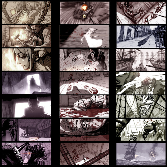
Throughout my research I noticed different versions and layouts of storyboards for games, one in particular stood out by Luke Harrington called War Dragons. I like the simple structure he has used and for my storyboard I will aim to do a similar layout.

References:
Quora. (2019). What’s the main difference between a storyboard and manga? [online] Available at: https://www.quora.com/What-s-the-main-difference-between-a-storyboard-and-manga.
boords.com. (2024). How to Storyboard for a Manga | Boords. [online] Available at: https://boords.com/how-to-storyboard/manga.
ArtStation. (2025). War Dragons/Horizon - Storyboards, Luke Harrington. [online] Available at: https://www.artstation.com/artwork/8e48eG.
ArtStation. (2025). Beat Board, Seung Eun Kim. [online] Available at: https://www.artstation.com/artwork/WA6JG [Accessed 20 Jun. 2025].
BD Musings. (2014). Gina – On the Distinction between Comics and Storyboards. [online] Available at: https://bdmusings.wordpress.com/2014/09/05/gina-on-the-distinction-between-comics-and-storyboards/.
ArtStation. (2025). Crash Bandicoot 4: It’s about Time Storyboards, Maximilian Degen. [online] Available at: https://www.artstation.com/artwork/Qr6EGZ [Accessed 20 Jun. 2025].
ArtStation. (2025). 🔮🔮🔮, AlbaBG. [online] Available at: https://www.artstation.com/artwork/ZagZ9Z [Accessed 20 Jun. 2025].
0 notes
Text
Working in 3D - Reflection
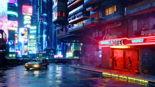
This piece of work was enjoyable but became a challenge near the end. With the scene getting heavier and all the assets with their detailed geometry Blender started having a hard time in terms of performance. After modelling and texturing every asset I wanted to add some lighting to bring the whole scene together. However with Blender struggling to run on my home computer (which I would say is fairly high-end besides the graphics card) it was almost impossible to add any type of lighting to the scene. So then I decided to render what I have and for the first time ever to attempt doing a paintover for the lighting. Personally I would say that I'm quite experienced when it comes to 3D modelling, and in particular I would say I picked up on Blender as my 3D software fairly quickly. However I had never before moved my 3D work back to the drawing tablet.
I can confidently say I have unlocked a new skill, which is paintover my work. All the lighting in the screenshot is done through paintover on my tablet, and I am very happy with how it turned out, maybe I even went overboard with the lighting. I added some lens flares on the street lamps, neon lights to the vending machines, and mild warm lighting to lanterns and any other windows. For a more moody and haunting atmosphere I also added some fog. This means that I avoided having to use volumetric clouds in Blender which would be a whole other challenge. If I were to further develop this project I would try to model the interior of one of the buildings, maybe the ramen restaurant or the temple, since so far I have only focused on the exterior of buildings, this will introduce me to props design in 2D art and 3D.
0 notes
Text
Working in 3D - Artwork
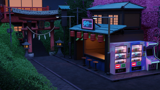
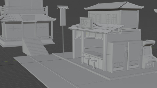
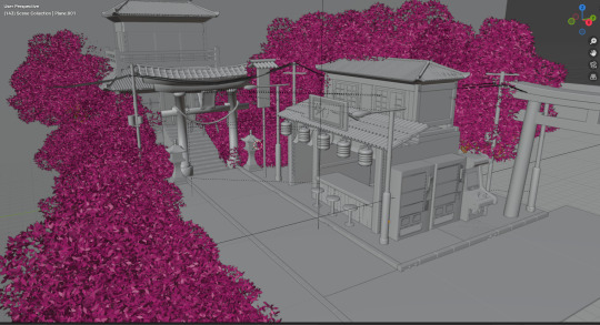
I wanted to put together a mini 3D environment, with the focus of mixing traditional Japan and modern Japan in a little condensed street. I first modeled a corner pathway and I started to work around it by adding some more models. I modeled a traditional Japanese temple with a staircase pathway, leading you up to the entrance. I also added some stone lanterns and torii gates which are often seen near Japanese temples. Further down the path I imagined the area having a small food court so I modeled a ramen restaurant, with some vending machines on the side of it. Lastly I added an arcade machine as they are very popular in Japan and can be seen on every street.
Then I moved on to the UVs of the models. UV is an essential part of creating 3D models and applying a texture to them. This includes UV mapping which refers to the process of unwrapping a 3D model's surface onto a 2D plane. For the UV editing I mostly used blender’s built-in feature for UVs called Smart UV projection. This feature allows for automatic UV projecting simply by selecting the whole mesh and blender can then calculate how the UVs should be arranged in order to best display any given texture. I found this an extremely useful tool, especially for the complex models in the environment. With the correct UVs applied I started to texture. I also did this process through blender.
When texturing this environment I was aiming for a stylized look on all the buildings and the corner pathway. I had even more fun texturing the arcade machine and the vending machine. For the vending machine I used a custom design that I made through photoshop as I wanted a very specific cherry blossom wavy graphic design for the exterior. I kept the inside white but filled it with fluorescent lights for a nice emission in the night. As for the arcade machines I wanted to make it look old and worn down but still be able to run games. I took this opportunity to put a screenshot texture of one my favourite retro games which is Kirby’s Dream Land. To finish up I added some street lights and foliage in the scene. With the environment textured I rendered it as a still frame.
After rendering in blender I took the still frame into photoshop for lighting and more colour. Lighting I added emissions from signs,street lights and vending machines.

0 notes
Text
Working in 3D - Inspiration, Artist and Other influences
This piece of work takes the Tokyo inspired environment with the neon lights that I did and further expands on it using 3D. For this project I aim to use mostly Blender and possibly Unreal Engine 5 Niagara to add some vfx into the scene.
In the Light and Shadow blogs I have already covered the game reference I took inspiration from and I think those games also apply as a good reference when looking at their 3D environments. In particular I will refer back to Ghostwire: Tokyo the most for references in this project. When looking into their 3D environments I found a fascinating article that explains in detail how they recreated Shibuya in the game using Unreal Engine.
Disclaimer: The article is in Japanese and I had to translate it to English in order to understand it.
I would also add another game to this list which is the Yakuza series, developed by Ryu Ga Gotoku Studio and published by Sega. Yakuza (or Like a Dragon) series is renowned for its richly detailed urban settings inspired by real-life Japanese cities and neighborhoods. Using a wide range of game references and real life photography study of japanese streets I wanted to create a little street corner that expands past the vending machine scene from Light and Shadow.


References:
ArtStation. (2025). 3D model of Japanese house ‘パン屋’, Irina Karpova. [online] Available at: https://www.artstation.com/artwork/rJk93G [Accessed 20 Jun. 2025].
ArtStation. (2025). Neo Tokyo - Artstation Challenge, Javi Skau. [online] Available at: https://www.artstation.com/artwork/Xg0vXy [Accessed 20 Jun. 2025].
ArtStation. (2024). Maria Yue💡. [online] Available at: https://www.artstation.com/xiaowantou.
ArtStation. (2025). JP NIK. [online] Available at: https://www.artstation.com/nikojyp [Accessed 20 Jun. 2025].
Cake, F. (2024). What Inspired: The Yakuza Series - Freecky Cake - Medium. [online] Medium. Available at: https://medium.com/@FreeckyCake/what-inspired-the-yakuza-series-2bd12d4e7283.
My Game World (2019). YAKUZA KIWAMI 2 walking in the city at night in kamurocho (PS4). [online] YouTube. Available at: https://www.youtube.com/watch?v=aEUGXcRKgBc [Accessed 20 Jun. 2025].
0 notes
Text
Light and Shadow - Reflection
As a character concept artist this was definitely a challenging task to transition to from my usual artwork, especially that I already had an established artstyle within my character. It was both difficult and exciting to attempt environment art for the first time. I feel like I had to rewire my thinking process. Rather than focusing on personality, anatomy, poses, and emotion, I felt the need to zoom out and consider the space, depth, lighting, scale, and atmosphere instead.
And these are the things that are essential to world building. However I didn’t feel too lost as some of the skills and techniques I have within character art still carried over. For example the uses of silhouette, focal point and lighting still matter in order to create a balanced atmosphere. SImilarly to character art, the environment can evoke emotion. For example a foggy forest can feel anxious and a wide sunny field can feel safe.
As a first attempt, overall I was very pleased with how it turned out and I believe it was a success as it clearly showed 2 different tones of neon lights. If I were to develop this project further, I would push outside of the vending machine and showcase a different perspective of the city and maybe even what characters would be in this city and how they would look.
Some of the feedback I got was to do a little less cherry blossom trees as they took up a big part of the environment. And for the warm tones the scene looked too pink almost like all the colours were clashing and blending into each other.
A big key lesson that i leant was lighting and atmosphere design. I studied references of how neon lights would appear with cool tones on a cold winter day in Japan and on a warm summer evening just after sunset. In a way I also explored how to showcase a day and night cycle for a stylized environment. Furthermore, with the scene being very nature-heavy from the cherry blossoms I learnt about foliage and how it should behave. I even followed a tutorial and made my own personal cherry blossom brush on Procreate as I wanted the flowers to look a certain way.
I’ve always enjoyed doing characters and creatures, and I feel a lot more in my comfort zone when I’m developing a character. I don’t see myself doing a lot of environmental art but I am definitely more open to the idea and I feel more confident to attempt another one in a different setting. For my career path in the games industry as an artist, I would still try to aim for character or creature as this is what I still love doing the most.
0 notes
Text
Light and Shadow - Artwork
Light and Shadow is something I love adding to my work but at the same time I sometimes struggle to visualise how the light source affects certain objects or areas of my characters. For this project I had plenty of ideas I can make a start on. For my lighting I definitely wanted to focus on hot and cold hues. At first I had the idea to do night and day or summer and winter showing lighting in a soft way rather than with dramatic lighting. With this artwork I also wanted to attempt doing an environment art which I thought would best display my idea. My strength and passion in art comes from character art so attempting an environment this time was definitely a challenge for me.
With the lighting and setting I had in mind I wanted to focus on one thing that emits light that would light up the whole environment. At first I was thinking of a street light on an empty road, which would be dramatic however I specifically wanted neon lighting. Then I had the idea to do a vending machine that would showcase the fluorescent lighting I was looking for. Using this foundation I developed my environment in two different ways. The first one being a cold winter evening, with cool tones and dark hues. The vending machine lights really came through against the blue tones in the scene. Then using the same environment I did warm lighting. This lighting focuses on red and pink shades to give off a cosy and warm feeling in the scene.


0 notes
Text
Light and Shadow - Inspiration, Artists, and Other influences
The inspiration for this artwork came from nighttime city environments from games such as Cyberpunk 2077, Need for Speed Heat and Ghostwire: Tokyo. More specifically I wanted to capture neon hues in Tokyo and Ghostwire was the perfect example to refer back to when developing my research and skills for this project.
Ghostwire: Tokyo is a 2022 action-adventure game developed by Tango Gameworks and published by Bethesda Softworks, a game I played not so long ago. The setting of the game is night time Tokyo, which inspired me to do neon lights you see in Tokyo streets and neighbourhoods. The game heavily focuses on beautiful lights throughout the city and uses it in different ways throughout the game such as: horror elements and combat. For example, lighting is used to indicate the player being in combat. Normally the lights are neutral, bright and colourful throughout the city, however if the player is near an enemy the lights will turn to amber, informing the player there’s danger approaching. And when the player is in combat the lights glow in bright intense red lens flares, signifying danger.
Another game with similar use of lighting is Cyberpunk 2077. Cyberpunk 2077 uses lighting in a highly intentional and cinematic way to create atmosphere, guide the player's attention, and reinforce its thematic focus on dystopian futurism and neon-noir aesthetics. Around every corner in the environment, you would see neon signs, LED screens, and holograms everywhere in the City at night. This is mostly shown in saturated tones like blues, purples, and reds.
Need for Speed Heat also stood out as a good reference for this piece of work due to its dramatically different day and night cycle in the game. Day time is a bright and busy city with harsh sunlight. However at night the city comes alive with stylized and cinematic lighting from neon lights, wet streets, and strong reflections which further enhance the overall street racing atmosphere. Night races are illegal, and the lighting truly reflects that tension when racing.
Some other mentions I also looked into with similar lighting are The Grand Theft Auto Series and Mirror's Edge Catalyst at night.
Movies
Furthermore, I looked into a few examples of movies that use vivid neon lighting. A great reference I found is from a movie called Bullet Train. The movie is set mostly on a high-speed train racing through Japan. The Art direction leans heavily into a neon aesthetic, both for the train interiors and Tokyo cityscapes, blending vibrant colours and stylized action. Another example is John Wick Chapter 4. The setting switches up a few times but the scene that stood out to me was the fight in Osaka. It featured Japanese architecture lit by traditional lighting and neon cool tones.
Artist
During my research I found a beautiful Artstation Page by Maria Yue, a Principal Lighting Artist in Romero Games. I found it interesting how Maria Yue masterfully combines artistic storytelling and technical lighting in her artwork. Her portfolio includes stylized environmental studies and real-time game levels with rich mood and depth.
Reference:
1. Linearity blog. (2022). Cyberpunk: How to Master the Futuristic Style. [online] Available at: https://www.linearity.io/blog/cyberpunk-style/.
2. Cyberpunk Wiki. (n.d.). Cyberpunk 2077. [online] Available at: https://cyberpunk.fandom.com/wiki/Cyberpunk_2077.
3. Tokarev, K. (2015). The Creation of Mirror’s Edge Catalyst Levels. [online] 80.lv. Available at: https://80.lv/articles/the-creation-of-mirrors-edge-catalyst-levels [Accessed 20 Jun. 2025].
4. Criterion Games. (2025). Need For Speed Heat : Pause Menu Lighting. [online] Available at: https://criterion.artstation.com/projects/lxGQ4k [Accessed 20 Jun. 2025].
5. S H I N 0 (2016). Mirror’s Edge Catalyst - The Perfect Night Run - Running Gameplay [1080p 60FPS]. [online] YouTube. Available at: https://www.youtube.com/watch?v=UwDp-vNgRBY [Accessed 20 Jun. 2025].
0 notes
Text
Nostalgia and Memory - Reflection
With each week my aim was to challenge myself to attempt something completely new or something I’m not confident in. By doing this I learn new practical techniques in art and new ways and solutions to problem solving. Problem solving as a concept artist in the games industry is a crucial skill to be able to understand and act on.
For this week I tackled animal artwork, which is very different to what I am used to with creature art. A creature or a monster can be anything, it can have any shape, multiple limbs, or a crazy unrealistic facial expression. Monsters don’t need to have the right anatomy but rather a creative and exaggerated anatomy instead. It feels much easier to create something that looks unnatural or off so rules of accurate anatomy don’t apply.
For this task I had to have a good understanding of cat anatomy as muscle structures, joints, and proportions vary widely from humans. Even stylized animal art often needs a foundation in correct anatomy to look believable. Then I followed some tutorials to learn how to capture poses and expressions in my sketches. When it comes to conveying mood and emotion in animals it is important to focus on the ears, tails, posture, and subtle eye shapes. Rendering his fur was also challenging but I followed a very stylized art style which allowed me to use heavy and broad strokes on Procreate to create wisps of fur. I didn’t focus too much on the details but I tried to include the key features my cat has.
I'm very happy with how it turned out, to further develop this project I would definitely do an environment art to showcase how my room used to look when I first got Toby. I could also draw my room at floor level as if to show Toby’s perspective and viewpoint on my room. Another environment idea I could attempt is to draw him in my garden. That would be very heavy on foliage artwork and it would mostly consist of green hues which could be interesting to balance.
0 notes
Text
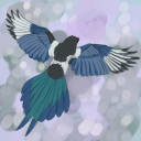
Nostalgia and Memory - Artwork
For my artwork I made Toby the main focus. More specifically I wanted to capture his facial expressions that I know and love and most importantly his favourite poses. He has been with me ever since he was a kitten so I thought it would be fitting to draw him as a kitten and then as a senior cat.
Using references I had of him I did some sketches of poses and expressions. More specifically, I tried to capture that same expression he gives me all the time when he gets hungry. Then using Apofiss’ art style with large feather-like brush strokes I did his artwork as a kitten and as the senior cat he is today. When rendering his fur I was also able to showcase his features such as the white mark on his nose and the super fluffy tuxedo-like fur he has.

0 notes