Statistics
We looked inside some of the posts by marmstrongarts102-05 and here's what we found interesting.
Average Info
Notes Per Post
0
Likes Per Post
0
Reblog Per Post
0
Reply Per Post
0
Time Between Posts
7 days
Number of Posts By Type
Photo
6
Text
5
Last Seen Tumblr Blogs


Fun Fact
Tumblr Inc. has $15.1M in annual revenue.


Text
Weeks 11, 12, & 13 Reflection
Project 4 was exciting to me because syntax and semantics are such an important part of design that can be seen in the world around us, especially in industry and advertising. I often think of art as being a wild and creative form, so this is not a project I would typically take on in my own time, but I really enjoyed learning about visual hierarchy and appealing layouts because it is so applicable. I very much enjoy fashion, so I wanted to try to describe something that I really like to add my own style to the project. I went about this piece as though I was creating a website or advertisement for a company selling these purses and I wanted a consumer to be able to read it and know the vibe that the purse would bring to an outfit and to what type of event they should wear it to. I am working on a few personal digital projects and a lot of times I don’t know why something doesn’t look good so learning about spacing my type and matching fonts was a great skill to acquire.
My library study for project 5 was a great way to begin because it was a lot of fun and I saw a lot of different kinds of layouts, so I gathered a lot of inspiration. I very much enjoyed seeing layouts in design books that I actually didn’t like. That sounds weird, but sometimes I don’t love my work and other people do, or I am told I should change something about my work that I don’t like, so for some reason it was comforting for me to be able to have that opinion about a design book in a library. Digging through my pinterest helped me piece together what direction I wanted to go in and what it truly was that I was being drawn to in my layouts from the library study and after creating my mood board and layout draft I am excited to get moving on this project and bring together all of my work!
0 notes
Text
Weeks 7&8 Reflection
This project has been interesting for me because I missed a lot of checkpoints in the process. Although I have been behind, I have really made an effort to stay true to my design process in this project. My final product will be late because I was nearly a week behind on every assignment, so I wanted to make it worth it in the end for myself. I am ultimately very excited for how this project will end up once completed. Learning about gestalt principles and the emotional meaning of colors was an interesting part of this assignment and I feel that incorporating the gestalt helped me to understand how to go about simplifying my concepts into a design such as a mascot logo. When I thought about pirates and owls, the main symbols that came to mind were death, strength, and qualities of magic and legends. This translated for me into a sports logo with the concept statement being along the lines of if you drink this you will transform into the strongest opponent on the field or court. I tried to implement style in my structure that was sharp and I want my final typography to be similar to a monster energy drink type of logo. I also intend to use my type to add shape to my logo which I am excited about since I have been trying to focus more on text this semester.
0 notes
Photo


Project 3 Photos
by row: 1) Steps 1 and 2. 2) Step 3. 3) Step 4. 4) Step 5 (near final composition)
0 notes
Text
Weeks 5&6 Reflection
Overall, I believe I learned a lot during my design process for project 2, despite being slightly disappointed with my final submission. I was very excited to combine my own drawing with my own photography for this piece. My biggest struggle was designing the layout of my elements to support the typography. After the critique, there was a large improvement in my piece once I added the white space by changing the shape of the background, but I still struggled with how to highlight and support my typography. I reworked my concepts several times, but unfortunately, I didn’t feel I had enough time to execute as I would have liked. I hope to continue working on this piece and I have a few ideas in mind that resulted from my intensive design process.
I am very excited to learn both logo design strategies and how to simplify my designs. I generally have extreme detail in my artwork, and I struggle to simplify it when necessary. I am currently working to further simplify my designs, and I am working towards a design that integrates the pirate and owl in a clear way. I also have started to think about how to add elements that portray my logo to be for a sports energy drink.
0 notes


Text
Weeks 3&4 Reflection
Being conscious about my design process and digging deep into the symbolism behind my art during project 2 has been a great experience for me. I don’t think I have ever truly focused on where my inspirations come from, and it was amazing to see how I transformed and combined multiple concepts into this piece. I tried to determine why I drew what I did in my sketches, and pin down the concept so that I could understand how to express my thoughts and feelings about the quote I chose. I thought about water to represent Zen while in motion, and I wanted to include some sort of ecosystem to show our connection to the world and its beauty. Stairs, clocks, pulleys, and mosaics sat in my head for the first week of my process, and I could not figure out why. I eventually realized I was drawn to these ideas because a main concept in both quotes I focused on was human connection and oneness with the natural world. To me, all the aforementioned symbols spoke to this concept, and it helped me understand the idea I ultimately wanted to convey. I somewhat struggled with this during project 1, so another major focus for me during this project was integrating the text into my piece. I mainly played around with visual hierarchy and placement with the image to highlight the text, which I hope will lead to an improvement in my typography this time!
0 notes
Photo


Concept sketches and inspiration photo
0 notes
Text
Weeks 1&2 Reflection
I really enjoyed combining my inspirations from both the physical world and the people around me in this project. I went on a lot of walks when classes first started and took pictures to see what would catch my eye. I thought about these pictures as I interacted with others and attempted to connect everything with my own thoughts and feelings for my final product. During the first week, I reflected a lot about where I am in life right now and my future, which is usually natural for me when classes begin, but this time felt different because I’m a senior. Despite my excitement for the opportunities to come after I graduate, I have been uneasy and questioning myself a bit. All the snippets speak to my recent internal conflicts between excessive pride and confidence, loneliness and independence, and love and paranoia through symbolism. The snippet to the doors specifically attempts to portray the feeling of being stuck and the idea that doors can be open, but they don’t mean a thing if you don’t decide to pick up your feet and try to walk through them. Overall, this project has made me extremely excited to continue learning skills in Photoshop and improve how I translate my artistic vision into my work.
0 notes
Photo
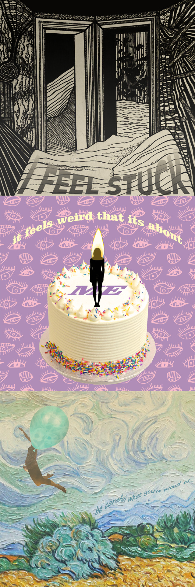


1) Final Snippets. 2) Sketch + Photo Inspiration. 3) Sketch + Photo Inspiration.
0 notes