Don't wanna be here? Send us removal request.
Text
Animating Alien Space Worm
I placed the front of my worm picture against transparent acrylic, positioned in front of my bedroom lamp. This allowed me to wright corresponding numbers on the back of each part of the body, ranging from number 1 on the smallest part, to 21 - the biggest.

I cut all the numbered sections out of the paper and stored them in the see-through sleeve of my notebook.

For creating my background I started with a pencil, etching jagged lines and a mysterious flat mountain, reminiscent of red craggy canyon environments. For lighting colour as well as initial shading, a felt tip was used to give off an unearthly red. black spots are the holes within the distant mountain that the space worm uses as a tunnel network.

With each size body piece in hand, I drew a head to succeed them. The reason will be clarified.

Lighting and shading was taken into account when colouring in, although I was using some of the same felt coolers for different levels of shading. This may have been the reason the the colouring could have been more optimal. The vividness could be seen on the back of the page allowing me an easy bit of numbering, based on head size of course.

I stored some felt tips in my pencil case so that the varying heads cut out could be compartmentalized from the body pieces.

The plan was to use a high tech camera with a memory chip inside it to capture the frames. There was however, too little time to complete the animation in the classroom and there were issues with the tripod legs being visible through the lens. I didn’t take the camera with me, but I planned on using the Stop Motion app on my iPad to capture and compare frames as well as create lighting effects. iPads can be fit to a tripod, as I discovered later when I borrowed one from my personal IT tutor.

Some of the smaller body pieces where lost, but this did not make any noticeable setback, for it wasn’t paramount to position the exact matching pieces next to each other for an authentic look. A number 6 head piece would have looked snug next to body number 4 body piece for instance.
The rocky A3 background had a shading overhaul to emphasize where the light is coming from. It was sellotaped to my A3 sketch pad to give it some weight so as not to shift too easily. The tripod was position in such a way that it could look down on a table while the legs where extended to the floor. With a minor view angle, I was able to leave no noticeable feature in view aside from my animation setup.
This is how I used the paper segments of the alien space worm to create animation over frames: It started with shooting nothing but canvas for 150 frames or 4 seconds worth of shots. Commotion began with use of paper segments of explosions...of dust and debris. Those where for the ‘distant’ position with the worm causing a massive disturbance to the ground around it, prior to and upon entry to the scene. Having cut up to eight varying smoke effects, those where swapped with each other over frames for that wild effect.

As my worm started to dip from it’s arc, I noticed how little room there would be to fit the last bigger head and body pieces onto the A3. Consequently I did a test by positioning all the body pieces onto A3 sheet to see how the arc should be shaped. OK, I ought to have done that, but I didn’t. I just removed some frames and altered the position of the paper pieces from the height of the arc. In my tired stupor I just couldn’t be arsed to place everything onto the paper and made what turned out to be a good estimate on how much to raise the arc of the worms trajectory. Once animated, you’ll see I tried to keep the app lighting consistent with this factor, with some success.
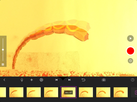
As the extremely fiddly procedure of Manoeuvring bendy and occasionally sticky paper neared the end of ‘head’ usage, I came upon an issue with how to position the rear pieces. How do I explain this?: The bigger head pieces,‘nearer the viewer’ are meant to be moved further than the smaller pieces,‘further from the viewer.’ That’s to give the impression that the head is closing in fast based on perspective. Generally, the further something is away from the viewer, the slower it would appear to move. However...in order for the pacing of movement to differ between bigger and smaller pieces without them squashing or removing pieces, I needed to overlap the bigger pieces more than usual.
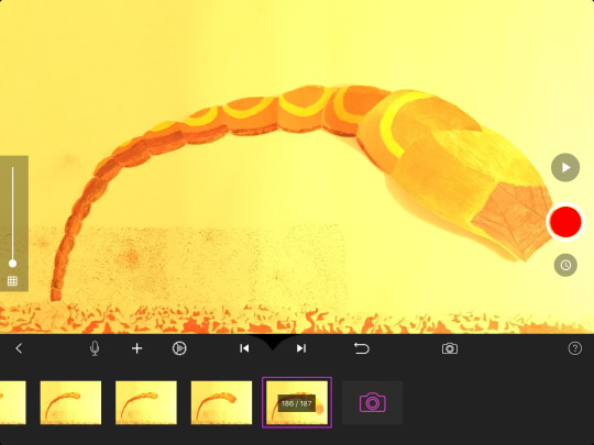
Looking at the length of the animation and seeing just how incomplete it looked, I had to include the tail coming out from the ground before following the rest of the worm into the earth. I did not make the tail feature complicated in shape. With an eye catching yellow tip to match the rings on the body, It was a good tail to scale efficiently with multiple size renditions, as well as apply realistic shading.

Another issue arose: If the rapid-moving body pieces are being positioned further ahead in the frames, logically, the tail piece must also move at the same rate. What this means though is that the tail would end up appearing to move as fast in the distance as it does in the foreground, which would break the logic, realism and thus immersion. I could have simply ‘slowed down’ the pieces of the body that are entering the ground due to how the ground itself would slow the worm as it enters it. This would have allowed me to maintain the gradual movement appearance of the worm in the background. I hadn’t taken that on board though.

0 notes
Text
Coding Software - Visual Studio Dream Weaver
The smallest error in a paragraphs of text, more than likely renders video game functions obsolete.
I learned what potions of code perform what roles, for this particular Unity programming:
The text from lines 1 to 13 simply allows the play button to work in Unity.
17 to 27 determine what happens inside the transparent box, set up earlier.
Text from 29 to 33 determine what happens outside the transparent box.
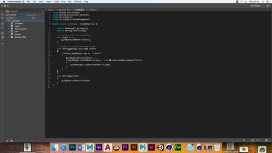
Following that experience, I know what kind of input goes into programming for allowing events to take place at certain locations - as well as how ludicrously big text can be for allowing the simplest functions.
Being able to program events to unfold in precise and interesting ways sounds rewarding to me, but I don’t know if I have the intelligence, patience and tenacity to figure out how functions work and make them operate the way I want.
0 notes
Text
A Description of Mudbox
Mudbox is a sculpting and painting software tool made by Autodesk. The abundant amount of sculpting tools provide many ways to make flexible fluid environments, subjects, facial features etc.


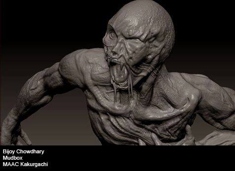

By Jam Sutton
0 notes
Text
A Description of Cinema 4D
A polygon based software program that textures and renders creations
I find that this program provided by Maxon, is more useful for crafting solid angular structures such as buildings, weapons and certain clothing peripherals - anything that is not usually flexible or porous.


0 notes
Text
My Science Fiction Building
I wanted to create something that was eloquent with a technological marvel about it, yet appeared aged with it’d solid foundation. This image was found on universe-pathways.blogspot.com

I wanted to replicate the kind of jagged detail found within the inspiring artwork. The way this was pulled off was by merging various shapes together, only I used the function that makes an overlapping object create a hollow in another.

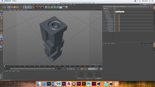
Replicates of the structure where made and stacked on top of each other to make a really tall rendition. It looked a little too thin and frail though, so copies of those really tall towers where place side by side, which in turn gave the whole structure more detailed - just what i like. That rendition was shrunk so as to sit better next to what I would create next.

What I had created was just part of the infrastructure. What follows here is the creation of what I considered to be the main tower at the time. I started with the Oil Tank Primal Object. To pull the top of it up and make it taller, the face tool helped highlight the roof polygons as well as the wall connecting to it, followed by dragging those up the y axis.

Pushing and pulling polygons is always easy way to make interesting shapes and merely doing that with rings of polygons allowed me to make elegant shapes out of the roof. That experimentation continued as I highlighted alternating rings of polygons, dragging in opposite directions.

To make an interesting shapes out of the wall I added polygons to it.

With these polygons highlighted, I used a number of transformation features to see how each one effected the appearance. Most where not noticeable, but the Invert Bevel made a drastic difference in the shape. The result was also tested on to the roof of the already-affected polygons.

I stuck with this because I believed that rustic textures applied give that old yet robust aesthetic, only looking unusually elegant as well.

I wanted a transparent global effect for two positions of the whole building. This was initially tested on the top of the altered oil tank, but I knew I wanted the transparent globes to be stretched tall for that sense of 80′s style art to be integrated in a minor way.

I had not visualized a functional reason for the transparent roundness to occupy the bottom of the slim spire. I just though how nice flashy futuristic tech would look wrapped around robust metal.
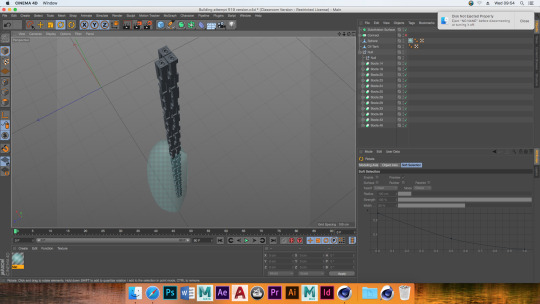
Copies of the ‘kinetic barrier’ and the tower where arranged to the sides of the bulkiest structure thus far.

I decided that the detail of what has currently been assembled does not present enough intricate detail for the amount of structures that there are. Carving a main entrance into the current infrastructure may have made it feel complete, but I thought it would be more interesting to have another structure - in order to make the system of buildings seem substantial. Due to time constraints, I decided to just create one more big one, around which, copies of the previous models would rest.
I Started with the Platonic Primal Object due anticipation of spontaneous results varying from the oil tank.

The plan was for this main structure to be tall as I wanted it to stand out amount what I had already created. More than that though, I wanted it to be a vertically orientated structure that vaguely resembled the artwork I took inspiration from. With that in mind, the primal object was rotated so that a parting slanted area of the shape faced skyward. This was under the idea that this would make a satisfactory roof. With this orientation, the underside was made flat by deleting the sloping polygons and filling in new ones between the evenly long sides.

I started just by pulling up the polygons on top of the shape to see how it looked. There. From there, triangles on opposite sides of the structure where highlighted and pulled up in groups at a time. This made the structure both symmetrically appealing yet varied at the same time.


Sections sloping upward from the flat base where tilted to rest evenly on the theoretical floor, making the building more stable looking.

Quizzical as to what polygons to alter next to make this tall structure more interesting, I targeted the really long polygons as those where the most bland to me.

A number of save files kept different renditions as a result of experimenting with a variety of the transformation features. That way I could make better comparisons on which one I liked the best. Furthermore if the experimentation of one design did not pan out in a satisfactory way, I need only load another save evolutionary path of the building. Here are some of those results.


I really took a liking to the elegance of this one, so with those same polygons still highlighted, I used the exact same transformation feature again to exaggerate the effect.

The result was an ornate looking spire structure. I realized that the base looked like a rock that the foundation of the building is resting on. Thus I decided to alter the rock base so that the bottom was more jagged. This was both for making it more stable as those points did into the ground.
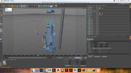
I experimented by positioning the previous structures within this new one, but I didn’t like how some structures were being obscured. Therefor I planned to copiy the earlier structures and position them around this mystical and ornate looking structure. This will make the collection of buildings look like a complex that works in a system.

At this point I wanted to add textures to my buildings, but from what I’ve learned, textures become stretch and blurred if there isn’t a sufficient number of square polygons. So I added them to the rock and the entirety of my new building.

I have not gotten around to adding textures to the building and for that I feel gravely that I am under-performing. It is time to slap some textures on and impress some onlookers. Only then could I give a final comparison to other crafts on Cinema 4D.
0 notes
Text
Lunar Model Comparisons to Fictional Spaceships
Outward appearance Comparison
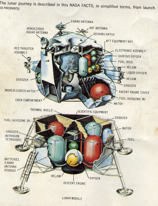
Also known as the Eagle, the Lunar Model, was the space ship that closed in on the moons surface while the main shuttle remained in orbit. As one can see from it’s appearance it was designed solely to be functional with little to no dedication for prettiness - although that can be down to perspective of course.

For James Cameron’s Avatar, the fictional space ship was designed to be realistic for that hard science-fiction edge.
https://kimbody1535.wordpress.com/2013/04/10/interstellar-voyages-with-the-venture-star-a-look-at-the-best-part-of-avatar/
A link to a critique presenting lots of factors into why the realism of the ship is desirable, which is too must text to sample onto one blog in my opinion
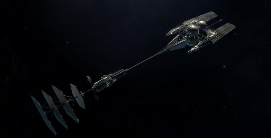
Anatomy comparison
I am uncertain on what way I ought to draw comparisons here. Pointing out the different components, and components that are in different positions, is surely what the diagrams are for. I do not deem myself knowledgeable in the way of rocket science or even basic engineering. Therefor I don’t know if I have what it takes to compare functionality. To be honest, the majority of the space ships wouldn’t function in real life. How simple shall my comparisons be?

https://kimbody1535.files.wordpress.com/2013/04/isvdiagram18.jpg for enlarged version of diagram.

A fictional ship-size comparison, curtsy of Deviant Artist - DirkLoechel

Essentially this is to celebrate the vast amount of creativity that has gone into science-fiction’s space ships - be it for television or video games. I like that there are some more cumbersome looking designs in there; due to how the eagle lunar model was also cumbersome looking, yet functional. It makes me think of how those ships,‘which are not so elegant,’ could better serve the hard science fiction side of the imagination. That, complete with a lot of lore detailing why science is still limited in certain science-fiction tails.
0 notes
Text
Designing Alien for animation
To begin with, I was tasked with creating ten varying alien designs. I would pick one to animate later. I Only managed to create two, but both were strong designs for different reasons.

The first was the typical big headed alien, only it was contained within an Egyptian style esophagus. It has a gap in it that exposes the mouth. The inspiration behind it were Egyptian hieroglyphics and a playable character in an upcoming video game called Un-Dungeon.


The concept of sacred coffins actin as a host for a spirit fascinated me.
The second alien I designed was based off of giant worms of the like found in various Science fiction stories. For example there’s Star Wars: The Empire Strikes Back, with the giant worm that inhabited the astoroid. Well it’s actually a slug, but it looks like a worm. The point is it’s an alien that burrows through rock.

The thresher maw from Mass Effect resembles an elongated invertebrate with features of a preying mantis and slug. Unfortunately I did not work at a pace that warrants applying varied features and details, like that which this brilliant monstrosity possesses.

There’s also this abomination from upcoming video game Scorn.

I chose the worm to animate due it’s simple features enabling me to use an unorthodox animation method, all the while allowing me time to draw and colour a detailed background. On a side note; I had issues with cell animation due to a high dependancy on consistent accuracy with a pen, as well as my own transparent paper and Lightbox.
0 notes
Text
Apollo 11 Moon Landing 1969
All images belong to Nasa
https://www.nasa.gov/mission_pages/apollo/apollo11.html
[Text samples - July 1969. It's a little over eight years since the flights of Gagarin and Shepard, followed quickly by President Kennedy's challenge to put a man on the moon before the decade is out.]
This shows just how eager humanity in general was to explore any kind of terrestrial land other than Earth. The drive to achieve such a goal is obvious from the time spent in preparation for this expedition. When I think of exploration to alien worlds I feel giddy with excitement and awe. In future projects involving the depiction of traveling to a new planet, I would want to convert that sense of anticipation into my work...somehow.
[Now, on the morning of July 16, Apollo 11 astronauts Neil Armstrong, Buzz Aldrin and Michael Collinssit atop another Saturn V at Launch Complex 39A at the Kennedy Space Center. The three-stage 363-foot rocket will use its 7.5 million pounds of thrust to propel them into space and into history.]
So much resources went into the plan to get a man on the moon. If I ever make an authentic depiction of space travel, I would try to present as many material based factors into my visage as possible.
[At 9:32 a.m. EDT, the engines fire and Apollo 11 clears the tower. About 12 minutes later, the crew is in Earth orbit.]

[After one and a half orbits, Apollo 11 gets a "go" for what mission controllers call "Translunar Injection" - in other words, it's time to head for the moon. Three days later the crew is in lunar orbit. A day after that, Armstrong and Aldrin climb into the lunar module Eagle and begin the descent, while Collins orbits in the command module Columbia.]
Reading this, I really get a sense of the time and care spent to land on terrestrial land from an orbital position. My rendition of such journeys would depict thoughts and feelings of the passengers to create an exposition - for that sense of time.
[Crater 308 stands out in sharp relief in this photo from lunar orbit.]

[When it comes time to set Eagle down in the Sea of Tranquility, Armstrong improvises, manually piloting the ship past an area littered with boulders. During the final seconds of descent, Eagle'scomputer is sounding alarms.]
[It turns out to be a simple case of the computer trying to do too many things at once, but as Aldrin will later point out, "unfortunately it came up when we did not want to be trying to solve these particular problems."]
If I ever incorporated mechanical systems into a story, consistency with the rules of chemistry and electronics would be maintained. That way, if I were to progress in making a story, a precautions situation would be presented realistically.
[Armstrong will later confirm that landing was his biggest concern, saying "the unknowns were rampant," and "there were just a thousand things to worry about."]
With an endeavor as complicated as space travel, the smallest miscalculation could prove fatal, making journeys a painstaking and scary ordeal. I don’t know how I would depict a mistake in some kind of hard science fiction, except for making the error terrifying to my characters but non lethal. That would portray the tension without necessarily being melodramatic.
[At 10:56 p.m. EDT Armstrong is ready to plant the first human foot on another world. With more than half a billion people watching on television, he climbs down the ladder and proclaims: "That's one small step for a man, one giant leap for mankind."]
I could never appreciate the giant leap that setting foot on the moon was to mankind. That’s solely because I was not born to witness that monumental small step; this triumph. had on the [Aldrin joins him shortly, and offers a simple but powerful description of the lunar surface: "magnificent desolation." They explore the surface for two and a half hours, collecting samples and taking photographs.]
[Buzz Aldrin climbs down the Eagle's ladder to the surface.]

Collins later writes that Eagle is "the weirdest looking contraption I have ever seen in the sky," but it will prove its worth.
I’m happy that the eagle was a strange looking vessel that functioned well. My own kit-bashed space ship was not really elegant.
[They leave behind an American flag, a patch honoring the fallen Apollo 1 crew, and a plaque on one of Eagle's legs. It reads, "Here men from the planet Earth first set foot upon the moon. July 1969 A.D. We came in peace for all mankind."]

[Armstrong and Aldrin blast off and dock with Collins in Columbia. Collins later says that "for the first time," he "really felt that we were going to carry this thing off."]
[The crew splashes down off Hawaii on July 24. Kennedy's challenge has been met. Men from Earth have walked on the moon and returned safely home.]
I can only imagine the crew’s sense of satisfaction at that point in time.
[In an interview years later, Armstrong praises the "hundreds of thousands" of people behind the project. "Every guy that's setting up the tests, cranking the torque wrench, and so on, is saying, man or woman, 'If anything goes wrong here, it's not going to be my fault.'”]
This is an important reference for any story about realistic space travel or any hard science-fiction that is not set much further ahead of our current time period. [In a post-flight press conference, Armstrong calls the flight "a beginning of a new age," while Collins talks about future journeys to Mars.]
This event was truly pivotal and I don’t know how I would create fiction as exciting to absorbed readers as the Apollo moon landing was to people living in 1969.
For another time, I could merely create a sense of wonder by creating spaceship art that follows the rules of real life physics, while trying to be diverse with form.
0 notes
Text
Production of Animation: Redline
Takeshi Koike was an unrecognized small time animator for years before he got picked up by Studio Madhouse, after his talents were recognized. His project collaboration with them was Katsuhito Ishii’s Redline, one of the most insane exhilarating and visually wacky anime there is.


This took 7 years longer to produce than originally planned...with 100,000 hand drawn frames. It was released in August 2009.
Koike was in charge of the story boarding, unit director and animation director. The film was produced by Yukiko Koike and Kentarō Yoshida. Masahiro Fukushima was the executive producer.

Tim Maughan on Tor.com, interviews Takeshi Koike, the link to it is below.
https://www.tor.com/2011/11/02/why-you-cant-miss-redline-an-interview-with-director-takeshi-koike/
I found that the Koike’s overall career was inspired by Hayao Miyazaki’s works; such as My Neighbor Totoro and Princess Mononoke. However, the particular art style for Redline was inspired by Frank Miller’s Sin City and what he describes as‘unifying the shadows through the use of blacks.’

Redline was complimented with a banging techno soundtrack, provided by James Shimoji.
I can relate my own work to Redline’s animation direction of close ups and rapid and fluid animation. This can be seen when my worm closes in through the air, towards the camera, before crashing into the ground. Regarding my art style, I am aiming to incorporate high levels of contrast in colour shading to implement the effect of detail and to emphasize the position of the light source - for that cinematic effect. To that end, the art style aspect of Redline would sync even more with my work.
0 notes
Text
Space Worm Animation Plan
For animating, there was stop motion, cell drawing and the traditional hand drawn style to use for my own project. I chose to do something that was sort of a cross between all three of those; hand drawn cut-out segments re-positioned and replaced on a still background.
For perspective, my animation will play like this: The scene is a barren terrain, lit by a sun positioned low and to the side. My alien is a giant space worm that cascades out of distant ground, through space, towards the viewer at an angle, crashing and burrowing into the ground near the view point.

Looking closely, my leaping worm essentially consists of a chain of spheres that increase in number along a trajectory. Considering how similar many of those spheres are to each other, I plan on cutting up a single detailed drawing of my space worm and moving an increasing number of pieces to succeeding frames, allowing a ‘closer’ presentation of the worm. That is only when the sense of scale and perspective remains authentic. The head and tail for example, are distinctive sections that will need to be drawn at sizes for different frames. This will allow me to respect the proximity of the alien to the view point. The sun’s position is relevant in that I do not need to account for shading affecting either the rear or front sections of the worm. In particular, making the sun shine from behind the viewpoint would mean that I should draw and cut out shaded variants of pieces that I could just move to the next frame.
0 notes
Text
Kit-Bashing for a Space Ship
Overhearing talk between my lecturer and another student, I was aware that the only grounding feature that had to be implemented was a means of propulsion. As far as I was aware, I had as much creative freedom as I wanted, except that it was recommended not to make the spaceship very big or too complicated.
The scrap you see below is the fruit of my scramble to grab some aesthetically pleasing looking pieces for myself. At the bottom of the image is a metal rod with turning cog components attached; a complex looking space peripheral which I immediately became infatuated with. However it’s length was a fair degree too big, a problem that would have been solved just by dividing it with decisive cuts to the rod. My issues at hand though, were: I was scared of cutting metal with a machine saw and that was before I took notice of the metal guilontine. I was indecisiveness on what aspect of peripheral to preserve as well as where it would connect. As I was aware, my conundrum was distracting me and I was pedantic because I didn’t want to ruin a piece that could serve an, as-of-the-moment, unforeseen function, all the more, because I had a limited number of interesting looking computer junk. The sensible thing to have done of course was not become attached to my craft this way and to throw my self into the thick of it, experimenting quickly. Bending, cutting and breaking materials into shape would have granted me more flexibility, although I don’t think it would have been easy to visualize exactly how it was going to look.
As you may guess, I do not know the definitive names for these components.

To me, this square piece looked good for an interior due to the elaborate nature of the plastic as well as the symbolic pattern in the metal. Looking at it from this very angle gives it a vague resemblance to science fiction platforms designed to target or scan for subjects. My thoughts were more with the Death Star’s platform for the planet-destroying laser from Star Wars, only that consisted of a small plat form next to a long tunnel.

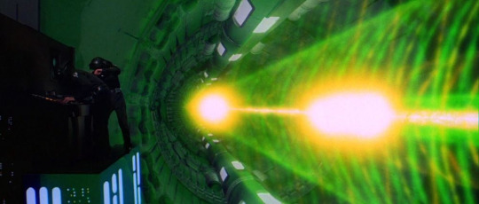
There isn’t much to say about my opinion of this collection of fuses, wires and batteries. That is, except that I knew it would look elaborate in some way if I could just have it visible from within my space ship.

In order for the board of fuses and batteries to fit between the plastic and metal, a portion needed to be broken off the side of the board. Visage of this entanglement of mini structures would depend on the piece of my space ship ceiling.

I liked how this part had a gap for a window, as well as the extension to the right which I would use to house the main control center.


This piece which came from a recording device, was used to depict the front viewing window of the main control center. Thus it was attached using the glue gun.

I had to carve away a potruding clip-on from the observetory window section so that it could press squarly aginst the spaceship’s main body when gluing.

I am proud of how the interior seen from above looks like...an enormous bathroom. Alternating interpretations can make that seem like an engineers station and a cargo hold combined into one room.

This was to serve as some sort of antena, before I found it too bulky, making the glue weak.


The black and metal certainly melds seamlessly, as well as adding an interesting shape to the ship. Shame I wasn’t intuitive enough to make the structure hold fast somehow.

I liked using wires as it could make even the most stupidly simple cration look a little intricate and complicated.

I thought that this looked like a highly stylized for my space ship, if not very air tight. This space ship of mine then will serve as an atificial intelligence trancport vessel, as machines needn’t relay on oxygen.

My only issue was how it protrudded above the space ship after being glued to the main body.

This piece was about style for me, in the way that art decore is applied to buildings. It’s funtion could be for utilizing solar rays to charge certain components to sustain machines.

Angled on it’s side, the piece certainly adds to the style of the shuttle

I cut a segment off of a plastic bottle in order to create a rounded window, which looks reinforced due to it’s ridged shape.

Below are some of other students creations thus far. The one just below looks like a piece of a ship rather than an actual space ship itself.

This one impressed me the most because it’s difficult to imagine the pieces separate. The case with many of these, is that not too much though went into the tiny pieces added. This is just as well, as time management would have been an important issue to keep in mind and this creation thus far looks good.

Below is what I consider to be the most ideal means of creating an aesthetically plaesing looking space ship - using a liquid bottle as the main body


I didn’t like how the left side of my craft extruded, stylish as it may have been. While space crafts come in a variety of sizes, it wasn’t eloquent in form.
Pretty much the entirety of the day was spent finding ways to reduce the size of the metal; that is to form the square space of the ship’s side as well.
Once done, I prepared to spray paint the default grey colour all over the ship. I sellotaped window sections as well as gaps so that the paint would not detriment my adopted design

You would think that merging features with one colour would make a space ship design obsolete and boring. The thing is, my space ship is made from computer scrap, so my space ship looks, what I would call, seamless or pristine when coated with the one colour.


The sellotape was removed from all parts except for the roof window. I liked how the that sellotape looked like thermal cloth coverage or some other kind of protective/preservative covering. I left it grey even when giving the space ship it’s next coating.

Acrylic paints where mixed to make a dark orange hue resembling ‘The Red Dwarf.’ Black was applied to the radar disk and rectangular radiation detector, as well as choice sections on the front.

Looking at my spaceship, I adhere my design as a cross between nerdy spaceship designs before the year 2000 and other ‘blocky’ spaceships. Examples are below.
Model maker Susan Turner produced a miniature flying saucer (from blueprints by production designer John Lloyd) for Science fiction Horror Movie: The Thing.

The Red Dwarf from space sitcom: The Red Dwarf, debuted in 1988, produced by Ed Bye.

The Nostromo from the Movie: Alien, by Ridley Scott, produced in 1979.

At the time of creation, it seemed like too big a challenge to create something new and cross-reference examples of other space ship designs of other space ships. I also took issue with occupying my mind with inspirations for a basis on how to craft my ship. There were also enough challenge as it was, making sure I had pieces that could connect by their flat surfaces - due to my negligence to rely on a lot of glue...because of potential frailty. While I wanted to be strikingly original, there was a fear of my craft not really resembling a space ship that could function. That was irrelevant though, because the record of planning and the process would have provided good marks off the bat due to research being inherently incorporated. This is especially the case, considering the first landing on the moon required a streamlined shuttle to cut through the atmosphere, as well as the ‘strangely-shaped’ Eagle, solely made to land on and blast from the moon. I could therfore have been a bit more shameless with the creation.

I was in awe of other students space ships, all given varying colours to further depict the intricate looking details built. That goes especially for the top one. It’s angular and ornate structure is captivating and unique.


0 notes
Text
Chad & Jared Mouldenhauer The Making of Cupman
They created a game with inspired throwbacks to 1930′s rubber hose animation - it was called Cuphead.

Painstaking drawing went into the game to capture the weird animation that was birthed with the beginning of the craft. The Great Depression was gripping the nation during that era with pantomime animation.


Text information regarding the making of Cup Head was provided on this website:
https://www.digitaltrends.com/gaming/cuphead-producer-interview/
Maja Mouldenhauer, Chad’s wife and leading ink artist provided the following information: The visuals were not the point of starting the project. The old-school run & gun style game-play of Contra 2 for the Super Nintendo Entertainment System, as well as the Mega Man series, was something that the Mouldenhauers cherished as children. It was also something that Chad and Jard wanted to bring back to today's marketplace, as the genre seems diminished on the whole.
As colourful and playful as the visuals are, it is known that Cupman is no family-friendly game like Mario, oh no. The aforementioned Contra, has provided it’s punishing spirit for the Mouldenhauer’s project. Players only have the life points possessed at the start of a level to make it to the end with.
Originally, the game was solely going to consist of the boss battles. However the excitement of fans bolstered the depth of the project.
Even during an intense boss fight, it’s primarily their appearance; with the pantomime like cartoon designs; differing greatly between those formidable foes; that was the aspect that resurfaced as a more memorable point of reference. Indeed, designing the bosses was one of the most interesting parts of making the game, according to Miss Mouldenhauer. The amount of creativity that went into this game would not have been suppressed by realism.
It was through trial and error that Cuphead came to use the bold aesthetic. With inspiration of Fleischer Studios cartoons, a childhood favorite of Chad & Jard, the family would get to trying out the same visual style when making their game.
There was a problem, in that the style could not be matched digitally. The developer trio found that a hand drawn style allowed them to create just the right look they wanted for their game. There was careful observation of the old 1930′s cartoons, with lots of pausing and taking screen shots, as well as studying the pen weights and seeing how the lines tapered. The studies proved fruitful and Maja found the techniques to recreate the distinctive style of hosepipe animation of the 1930′s era.

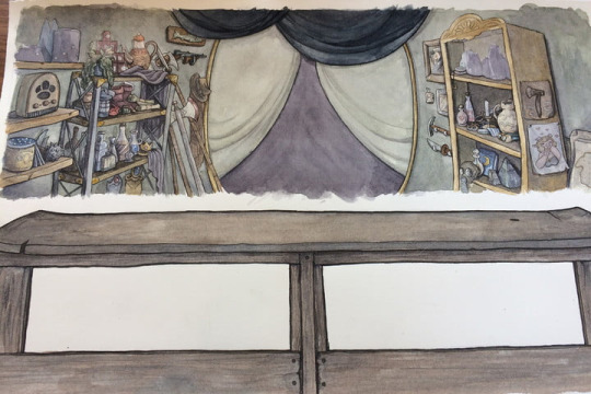


I wanted to bring up special mention of Maja’s efforts. She single-handedly drew every frame of the games animation, while looking after her daughter, during pregnancy with her son and while recovering - post partem. Maja herself, was a fan of difficult old school video games such as Super Mario Brothers and Donkey Kong.
The game filled a ‘run and gun genre hole’ in the marketplace.
0 notes
Text
Mudbox Alien
There were lots of new tool that I have had some experience with now due to some prior experience and this very session. For instance there were the wide range of sculpting tools and paint edits. Those are usually accompanied by some machanics such as the the use of symmetry to automatically craft the remaining half of the creature within a certain axis.
Everyone created a new Mudbox scene opening a rig file of either a man or woman from the shared folder. Once I got the model of a man on my screen I used sculpt tools, of which there were a variety.

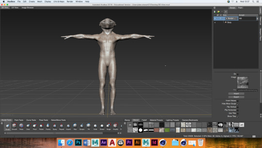
The bulge and relax tool was used to create that nasal structure while I used the pinch and grab tools to make the holey skull composition. The smooth tool would have been used to give the the head it’s overall shape. Speaking of the head, it was inspired by the design of King Zorro from The Legend of Zelda: Ocarina of Time

I wanted this aquatic alien to have scaly and crustacean features. I considered the use of textures and the shape in order to convey those aspects.
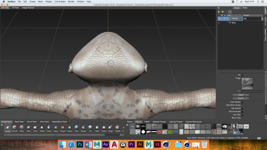
I decided to differ from the design of King Zorro. Visualizing the pirates who served Davy Jones in Pirates of the Caribbean, I dragged jagged shapes to give off a crusty back.

A change of heart took place. I felt the shape of the body structure should differ a bit more from humans, so the foam tool was used to blow up the abdomen area. It was my shortsightedness that made me forget to freeze the crusty protrusions on the back before hand. Otherwise I could have retained that aesthetic, but I was on a roll.

With a highly rounded upper back a texture was just needed to for that exotic aquatic pattern.

I didn't want the to leave the bottom looking human as that would have broken the impression that this is very much meant to be an alien. Unfortunately I did not get around to making the arms look non-human.

If I could imagine any way for fish to develop strong legs in a proportionately short time period, it would be because of additional bone structures to provide support those appendages. They would otherwise be incapable of supporting the creature.

Even if the face could have been given a shiny single colour texture, I wasn’t in the mood for simplicity and applied that rash like appearance that is natural on the skin of some real life aquatic forms of life.


I am in no doubt that I have the capacity to develop my skills in designing and creating creatures, based on current evidence of alien drawings for an animation as well as this quick shot into alien crafting. Next time I create an alien in Mudbox, I would like my craft to be based on some concept art of mine. When comparing my Mudbox creation to other sculpting artists, I feel that my work feels incomplete. While this is literal in my case, I can’t help but be inspired by hoe the detail of other artist’s work seems consistent with a theme. My work on the other hand, felt experimental with aspects of the bone, shell and scale barely merging within a theme.
0 notes
Text
George Hull
Concept Artist and film designer

The link below leads to an interview about George’s involvement in the art of The Matrix.
https://www.matrixfans.net/interview-with-george-hull-concept-illustrator-from-the-matrix-reloaded-2003/
George Hull was enraptured with the detail and artistry for Blade Runner, inspiring him to create art with similar level of awe.
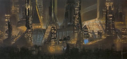

When creating art for The Matrix, George was presented with assignments by the Wachowski brothers. Hull would then create some rough thumbnail images which the Wachowski’s would look at and they would pick what they wanted to have painted.

0 notes
Text
Adam Savage
An American special effects designer and fabricator, actor, television host, as well as an educator.

https://adamsavage.com/pages/bios
Adam has been able to take anything that he invents in his brain and craft a perfectly accurate representation of what he envisions. This is thanks to the vast array of skill that Adam acquired over the years, which has allowed him to craft the likes both futuristic and ancient creations.


His special effects career began in 1993, since which, he has honed his skills through a dozen feature films, not to mention a hundred television commercials. Star Wars Episode I: The Phantom Menace and Episode II: Attack of the Clones, Galaxy Quest and the Matrix sequels are movies he got involved with model creation.


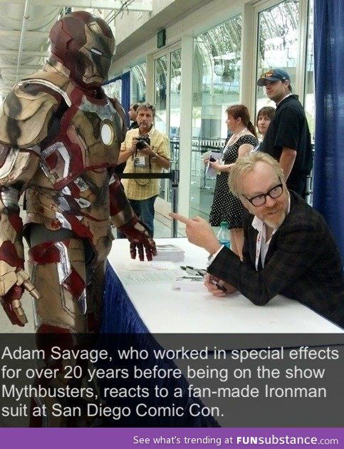


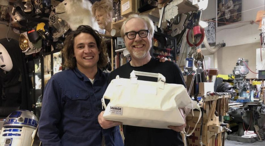
If the picture above is anything to go by, creating models as good as Savage’s looks like a lot of fun. If my primary plan of building a career in the video games industry goes wrong, modeling is another option that now intrigues me. If I can make highly authentic special effects that could be widely considered good, then that would also interest me as a career option. It should be said though that Adam has accumulated the wealth required for his creative undertakings, whereas I do not have the funds to be as extensive as Savage.
0 notes