
Don't wanna be here? Send us removal request.
Statistics
We looked inside some of the posts by marsnicolasliwiak and here's what we found interesting.
Average Info
Notes Per Post
6
Likes Per Post
6
Reblog Per Post
0
Reply Per Post
0
Time Between Posts
20 hours
Number of Posts By Type
Text
17
Last Seen Tumblr Blogs


Fun Fact
12.7% of mobile users access Tumblr.
Text
Lesson: MARS poster explanation
Janus alien
For my God I was given Janus, the Roman god of beginnings and endings, and is most well known for being depicted with two faces.
For the moodpboard, I just found a bunch of images related to Janus, mainly time related items, but also siamese twins due to the conjoined head thing. I don't have much to say other than that my alien would be super straight forward in terms of what it was based on.

For the process, the design stayed fairly consistent, with only details like a necklace made up of multiple keys being removed as it made the design too cluttered. Finding a balanced between simple and over designed was the main hassle, but I figured things out pretty quickly.
I do have explanations for each design choice though: The antennas are a lock and key, the clock at the neck combined with the brown and cream colour palette is meant otherwise resemble a grandfather clock, and the rest of the outfit has an hourglass within it, a play on words for the term hourglass body. The wreath I an addition based on the wreaths roman gods would wear, and the extra hands are just a result of being conjoined, but also could represent the opposing ends and beginnings.

For the background and border, I wasn't inspired by any roman art or murals, I just did my on thing that fit the alien's design because the intent was that the alien would be the primary piece, but then the template would look empty without it...
And all because the boarders were 1:1. On what Earth is that canvas size acceptable for an art protect? Not even 3:4? What a joke.

But that's the alien. I do think a a more detailed art style could have amplified the design, I like it as it stands.
Arrowcross robot
The robot was the first piece I designed for my project rework. To fit in with the plush project that we worked on, I decide to draw a fake action figure of my robot. I was inspired by the packaging in 80's action figures like G.I Joe figures, with a bit of Japanese influence for the text and design for the robot.

The process was very straightforward. I did design the robot to initially be just a standalone drawing, but I opted out of that and stuck my previous sketch onto this new box. The main issues came from the perspective and positioning since I couldn't get one of the arms to look right. For colour, I used halftones on the packaging and some fillers to make the cardboard look more aged. The text is just Japanese in a bold font with a filter over it. For the figure, I tried to add details like plastic tabs and articulation, but I'm not sure if they're that visible.


Again, this piece would've greatly benefited from a 3:4 frame, but otherwise, this piece is fine too.
Cockroach spaceship
The insect I was given is the Giant Burrowing Cockroach, and I didn't care enough for it, so I made it into a spaceship...Except more really. Does calling something a spaceship imply that it could fly? Well, this cockroach doesn't fly, so this is more like a walking ship, like the ones from Star Wars (And one I referenced). The yellow colour was the closet to the brown without the brown looking off, since I wanted my ship to look more prestine.

As for design, This cockroach the most cockroach looking roach I've seen, and by that I mean is the insect doesn't have much defining it, so I could stray away a bit from how it looks for ship practicality. There really Ian much to say since this the least inspired of all the pieces; I just had the idea and got to work. The blueprint idea was just there to make the ship feel less barren.


This piece is the one I like the least, but I expected that since I'm not really a ship designer. It looks neat enough though that I'm not disappointed.

In short, am I that proud of the outcomes? ...Not really, but I knew I would never win this competition, so I don't really care. I just thought of making refined pieces to at least not look like an utter failure due to working with some of these mediums for the first time in my life.
0 notes
Text
Research: Conspiracy theories
Conspiracy theories about aliens are basically everywhere. Whether Ufos exist or if other, more intelligent life exist elsewhere is often theorised and questioned...Most of my experience in relation to conspiracy theories is GTA myth hunting videos. And frankly, GTA myth hunting videos are far more entertaining than the reality of the situation, that being that we ain't got a clue and we don't really care.
Stuff like Ancient Aliens, a show about alien theories as talked about the most shut-in people I've seen on the goddamn History Channel for some reason, has been made infamous for those reasons alone and the ancient astronaut theory, concluding that all life forms are derived from aliens.
Life certainly is a conspiracy on its own when stuff like this comes into question.
0 notes
Text
Research: Personal artist research (Part 2)
Baron Ueda
Baron Ueda is a Japanese artist and character illustrator and creator of the company Frlamemonger. He has illustrated for multiple companies, such as Nike and McDonald’s, and often includes a mascot called AI Bear in his work.
Ueda has a few different stylisations, some more realistic, but I love his more cartoony work which is referred to by him as “Charactive”. Ueda’s art is bold and dynamic, with unique colour palettes, well rendered backdrops, angular, cool characters and a controlled chaos to every piece he makes. He definitely has an iconic style, especially with the way he stylizes the eyes and heads.
I think a lot of people, even those who aren’t into cartoony styles, can see the effort and pride Ueda puts into his art. While a lot of it is commercial-based and a lot to take in visually, it all has a distinct and lively flare.


website:
Kelly Ficarra
Kelly Ficarra is an American artist and animator who primarily focuses on comics. Her artwork takes inspiration from late 90's and early 2000's cartoons, with the usual cutesy and edgy touches, though her artwork also often has comedic, sapphic and sexual elements.
Most well known for her character illustrations, Ficarra draws female characters with different focuses and themes, some more provocative than others. Whether they be run-of-the-mill girls or angels and demons, Ficarra finds a way to make them all equally charming and fun, and the imperfections in her line art add a lot of life to their posing. Her best works are usually made using either watercolour markers or digitally scanned since they embody the cel frame look to the T.
Personally, I just really like her work, her designs and how “imperfect” they look overall. Despite their flatness, they have a lot of personality.


social:
OneBadNoodle
Onebadnoodle, also known as The Noodle, is an American artist and character illustrator. They generally draw fan art and redesign different characters, but also draw humanoid original characters.
Noodle’s characters are usually based on one major concept, whether it be clothing or bugs, and are given characteristics based on that. Even with this simple approach, they amplify their work with the art style; Despite the rough and sketchy nature of the lineart, the emphasis on shapes and angularity makes the designs look sleek. Their colour selection is also interesting, not being too bright but still having a bold and colourful vive.
Personally, I already mentioned that I’m a fan of thematic and brash character designs, and Noodle’s design fit my exact tastes, though what I prefer about their art over another artists who make similar pieces is their art style and it’s cartoonish look, which especially helps showcase silhouette better and allows for more experimentation.


Social:
Some personal thoughts
So, I'm aware that we're supposed to include an artist whose work we don't like as much or don't connect with. Here's a funny thing...
I can't name any artists whose work I dislike enough to name here. I'm open minded to art and the styles people have, even I dislike them. For example, I have an obvious preference for simplicity and iconography in terms of character design, but that doesn't make artists who draw over-designed anime characters akin to Genshin Impact any less credible, it just means I don't like how the characters look aesthetically, and those artists might think the same thing about the art I like and draw.
Art is super subjective and I’m not saying that I like everything because that is a lie, but I prefer to acknowledge artists who actually had a positive impact on my life, the ones who made me love and appreciate art and who’s work I relate to and find interesting enough to be inspired by (Especially since Ai is taking away artists' jobs and you included Ai generated pictures as part of the research for this project. Even if unintentional, that is really disrespectful to the people studying art and artists on this course.). If I dislike the art someone makes, I just turn my attention away from it, and if I dislike the artist? They don’t deserve to be mentioned, because my reason for disliking them is that they’re a terrible person.
1 note
·
View note
Text
Research: Personal artist research (Part 1)
Craig McCraken
Craig McCracken is an American artist and cartoonist who has worked on many acclaimed cartoons such as Foster’s Home for Imaginary Friends and Wonder Over Yonder. For this however, I will focus on his most popular cartoon and the one I have the most familiarity with: The Powerpuff Girls (I’m doing this since this cartoon has one of my favourite and most influential art directions from him. I hope that’s allowed).
A mix of flat old-school Hannha-Barbara with Japanese tokusatsu, The Powerpuff Girls is by far one of the most characteristic cartoons ever made. The concept of three weird yet cute looking girls, Blossom, Bubbles and Buttercup, who become superheroes to an incompetent city due to an experiment gone wrong by Professor Utonium was strange as it is, but the show had so many things going for it: Fun characters and villains, unique shape-focused designs, a colourful yet cynical world, lively polygonal backgrounds, iconic music, unhinged storylines, and most of all, violence. Violence that wasn’t afraid to be over the top and was packed to the brim with impact frames and anime sound effects.
This cartoon is what got me into art. With it's thick outlining, American-Japanese art influence, references to retro, fun yet sleek designs, bright colours and cartoonish proportions, the show has such a simple yet charismatic style that's recognisable from anywhere; easy to draw but hard to perfectly stylize. Craig McCracken has a knack for making good characters and unique premises, and he, alongside of team of talented creatives, have made a cartoon that’s unforgettable.


Hideyuki Tanaka
Hideyuki Tanaka is a Japanese artist and creator of company Framegraphics. Framegraphics specialises in all sorts of art: Illustration, 3D modeling, animation, character design, marketing, music videos ect. Tanaka’s art takes inspiration from 1950's manga like Astroboy and Osomatsu-Kun mixed with sleek, futuristic and colourful yet somewhat cynical tones that became popular in the 2000's.
His most popular work is the character of Milk Chan, a cute-looking yet aggressive and snobby child from the future who stars in the surrealistic pop culture comedy anime Oh! Super Milk Chan, but he's also well known for being the main character designer and modeller for the Bust a Groove games and their spinoff title Dance Summit 2001 (He also made the anime Little Village People for MTV, but that’s a really obscure project. Shame because I like the more alternative art style and the show is kinda a guilty pleasure of mine.).
Hideyuki Tanaka is one of my biggest inspirations, especially when it comes to his older work, and a lot of his character designs have a distinct and quirky look to them I love. His work on Bust a Groove/Dance Summit 2001 has especially had a chokehold on me due my character design philosophy being closely tied to how that game goes around, in the sense that the characters are all mainly humans with unique and specific themes that show off their personality. Not everything that Tanaka has made in the past has aged well to be sure, but the stuff that has is still extremely stylish.


Social:
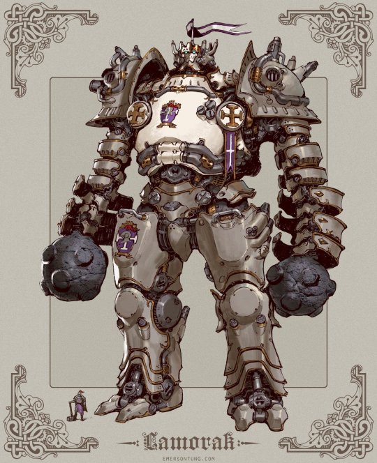
Simone Legnor
Simone Legor is an Italian artist and the creator of lifestyle and minifigure brand TokiDoki alongside Pooneh Mohajer and Ivan Arnol. Legnor’s artwork has heavy influences from Japanese art, primarily books and prints, though his art also influences from a style called Superflat Pop.
Legnor's art and character designs are the ever popular and marketable blend of cute yet dark, with an array of food themed characters but also ones based on cacti, reapers, mob bosses and so on. While the characters themselves are simple and iconic, the artwork for TokiDoki itself is often chaotic, with the characters displayed all over the place with a sexy woman here or there to balance out the repetitive anarchy. His colourful and hectic yet edgier approach is what has given TokiDoki popularity amongst a large audience of teens and young adults.
For me, I was always a fan of the cute yet edgy, if that isn’t obvious, and I was well aware of TokiDoki and liked the art a lot (I even had a TokiDoki carrier bag when I was younger). I still love the art work for the brand and especially the designs for their cactus characters.


Website:
3 notes
·
View notes
Text
Research: Toy photography
Brian McCarty
Brian McCarty is a photographer who specialises in toy photography. He also found and created the War Toys project, where toys are photographed in war-torn countries based on children's drawings.
McCarty photographs the toy figures in different real life locations, but he also adds spectacle effects like explosions or other hanging figures so they look like they're flying. the toys are photographed in a point-of-view angle to make it feel like you're a similar height to them and thus more immersed.


Michel Wu
Michel Wu is a toy photographer who has dine work for motile toy companies.
Wu's photos have the interesting quirk of having real-time spectacles that need to be activated perfectly for the shot in a few different tweaks, such as using an empty can of aerosol to make waves in water or a blowdryer to move dirt. Some photos need to be photographed as quickly as possible whether it be due to confetti or dripping water.
The photos are very lively and dynamic due to the precision needed to pull them off, and with how great these look, it clearly pays off.


0 notes
Text
Research: Plushie packaging design
Minini
Minini is a series of small plushes based on mobile messaging app LINE's characters, LINE FRIENDS. A series called Minini Factory put the characters in small brown boxes that looked like delivery packages and came with a blanket for the plush to sleep in, being able to reuse the box as a bed. These also came with identification cards.


Yummy World
Yummy World are a series of plushes based on food by KidRobot. While some are just standalone food plushes, the more well known Yummy World products are the ones that have a plush as the packaging for smaller plush foods. Plushception if you will.


Do the Dot
Do the Dot are small plush fashion dolls made by Japanese artist Aketsun, who also makes custom retro clothes for Blythe dolls. The plushes themselves are art pieces, and the box that contains them look akin to actual retro fashion doll packaging with the pink rectangular box, extra dress and brush, decor and of course background.

Matchbox Mice
Matchbox Mice are plushes made by Bluebell's Borrow whose main appeal comes from the plush mice coming with their own matchbox that act as beds, like something out of a fairytale. The boxes are imprinted with their own old school inspired designs.
The mice, who are all referred to as Maileg, are small scale and well made, and you can buy more of them if you want considering that they also sell them in threes, or you can buy one in a tin packaging that looks like a suitcase.


0 notes
Text
Lesson: Rendering
For this lesson, we had to try out rendering Maya and creating a scene in Photoshop.
In Maya, you can create lighting from the Arnold option and summon a camera. The listing can be freely altered from the options and the camera can be moved and angled using the scale tool. Really basic stuff. Then you have click the clapper icon and render the image to be saved.
We were tasked with a creating a scene for the ship using Photoshop, but to be honest? I seriously don't care for this ship or Maya in general. Not because I find it hard to use, but because it's really tedious unless you spend time experimenting and watching Youtube tutorials. And even if I did want to do 3D, I'd use Blender because it managed to not only have a better interface, but it also doesn't cost a thousand per year. Professional software yadayada, do you think I'm going to be professionally 3D modelling ships? Unless I'm forced by my hand, I will model what I want that isn't this.


Here's the ship. I'm not sure why it's transparent since I only used that setting for the glass, but I don't think there's a fix other than changing the shading.
0 notes
Text
Research: Robot sculptures
Toy robot packaging
This is a video about old school toy robot packaging.
These all share a common baseline: Cardboard packaging, bold fonts, hand-painted sci-fi backgrounds, the robot doing cool things or being in motion, a description for its functions at the bottom or back, art for the top of the box, so on and so forth. These are very nice packages, mainly due to the artwork, even if they're repeititve in nature.
youtube
Robot build
This video by Thomas Burns showcases how he built an electronic robot that can respond to commands using the circuit board of an Alexa.
After a lengthy montage of Burns goes around stalls selling electronic scraps, he comes back with a small scale CRT tv, with its circuit board open to be tampered with, mainly to hijack the horizontal signal and replace it with an audio signal. By connecting two of the lines to the audio circuit and connecting a phone to an amp, a wavegram appears and moves.
The 3D printing process begins and produces an eyeball and eyelids. the eye mechanisms are using a method developed by Will Kogi of Milheim Mechatronics, which is quick and cheap to build. Once finalised, the eyes can move freely with a sensor circuit board.
Now to work with a dissembled Alexa for reprogramming. With some altercation to the sister board so it could connect to a microcontroller, the Alexa can now activate and respond without additional commands. Extra work is now done for the eyes and their detailing with acrylics and have them covered I resin (With some mistakes made in terms of molds).
For the body of the robot, a chassis made from acrylic sheets is formed and fitted to hide all the parts. Once fitted, a test is done and the robot is complete.
youtube
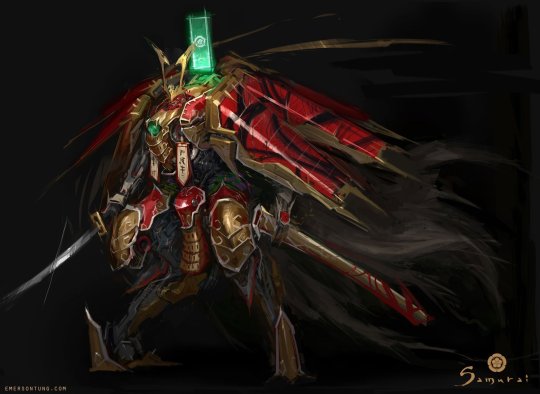
Emerson Tung
Emerson Tung is a concept artist who specialises in illustrating armour and mechs. He has drawn a vast variety, from medieval-armor inspired robots to robots inspired by random items, all of them are gorgeously detailed and well designed. there's a lot of variety in terms of art direction, some more simple and serious than others, but they all work within their given worlds and contexts.
Wooden robot
Here's a robot by DR Toys about his process in making a robot entirely out of wood.
He starts out by mapping out the pieces he's going to cut with a pencil. Once the pieces are cut with a saw, they are sanded ti have grooves so parts could be fitted. This is how the base body is formed, with extra measuring and cutting done to actually put the pieces together (As well as drilling holes to put in other wood pieces into the robot itself). Wood disks are glued together with wood filler to hide seams.
Some designs are imprinted and cut out using a laser cutter and are sanded. They are placed using glue and tweezers as showcased by pencil guidelines. A frame is formed for volume and detailing for the bottom half of the body and then glued to the top part.
After finalising all the details, the robot is given a coating of blue paint with details like wear painted with acrylic paints.
youtube
Wooden toy robot
Another video about making a wooden toy robot. Yay.
Multiple pieces of wood have their sides measured and cut down by a chainsaw to form the body of the robot. Once the pieces are cut, some of them are drilled into to attach the limbs to the body. Once th pieces are actually finished, they are sanded down and indented with details. A large piece of sting is cut and glued into the holes so al the pieces could be connected to the torso. The wooden parts are then polished and have marbles inserted into the eye holes.
youtube
Pop culture robots
Here's a top 10 list of greatest robot designs in pop culture. I'll be honest: I never cared much for robots or mechas, at least in popular culture. There are some pretty good picks here, like Canti for FLCL and The Iron Giant, but I can tell the author has a bias towards mechs (Nothing wrong with that. They are pretty cool looking and can defiantly be iconic). I don't have a lot to elaborate on because I can't name a robot design that 1. Is popular and 2. Can beat out a Gundam of all things.
0 notes
Text
Research: Ships (part 2)
Returnal
Return is a 2021 sci-fi rougelike developed by Horsemarque.
When it comes other the ships in the game, there is only one: The Helios, this large and blocky ship that's very Star Wars esq. Not much to say on it other than it looks cool.
youtube

Chorus
Chorus is a 2021 space game combat game by Fishlabs.
In the game, your player character, Nara, controls a sentient space warship called Forsaken. the ship is quick and agile, a feat that a lot of theatre ships can't compete with.
As for Forsaken's design, I like that it leans more into angularity rather than blockiness and the colour palette of black and red makes it look menacing, perfectly so considering the ship's purpose.
youtube

Cowboys & Aliens
Cowboys & Aliens is a 2011 space western movie directed by Jon Favreau.
In the movie, there are different two major alien ships: The Alien Abduction ship and the Demeronian Mothership. The abduction ships are very interring indesign, having multiple wings and being thin, looking like dragonflies or other insects. The mothership, on the other hand, is a tall pillar with rockets on the side, creating a major contrast especially in size.
youtube


District 9
District 9 is a 2009 alien mockumentary movie directed by Neill Blomkamp.
the film's most notorious ship is the Prawn Mothership, named as such due to the aliens looking like prawns. The ship is disk-shaped and is very grimy, with pipes and engines sticking out of it while the top is completely flat. It looks like something from our world that the aliens decided to take for themselves. Neat.
youtube

0 notes
Text
Research: Spaceship models (part 2)
Spot robot
this is a video showcasing the Spot robot, with is essentially a robotic dog.
With an insane introduction of dropping this thing from 20 feet above, it is able to get back up without its head due to smart motor arrangements mechanisms. The legs are bent backwards to allow easier overcoming of obstacles. Each leg has 2 motors, with the planetary gases connected to the motor and stator. The knees are connected with the stator and rotor, allowing both the upper and bottom parts to support each other. The leg measurements should closely resemble that of an actual dog so the robot doesn't immobilise itself.
Battery can be an issue for this complex machine. To avoid battery drainage, the knee motor should be closer to the hip joint since they're closer in weight.
For dexterity, the legs are made of carbon fibre with extended hinges, and the upper parts contain a ball screw to rotate the motors. Carrier arrests are placed for less linear movement, allowing the bottom parts to move in sync.
The robot is able to get up easily due to a motor-tilt motor sign connected to the hip motor, with sensors to decode a fall. the robot can also crawl and have mounting rails for holding objects like cameras. To climb down from stairs, the robot faces backwards.
All motors should correspond with force and compression.
youtube
Scratch built ship
This is a video about ships built from the ground up, presented by model maker in Wonderfest. Staring BP Taylor, who made 2 models. One's a kit bash, the repurposed 3-We, and the other is a scratch build of a spherical ship.
For the sphere ship, the front was vacuum formed and then sanded out to get a clear appearance. For the ship's designs, Taylor selects his items for the ship's look and sketches them out and establishes shapes first and forms later, with focus on the amount of detailing the ship should have. He also has to establish scale but putting parts together. A other of the items Taylor uses are either from remains of broken electronics, items from model kits or toys or general scrap parts. He airbrushes his complete builds in grundy and dull colours.
youtube
Jean "Moebius" Giraud and Jean-Claude Mézières
Jean Giraud, also known as Moebius, was a French artist who is most well known for his sci-fi and comic work. He is renowned for his and abstract concepts and fantastical art direction, working on many projects from comics to concept art for films like the Fifth Element and Tron.
Jean-Claude Mézière was also a French artist who primarily worked in comics. Inspired by the works of Jack Davis and Andre Franklin, his work also leans into sci-fi surrealism and is well renowned for it's uniqueness, with his style going on to inspire works like Star Wars. He also worked on The Fifth Element.
Wallace and Gromit: A Grand Day Out
Wallace and Gromit: A Grand Day Out is a 1989 stop motion short by Aardman Animation and the first Wallace and Gromit cartoon ever made, with the plot focusing on Wallace and Gromit's plan to visit the moon to get cheese.
In terms if technicality, Wallace and Gromit's stop motion animation has always been a marvel, and even here that's no exception. While more rigid and imperfect, it still has a ton of charm and is impressive. As for the spaceship itself, it is a simple cartoonish rocket in a plain orange.
youtube
youtube
As for the robot, it's also charming and non-complex. Not much to dy on it besides that like the cartoony arms.
youtube
Apollo spacecraft recreation
Heres's a video explaining the structure of the Apollo ship.
The launch vehicle used to send the poll to space, the Saturn V, has three parts: S-1C, which was powered by F1 rocket engines, S-II, which was powered by J2 rocket engines, and the S-IVG and was powered by one J2 rocket jet. Saturn V also contains other components to ensure that the ship can travel and land safely. The tower that holds up the Saturn V is called the launch umbilical tower which has 9 retractable arms to have inner access to the rocket.
The Saturn V speeds up upon flight, and the engines start to shut off and separate the higher the rocket is.
The Apollo has 3 parts: The command module, service module and lunar model.
youtube
Maya
Here's a tutorial on how to sculpt a space jet in Maya.
Staring with a cube, select smooth mesh and set division level stop 3 for the body of the jet. After setting up the symmetry tool, a few faces are selected in a square formation to form the inside of the cockpit and be able to use the circularise tool. To maintain symmetry, click on the evenly distribute option to order the faces into place.
Now to extrude. the selected area is scaled and pulled inside.To form the cockpit, a cube is summoned and mesh smoothed and transformed, with some copy and pasting to keep all shaped on the same base. then select the back of the shape and use soft select to extend and flatten it.
After messing the shape, the wings can be formed. In a new layer summon a box and scale it to a flat rectangle. Then you can do whatever you want with it, whether out be extruding, adding edges or bending with soft select. After that, the ship can reappear and have the wings scaled to its size.
To sooth out the ship, go to the mesh option and select smooth. Then you can add a rocket. Select a cylinder and scale it so the ends are pointy and turn up subdivision to turn it into a pill, with extrude used to put into the inside. Then the object is duplicated an placed on top of the ship.
youtube
2 notes
·
View notes
Text
Research: Spaceship models (part 1)
Ryan Nagata
Ryan Nagata is an artist and modeller based in Los Angeles who is most well known for his high quality replicas of spacesuits. Having ambitions of directing films before fully turning to prop making, Nagata's work is heavily focused in old-school sci-fi, though he does take some other avenues like his war focused models.


Spaceship panelling
A hard edge model maker (and myth buster) named Adam Savage has decided to showcase how he'd make props for movies such as Star Wars and Terminator 3.
There are three major stages for this kind of model making: Basic form, penalization form and the addition of small details. The bases for the models are built out of thin layers of polystyrene, outlined with a ruler and cut straight, with the pieces sticking together using weld bond. Once the base pieces are suck totter, detailing can be sketched out and have more pieces added, also adding notching. For any holes, either to insert other pieces into or just to add detail, a drill with a small driller can be used.
Then there's griebles. Griebles refers to finalised and miniature detailing and the term was coined by George Lucas, with flat polyester pieces and actual plastic pieces being used and stuck with weld bond. Savage emphasises that randomness is key, especially if the props are made to look as man-made as possible, with no flat pieces to draw the eye away from the more important areas. Once the base is finalised, it can be softened with sand paper.
Then there's the audition of parts of model kits, primarily military ones. Pieces are popped out and attached with weld bond and tweezers. Then it can be coloured with grey primer for the final touch.
And that's the process of creating a prop, a small one no less. A lot of passion and work for something that seems insignificant but can contribute to storytelling and work building.
youtube
Scratchbuilt Interstellar Spaceship
A channel called Cosmic Quest has taken it upon himself to model the incredibly complex Interstellar Spaceship, also known as the Pathfinder.
Starting off with a sketch of the ship and what rooms it contains, and then deciding what it's scale should be. Using the ever reliable polystyrene, a rectangle is the base body of the ship and styrene is sanded down and used for walls. As the more of the base is formed and glued together, construction of the bridge section begins. Using a large chunk of polystyrene and thinly cut panels, the bridge is formed and is attached to the front. Other pieces, such as leftover plastic and pieces from model kits and toys, are placed and glued for detailing, such as how different plastic cups are sanded, given internal metal detail and glued to the ship to represent the engine.
As the model starts to take shape, and more stabilisation is added, he ship has more plastic details added to the exterior as the final product starts to take it's gorgeous shape. The ship is given a coating of primer and the addition of masking tape for texture, with a final coat of grey spray paint added. Airbrushing is done to add a chrome look, and the rest of the details are painted in acrylic paint. Gloss is also added, some decals are created in Photoshop and added as the final touch to the detailed ship.
youtube
Spaceship design
This video has Issac Arthur discuss spaceship design in science fiction and how they are constructed, with more information on the formation of real ships and their details such as budgeting and scale.
The video starts by discussing why spaceships have the formations they do: For ease of travelling and launch, and spaceships are extremely focused on safety and stabilisation, as they should, so the tend to have expensive shields and armour defending weaker parts of the ship, like the front, and vast enough surface and area even with their cylindrical and arrowed shape. Specific rules are set in stone so the ship doesn't explode or crash upon reaching the stratosphere, and the ship also can't travel too far away that the pressure implodes it, so a lot of consideration is out into the ship's longevity.
Science fiction ships, on the other hand, are more focused on world building and iconography, as well as purpose to story. World building helps establish how the ships are built with what materials and their uses, while their shape, colour palette and interior can be used for iconography and recognition, as well as storytelling.
youtube
Ship design based on object
An artist named Robert Laszlo has made a video about designing a ship from a spoon.
The spoon chosen for reference is considered interesting duo it's wide and slightly square shape. A sketch of the spoon from a certain angle is drawn for stylisation and design ideas. Then, multiple sketches are drawn with marker and pen to test the waters and see what works and render the ship from different angles, with parts of the spoon representing the different parts of the ship. A finalised version of the concept arts is then sketched and shaded more professionally to finish this creative design.
youtube
Star Wars design
This video by EC Henry focuses on the design philosophy of Star Wars' ships.
This video lists three important factors: Silhouette, material use and inspiration
In silhouette, iconography is important not only for pop culture recognition, but also for memorability and quick identification, which is especially useful during battle scenes. This is an issue in later Star Wars media, since certain ships share designs with others due to story reasons, primary upgrades.
In material, flat planes and shells are most important and their shape should lean into angularity or shell shapes. The ships tend to have imperfections, such as aging, which gives them a realistic look and immerses you into the worldbuilding and designs, but they can't be too detailed without the ability to be easily replicated for models.
In inspiration, Star Wars ships are based on actual things and machinery, from solar panels and docking points to WW2 Warcrafts and ships to even concept art for spaceships. This inspiration not only gives Star Wars' ships mechanical practicality, but they also help in making the ships believable and realistic.
youtube
Chris Foss
Chris Foss, or Christopher Frank Foss, is a British illustrator who is best known for his is sci-fi work, primarily in comics. His work is extremely realistic yet fantastical, creating a gorgeous art style with a lot of unique ideas and designs for the ships. He has a Youtube channel that he showcases tutorials on and discusses his thought processes.
Foss starts doing the lineart for his ship as he has completed the sketch. Once the linear is finished, the background is carefully spray painted and the ships get their shading in pure black water-based ink. After that, the ships can be coloured now, starting with the smaller details and expanding from there. White acrylic is also added for shine.
youtube
Scratch built spacecraft
A user by the name of Mr R Models has crated two videos in which he makes ships inspired by Chris Foss' artwork with scrap materials.
In the first video, the ship's foundation is based on part of a Dyson vacuum cleaner due to its shape and details. Building upon it, the bod was formed with a mouthwash bottle and cap at the bottom to represent an engine. The sides were made using shampoo bottles attached with plastic tubing. there's also use of lego for more complex details.
youtube
0 notes
Text
Lesson: Cereal box
For this lesson, we had to design a cereal box in Maya and edit it in Photoshop.
Now, I'm not an American nor did my childhood revolve around pure sugar for breakfast, but they're all the same template anyway: Cartoon character with bowl of cereal and bright colours to draw in the children. Maybe a maze or word search on the back. Bonus points if it comes with a disk for Chex Quest because why not (That game is a pretty decent Doom dupe though).
For some reason, I thought about bolts (though I confused those with nuts, the metallic ones) and eating those. I have no idea what prompted this other than I wanted to make satire but in a childish way, if that makes sense, so I designed my two mascots fit into that.
I present to you these alien guys. One's a nut, the other's a screw. I was very much leaning into the Kirby inspiration for some reason, but I'll admit I do like the designs.

For the box itself, we had to create a rectangle and pull up the UV menu to make parts of the shape 2d, and import those into Photoshop.
The drawing part wasn't hard, I was mostly mad that the resolution of the map was working against me, so maybe I should've out the pieces on a higher quality canvas rather than using the pieces as was, but whatever.


Interestingly enough, the rendering stage was difficult to deal with. The front of the box was upside down and the only way to do that was to fix it in the photo itself. I have literally no idea why it did this unless that’s how the rectangular UV map works. The parts are all stretched because I feared that messing around with the UV map might mess up the parts, and the low quality doesn't help in noticing that
But that's it. I did not put in a whole lot of effort, I think about 1.5 hours, but it looks fine.


0 notes
Text
Lesson: Plush making
Fo these lessons, we had to create our plushes and sew them. I should preface by saying that I know how to sew, but I'm not an expert by any means, and you'll defiantly be able to tell by how I sewn this lil guy together.
I started off with pencil drawings of the face and tentacles. Now, the way I would cut out multiple parts to be sewn together is by folding the fabric over the sketch and cutting it that way to get two pieces of the same sketch, though this did not work well at all due to most of the fabrics used here being really thick, but irregularities from a design with this many parts is expect (Trust me. When I'm committed to a design, I'll try my best to make it work even if I overestimate my skills).
The face and four tentacle parts were easy to sew together with the running stitch. Sewing the many parts for the face was fairly easy too if you don't count how inconsistent they are in shape. The cheeks, eyes and other smaller details were sewn with a different method that made the thread less visible. I will also say: I HATE the black fabric we had to use because the white fabric now looked more grey due to excessive shedding, and there wasn't a way to get rid of the shedding in the lesson, so I was mad about it all the way through.
I then used four square shapes for the bottom of the tentacles, which are all inconsistent and different in height and width, and that's when I realised it'd have been easier to draw the sketch references on a piece of paper, but it was far too late by this point. The hardest part by far to sew on was the wings. The wings were held up by a triangular piece, so they had to be sewn to the triangle and then the triangle and wings needed to be sewn int the plush. This was really difficult because the white fabric was really light and easy to move to an incorrect place, and I wanted to use grey fabric but there literally was none, so I had to pin it in place to hell. Actually sewing this piece on was even harder since I'd accidentally make a stitch through the plush into the front, so I had to find a work around with inconsistent stitches. The wings were even harder since by this point, the pushed one small opening at the bottom so it couldn't be flipped, but I found a work around that also elevated the wings, which was good...But they blend into the plush too much so who cares!
I added in some face detailing and thus, the creature was complete...I can't even say I'm mad or disappointed or overambitious. It came out...Fine. Not like the plush you expected because you probably thought I'd have one large fabric piece to make up the body, but whatever. The creature is completed.


0 notes
Text
Research: Plushies
Insect plus
Here are two insect plushes (I think there was supposed a board or image, but the link me to the main page of Pinterest)
This is a luna moth plush by SnapdragonStars on Etsy. Obviously, this is a very cartoonish depiction of a moth, but that's why I like it; It looks like a cutesy fantasy creature. It is made of more than one fabric, with soft fleece fabric forming up the entire moth while the eyes are done with felt. Of course, this is a well made plush; It looks stable, has no outlying seams and is consistent in all areas.

This a colourful millipede plush made by WildRabbitsBurrow on Etsy (unfortunately it is sold out). It is fairly large plush at 30" long, and 5" width and made of entirely of fleece. Obviously, this a very well made and cute plush.

Most notable thing spit these Etsy plushes is that they are all made with a pattern so customisation is easier.
Art dolls
Here is a video about the making of art dolls.
The artist in his video, who is named Zaryana and owns Bezu Art Studio, talks about her major inspirations: Puppets, poetry, mythology etc, and that her dolls have a fantastical and fairy-tale look to them.
To form the dolls, wires and aluminium foil are used to make the armature and then different colours of wool are threaded and needle felted into designs and outfits like dresses. Then the hands and head can be sculpted and painted in acrylic.
One to note about this video is that Zaryana loves her craft a lot. She talks in length about how forming and creating the dolls is fascinating and rewarding when the execution is just right, and also how she keeps this attitude due to her doing artist workshops and wanting her students to be proud of they make no matter what. It's very inspirational.
youtube
Fugglers
Fugglers are plush dolls by Spinmaster whose entire gimmick relies on the plushies looking ugly and horrific but in an endearing way. With their semi-realistic teeth and slightly swollen eyes, I’d say they’re the more messed up version of another plush line, Uglydolls (The older ones at least).
This is a Fart Faced plush (Great name I know) of an orange bat. This is the only cute Fugglers plush I could find because it doesn't look diseased or like it was awoken from its 20 year slumber. In quality, all Fugglers plushes either use faux fur or nylon, and this one is tae in terms of length and texture compared to some of the other plushes. They all have beady eyes and realistic teeth, though features like swollen eyes and missing teeth appear on some designs.

This plush is a lot more simplistic, with no textured fabric and. basic monster design. I'm not sure if this an older plush, but in the case that it is, I want to point out the button eyes. Newer Fugglers seem to lack these or not use them as much, but I prefer the button eyes over the plastic ones. They have lot more charm in my opinion.

LOVE & A SANDWICH
LOVE & A SANDWICH is an Etsy shop owned by Chelsea Bloxsom. The shop is well known for their cartoonish monster plushes and pins.
This is a plush of a soot sprite from Spirited Away. The design is really simple compared to some of the other plushes sold, but I'm a fan of simplicity. I wanted to showcase this guy to due to the fabric he uses, that being faux fur, since this shop seems to love using that fabric. It is a smaller scale plush at 12cm, so it's a cheaper product.

To contrast, here's this plush of an alien Jake design. It is very tall, at 40cm, and is made of fleece and felt. Despite this seemingly simple design, it costs over a hundred pounds, which is defiantly due to scale. This amount of fabric can be costly to work with to be sure.

Fluffy Monsters
These fluffy monster plushes are being sold by a store called Kawaiies, who are a reseller of cutesy items and accessories (And I really mean it. These things were also sold on Aliexpress and Shien and I'm fairly certain they're being upsold by the ten fold on this site. I don't want to be a know-all, but I'm pointing it out.)
The plushes themselves appear to be well made though. The fabric on the tie looks really cheap, but everything else is put to snuff, but I can't judge that myself beyond photos.
Jellycat
Jellycat is a company that specialises in plushes. they are renowned for their high quality products and cute designs.
This a plush from the Amuseables line, which are small plushes of inanimate objects that are given faces and legs/arms. This lil guy is made of polyester and cotton and is also weighted, so it has beads or pellets that make it heavier towards the bottom so it could sit up right.

For a more traditional plush, here's the Cordy Roy Fox plush. It is a more regular size at 42cm tall and is made of polyester and nylon, though with a very interesting texture. I can't find much on the fabric used here, but it's very uncommon in plushes.

Youtooz
Youtooz is a company that makes figures and plushes of YouTubers and media such s cartoons and video games. All their plushes and figures are based on something preexisting, whether it be character or person. Youtooz are well known for their closed eyes, though they started to incorporate those in different and more unique ways.
This plush isn't of a Youtuber, but it is of the Aisha from the game Neopets. I should preface that I never played Neopets, I was a Moshi Monsters kid, but I love the design of the Aisha and they work well in Youtooz form. The species already has closed eyes so this just works, and due to being simplified, looks super cute.


So I know that Youtooz specialises in YouTube products and that I should look more into those, but so many of these are Vtubers and those scare me, and there aren't a lot of plushes of actual YouTubers either, they're mainly figures, so I'm going to disobey your rules of likeness and mention another cartoon character.
This cat is named Nabi and is from an animation for the song There She Is!! by a Korean band called the Witches. This video is fairly well known in terms of animations from the earlier days of the internet and I defiantly came across it a few times (And seeing it in the wild is why I included it here). Now, The designs for the characters in general is super simple, so maybe bringing Nabi into this wasn't a good idea, but the design on the plush is very on point and even disobeyed the closed eyes rule; I think they applied it to the eyebrows instead, and that's a great choice.


For general quality, Youtooz plushes look well made and stitched, and they're all made from some kind of nylon or cotton.
0 notes
Text
Movie review: Attack The Block
Story: 7/10
Characters: 9/10
Sets and locations: 10/10
Sound design and music: 8/10
Overview: Attack the Block is a hectic yet interesting film about a whole apartment block having to face an alien. Let me get this out of the way now: I ADORE the alien’s design. I love that’s it’s portrayed more as an untamed beast whose violence can be seen more as fear rather than the generic ultra-smart humanoids who happen to have some kind of vendetta against Earth. Plus it being pure dark except the neon mouth with a bunch of teeth is so simple but it works; you know where to focus and when it could strike. I’ll remember its design more compared to the dime a dozen alien designs that exits to be sure.
As for the set-dressing, it’s done well and really fits the alien invasion idea. A cramped space that houses multiple people that can be killed at any moment? It’s definitely claustrophobic. As for characters, some of them are important, especially Moses since he tackled the alien for the most part, and others are there to be victims to the chaos. They all serve their purpose and can be intriguing to watch.
The dialogue though? I do think it’s a bit over the top with the slang, but I think it adds to the movie’s more unique feel.

0 notes
Text
Movie Review: The Fifth Element
Story: 7/10
Characters: 7/10
Sets and locations: 10/10
Sound design and music: 8/10
Overview: The Fifth Element is a movie filled to the brim with interesting ideas, locations and outfits (ESPECIALLY the outfits. These cheesy and crazy looks are so fitting for a spacey sci-fi world. I think if more sci-fi movies weren’t afraid to be fashionable and crazy, I’d like the genre more).
As for the story…Stuff just kinda happens. I do like the concept of a futuristic taxi cab drive as a protagonist, but that’s about it. The characters were more or so reactionaries. Not uninteresting, but not characters I could get into…But something about Leeloo makes me uneasy? She seems for like a macguffin to solve the plot that HAPPENS to also be a character strapped along the ride. She’s not even a bad character, she gets the most development, but I think she could’ve been done more justice (That fact that she’s consider a love interest…I do not see it).
When it comes to this movie, you’re here more for the setting and world building than the characters I feel.

0 notes
Text
Movie Review: No One Will Save You Now
Story: 7/10
Characters: 4/10
Sets and locations: 10/10
Sound design and music: 10/10
Overview: No One Can Save You Now…It’s certainly a movie. I’ll admit, it’s hard for me to be super immersed into a movie or series; I don’t see myself as a bystander but more as a spectator, and with that view, this movie seriously does not work for me.
The whole film is a woman running away from aliens after getting a new house. It does get progressively scary and hopeless, and even horrific, but then the movie just does a complete 180 at the end and suddenly everything is fine. Even if it’s supposed to be brainwashing, it still feels abrupt and completely pulls you out of the film. Also, this film is not focused on character, so you’re rooting for one person who can’t defend herself and gets constantly attacked, which isn’t fun to watch and gets daunting.
This film does nail the atmosphere, I’ll give it that. The soundtrack is also very haunting, and the sets are well made and realistic. The special effects and CGI are also well made and believable if you can get immersed, but this movie seriously isn’t for me.

0 notes