
Don't wanna be here? Send us removal request.
Statistics
We looked inside some of the posts by matt-gd260 and here's what we found interesting.
Average Info
Notes Per Post
1
Likes Per Post
1
Reblog Per Post
0
Reply Per Post
0
Time Between Posts
18 days
Number of Posts By Type
Text
4
Last Seen Tumblr Blogs


Fun Fact
Tumblr Inc. is funded by 13 investors.
Text
Module 3
Complementary colors are used here and it's aesthetically pleasing. This in combination with the design of the chart really help draw a reader in to read about a very important topic.

2. Analogous colors are used here to inform the user that this is a sugar free version of an existing product. Our eyes are drawn to analogous colors so using it to convey important information like this is good.
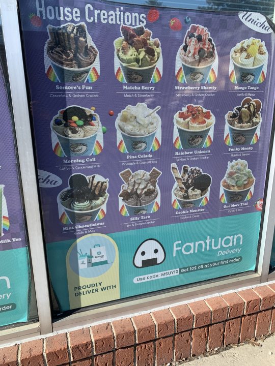
3. Cool colors are used here and it's a great fit because it's an ice cream menu.

4. Folgers uses warm complementary colors. It fits with the product well especially with their rising sun logo.
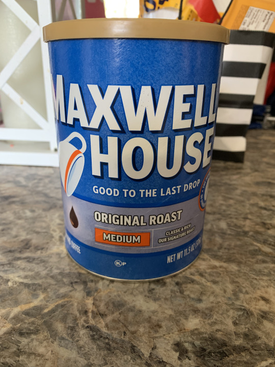
5. Color contrast is used here to highlight the most important things of a product, company name and product type (original roast, medium). This paired with the large bold font make it easy to pick out on a shelf.
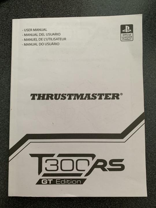

6. This is the front and back of a user manual for a controller I own. I really like the choice to have a continuous line on a book like this.

7. The figure-ground effect is used well here. The literal negative filtered photo creates an interesting visual using blank space.

8. The font used here conveys that this is a relatively old building on campus. Although it was built in the 40's, the font reminds me that we're at a very historic university.
0 notes
Text
Module 6

Here is an interesting graphic I found on a Formula 1 forum online that compares the amount of overtakes that happened every year at a specific track. Just based on this, it seems like 2016 was a very competitive race with many overtakes. However, this spike in overtakes can be attributed to multiple crashes between drivers in higher positions. For example, on the first lap, there was multiple cars that crashed together and ended up having to quit the race. Meaning every car behind them (upwards of 10 cars) would "overtake" these cars as they continued. It also shows a dip in overtakes after 2013 (excluding 2016). People attribute this to regulation changes in the sport, leading to cars being hard to follow closely, thus making it harder to overtake. But these changes didn't occur until 2017, so the data from 2014 and 2015 is unaffected by this perceived change. It's also worth noting that the 2016 race is actually the race with the second highest number of overtakes the "modern" era. However, after the regulation change making cars harder to follow, in 2023 Dutch Grand Prix had 188 overtakes.

This showcases a couple examples of identity systems. On the left there's a CVS brand vitamin bottle, which has the CVS brand standard font, color, and placement usages. On the right there's two Johnson & Johnson products with the same color and text positioning.
CVS has a very specific and simple brand guideline it follows with it's products. It has the name of the product, "Calcium, Magnesium & Zinc" horizontally aligned in the same way as their other products. The "billboard effect" is used in packaging to grab a customer's attention and point it to where these are on the shelf. This is only possible with a unified design and things like repeating patterns such as the blue rectangle to grab people's attention.
Medical products also have a very uniform design to them. Using red, white and blue to convey the message that their product is professional, sanitary and safe to use. Each product also uses bold and easy to read font that grabs the attention of customers and also helps them know what type of product it is at a glance. This also makes it easier to read in high stress situations like a medical emergency or in low visibility situations like at night.
0 notes
Text
Module 4
I believe the font used here forms perfectly with the inscription like design.
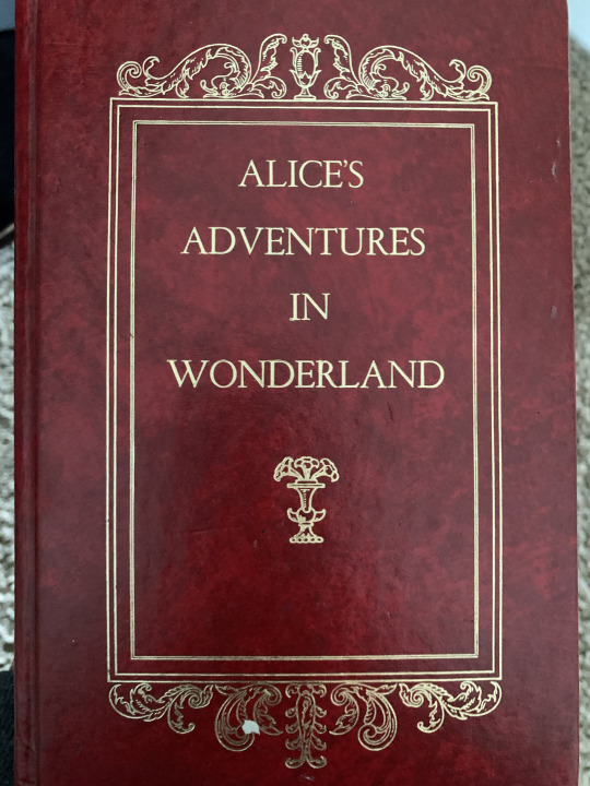
2. Here's an interesting example of typographic hierarchy. Colleen's last name is larger than her first and I'm not really sure why. Clearly this is a bit anti-typographic hierarchy but why is it used here? When I asked my mom (her book), she also had no clue and that she wasn't a fan.
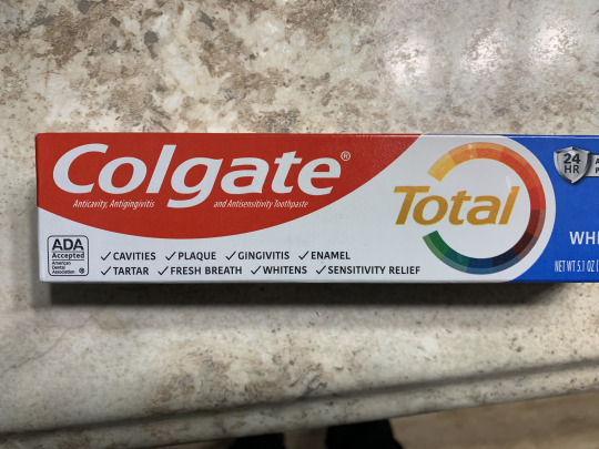
3. Easy example of ascenders, and a descender in "Colgate". I believe this is using a large x-height as well.
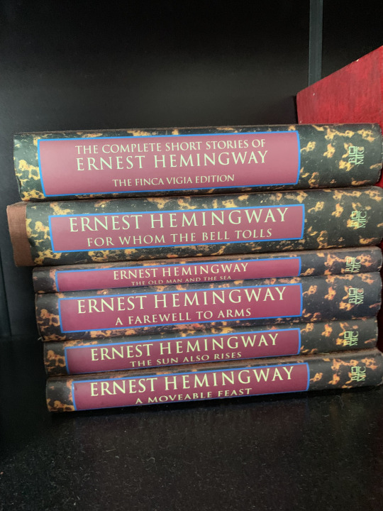
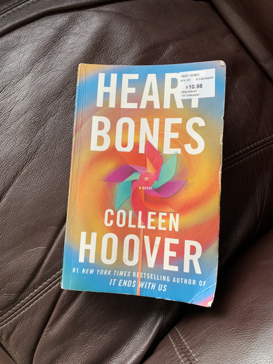
4. I really like the designs on the spines of these books. Displays counters and crossbars.
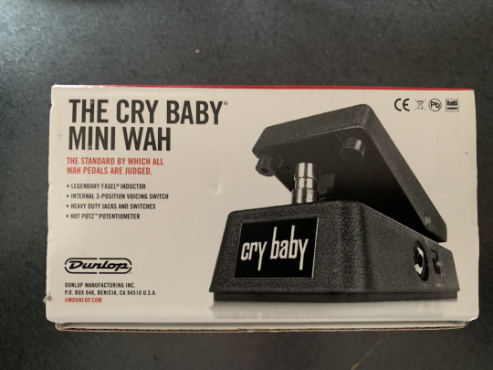
5. This guitar pedal has very large ascenders and descenders indicating a small x-height.
6. The red text uses a font that has a relatively large x-height. I somehow couldn't find a better example than this.
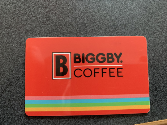
7. Biggby uses a modernist font that's more rounded on the edges. Whenever I see a font like this it always reminds me of the fonts toy companies like Duplo use.
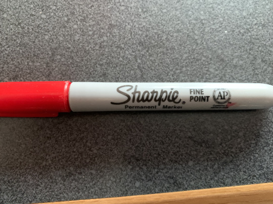
8. I love the handwritten style font Sharpie uses. I think it conveys how their markers perform because it looks like someone wrote the logo with one.
0 notes
Text
Module 2

Simple example of weight. The number on speed limit signs is the most important piece of information so the weight/size is larger.

2. On my coffee mug there's a decent example of passive lines (the lines surrounding the "flowers"). I believe these are passive because they have a consistent pattern.

3. Here are some more active lines on this cheesy decoration I own. The lines curve significantly on the left side, even out, then start curving again on the right.

4. On this CATA sign, we have a possible example of contrast via the tri-colored lines. Above, there's spacing for the CATA logo, and below they're straight lines. "CATA" is also intertwined with the thick blue line with a bit of padding to separate it.

5. I'd argue there's a bit of repetition/progression on this pack of Trident Gum. The white and light green triangle shape repeats until it hits the third layer of white triangular lines over a green background. This design works very well next to Trident's competitors as the background and weight of the Trident logo stand out more. I should have gotten a picture of this on a store shelf to illustrate this.
1 note
·
View note