#module6
Explore tagged Tumblr posts
Visit Tumblr Blog
Explore Tumblr blogs with no restrictions, modern design and the best experience.
Last Seen Tumblr Blogs


Fun Fact
If you dial 1-866-584-6757, you can leave an audio post for your followers.
Text
Module 6
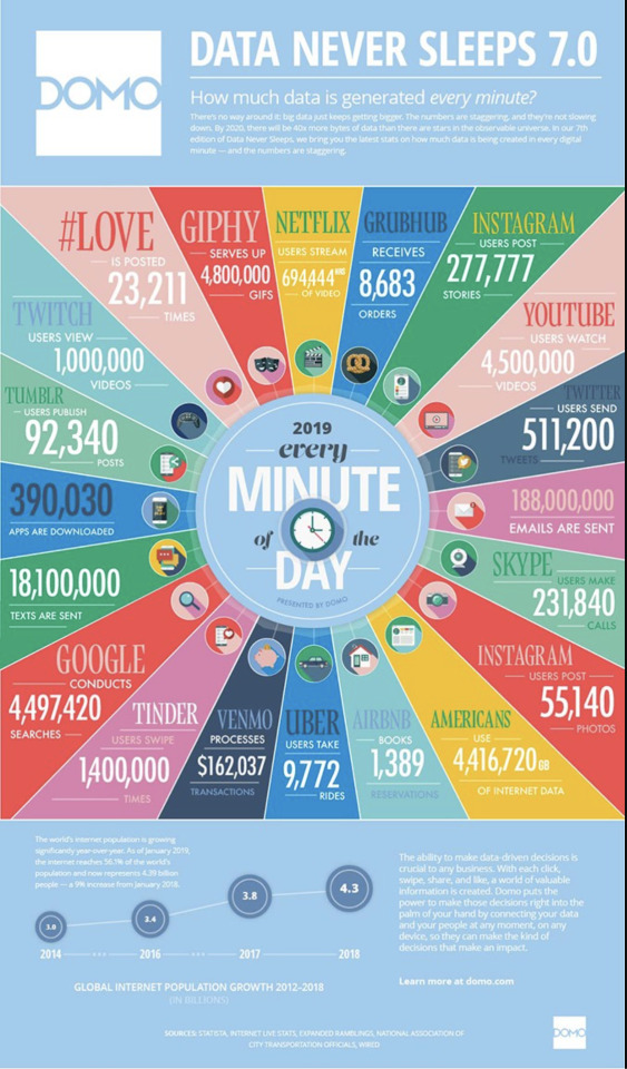

This is an infographic I've pulled from online. The underlying agenda of this infographic is to try and get readers to become scared of their data becoming stolen by other companies and tells the user that if they use their company their data would be "placed in their (the user's)hands.
Marvel uses the same font and colors to keep consistency within their brand. Keeping the same colorway and font helps the brand become more recognizable amongst others as people all over the world are familiar with it.
0 notes
Text


This infographic I found online illustrates the numerous benefits of exercise on mental health, highlighting its positive impact on mood, stress reduction, cognitive function, and overall well-being. While presenting factual information, the underlying agenda of the visualization is to promote the importance of physical activity and encourage individuals to prioritize exercise for mental health benefits.
The Apple logo of my MacBook Air, is a quintessential element of Apple's larger identity system, embodying the brand's commitment to minimalist design and technological innovation. The logo's sleek and timeless aesthetic, coupled with its consistent application across various products and marketing materials, establishes visual coherence within the brand's identity. Through meticulous attention to detail in color, typography, and imagery, Apple achieves consistency in its design elements, ensuring uniformity in text alignment, positioning, kerning, and the use of caps. The logo's symbolic representation, devoid of unnecessary ornamentation, reinforces Apple's brand values of simplicity, elegance, and sophistication, contributing to a cohesive and recognizable brand image.
0 notes
Text


This is a Disney map, which contains a large number of rides, but this map does not tell you how far apart the rides are. It may look like a small distance on a map, but in reality, it can be very far. The purpose of this design is to make the picture more compact.
The designs of the Good&Gatger brand are highly similar. If you see one, you will immediately think of the other. The design of this series allows consumers to find items from the same manufacturer faster.
0 notes
Text
This infographic’s agenda is to get people to realize the significance of income inequality in Europe. This infographic is trying to get its audience to care about income inequality. The snake-like graphic that maps countries in Europe from the least to most income inequality. This organization draws the viewer's eye across the page, making the lead up to the country with the most income inequality more dramatic. Although infographics like this are intended to raise awareness to important subjects, it is impossible to accurately represent complex and nuanced information in one simple graphic


2. This piece of design is part of Michigan State’s larger identity system or brand reputation. Consistency Michigan State’s marketing and communication brand utilizes a simple color scheme of green, white, gray, and black to create unity and consistency. The even spacing, bold yet simple sans typefaces, and heavy use of capital letters create an organized, strong, put-together look for our school. The use of the traditional design grid aligns each design block to create flow and balance in the piece, helping Michigan State maintain a cohesive, bold, fresh identity system.
0 notes
Text

This infographic is showing millenials and their media consumption. The underlying agenda that I believe this infographic is trying to say is that millenials are using screens too much. The whole infographic is filled with different images/symbols that have something to do with using a screen and all the numbers are focusing on what they are doing with their screens, rather than everything else that millenials do off of the screen.

2. This piece of design is apart of a larger identity system, which is the whole packaging for the toilet paper. The brand achieves consistency with the packaging of this product because all information seen on this is on one side, which allows for easy stacking in the store. Also, within the design of the packaging, they use the same colors throughout with green, purple, and yellow, with red at the top to signify that there is something different about this product, which is that it is a deal. The alignment of the elements is consistent because they are all either in the center of the design, or in the corners, sticking to the grid, and are not all over the place. All text is in caps except for the logo and recycled word, which shows consistency. The imagery is illustrative giving the viewer a soft feeling from the packaging, which the toilet paper company wants.
0 notes
Text
Module 6

Here is an interesting graphic I found on a Formula 1 forum online that compares the amount of overtakes that happened every year at a specific track. Just based on this, it seems like 2016 was a very competitive race with many overtakes. However, this spike in overtakes can be attributed to multiple crashes between drivers in higher positions. For example, on the first lap, there was multiple cars that crashed together and ended up having to quit the race. Meaning every car behind them (upwards of 10 cars) would "overtake" these cars as they continued. It also shows a dip in overtakes after 2013 (excluding 2016). People attribute this to regulation changes in the sport, leading to cars being hard to follow closely, thus making it harder to overtake. But these changes didn't occur until 2017, so the data from 2014 and 2015 is unaffected by this perceived change. It's also worth noting that the 2016 race is actually the race with the second highest number of overtakes the "modern" era. However, after the regulation change making cars harder to follow, in 2023 Dutch Grand Prix had 188 overtakes.

This showcases a couple examples of identity systems. On the left there's a CVS brand vitamin bottle, which has the CVS brand standard font, color, and placement usages. On the right there's two Johnson & Johnson products with the same color and text positioning.
CVS has a very specific and simple brand guideline it follows with it's products. It has the name of the product, "Calcium, Magnesium & Zinc" horizontally aligned in the same way as their other products. The "billboard effect" is used in packaging to grab a customer's attention and point it to where these are on the shelf. This is only possible with a unified design and things like repeating patterns such as the blue rectangle to grab people's attention.
Medical products also have a very uniform design to them. Using red, white and blue to convey the message that their product is professional, sanitary and safe to use. Each product also uses bold and easy to read font that grabs the attention of customers and also helps them know what type of product it is at a glance. This also makes it easier to read in high stress situations like a medical emergency or in low visibility situations like at night.
0 notes
Text
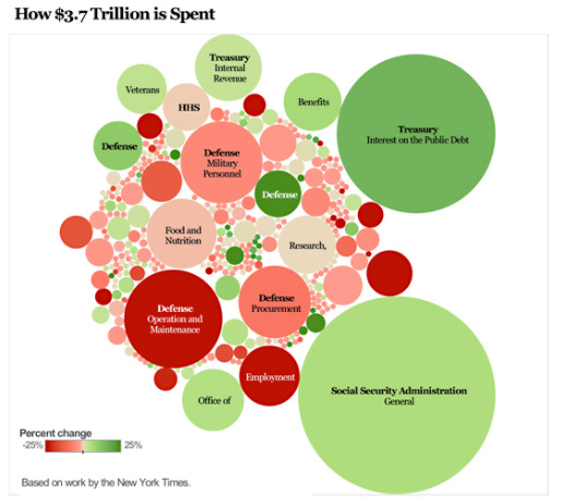
This images purpose is to show much money the government spends and what they spend it on the most. Out of the $3.7 trillion budget, most of it is spent Social Security, Treasury and Defense. From the size of the circles, it gives off the impression that the size represents the amount that each category receives. This is manipulating because you are forced to focus on the larger circles. But what about the smaller ones? What do they represent? Why are those priorities smaller than the ones clearly highlighted? It brings up a lot of questions and doubt.

This is a Target brand called "favorite day". The font is very modern and sleek. It is simple and easy to read. The design on this label is coordinated and flows, from the typography and font size to the color. There are four different fonts, but they are the same color and somewhat the same style. Compared to the other Target brand Good and Gather", the font is different, but still sleek and clean. You have the brand at the top, the title of the product in the middle and an image of the product lining the bottom on the package. Across all of the products, the layout and font sizes are consistent. It also matches the atmosphere of the store and brand, simple. The logo is simple, the employees uniforms are simple, and so are the product packagings.
0 notes
Text


Module 6
Image 1 - This is an infographic I found online about education around the world. As you see they are communicating through text, color, and numbers. It’s a great layout and way to spread information and statistics.
Image 2 - This is Paula’s Choice packaging and you can tell that they are different from others. They choose great colors that describes their brand. Also, they have the same text throughout all bottles, you can see that they rotate the text in “clinical,” “clear,” and “exfoliate.”
0 notes
Text


Photo 1: This is a data visualization. In this graphic, I believe that it is trying to spread misinformation visualization by flipping the y axis from where it traditionally has always started. This makes the visualization of the data seem opposite of what it really is, which in this case would make people think that Florida's "Stand Your Ground" law has decreased gun deaths when it has actually increased in the years surrounding it. It is attempting to change the viewers perspective of what they are seeing and or manipulate it.
Photo 2: This design is part of a larger identity system. The design and logo on the remote is part of a larger identity system for the company Amazon. The design is consistent with the typography, text alignment and imagery that the company uses on the rest of the products. Amazon has achieved one of the most recognizable large identity systems by using a consistent logo and design across all their products no matter what it may be.
0 notes
Text

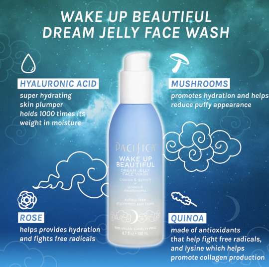
For the infographic the underlying agenda is this aspect of use of a "dreamy" aspect in the product. It makes it seem as though this product is what you will need to "wake up beautiful". It uses all these different ingredients that are deemed to be healthy although these are not the only ingredients within the product. Many brands similar will use graphics like this to promote a product to make people believe it is very healthy and the path to a good complexion. That being said many of these products have harsh or bad ingredients if you look closer on the ingredient list and not just on the graphic.
For the Meyers cleaning spray, it is no surprise that the graphics on the bottle are very visually appealing and a recognizable brand. Outside of that though no one would need to know the brand when seeing the shape of the bottle to know what it is. If you know this brand you know that all of the shapes of the bottles are very similar to one another along with the typefaces they use. They keep everything in a similar range so it is not trivial for a consumer walking down an isle to recognize this brand and remember they like it.
0 notes
Text


Image #1: In my opinion, the underlying agenda of this infographic may be to highlight the success of the college (UCLA, who the College Senior Survey is associated with) in preparing students for their future careers. By showcasing data on post-graduation employment rates, salaries, and career paths of recent graduates, the college aims to attract prospective students and reassure current students and their families of the value of their investment in education. I also think the underlying agenda of the infographic may be to build the college's reputation and brand image.
Image #2: Room Essentials achieves consistency in its visual identity by carefully managing the relationships between color, typography, imagery, and graphic elements. Room Essentials uses a mix of illustrative and photographic imagery to convey its brand identity. Illustrations may be used to add a playful or whimsical touch to product packaging or marketing materials, while photographic imagery showcases products in real-life settings, helping consumers envision how they might incorporate the Room Essentials products into their own homes after buying. By maintaining consistency across textual and graphic elements, the brand is able to establish a strong and recognizable visual identity that resonates with its 'target' audience.
0 notes
Text
Module 6

I think the underlying agenda of this infographic is that chocolate is the superior candy. They do this by making the chocolate bar bigger than the other candies. They do not reveal the overall data of the kids they surveyed. Putting generalized candy names and I assume combining the data into these 4 categories can skew the way it looks and the information. They also made the hard candies have skulls. Why use hard candies instead of a chocolate bar?

2. The Great Value brand of Walmart keeps consistency by using the same color of light blue within its logo. It also uses a type font that is easy to read. The letters are close together, even touching in the word "great." The little TM is always at the corner of the e in "value." The design is simple enough to be recognized by anyone who shops at Walmart. Also, the oval of the Brand is used to wrap around the description of various foodstuffs. You'll know it is Great value just from the two ovals.
0 notes
Text
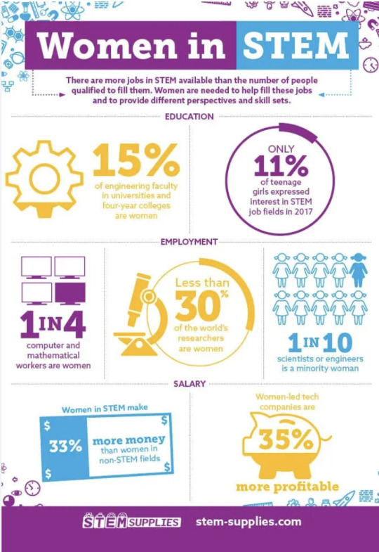
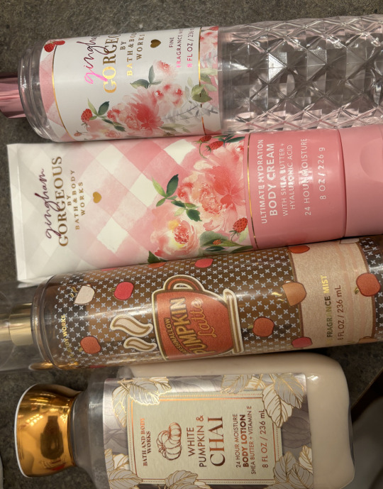
Image 1: This is an infographic I found online and it has statistics in regards to women in stem. The underlying agenda that the infographic is trying to push is to get more women to join STEM related fields, they do this by putting percentages and numbers. For example, women in STEM make 33% more money than women in non-STEM fields.
Image 2: Bath and Body Works is a large identity system that offers a wide selection of products. They have hand sanitizer, body mist, body scrubs, lotion, lip products, candles and so much more. The brand achieves consistency by maintaining the logo in the same font and size throughout all their products. The alignment of their logo with it being aligned to the middle also allows consistency.
0 notes
Text
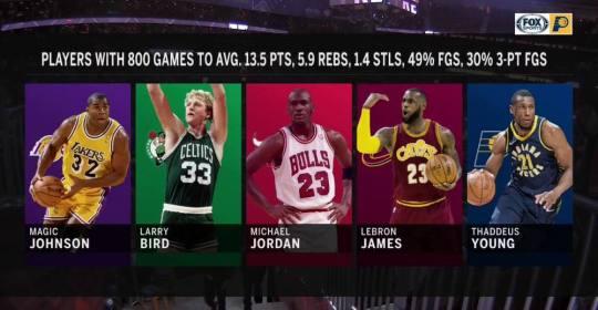
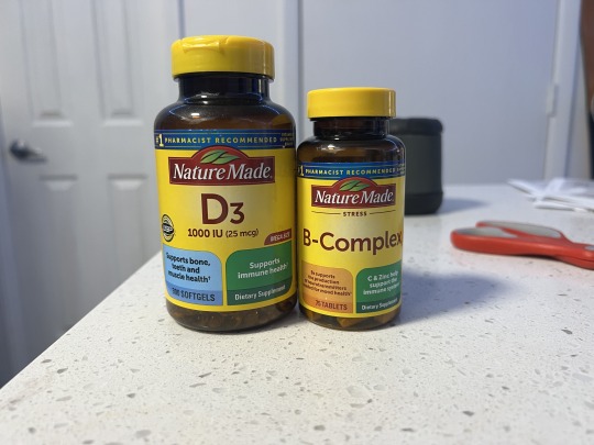
Image One: The underlying agenda shown here is trying to portray the player Thaddeus Young as one of the greatest players by cherry picking very specific data that he was able to acieve that other players who many considers the greatest achieved as well. This is clearly propoganda as the people who created this graphic are apart of the Fox sports broadcasting team for the team Thaddeus Young played for. To summarize, the team that Thaddeus Young played for put out a graphic that paints him to be one of the greatest of all time, even though the statistics shown are very specific and not indicitave of his whole career.
Image Two: I put two items from the same brand here to give my example a bit more visual context. Here I have vitamins from the Nature Made brand. The identity system that sets them apart from other brands is their dark colored bottles with a contrasting yellow lid and label. This is present on all of their products, and exists to set the brand apart from others, and to catch the eye of the viewer. The text is also quite consistent and easy to read. They make it quite large and directly in the center of the label, with adequate spacing around the name of the vitamin to ensure there is no confusion as to what vitamin it is.
0 notes
Text


This infographic titled, "With more wells, we're producing more natural gas than ever before" shows a data visualization of wells that produce natural gas. This clearly has an underlying agenda which is trying to persuade viewers against the installation of wells. While it may seem objective because of its professional style choices, a closer look at it reveals its misinformation. The y-axis does not start at zero, and the intervals are very close together. This makes the line appear more drastic than it really is. By reading closely, it is evident that the number of gas producing wells has only actually increased by around 80,000 over five years.
This hand cream from Bath and Body Works is part of the Aromatherapy line within their brand. Each product in this line includes the gold logo and a gold accent strip with the product's scent. Consistency is achieved by carrying this logo and utilizing a specific typeface that is in all capital letters. The lettering also appears to be kerned a bit more than the average font. Each product also features a background photo of the source of the scent. For example, here they used a sage green color and a eucalyptus plant to capture the scent. For another, they used a lavender purple and a lavender plant in the background. Each product also emphasizes its purpose. This hand cream scent's purpose is for stress relief, so it is highlighted by a larger text size and heavier weight.
0 notes
Text
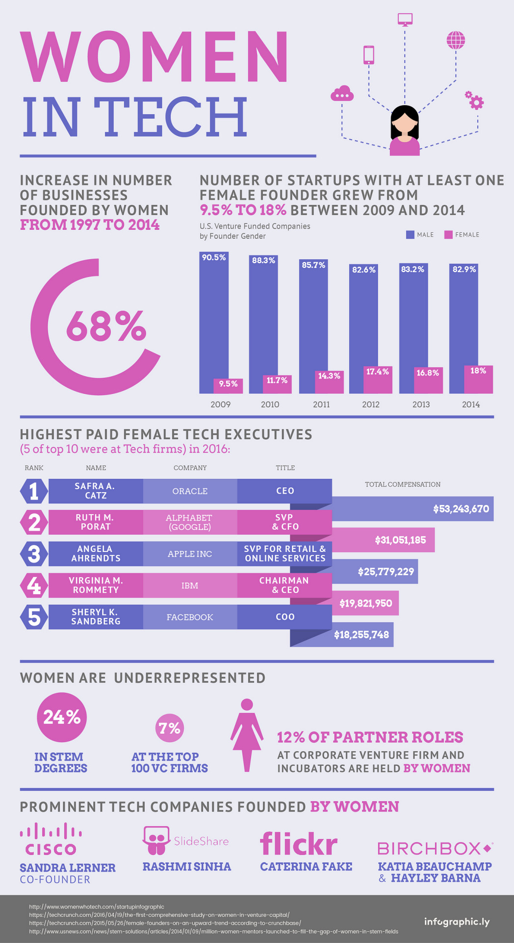

Image 1: This infographic and data visualization show information and data about women in TECH. Although the information identifies the important topic of the increasing in number of businesses founded by women from 1997 to 2014. It shares specific statistics to exaggerate the number of startups with at least one women founder grew from 9.5% to 18%.
Image 2: Sprite LIME-LIME Packaging - I had to pick an example that featured one of the most recognizable identity systems in today’s world. The first and most obvious example of consistency with all of the Sprite products is the distinct green that is used in their branding. While it may be argued that no color can be entirely associated with a single brand, Sprite's distinct green comes remarkably close. In addition to the signature color, Sprite's expressive script logo is another highly recognizable component of its brand identity. The typography, with its fluid and dynamic character, adds a playful and refreshing touch to the overall design, perfectly aligning with the brand's positioning. Whether encountered on a shelf or in an advertisement, the Sprite green, script logo, and minimalistic design approach work together to create an instantly recognizable and memorable brand identity.
0 notes