
Statistics
We looked inside some of the posts by maydemaeijer and here's what we found interesting.
Average Info
Notes Per Post
1
Likes Per Post
1
Reblog Per Post
0
Reply Per Post
0
Time Between Posts
4 minutes
Number of Posts By Type
Text
17
Last Seen Tumblr Blogs


Fun Fact
Tumblr is used by 21% of adults online aged 18-29 years.
Text


OLIO PLUS BUNDLE AND REFLECTION
Riso work is always challenging as you are working with a limited colour palette and to a relatively strict brief. It also means your style may have to change or be adapted to suit riso. Since I only have used it once in first year I learned that bold lines work best and that grey scale is often very difficult to get strong artwork from. I decided to stick to bold line for this module as I know it has a more effective outcome (in my opinion). I enjoyed creating a stylised and somewhat humorous drawing for a 3AM thought that also reflects me an my life! It was also enjoyable and testing to create the cover drawing as simplified cartoons are not something I often partake in drawing and they are a lot more complicated than you’d imagine! Smooth lines are very time consuming and take a lot of practice however I am really pleased with the outcome as it’s strong and matches the brief entirely.
1 note
·
View note
Text


OLIO 16 BUNDLE AND REFLECTION OVERALL.
Olio has completely challenged me in a positive way. The task to create the olio cover was particularly challenging but I really enjoyed making my overall design. I have learned so much about my working process and how I come to find ideas and process everything into a final outcome which has helped me trust myself a lot more. I realised a lot of my ideas an inspiration tend to start from me looking at multiples of references and photographs. From this I can use a basic outline and exaggerate certain aspects of an image and adapt photos to the colours and lines I see as well as changing the shapes and enhancing features.
Tom’s feedback and the peer response throughout the module has been really useful as a fresh set of eyes (especially during lockdown) is so needed. While spending time alone in an office drawing, you don’t get the usual buzz of a studio and constant conversation with lecturers so online class for guidance has been very beneficial. I have enjoyed working to a brief where I can experiment as well as develop a style I had for my children’s book illustration module and really use the time to visually research artists such as Peppa Potter who have an influence on my style and give me inspiration. Learning new techniques and experimenting deeper with pro create and layers has also been a learning curve as well as the technical side of exporting different files types and uploading to shared dashboards. Blogging is also relatively nee to me so documenting work has been a busy experience.
0 notes
Text


My design and reference


Learning what works best. I made lots of versions of this design, incorporating butterflies, flowers and plants amd had to reflect on which worked best on the page and what was classed as ‘too much’
Here you can see where I started and where it developed to. I ended up removing a few of the plants as it felt too overcrowded, often with tattoo design, simpler is best.

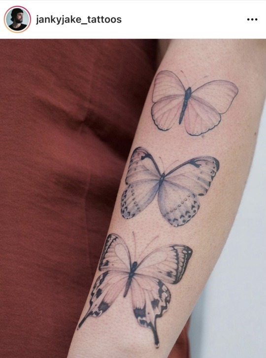
I added butterflies I had created from a flash for my final major project as an accessory to the leopard inspired by Janky Jake tattoos.
0 notes
Text

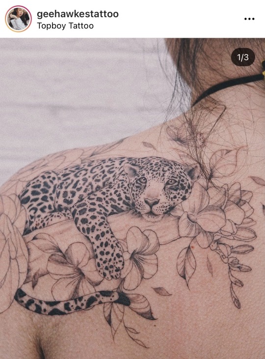
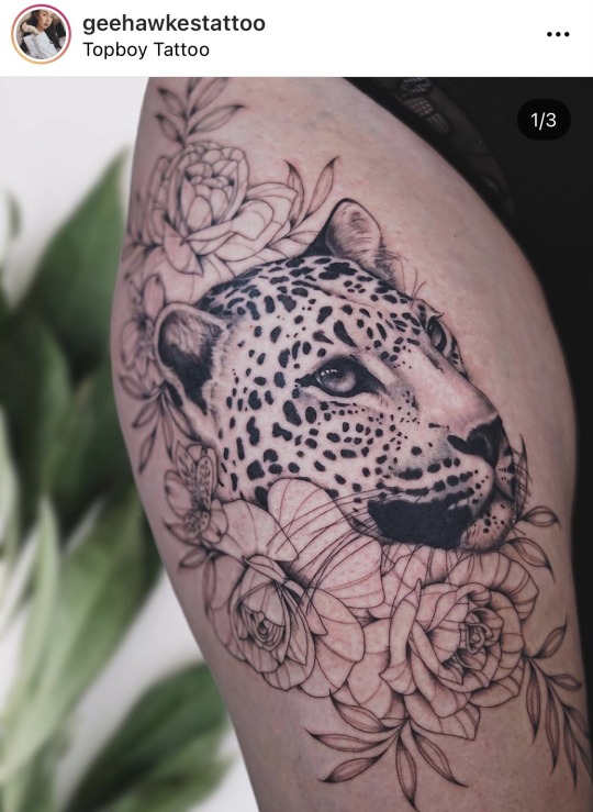


Tattoo artist inspiration... my Tyson is influenced a lot my Alexandria Nolan and Geehawkes tattoo. I love the combination of plants and animals and this translates into their work effortlessly. I spend a lot of time on their Instagram handles looking at their work and listening to podcasts they are involved in to learn more about their journey and art style. I get lot of my inspiration from photos and other artists amd these are the Ian two who I always go back to.
I have in fact been tattooed by Alexandria and she has given me advice about finding apprenticeships, the dos and donts and so I have a lot of respect for her art and practice.
0 notes
Text

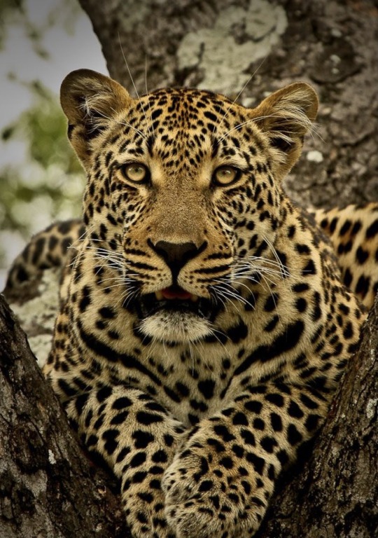
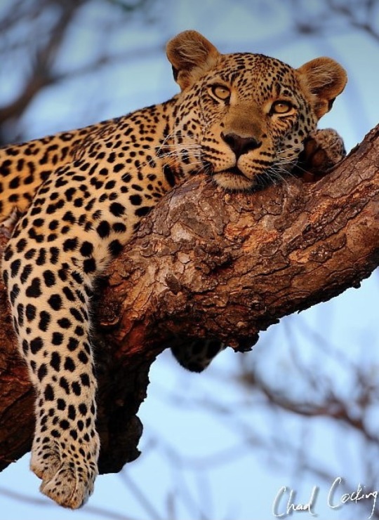

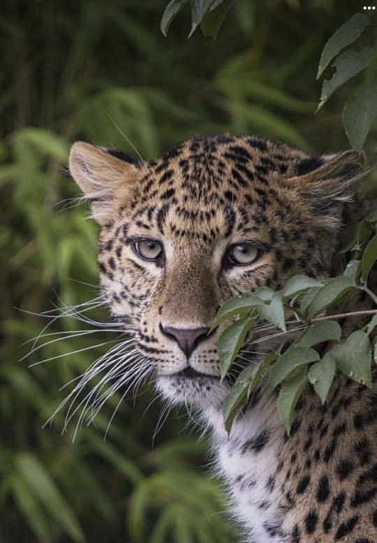


Gathering reference for inside cover olio 16. Inside cover collection of references of large cats, cheetahs and leopards. I have learned a lot about my working practice and how my initial first stage is collecting images to base my ideas from. These in particular stood out to me and my style for tattooing. I thought they’d work well with black line work. I use reference to really get a feel for the animal and how I want to present them in my drawings so multiple images is especially important as I may take certain aspects from one and another from a different photo.
0 notes
Text

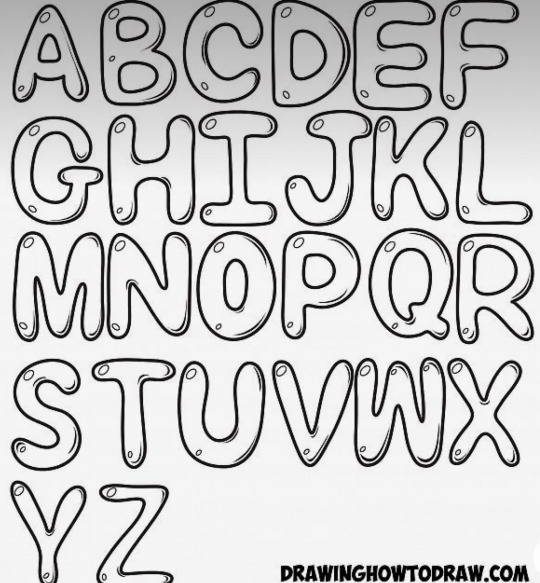
I experimented with a few different fonts from DAFONT. Which is commonly used by tattoo artist for script tattoos as has an enormous selection of fonts to try out.
I definitely was looking for an extremely bold black font to match the panda design and balance out the bottom end of the page.
0 notes
Text


Here is the final mock up of the split layers and how they work together to form the final composition.
0 notes
Text


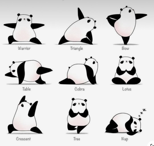

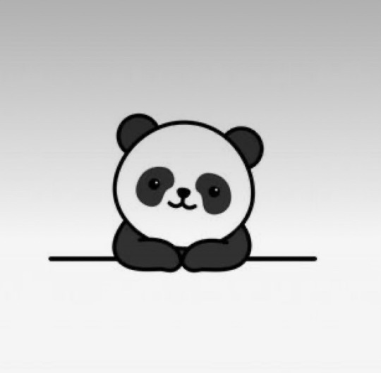
Visual aids. I found these on Pinterest for cartoon inspiration and how other artist have portrayed cartoon pandas as it’s not my usual line of expertise.. these really helped me adapt my own ideas..
From sketch to final split layers in this time lapse you can see how I came to the final outcome. I had a lot of fun rounding off the edges and making it a smooth cut design that would work well with the riso printer.
0 notes
Text


3AM THOUGHTS, COVER ILLUSTRATION
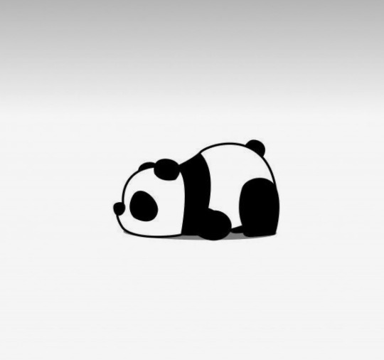
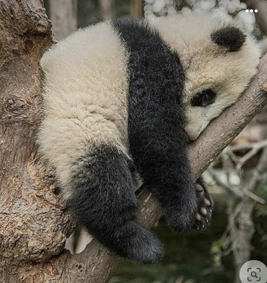
My mock up sketch came from this photo of a face planting tree panda and I used this as reference for completion on my page. I tried a few head positions and decided to go for the more cartoony style of a squished snout! I think this composition works stronger and is more creative, the initial sketch was too redone and common and I like the idea of the character facing the viewer.
Here were my concept sketches
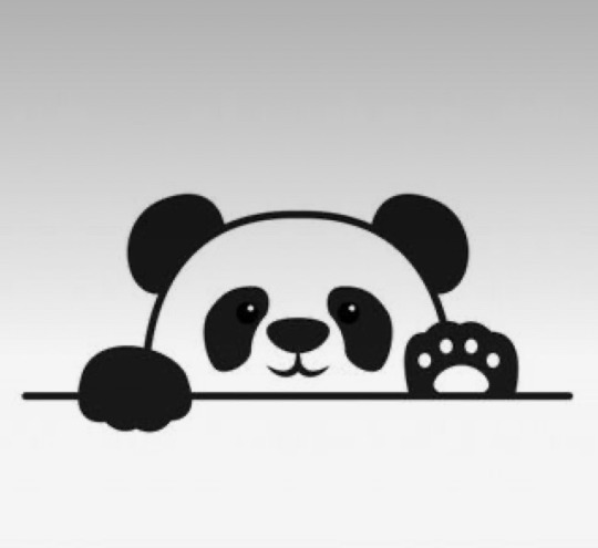
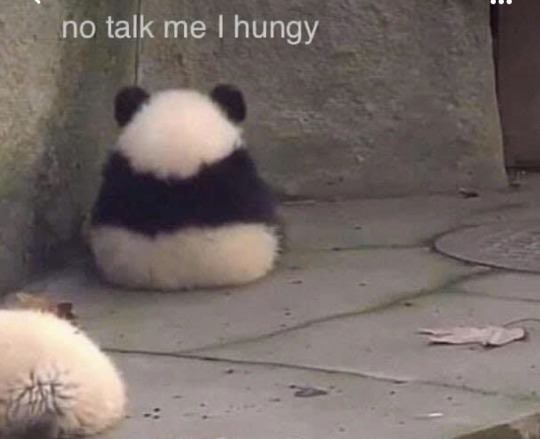
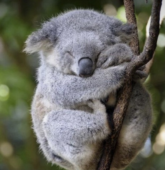
Had to be a sleepy panda ! Sticking with the olio16 cover illustration of three bears, I thought I’d stick to the bear theme and draw a sleepy 3am panda. There are some really easily translatable aspects to drawing a cartoon panda that could work so well with the riso printer and limited colours. Here are the reference images I was looking at for visual research.


0 notes
Text
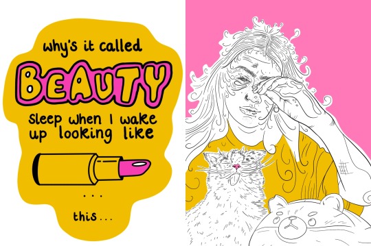
Mock up of the inside page. This would be my double page spread and shows how the drawing and typography works as set mech to one another. I was really pleased with how these turned out as they were completely out of my comfort zone. Lipstick pointer to the other page !!
0 notes
Text


Font
For the personalised font I had a play with bubble writing and the idea that something cosmetic is spilled out under the text ad it links to the idea of beauty sleep. I wanted to include the same colours to match with the opposite side drawing. And added a fun lipstick as a playful accent ..
Here is a layout of the separate mock up layers,
I like how playful the text came out as it matches with the humour out aspect of the illustration and is easily legible and eye catching.


Based loosely from bubble writing found on Pinterest
I like how the lipstick almost acts as an arrow and points to the opposite page.
0 notes
Text


TECHNICAL DOCUMENTATION PRINT AND LAYER SEPARATION. Edits and layers based on feedback.
As each layer I wanted in full saturation of colour, each layer is black. Used a ,pick up of pink yellow and black inks to reflect how it would look printed on the separate colours. I had to depart the layers out on Procreate an export as a PSD file, renaming each layer with designated colours.
It took a lot of reworking! Here is time lapse that reflects the edits it took…
As ,y favourite colour is yellow I thought I can add bold accents into the drawing by giving myself a yellow t shirt, bear a bright pink accent nose and and wash of pink for the background to fill into sparse gap.
I really liked how it turned out in the end as it like the combination of the black lines with the bold colour shapes. I also like the the composition and how the three main parts interact in the space. It looks full but not clustered and in the details on the face were inspired by Callaghan’s work.

0 notes
Text


COLLABORATIVE MEETING. INTERACTION AMD OUTPUT. Class feedback; everyone liked the design and composition but agreed that the pink cat made it look as though it was blending into the background. It needed an injection of colour and that I should playa round with different ways of incorporating yellow and pink. I also wanted to ask everyone what their opinions of my inside cover for olio 16 were. I was unsure on what kind of illustration to include as my style varies extensively and I work in different ways. I included a few styles of my work that could fit into the inside cover for olio 16. I was unsure whether to have an illustrative piece or a tattoo design idea as this I the line of work I am going to be exploring once I finish university. All feedback was to stick with tattoo design as this is what I will want to be gaining client base and contacts for. The floral fox piece was popular however it was an experimental design that I didn’t feel completely comfortable with representing my work as I decided to carry forward tattoo design bu to make a new design specially for the cover that I could also use for my tattoo portfolio for my final Major project.
0 notes
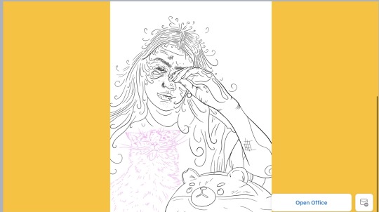
Text


This was my initial design, pink cat and the rest bold black line work, I feel as though it doesn’t stand out.. it needs a revamp for colours. I was pleased with the stylised effect of the drawing and the bold line work as it will be printed in black ink. But I want some colour in the mix as well.
0 notes
Text
Finding a composition, I cut the image of Bear into the composition with Shiba and had a play around with the composition of the image on a portrait page.


IDEA OF DETAILING. Details I want to add inspired by Laura Callaghan.. although her style is extremely complicated and complex. I like the idea of small, details that gets the viewer to look closely at an image, almost like a searching game. The idea of what clues you can detect and ideas you can pull from a drawing. Adding in small things such a chipped nail varnish and bags under the eyes will signify tiredness, maintenance and exhaustion... the uni lifestyle really!!
0 notes
Text
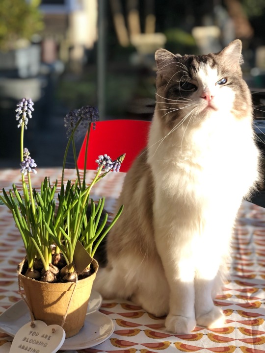
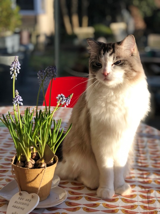
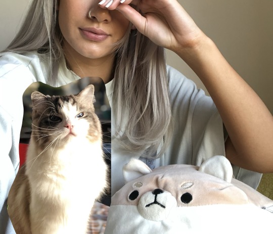
COLLATING REFERENCE TO WORK FROM. I took a photo to work from for the design and have taken lots of my cat Bear to work into the image. These are the photos I am going to be working from
0 notes
Text


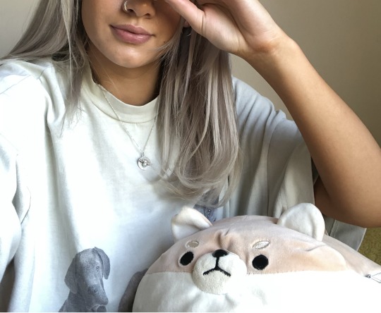
What do my mornings consist of?
Reference images collected of me and my morning. Pictured is my cat Bear and Shiba, who is recognised by those closest to me. He is a plushie who is used to help relieve the neck ache I get from drawing! Shiba and Bear are what will make my illustration recognisable to me. I will be drawing myself in a stylised bold black line work drawing and will include both shiba and bear for humorous effect. I will also be drawing myself in an exaggerated rough form... bags under eyes, chipped nail varnish ect.. small details noticed by the viewer.
0 notes