
Don't wanna be here? Send us removal request.
Statistics
We looked inside some of the posts by medearadt1 and here's what we found interesting.
Average Info
Notes Per Post
0
Likes Per Post
0
Reblog Per Post
0
Reply Per Post
0
Time Between Posts
2 days
Number of Posts By Type
Text
17
Last Seen Tumblr Blogs


Fun Fact
In 2020, Tumblr had 29.4 million users in the US.
Text
Final Project – Conclusion!
…………………………………………………………………………………………………………...
Right off the bat, I want to say that I am so, so proud of this. I can't look at it an even begin to comprehend I literally built and textured everything from scratch. It's a million times better than I thought it would be, and I'm glad I followed through, even with my self-doubts that it was too simple of a concept. I found both a lot of struggle and joy while working on this project. There is always that lingering cloud of doubt when it comes to things I've never attempted before, but I tried to not let it slow me down. I did lose work a few times with unexpected crashes (which only pushed me to save more frequently), but the teaching style we were given made both understanding and navigating this new software that much easier. I adore modeling. I love making things, making them accurate, giving them life, to tell a story through an environment. I think I realized that ever since I did the certificate two years ago and made a crude Alice in Wonderland inspired game. I think if I could go back now and show that younger version of me what we can do now, they wouldn't believe me in the slightest.
For me, ADT1 was a joy. Exactly what I am looking for out of this degree program, and I am more than happy with how much effort and time I poured into my scene. …………………………………………………………………………………………………………...
0 notes
Text
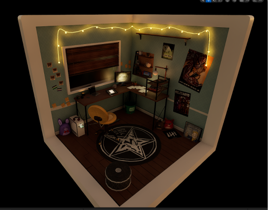
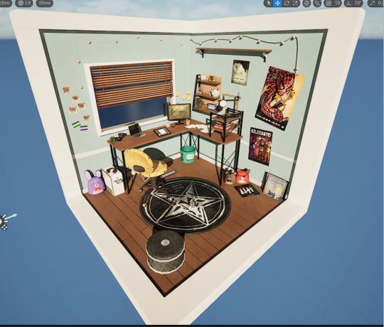
Final Project – Beauty Shots
Hell yeah! Beauty shots! Here I get to show the best angles I could find of my diorama. I used Unreal Engines High Resolution Screenshot mode for these, a skill I picked up back in the certificate.
But enough blabbing! Lets take a look, shall we? …………………………………………………………………………………………………………...
The beauty shots:


I also did some nighttime shot variants, just to get the effective so the lighting fully. Look how effective those fairylights are!

…………………………………………………………………………………………………………...
0 notes
Text
Final Project - Bringing It Together
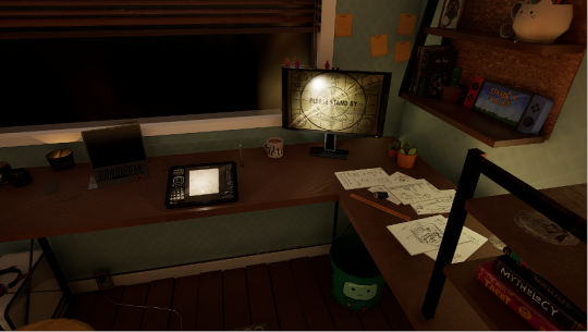
You thought texturing was fun? This was even better. Though, minus repeatedly shoving the materials together took an entire morning, as it was the most boring, hand-cramping thing I had ever done. Here, I pretty much get to play a glorified version of the Sims, or Houserflipper– meticulously placing items into the scene, arranging them to look like its me whos been living there. Taking into consideration how I would display things. Getting to play with lighting is also ALWAYS entertaining, the lighting system in Unreal Engine will always be my favourite. It also meant I could light up the many screens I had in my scene to make it appear as if they were on and actively being used.
…………………………………………………………………………………………………………...
The Process
I didn't texture things right away. Instead I pulled the models into the scene so they could find the right place to sit. This more sterile looks is preferable to me because I can easily tell what I'm working on, and items will more easily find the right place to be.
The set-up:

I then went ahead and made ALL the materials, which was a lot of importing, mass editing and then dragging them in Material Instances, a process I have described before in a previous post. Here I hadn't tackles lighting yet, and was simply getting it all down. It was here I also added the diorama frame. Material input:
Once I was happy with the layout, I then got to fiddle with lighting. I ended up going to a dusk setting, with that golden hour glow that you only get for a few minutes of each day. I also angled the sun exactly where it goes down infront of my apartment! For accuracy of course. It always astounds me at what a difference it makes. When it goes from sterile, unadjusted lighting, to this. I did want the blinds shadow to fall across the room.
Adjusting the lighting:

…………………………………………………………………………………………………………...
0 notes
Text
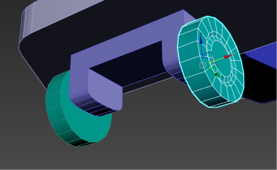
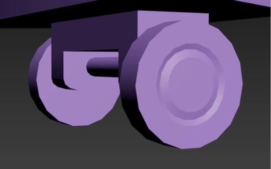
Final Project - The Models cont.
Finally, here are the mains of the scene, the big Goliath objects that make up the brunt of the base.
…………………………………………………………………………………………………………...
Main Models
Using the same formula, you know the deal by now. Alphabetical, notes at the bottom.
The B's:

The blinds! These probably took the longest out of any model to make, due to all the tiny finicky bits. Each wooden slat is capped (on both ends) with a slighter larger, darker wood, that makes the top and bottom, which are bigger as they are the supports. The slats themself aren't even, they are supposed to look messy (because God knows my own blinds also looks atrocious). The cables running through, as well as the draw strings, were mostly to make it look AS authentically accurate as possible. The C's:

The corkboard and the chair were two very opposite to each other when it came to creation. The chair was rather simple, the legs and wheel stoppers might have been a bit smaller to work with, but it was rather simple over all. The corkbord on the other hand– where it looks like it's just an extension of the desk (same colours to match) actually has over one hundred tiny holes booleaned into it. If you've ever seen an actual corkboard, you know that they have divets, and I didn't think when creating them that they would be miniature hell to unwrap. It took. Decades. Totally worth the outcome though!
The D's:


The D's. First the diorama frame. Mostly for aesthetics, because I didn't want the raw edges of the floor boards visible. It makes the whole scene appear softer, as well as giving it an overall finished look. But the desk! The main stake! Everything rests on this bad boy (literally)! The legs are a shiny black, that actually have tiny silver screws on the legs (a tiny, but necessary detail). The wood matches both shelves found in the scene and it has tiny floor covers on the bottom of the main legs. I was really proud of this. I think the wood textures really bring everything together. The S's:

The shelf is nothing to write home about. I left it empty (void of trinkets) on purpose, since it was mostly an environmental prop to fill out space. The schoolwork on the other hand, is very fun. It's actually my notes from ADT1 as a class. Including my original sketch of the diorama I create, my model list (with models I've made crossed out with blue highlighter), and my notes. I wanted to go just a little meta with it, so the scene looks like how my weekends have been spent creating this diorama. You can also see that the notes are a call out! One reads: "Why are you reading this? You're too close!! Look at the diorama, not a note!" And the other: "What do I put here? Pretend notes!" The W's:


The walls and floor! As well as the window pane and window sill, which were simple matte colours and a glass material (because I couldn't just leave the window BARE). For the main body, I did unwrap all the floorboards and the skirting board individually, which was tedious, but other than that, they are equal walls with one window hole booleaned into the side.
0 notes
Text
Final Project - The Models cont.
Next I'm going to be showing off the electronics. This is a smaller category, but I want to leave the more boring stuff (the main building blocks of the scene) till last.
…………………………………………………………………………………………………………...
Electronic Models
Again, we'll be going in alphabetical order, with notes under each with my thought processes. The C's:

Both my computer and my drawing tablet come together in C. This was one of the first models I made in 3DS! I was particularly proud of the wire work here. As you can see, the tablet screen is OVERALLY detailed, to make up for the off computer screen (which is very shiny in scene). It holds a piece of my actual art on the fake canvas! On the laptop itself, as well an X-Men sticket, the keyboard also holds a secret message, which I thought would be a funny little easter egg! "Not A Real Keyboard I'm Afraid, No Way Lol." I can imagine if I ever made this an actual game, I would love to find something like this.
The H's:

Only the headphones for H! This model was really tricky to get right, but texturing it was rather easy! It's a mock of a pair of my gaming headphones, but I added some cute little horns on top, with some height maps to make certain aspects (the stripes and the skull) stand out. I also added some weather on the inside of the headphone and headband.
The M's:

Another solo category. I free-handed the classic Fallout 4 load screen and added some particle texturing to make it look old and weathered (as well as some fake screen glint). I also used corner edge wear generator on the base!
The P's:

I was incredibly proud of this power-board when I first made it. The wire, the wall socket– it was all perfect! Een the holes are booleaned to have actual depth! I couldn't believe I actually made it to be honest, and it looked even better textured! Though I wish I had raised the wall socket up just a little. I also added my phone, which I often keep plugged in when I'm drawing. You can see I decided to recreate my Green Goblin lockscreen! That would counter the rather black colour palette, and I though it was cute.
The T's:

My good old tower. It's a rather simple design, so I decided to spice it up a little with vents on either side and an extruded face on either side. I also made a Sims 2 CD to go on the disk-tray. This is more of a homage to how I used to religiously play Sims on the family computer as a child, and that making this little diorama scene was much like playing Sims.
The S's:
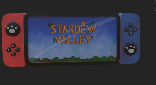
This was THE first model I made when I was practicing. I decided to include it (just without it's stand) in the final scene. I added the joystick covers I own, with the little pawprints on, as well as tried to convey the scuffed nature of the console, since it's a hand-me-down. Drawing the game screen on the inside was super fun! I think it looks almost like a screenshot, especially from far away, put I actually drew that myself! …………………………………………………………………………………………………………...
0 notes
Text
Final Project - Substance Painter
Yay! The fun part. It was here that I decided to hand-paint Every. Single. Model. I. Made. This might sound like a cool idea! It allows me to use my artistic skill to add my own twist on something and make it that much more personal and stylized. But heres the hook. I ended up creating FOURTY SEVEN models. Yes, you heard that right, FOURTY SEVEN. Which makes more sense when I also tell you I spent over eight hours working on texturing my models. Now in no was this a bad thing! Actually I really enjoyed this process. I got to really make each piece exactly to the standard I wanted. Substance painter actually offers an insane amount of texturing brushes, which made applying hand done shading/texturing incredibly easy!
Only a fraction of the brushes available!:
I ended up doing this all on my WACOM drawing tablet, my preferred choice. I also had Substance Painter on my home laptop, so I spent a majority of my time texturing doing it from the comfort of my desk (talk about relevant!). I honestly had the time of my life messing around with Substance. I felt like I really learnt the way the program works, and considering I had only started using it this year, I'd consider that a big win! It just happened to be very similar to Clip Studio Paint, my drawing program I do all my commission work on.
..............................................................................................................................
The Models (yes, all 47)
So I really had to think about how I was going to lay this section out. I decided to group together a few of the objects at a time in alphabetical order, and add notes where I saw fit, speaking on the thought process or hidden easter eggs that I dotted literally everywhere in my scene. Starting with the trinkets (because there's the most of them)
The B's:

Starting off strong. Of course, the BMO bin is noticeable, but my pride is the books. These are actual books (based on real references) that I have on my desk! I probably didn't have to style the covers so highly (since they can't be seen very well in the final scene) but it was important to me to get them accurate! I also had a lot of fun recreating the font styles and cover images.
The C's:

Here I have some extra angles to show off with some of my models. Again, all of these are based off real life items I own, including the white sage candles (which actually have little modeled candles inside!) and the cat mug! I was also really proud of my Last of Us coster, with the metallic glint that is supposed to mimic the fireflies dog-tags found in game.
The F's:
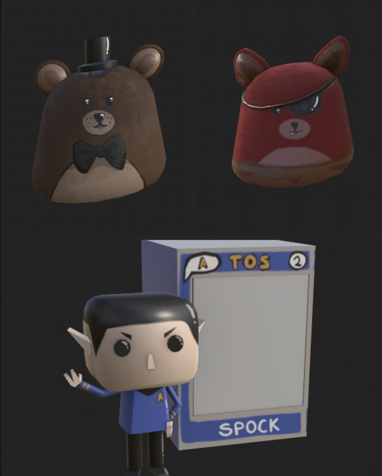
A smaller category, containing the last two of the plush collection and a singular Funko Pop. Looking back, I wish I had spent more time of the Funkos texturing, it was one of the last things I finished and I was in a slight hurry to get it in game, because modelling that bastard was definitely something. I think it is easily recognizable for the brand however, and since its so small up on my shelf, I'll try not to get hung up over it.
The L's:
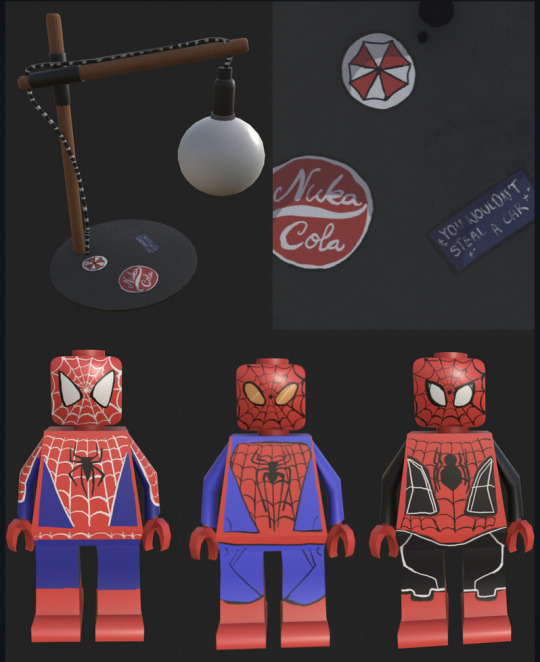
Ah, look at them. The Spider-Boys. These little Legos are ones I actually own, and they are stuck on top of my TV. The suits are in homage to each set of movies:
Raimi (Maguire)
Web (Garfield)
and Watts (Holland)
Spider-Man is a massive hyperfixation of mine, I actually collect all the original merch from the Raimi movies, since they are my all time favorites. Getting to draw each of the unique suits for each Spidey was loads of fun for me. The lamp is an exact replica of my own, actually I was impressed with how accurate I was able to get it. I added some stickers to the base of the lamp as well for extra effect– do you know all the references?
The P's:
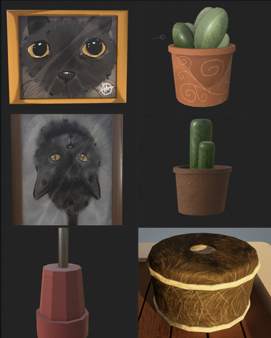
This is a bigger category, so I've split it into two parts. The first is the smaller objects. The pictures are based off pictures in my camera roll of my cat, Gul Dekat (Duckie for short). He's my entire world, and I love him to pieces. I also included his favourite pouf to sleep on, and a few plants. But my pride and JOY in this diorama are the posters.

I spent the most time on these bad boys. Two are recreation of game posters from some of my favourite franchises, and my biggest is my original Spider-Man 2 poster (which is the best Spider-Man movie EVER, period. Argue with the wall.) As well the addition of a set of polaroids. Zooming in will show that they are genuine pictures that I copied again from my phone! A movie night with my bestfriends, another of Duckie, my 18th birthday, a hike me and my family went on, and Armageddon 2023.
The R's:

Only two for My rug and my rubber/ruler combo. The best part of drawing my rug was having to try and replicate my rug perfectly, which involved a lot of getting up from my chair, staring down at my rug, and repeating. If you cant tell, it's Baphomet (the goat) in the pentacle! I also quite like the tiny details on the rubber, how you can tell its been used not only by the dark graphite on the end, but because of the tiny dent on its surface!
The S's:

Mostly little environmental knickknacks for the S category on trinkets! My favourite pair of Uggs, some fairylights (that actually lit up in the scene, for that cozy glow), sticky-notes which I often use to keep tab on my school timetable, and my digital tablet stylus.
..............................................................................................................................
0 notes
Text
Final Project - 3DS Max
This was the part of the project I was least familiar with going into it. My experience with Unreal Engine and Substance Painter made it so I knew my way around the programs with ease, but I had never used 3DS Max before now.
To make it easier on myself (and to not give myself a shit ton of unwrapping to do at the end of everything) I ended up unwrapping each individual model after I had finished making it, so I wouldn't have to constantly backtrack. I also split my models into three separate groups:
Main - thing like the walls, floor, windows etc. The real backbone essentials of the scene.
Electronics - secondary core items, things like my laptop, digital art tablet, monitor, powerboard etc.
Trinkets – everything else that would act as clutter/decoration for my scene.
..............................................................................................................................
This was definitely the most tedious part of the creation process. I kept having ideas for new objects when I was creating, and hence I'd make more and more work for myself.
I did however find that after a bit of time, I began more and more accustom to how to more efficiently unwrap certain objects! By the end stretch, I was even confident in doing spheres (which originally proved tediously difficult). I actually began to get this sick satisfaction when an unwrap would come together and look neat in that little gridbox.... I thought the sun would never dawn on the day I actually found unwrapping fun.
A few of my models and their unwraps:


Though I made all the trinkets separately, I did end up making the main body in the same file and exporting everything separately. This was to make sure everything was roughly to scale, and to also get a feel for the layout in general. The 3DS Max main layout:

I know this section is short, but there will be a much longer section with substance painter! Since that is where I focused a majority of my attention.
..............................................................................................................................
0 notes
Text
Final Project
And finally, we move onto the final project. Our 3D diorama scene, made entirely from scratch.
I already knew going into this what I wanted to do. I did have a toss up between some other, more horror-based, topics, but I ended up going more domestic and personal– a slice of my own life. My goal for this project was to really test how much I could get done in the limited timeframe, and create as much as possible, so I could slowly gain more speed when both modeling and texturing.
..............................................................................................................................
Initial Planning
I started by making a physical hand-drawn version of what I wanted my end result to come out looking like. I had settled on a scene of my own desk in my apartment, which would come hand in hand with my piles of trinkets and keepsakes that I keep around me. The vibes should radiate a calm, lived in energy, to really drive home the fact that this is something important to me.
The original sketch:

Of course, it isn't a one on one to my actual bedroom. My desk is an extended size and I added and extra shelf for some other knickknacks that I wanted to implement. With an L shaped desk rather than a normal desk, I could effectively fill the diorama space, and make it more interesting to look at. I took several reference photos that I was going off of, from my actual desk however. My real life references:

..............................................................................................................................
With the planning part done, I made a few lists of objects I would like to add within the scene itself, and I moved directly into 3DS Max. My plan for tackling this assignment, would be to do everything in steps. These steps would be:
Make and unwrap everything in 3DS Max
Texture everything by hand in Substance Painter
Import it all into Unreal and set up the scene
That way I could focus myself on each program without the stress of having to go back and forth between different platforms every hour or so.
Just to note, I wasn't too sure how much of the process of each individual item I should show, so I decided I would show a few choice unwraps in the 3d software, before doing a model rundown once they had been textured and rendered in Substance.
..............................................................................................................................
0 notes
Text
Solo Attempts / Porting Into UE
Woohoo! The major learning curve is over! (For the most part). Now I I can have free range to try out the entire process I just documented on my own. We were given a few picture references, but I quite literally steered it into more creative territory. I wanted to know if my brain could handle unwrapping a UV what wasn't so simple, and though it took me a bit longer, I would say I had somewhat decent success.
Though I won't be showing the entire process because it would take forever, I will give you a highlight reel to show I didn't juts cheese my way to the end!
..............................................................................................................................
Making A Car Toy
I started with the model of the car I was making! (hence the steering pun from before...) For the UV, I found the the technicality around the grill was the hardest part, and I could have removed the height from the cylinders I used as wheels, but that was merely an oversight on my part. The Ultimate Car UV:

I then exported it, with texture smoothing ON this time, so it wouldn't bug when putting it into UE. Here I got to do all the colouring and texturing, deciding to go for a nice pastel blue theme and stark black wheels, as well as smaller details such as a number plate and radio antenna. You can see I used the same folder system as we were taught to do with the plane. Painting the car:

I then threw it all into UE. I was already pretty confident on chucking stuff into my folders in the engine, and was nicely surprised that upon opening the system it came back as a sort of muscle memory.
Create your own personal folders under the Content dropdown
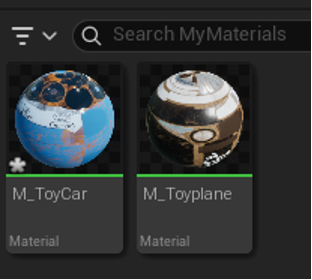
In textures, export your maps from Substance Painter and drop them in (I named mine for clarity). You may also have to go in and change Metallic, Rough, and AO to have sRGB turned off.

In materials, we can create actual material objects with the right click menu. Opening this will let up hook up our textures to the material node and have a fully ready material to place on our model.

And finally, in meshes, import the basic blank meshes from 3DS max, you can double click on this to open a separate window. Here, on the right hand panel, we can drag and drop our fresh material into the slot.


And boom! A completed car in Unreal Engine, made entirely from scratch. Glory shots:

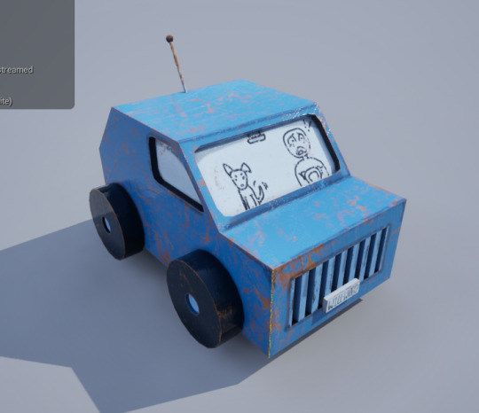

This model might have the better half of the day to create, but it was satisfying to bring all the parts of the work flow together after doing them all separately over the week. I can definitely see how it's a 'the more you do it, the faster you become' thing. ..............................................................................................................................
0 notes
Text
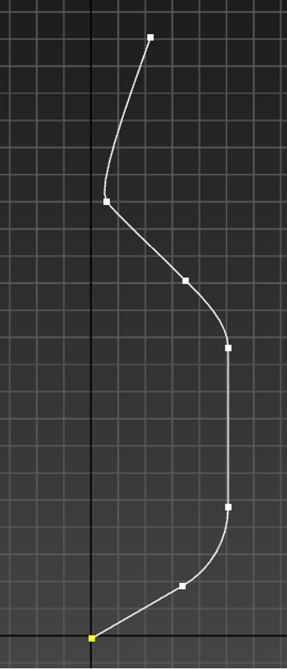
Line Tool Returns
Like the hydra rearing its ugly head from the decapitated stump of its predecessor, the line tool has slipped its way into the games stream like an unwanted parasite. This tool, as many of my classmates would agree, does nothing but cause pain and strife– and it's reason for existing is like a cruel prank that doesn't know when the bit has ended.
..............................................................................................................................
So to make many types of winding cylindrical objects such as houses, cables and industrial piping– the go about way is using the line tool– which does as stated in the name. With a few clicks (or clicks and drags) you can easily create an easy tube in whatever winding pattern you want.
It's located in the panel next to the create tool, one we haven't accessed yet. It allows you to work in the 2D rather than the 3D, which proves helpful for objects requiring or utilizing the lathe. Finding the line tool (even if I'd prefer it stayed hidden):

After completing our shape, we have the option to join it up at both ends by simply clicking them together– or you can leave it as an open shape and right click to unselect it and stop drawing. From their we can change the viewport on the right hand side to make the actual cylindrical shape far more visible (rather than just a small line).
Enabling viewport:
There are many little changes we can make here, like changing the size and making the shape appear more smooth or janky, or how many faces are on the cylinder itself. It is also still editable while in this form. By selecting the vertices menu we can highlight the vertices of the line and move them around in both the 2D and the 3D space. Our line creation:


Theres also this helpful drop down menu that will allow you to change the vertices and what kind of angle it is. Changing a vertice:


Using these skills we can then create a variety of objects. Especially using the lathe– with is essentially a symmetry tool. The only extra add on is the shell tool, which turns one sided polygons to. double sided.
First we create out shape on one side using the line tool. It starts angular, but then using the vertices tool we can select each vertice and apply a fillet– which will curve out the edges we want.
The starting line:

Then we apply the lathe, once we're sure that we like the initial curves. We can add this through the modifier panel, just like many other things we've been using for the modelling. We can then toggle on the option that allows us to go down the menu and select the base line, while still seeing what the end product looks like.
Lathe'd up:


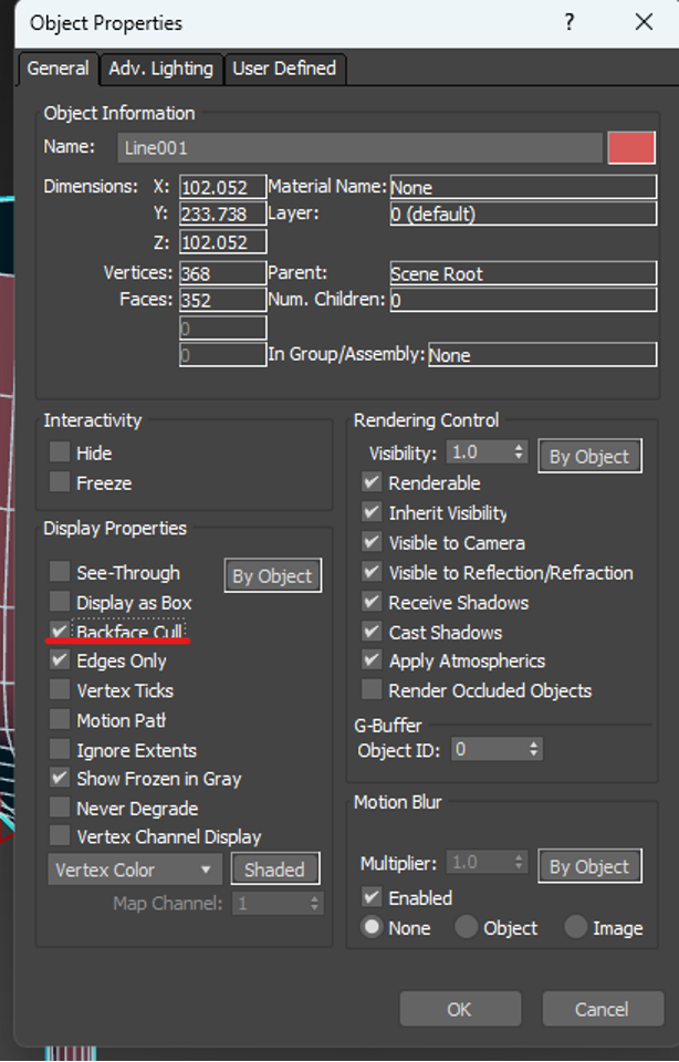
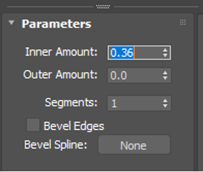
In object properties, we can check for artifacts by turning on the backcull, which means we can see how the object would look in game without the black- unrenderable back of the item. We can then apply a shell to fill out these unrendered spaces, this can be adjusted in the side panels of 'outer amounts' and 'inner amounts'. Backculling and shell applications:
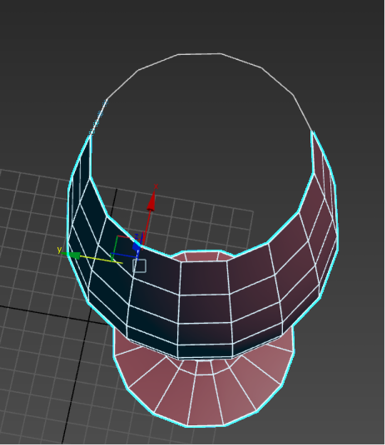

We then repeat this process for most objects like this that we want to lathe and shell. Here are a few examples of what I made following this same formula. Examples I created:


Honestly this process was insanely easy to get the hang of. I actually enjoyed using the line tool for once in my life despite its horrid nature and the reputation that proceeds it.
..............................................................................................................................
0 notes
Text
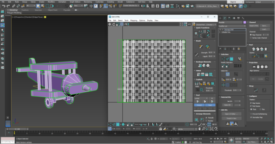
Texturing
For texturing. We export our model from 3DS Max and open it in an application called Substance Painter. To my absolute delight, Substance Painter's workings is extremely similar to my drawing program that I use for all of my digital art! The masking system is identical, as well as the layering and adding additional textures for depth. This makes colouring the model a million times easier, and reduces my own stress drastically.
Substance Painters substantially better layout:

The first thing we did was make sure the right maps were imported onto the model. As well as the normal map, we also wanted to ambient occlusion (AO) and curvature maps. These help with things such as shader depth and accuracy. We also cranked secondary rays up to the max. The settings applied:


With everything in place we can then start adding and masking layers. Starting with a bottom texture and block colouring certain parts of the mesh with the polygon select tool. In simple terms, we create a layer labelled after the part we're colouring, then make it a folder– within that folder we can create a fill layer and mask it. Mask us to focus on specific parts using dark and light values.
Colouring:


This makes blocking out the basic solid colours incredibly easy! You can see I also utilized the paintbrush tool to draw on the side of my plane (on it sown layer of course). The block out for the colours:

Then, to textures, whether it be to the main body of the plane or the metal parts, we can use an option on the bottom right hand corner that will allow us to generate a material like texture using out maps. We can simply attach this to our fill layer.
Adding the generated texture:


This allows for manipulating the wear and tear using the settings that appear in the menu of the generator. We can actually copy and past the Generator material in the places its required. That left me with this. Though it is not rendered as of now, it still a decent enough product! Textured model before rendering:


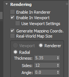
The final part. is to take it to the rendering panel in the top right (the little camera icon) and mess around with real-world lighting. There are several settings to chose from and each are fully customizable to suit your needs or vision of the end product. The render is the best to put into portfolios!
All the settings come with photography-like alterations. Its a simple drop down panel that can be enabled by ticking the associated box. You can also edit how long it takes for the model to actually render after adjusting the viewport camera. Altering the available settings:


In the end, you have some studio-like shots, with some snazzy lighting. I did end up keeping mine on a plain (no pun intended) background. The final result!:

But heres the final result! I was very proud of it and insanely blown away but just how easy it was when you broke it down and did it in sections. I think the version of me doing the certificate would have been proud (and honestly, hopefully, a little shocked).
..............................................................................................................................
0 notes
Text
Unwrapping the UV
After completing the model, it was time to move over to unwrapping it in preparation for texturing. 3DS Max has an unwrap tool within it, so we won't have to move programs to achieve this– though that is an option for more advanced modellers.
..............................................................................................................................
We start by selecting the model and moving over to the same modifier panel that we found our symmetry tool in. Here was can search for 'Unwrap UV' and then open UV editor with the subsequent pop-up box. Accessing the UV unwrap tools:


This will present us with a new, busier, window. This is the workspace that we'll be unwrapping the UV in. It is fully customizable, but I kept my simple enough so I could easily access both the model and its UV.
Right off the bat, the green seam lines on the plane are visible. Something that will become a key component in sorting out each mesh piece. The workspace:
Because we're working in a 2D space, we flatten the mapping using the drop downs on the top of the screen. Which turns the layers of lines into a semi-cohesive layer of lines. There are all the parts of our plane, ready and waiting to be sorted out by hand. A definitely NOT scary UV auto-unwrap:

To rifle through this and pick out what we want, we can go to our model, and select whatever part of the plane we want, which will highlight it in the UV so we can move it aside to work on it. Selecting parts of the plane:
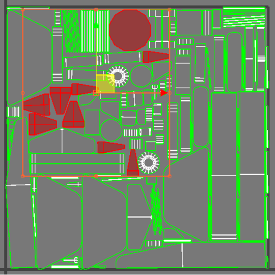
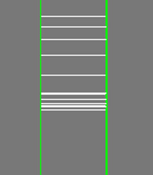
A big part of laying out a UV is stitching pieces together to remove unnecessary seams. Luckily, this is easily laid out on the unwrapping window, and requires only a few clicks. By selecting the edge tool, we can select the parts of specific pieces we want to bond together. You can see here that I bonded several smaller strips into one long strip, which saves me pixel room on the layout as well as saves me pain when it comes to texturing later on. This process gets repeated for ALL necessary parts of the model. No skimping out! How to stitch:


After what may feel like several years, the mess of parts will turn into a far more pleasing spectacle to look at! I mean just look at how satisfying that is. The UV layout of the century:

And though everything here here is technically completed, there is still a few extra steps we can take to really maximize our outcome, and as someone who is all for aesthetics, you know I had to do it.
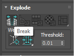
If there is an ugly seam in a very visible place, say, the rods on the wings, there is a way to alter where the seam itself is placed. Begin by click the edge you want to transfer the seam to on the physical model, which will highlight in the unwrap. Then we can use the 'break' button to transform it to a seam.
Transferring the seam position:

From here, it's as easy as selecting one of the previous end seams and using custom stitch, and voila! Now your ugly seam is hidden. Honestly this was underwhelming easy. The corrected seam:


And, just as a precaution, we can check how textures will appear on our model with an inbuilt projected pattern. In the top right theres a little option to enable and disable the feature, and upon enabling it you can easily see if your model has any form of distortion visible. As you can see, mine does not. Checking possible distortion:


Now to move onto the real fun stuff. The texturing!
..............................................................................................................................
0 notes
Text
The Model Model!
The 3D modelling part is officially over! Now all it needs is a bit of unwrapping and texturing (oh dear god). But, aside from that, here is the end result of our first ever ADT1 class! I have to say, I was pretty happy that we got it all done in one day, it was a nice way to wake my brain up and get me back into the swing of things. My fully hand-modelled plane:

I think my favourite part about working in 3DS so far, is that each new mesh is a different colour. That makes pulling together a model a million time easier. In Maya it was all the same shade of grey unless you went into a few drop-downs and made the mesh it's own object– this is supremely better on both my eyes and my brain!
..............................................................................................................................
0 notes
Text
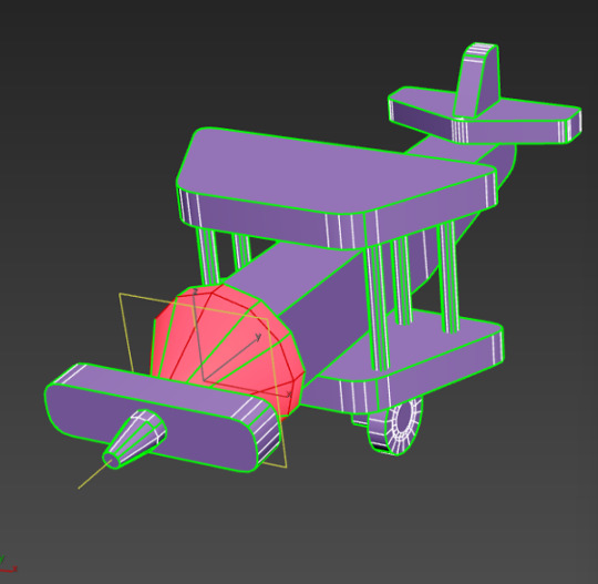
Finishing Touches
For the last few modeled parts, I thought I'd pull them all together, since they are rather short 'n sweet.
..............................................................................................................................
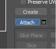
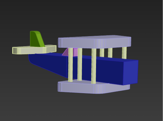
For the rods on either side of the planes wings, we duplicated a cylinder three times, spacing them out into a triangle shape. Then, with one cylinder still selected, we navigated to the right side of the screen and clicked the 'attach' button. We could then go around and click the other two pillars. This would combine the meshes together. You'll be able to tell if this endeavor was successful by clicking one of the pillars and having all three light up. A successful combining:

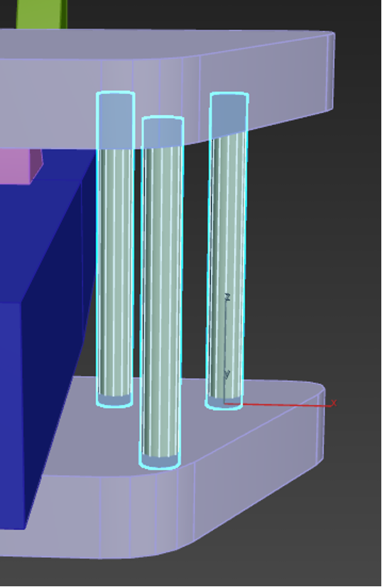
Then all that had to be done was mirror the object, which had to be done in a way that felt rather non-intuitive, but worked none the less.
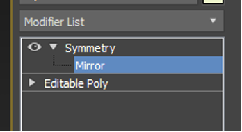
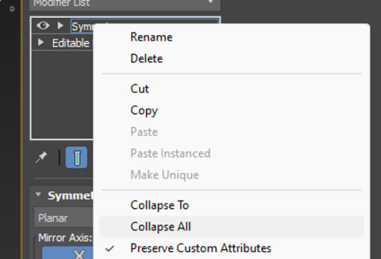
By accessing the 'modifier list' above the objects parameters, we could click the inbedded list and scroll through till we found symmetry. Once symmetry was added above our object mesh, we could click it's drop down and select mirror. Then using W,E,R, it's as easy as pulling on the mesh which will essentially duplicate it, but mirrored. To clean up, we can also collapse (basically a fancy way of saying merge) the symmetry drop down into our mesh to solidify it into one object. The many, many drop-downs needed to get there:
..............................................................................................................................
For the wheels and axle, we stuck a box on the underside of the bottom wing and added two cuts into it using the connect button (just like we did for the plane body). This time, instead of sliding the cut, however, we pinched it instead, allowing us to manipulate it and move it equally across the box. Cuts made in equal measure:

From there, we extruded the two faces either side of the cut, which adds protrusions to the original box shape, something I was familiar with thanks to last year. The height could be adjusted, and then I chamfered the edges for that nice rounded appearance.
Side note: Extruding is ten times easier in 3DS Max apparently. It tended to just... break a Maya model. Extruding protrusions:

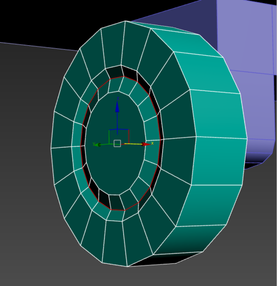
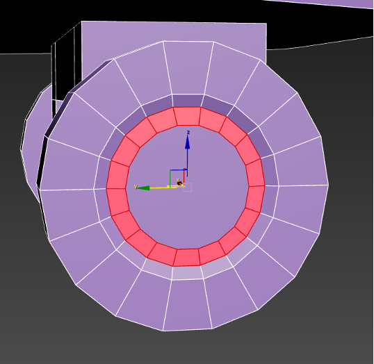
Adding the wheels was simple. All we had to do was add a large cylinder, and inset three inner circles into it– another option that becomes available through the click of a button once the item becomes a polygon. All of this was create the illusion of hubcaps and depth on our wheels. Adding insets to the wheels to create a hubcap:
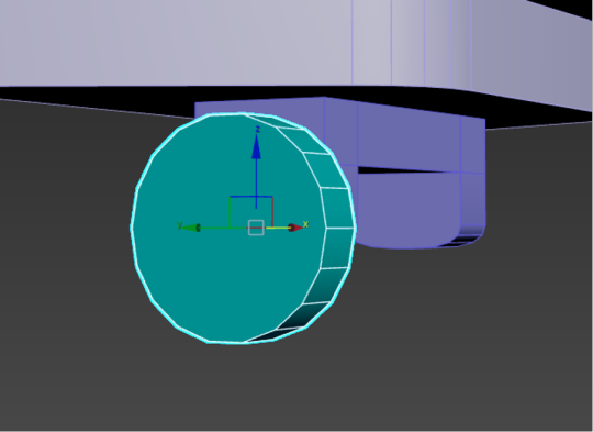
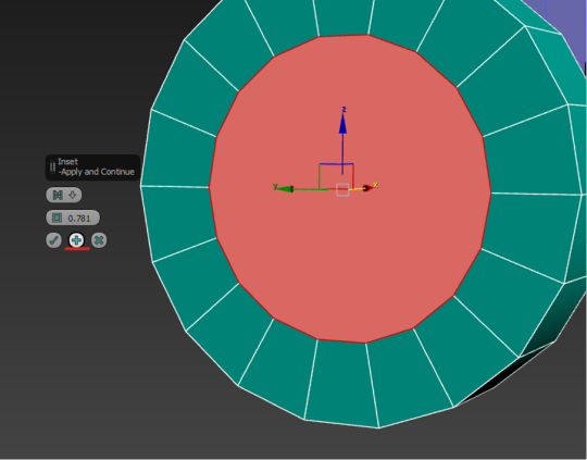
With three insets, I could double-click and use W,E,R to drag back the middle on to create a nice hubcappy illusion. I was pleasantly surprised at how nicely this worked.
The single wheel could then be duplicated and flipped using W,E,R. I chose to snap mine to my plane for accuracy, though it could have just as equally been eyeballed. A hubcap!:
And, for a little extra flare, we smoothed out the faces we created, to get rid of the janky hard-edged looked. This was as simple as selecting the ring of faces we wanted, and going to the bottom right to apply an auto-smooth. The smoothing process:

..............................................................................................................................
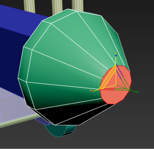
The final little pieces were the front cone and propellers! The propellers were easy, just another box that got the chamfer treatment, but the cones were actually a little different.
Instead of using an actual cone primitive shape, we used a simple cylinder. By cutting a connecting loop into it and sliding it down to the base, we could then select the front and scale it using W,E,R. This was the top wouldn't be entirely pointed! Though be sure to use the triangle between the side and up arrows, this ensures you'll pull the mesh in and down in a pinching motion.
Cone-ception! It's actually a cylinder:

..............................................................................................................................
0 notes
Text
Snapping Gives You Wings
To make this plane more plane-like, we're going to add the first of two wings onto the bi-fold. Utilizing the same auto-grid, we create a box roughly where we want the wings to be, doing the usual parameter adjustments.
Here, you can see a new tactic come into play. Once the box is an editable poly, we click either edge at the corners facing the tail. Then, using the 'R' or the W,E,R keys, we can rescale the corners into a trapezoid shape.
W,E,R in work:


From there, we can chamfer out the four corners by mass selecting them to apply the same level of curvature. We can then duplicate the curved wings by holding shift and moving the mesh downward. ..............................................................................................................................
This is where a curveball comes and whacks us in the face, however. Because things just went from a stroll in the park to a stroll through hell. Since the lower wing is resting on the model in a fashion where it being slightly intersected with the main body of the plane would look atrocious, we need to snap it to the planes body mesh. Doing this requires moving the pivot point and snapping it to the nearest vertex.
By moving into a settings option along the top of the screen, we can find a grid snap window. Opening this, we need to enable a tick box to enable axis constraints in the 'options' subsection. This is so we can more easily navigate and maneuver the object when in snapping mode in the future. We can then go to the 'snaps' subsection and make sure vertex is checked. This will make it so that the object will only snap to vertexs when moved. The snap settings:


The last thing we have to mess with in settings is on our mesh we want to snap. By selecting the wings and going over to the second box from the 'creation tab' (the plus mark, under which we can make more primitive shapes) we can find a button. Clicking it to turn it on will make it so that the W,E,R gizmo changes appearances, and we can lift it to the top of the object and snap it to the closest vertex. The final setting:
From there, its a case of clicking and dragging the mouse to a known vertex (corner) of the object mesh you want to snap to, in our case this is the body of the plane. A green line should appear to confirm our trajectory. The snap'pening itself:

After all of that faff, you now have two objects that are connected perfectly to one another! This was a confusing (but rewarding) hurdle to tackle, and though it made my brain melt slightly, I hope that by documenting it as thoroughly as I could that I can use this as a callback reminder whenever I need to. ..............................................................................................................................
0 notes
Text
The Devil's In The Details.
Now, for additional pieces like the cockpit and tail wings, it's a definitive rinse and repeat process, so to save you the boredom of rereading the same thing multiple times, I'll just give a basic summary of the process.
Shape and size a square using the auto-fix feature, which will allow you to draw it right ontop of the panes body (it's a tick box option on the right window that is already ticked by default). From there, make it into an editable object and add a chamfer to the edges needed.
Remember we are making a TOY plane, no kid should be playing with sharp wooden angles, and if we're going for a worn down and loved feel, the edges would be soft from years of usage.
The tiny cockpit:

Since these meshes are resting on the main body of the plane itself, hidden and unseen faces can be deleted to optimize the polygon count. This is a tactic used by game studios to both decrease their workload and increase efficiency. Something we were taught last year.
3DS Max has a unique feature that helps with isolating meshes, which can become incredibly useful when working in an already crowded environment, or to see the hidden underside of things!
By selecting an object and hitting right click, you can find an 'Isolate' option in the menu. When applied the selected object will become the only viewable mesh in the scene. This mode can be toggled off using the same right click.
The literal 'Isolation' button:

After doing the same process a total of three times (adding boxes, shaping boxes, and optimizing their poly count), I came out with... this thing. I will admit, I was skeptical. Because this? Is not a plane. By any stretch of the imagination.
A.... plane?:

Regardless of what I thought, we moved right onto the next step. Adding the wings! Which would employ new tactics such as object snapping and the symmetry and mirroring tools.
..............................................................................................................................
0 notes
Text
It's All Boxes? Always Has Been.
The creation of this plane started with it's main body, which began as a simple rectangular box. Throughout it's construction, I found it incredibly amusing that so much of this toy could be made just by manipulating the box primitive.
..............................................................................................................................
Going In Tail-End First
We started with a simple rectangular box. After finding the right adjustments in parameters, that is when I converted it to an 'Editable Polygon'. This is when the true magic takes place, as it would allow me to start using the sub-tools I previously. discussed. Either by right clicking the rectangle mesh or going to the onscreen menu on the right, it will give you the option to convert it, as shown below. Making the box an editable polygon:

Since the body of the plane we were modelling our own after, had a slight lift toward the tail end, we could need to add a 'cut' through the object, giving us more vertexs and edges to manipulate. The term to 'Cut' is ingrained into my mind from using Maya, even if it isn't the term used in class. This is because it's practically the same thing, just labelled differently (so forgive me if my language sounds incorrect or off, it is simply how I remember it).
To make the connection, select the four edges of the main body and use the 'Connect' button up in the top right. For now, we don't need to pull up the more detailed menu and can instead use the shortcut. Slicing the box up:


You can see here that now the mesh is spliced in half. With more faces to work with, the act of lifting the tail end is as simply as selecting the bottom left face (at the front) and raising it. A reminder that to raise something, we use the W,E,R commands, more specifically the 'W' which alters the direction. The tail-lift:

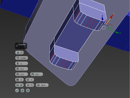
We're not done here, however. We don't want the end to remained squared off now it's lifted upward, since it would look both inaccurate and ugly! Now is when we explore the uses of the 'Chamfer' settings.
Now when working in Maya last year, the rounding out of objects like this was used by 'beveling'. At first I didn't really understand the distinction between the two, but after a quick google, I came to the conclusion that Chamfer is like bevels more precise older sibling. A bevel is basically just cutting a slope, whereas chamfer is cutting the edge to create a more rounded appearance. The more you know!
So I chamfers the end of my plane. All that you need to do is select the edge you want to apply the setting too (can be multiple), and click the chamfer button in the top right. Accessing the menu will allow for alterations and precise finnicking with the chamfer edge itself– such as how tight it is or how many edges its converting into and how far to spread them apart.
For now, we mostly utilize the highlighted settings. The edge count and the distancer. The first curve:


But, with that, the main body is completed, and we can move on to adding the smaller details along the body of the plane. ..............................................................................................................................
0 notes