
Don't wanna be here? Send us removal request.
Statistics
We looked inside some of the posts by medium-difficulty-blog and here's what we found interesting.
Average Info
Notes Per Post
5
Likes Per Post
2
Reblog Per Post
3
Reply Per Post
0
Time Between Posts
2 months
Number of Posts By Type
Text
2
Last Seen Tumblr Blogs


Fun Fact
Tumblr’s website traffic is steadily declining.
Text
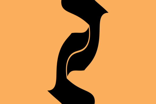
Flags for Lower Egypt
I recently became enamored with vexillology, the study of flags. In particular, I found that I really like the Japanese prefecture flags, particularly the way many of them abstract the characters in their names into a symbol, map or metaphor for a quality of the region itself. I wanted to try my hand at designing meaningful symbols from written characters while still being simple enough to recognize on a flag. I thought of the hieroglyphs from Ancient Egypt and wondered what I could do with those. This is the result.

(Also it’s worth noting for any Egyptologists out there that while I did research on each Nome, it was difficult to find a time period within Egypt’s long history where the culture of each one is well documented or noteworthy. I initially aimed to represent early Middle Kingdom, but there may be some anachronisms for the sake of making all the flags interesting.)
Sources: http://www.ucl.ac.uk/museums-static/digitalegypt/maps/nomegeneral.html http://ib205.tripod.com/lower_nomes.html http://www.narmer.pl/map/nomy_en.htm http://www.reshafim.org.il/ad/egypt/geography/cities.htm

NOME 1: This flag contains stylized elements of this nome’s name in hieroglyphs which translates to “White Walls.” The hieroglyphs are distorted to resemble the Pschent, representing its capital Memphis as the seat of power of the Pharaoh.
NOME 2: The elements on this flag resemble the hind leg of cattle, which are derived from this nome’s name meaning “cow’s thigh.” There are two of them because this is the second nome.

NOME 3: The symbol comes from the headdress of Hathor, who represented the setting sun and cattle. As the most western part of the Nile delta and a route through which cattle were frequently transported, this area was naturally a major center of her cult. The silhouette in her headdress comes from the nome’s hieroglyphic name and the background color from the sky at sunset.

NOME 4: The shape comes from the maw of a crocodile, which is the form most frequently taken by Sobek, a guardian deity of the Nile who is associated with this nome. The tan area is a stylized and rotated version of the right-most character in the nome’s glyph meaning “southern.”

NOME 5: The green color comes from the skin of Osiris who was believed to be buried in Sais, the capital of this nome. The arrows and shield come from this nome’s glyph which itself is derived from the headdress of the war deity Neith whose cult was centered here.

NOME 6: The red half-pipe shape and bull come from the nome’s name in hieroglyphics. The sun in the background represents Ra, one of the district’s chief deities.

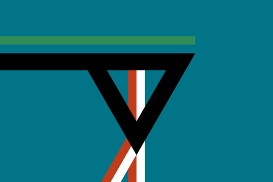
NOME 7: The flower is a papyrus plant. The seven stems on the outer ring represent the seventh nome, the inner blue area represents the seven tributaries in the Nile delta and the center represents Ra.

NOME 8: A center of worship for the creator god Atum, the background represents Atum and each petal on the flower represents a deity from the Ennead (except for the top petal which represents two Gods to match the number of petals to the number of the nome.) From the top clockwise: Shu/Tefnut, Nut, Nephthys, Isis, Set, Horus, Osiris and Geb. The center represents Nun, the state of nothing the world was created from.

NOME 9: The green background represents Osiris, as this nome’s capital Andjet was believed to be his birthplace. The charge depicts an aspect of Andjety, a fertility god associated with Osiris and the 9th nome.

NOME 10: This symbol comes from this nome’s name which translates to “Black Bull.” The blue eyes represent the parting of the Nile, as it is situated at the southernmost point of the delta.

NOME 11: The lion’s paw represents Bastet, Sekhmet, and Maahes, the lion deities worshiped in this nome’s capital, Taremu. The single claw, along with the digit it is placed on, represents the Egyptian numeric representation of 11. The blue background running between the palm and digits of the pawprint represent the many tributaries in the Nile river delta.

NOME 12: The charge represents a map of the capital city Tjebnutjer which is sandwiched between the Nile and Lake Burullus. It frames the Nile as the “mother” of the “lake” to create a visual metaphor using the name of this nome, which translates to “calf and cow.” Additionally, the triangle and the two lines (including the negative space between the water) resemble the Egyptian numeric representation of the number 12.

NOME 13: The circle at the center the flag represents Aten, the sun disk associated with the solar deity Ra, who was principally worshipped in this nome. Aten, combined with the flares, represents the Eye of Ra.

NOME 14: As the easternmost nome, the circular shape and background color represent the sunrise. The other shape represents a sitting lion, which is the form Horus was represented in when worshipped in this region. It also represents Aker, a lion-like deity associated with the horizon.

NOME 15: The head of an Ibis, derived from the nome’s glyph as well as a form of Djehuti, the god of wisdom whose cult was centered here. Designed to resemble a partial eclipse, representing acknowledgement of curiosity, fear and change.

NOME 16: Derived from the name of the nome, meaning “Land of Fish.” The center icon represents the protection goddess Hatmehit, who was often depicted as a fish. The upper and lower wave represent the Nile during its flooded and normal states.

NOME 17: This flag’s elements come from the nome’s glyph. Containing a major cemetery and temples from across several dynasties, the charge is symbolic of the passing of ideas from one generation to the next.

NOME 18: This nome’s capital is the center of worship for the cat goddess Bastet. The charge is a ceremonial sistrum often she often holds in depictions. The crossbars form eight protrusions, which along with the frame acting as the Egyptian number 10, represents the number 18 for this district.
NOME 19: A stylized version of the Eye of Horus. The colors represent the triad of gods worshipped in this nome: Wadjet (blue and green), Min (black) and Horus (red and white). The nine lines along with the triangular arch (10) represent the number of this nome.

NOME 20: The charge is based on the plumed falcon from this nome’s glyph. The two feathers are hollow to represent the Egyptian numeral for 10, indicating this as the 20th nome.
5 notes
·
View notes
Text
Why Ludwig Wittgenstein would love Super Mario 64
Super Mario 64 is the first game I ever played, so I suppose it is a fitting subject for my first post. Despite having a visual aesthetic which has aged like store-bought strawberries, it remains one of my favorite games of all time because to this day, there is still much we can learn from it, and many games continue to do so. I have a lot to say about this game, but I think what I’d like to talk most about is how and why it was so successful in making the shift to 3D and how it made its intricate control scheme so approachable.
Whenever a new technology goes mainstream in the game industry, there is a honeymoon period in which developers experiment with a wide variety of new ideas, learning what works and what doesn’t. We saw it with touch screens, we saw it with motion controls and now we are seeing it with VR. In the case of Super Mario 64, as a launch title for the Nintendo 64, it carried the monumental task of introducing a generation of gamers to polygonal 3D and analog controls. If you are curious about how successful it was, you need only look at the controls and camera of every game with a third-person camera that has come out ever since because the pedigree of Mario 64′s formula is still going strong. So how was Nintendo able to completely overhaul the design of their most popular franchise to date and completely nail it the first time?
Why 3D?
Let’s start by delving into the challenges of 3D game design compared to those of 2D game design. One of the primary benefits of 2D game design is that the player’s options are much more limited, meaning player behavior is much more predictable. I won’t bore you with yet another thorough Mario 1-1 deconstruction, but the opening to the original Super Mario Bros. is a quintessential example of using a player’s limited range of options to teach them the game’s mechanics. The player can’t progress without learning to jump over the goomba. With such a limited set of abilities and options, it is easy for the designer to know what the player knows at any given time, opening the game up to be more focused and more physically challenging. This is why so many early games got away with being so hard.
As for 3D game design, the foremost benefit is that humans intuitively think in 3D because we live in it. Even 2D games make some concessions to fit a 3D mindset, such as implicitly being able to jump on top of a platform that is drawn behind the player’s sprite. In 3D, you don’t have to teach a player that they will land on an object that’s directly below their character or that they won’t land on something that’s in the distance. That’s just how our world works, so why wouldn’t we expect the same for this fake one? The challenge with 3D, or at least Mario 64’s idea of it, is less one of the player’s intuition than one of the player’s information. Once you give the player control over their field of view, you lose the ability to know what they are seeing and where they are going at any given time. In 3D game design, teaching the player where to go becomes harder than teaching them how to get there. That doesn’t even cover the new complexities that arise for the controls and spatial recognition. How does the player control the camera and movement at the same time? How can one judge distance without depth perception? And when all is said and done, this doesn’t even address the most important problem, which is the problem of engagement. Why is this fun? Why bother making a game in 3D if it has nothing to add beyond complications for the player and designer?
To understand Nintendo’s answer to this question, simply compare the opening of Super Mario Bros. to the opening Super Mario 64. The former is a funnel of challenges while the latter is a playground of options. Off the bat, Mario 64 has no enemies, no bottomless pits, no time limits. Just a big, wide open space. Once the controls are handed to the player, this is the first screen they see:
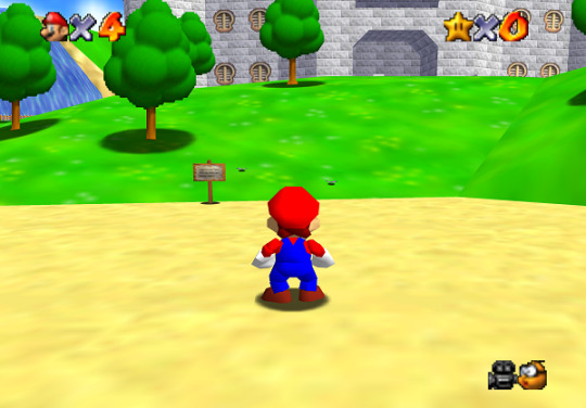
In the opening, the player is instructed to head for the castle, which is visible directly in front of the player. So right away the player has an idea of what their objective is. But wait- the castle is obscured by the hill, yet the path seems to open up to the left. Perhaps I should go that way? Can I climb that tree? What happens if I jump in that waterfall?
Rather than trying to solve or work around the challenges of 3D game design, Mario 64 embraces them as the foundation of its formula. Rather than trying to make it work as a test of reflexes like its predecessors, Nintendo was not afraid to abandon all but the most fundamental characteristics of Mario in order to construct an experience where the player can learn about and engage with the world at their own pace.
Language Games and the Language of Games
In an interview, Shigeru Miyamoto explained that about halfway through the development of Mario 64, the game started to become boring. Moving around lost that thrill it had in the game’s initial stages. The cause was a subtle change in Mario’s turning speed, yet it made all the difference in the world to Miyamoto. This is a phenomenon that is often referred to now as “game feel”, the visceral, qualitative enjoyment that comes from how the game responds, almost as if it were an extension of your own body.
Much of Super Mario 64’s development was focused on this “game feel.” The objective was to make simply moving Mario around the world enjoyable- all else was secondary or contributing to that end. As an avatar for the player, Mario 64 had a substantially more nuanced catalog of actions than any other game he had appeared in previously. Compared to his previous signature actions of running and jumping, Mario 64 added backflipping, wall jumping, long jumping, punching, diving, somersaulting and even crawling.
Many of these moves are superfluous, some are useless, but taking away even one makes Mario substantially less interesting to play as. The brilliance of Mario 64’s control scheme is how holistic it is- how each command further ingrains the rest of the moves. I’m going to explain this, but first I need to take a very hard ninety-degree turn here, so bear with me.
In discussing semantics, early 20th century philosopher Ludwig Wittgenstein believed that many fundamental problems with communication arose because people used words in such a way that escape a single definition, becoming dependent on the context they are used to be properly understood. For instance, it is difficult to find a useful, working definition of “game” which covers both Chess and Duck Duck Goose. But if the speaker says “the children are playing games in the backyard”, it can be inferred that they are using a definition which encapsulates the latter.
In response, he proposed a theory of semantics where language is constructed as a game which he called, appropriately enough, “language-games.” In the same way that playing cards take on different meanings when you are playing Poker or Hearts, Wittgenstein argues that words take their meaning from the common set of rules that participants in a conversation are operating on. When two or more sets of rules are being used, that is when confusion starts to happen.
I believe that the reason Super Mario 64’s control scheme is so easy to internalize is because it treats the underlying mechanics much in the same way Wittgenstein defines a language. It doesn’t ask the player to see the control scheme as a big predefined dictionary of moves, but rather it allows the moves (i.e. “meaning”) to emerge from how the input associates to the current context. In other words, while each button has a variety of effects that depend on Mario’s situation, the utility is almost always the same. There are many different ways to jump in the game, but all of them use the A button. There are many ways to directly interact with objects and enemies, and all of them use the B button. Not only does this reinforce the expected outcome of each action, but this means the player does not have to hesitate to press a button. Since they know the limited range of actions associated with it. For instance, the C buttons and R button are reserved for camera controls, so the player does not have to worry about causing Mario to move if they want to adjust the camera. On top of that, this mental model creates an intuitive chemistry that new, predictable actions can emerge from. For instance, since Z makes Mario crouch to the ground and the control stick makes him move, using them together to make Mario crawl is a completely logical outcome. While crawling is rarely useful (and tedious even when it is), the existence of the move adds more meaning to both the Z and the control stick and reinforces their respective purposes in controlling Mario.
The Control Chemistry of Metal Gear Solid
As a contrasting example, let’s look at how this describes a game with a bad control scheme: Metal Gear Solid. Both games were made in the same time period, yet only one of them can I go back to and immediately pick up and play as if I only just played it yesterday, and I’ll give you a hint: it’s not the one I just spent a dozen paragraphs talking about why it holds up so well.
In all fairness, Metal Gear Solid is a much more complicated game than Super Mario 64, with tactical thinking and inventory management, so the controls are attuned to work in a wider variety of contexts, such as navigating item menus and aiming weapons. Having multiple interfaces can be useful for crafting a particular experience, but Metal Gear Solid struggles to make them work together intuitively.
For instance, holding the L1 and R1 buttons allows the player to scroll through their weapons and inventory respectively. Unless they are in first person mode, in which case they let the player lean to the left or to the right. I don’t know about you, but I don’t find First Person + Check Inventory = Step to the Right to slips into my brain quite as easily as Slide + Jump = Long Jump. If I forget this little exception, Snake responds in a way that I don’t expect. When it comes to judging games on “game feel”, the character not responding to my input is bad enough, but doing something completely different from my immediate expectations is major points off.
That’s a small example, but even the general behavior of the game when switching between these control modes is very unsatisfying and undercuts the flow of play. The game pauses when the player scrolls through their inventory. Additionally, the third person camera is at a fixed angle while the first-person view is not, so switching between them can be very disorienting, as the player may forget which direction Snake is looking in.
I think most of these control issues stem from the fact that Metal Gear Solid’s creators weren’t so bold to do what Mario 64 did which was rework the design of its predecessor from the ground up to accommodate a new dimension. The camera angle, menu design, movement controls and core mechanics come straight from the original Metal Gear games, but new features which benefit from the 3D environment such as the first-person mode appear to be design afterthoughts. I would propose a better control scheme to illustrate how it could have been better, but I think Metal Gear Solid V already offers a much more actualized interpretation of Metal Gear Solid 1’s design. By favoring experimentation and exploration over challenge, it is better adapted to the advantages and disadvantages of 3D game design. Allowing the player to sort their favorite weapons and gadgets on a quick access wheel solves the flow-breaking menus. Keeping the camera facing the same direction when entering the first person-view makes examining one’s surroundings much cleaner. And above all, even despite the vast array of options, the interplay of the game’s mechanics has a much more meaningful chemistry. For instance, Metal Gear Solid V adds the ability to stand up, move freely and even dive in your cardboard box. It’s about as useful as Mario’s crawl in the grand scheme of things, but it adds greatly to the experience. It makes the controls seem more responsive since they can be extrapolated into a larger set of contexts, and it makes the cardboard box more interesting because it gives the player an opportunity to experiment with more choices and actions. In other words, it extends the language of the game.
Conclusion
I think one of the measures of a great game is how fun it is to play when you aren’t actually trying to achieve anything. While more recent games have improved on Super Mario 64’s design and controls, the fact that anyone can pick up and learn how to navigate the game world even if they haven’t played a game in their life makes it a timeless experience.
You could argue that there are some exceptions where unintuitive controls can benefit a game, like when the underlying challenge of the game is master them, like Octodad or QWOP, but in general, it helps to look at your game’s controls like a language for interfacing with it. When presented with a large space of options, humans tend to think more abstractly than concretely, so the best interfaces are ones that are modular enough to work in an expected way in any feasible situation. “Jump” or “Shoot” doesn’t always mean the exact same thing inside the game, but in the player’s head that makes little difference. Ideally, a controller should feel like an organic extension of the body, creating as little friction as possible between the player and what they want to do in the game world.
0 notes