
Don't wanna be here? Send us removal request.
Statistics
We looked inside some of the posts by meeth-designresearch2 and here's what we found interesting.
Average Info
Notes Per Post
3
Likes Per Post
3
Reblog Per Post
0
Reply Per Post
0
Time Between Posts
5 days
Number of Posts By Type
Text
17
Last Seen Tumblr Blogs


Fun Fact
After the announcement of the deal with Yahoo!, there were 170K signatures of unhappy Tumblr users petitioning to prevent the sale in 2013.
Text
The Image
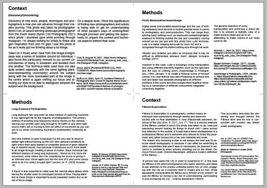
The image component of this assignment was really interesting as it allowed us to illustrate and showcase the concepts and ideas we were talking about in our cards + what we want to explore and demonstrate something of our own. I chose a photo that I had taken earlier in the year before the lockdown as I felt that it portrayed both my contexts and methods used in my critical commentary more effectively than any other work I have done during this semester. Also chose this particular image as I wouldn't be able to achieve the full potential of using these contexts and methods in the current covid environment due to restrictions. This was taken at a pier located near St Marys Bay in Auckland.

I used these slides from the week 11 presentation as a foundation to understand by what means this image could represent my ideas and how it could communicate what kind of things I would like to explore next year. I am also happy that I got the opportunity to use this image as I decided to not post it on my Instagram as I had already posted a similar photo from the same location. So this photo was just lying in my folder but I am glad I could use it for this assignment as a piece of work I could de-construct and analyse to get me thinking about my current and future practice.


0 notes
Text
Post Cards + Commentary
After getting feedback from James from the formative, I restarted the writing for all cards and also the commentary as I now had better understanding of what I needed to include and focus on more. In terms of the critical commentary, I decided to start that from scratch again as well as I didn’t have a clear understanding of what I needed to write before. After my doubts got cleared and I knew what I needed to do, it became more easier to write and this made my writing flow better while letting more academic sources inform my understanding of my contexts and methods, and how they relate to my work, and what I would like to do more of.
0 notes
Text
Critical Commentary Resources
Used these exemplars to get an overall idea of how to structure my commentary abstract/paragraphs/conclusion.


0 notes
Text
Resources used for improving Postcards
Along with James feedback, I was also going through all the slides and presentations shared with us throughout the semester that would come in handy which would strengthen my writing and thinking process for my context and methods postcards


0 notes
Text
Working on Feedback
Development of my postcards,
- adding in-text references
- including more academic research into contexts and methods
- deeper analysis

This also gave me the chance to select which contexts and methods I would examine more deeply in my Critical Commentary. I chose the following
Context
- Discovery (lots of things to talk about and it’s essential to any kind of practice but at the same time very applicable to photography/design)
- Flâneur (new term I was introduced to, would allow me to learn something new but still be relevant to the work I’ve done and would enable me to make connections with my own practice)
Methods
- Points of View (the kind of method that not a lot of people may pay attention to (could be the creative and also the viewer/audience). So bringing it to light and examining it’s significance to practical and theoretical contexts and how it can be used to create something unique)
- Photo Manipulation (this method is pretty well known amongst today’s audeince and I selected this as my second method as I want to dive into how it’s considered a regular practice in regards to the post-production of images and the positive and negative impacts it can have on our work)
0 notes
Text
Feedback from James
Got some useful feedback and links to resources from James and went through all of them and carefully extracted excerpts of what I thought would be useful for my commentary as academic sources to back up my thinking.


0 notes
Text
Critical Commentary Draft
This is still in early stages. I was struggling to write my abstract as well as Paragraph 3 and 4. I think I’ll get a clearer idea after I get feedback. This is what I have for now.


0 notes
Text
Luke Nicholas - Methods Example
One of the photographers who photo I chose for the postcard set is Luke who’s shares his methods on Instagram of how he takes the shot and the settings he uses. This is the reason why I chose to write about Methods for his photo instead of context.


0 notes
Text
Thomas Luethard Research Resources
Some resources I used to gather information and learn more about Thomas Luethard who’s work I used in my postcards.
https://twistedsifter.com/2016/05/23-street-photography-tips-by-thomas-leuthard/
https://www.flickr.com/photos/thomasleuthard/page1
https://gigazine.net/gsc_news/en/20160525-photo-walk-tip/
https://www.youtube.com/watch?v=w4uUjLt22gE
https://www.streetsoulphotography.com/interview-to-thomas-leuthard/
1 note
·
View note
Text
Research Resources
Some resources which are helping me connect ideas about methods + contexts
https://www.spaceandculture.in/index.php/spaceandculture/article/view/92/55
https://www-bloomsburydesignlibrary-com.ezproxy.aut.ac.nz/encyclopedia-chapter?docid=b-9781474294140&tocid=b-9781474294140-chapter18&st=landscape+photography
Using some of these sites suggested by James for visual inspiration/finding images.
https://commons.wikimedia.org/w/index.php?search=photography&title=Special:MediaSearch&go=Go&type=image
https://library-artstor-org.ezproxy.aut.ac.nz/#/home
https://digitalnz.org/records?text=photography&tab=Images#/
0 notes
Text
Kati Rubinyi Website
This is the Kati Rubinyi’s website on the book I selected, has some additional information which is useful
https://www.printedmatter.org/catalog/tables/122/23866
0 notes
Text
Rediscovery

While doing the postcard task, I rediscovered some photographers who’s styles are very similar to the photographer from the book I selected. I’ll be listing their names below so I can come back to it and look at their work again. These photographers have also somewhat given me inspiration for my own work in the past.
- Thomas Leuthard
- Clarissa Bonet
- Chuck Jines
- Ronya Galka
- Daniel Antunes
0 notes
Text
Keywords
- Modern
- Abstract
- Strong Contrast
- Urban
- Trippy
- Symmetrical
- Minimalistic
- Futuristic
- Manipulation
- Extending Time
- Vibrant
0 notes
Text
Methods - Identifying the work of others
Luke Nicholas - @SonyNZ Digital Imaging Advocate

Luke is someone I have been following for quite some time now on Instagram. He specialises in Urban, Cityscape & Night Photography in and around Auckland. He has a unique style of editing which can easily be identified once looking through his work and I look up to him as a photographer, he posts a lot of unique and also helpful content for other photographers. The reason I chose this photo of his in particular as it features many different aspects of photography in one image. He’s used a time slice effect, long exposure and had to be extremely patient to get all 8 images then combine them into one. This image consists of 8 separate shots all taken at different times during the sunset. All carefully selected to show the change of light. This was very unique and something you don't quite see often. More of his work is available to be viewed on Instagram - @lukenicholas
Mike - @northborders (Instagram)

Mike is a photographer I discovered on Instagram and YouTube 2 to 3 years ago. He does all types of amazing photography but has a niche in urban, city, and automotive photography. I selected this as a photo to analyse as I’ve wanted to execute something similar but I’m just waiting for the right time and place for it. I think he's based in Melbourne which has a lot of trams and he's used that to create a cool long exposure effect with his subject in the middle. I have also seen him mirroring and blending another image in when he wants a similar look on both sides so that's what I’m guessing he did here unless he got really lucky and two trams actually went past at the same time. Nonetheless, very cool photo, I will definitely be doing something similar personally in the near future.
Badlapur - Bollywood Movie Poster (2015)

I’ve only started really getting into Bollywood movies a few years ago, I’ve grown up watching them. Because of my interest in design, movie posters are things that always excite me. Each poster has it’s own message that it’s trying to convey based on what it’s about. Badlapur is actually a city in the Maharashtra State in India. “Badla” means “revenge” in Hindi and that is basically what the movie is about. It belongs to the neo-noir action thriller genre. The reason that I really like this poster is how the designer has used double exposures to in a way show two personalities/mindsets as a dark silhouette of the main protagonist. The fire on the left is also integrated nicely with a soft edge just to add more energy into the poster. Anger is definitely one of the driving forces that is fuelling the protagonist along with the traumatic events that happened to his family. The striking red font certainly gives the impression of something negative and significant which matches with the rest of the design elements used in the poster.
Fan - Bollywood Movie Poster (2016)

I absolutely love this poster. Both the roles in the movie are played by Shah Rukh Khan who's playing a double role in this movie but with more prosthetics for one of the roles. This movie also belongs to the action thriller genre. If I didn’t already know about the events which occur in the movie I would been interested in finding out if I was looking at it for the first time. The colours play a key part in grabbing the viewers attention showcasing a due lighting effect. It’s showing how both personalities could possibly be contrasting with each other. The shards of glass would also make the viewer wonder why and for what reason it is shown in that way. It creates questions - why? how? who? which ultimately provokes the viewer looking at the poster to watch the movie.
2 notes
·
View notes
Text
Cut then clipped them together
I forgot that all of them needed to be A6 size on the A4 page so their not exactly A6 size and some are a bit bigger - whoops.

0 notes
Text
Printed Out 24 Images
Here is the printout of the 24 images


0 notes
Text
Re-doing the SDL
Since I didn't do the 24 images activity properly, I’ve gone ahead and done it properly with more selective choices. This selection of images is mainly lens based but I’ve also featured some Bollywood movie posters as I aspire to create similar work and I’m always the one to notice the tiny details in the posters, they really interest me. My interest for Indian movies fuels this love for poster design even more. I’ll be picking a few photos/posters from this series and analysing them a bit more to dive deeper into the design heroes/artists methods of working and identifying the context in which they are presented in.
I’ll also be printing these out and trimming each to fit the small pile of A6 images requirement. Also, what my other peers had written on the sheet of paper before similarly follows through here as well but I think since this series of images/designs has more variety, I’ll be able to expand on other keywords that best describe them along with identifying new ones.


0 notes