
Don't wanna be here? Send us removal request.
Statistics
We looked inside some of the posts by megwhalenblog-blog and here's what we found interesting.
Average Info
Notes Per Post
0
Likes Per Post
0
Reblog Per Post
0
Reply Per Post
0
Time Between Posts
3 days
Number of Posts By Type
Text
4
Photo
13
Last Seen Tumblr Blogs


Fun Fact
Women make up for the other 50% of Tumblr’s audience.
Text
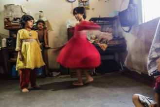
Week 11 Series Update
https://drive.google.com/open?id=1l4hY6f6cHyK3lF7xqPzzu37nQbvch_g0
Reflection on feedback:
Everyone liked my improved series idea. However, two of the photos did not fit the best, so I decided to edit one and replace the other. Overall the feedback was really helpful in forming my final series.
0 notes
Photo
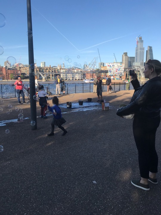
10.6 “The Londoners”
The photograph is one I took walking along the Thames next to the Tate Modern. It was a rare sunny day in London and there were so many people out and about. There are always lots of street performers along the river that draw the attention of pedestrians. Here, there are kids playing with bubbles, which would naturally draw the gaze of those passing by. It’s a pure marvel of childlike fun. And something I’ve noticed about people in London, especially at tourist spectacles, is that the first instinct is to whip out a phone and take a picture of it. In the picture, you see the kids playing with the bubbles framed by two women, one in the foreground and one in the background looking at the scene through their phones. While I was photographing the scene, I wanted to take the picture so that the actual scene takes place between the two filmers – which gives the photo a framed appearance. I included the river and the buildings and sky to create the happy, sunny atmosphere that would draw people outside. I cropped out some of the people on either side, to really focus on the scene.
0 notes
Photo


10.3 “Mirror in the Landscape” Margaret Courtney-Clarke 2015
10.4 “Civilians line up for an aid distribution in the Mamun neighbourhood, Iraq, having remained in west Mosul during the battle to retake the city.” Ivor Prickett 2017
10.5 “Two friends pose for their portrait on the corner of Cornwell and Hercules Street in Woodstock, Cape Town, South Africa.” Alexia Webster 2011
Exhibition Analysis Sheet Cont.
2. From this exhibit, I can see the differences in quality of life in this part of the world. There’s so much pain, but so much beauty. There is so much culture and life beyond just the industrialized world in which we live, and the exhibit gives some insight into the colourful and unique variety of life that we may not know much about.
3. Some of the series you can get a good understanding of what’s going on just from the photographs. But some series are aided by the text for context purposes. For the “Still She Smiles” series, you can view the images and have some idea of the photos, but the text is integral for a complete understanding and appreciation of the work and the subject. Some of the series are more abstract, but for the most part knowing the theme of the exhibition itself gives you a small insight into what you are looking at.
4. I think the whole exhibit is worthy of praise. I think art, and especially photography, is an important medium for communication across different populations of people. This exhibit is more than documentary photography, it showcases insightful and inspiring images tied together by the theme of hope. It highlights differences in people, but ties all these series together with the thread of humanity.
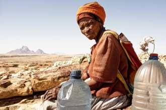
5. The subject is depicted in a very familiar, informal way. The photographer chose to include the background of dry land and hills, and the jugs of water in the foreground. The camera angle is focused on the subject and she is squinting so the light must be coming from where the camera is. This influences how I understand the photo because it is very raw; it is only the woman with the water, squinting and un-posed in the dry land under the bright sun – it makes the woman’s old, wrinkled face look like the mirror image of the landscape. The relationship between the photographer and the subject is informal, and it is a documentary portrait style. The photographer is just sitting beside her also experiencing what she is experiencing.
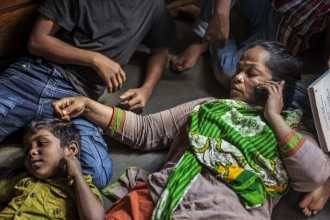
The subjects are depicted from up close. The photographer includes the cramped lines of people, but does not include the full length or where they are eventually trying to get to. The camera angle focuses on the face of the young girl hugging the woman in front of her. This influences the way you understand the photo because you see a crowded line of women with head dresses on, but this tiny girl’s face is uncovered in the midst. It gives you a sense of urgency or concern, and curiosity as to what they are waiting so anxiously for. The relationship between the photographer and the subjects is an outsider point of view. The photographer is not in line, but rather looking at the forefront line and also seeing the second line in the back.
The subjects are depicted in a portrait style. The photographer chooses to include the full bodies of the subjects and the incomplete edge of the wall they are standing against. The focus and light is on the subjects, giving the photo the impression that it is any common posed picture, like the kind your mom makes you take before your first day of school. It influences how you see the image because you get a sense of the difference in society and life in that part of the world. The relationship between the photographer and the subjects is strange – you see the two children standing slightly uncomfortable for the picture – it gives the impression that they do not know the photographer well, or that they are very unused to having their picture taken.
0 notes
Photo


10.2 “Still She Smiles” Shahidul Alam
Exhibition Analysis Sheet
1. The series “Still She Smiles” by Shahidul Alam showcases the smiles and little moments of life for Hajera Begum and her children. I think these photos were taken to exhibit the small smiles and happy moments of a life that can be hard, and remind that there is hope and happiness in people despite hard situations. I think these photos were taken in honor of Hajera Begum because she is an incredible woman who continues to smile despite everything that has happened to her. And I think the photos were also taken for the audience – to gently remind us to be grateful for what we have and be grateful for the things that make us happy in life.
0 notes
Text
Week 10 In Class Assignment

10.1 Dagahaley Aden
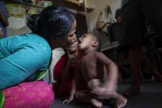
The image illustrates the part of the article talking about malnutrition, and specifically child malnutrition. It highlights just how poignant the effects of the drought are on refugees and focuses on the child to represent the whole of the population, although seeing a child so small and skinny truly captures the malnutrition.
The image presents the article in a very stark light – it puts a face to the words describing malnutrition and visually demonstrates how it could be that child refugees are dying from lack of adequate nutrition. The image makes the comment that here is a child, this is the face of the victims described in words.
The image helps you engage with the text by personalizing the story and the facts and numbers. When you read the text, it is distant information because it talks about a large group of people. But when you see images, you’re face to face with the victims and the problem becomes closer to you because the information is suddenly humanized.
I chose this image out of the four because I found it to be the most striking. It doesn’t just capture a sad face or a fleeing people, it directly shows the shocking effects of malnutrition – and on the most vulnerable victim, a child. The other images illustrate the fleeing from land or the refugee camps, but this image is singularly on the bones of this poor child – and that to me highlights what the text was saying about the death of child refugees due to malnutrition.
0 notes
Photo
9.3 Dora Maar Inspired Photo
9.4 Cropped Photo
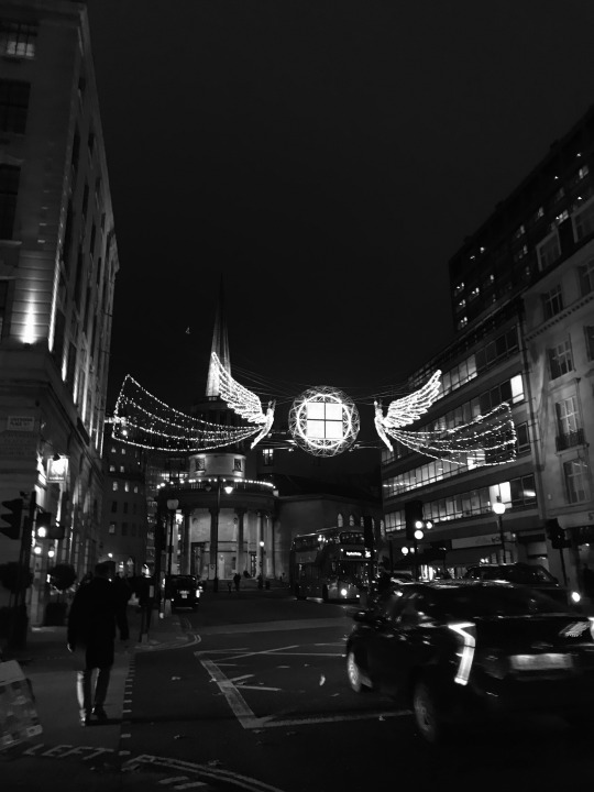
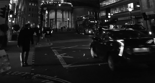
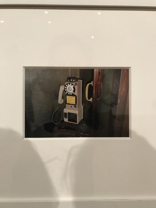
“First Holiday in London”
“Sunset at 4:13 pm”
“Nightwalker”
The original photo is of the street outside Regent Campus. I took this the first night the Christmas lights were put up – I had a mixture of emotions because I love the holiday season, but yet there’s no snow and it doesn’t feel like Christmas yet in part because I’m not home with my family and friends in the US. Making this picture black and white made the lights pop while also creating a shadowy darkness. The three captions that I would give to this picture that all capture different meanings are “First Holiday in London,” “Sunset at 4:13 pm,” and “Nightwalker.” The first caption “First Holiday in London” captures some of the tourist marvel at the street lights – it is really incredible to witness every street lit up like this for the first time. This title also hints at some sort of nostalgia for home though because it makes the viewer wonder why is this the first holiday here? Where are her holidays usually? The second caption “Sunset at 4:13 pm” captures a darker mood of the photo. I had just gotten out of class a little before 5 and it was already dark. The early sunset really messes up my head honestly and I think the photo captures exactly how strange the early sunset is because there are so many people walking around and so many cars about. It also hints at the winter time in addition to the lights because of the time of sunset context. The third caption “Nightwalker” gives the audience a sense of a captured moment in what it’s like to walk the streets at night in London – there’s always lights on and cars and people walking around no matter what hour. In the cropped photo, I cropped out the Christmas lights above the street, which takes a lot of light out of the scene. Now it simply looks like a dark London street at night.
0 notes
Photo


9.1 “Untitled (Sphinx Hotel)” Dora Maar 1935
The focus is on the “Sphinx Hotel” sign on the building, which gives the effect of the people in the background just being part of a collective mass of tenants in the background. The contrast is not super high, which makes the photo look like a soft, old memory. The camera angle is from below and a little crooked, which makes it look like the photographer was capturing a moment rather than a posed image. The composition contains strong straight lines, and shadows within the rooms behind the people, and the color is a soft black and white, giving the photo the effect that it is a captured memory in the past with some eerie vibes. I think the exhibition text is needed to understand the message of the photo, but even the title “Untitled” and the text do not provide much context. The photo reminds me of an old hotel in American Horror Story where the tenants come to let out their inner “freak” – so that’s the vibe I’m getting from the piece is maybe this hotel was a place for lovers to go in secret away from the rest of the world.
9.2 “Portrait of Dora Maar, forward facing, at Chateau de Boisgeloup Gisors, in March 1936″ Pablo Picasso 1936
The focus is on the woman in the foreground, and this gives a portrait style effect. The contrast has an interesting effect because it is lighter on the woman and her front, while the background is darker and shadowed. The camera angle is straight on, directed at the woman who is in a seated, angled position. The composition contains a lot of lines and edges, like the outline of her body and the desk in the background. All of these components contribute to a hazy portrait of a woman who looks unhappy in the space that she is photographed. The exhibition text might be needed for context of the mood and emotion of the photo, but it too is unhelpful. All the title informs is that it is a portrait of Dora Maar. The photo reminds me of anyone lost in thought or in a low place. She is hugging her knees to her chest, which is a sign of comfort or vulnerability.
0 notes
Text
Week 8 Brainstorming Session
https://drive.google.com/file/d/189guR8nOmx11TsM3pPnHcN-Imw_tQEpB/view?usp=sharing
Progress Report following class:
My trash idea had no personal unifying style. My main feedback was to focus more on what the images meant to me/what do I want to say. So I will think more about what story the images tell about London and reflect on the influence of the course through lighting and editing.
0 notes
Photo
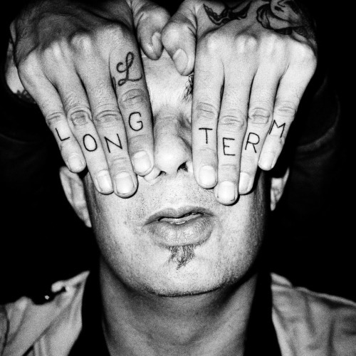
8.1 Lorenzo Castore “Present Tense 2011-2015″
The composition of the image includes a man with hands covering his eyes. There are tattoos on the hands and the image is in black and white, with a bright light source creating an “over-exposed” look in the foreground, while the background looks very dark. The mood is dark and mysterious. It’s very interesting because the hands are so stark with the tattoos, and that in combination with the black and white, gives a very intense look to the photo. The photo is of a man with hands over his eyes, but the photo is about not being able to see, or not wanting to see. He isn’t struggling against the hands. The tattoos spell “long term” so I believe that the photo is about how the subject cannot see the future or that the future is obstructing his view of the present world around him somehow.
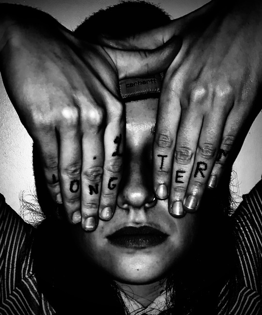
8.2 Recreation
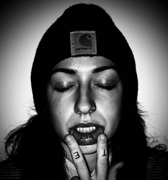
8.3 Inspired Photo
Recreating this photo was a really cool experience because it challenged me to look at the details and the posed nature behind the photo. It made me look from the eye of the original photographer and see not only the end product, but everything that went into the photo. It made me think more about light and mood, and editing especially. It was cool to recreate the photo as the photographer wanted, and then adapt his style to take an inspired photo.
0 notes
Text
Week 6/7 Group Presentation
https://docs.google.com/presentation/d/1DY8E1TBp9t95F7aA4o3MIebEeSX5zD2DLdvVQOugkrE/edit?usp=sharing
Role in presentation: I initiated group work and a meeting time, researched the series, typed out answers to several of the questions, organized the slides and presented in class.
0 notes
Photo
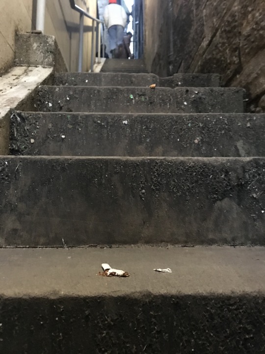
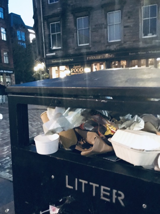
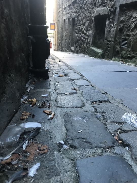

5.4 Personal Series: Beautiful Trash
This weekend I was in Edinburgh and I think one of the things that I see every day in London and then notice in cities around the world is the trash. Humans are such a material and wasteful society. I really care about recycling and the environment, and seeing the trash everywhere is an interesting part of the city’s character in a way. I think what I wanted to capture is how we pass by trash every day and think nothing of it. We all see it, but our brains are so used to it that it almost doesn’t register, and some of us contribute to the trash on the streets. In these pictures, I capture 3 different city scenes where life is vibrant and buzzing around, but you are forced as a viewer to see the trash, and see from the perspective of the trash – then it becomes non-ignorable, you must see it. I love how different the three photos are, it’s not as simple as city streets with trash, the trash is everywhere, present throughout life. I also like how the series altogether showcases an irony of sorts – all three images are beautiful photographs that people would take of the scene, but I purposefully took them of them with the trash. For example, someone would post a picture of the sunset over the street which in a way idealizes it, but I am forcing the viewer’s eye to see the full picture which includes the trash – the litter is part of the city itself.
0 notes
Photo
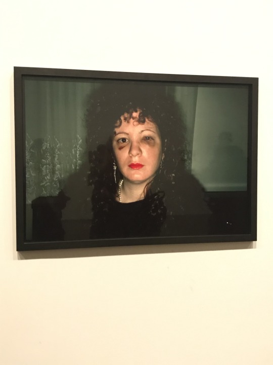
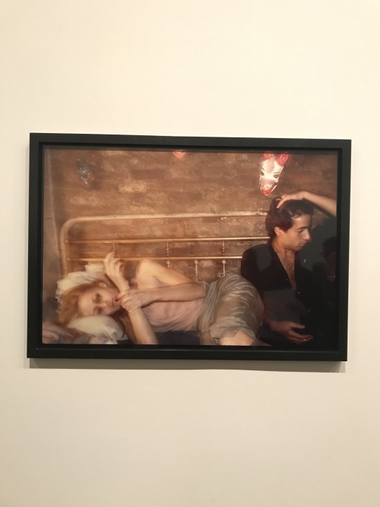

5.3 Nan Goldin “The Ballad of Sexual Independency” 1970-1980
The artist is documenting her experiences in life and love in an “uncensored and uncompromising” manner. The photos are very raw and candidly convey the hard, emotional truth of love. Her photos are portrait-style, close up to her subjects. They are posed but the subjects are candid. The lighting is natural and the photos are very clear. I consider these great photographs because they elicit such a poignant emotional response. I think these photos are brilliant because they capture such intense, hard-to-face moments of life. They are extremely personal because it’s photos of the artist and her friends – and the intimacy shines through. These photographs definitely convey the artist’s intended message, which was to capture the raw moments of her life without holding back. That’s why this series works so well as a series, not individual pictures – it’s a timeline of the true pain in her life, not just a singular event that could be underanalyzed in isolation. The written information is very well worded. I quoted in the first sentence something from the description that I think puts her work into perfect perspective. It’s interesting because I had seen this exhibit before we went as a class and I hadn’t read the description. But reading the description this time definitely informed the reason behind the artist’s work. I felt like the photographer was letting me see behind the curtain – an intimate gaze into her life, and understand why she chose to photograph her subjects as she did.
0 notes
Photo
5.2 “American Surfaces” Stephen Shore 1972-73
I think the artist is trying to capture what American life was like in the vibrant period of the 70’s through a series of stills. To convey this message, the photographer utilizes a very characteristic style – still scenes with mostly objects photographed in similar lighting. It’s interesting to think about whether these are “good” photographs because his work was one of the first that helped establish color photography as “art.” Maybe at the time, these photographs may not have been “great” but looking at them from a more modern time period, I think these are great photographs. It gives such a beautiful view into what that time period was like. I love that “old camera” feel that the photos all share and how candid the photos seem. It truly feels like a documentary of the time period – which is partially what the artist was trying to do along his roadtrip is capture life as it was. Seeing all the images together provides a fantastic context. I think seeing them all together showcases the documentative style, whereas if I had just seen one or two I don’t know if I would’ve understood what the artist was trying to communicate. The written information gave me a neutral lens looking at the photographs. I think it allowed me to see how the photographer marveled at American life at the time and that shows through in the photos.
0 notes
Photo
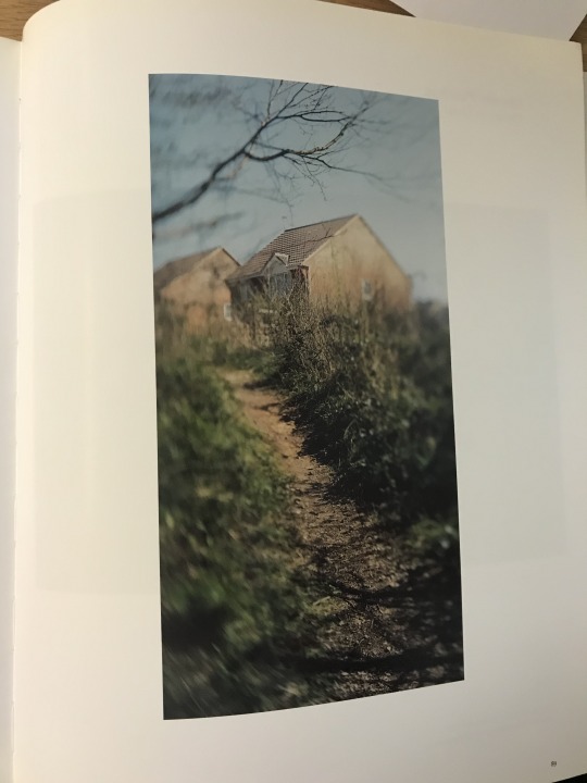
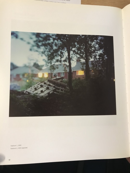
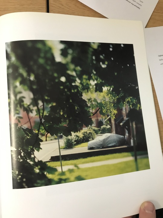
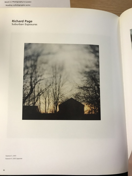
5.1 Richard Page “Suburban Exposures” 2003 - in-class activity
My first impression browsing this series is that the photographer is an outsider. The pictures are taken at a distance and there are branches framing the scene. It feels like the photographer is watching a scene from the outside and it has somewhat creepy vibes from the way the lighting is. The images are a series more than just a collection of pictures because of both the subject matter and the style of photography. All the photos are taken outdoors looking onto a town or a building. All the pictures are taken somewhat far away and with something like trees in the line of the camera, and no people in the frame. All of the pictures have some blurred or out-of-focus parts of the picture. The colors are highly contrasted and there is a juxtaposition of light and shadows. The darkness is always in the foreground, whereas the light is further away. The title frames the series in a curious way – “suburban exposures” is a strange title. It informs that indeed the pictures capture a suburban scene with buildings and nature. Exposure is the interesting word that informed my weird vibe from my initial impressions of the pictures. Exposure could mean introduction to something, but here I almost feel like it has a darker connotation, like you as an audience are seeing the vulnerable, or darker parts of this suburban life. The only thing I could tell about the progression of the pictures is that it seems the photographer is moving through the town. He or she starts outside, then moves in closer, and then ends farther away again – this gives me the impression that the photographer or the viewer went on a journey and him/her leaving at the end plays into the title – he/she learned about the true exposed nature of the suburban town and then left. I think my first impressions have been altered and informed based on the title and thematic elements of the images. My first impression was creepy and outsider, but now I think the viewer/photographer was trying to show his/her experience of a suburban town – it is clear that the photographer is trying to showcase a darker side of suburban life – colder, more lonely, etc. The sequence of moving in closer and then backing away again helped shape my last impressions.
0 notes
Photo

Photo 4.7 Inspired Portrait
The two portraits by Mayotte Magus capture a moment in time for the subject. Each composition includes a subject surrounded by a scene – one is at work at a very messy desk and the other is looking inside a window with lots of objects inside. While the subject is the main focus, the background provides insight into what the photographer is trying to convey about the subject. The woman at the desk has a tired stare on her face; she is looking at the photographer not smiling. She has a very worn expression suggesting that she is tired from responsibilities and work, which is added to by the piles of papers surrounding her. She doesn’t outwardly look unhappy, but rather semi-content with being trapped in such an overwhelming job. You can tell the emotion through the eyes here, and in the other photograph as well. In this one, the woman is shielding the outside from her gaze, solely looking inside whatever is within the window. Her eyes convey that she is feeling a nostalgia or something in response to whatever she is looking at. She is also on the outside looking in – maybe there’s a sadness or a separation. I was inspired by how both portraits capture the subject in a moment, and that you can see the subject in the context of their surroundings and view their emotion at the time. For my portrait I captured my friend in a very unassuming moment. We saw this beautiful lake and she is a very fun, free-spirited individual who needed to touch the beauty and feel the water. And I captured that part of her character in such a candid moment. Although my portrait is in color, I aligned the lighting to be neutral so that the portrait was simply the subject without a light that would’ve changed the mood at all. The background contains people unlike the other two portraits, but I cropped it such that their faces are not seen and the focus remains on the subject. The other people are part of the background – I think they add to the vibrant, fun social atmosphere of the portrait itself.
0 notes


Photo
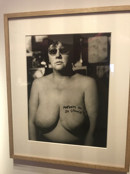
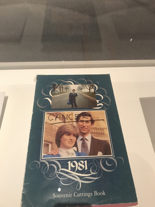
Photos 4.2-4.4 Misbehaving Bodies Exhibit Oreet Ashery
Jo Spence
The artist is trying to show a different reality to her cancer diagnosis and treatment. It’s a raw, unfiltered look into what it was like for her. I consider some of these to be portraits, as in the case of photo 4.2. The focus is clearly on her, the subject, and conveys an honesty, struggle, determination, and pain. Seeing the collection of her work is very striking – it makes me uncomfortable, but I think that’s the point. The effect creates an emotional reaction in the audience. The photos convey are very raw – one is literally a picture of her naked breasts with a taped X over top. Jo Spence wanted to share her true story and she did that through having very open photos – the bareness of the photos elicited that same raw emotion. The information gave a great deal of context to the pieces. The one text explained how inhuman the one doctor treated her marking of her breast for surgery. I think that specifically helped inform what Spence was trying to showcase, the truth to her illness, and also humanize the illness.
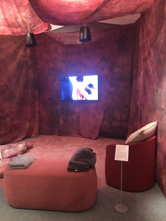
Oreet Ashery
The artist is trying to show a truth or a story to grief and loss. She incorporates the death of her father into the art, as well as creates a “Genesis” story. I do not consider these portraits because it’s film and there is not a singular subject or focus necessarily. The effect of seeing her work together is additive – you get an encompassing understanding of the emotion and the message – from the abstract Genesis, to the real film of her father. The videos are very raw, especially the clips of her father, and convey the “ugly truth” of grief. The information beside each video gave a short description of each episode, which helped provide context. Especially for the Genesis episodes, it gave an important structure for the videos, rather than seeing them as a confusing, abstract video about a fictional character.
I think the overall message of the exhibition is that cancer or grief, whatever it may be, is a raw experience that affects people. It’s not some mysterious condition, it’s flesh and blood and it’s brutal, and the people it affects are real people with a story to tell. The works are displayed with very little decoration – it matches the non-glamorized subject matter. It helps me understand further how the artists wanted their works to be viewed. Specifically for Ashery’s films, there were chairs and cushions and pink sheets around the television – she wanted the audience to feel comfortable and to be invited in to see her work.
0 notes