
Statistics
We looked inside some of the posts by meimelmoo and here's what we found interesting.
Average Info
Notes Per Post
108K
Likes Per Post
57K
Reblog Per Post
50K
Reply Per Post
997
Time Between Posts
5 days
Number of Posts By Type
Text
15
Note
2
Last Seen Tumblr Blogs


Fun Fact
The KCSC sent more than 20K requests to delete posts related to prostitution and porn to Tumblr from January to June 2017.
Text
The Devil

Really love the way Sims referred adler as "the devil" It does gave me an idea to draw this in reference to Le Génie du mal.
72 notes
·
View notes
Note

Flowers for you!! For Support and appreciation of all your amazing work. As well to boost your very creative mind
aaa thank you so much for this.. I don't really active this time around (TT) a lot of stuff going on and keep me busy but this is means a lot!! I hope you like this little gift of quick Adler doodle (^^) (maybe a bit out of character for him..)

28 notes
·
View notes
Text
Tfw the CIA is watching you

Old man + his favorite Russian
65 notes
·
View notes
Text

mk ultra gng extract from my sketchbook
actually tweaking out. heartbroken. for the longest time i believed that park was wasian like brit-korean dont ask me why.
215 notes
·
View notes
Text
„Let’s go, Bell!“

The glowing tail happened on accident but i found it so cute! He doesn’t have to carry a flashlight heheh
103 notes
·
View notes

Text
Mark your Calendars
in honor of this Saturday being March 15th(When Final Countdown/Ashes to Ashes occur in 1981). I am gonna release a post explaining how I got into Call of Duty due to this game and how I got attached to the Adler x Bell ship specifically and why it appealed to me so much
(Like, Comments and Reblogs are always appreciated)
23 notes
·
View notes
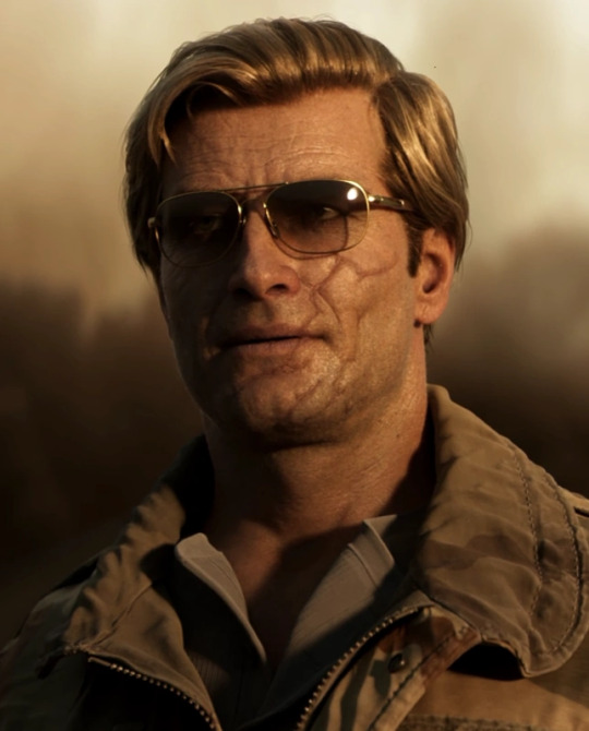
Text
Colorimetry of the Black Ops Guys
If I think about colors and associations, I’d say: (The pictures will be in the spanish part below this)
Russell Adler: Orange🧡
Frank Woods: Green💚
Grigori Weaver: Blue💙
Jason Hudson: Black🖤
Alex Mason: Brown🤎
Quick Concepts About Colorimetry:
Seasonal color analysis is divided into four main categories:
Winter: Cool and intense colors. (Example: electric blue, black, crimson red)
Summer: Cool but softer and more muted colors. (Example: pastel blue, lavender, pearl gray)
Autumn: Warm and deep colors. (Example: burnt orange, chocolate brown, moss green)
Spring: Warm but brighter and more vibrant colors. (Example: bright yellow, coral, grass green)
Now, if I had to analyze the colorimetry of the characters, it would be…
Russell Adler → DEEP AUTUMN 🍂🟠
Best colors: Brown, orange, mustard, burgundy, olive green, gold.
Why? His skin has a warm undertone, his dark blonde hair, and blue eyes contrast well with earthy tones, enhancing his intensity.
Proof: In Black Ops 6, the wine-colored shirt looks amazing on him, as do brown and beige tones in his Cold War outfits.
Worst colors: Very cool tones like icy blue, silver, fuchsia, cool violet, pastel tones.
Messages Behind His Outfits:
Authority & Experience: Nothing too flashy, but rather sober yet stylish. Classic garments that denote this.
Mystery: He always wears dark sunglasses, reinforcing his impenetrable and enigmatic image.
Adaptability: His clothing can be seen both in undercover operations and in field missions.
Summary of Adler’s Color Palette Over the Years:
1981 (Cold War): CIA, refined but lethal. Dominated by dark brown, black, beige, mustard, dark blue, terracotta. The style is elegant, mysterious, and dangerous yet sophisticated.
1985 (Warzone): Tactical adaptation. Colors like olive green, brown, khaki, certain shades of blue, and black dominate his skins and the narrative at that time. It’s more functional, less undercover, and more operational.
1991 (Black Ops 6): Wear and coldness. We see warm but more muted tones, like his wine-colored shirt and dark straight-leg jeans. Also, black, brown, dark beige, and some green tones. He’s rougher, less refined, and more somber, with lower saturation.
Adler’s style evolution is a visual representation of his psychological and professional transformation. From his tactical elegance in 1981 to his more worn-out and hardened appearance in 1991, his clothing and color palette reflect his personal journey, scars, and emotional deterioration.
What Remains Constant:
His preference for warm and dark neutral tones, characteristic of deep autumn.
His use of key accessories (glasses, gloves).
His combination of authority, sophistication, and lethality.
Frank Woods → SOFT SUMMER 🌿💚
Best colors: Olive green, moss green, grayish blue, muted burgundy, smoky gray, very warm browns, yellowish khaki, orange-reds.
Why? Although he has blue eyes and dark hair (winter traits), his skin has a more neutral-cool undertone, making soft and muted tones suit him better.
Proof: He always looks good in camouflage uniforms, olive green jackets, and cool earth tones.
Worst colors: Bright warm tones like golden yellow, intense orange, or warm red.
Messages Behind His Outfits:
Resilience & Survival: His clothes are functional, built to last in combat, reflecting his hardened warrior nature. He always wears muted and cool earth tones like military green or grayish blue.
Rebellion & Roughness: Unlike Adler, his clothing isn’t refined or tactically sophisticated. Woods prefers worn-out, practical garments that scream “battle-hardened soldier.”
Summary of Woods’ Color Palette Over the Years:
1968 (Black Ops 1): More structured clothing, militar uniform.
1984 (Cold War): His clothes look more worn-out, with more muted tones and relaxed cuts. He is 54 years old.
1991 (Black Ops 6): In his older age, his clothing is even more functional, with more neutral tones, some color but still sober, reflecting his toughness.
His colorimetry reinforces his identity as an eternal warrior: cold, resilient, battle-hardened.
Alex Mason → SOFT AUTUMN 🍁🤎
Best colors: Taupe brown, beige, olive green, burnt orange, petrol blue, faded denim blue.
Why? His skin has warm undertones, and his light brown hair makes more muted earthy tones suit him well.
Proof: His outfits in Black Ops 1 and 2 often use earthy tones, and he looks natural in them.
Worst colors: Electric blue, pure white, or overly cool tones.
Grigori Weaver → DEEP WINTER ❄️🔵
Best colors: Navy blue, black, white, burgundy red, silver.
Why? His fair skin with cool undertones, dark green eyes, and black hair make cool and intense colors suit him best.
Proof: Cool tones in his clothing, especially dark blue, make him stand out. Also, in Black Ops 6, the cool lighting gives him an imposing air.
Worst colors: Warm tones like mustard yellow, orange-brown, or beige.
Summary of Weaver’s Color Palette Over the Years:
1968 (Black Ops 1): Dominated by black, dark blue, gray, and brown with a military aesthetic.
1981 (Cold War): His image refines with dark suits, reinforcing his status within the CIA. Cool tones in his shirts and pants give him authority while maintaining his field essence.
1991 (Black Ops 6): His attire reflects greater hardness and wear, transmitting the weight of his experience and scars. We see layers: blue jeans, a brown shearling coat, and an orange plaid shirt—but a cool orange.
Weaver projects a cold, strategic, no-frills aesthetic. His color palette reinforces his imposing presence and reserved nature.
Jason Hudson → TRUE WINTER ❄️⚫
Best colors: Black, dark gray, navy blue, intense red, emerald, pure white.
Why? His black hair, pale skin, and blue eyes create high contrast, making him a perfect match for the winter palette.
Proof: His black suit with a white shirt in Cold War gives him a sophisticated and authoritative look.
Worst colors: Warm browns, pastel tones, or beige, which would make him look washed out.
Dark colors like black and gray reinforce his serious and impenetrable image, while cold, saturated colors like red and blue add presence without softening his stern expression.
Summary of Hudson’s Color Palette Over the Years:
1968 (Black Ops 1): His clothing maintains dark and cool tones, reinforcing his serious and strategic image. Functional tailoring in black and gray, with cool-toned shirts. The contrast in his attire stands out.
1981 (Cold War): His combination of a black suit and white shirt creates maximum contrast, making him look imposing, sophisticated, and calculating.
His Most Iconic Look:
A black suit, white shirt, aviator glasses, and an unshakable stance.
He always wears dark sunglasses, further accentuating his natural contrast and distant aura.
Messages Behind His Outfits:
Authority & Control: As a CIA man, his polished, professional image projects order, seriousness, and absolute control.
Distance & Coldness: Black and white not only reinforce his authoritative image but also create a visual barrier between him and others. His style is neither tactical nor flashy but strategically discreet.
______________________________________________________________ Colorimetría de los chicos de Black ops Si me pongo a pensar en colores y asociaciones diría que: - Russell Adler: naranja🧡 - Frank Woods: verde💚 - Grigori Weaver: Azul 💙 - Jason Hudson: negro🖤 - Alex Mason: marrón🤎 Conceptos express sobre colorimetría: La colorimetría en estaciones se divide en cuatro categorías principales. Invierno: Colores fríos e intensos. (Ejemplo: azul eléctrico, negro, rojo carmesí) Verano: Colores fríos pero más suaves y apagados. (Ejemplo: azul pastel, lavanda, gris perla)
Otoño: Colores cálidos y profundos. (Ejemplo: naranja quemado, marrón chocolate, verde musgo)
Primavera: Colores cálidos pero más brillantes y vivos. (Ejemplo: amarillo brillante, coral, verde pasto)
Russell Adler → OTOÑO PROFUNDO 🍂🟠
Colores que le favorecen: Marrones cálidos, naranja, mostaza, burdeos, verde oliva, azules oscuros (con subtonos cálidos), vino, beige.


Por qué: Su piel tiene un matiz cálido, su cabello rubio oscuro y sus ojos azules contrastan con los colores tierra, lo que resalta su intensidad.
Pruebas: En Black Ops 6, la remera color vino le queda increíble, igual que los tonos marrones y beige en sus atuendos de Cold War.

Colores que NO le favorecen: Tonos demasiado fríos como azul hielo, plateado, fucsia, violeta frío, tonos pastel.
Mensajes detrás de sus outfits:
Autoridad y experiencia: Nada que sea tan llamativo, sino más bien algo sobrio pero con estilo. Prendas clásicas que denotan esto.
Misterio: Siempre usa gafas de sol oscuras, lo que refuerza su imagen impenetrable y enigmática.
Adaptabilidad: Usa ropa que se puede ver tanto en una operación encubierta como en una misión de campo.
Resumen de la paleta de colores de Adler a lo largo de los años:
- 1981, cold war: CIA, refinado, pero letal. Predominan colores como marrón oscuro, negro, beige, mostaza, azul oscuro, terracota. El estilo es más elegante, misterioso y peligroso aunque sofisticado. Si notamos colores más vivos.


- 1985, warzone: adaptación táctica. Colores como verde oliva, marrón, caqui, ciertos tonos de azul, negro, es lo que más vemos en sus skins y la narrativa de lo que pasaba en ese momento. Es más funcional, menos encubierto. Más de operaciones.


- 1991, black ops 6: Desgaste y frialdad. Vemos tonos cálidos pero más apagados, como su camiseta color vino o sus jeans rectos oscuros. Además hay tonos como el negro, marrón, beige oscuro y algunos tonos de verde. Es más áspero, menos refinado y más sombrío. Si hay menos saturación.


La evolución del estilo de Russell Adler es una representación visual de su transformación psicológica y profesional. Desde su elegancia táctica en 1981 hasta su apariencia más desgastada y endurecida en 1991, su ropa y paleta de colores reflejan su viaje personal, sus cicatrices y su deterioro emocional.
Lo que se mantiene constante:
Su inclinación por tonos cálidos y neutros oscuros, característicos del otoño profundo.
Su uso de accesorios clave (gafas, guantes).
Su combinación de autoridad, sofisticación y letalidad.
Frank Woods → VERANO SUAVE 🌿💚

Colores que le favorecen: Verde oliva, verde musgo, azul grisáceo, burdeos apagados, gris humo, marrones muy cálidos, caqui amarillento, rojos anaranjados.
Por qué: Aunque tiene ojos celestes y cabello oscuro (características de invierno), su piel tiene un matiz más neutro-frío, por lo que los tonos suaves y apagados le sientan mejor.


Pruebas: Siempre se ve bien en uniformes de camuflaje, chaquetas verde oliva y tonos tierra fríos.
Colores que NO le favorecen: Tonos cálidos y brillantes como amarillo oro, naranja intenso o rojo cálido.
Mensajes detrás de sus outfits:
- Resistencia y supervivencia: Su ropa es funcional, hecha para durar en combate y reflejar su naturaleza de guerrero endurecido. Siempre usa tonos apagados y tierras fríos, como el verde militar o el azul grisáceo.
- Rebeldía y rudeza: A diferencia de Adler, su ropa no es refinada ni táctica de manera sofisticada. Woods prefiere prendas desgastadas, prácticas, que gritan "soldado curtido en batalla". Resumen de la paleta de colores de Woods a lo largo de los años: - 1968, black ops 1: usa ropa con más estructura, uniformes militares. - Rebeldía y rudeza: A diferencia de Adler, su ropa no es refinada ni táctica de manera sofisticada. Woods prefiere prendas desgastadas, prácticas, que gritan "soldado curtido en batalla". Resumen de la paleta de colores de Woods a lo largo de los años: - 1968, black ops 1: usa ropa con más estructura, uniformes militares.
- 1984, cold war: su ropa se ve más gastada, con tonos más opacos y cortes más relajados. Acá ya tiene 54 años.
- 1991, black ops 6: con su edad avanzada, su ropa es más funcional aún, con tonos más neutros, algo de color pero sigue siendo sobrio y que reflejan su dureza. Su colorimetría refuerza su identidad de guerrero eterno: frío, resistente, endurecido por la guerra.
Alex Mason → OTOÑO SUAVE 🍁🤎

Colores que le favorecen: Marrón topo, beige, verde oliva, naranja quemado, azul petróleo, azul jean desgastado.
Por qué: Su piel tiene matices cálidos y su cabello castaño claro hace que los tonos tierra más apagados le favorezcan.


Pruebas: Su vestimenta en Black Ops 1 y 2 tiende a usar colores terrosos y se ve natural en ellos.
Colores que NO le favorecen: Azul eléctrico, blanco puro o tonos demasiado fríos.

Grigori Weaver → INVIERNO PROFUNDO ❄️🔵

Colores que le favorecen: Azul marino, negro, blanco, rojo borgoña, plateado.
Por qué: Su piel clara con matices fríos, ojos verdes oscuros y cabello negro hacen que los colores fríos e intensos lo favorezcan más.
Pruebas: Los tonos fríos en su ropa, especialmente el azul oscuro, lo hacen destacar. Además, en Black Ops 6 la iluminación fría le da un aire imponente.
Colores que NO le favorecen: Tonos cálidos como amarillo mostaza, marrón anaranjado o beige.
Resumen de la paleta de colores de Weaver a lo largo de los años:
- 1968, Black Ops 1: Predominan el negro, azul oscuro y gris, marrón, con una estética militar y operativa.
- 1981, Black Ops Cold War: Su imagen se refina con trajes oscuros, reforzando su estatus dentro de la CIA. Sus camisas y pantalones en tonos fríos le dan un aire de autoridad sin perder su esencia de campo, a través de los colores. Aunque ahí estaba en una oficina.
- 1991, Black Ops 6: Su vestimenta refleja una mayor dureza y desgaste, transmitiendo el peso de su experiencia y cicatrices. Como podemos ver por las TRES capas de ropa que tiene Weaver. Aún en distintos colores como los jeans azules, abrigo de cordero marrón y camisa a cuadros naranja pero de un naranja frío.

Weaver proyecta una estética fría, estratégica y sin adornos. Su paleta de colores refuerza su presencia imponente y su naturaleza reservada.
Jason Hudson → INVIERNO PURO ❄️⚫

Colores que le favorecen: Negro, gris oscuro, azul marino, rojo intenso, esmeralda, blanco puro, azul marino.
Por qué: Su cabello negro, piel pálida y ojos azules crean un alto contraste que encaja perfectamente con la paleta de invierno.
Pruebas: Su traje negro con camisa blanca en Cold War le da un aire sofisticado y autoritario.
Colores que NO le favorecen: Marrones cálidos, tonos pastel o beige, que lo harían ver apagado.
Los colores oscuros como el negro y el gris refuerzan su imagen de seriedad e impenetrabilidad, mientras que los colores fríos y saturados como el rojo y el azul le aportan presencia sin suavizar su expresión severa.
Resumen de la paleta de colores de Weaver a lo largo de los años:
- En black ops 1 (1968), su vestimenta mantiene tonos oscuros y fríos, reforzando su imagen seria y estratégica. Sastrería funcional en negro y gris, con camisas en tonos fríos. Se destaca el contraste en su vestimenta.
- En black ops cold war (1981), su combinación de traje negro y camisa blanca crea un contraste máximo que lo hace ver imponente, sofisticado y calculador. Su imagen más icónica: traje negro con camisa blanca, gafas de aviador y un porte inquebrantable.
Siempre usa gafas de sol oscuras, lo que acentúa aún más su contraste natural y su aura distante. Hudson proyecta un aura de frialdad, profesionalismo y control absoluto. Su paleta de colores fríos, oscuros y de alto contraste refuerza su imagen de estratega calculador y líder imponente. Mensajes detrás de sus outfits:
- Autoridad y control: Hudson es un hombre de la CIA con una imagen pulcra y profesional. Su vestimenta proyecta orden, seriedad y control absoluto.
- Distancia y frialdad: El negro y el blanco no solo refuerzan su imagen autoritaria, sino que también crean una barrera visual entre él y los demás. Su estilo no es táctico ni llamativo, sino estratégicamente discreto.
- Alto contraste y presencia imponente: Su combinación de traje negro y camisa blanca lo hace visualmente impactante, dándole una presencia fuerte y calculadora.

35 notes
·
View notes


Text
Moodboard - Willian ‘Case’ Calderon

Requests open <3
61 notes
·
View notes
Note
just wanted to stop by and drop some 🌹🌹🌹🌹🌹🌹 for all your work(your Adler and Bell stuff is 🔥
thank youu so much!!💚 Also I remember your headcanon of Adler being baseball player I think if I remember correctly.. and I forgot to post this here! 😭 And yeah I just remembered about the natural when you post about it..


This is like my old Adler drawings that I had 😭 also don't mind the maid dress I don't really know why I drew him like that..
49 notes
·
View notes
Text
In regards of the Trump government scraping all trans inclusion in its queer information portion of its websites I have made this thing. Spread the word. Don't let them pretend we never existed.
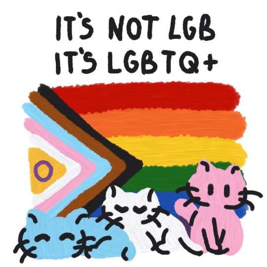
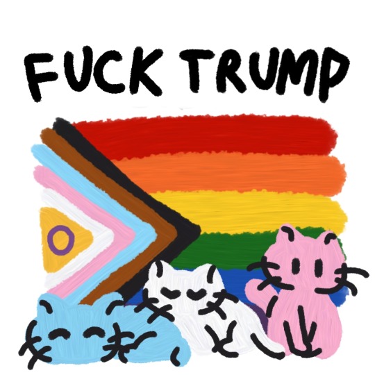
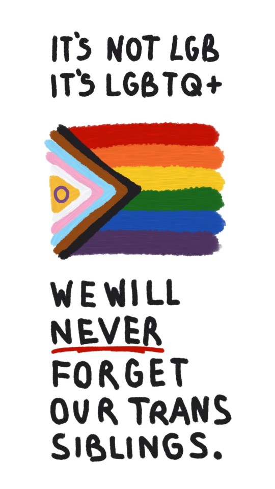
P.S: Don't like! Reblog! <3
EDIT: Well this got a lot of attention! I got a few users asking to print or repost my art and I am unimaginably grateful to everyone's interest, especially since it's a really simple drawing I made on a whim haha! Anyone who is looking to print these out to hang or hand out or repost on another platform is free to do so, although I ask you to credit me and let people know it's from my Tumblr profile! If anyone wishes to do anything else with my art or post and wants to clarify what I consent to then they can message me privately and I'll explain! <333 all my love to my queer siblings
107K notes
·
View notes
Text
Smokehead 🚬

Always stuck on drawing bocw Adler.. 🚶 I just love his hair much in bocw but his bo6 look is also fine..

Peardler..
95 notes
·
View notes
Text

Happy late Valentines day!! Here's Adler with some flowers!
Kind of rushed because I didn't realize how late it was...
Here's one of my favourite love songs!! To celebrate the season 🥰
65 notes
·
View notes
Text
Happy Valentine’s Day to all my Mutuals/Followers/People I follow!❤️🩷❤️🩷

6 notes
·
View notes