Statistics
We looked inside some of the posts by melanie-fiederlein and here's what we found interesting.
Average Info
Notes Per Post
2
Likes Per Post
2
Reblog Per Post
0
Reply Per Post
0
Time Between Posts
7 days
Number of Posts By Type
Text
10
Last Seen Tumblr Blogs


Fun Fact
Tumblr Inc. is funded by 13 investors.
Text
Module 6
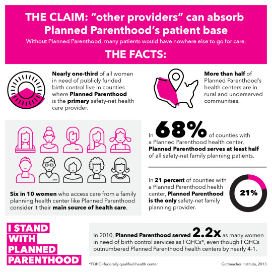
Image 1: The following infographic has an underlying agenda of persuading the public that Planned Parenthood is necessary and other providers cannot absorb their patient base. This infographic uses a bold, large font to communicate the most important information. I noticed that this graphic is made by Planned Parenthood and they selected data that would be the most persuasive to viewers. In the bottom right corner, Planned Parenthood states their source as the “Guttmacher Institute, 2013.”

Image 2: Mrs. Meyer’s cleaning products all have the same branding that emphasizes plant-derived ingredients, essential oils, and a fresh look. The scents are inspired by a Midwestern garden and they use bright, spring colors to correlate with their scents. All products include "Mrs. Meyer’s Clean Day" in big, bold, block lettering that immediately connects their products to the brand. Overall, the design of their cleaning products is made carefully and aesthetically pleasing. This way consumers feel like they can leave their products out, instead of tucked away.
0 notes
Text
Module 5

Image 1 (Denotative): This design’s denotative meaning is the literal meaning, the scent. This is located directly under the logo of the product and above the label “body lotion.” The scent of the product is called shea velvet which is described as shea butter and sandalwood.
(Connotative): The design’s connotative meaning of shea butter is the rich, moisturizing fat that comes from shea trees. The connotative meaning of sandalwood is a sweet-smelling wood from a tree that will give calming properties, as sandalwood is a sacred item that has been used in temples and shrines.

Image 2 (Iconic function): The buttons/icons on this diffuser remote show which functions each button holds. The top left signals turning the diffuser on, top right is music, middle left is light, middle right is brightness level of the light, the bottom left is lower volume, the bottom right is increase volume.

Image 3 (Indexical function): On this hand sanitizer bottle, the design includes indexical relationships between the exclamation point indicating danger. Also, the flame symbolizing that the product is flammable and can catch on fire if exposed to flame.

Image 4 (Symbolic function): In this design for the Southern Poverty Law Center, they use a justice scale as their logo. However, a scale can symbolize more than one thing: like weighing an object, body weight scales, etc. Only when it’s associated with justice in government or law is when we see it as a justice scale.

Image 5 (Past style): This typography style was very popular in the 70s and is currently trending again. This style was very bold, playful, and based in the entertainment industry. The design is fun and attention-getting.
0 notes
Text
Module 4

Image 1: This spread in a Vogue magazine illustrates rhythm with vertical text. Your eye is guided past the picture to the tall, thin type and down the page to the column of text.

Image 2: The title of this magazine page is an example of typographic hierarchy. The title font and subtitle immediately draw your attention. There is bold text on the page, but your first look is at the title.

Image 3: The ‘L’ in “gelcouture” is an example of an ascender because the letter reaches above the ‘T’.

Image 4: The ‘P’ in proposal is an example of a descender because it’s hanging lower than the baseline. It looks longer than usual.

Image 5: The ‘O’, ‘P’, and ‘R’ are examples of a counter. A counter is the enclosed space in the letters.

Image 6: The ‘H’ and ‘A’ are examples of crossbars. A crossbar is a short-stroke connecting to the other strokes.

Image 7: In this Garnier advertisement, the word ‘rubbing’ is an example of a font that has a large x-height. The ascenders in the word are not much taller than the rest, making the x-height appear larger.

Image 8: This Cupcake wine logo is a good example of a small x-height because the ascenders are comparatively much larger than the rest of the letters.

Image 9: The text on the cover of this Vogue magazine is a good example of a modernist font. In fact, this font might be Helvetica itself, which is seen by some designers as a staple modernist font. The font commands attention without being too overpowering.

Image 10: The Ziploc logo is connoting their product, a zip-up bag. The ‘zip’ is styled differently than ‘loc’ so you focus on the zip that locks and seals the bag.
1 note
·
View note
Text
Module #3
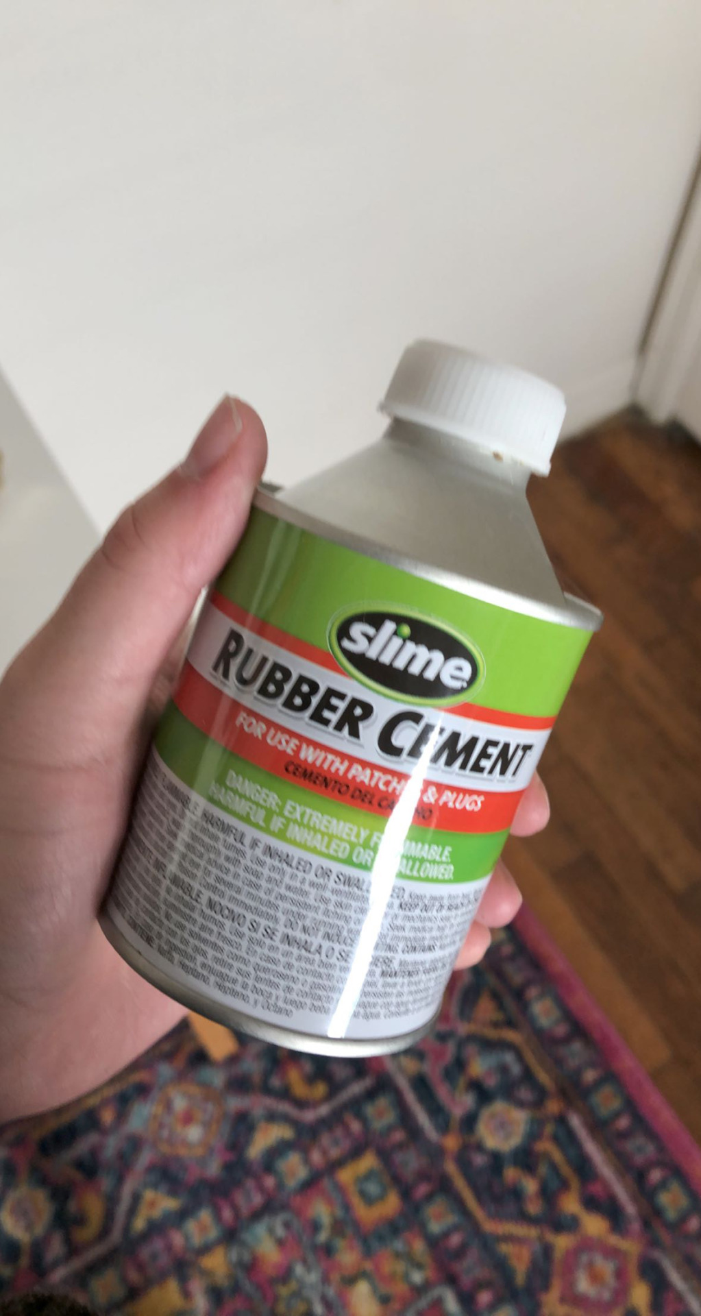
Rubber Cement: This design uses complementary colors, red and green, to contrast the brand from the product. The red highlights the instructions and what the rubber cement is supposed to be used for, to avoid safety issues.
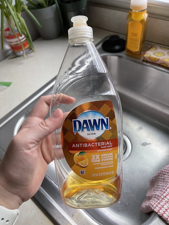
Dawn Orange Scent Dish Soap: The analogous colors of orange are being used to portray the orange dish soap scent. I think this makes the aspect of the design somewhat prominent to differentiate the product from other scents.
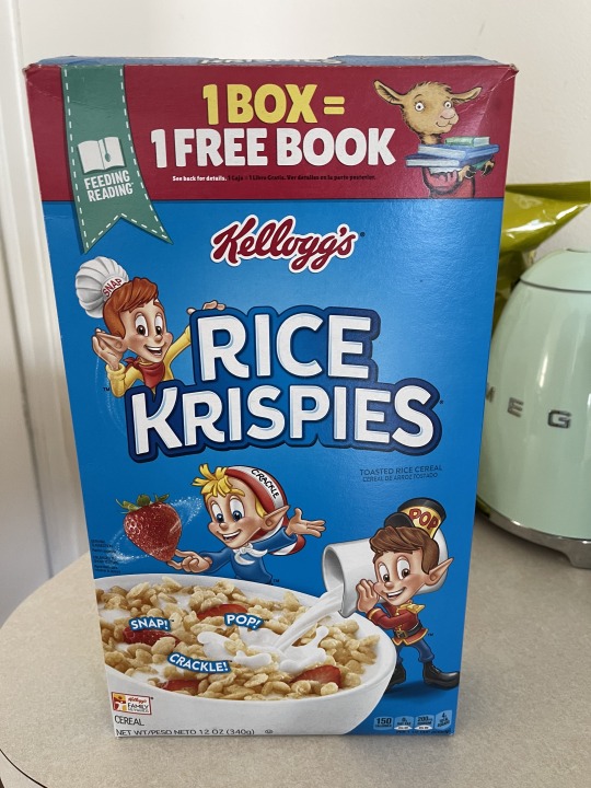
Rice Krispies Cereal Box: I think the cool color, blue, is trying to appeal to your hunger and create a sensation of cereal in cold milk that snaps, crackles, and pops.
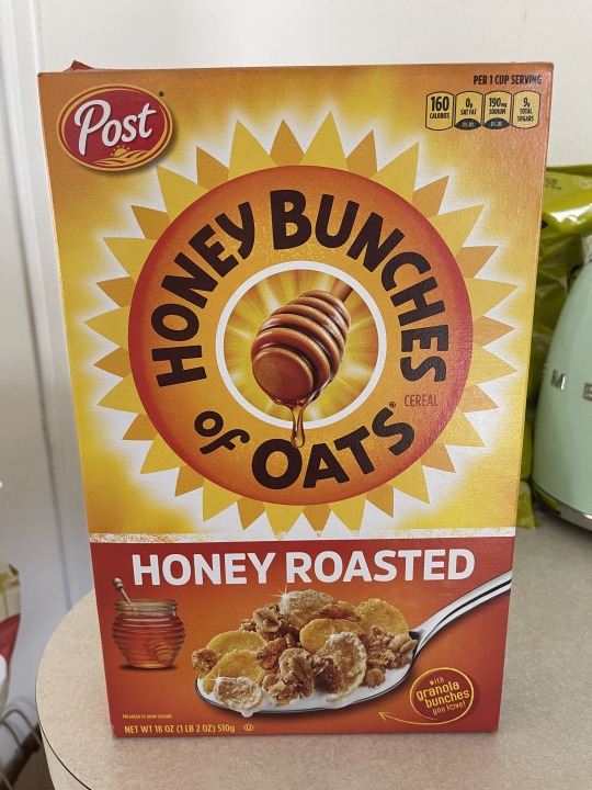
Honey Bunches of Oats Cereal Box: I think the colors are trying to get the consumer to associate their cereal with fresh honey. The warm colors help their bee mascot stand out more as well.

Mint Jade Teavana Packaging: This packaging has contrast in value of blue green. Since this is a tea brand, the color is meant to create a calm, relaxing response.
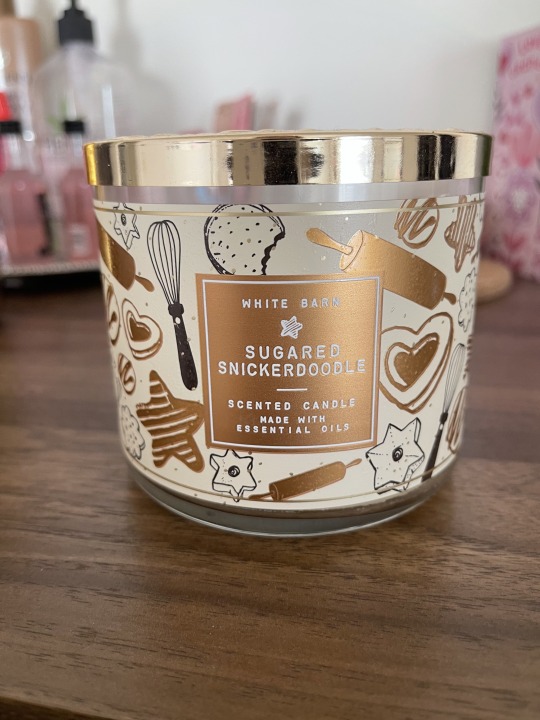
Sugared Snickerdoodle Candle: This candle design includes the Gestalt principles of proximity and continuity. The doodles of baking materials and cookies are close in proximity to create a doodle-drawn look. They are also continuous in style as there are 8 or 9 different styles repeated across the candle.
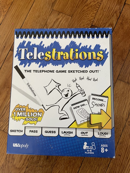
Telestrations Game: The telestrations game is an example of an active figure-ground relationship. The contrast between the notepad design, as the figure, and the blue background.
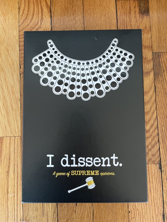
I Dissent. Game: This piece of graphic design tries to look historical with the use of a typewriter typography and supreme court collar.
0 notes
Text
GD 260 Module 2

Image 1 – Trader Joe’s Chocolate Pretzels
This Trader Joe’s packaging for their dark chocolate mini pretzels demonstrates contrast with use of texture, position, and spacing. The typography is spaced nicely so the pretzel graphics look spaced evenly throughout the package. The photograph on the bottom was taken on wood which gives a visually pleasing contrast of textures.

Image 2 – Dot’s Homestyle Pretzels
The design on the Dot’s packaging is a good example of contrast with shape and scale. Your focus is drawn to the big diamond shape where their logo is placed and to the pretzels. The design of this packaging was well thought out because it looks like a sneak peak of what’s in the bag; this was accomplished because the pretzels are scaled to their actual size. The black arrow also commands your attention to the flavor of the pretzels and their slogan.

Image 3 – Anastasia Beverly Hills Amrezy Eyeshadow Palette
This Amrezy eyeshadow palette design shows contrast through texture and weight. The entire palette is covered in a grainy glitter that immediately catches the eye. The typography is debossed so the ‘Amrezy’ and logo looks to be indented in the package. The font weights of the logo and title also create contrast to make the ‘Amrezy’ stand out.

Image 4 – Ever Spring cleaning product
This design for Target cleaning wipes demonstrates contrast through weight and positioning. The top half of the product is very clean and minimalistic whereas the bottom is a little busier to provide more information. However, balance is achieved in this design because the font weight is much larger on the top.

Image 5 – Morning Psychedelia by Chris Bigalke (Society6 art print)
This piece of artwork from Chris Bigalke shows contrast through texture, rotation, and spacing. He balances all his images in the collage with use of these techniques. The positioning of the rug creates balance with the top and bottom of the canvas. The mountain contrasts texturally with the rug and objects that are spaced on top.
0 notes
Text
Image 5: Colourpop

There are multiple examples of graphic design in this photo. Every product was designed specifically for the product to be the most appealing to consumers. The text on the "Ooh Lala" pallete was made to be a metallic finish adding another component of design to the product. The box was designed with pastel colors, clouds, and little stars to convey their dreamy theme.
0 notes
Text
Image 4: Wharton Center

The logo for the Wharton Center and Hamilton is a good example of graphic design. The Wharton Center's logo is more simplistic and sophisticated with contrasting fonts, sans and sans serif, and font weights. Hamilton's logo includes a graphic of hamilton as the tip of the star as well as text. Even the background of the Hamilton poster was well thought-out to pair with the play set in the 1700s.
0 notes
Text
Image 3: Instagram Advertisement

This image is an example of graphic design used for branding in the real world. First Aid Beauty hired a designer to make aesthetically pleasing packaging to correlate with their brands image. This specific packaging has bold colors that appeal to women, the target market, and text that clearly communicates the product.
0 notes
Text
Image 2: TMG Poster

I recieved this poster for being a VIP member at a comedy show. It is a combination of text and image. The text clearly communicates who is performing and when. The text is displayed as an arch with the photo of them praying. The designer demostrates the irony of a group named "Tiny Meat Gang" performing in a church with this design.
0 notes
Text
Image 1: Posters from Society6

I bought these posters from Society6, all from different designers. The first poster is type with a drop shadow; typography. The artist also embellished the "O" by making it a peace sign.
1 note
·
View note