#module5
Explore tagged Tumblr posts
Visit Tumblr Blog
Explore Tumblr blogs with no restrictions, modern design and the best experience.
Last Seen Tumblr Blogs


Fun Fact
Tumblr is used by 21% of adults online aged 18-29 years.

Text

Transformation In Adult Learning And Types of Learning Experiences...
From our readings in module 5, I’ve gleaned how “transformation” in the context of adult learning relates to how individuals critically assess and revise their deeply held beliefs and worldviews. Paulo Freire’s Education for Critical Consciousness (1973) has elucidated the terminology, transformation, as a process that is rooted in learners’ ability to engage with their temporal existence and critically reflect on their social realities. From this, I've gathered that true transformation involves the active integration of one’s experiences meshed together with an active awareness of time—where we are accountable for understanding the past, evaluating the present, and consciously shaping the future.
Meanwhile, Mezirow’s concept of transformation (2000) differs from Freire’s in the matters concerning critical reflection and the development of a more in-depth understanding of one’s socio-political environment. As Merirow’s “transformation” calls for individuals to challenge their existing frames of reference—which can range from epistemological, ethical, logical, etc.—to make them more adaptable to transformative learning. Comparatively, Mezirow's concept of transformative learning aligns with Freire's in its emphasis on reflection, but it diverges in its focus on personal cognitive transformation and personal empowerment rather than broader socio-political change.
Whereas, Freire contrasts transformative learning with passive adaption to emphasize that learners must actively integrate knowledge into their lives to achieve true critical consciousness. This type of learning compels individuals to recognize systemic injustices, challenge oppressive structures, and become empowered agents of change, marking a significant departure from traditional, more informative learning experiences, which often focus on acquiring knowledge without fostering critical awareness. In sum, both theorists highlight the critical reflection process, but while Freire emphasizes collective, societal transformation, Mezirow focuses on individual cognitive development and personal empowerment.
A Significant Experience And How it Shaped My Actions Moving Forward
Freire and Mezirow’s conception of “transformative” learning has opened my eyes to new perspectives, more specifically as an aspiring educator it taught me of the importance of transitioning from passive acceptance of societal norms to actively questioning such systems in place. Likewise, inspired by Paulo Freire’s notion of critical consciousness and temporality, both made me rethink of my experiences as not static but part of an ongoing process of becoming.
This reflection became a disorienting dilemma, echoing Freire’s idea of integration, where I started to critically engage with my reality rather than merely adapting to it. It led me to commit to myself a promise of participating more actively in community-led initiatives than I have been previously, advocating for educational reforms in any means I could, and realizing that empowerment involves not only understanding but also actively transforming one’s circumstances. This proactive engagement aligned with Jack Mezirow’s transformative learning phases, where critical assessment of assumptions, planning new actions, and trying out new roles became essential steps in my journey toward personal and social change.
Moving forward, this event reshaped my commitment to education and social justice. My understanding of both Freire’s and Mezirow’s frameworks deepened my resolve to use education as a tool for empowerment, where learning is not just informative but transformative—helping others, like myself, to actively engage with and reshape their worlds.
Informative Learning VS Transformative Learning And Its Implications
Informative learning, as Freire discusses in Education for Critical Consciousness (1973), refers to gaining knowledge or skills without necessarily altering one’s perspective or challenging pre-existing beliefs. This form of learning is about acquiring information that enables individuals to adapt to their environment, but it may not lead to critical engagement or transformation. In my professional life, I have experienced informative learning when acquiring technical skills, such as when I mastered a software application called Orange Data Mining Tool. While valuable, this learning primarily enhanced my ability to function within the given system without provoking a deeper examination of its structure or purpose.
In contrast, transformative learning, as defined by Mezirow (2000), involves a fundamental shift in one’s worldview through critical reflection, leading to a revision of deeply held beliefs. Freire echoes this with his emphasis on critical consciousness, where individuals not only reflect on their own learning but also on the socio-political forces shaping their reality. In my personal life, transformative learning occurred when I engaged in community work that challenged my assumptions about inequality, which fondly reminded me of the time when I initiated a book donation drive for urban poor children in Tondo. Through critical reflection and dialogue with others, I developed a deeper understanding of systemic issues and began taking action to contribute to social change.
Both forms of learning have played important roles in shaping my personal and professional growth. Informative learning has equipped me with practical skills, while transformative learning has fostered a more critical and engaged perspective, empowering me to actively participate in the transformation of my surroundings. This blend of gaining knowledge and changing perspectives is crucial in fostering both individual and collective progress.
References:
Freire, P. (1973). Society in transition. In P. Freire’s Education for critical consciousness, pp. 3-20. NY: The Seabury Press.
Mezirow, J. (2000). Learning to think like an adult: Core concepts of transformation theory. In J. Mezirow et. al. Learning as Transformation: Critical perspectives on a theory in progress, Chapter 1, pp. 3-33. CA: Jossey-Bass.
0 notes
Text
Module 5


A photo of a woman. The denotative meaning is a woman with patterns on her clothing.
This same photo can hold a connotative meaning of a woman from an African tribe being upset because she is forced to marry.
This street sign of a person crossing serves as an iconic function. The icon of a person walking is used to signal drivers to slow down in the area since people might be walking there.
This map has an indexical function as displays both a letter and a map connecting both to a story about the past. When you read the letter, the viewer is able to discover the meaning of the map.
The sign "Black Lives Matter" has a symbolic meaning as the phrase depicted is connected to a larger movement.
The Coach Company logo is a design that is used throughout the company and references the past by using a coach with a carriage and horses. It connections a historical fact to its own name.
0 notes
Text
Find a piece of design and use your caption to describe its denotative meaning.
This book cover that reads “The Guest List” with a stormy castle behind it sets the physical scene for the book. When reading the book which takes place in Ireland, the reader can use the cover to imagine the weather and environment of the story. The title lets the reader know that some sort of event or party will most likely center this story.

Use the same piece of design (can be the same photo or a different photo of the same object) and use your caption to describe its connotative meaning.
This book cover uses dark colors and stormy, mysterious imagery to foreshadow danger and conflict to come in the book. The note under the title which reads “You’d kill to be on it” adds to the spookiness and elusivity of the book. The use of the word “kill” adds another layer of danger to the book, and foreshadows some type of violence or even murder to come in the book.
Find a piece of design and describe its iconic function (remember icon/index/symbol from the lecture).
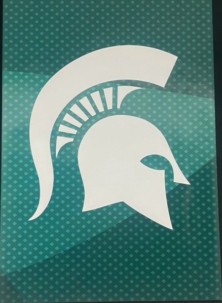
The Spartan head in its iconic function is now mostly used for marketing and branding. The Sparty head is easy to shrink and expand, it can be white and stand out against a dark green background, or vice versa. It is on virtually every piece of University property from sticky notes to sweatshirts. The Sparty head is a recognizable icon that has lasted and will last for so many years to come due to its amazing versatility and flexibility in the marketing space.
Find a piece of design and describe its indexical function.
Sparty himself acts as representation for our school. He is at football games, career fairs, and club meetings always showing up with an incredible energy that represents Michigan State’s spirit. Sparty himself is not as versatile and flexible when it comes to being used as a marketing tool because of his small details and intricacy. Shrinking or expanding Sparty to find different materials is less functional and logical than using the Sparty head.

Find a piece of design and describe its symbolic function.
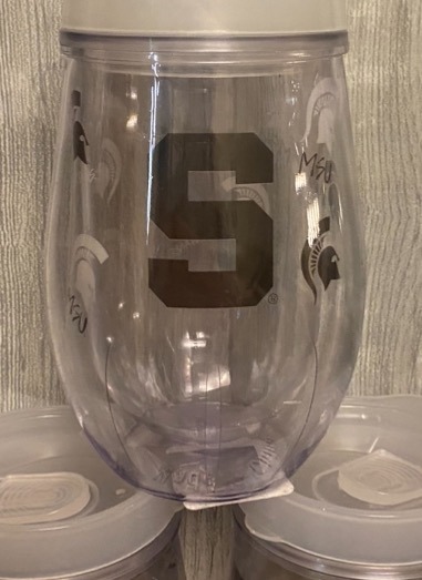
The structured, bold sans serif “S '' that represents Michigan State in its symbolic form. The “S '' can not only be a symbol for the State, but it can also be a symbol for Sparty himself. This symbol represents Sparta and Spartans without actually being a graphic of a fighting spartan. This “S” is also commonly used on marketing and advertising materials because of its simplicity and ability to fit many different formats, just like the Spartan head.
Find a piece of design that references a past “style” and in your caption say what you think the design is trying to signify by its reference to that style (think about the Stubb’s BBQ sauce example).
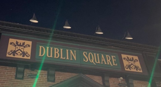
This bar is Irish-themed, hence the name Dublin Square. They use quintessential gaelic-inspired typeface to embody the medieval highland brand. Inside, there is Guinness decor, old Irish sayings all over the place, and an Irish-themed menu. The brand uses hints of green here and there, as well as traditional clan crests and clover motifs to signify the luck of the Irish. Drinking beer and dancing while having a good time is one of the most Irish pastimes, so this bar tries to create a fun-loving atmosphere that starts with its brand typeface and imagery.
0 notes
Text


1. I chose a picture of a stop sign the decorative meaning of the stop sign is pretty straightforward it signifies a command for drivers to come to a complete halt at the intersection.
2. The stop signs red color and distinctive octagonal shape, connotes authority, control, and the imperative to halt or pause. Beyond that it’s the function to follow rules and of obedience. It evokes feelings of caution and alertness. To remain vigilant.
3. The 3rd picture I chose was a tiny gift bag of two bears and hearts printed on it. I believe it connotes sentiments of love, affection, and warmth. Especially with the heart which is a known icon of love. Overall the design is meant to be gifted to loved ones for birthdays, valentine day, etc.
4. For my 4th picture I chose to take a picture of my sister and I’s sticky phone wallets. They serve as a convenient storage solution for cards and cash. Attaching securely to the back of my phone for easy access to go.
5. For the 5th picture I chose was a close up of the logo of my new balance shoes. The “N” embodies a symbolic meaning to represent the brands identity and values. This is a way to see symbolic function for example I believe everyone when they see the specific “N” everyone can guess it’s from new balance.
6. Lastly for my 6th picture I chose of Michigan Adventures “Coasters” dining which was designed to seem like a 80s diner. This can evoke nostalgia for classic American diners. With chrome finishes, checkerboard patterns, and vintage typography.
0 notes
Text


This is a tiger eating cereal again. This picture shows that the cereal is chocolate flavored, and the large amount of cereal hints that this product is delicious.
The stars in the picture can clearly tell you where you are currently.
The Nutrition Facts Table can help retrieve nutritional information and content
This logo symbolizes the name of the company and is highly recognizable.
McDonald’s packaging has a cartoon style of the past, trying to use this style to let customers feel the flavor of the past.
0 notes
Text


Module 5
Image 1: Charcoal Toothpaste - I chose charcoal toothpaste since there is charcoal in the toothpaste. The ingredients come together to make the product great. The meaning is that it can make your teeth whiter and freshen up your smile. It is supposed to make the user more confident in themselves.
Image 2: Exit - This sign tells the user where to go by the graphic and arrow. It leads them to the direction that they are looking to go. It helps navigate the area easier.
Image 3: Keep away from children label - This is a warning to not let children play or engage with the product which can cause harm.
Image 4: Stop sign - this is one that tells the driver to stop and warns them. The colors and font scream caution and to stop. The red makes it stand out. Also, many people know it by its shape which is an octagon.
Image 5: Abuelita - This is a hot chocolate packaging that is Hispanic hot chocolate and shows culture and history. It also shows how nostalgic it can be because it's called “grandmas” in English. Everyone has those memories with their grandmas making them food or a drink.
0 notes
Text

The first design I chose was the sunset logo. The denotative meaning of this design is that the name of the brand is "sunset" and it is a produce company. It was made to represent the brand and what they sell.
The connotative meaning of this design is that the brand is growing and happy. The design contains a sun within it to get viewers to feel warm inside, like they should feel when they eat their product. They want their viewers to relate sunsets with their product, which may make the viewer want to buy them.
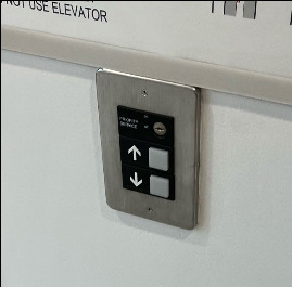
3. The up and down arrows of the elevator buttons are a perfect example of an iconic function. It tells the viewer literally what each button does, up and down respectively. The arrows are intended to resemble what the elevator will do if you press the button.

4. The fourth design I chose was the button for temperature on an air fryer. The temperature buttons indexical function is that it representing the temperature, rather than putting the numbers there. The button is the signifier and is related to the signified, which is the numbers at the top of the air fryer.

5. The fifth design I chose was this stop sign. The symbolic function of the stop sign is to tell the person to stop. As a culture, we know that the red octagon with white letters means to stop, making it have a symbolic function.

6. The final design I chose was this poster for the play Moulin Rouge. I think the design is referencing a modernist style because of the use of primary colors as well as the text conforming to the grid. I think the reason it is trying to signify this is style is because it is trying to capture that retro feel that the modernist style has because the play is set in the early 1900s.
0 notes
Text


Image #1- The denotative meaning would be that it represents a retro computer system.
Image #2- Connotative meaning: Beyond its surface appeal lies a connotative journey back to simpler times, evoking feelings of warmth, familiarity, and fond memories. Transport yourself to an era of innovation and creativity, where every keystroke was an adventure and every pixel held limitless possibilities.
Image #3- Find a piece of design and describe its iconic function. In this case, the octopus depicted on the can is a direct representation of the product contained within. The image of the octopus serves as a visual cue for consumers, immediately informing them of the contents of the can without the need for additional text or explanation.
Image #4- Find a piece of design and describe its indexical function. The indexical function of a corrosive material sign can be vividly depicted by showing the result of the material melting a hand. In this graphic representation, the hand appears distorted and partially dissolved, with flesh melting away and bones exposed. This image serves as a direct indexical sign of the corrosive properties of the material, illustrating the physical harm it can cause upon contact with skin. The melted hand serves as a tangible and immediate warning, visually communicating the severe consequences of mishandling or exposure to the corrosive substance.
Image # 5- Find a piece of design and describe its symbolic function. While it may seem to resemble an icon because it somewhat resembles the actual object it represents (a cross used in first aid contexts), its meaning is not solely derived from its visual similarity. Instead, it functions as a symbol because its significance is culturally and contextually determined. In this case, the cross symbolizes medical assistance, emergency care, and first aid, regardless of its visual resemblance to an actual first aid kit or equipment.
Image #6- Find a piece of design that references a past “style”. I think the sign is in this old western style to evoke a sense of nostalgia and authenticity, creating a unique atmosphere that transports diners to a past era. This sign harkens back to the rugged charm of the American frontier, with "weathered" wood, hand-painted lettering, and rustic imagery reminiscent of saloons and eateries from the Wild West.
0 notes
Text


Photo 1: This piece of design has a denotative meaning. The denotative meaning of the design is that the name is "alloy". This is because the main ingredient in the product comes from aluminum alloy. It is only expressing its main meaning and it has no ideas or emotions that people can try to connect it to. It is telling you what the product consists of and what the product is. It has no other intentions besides telling you what it is.
Photo 1: This piece of design also has a connotative meaning. The connotative meaning of the name "alloy" could be that the product is as strong and resilient as aluminum alloy. Aluminum alloy is exceptionally strong and it may be trying to express other ideas to imply its strength and resilience besides just a main idea of what it is. It could be trying to get people to think more deeply about its meaning over just the product itself.
Photo 2: This design has an iconic function. This sign's iconic function signifies that the road comes to an end and you could either turn right or left by using the arrows pictured. It represents the meaning of what you are supposed to do and what you are supposed to acknowledge. It is only showing a picture, yet it is expressing a meaning to drivers when they come across it. It's simplistic and its only goal is to represent its function.
Photo 3: This design has an indexical function. This sign uses the picture to indirectly suggest that this item should not be used or associated with young children because it could be a hazard. It is a picture that indirectly represents its meaning. It can be associated with something else than just the actual picture and it associates its function. It's not telling you directly what its meaning is but the picture is still expressing it.
Photo 4: This design has a symbolic function.This sign clearly portrays its meaning by using words in the design that clearly state "STOP" to signify that there is an intersection where a stop is required. It is a symbol that signifies its meaning with the words that tell you its function. It is telling you what you are supposed to do with a design using words.
Photo 5: This design references a past idea. I think that this design is trying to represent the history of the university. This design is more intricate and shows more detail of the classic values and history that the university is trying to portray with the retro design on the jacket. It is attempting to signity its values by referencing the style that was used.
0 notes
Text

The denotative meaning of this banner is solely to sell the Cedar Village apartments to the viewer. It is trying to tell the viewer to do something or take action by saying "hey, come rent from us", with the design of this banner. In addition, it provides information to contact or receive more information further emphasizing the point that this banner is denoting to the viewer that they are trying to sell something or get the viewer to take action.
2. The connotative meaning within this banner design is the happiness that one can gain from staying in these apartments as we can see by the smiling and happy individuals in the image. Therefore, they are also trying to push an idea through this connotation that the viewer can have fun or be happy if they reside here.

3. In this design, the iconic function that is being portrayed is the phone that is taking a picture of the blurred individuals, therefore the phone/camera is acting as the icon of the people. Along with that the polaroid images below that can also represent iconic function as they too are portraying the individuals that were photographed. With that said, we can see that there is a signifier and a signified element to this design that creates the sign overall, with these two examples in this poster.

4. This Toyota ad is proving an indexical function because it is hinting that this car is capable of handling all different kinds of weather and terrain conditions because the viewer sees the car transitioning from two different scenes. The two different scenes of the stormy city and the sunny wilderness are signifiers of the car (signified) which create this idea (sign) that the car has great durability and can handle any conditions.

5. These posters provide an example of a symbolic function in graphic design because we see something that is recognized as that particular idea. Thus, the symbol in this poster would be the colorful beach ball that which to many can be associated with the idea of summer because going to the beach or playing volleyball with a beach ball are summer activities. And that is part of the idea in this poster as they are trying to stress the summer season for a particular reason.

6. Lastly, this here ad by Apple, is representing a past style of pop art which was a pretty popular style back around the 1960s. At that time, pop art was a way of making different things look cool, fun, and playful because it broke traditional barriers of art and design. It also made different things stand out for example just because of how prominent this style was. Perhaps this ad is trying to signify the unique and innovative aspects of the Apple product while also drawing attention with this certain style. It can also signify that Apple too, is breaking barriers in the technology world just like the broke the barrier between the sleek and traditional advertising style of modernism.
0 notes
Text
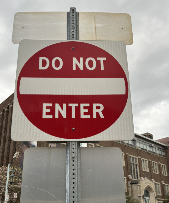
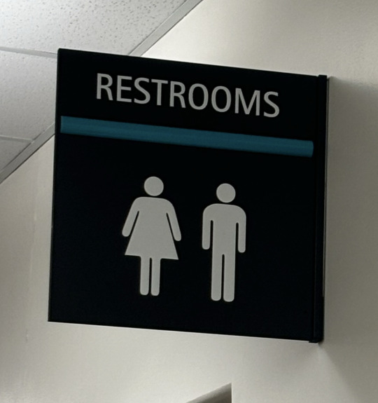
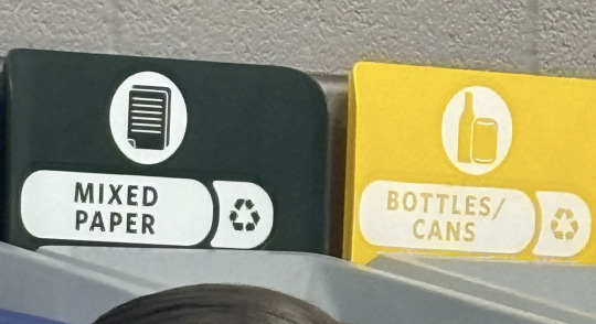
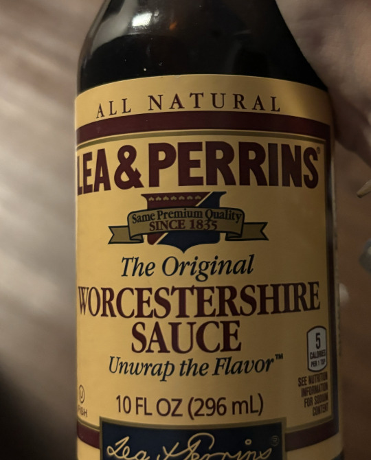
Image 1: The design that I chose to capture was the apple logo, the apple logo is very iconic in today's society and it can be used as a status symbol. The apple logo is a simple apple with a piece taken out of it and all big apple products contain the logo somewhere on the product. Denotatively the design represents the fruit shape.
The connotative meaning of the design is one of simplicity and uniqueness. The logo is a pretty simple design but it has been around for a while and has built an economy off it from phones, headphones and much more.
Image 2: The design that I chose was a DO NOT ENTER sign, it is very iconic in the America traffic signs realm. The red circle with the white letter on it is iconic and many people know the meaning of it.
Image 3: The recycling system is a very known symbol with the three arrows forming a triangle shape. The shape of the arrows represents the cycle of reuse, reduction and recycle.
Image 4: The symbolic design that I chose to capture was the bathroom sign, the triangle shaped dress is associated with the women's bathroom and the straight figure is known as the men's bathroom. Even if the sign has no words on it saying men or womens by seeing the symbol you know which one is which.
Image 5: The design of the label for this worcestershire sauce has a past “style” with the colors they choose and the tones of the label it gives an old fashion vibe to it. Also by including an older typography style and the logo saying SINCE 1835.
0 notes
Text
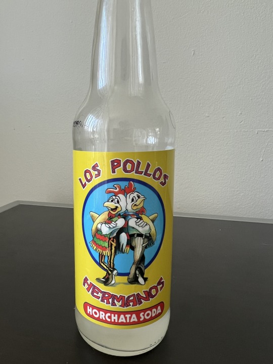
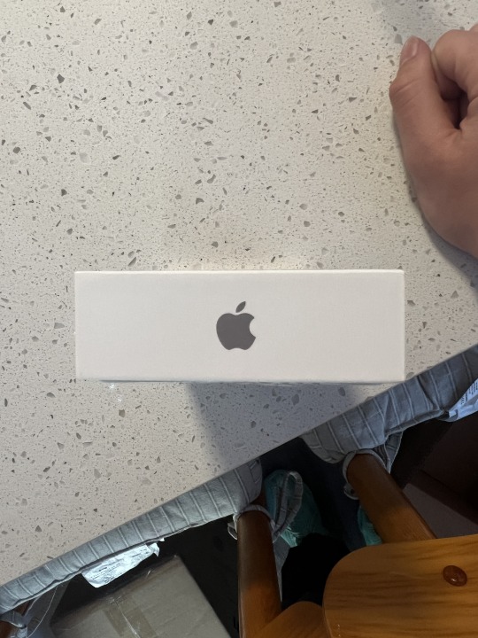
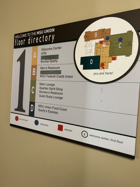
Image One, Denotative Meaning: The quite simple denotative meaning show on the glass bottle is the contextual descriptors shown on the bottle. There is the text that says, "Los Pollos Hermanos" Which means the chicken brothers in Spanish. There is an image that matches this text descriptor in between the words as well. Finally, there is the descriptor of what the product is, Horchata flavored soda.
Image One, Connotative Meaning: The complex connotative meaning on this piece of design is the background of the usage of the brand name, Los Pollos Hermanos. This drink is a themed drink based on the popular TV series, "Breaking Bad". Consumers who are fans of the show will also interpret the logo as signifying characters from the TV show. There is some more connotative messages unrelated to its TV show roots, such as the font in "Los Pollos Hermanos" typically being used in Hispanic culture.
Image Two: The iconic function in this image resides in the Apple logo. The Apple logo has become iconic in media as it represents innovation and high tech products that Apple as a company produces. If an individual sees the Apple logo, it is most often related to usability, simplicity, and trendiness. It has become so iconic that TV shows have made fictional parodies of the Apple logo such as the Pear Phone in 'Victorious'. This shows how iconic the simple bite out of an apple has become.
Image Three: The indexical function of this image is its utilization of shapes and their classifications for the purpose of assisting with wayfinding. For example, There is quite large blue circles that represent the locations of bathrooms in the building. Those are classified below the map to give context to the viewer. Also, utilizing a, 'You are here' mark allows for easier time navigating to these points of interest. For specially important information, such as the floor number, it uses quite large text. It also categorizes points of interest into letter categories and lists what attractions are in those areas.
Image Four: The symbolic function shown in this image is the triangle with an exclamation mark on the inside. This symbol is synonymous with 'Caution', or 'Warning'. Even though those two words are not mentioned on the design, it is implied that is what the design is intended for. That symbol is utilized worldwide for varying uses and is distinctly recognizable as a warning sign.
Image Five: This piece seems to be referencing a past style of classic movies or shows that would be seen in an old theater. I came to this thought process as the poster utilized the shape of an old ticket stub that is classically used in old theaters for upcoming shows. The typeface used also resembles fonts that were seen on typewriters or other various older printing styles.
0 notes
Text
Module 5 Scavenger Hunt

This poster advertising the class “Gender in News Media and Technology” uses imagery that has the denotative meaning of 4 women in different clothing and backgrounds giving a talk.
However, the poster also has the connotative meaning of unification and power empowerment. All four of these women come from either different careers or backgrounds as denoted by their outfits, but they are connotatively unified by the same red coloring in their clothing. From their suits, to the construction hat, to the head cloth, they all have the red color scheme bringing them together. The smiles and red blushes on the face also connotes a sense of confidence and happiness that empowers all four women.

This bell graphic that appears in every elevator is a great example of an iconic function. It bears a literal resemblance to a bell to inform people that the button can be used to run for help, similarly to a bell.

This “make summer a thing” poster is a great example of the use of indexical function. Instead of trying to use a literal image of summer, it uses graphics that are existentially related with summer. The watermelon is a fruit that is commonly eaten during summer times. The flamingo represents lawn flamingos or even inflatable pool flamingos that you would also see in the summer. The sun is a more literal representation of summer weather. The beach umbrella also invokes the idea of beaches and summer weather. The flower also invokes the relationship between plants flourishing and in the summer weather. While each of these graphics are not an iconic or symbolic image of summer itself, they act as an indexical function due to their pre-existing relationship with summer as a concept.

The recycle symbol on this recycling bin is a great example of a symbolic function. It is culturally accepted that the graphic of 3 arrows interloping in the triangle shape is the symbol of recycling. Even if the arrows have nothing to do with the act of recycling, it is a culturally accepted representation.

6. This poster advertising the class “Games and Society” is a great example of a graphic that references a past aesthetic. The font used in the header specifically references the pixelated aesthetic of video games fonts in the 1980. During the time, video game graphics were extremely limited, So this pixelated look came to define the aesthetic of the time period. This immediately invokes a feeling of nostalgia, as this era was such an iconic period of video game history. #module5
0 notes
Text


1.Apple Logo:The Apple logo is a stylized depiction of an apple with a bite taken out of the right side. It consists of a simple, iconic silhouette with smooth curves, typically rendered in a monochromatic color scheme. Denotatively, it represents the fruit itself, with its distinctive shape and the recognizable missing bite.
2.Apple Logo:The Apple logo, a stylized apple with a bite taken out, symbolizes innovation, creativity, and luxury. It represents Apple's commitment to cutting-edge design and user-friendly products, evoking feelings of excitement and admiration. The bitten apple adds a playful touch, suggesting non-conformity and pushing boundaries.
3.Stop Sign:The stop sign serves as an iconic symbol with a clear function: to command vehicles to halt. Its octagonal shape, bold red color, and prominent white letters spelling "STOP" make it instantly recognizable and universally understood. As an icon, the stop sign conveys its message without the need for language, ensuring consistent communication of traffic regulations and promoting safety on the roads.
4.Recycle Logo: The recycling symbol, with its three arrows forming a triangle often encircled, directly signifies recycling. This simple shape visually represents the cycle of reuse and repurpose, guiding towards sustainable practices. When people see this symbol, it reminds them of responsible disposal and encourages participation in recycling efforts, making it a clear marker for eco-friendly actions.
5.Handwarmer: The handwarmer product, with silver letters on a red background and white snowflakes, symbolizes warmth, comfort, and the holiday season. The red color makes it feel warm and lively, while the silver letters add a touch of elegance. The snowflakes remind us of winter and holidays, making it cozy and festive. Overall, this design promises warmth and comfort during cold days, bringing holiday joy to mind.
6.You Can Be A Stock Market Genius Book: Caption: This book cover has a vintage style, making us think of old times when the stock market was mysterious. The light bulb suggests it holds the secrets to understanding stocks. The yellow background feels positive and exciting. And the money at the bottom reminds us that stocks mean wealth. Overall, the use of a past style in the design signifies credibility and implies that the book offers enduring wisdom for success in the stock market.
0 notes
Text


The iconic Apple logo, featuring a bitten apple, embodies the company's commitment to innovation, user-friendly technology, and the pursuit of knowledge. Its sleek, minimalist design reflects Apple's dedication to simplicity and elegance, while its universal recognition solidifies the brand's position as a leader in the tech industry and a symbol of modern digital culture.
The Apple logo's connotative meanings go beyond its literal representation, evoking associations and emotions such as temptation, knowledge, rebellion, sophistication, modernity, premium quality, and a challenge to the status quo. These deeper interpretations add depth to the logo's symbolism, resonating with audiences on a subconscious and emotional level.
The TV remote's design incorporates iconic, indexical, and symbolic functions. The mute and volume buttons exemplify indexical and symbolic elements. The "+" and "-" signs are indexical, and associated with basic math. The mute button features a microphone with a "\" symbol, symbolizing "don't" or avoidance, indicating the action of silencing sound.
The stop sign exemplifies indexical design, using its red octagonal shape and bold white letters to directly signal drivers to halt their vehicles. Relying on universally understood symbols and colors, the sign's indexical function allows it to convey crucial information quickly and effectively, promoting road safety and traffic regulation worldwide.
The recycle symbol on a Coke bottle is an example of a symbolic function. The symbol has a conventionally learned meaning that instructs people to recycle the item, despite having no visual resemblance to the actual act of recycling.
Benefit, a beauty brand, incorporates a retro design aesthetic from the 1960s in their product packaging. This nostalgic look, featuring typography and colors reminiscent of the era, aims to evoke a sense of trust and quality in customers, suggesting that the product's longevity is a testament to its effectiveness.
0 notes