
Don't wanna be here? Send us removal request.
Statistics
We looked inside some of the posts by moniauthoring and here's what we found interesting.
Average Info
Notes Per Post
18
Likes Per Post
17
Reblog Per Post
1
Reply Per Post
0
Time Between Posts
6 days
Number of Posts By Type
Text
12
Last Seen Tumblr Blogs


Fun Fact
Tumblr.com is the 103rd most visited website in the world.
Text
Hero Website
We are reaching the final stage of this module and as a final assignment, we must plan, design and build a website about a hero from scratch. It sounds like a great project (and it is!) but I am sure that with all acquired knowledge and the worksheets, this project will flow without a problem.
I chose Frida Khalo as my hero because I would like to talk about a Mexican person.
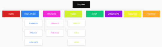
My site map looks like this so far.
💻 Home: Welcome Page
👩🏻🎨 Frida Kahlo: - Biography: Life, work, influence - Timeline - Frida facts
🎨 Artworks: - Paintings - Drawings
📷 Media: - Photos - Voice - Videos
📺 Latest News: Upcoming exhibitions, Blog
💰 Shop: Products inspired in Frida such as cups, clothes, bags, notebooks, etc.
👩🏻 About Me: Personal Bio, reasons why Frida has inspired me.
📩 Contact: Form where visitors can keep in contact, social media.
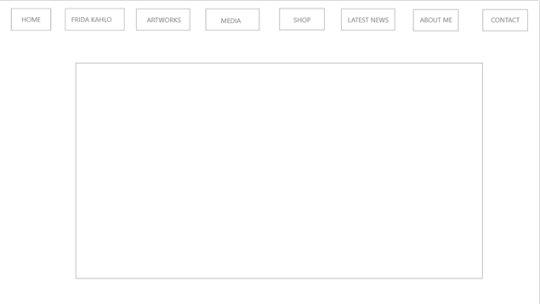
And my wireframe like this:
Wish me luck! 🤞
5 notes
·
View notes
Text
Planning and Designing a Website
With everything learned, it is time to plan and design my own website! 👏
As in any process, a series of elements must be considered:
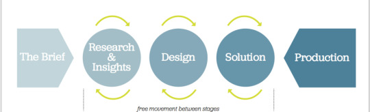
✍️ The Brief: The starting point of a project and is a constant reference point throughout its life cycle.
🔬 Research & Insights: Through surveys to clients to know the goals, purpose, audience, content, competition, etc.
📝 Content & Information Architecture: Plan content, site map, name pages and write a brief description of each page.
💻 Usability: Is concerned with the quality of a user's experience whilst using a product or system.
Some of the chief concerns of usability are: - Effectiveness - Efficiency - Safety - Utility - Learnability - Memorability
✂️ Design: Mood, tone, graphics, colours, fonts, etc.
📏 Wireframes: A simple sketch of the basic layout of the site. It defines the location/size of The page, header, navigation, content areas, footer, etc.
Let’s do it! 🙌
1 note
·
View note
Text
WordPress discovery
Something new this week!💃WordPress is a popular Content Management System built using PHP and MySQL.
Originally associated with blogging, it is now used for news websites, eCommerce sites, forums, galleries, commercial sites, etc. It is used by 39% of the web. 👀
I have never used WordPress before, it looks complex but it is easy and handy, actually.👌🏻The WordPress installation was ok because Ruairí explained it to us in detail, it was very easy to re-access the platform through the college's server.
Elements of WordPress:
📎 Dashboard: You can control almost all aspects of your site.
📱 Themes: WordPress sites’ look and feel are controlled by themes with a few installed, and you can install others or make your own.
💻 Appearance: Sub-menu gives you access to various options related to the look and feel of the site, as well as navigation.
🔑 Customise tab: This allows you to change various aspects of your site look and feel, as well as the site name, tagline, menus, etc.
🔎 Menus: You can add menus and decide what options go on the menu and in what order.
🧮 Widgets: They allow you to add various pieces of information to your site, usually in the sidebar or footer.
📝 Posts: You can add new posts, edit, delete and generally manage existing posts.
📄 Pages: They are used for more “static” content, that doesn’t change much.
✂️ Plugins: These are ways to extend and add to the functionality that already exists in WordPress.
Until next time! 👋
1 note
·
View note
Text
CSS Grid
CSS Grid is a very powerful method for precise grid layouts. 🧱 A grid is a set of intersecting horizontal and vertical lines defining columns and rows. We can declare an element as a grid container, and all direct children of that element become grid items.
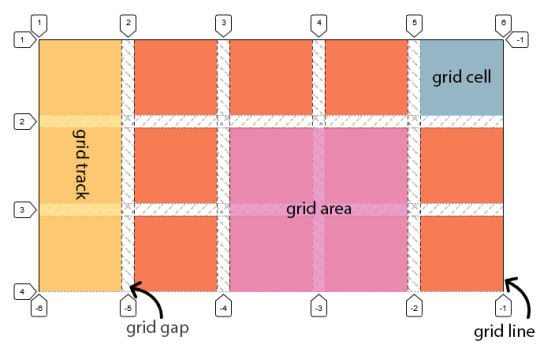
Features:
Fixed and flexible track sizes 📐 We can create a grid with fixed track sizes. This sets the grid to the specified pixel which fits to the layout desired. We can also create a grid using flexible sizes with percentages or with the new fr unit designed for this purpose.
#container { display: grid; grid-template-columns: 1fr 1fr 1fr; }
Item placement 📍 We can place items into a precise location on the grid using line numbers, names or by targeting an area of the grid. Grid also contains an algorithm to control the placement of items not given an explicit position on the grid.
Creation of additional tracks to hold content 🔍 We can define an explicit grid with grid layout. The Grid Layout specification is flexible enough to add additional rows and columns when needed. Features such as adding “as many columns that will fit into a container” are included.
Alignment control 📏 Grid contains alignment features so we can control how the items align once placed into a grid area, and how the entire grid is aligned.
Control of overlapping content 🔧 More than one item can be placed into a grid cell or area and they can partially overlap each other. This layering may then be controlled with the z-index property.
See you then! 🙌🏻
1 note
·
View note
Text
Top Platforms to learn programming
Last semester we had the multimedia programming module and it was very interesting. Personally, I think that learning to program, in the very near future, will be like speaking English today. 🤖
The good news is that today there are many online platforms that teach you the vast majority of existing programming languages, from a very basic level with no prior knowledge to a very advanced level. 😎
These are my top platforms where you can learn programming completely free, or at a very low cost. 👀
1. W3schools 💻 It's free and here you will find everything. And very well explained, with interactive examples, and step by step. It is very easy to choose what you want to learn and to perform and understand each of the examples that it suggests.
2. Hackr.io 🖱 It has a powerful search for free and paid courses, to learn almost any programming language. You just have to access the search for online resources that it has and go filtering what you need.
3. Codecademy 🖥 There are free and paid courses. In addition to a concise and understandable explanation, the interactivity it offers you to “put what you have learned into practice” is very good and flexible.
4. YouTube 🎞 YouTube is full of video tutorials on any subject (and there is no shortage of programming).
Try them and tell me how it went 🤓
1 note
·
View note
Text
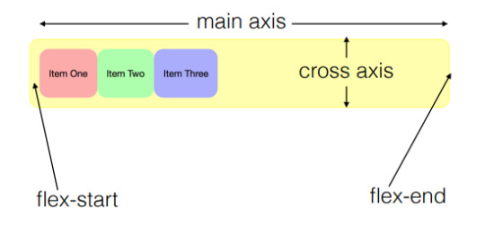
What is Flexbox?
I think this little friend provides a more efficient layout aligning and distributing space among items in a container, even when their size is unknown and/or dynamic. 🧠
It consists of a parent element 🤰 "flex container" and it is children are 👶“flex items”.

When we are working with flexbox we need to think in terms of two axes:
➡️ Main axis: It is defined by the flex-direction property.
⬇️ Cross axis: It runs perpendicular to it.

The main axis is defined by flex-direction, which has 4 possible values:
👉🏻 Row: Items will run horizontally from left to right (in English), from the flex-start to the flex-end.
👈🏻 Row-reverse: Items will run horizontally from right to left.
👇🏻 Column: Items will run from top to bottom.
👆🏻 Column-reverse: Same as row-reverse but bottom to top.
There are 3 important properties to have more control over flex items:
🙌 Flex-grow: This defines how an item should grow to fit the available space.
💢 Flex-shrink: It defines the ability for a flex item to shrink if necessary.
🤝 Flex-basis: This determines the default size of an element before the available space is distributed.
We have a shorthand property flex that allows us to combine all three. By default, it is set to: flex:0 1 auto;
This means:
flex-grow is set to 0, so the items do not stretch to take up more space.
flex-shrink is set to 1, so items can shrink rather than overflow.
flex-basis is auto, so they will get their size from the CSS or the content
I highly recommend checking this out: 👀
https://css-tricks.com/snippets/css/a-guide-to-flexbox/
See you then! 👋
1 note
·
View note
Text
The Box Model
😫 I have started to feel a little bit overwhelmed with HTML because if something in my code is not in the right order, I am going to mess everything. 🤯
Every element creates a "box" 📦 in the document flow and the properties of these "boxes" can be manipulated by CSS.
This week we learned about 🧧 the CSS box model that is essentially a box that wraps around every HTML element and it has 4 areas:
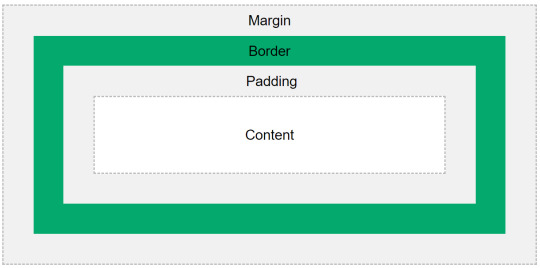
📝 Content:
Text and images.
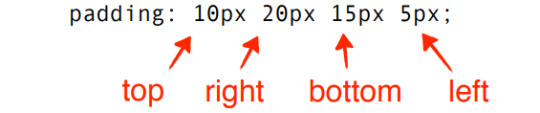
📐 Padding:
It is transparent and located between the contents of the box and the edge of the box.
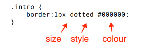
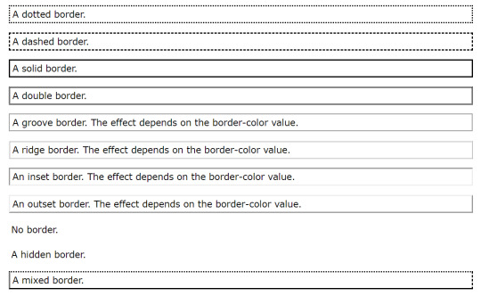
🪟 Border:
It goes around the padding and content.
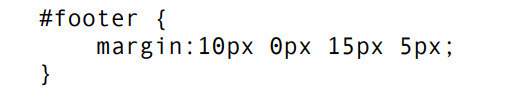
📑 Margin:
It is transparent and clears an area outside the border. Can be rem, %, px, etc.
🔗 Links can be styled differently depending on which of the 5 states they are in.
a : link: When the link has not been activated or visited previously.
a : visited: A link the user has visited
a : focus: For example while a keyboard user’s cursor is on that link.
a : hover: When the user mouses over the link.
a : active: The user activates the link during the time they are clicking on it or when the link has been opened in another window or tab.
My favourite part... colour! 🎨 To set the color to the text, background and, borders in our website through CSS we can use:
Text:
h2 { color: green;
}
RGB:
h2 { rgb (0,255,0);
}
Percentages:
h2 { rgb (0%,56%,18%);
}
HEX Values: (The most common)
h3 {color: #FF0099;
}
Let us work on the worksheet!
1 note
·
View note
Text
Exploring CSS
👏 Yeah... It is time to learn CSS which is used to add our own essence through the External Style Sheets, rules that control how elements should be displayed on our website.
👉 Main parts to the CSS rules:
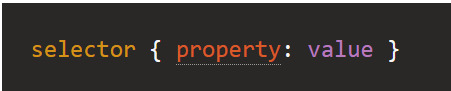
1. Selector:
It represents the HTML element that we want to style.
h1 { color: blue }
2. Properties:
They are between curly brackets and colons that define what you want to do with the elements we have selected. Such as colour, size, position, etc.
h1 { color: blue }
3. Values:
They are the changes we want to make to the properties, such a text, numbers, etc.
h1 { color: blue }
✋ Types of selectors:
1- Element:
This group includes selectors that target an HTML element such as an h1.
2- Class:
They are indicated by a dot.
3- Id:
They are identified by a # symbol.
4- Position in document
Select elements based on where they appear in the document.
The last lab did not make sense for me, I thought that it was more work to do, identifying different code sections such as header, main, aside, footer, etc. 🙌 Now, I understand why we did it in that way, doing the division gives more structure to the code, it is easier to define the format, font, or colour that we want on a specific section of the webpage.
It is cool to see new changes on the previous worksheet, more beautiful fonts, alignment, etc.

See you next week with my CSS update! 👩🏽🏫
1 note
·
View note
Text
Structure/Layout
As I always say, having order in general is necessary and makes things easier, and HTML is no exception. 🙌
A lot of websites have a similar structure, so now it is time to add Header, Navigation, Article, Aside, and Footer to my code. It seems that is going to be the last step with HTML and then we will be ready to CSS. 👀 In my opinion, this part is very intuitive because it is like 🚶♂️ the skeleton of the page, a combination of elements, and <id> and <class> attributes can give a page structure.
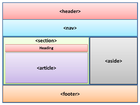
📌 Basic sections:
<header>: A big strip across the top with a big heading, logo, and perhaps a tagline that defines the general header of the page. It goes inside the <body>.
<nav>: This navigation bar is the main menu or a table of contents.
<main>: Main content unique to the page with various content subsections represented by <article>, <section>, and <div> elements. It goes inside the <body>.
<article>: It contains a block of related content that makes sense on its own without the rest of the page. Such as an article, blog entry, comment, forum post.
<section>: Similar to <article>, a group of related content, a generic section of a page with its own heading. A page might have multiple sections.
<div>: It has no meaning itself and it is used to group content together if there is no better semantic block element to use.
<aside>: Also referred to as a ‘sidebar’, contains content that is not directly related to the main content but can provide additional information indirectly related to it, such as advertisements, links, recent posts, etc.
<footer>: Copyright notices, details, or contact info with fine print on the bottom of the page.
📎 Other elements:
<class>: Identify one or more elements in a document and it can appear multiple times on a page. One element may also have multiple classes.
<meta>: It allows to include information about the document. It is a void element, and it must appear inside <head>.
<charset>: Specify a character set for the browser to use in displaying the page. This should be declared after <head> and utf-8 is recommended.
I am really excited to start learning CSS! 🤩
2 notes
·
View notes
Text
Lists, links and images
I am feeling like a programmer 😎 Ok Let me dream for a moment (haha) 😆 In the lecture this week I learned how to add lists, images, and links to my HTML page.
📝 3 types of lists:
*Unordered:
Items placed in any order, typically rendered as a bulleted list.
We use the <ul> element and then the <li> element for each item on the list.
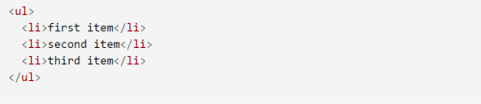
This code will output:
first item
second item
third item
*Ordered:
Items in a specific order, rendered as a numbered list.
This type of list use <ol> elements with <li> for each item.
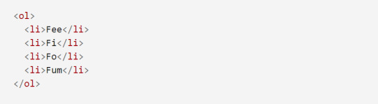
It will look like this:
Fee
Fi
Fo
Fum
*Description:
Ruairi said that we will cover just the first two, so it is an opportunity to look for more information. 🔍
📷 3 main formats of images:
-JPEG (Joint Photographic Experts Group)
-PNG (Portable Network Graphics)
-GIF (Graphics Interchange Format)
If the image is part of the content of the document, we use the <img> element along with the source (src) attribute, which includes the location and name of the image. However, we use CSS if the image is part of the design of the page.

🔗 Types of Links:
Linking to External Sites: We need the absolute URL, the full web address for the site.

Linking to pages on the same site: We use a relative link, the location of the page.

💻 All above is summarized in the second worksheet in labs, where everything looks more dynamic by adding these 3 elements seen in class.

Call me Moni programmer, please! 🤓
1 note
·
View note
Text
This is just the beginning
A long time ago (I think secondary school), I learned the principles of HTML, but to be honest I could not remember anything because I did not practice it anymore and maybe at that moment I did not know how important this language was. 😕
I attended my first Web Authoring lab at the campus (finally) with Ruairí's motivational phrase in my mind: "You will be fine", 😎 and I can say it was not so bad following my notes and asking some questions for clarification.
I figured out that the key points for this topic are to be organized with the code, not forget to open and close tags, and the last one (but not less important) to identify HTML (HyperText Markup Language) as the structure of our page with headings, titles, body, content, images, etc. and CSS (Cascading Style Sheets) as the presentation of the sites, the design in general. 🎨
I really want to be at the step where I can manage colours and fonts, this is so... simple.
I downloaded Atom software as my text editor and it works for me, it has been very useful especially because it helps to highlight tags with colours and gives suggestions when I am coding. It is good so far, let us see in the assignments. 🙈
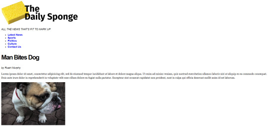
This is how the first exercise from the first worksheet looks like after coding on Atom:

and this is how it looks like on the website:

Thanks for reading me! See you next time!
1 note
·
View note
Text
Let us begin!
Welcome to my blog! 🤓
This is Monica, but you can call me just Moni, yes... like money. 🤑 I am from Mexico, and this is my Web Authoring blog where I am going to post about my lecture content and some interesting articles and thoughts about digital media topics.
I am currently studying my second semester of the MSc Interactive Digital Media at Griffith College in Dublin, Ireland. It has been challenging because my background is so different from the rest of my classmates. ✈️ I have a degree in tourism management, but since I can remember I have been interested in digital platforms and technology. In my opinion, they are fascinating and necessary in daily life, which is why I am here. In addition to acquiring and developing new knowledge in this area of digital.
I am a returning student and I had really enjoyed all last semester's modules; my favourite ones were Multimedia Programming where we learned how to make pieces of digital art, and Interaction Design where we design an academic interface, both with Ruairí as the lecturer. He said that Web Authoring will be easier, let us see. 😅
I love the idea that I am going to be able to make my own websites soon! 🤩 but first baby steps, we are going to start with the basics (HTML) then CSS to add more interesting stuff like fonts, colours, etc.
Stay tuned so we can share ideas and discuss this unexplored area for me.

2 notes
·
View notes