#flexbox
Explore tagged Tumblr posts
Visit Tumblr Blog
Explore Tumblr blogs with no restrictions, modern design and the best experience.
Last Seen Tumblr Blogs


Fun Fact
Tumblr.com is the 103rd most visited website in the world.
Text
Helpful Poster Guide from CSS-Tricks for CSS Flexbox
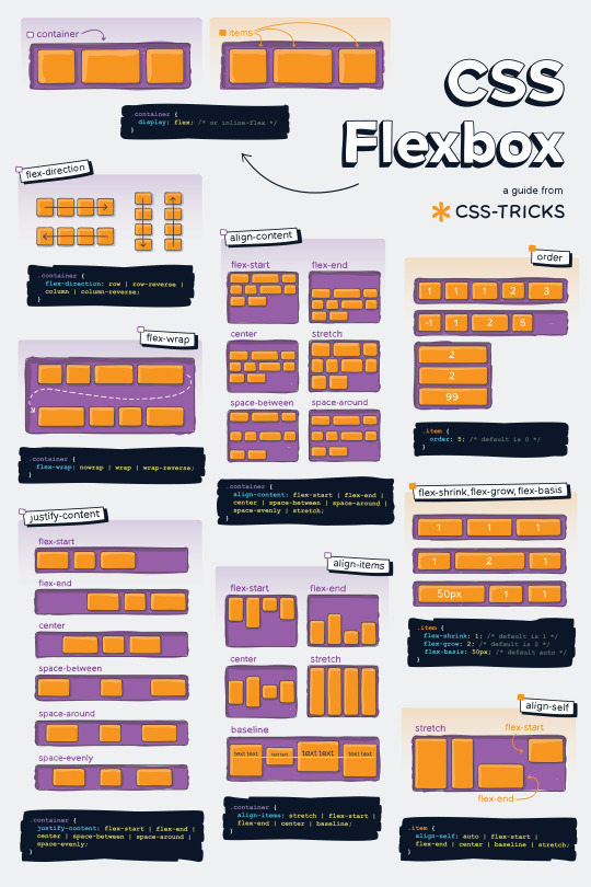
#codeblr#coding#studyblr#studying#programmer#coder#programming#progblr#study#code blog#code#css#flexbox
311 notes
·
View notes
Text
she flex on my box till I overflow
23 notes
·
View notes
Text
CSS Positioning...
Today is the day I try my absolute best to focus on CSS flexbox.
Positioning in CSS is a complete guessing game to me currently, so today I'm going to specifically take the time to deep delve and try to fully understand what does what.
If you have any handy tips, I'd be grateful to hear them! Otherwise, I'll end up trying to make something that will hopefully make it easier to others too.
Wish me luck!
#css#flexbox#learning to code#web design#coding#codeblr#studybrl#study blog#learning#web development#programming#career change#career switch#motivated
16 notes
·
View notes
Text
Flexbox Landing Page
#css flexbox examples#flexbox css#flexbox tutorial#html css#css#frontenddevelopment#webdesign#html#css3#divinectorweb#flexbox#landing page website#website design#create a website
4 notes
·
View notes
Text
Curious about when to use display: flex or display: inline-flex?
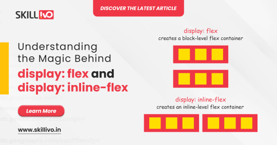
display: flex turns your element into a block-level flex container, giving you full control over its child elements' alignment and spacing. Perfect for structuring complex layouts! 🏗️
On the other hand, display: inline-flex gives you the same flex properties but maintains the container as an inline element. Ideal for inline-level layouts where you need the magic of flex without breaking the flow! 💫
Read Article- Click Here
Follow-
LinkedIn- Skillivo
#WebDevelopment#CSS#Flexbox#Coding#Frontend#WebDesign#Programming#CodeNewbie#LearnToCode#TechTips#Skillivo#ProgrammingTips#InlineFlex
3 notes
·
View notes
Text
No Streaming Today
As a reminder, there's no streaming today! Instead, we're doing a small workshop on Astro + GitHub (testing the FujoGuide Issue 2 content) for $upporters only.
To dry your tears, a PSA: you can now use "flexbox" to create layouts on AO3. If you don't know how to use flexbox, let "flexbox froggy" be your guide!
3 notes
·
View notes
Text
3 notes
·
View notes
Text
La propiedad display en CSS: Desde lo básico a los diseños más avanzados.
La propiedad display determina el tipo de caja que un elemento forma y cómo se comporta dentro del flujo del documento. En otras palabras, indica si un elemento se mostrará como un bloque, una línea o si se ocultará por completo. Valores de la propiedad display La propiedad display admite varios valores, cada uno con un comportamiento específico: Valores básicos: block: Crea un bloque que…
#block#caja#contenedor#CSS#CSS3#desarrollo web frontend#Diseño web#diseño web adaptable#diseño web moderno#elemento#elementos HTML#Flexbox#flujo del documento#Grid#inline#inline-block#layout#maquetación#posicionamiento de elementos#propiedad display#responsive design#tipos de display#valor display
0 notes
Text
Learn how to design and build websites for any screen size. We cover mobile-first design, CSS flex-box, and how to use Figma's auto-layout to design user interfaces.
0 notes
Text
CSS Flexbox Layout by Abdelfattah Ragab
CSS Flexbox Layout by Abdelfattah Ragab
Welcome to "CSS Flexbox Layout". In this book I explain the flexbox layout model. I explain the properties of containers and elements and show you how to use Flexbox to create modern and responsive web designs. By the end of this book, you will know everything about Flexbox, use it to create responsive designs and handle all kinds of scenarios. Let’s get started.
Available on https://shop.tredition.com and https://www.amazon.com
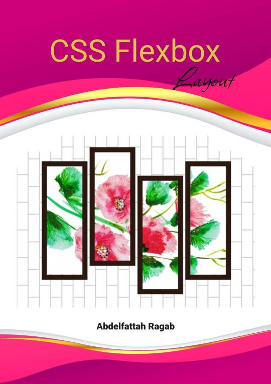
0 notes
Text
flex-direction: row; & flex-direction: column;
Flexbox has a property called flex-direction and this determines the direction that the flex items are displayed.
flex-direction: row; - this is the default and aligns the items across the page, making the main axis, left to right and the cross axis, top to bottom.

When this property is applied with this value, and if you use the flex-basis property on the flex items within this container, it would affect the width of the items:

if we apply a flex-basis of 500px to the first child div, it would change the width of the div.
flex-direction: column; - this aligns the items down the page, making the main axis from top to bottom and the cross axis from left to right.

When this property is applied with this value, and if you use the flex-basis property on the flex items within this container, it would affect the height of the items:

if we apply a flex-basis of 300px to the first child div, it would change the height of the div.
The flex-basis property interacts with the main axis, and depending on the direction of the main axis, determines whether the flex-basis will change the items' width or height.
#codeblr#coding#studyblr#studying#programmer#coder#study#progblr#programming#random notes#css#flexbox
88 notes
·
View notes
Text
CSS Grid vs. Flexbox: Choosing the Right Layout Tool for Full Stack Developers
CSS Grid and Flexbox are both modern CSS layout techniques that make web design more flexible and efficient. Mastering these tools is crucial for Full Stack Developers, as they help create responsive and visually appealing designs. If you want to become a Full Stack Developer and gain top-notch skills, the Best Institute for Full Stack Developer Course in Pune, Mumbai, Nagpur, Delhi, Noida, and other cities in India is the perfect place for you. courses will deepen your understanding of essential tools like CSS Grid and Flexbox. Read on for more insights!
0 notes
Text
Introducción a CSS: Estilizando la Web
Introducción
CSS (Cascading Style Sheets) es el lenguaje que se utiliza para describir la presentación de un documento escrito en HTML o XML. Mientras que HTML estructura el contenido de la web, CSS se encarga de darle estilo, desde la disposición de los elementos hasta los colores y las fuentes. Si estás empezando en el mundo del desarrollo web, aprender CSS es esencial para crear sitios atractivos y funcionales. En este blog, te proporcionaré una introducción a CSS, cubriendo sus conceptos básicos y algunas prácticas recomendadas para que puedas comenzar a diseñar páginas web impresionantes.
1. ¿Qué es CSS?
CSS es un lenguaje de hojas de estilo que permite definir cómo se muestran los elementos de un documento HTML en la pantalla, en papel o en otros medios. Gracias a CSS, puedes separar la estructura de un sitio web de su presentación, lo que facilita el mantenimiento y la escalabilidad del diseño.
a) Características Principales de CSS:
Selección de Elementos: CSS te permite seleccionar y aplicar estilos a elementos HTML específicos o a grupos de elementos.
Diseño Responsivo: CSS facilita la creación de diseños que se adaptan a diferentes tamaños de pantalla, desde dispositivos móviles hasta monitores de escritorio.
Control de Estilos Visuales: Con CSS, puedes controlar el color, el tamaño, la fuente, el espacio entre elementos, y mucho más.
2. Cómo Empezar con CSS
Para comenzar a usar CSS, puedes incluir las reglas de estilo directamente en un archivo HTML o en un archivo CSS separado. A continuación te muestro cómo hacerlo:
a) CSS en Línea:
Puedes aplicar estilos directamente en los elementos HTML utilizando el atributo style.

b) CSS Interno:
Puedes definir un bloque de CSS dentro de la etiqueta <style> en el <head> de tu documento HTML.

c) CSS Externo:
La mejor práctica es usar un archivo CSS separado para mantener el estilo y el contenido por separado.

Contenido de styles.css:

3. Conceptos Básicos de CSS
CSS se basa en reglas que constan de selectores y declaraciones. A continuación te explico los conceptos más importantes:
a) Selectores:
Los selectores indican qué elementos HTML deben ser estilizados.
Selector de Elemento:

Selector de Clase:

Selector de ID:

b) Propiedades y Valores:
Las propiedades son aspectos específicos del estilo que se aplican a los elementos, como color, fuente, y margen.
Propiedad color: Cambia el color del texto.

Propiedad font-size: Cambia el tamaño de la fuente.

Propiedad margin: Define el espacio exterior alrededor de un elemento.

c) Especificidad y Herencia:
La especificidad determina qué reglas CSS se aplican cuando hay conflictos, y la herencia permite que ciertos estilos se transmitan a los elementos hijos.
Especificidad:

Herencia:

4. Diseño de Páginas Web con CSS
CSS permite controlar el diseño y la disposición de los elementos en una página web, facilitando la creación de sitios visualmente atractivos y organizados.
a) Modelos de Caja (Box Model):
Cada elemento en CSS se representa como una caja que comprende márgenes, bordes, rellenos y el contenido.

b) Layouts (Diseños):
CSS proporciona varias técnicas para organizar elementos en una página, incluyendo Flexbox y Grid.
Flexbox:

Grid Layout:

c) Media Queries y Diseño Responsivo:
Las media queries permiten que los diseños se adapten a diferentes tamaños de pantalla, lo que es fundamental para crear sitios web responsivos.

5. Recursos para Aprender Más CSS
Documentación Oficial:
MDN Web Docs: Una guía completa que cubre todo lo que necesitas saber sobre CSS.
Tutoriales en Línea:
CSS-Tricks: Un sitio repleto de tutoriales, ejemplos y trucos para mejorar tu uso de CSS.
W3Schools: Un recurso fácil de seguir para aprender los fundamentos de CSS con ejemplos prácticos.
Libros Recomendados:
“CSS: The Definitive Guide” de Eric A. Meyer: Un recurso profundo para desarrolladores que quieren dominar CSS.
“CSS Secrets” de Lea Verou: Este libro revela técnicas avanzadas para crear efectos y diseños sorprendentes con CSS.
Conclusión
CSS es una herramienta poderosa para cualquier desarrollador web. Desde controlar la apariencia básica de los elementos hasta diseñar sitios complejos y responsivos, el dominio de CSS te permitirá crear experiencias web atractivas y profesionales. Comienza practicando con los conceptos básicos, y poco a poco, profundiza en las técnicas más avanzadas para llevar tus diseños al siguiente nivel.
#CSS#diseñoweb#desarrolloweb#estiloweb#frontenddevelopment#aprendeCSS#webdesign#cssbasics#webdevelopment#responsiveweb#flexbox#gridlayout#webstyling#tutorialesCSS#cssdesign#cssgrid#htmlandcss#webdev#cssforbeginners#diseñoresponsivo#coding#webcoding#frontend#webcss#estilosweb
0 notes
Text

Responsive CSS Flexbox Timeline
#flexbox timeline#html css#css#frontenddevelopment#webdesign#css3#html#divinectorweb#learn to code#flexbox#code#html css tutorial#divinector#responsive web design
1 note
·
View note
Text
I'm trying to learn flexbox, and this interactive guide was helpful.
0 notes
Text
so far my coding journey can be summed up as, “it’s easy! if you want to learn coding you should learn HTML, but if you want to learn to style stuff you should learn CSS, but if you want to learn commands you should learn JavaScript, but if you want to learn adaptive design you should learn Bootstrap or Flexbox, but if you want to learn user interface design you should learn Figma, but if you want to easily integrate your design you should learn Webflow”
0 notes