
Photography Student @ CofG College | Profile Pic @ell3kennedy
Don't wanna be here? Send us removal request.
Statistics
We looked inside some of the posts by morganmccaskiecogc and here's what we found interesting.
Average Info
Notes Per Post
9
Likes Per Post
9
Reblog Per Post
0
Reply Per Post
0
Time Between Posts
1 month
Number of Posts By Type
Text
17
Last Seen Tumblr Blogs


Fun Fact
BuzzFeed published a report claiming that Tumblr was utilized as a distribution channel for Russian agents to influence American voting habits during the 2016 presidential election in Feb 2018.
Text
Photojournalism | News Research
Video Notes
Changing from physical papers to internet/online presence
Decline in newspaper sales
Fewer people are interested in physical newspapers
2.25 million readers lost interest in newspapers
Half a million people stopped buying Sunday papers
Advertising makes up the majority of newspaper pages
Adverts have moved from physical newspapers to online advertising
Local papers have taken the largest hit
Advertisements are the main source of income for newspaper businesses
Journalists, editors, and newspaper staff face job loss
The newspaper has faced revolutions before (radio, TV, etc.)
Modernisation began in the 1980s
Fleet Street was the newspaper 'hub' of the country up until the '80s
"Modernisation" was transferring to computerised offices
The only major British paper not to lose readers in the previous year was The Sun
The Sun won more awards than any other paper
They reduced their price to keep customers (still retaining good profits)
The Sun's main competitor is The Mirror
120-page newspaper, 30,000 copies per hour (40 pages in colour) upgraded to 80,000 copies per hour (all pages in colour)
Investing in new technology and processes
Due to these investments, some papers had to increase prices
Free giveaways are a technique used to boost sales i.e. when The Sun was giving away a free CD copy of McFly's newest album at the time - The Sun gained 300,000 additional readers and the McFly album reached 2.5 million listeners in one weekend
Metro 55% news and 45% advertisements
Robert Murdoch - CEO of News Corporation
The digital revolution is bringing more competition
If readers can't immediately find something on your website - they'll look elsewhere
Videos were being introduced as a form of news outlet on websites/online
Online news is generally free which has an impact on newspaper profitability
Two-thirds of the Guardian's readers are out with the UK
The market is global - no longer physically/geographically restricted
Reader-specific advertising to improve adverts and reader experience
Amazon released the Kindle - subscriptions to newspapers available (as well as books) portable, user-friendly
The younger population tends not to read traditional newspapers
Presentation Questions
Where do you get news?
Television
Radio
Social Media e.g. Twitter
Online newspaper websites
Word of mouth
Four tenets of a newspaper:
Accessible by the public
Published at regular intervals
Information is current
Covers a variety of topics
Why were newspapers so powerful?
The main or only source of news for a long time
Influential
With the inevitable demise of newspapers, what are the implications for photographers today?
Less work
Reduced pay
Stock photos over hiring out
More easily accessible images via the internet
No job security
Paparazzi dominating tabloids
"Citizen" Journalism i.e. newspapers buying images from citizens/pedestrians who happened to take a snap on their phone
Benefits of online news
Larger audience
More exposure
Opportunities for press photographers
Freelance work
Agency work
Can send images to papers rather than working for them
Don't have to wait to be "discovered"
Benefits of working for an agency
Guaranteed work
Additional opportunities
Job security
Benefits
Photo Agencies
Agent France Presse
Reuters
Corbis
Getty
Magnum
Broadsheets
The Times
Sunday Times
The Telegraph
The Guardian
The Observer
The Herald
The Scotsman
The Independent
Tabloids
The Sun
The Mirror
The Daily Mail
The Daily Record
Sunday Mail
Tabloid/Broadsheet Task
What is the photographic style of the paper? Why do you think that is? Daily Record - Attention-grabbing with various images to keep the reader's attention. The Independent - Takes a more organised/structured approach primarily full of informative articles and fewer images.
How many images are in the paper? 161 images in the independent vs. 189 in The Daily Record.
How many are credited? Only 18 of the 161 images were credited to The Independent
Comment on the layout of the paper. What proportion text, what proportion images? In The Independent, there is an even split of images and text, whereas The Daily Record has slightly more images than text.
Freelance or Staff - can you tell? When looking for credited images, sometimes the same names appear which might indicate these photographers are staff for the paper as their images are used consistently throughout.
Comment on the quality of the image and effectiveness; does it tell the story? The images with accompanying text work well to help convey the story.
Look for similar stories/events. An article regarding Russia and Ukraine.
Where is the article? Page 23 in The Daily Record, page 33 in The Independent.
0 notes
Text
Photojournalism | Sports Photography Research
Research sports photography awards. Choose two. Who is the sponsor? How long has it been going? How many winners? Who are the judges? What are they looking for? What are the prizes?
World Sports Photography Awards
The World Sports Photography Awards is sponsored by some big brand names such as Sky Sports, Color Sport, Imago, and MBP.
There have been 3 editions of the World Sports Photography Awards, the 2023 competition will be the 4th year.
Each year there are upwards of 70 winners with the exception of the first year with there being 24 winners.
The judging panel is made up of a large number of professionals with varying experience and backgrounds. Some of them include sportspeople, photographers, editors, business directors from varied companies, and more.
The judges are looking for skill, diversity, originality, and creativity in composition.
There are Gold, Silver, and Bronze winners as well as a winner in each of the 25 individual categories. MPB offered gift vouchers to the three overall winners and IMAGO offered cash prizes and partnership.
Sports Photography Category - The British Photography Awards
The British Photography Awards are sponsored by brands such as Affinity Photo, Cobra, and MBP.
These awards have been running since 2016.
For each category, there is an overall winner, a people's choice winner, and a number of shortlisted images.
The member panel is also the judging panel for the competition.
The judges are looking for passion, skill, and creativity.
The winners are awarded a trophy and their work is displayed on the British Photography Awards' online channels.
Research two photographers who have won Sports Photography awards in the last year. Do they have a specialist sport or do they cover most sports? Which publications or agencies do they work for? Choose some of what you consider to be their best work (4 photographs each) and comment on their effectiveness in terms of technical considerations and their effectiveness in telling a story.
Anna Szilágyi
Anna is a sports photographer who covers a wide variety of sports and has photographed various competitions and events. She previously worked for the Associated Press in Budapest, Hungary, and has recently started working as a staff photographer for the European Press Photo Agency in Munich, Germany.


Anna has a varied approach when photographing sports. In some of her images she freezes motion to capture a precise moment in the action and other times she uses motion blur to show the fast movement. She shoots a wide range of images, some being portrait style, victory shots, and action at the moment. A common theme throughout Anna's work is the artistic feel of her photography. It is obvious that the photography is sports-oriented but she puts a slightly more creative twist on her shots with a very painterly dynamic.
Phil Noble
Phil Noble is a sports photographer who works for Reuters as a senior photojournalist, specialising in sports photography. He covers a variety of sports and sporting events across the North of England, including the Olympics, Commonwealth Games, World Cup, and Premier League.


Noble is a highly experienced photographer with an extensive sports portfolio. He captures a wide range of shots such as action shots, details, victory shots, and images that provide more context to the event or location. Noble is able to tell a well-rounded story when shooting sports as he uses different angles, viewpoints, and techniques to create a different photographic dynamic and this allows the story to be told from a unique point of view.
0 notes
Text
Photojournalism | Andy Buchanan Guest Speaker
Identify an element of the guest speaker’s talk that resonated with you in some way.
Something that resonated with me was when Andy was talking about being unable to control what's going on in the background when shooting these sporting events. It's not always possible to get the perfect shot on a clean background, especially when photographing on location and for photojournalism. I could personally relate to this as I have found it to be quite frustrating when I can't get a shot with a clean background, for example when shooting street photography and there is a lot going on in the background. Andy gave some good tips about working with busy backgrounds: shoot with a longer focal length and wider aperture in order to blur the background, move yourself to a better position to find the best background, and use the scene in the background to your advantage, ie if there is a sign or marker of the event, the location, or something that gives more context to the shot.
What question will/did you ask the visitor?
Do you have any tips on how to manage the fast pace of sports photography?
Shoot a lot! Keep shooting throughout the whole event
Anticipate the shot - you’ll start to notice patterns and get into the rhythm of the sport
You will miss some - it happens, don’t be disheartened
Know your camera, its limitations, and how to use it
You don’t need fancy gear, if you have a 35mm lens then think about what you can do with it and apply it to the shoot
How do you think this will impact your own practice as a photographer?
Andy gave some very good tips and advice on how to approach sports photography. As it is an area I have not yet explored within photography, I have been feeling slightly nervous about the sports brief and how to go about getting the shots I want. I think the advice Andy gave us will impact my own practice as a photographer because I can take on board what worked and did not work for Andy and put my new knowledge to practical use when shooting the sports brief. I think it will help me to be more successful in this project as I have some basics and helpful tips to start me off.
Notes
Action and reaction - action shots of the game/reaction to win or loss inc. crowds
Anticipate the shot
Shoot the ‘peak’ ie. vault - at the top/jump
Optimum moment ie. bike jump in the air
Tight shots - involved, in the moment
Wide shots - scale, spectacle, dynamics
Every sport has a rhythm - pay attention
Play with viewpoints and angles - give options
Often find terrible backgrounds - people, mess, etc. but try to compose in the best way possible
Get the ball in the frame!!!
Look for signs or objects that provide context ie. Commonwealth Games in the background of diving adverts on a football pitch
Set up the shot and wait for someone to come into the frame
Use negative space to your advantage
Look for other elements such as shadows, reflections, silhouettes
Shoot details - dusting hands before gymnastics
Include locations ie. on a golf course get the location in the background, mountains in the background of the bike track
Play with compositions ie. pool lines, and diving board
Use the environment ie. leading lines
Using available light, flash is not allowed usually
Getting the eyes sharp is vital - nothing much else matters
Long lens (400-800mm), fast shutter speed, wide open aperture
Capturing movement, motion blur, capturing energy
Zooming & panning (techniques) - ensure the subject is identifiable and sharp, and that the picture still makes sense, everything else can be as blurry as you like
Low viewpoints, shooting up, wide lens
Shoot everything!
It’s always going to be messy, with people or objects distracting in the background but can’t do anything about it
Moments happen quickly, they’re unexpected and unplanned - the only way to capture these is to be there and keep shooting
Go and shoot local teams to learn how to photograph sports - local events, public events, etc.
There is no difference between the World Cup and the local football team that plays in the park on a Sunday. Motivation and drive are the same at any level
Depending on the event, sometimes use tracking focus
Develop a feel for when to set focus, anticipation
Continuous shooting mode for lots of shots
Shoots in JPEG to limit space taken up by files and RAW is not required as no editing
Shoots JPEG, assigned an editor at the agency, they crop/straighten - no major editing, captioned and sent out. All happens in “real time” as the shooting is happening, the camera is tethered/connected to the agency office
Ethically important to be accurate - fake images raise questions about the reliability of the whole agency
Making pictures out of something you have no control over is a challenge but can be enjoyable
Experience OVER qualifications!
Fast moving and freezing action over 1/1000 up to 1/2000
Get there early, scope it out, see what’s going on, test shots, locations, ideas, make decisions
0 notes
Text
Photojournalism | Magnum Research Task
Magnum Photos is a photographic agency that was created in 1947 following WW2. Photographers Robert Capa, Henri Cartier-Bresson, George Rodger, and David Seymour were the original founders.
Professional photographers can submit a portfolio for consideration to become a member of Magnum Photos. There is a long process and successful candidates are selected by current Magnum members. An Annual General Meeting is held each June where new members are considered and votes are held for each candidate. Becoming a Magnum member is a great achievement as a photographer. If a candidate is successful they are considered a Nominee Member for 2 years before they can become an Associate Member. It takes 4 years to become a full Magnum Member.
Olivia Arthur


Olivia Arthur is a portrait photographer from London. She has been working as a photographer for 20 years and has held a full Magnum membership since 2013. There are common themes of women, personal issues, culture, and sexuality throughout her work. She is based in London but has traveled to various parts of Asia and Europe through her photographic career. Olivia has been published in various journals including The New Yorker, Vogue, and Time Magazine, and has worked with huge commercial clients such as British Airways. Arthur studied Mathematics at Oxford University before going on to study Photojournalism at the London College of Printing, and this was the start of her photographic career.
Leonard Freed


Leonard Freed was an American photographer born to Jewish parents. He worked as a photographer from the age of 24 after discovering his initial interest in painting was not the career he wanted to pursue. In his early career, Freed traveled across Europe and North Africa for a few years before moving to Amsterdam and focusing on photographing the Jewish community there. He has published various books and has his photography displayed in the Museum of Modern Art, Freed has a great reputation as a photographer. He is also well known for his photographs from the American Civil Rights Movement. There are strong themes of racial discrimination and societal violence present in his work. Freed was a member of Magnum Photos from 1972.
0 notes
Text
HND Year 2 | 2023-24
0 notes
Text
Architecture | Task 4 | Evalulation
The theme of this project was to photograph architectural structures to capture their best aesthetic qualities. The project's most interesting part was the preproduction stages, specifically the inspiration and research stage. I enjoyed researching different styles of architecture photography and finding inspiration in the varying photography. A new technique that I have experienced within this project is perspective correction and it is something I would definitely like to develop further. The feedback I received on this project was to reshoot at a different time when there were better weather conditions and more available daylight. I was unable to reshoot within the deadline but optimised the images to improve the colour and lighting due to the shooting conditions on the day. I feel that the most successful part of my project was the perspective adjustments made in the post-production stages. The main problem I had with my project was poor lighting when shooting. This could have been avoided by shooting on a different day with better lighting and more contrast in the sky. This problem did not have a significant impact on my final images but shooting on a better day could have provided a more contrasting and exciting sky. If I was given the chance to complete this project again I would have given myself more time and multiple shooting opportunities to ensure I had the optimal weather and lighting. The technical issue I had with my final images was some chromatic aberration visible when zooming in on the edges of the buildings. Overall I think the project was successful but I know what I could do to further enhance and improve for next time.
0 notes
Text
Architecture | Task 3 | Optimising
Screenshots of Photoshop Layers


0 notes
Text
Architecture | Task 2 | Shooting - Contact Sheets


0 notes
Text
Architecture | Task 1 | Planning
Google Maps Recce


Weather Report

Light Direction + Time of Day


Plan
My plan is to shoot Monday 30th May between 9.30am and 1.30pm in order to get optimal lighting. This time of day is forecasted to be dry and slightly cloudy. I should be able to get the back of the building earlier on in the shoot, the corner/side tower around midday and the front of the building (from argyle street) after that.
0 notes
Text
Architecture | Task 1 | Perspective Research
Perspectives
A common problem in architecture photography is perspective. When the camera and the building are at two different levels, i.e. the photographer is shooting at an upwards angle from the ground, this is known as keystoning. There are various types of perspective distortion, and these can usually be corrected with some photoshop features.
Perspective Distortion
The two main forms of image distortion are pincushion and barrel. Pincushion distortion is where the subject appears to be slightly pinched in the middle, and the outer areas seem larger than they should be. The barrel distortion is the opposite, where the centre of the image seems to bulge out.
Keystoning
To correct keystoning, the image must be loaded into photoshop. From there, we can carry out lens corrections that help to correct any distortion caused by the camera lens, then we can move on to the perspective issues. Straightening the image should be carried out firstly (if required) then the image distortion can be edited.
Once any lens corrections or image distortion are corrected, then the perspective corrections can be carried out. There is a feature in photoshop called lens correction where there are various sliders to control vertical and horizontal perspectives as well as angle and scale adjustments.
Before

After

Perspective Warp
Another method is to select and map planes of the image where a selection is made of two exterior walls, for example. By using perspective warp, the perspective can be corrected and manipulated in various ways. There are automatic features such as: straighten vertical lines, level horizontal lines, and automatically straighten vertical and horizontal lines.
Before

After

0 notes
Text
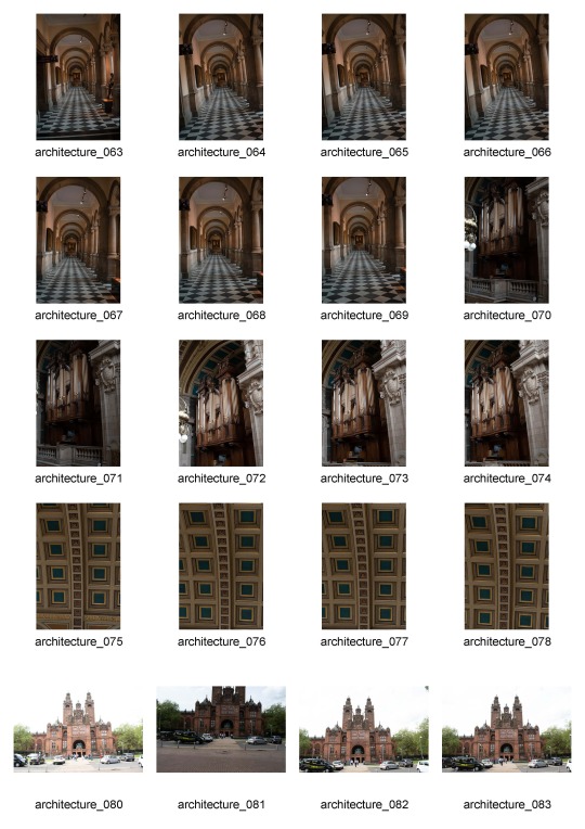
Architecture | Task 1 | Inspiration

In this first shot, the photographer has taken a bit of an abstract approach and focused more on the geometric aspect of the buildings rather than a full shot of the structure. Using the clouds/fog to conceal the top of the buildings emphasises the height and sheer size of the structures. The almost symmetrical image helps to convey the very modern and sleek look of the black and glass building.

This next image focuses on the very uniform and symmetrical look of the building. The composition and framing from a slightly lower level, directing upwards, help elongate and heighten the building. The potted trees on either side and the size and almost distortion of the floor tiles support this.

This is an interior architecture shot, of what looks like a corridor. The light is coming from the left-hand side and casting shadows around the arches of the corridor. The photographer has used this lighting to their advantage to emphasise the arches and the structure of the corridor. The stripes of light and shadow add more depth to the arches, making the image look 3 dimensional.

This shot focuses on the rectangular shapes of the steps and wall and the simple and minimalistic design. The straight vertical lines of the building contrast highly with the diagonal shadow across the centre of the image. The use of human interaction emphasises the sheer size of the building. The lighting cast on the walls on the right-hand side of the image help to create a more 3-dimensional effect and almost creates an optical illusion of where the stairs and the wall pillars meet.

The photographer has used the frame inside a frame technique here by capturing a small area of the left and right-hand sides of the main corridor of pillars. The composition helps lead the viewer's eye along the corridor and toward the ceiling as the camera is tilted slightly.

This is another minimalistic city shot where the photographer has captured a more abstract image. The height of the buildings and the increasing height of the steps is accentuated by the use of vertical composition and the framing and positioning of the camera in relation to the buildings. Human interaction is also used here and it helps to emphasise the scale of the buildings compared to the average human.

This is a shot of a curved row of edwardian style townhouses in Glasgow. The perspective here emphasises the curve in the buildings and exaggerates the shape. The fence and the top of the houses both curve parallel to one another and produce leading lines to help guide the viewer's eyes along the image.

This shot is another interior that focuses on the intricate work in the ceiling. The arches and curves in the ceiling are the main focus of the ceiling and of the image as a whole. The pillars along each side of the image, the aisle between the rows of benches and the fixture on the ceiling down the centre of the image all act as leading lines and these help to bring in the focus and the viewer's attention.

Here is another interior shot that also focuses on the arches and curves in the ceiling of the building. The lighting is daylight backlighting the scene and it is casting shadows across the foreground of the image. The curved arches contrast with the straight harsh edges of the shadows. The strong light also helps to emphasise the shapes of the structure due to the areas of light and shadow.

Finally, this exterior shot focuses on the outline of the roof of a building against the sky. The photographer has used the aspect and direction of the shot to emphasise the height and size of the building. The light coloured building contrasts nicely against the pale sky and the defined edges of the roof help to create a distinction from the background. A soft and even light has worked well to ensure there are no great areas of shadow and no overexposed highlights.
3 notes
·
View notes
Text
Recycle | Task 5 | Evaluation
The aim of this project "Recycle" was to use light painting techniques to photograph something old, used or worn-out. I found this project theme to be quite interesting as it focused on a different and more unique subject matter than previous projects and it introduced a new specialised technique. The most interesting area of this project to me was the light painting technique and learning more about the production stages of light painting photography. Painting with light is a relatively new technique to me, after a brief introduction within the NQ photography course last year. This is definitely a technique I'd like to develop further and learn more about. Throughout this project, I researched various photographers who specialise in the light painting technique, the most prominent being Harold Ross. When researching Harold Ross I found that he had mastered the light painting technique and used it to bring his images to life. I feel that the most successful part of this project was the shooting stage. I was able to effectively shoot multiple exposures with different light painting on each image in order to produce a composited image in photoshop. One of the main problems I encountered with this project was having restricted space and access to equipment as I had to work from home for a period of time. This limited what I was able to do in terms of shooting as I had a very small space to work in. I attempted to produce the best images that I could with these restrictions but if I was given the chance to redo this project I would ensure I had the right equipment and studio time in order to produce the best composite I could. I think that in the final image it is clear to see that it is the product of a light painting composite project but I feel that it could have been improved with improved compositing.
0 notes

Text
Graded Unit | Evaluation
Introduction
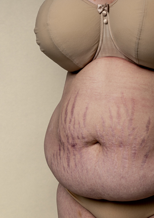
The aim of the personal project was to create images we wanted to make, with meaning within a genre of photography of our choice. Having followed the body positivity movement on social media and the internet, I became interested in the idea of creating a series of images that would portray a woman’s body inclusive of all shapes, sizes, and conditions. I personally have experienced body confidence issues relating to skin conditions and weight which made the project more personal and meaningful to me. Having more creative freedom seemed daunting to begin with as I felt overwhelmed at the fact there were no guidelines or specifications or themes to follow, the idea was to be all my own. Now having completed the project, I feel happy with my images and grateful to have had an opportunity to create a series of images that are worth something to me.
My goal for this project was to produce a body positive photography series that focused on real women and their bodies. I wanted to create a series of images that were diverse and inclusive and portrayed what a real body looks like; with body fat, stretch marks, cellulite, scars, skin conditions. Creating a positive photo series that sends a strong image was and still is one of my main goals. As mentioned in my plan, too many women feel pressured to look a certain way because of today’s society and the current “beauty standards.” Celebrating human bodies and recognising what a normal body is, is incredibly important.
Planning + Development
To begin with, I researched body positive photography, portraits of women, photographs of scars, to try and find photographers whose work was like my vision. I found several photographers and projects that fit my idea and looked further into Elisabeth Van Aalderen, Sophie Mayanne, and Sophie Harris-Taylor. After completing my research and writing my approach essay, I felt much more inspired and prepared to produce a successful photo series. I used examples of the work I came across in my research to convey a clear idea of my vision to the models I was working with. This was highly effective when trying to guide and instruct women who had never modelled before on the poses that I was asking of them.
Throughout the initial stages of the project, I focused on finding a diverse range of models to ensure I was able to capture a variety of unique bodies. I aimed to have around 15-20 different women modelling for me to ensure I had more than enough in case of cancellation and to maximise the number of images I had to work with. In doing so, I ended up working with fifteen different women and ended up with seventeen possible final images. To ensure that I was fully prepared for the shoots, I created in depth plans including shot lists, lighting plans, and lighting diagrams. This helped massively during photoshoots due to the 1-hour limit with each model. I was able to work more efficiently and managed to get all the shots I had thought about and planned out beforehand.
Action Plan Changes
My initial plan was to test shoot over the Spring Break before shooting for the project. After consideration, I decided that it would be more efficient for me to use the time to produce in depth shoot plans instead of doing test shoots on location or at home without the required equipment that I had access to in the studio.
Throughout the progression of my project, the main problem I encountered was strike action on days I had arranged photoshoots with models. I contacted the models who were shooting on strike days, to reschedule. Not everybody was able to reschedule, so I rearranged dates and times and reached out to more people who were previously interested. In doing so, I was able to fill my scheduled shoot times with new participants.
When shooting, I found that using my standard kit lens at a longer focal length was more efficient than using a 70-300mm telephoto lens. I had originally planned to use the telephoto lens to avoid distortion at shorter focal lengths but found the kit lens at longer focal lengths (35-55mm) produced no distortion. Also, after experimentation in the studio, I found a silver reflector to be too bright and produce too many harsh highlights. As a result, I used large white foam boards as reflectors to bounce in less light to produce softer lighting on the right and to soften shadows slightly.
Positive Aspects of the Project
Personally, the most positive aspect of the project was the theme of body positivity. The theme being something that has been the cause of debates for years and a real problem today (especially on social media) made me feel that it was even more important to be successful in this project. People are easily led and influenced by mediums such as television, social media, the internet, magazines and more to think that the only acceptable way to look is size zero and flawless skin. The aim of the body positivity movement is to normalise natural bodies and promote self-love.
Other than the theme, I think that the images work very well together as a series and effectively convey the message of body positivity and accepting and celebrating all bodies. Each image focuses on a different body, and my abstract approach works well to bring focus to various aspects such as scars, skin conditions, cellulite, stretch marks or body fat. The soft neutral colours work well with the theme of natural bodies and help to keep each image consistent with the theme.
Another positive aspect of the project that I thoroughly enjoyed was working with all the different women who volunteered to model. Seeing how many women were interested in my project and how many of them were willing to model was a bit of a shock to me but this further motivated me to produce these images for my project. Speaking to the different models about their insecurities, confidence and other body problems helped me to fully understand the importance of body positivity and the problems that every woman faces and experiences throughout their life.
Knowledge + Skills Gained
Throughout this project I have gained more skills and knowledge mostly within the post-production stages. An aspect of photoshop that was entirely new to me was the match colour function. Using this technique, I was able to keep the background colours more consistent to achieve a more cohesive look and feel to the images to help link them as a series.
One skill I developed during the production of this project was my people skills. From the very beginning of my project, I was contacting models, speaking to people on a near daily basis and organising and scheduling various photoshoots. Following this, I met and worked with fifteen women who I’d never met before. Another important skill I was able to develop was portraiture. Having limited experience with portraiture photography I was able to improve my skills in the genre including lighting set up, posing/angles and engaging with the subject. With each photoshoot, I felt more confident in my skills and more comfortable shooting and collaborating with each model.
Conclusion
I feel that after successfully completing this project I have managed to grow and develop both my photography skills and my confidence within photography. I have enjoyed each step of producing this series of images and am satisfied with the images I have submitted. This is my first major photography project I have completed and am proud of how it turned out. I feel that the theme, the execution of the plan and the final images all went incredibly well and that I have produced a strong piece of work. In addition, I feel that I have surpassed my own plans and expectations for this project and have been able to produce a project which does in fact convey a strong message about body positivity. I feel that I have successfully produced the project that I had envisioned as well as meeting the brief of the graded unit personal project.
Even though I am happy with my images and happy to submit the series for my graded unit, I know that there is always room for improvement. Regarding the post-production process, I think my optimisation could have been better if I had used and practiced the match colour function on photoshop before in other work before using it for the first time through this project. If I had taken the time to practice using the function, I would have been able to use my time more effectively and efficiently during the post-processing stage. Also, the lighting set up for each shoot wasn’t the same, this was corrected in photoshop but some of the post-production work could have been avoided with more consistent lighting and less shadows in my shots. If I had the chance to complete this project again, I would ensure I had more experience in the required photoshop techniques and was able to keep more consistent lighting across the photoshoots.
0 notes
Text
Graded Unit | 10 Final Images
5 Prints


5 Digital


4 notes
·
View notes
Text
Graded Unit | Progress Update | 24/05/22
At this point, I have now selected my final 10 images and sent 5 to print for submission and the other 5 will be digital submissions. Each image has been resized to A3 to meet the exhibition standard for submission. I have completed and submitted my evaluation report to mycity and submitted all 10 of my final images to mycity.
In my previous progress update post, I was waiting on test prints from Deadly Digital after receiving my test prints from Loxley Colour. I ordered both lustre and glossy prints to get an idea of which paper best suits my prints and theme, which I decided was Deadly Digital's Studio Lustre Paper. These prints cost me a further £53 and bring my total costs to £68.17.
0 notes
Text
Graded Unit | Contact Sheets
Ellis


2 notes
·
View notes