
Statistics
We looked inside some of the posts by mw-twentytwenty and here's what we found interesting.
Average Info
Notes Per Post
36
Likes Per Post
14
Reblog Per Post
1
Reply Per Post
0
Time Between Posts
6 hours
Number of Posts By Type
Link
1
Photo
12
Video
4
Last Seen Tumblr Blogs


Fun Fact
Tumblr has 16.74 million mobile monthly users in the US.


Photo


Gradient Computation
Thought it would be worth uploading this inquiry into the actual technicality behind gradients. Came across this Gradient Computation on a science journal which was also very technical to read, definitely did not understand much of it, but thought the diagrams were worth including, also did a very quick depiction of the geometric form just for fun (back when I was experimenting with gradients)
0 notes
Video
tumblr
Screen Calibration
A few weeks old — as you can tell by my messy desktop — screen record of looking into screen calibration — still not really sure with what I could do with this information and how I could expand, but nevertheless it is still very interesting especially the calibrations where its would display the screen as white with CMYK processing, there’s a lot of technicality and mathematics involved with the reasoning behind that too
0 notes
Photo

Quantum Mechanics
Image I came across about Quantum mechanics which is just visually very aesthetic and cool
Wave functions of the electron in a hydrogen atom at different energy levels. Quantum mechanics cannot predict the exact location of a particle in space, only the probability of finding it at different locations. The brighter areas represent a higher probability of finding the electron.
1 note
·
View note
Video
tumblr
Mesh Spheres
A quick experiment with changing different mesh points of the mesh flat circle and utilising different shades on each mesh point to create a three-dimensional form to the flat surface.
0 notes
Photo


“offer weapon”
Arrival, Denis Villeneuve, 2016
Original short story by Ted Chiang called Story of Your Life, 1998
Palindrome, linear, backwards as forwards and vice versa, uderstanding the language was a “weapon” against time in a way, was a way to perceive time all at one rather than linear, to have a different perception of reality, ethics, difference between the book and the film adaption, like change of the heptapods names, Flapper and Raspberry vs. Abbot and Costello, Gary vs, Ian, Louise’s name stayed the same, interesting side note - I watched an interview with Ted Chiang, and he said that lots of producers would only do the film if they changed the protagonist to a male - the software for the logograms looks similar to Adobe so thats fun, Linguistic relativity, also known as the Sapir–Whorf hypothesis, Whorfianism, a principle claiming that the structure of a language affects its speakers' world view or cognition, and thus people's perceptions are relative to their spoken language, Captain Cook, Kanguru vs. Kangaroo, “what did you say”
I forget the term for when an event in the future wouldn't have happened if you hadn't travelled from the future to the past to cause that event, retrocausility? bootstrap paradox? either way, reminds me of Christopher Nolan’s Interstellar, Baran bo Odar and Jantje Friese’ Dark, also the same idea but, Ted changes Tower of Babylon, when he got to the very top to the “heavens” he ended up back on Earth, like a wormhole
5 notes
·
View notes
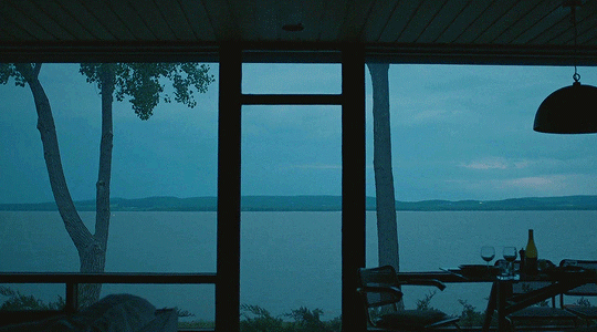
Photo


“We don’t want other worlds; we want a mirror.”
Solaris, Andrei Tarkovsky, 1972
"2001: A Space Odyssey is phony on many points, even for specialists. For a true work of art, the fake must be eliminated.”
That pronouncement comes from a 1970, pre-Solaris interview with Tarkovsky by Naum Abramov. The Russian auteur indicts what he sees as 2001's lack of emotional truth due to its excessive technological invention, effectively declaring that, in his own foray into the realm of science-fiction, "everything would be as it should. That means to create psychologically, not an exotic but a real, everyday environment that would be conveyed to the viewer through the perception of the film’s characters. That’s why a detailed ‘examination’ of the technological processes of the future transforms the emotional foundation of a film, as a work of art, into a lifeless schema with only pretensions to truth."
just realised it has a similar colour palette to all the other visuals from the films that I have posted about
0 notes
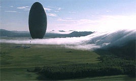
Photo


Science Fiction Architecture
— some notes from The Aesthetics of Science Fiction. What does SciFi look like after Cyberpunk? an article by Rick Liebling, 2018, who coins the term Hard Concrete to describe the article’s title
— also another good article is What styles defined specific eras of science fiction? by Robert McLaughlin
— a really cool breakdown of the typography in 2001
Liebling thinks bout what science fiction looks like beyond the prevailing design aesthetic of the past 35+ years which is Cyberpunk, as he focuses on the architectural design of SciFi.
The main example of Cyberpunk is almost always going to be Blade Runner (and Blade Runner 2049, and Black Rain too) as the established visuals of dark, rainy, urban landscapes with neon signs and a multicultural street life, to some degree a call back to film noir as well. Also literary origins from William Gibson, Bruce Sterling, Pat Cadigan, and Japanese mangas like Akira and Ghost in the Shell. “The city of Blade Runner is much more influenced by the aesthetics of 1900–30s skyscrapers than those of the 1960s. So in a sense it’s natural that it’s moved on, while still looking backwards for inspiration.”
The cyberpunk look was a product of the times, mixing rebellious youth culture with advancing technology, the explosions of capitalism and the lingering scepticism of the military-industrial complex, the late 70s and early 80s were a deeply cynical time that called for a visual identity to match
The signature Sci Fi look that came before Cyberpunk was the Atomic Age and Space Age ushered in a vision of the future that was clean, crisp and bright, — side note: makes me think of the retro futurism aesthetic — Stanley Kubrick shook up the genre in 1968 with 2001: A Space Odyssey. Which then led to Star Wars, but that is more rooted in fantasy than in hard science.
“I’ve noticed over the last decade or so that there are some recurring themes. I call it Hard Concrete. Like Cyberpunk and Atomic Age & Space Age design before it, Hard Concrete is linked to the realities of the times. If Cyberpunk was the visual embodiment of the corporation as mysterious behemoth, Hard Concrete parallels a world where corporations and governments have been exposed as brutal, uncaring and stripped of their shiny, mirror-glass facades. They may be no less controlling, violent or malevolent, they just no longer bother to hide it. “The aesthetic of futurism changed, too, without anyone issuing a manifesto — from big and bold, primary colors and metallic shine to grim, dank rot and ruins.” — James Gleick in his book Time Travel (p. 305)”
“Gone is the coolness of cyberpunk, no longer neon on black but just colour palettes of pall greys, flat blues to a drab olives. The slick polish is gone. Hard Concrete also looks back to design cues from Brutalist architecture. While Brutalist architecture was built for government organisations, and in viewing its use as a science fiction aesthetic it fulfils the same role, what’s happened in between the 1960s and today infuses the look with a different meaning.”
“As a material, concrete gives life to our relationship with power structures, especially as depicted in science fiction. It is at once transparent — a sort of “nothing to hide here” transparency — while also being opaque and impenetrable.”
“I think the Hard Concrete also performs like a frame of the human condition through its materiality. Many sci-fi narratives are ultimately questioning our humanity in a speculative way, including our relationship with technology, our social evolutions and devolutions, etc. The blank concrete surfaces are most often in stark contrast to the human figures and their interactions. There is not a human scale to this material. In fact, it doesn’t really have a scale. Thus it does not relate characters to the natural world or themselves.”
side note — was just writing my end of semester reflection and looked up the word ‘cyberpunk’ into google to decide whether to write it being an aesthetic or genre, and it didn't come up with the usual definitions or wikipedia, it came up with a new video game called ‘Cyberpunk 2077′, which actually looks pretty cool, the game design is really pretty so note to self keep that in mind
0 notes


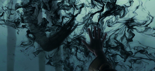
Photo


Vaporwave / Lofi Aesthetics
There is this aesthetic of slowed down + reverb + pitched down audio paired with animated visuals of a specific aesthetic (such as these set of posts). There are so many YouTube accounts dedicated to creating things like these which are continuously recommended to me form the Youtube algorithm. The audios are generally pretty melancholic and have a nostalgic tone to it when paired with the visuals. I'm specifically looking at the visuals here though, I just really like the animations as they have the grainy VHS degradation, shine/glow, and contrast of simple colour palettes which I just basically love the look of.
This aesthetic/sub-genre seems to have sprung, at least in my eyes, from the vaporwave aesthetic. I watched a YouTube video titled “How Vaporwave AESTHETICS took over the internet”, and this dude went way back to WWII when Japan was essentially military dictatorship and turned pro democratic. As the US funded Japan’s post-war economy, instead of putting the money towards the military to be an ally for the US, it was put into industrialisation and technology of the country. This period during the 80s and 90s was known as the Japanese Economic Miracle and this is the era that inspired vaporwave. The elements of bright city lights, metropolitan lifestyle, neon, luxury, easy living, technology and pop music transformed the country into a modern consumerism-filled country.
The word vaporwave comes from the term ‘vapourware’ which is used in the computer industry to refer to a computer software/hardware that has been announced but is never manufactured nor officially cancelled, it just disappears, kind of like the bygone era it is supposed to represent.
The 2011 song by Macintosh Plus established the blueprint for this movement. Vaporwave was a cultural/social online type of thing that evoked images of some idealised futuristic but nonetheless fictional Japan (eg. Cyberpunk, neon, Blade Runner).
Visually, it incorporates early Internet imagery, late 1990s web design, glitch art, anime, 3D-rendered objects, and cyberpunk tropes in its cover artwork and music videos, probably influenced by Metahaven as well and Web 2.0
“Weather channel, elevator music and things like that were common audio to remix, so that you can tell what it is as its familiar but at the same time its different. At its core, vaporwave is a form of escapism, something that takes you somewhere else while at the same time evoking feelings you cant really describe ... we will keep reminiscing about the past as humans have always done since the beginning of humanity eg. romanticism, glorification of all past and future”
22 notes
·
View notes
Photo
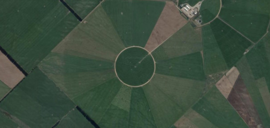

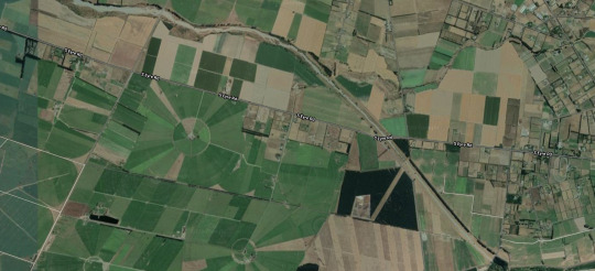
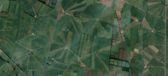
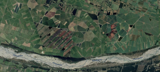
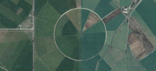

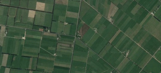
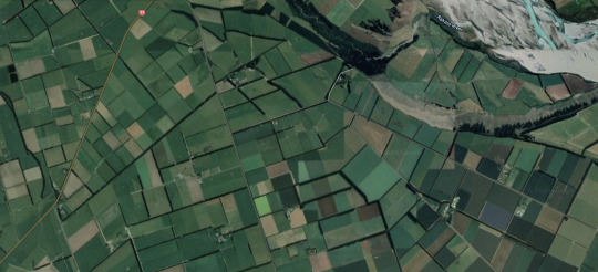
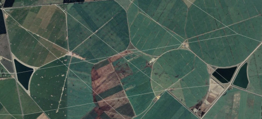
Google Maps Field Study
Since looking for a word for a things in a set of four (for my quadrivial fields post), the work “quadrivial” came up which means:
1: of or relating to the quadrivium. (In liberal arts education, the quadrivium consists of the four subjects or arts, namely arithmetic, geometry, music, and astronomy, taught after teaching the trivium (an introductory course at a medieval university involving the study of grammar, rhetoric, and logic))
2 : having four ways or roads meeting in a point
And naturally it lead to me using this word as the way I slayed out the set of four different gradient fields looks like fields around four roads that met at a point
So, this got me thinking about google maps in the sense that things like roads, roads connect, humans, man made, industrialisation, agriculture, colours of fields in a plane from below on the earth, what that looks like, what are these views and patterns like, colour palettes of different areas, the geometry of environments etc
So, the images here are just screenshot from Google maps of areas around Christchurch that had interesting elements to them
0 notes
Photo


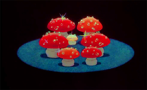
Nausicaä of the Valley of the Wind by Hayao Miyazaki, 1984
0 notes