
sharing anything to do with being creative :) IG I @MYKA.DOODLES
Don't wanna be here? Send us removal request.
Statistics
We looked inside some of the posts by myka-art-posts and here's what we found interesting.
Average Info
Notes Per Post
11
Likes Per Post
9
Reblog Per Post
2
Reply Per Post
0
Time Between Posts
2 days
Number of Posts By Type
Photo
9
Text
3
Quote
3
Link
1
Video
1
Last Seen Tumblr Blogs


Fun Fact
Tumblr’s website traffic is steadily declining.
Photo
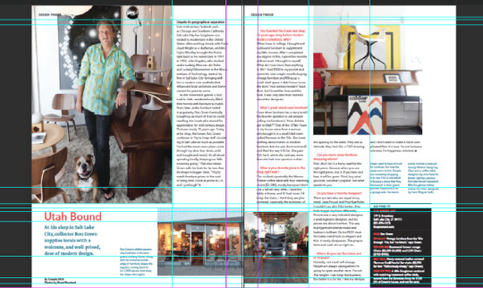
Applying the grid system to existing magazine double page spreads (Dwell magazine & ARCH+ magazine
Initially when I saw the dwell double page spread it felt as though the pictures were a bit out of place however with placing the guides on the spread, I was able to see how each heading or image text would line up, it is not consistently the edge of box. Often the use of heading to match up with images across the double page spread works really well. As a reader we would not be able to see the role of guides in magazines and how vital they are as they aloow the page to work well as a whole.
0 notes
Photo

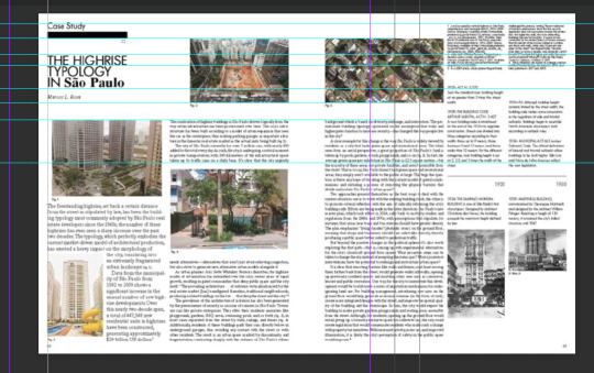
Magazine research (front cover)
I researched some magazines that final year interior architecture student had given me a list of. I found a selection of what I feel like something I would like to replicate, the ‘ICON’ typeface is a bold san serif font which is common in a architecture magazine as the title is for the legibility and easily remembered by viewers (readability of the typeface) and the focus is on the imagery but does not take away from the title of the magazine.
0 notes
Text
Arkitekt magazine research
Prior to this I had noted that an architecture student would also be the target audience magazine so I asked Ammaarah Siddique L6 Interior Architecture and design student (BCU)
What she would find interesting to read in an architecture magazine ?
“ we are more visual people, so illustrations are a must. make it more graphical, less writing. Generally the magazine should cover like the certain trends of architecture, materials reference/ buildings.”
she then gave me reference of different architecture magazine she liked to reference :
Dezeen The architects newspaper The world of interiors ARCH+ Frame Gensler Dwell Icon Architecture digest
0 notes
Photo

Brief : Create a architectural magazine named ‘Arkitekt’ focus on audience and look at grids to help focus on the layout of magazine, I will look at further research to help myself understand the grid system more in depth.
0 notes
Photo

Anatomy of a letterform :
I decided to learn about the basics of how terms are applied to a typeface and how they give a different typeface depending on the typeface.
0 notes
Photo


Alison Carmichael
(contextual study notes)
I was drawn to this because how she is using a script (handwritten) type to convey these offensive messages and it shows how you would expect the first image to be of a nice word however the use of the word seems to juxtaposes the idea of this intricate typeface. The way in which we view certain type is subconscious because the exposure of the brands that use these allow you to make a decision before even reading the word.
0 notes
Text
What is the difference between typography and lettering?
typography: the style and appearance of printed matter and the art of arranging type.
lettering: the act, art, or technique of inscribing letters onto something.
0 notes
Quote
A typeface is a family of fonts (very often by the same designer) within a typeface there will be fonts of varying weights or other variations. For example light, bold, semi-bold, condensed, italic etc. Each such variation is a different font. The only evolution in terminology that results from transitions from metal cast to digital fonts is that (point) size is no longer fixed
Erik Spiekerman
0 notes
Text
‘For the love of type’ contextual study notes
Typography is arrangement, style and appearance of type and typefaces.
Emotional equality of a design
The name ‘Daniel Taylor’ in different typefaces gives a variation
how the name can be represented for example it being
decorative font, traditional font or western will give it a characterisation of itself
Typography can affect the readability of an idea and the readers feeling towards it
How different typefaces are portrayed
Typeface is family
Font is italic bold etc
Four basic groups
San serif
Serif
Script
Decorative
Type settings linotype machine
Skill lies how to manipulate t for the results required
Text hierarchy
readability
Pull quotes
Practitioners
Herb lubalin
American graphic designer
Significant to the way typography was used
Expressive typography
Avant Garde logo for magazine made typeface
Brands that use Avant Garde: Nutella adidas Microsoft 1982
Craig ward
Wordsarepictures.co.uk
Very expressive type
Materials to add meaning to his typography
Alison Carmichael
London based
Versatile approach to lettering
Controversial
Sarah Hyndman
Why fonts matter (book)
Ted talks
Typetasting.com
0 notes
Link
I was interested in learning more about typefaces so I decided to watch this film and learnt about the typeface Helvetica. I listed what I learnt below.
Helvetica film notes
Massimo Vignelli:
Life of a designer is a life at fight. fight against ugliness as in visual disease around us we cure it with design. good typography is the distance between the letters space between the black that makes it. he only uses three typefaces. He feels that there is no need more all these different styles of typefaces and font. Helvetica was generated as a typeface by the desire of having a better legibility. A modern/clear type, good for everything. Helvetica spelled out ‘modern’ loud and clear.
Typefaces express mood and atmosphere gives word a colouring. Helvetica is widely used. Social responsibility amongst graphic designers in 1950s (post war). International typographic style also known as Swiss style is a graphic design style that emerged in Russia Netherlands and Germany in the 1920s and was further developed by designers in Switzerland during the 1950s
What is Swiss style typography?
Used by many Swiss cultural institutions and political advertisements and a lot more because it was thought to have suited the drastically increasing global Postal market used in street signs Maps public service announcements etc.
So the 1950s was a time for rational typeface and then came Helvetica. Linotype owned the Haas and Stempel foundries and now owns Helvetica.
Wim Crouwel
‘loves modernism’
‘interested in clarity’
‘Should be readable slash straight forward’
‘advocate of grid system’
‘it is an art that requires practise’
‘grids are a tool of order’
‘creating order is typography’
1 note
·
View note
Photo

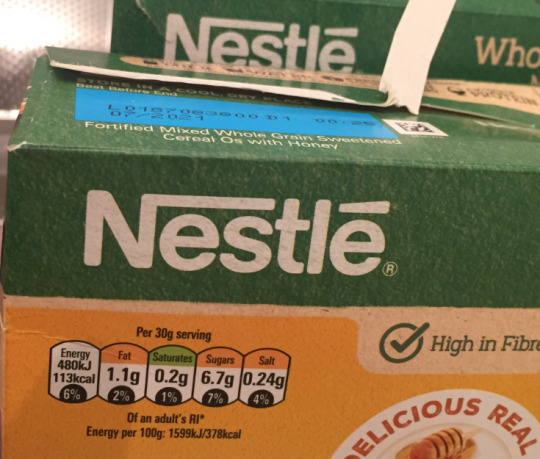

Brief :
Select a letterform a package in your kitchen, it can be a capital or lowercase (not punctuation or a numeral). Using an A3 sheet of paper and a pencil, draw the letterform as you see it scale it up, taking great care to follow the subtle lines, curves and details you can observe on the letterform.
I saw the nestle logo and thought the font look fairly easy to do. I started doing a smaller version of the whole ‘N’ as seen in the nestle logo with a long stroke that goes across the word. I then decided to redraw the ‘n’ in a more scaled up up version trying to get the curves of the font. I found that the type face is similar to Helvetica rounded bold a san serif font designed by Eduard Hoffmann & Max Miedinger and published by Linotype. I learnt that Helvetica is a very common font used by brands as it is quite modern, so I then watched a film on Helvetica.
0 notes
Video
tumblr
I find time-lapses very satisfying so for the call out my name task I decided to record myself filling in my chosen font which was Harlow solid italic. I am rather pleased how it turned out and find this process rather interesting and fun as I am not as precise as a computer but it still gives the characterisation of the typeface.
0 notes
Photo
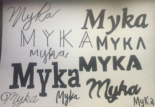
I tried to copy different digital fonts (from https://www.azfonts.net/) and tried to draw them by hand. I realised how difficult it is to keep a consistent width and I do not have the steadiest hand but as I continued I found it easier and more enjoyable how each font adds a different feel to my nickname.
0 notes
Photo


The Brief :
Find a typeface you like and type in your nickname - a serif and sans serif is best. Then try to recreate it as by drawing it as accurately as you can on A4 paper or in your sketchbooks. Once you have successfully hand drawn your name, annotate (using a pen or pencil, or type and add it onto your work) it with typographic anatomy.
I attempted this by going onto Word writing my nickname then highlighting my nickname and choosing a font I liked. I went with serif font ‘Batang’ and sans serif font ‘harlow solid italic’ I found this task rather interesting because I realised that I am unable to write the typeface in a neat and clean way in which can be done digitally but I feel like it gives the typography a sense of character and allows a sense of personality. I have also learned what typography anatomy is, I then applied it to my nickname. I found this helpful in the way in which certain typefaces use this structure. I would like to research more into different typography in further tasks.
1 note
·
View note
Quote
In order to have creativity, you have to allow for dead ends to happen.
Christoph Niemann
0 notes
Quote
If you want creative workers, give them enough time to play.
John Cleese
0 notes
Photo

I was totally obsessed with every single outfit that Minju Kim designed for Seo YeJi. she looking stunning here, so I digitally drew it :)
9 notes
·
View notes