
Statistics
We looked inside some of the posts by n10997831 and here's what we found interesting.
Average Info
Notes Per Post
5
Likes Per Post
2
Reblog Per Post
3
Reply Per Post
0
Time Between Posts
1 day
Number of Posts By Type
Text
17
Last Seen Tumblr Blogs


Fun Fact
Tumblr has 411 employees.
Text


Sougwen Chung
Installation/Exhibition Series Vancouver Art Gallery
Exhibits a research that links humans and machines in a compelling collaboration
Human and machine meet to make and create art
Performance art - video documentation of collaboration
Intriguing design-based elements
1 note
·
View note
Text


Chantal Gibson Untitled (Redacted Text)
Vancouver Art Gallery
Installation incorporating books as a material and the process of redaction
A series that I can relate to my own practice, yet reveals methods in which I can expand my approach to text
E.g. Instead of using individual pages from a book, use the entire object (as seen in Gibson's work)
0 notes
Text
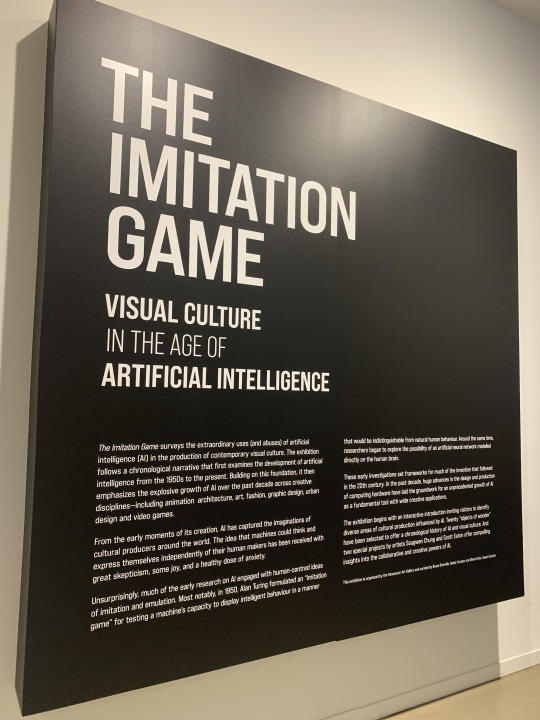


The Imitation Game
Vancouver Art Gallery Exhibition
Installation following a chronological narrative that first examines the development of artificial intelligence, spanning from the 1950s to present
Featured Artists and Artworks
An installation of text, to which I have related to my body of work across the semester
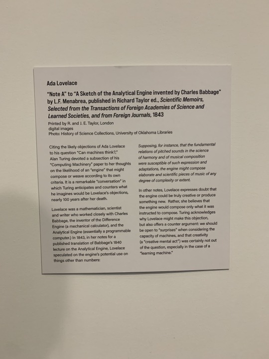
Ada Lovelace "Note A" to "A Sketch of the Analytical Engine invented by Charles Babbage" by L.F. Menabrea, published in Richard Taylor ed., Scientific Memoirs, Selected from the Transactions of Foreign Academies of Science and Learned Societies, and from Foreign Journals, 1843
Single page of text with black background
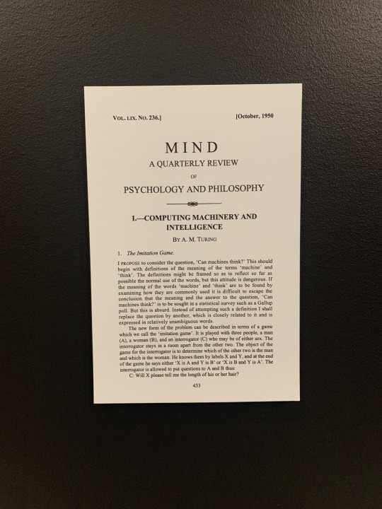
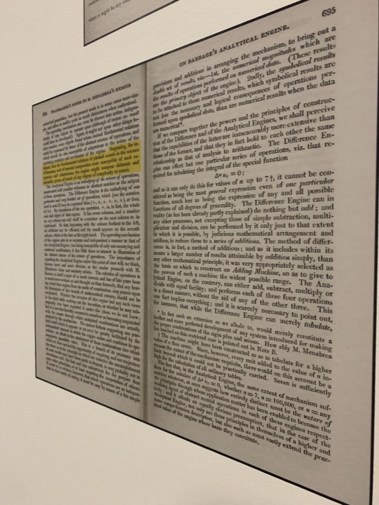
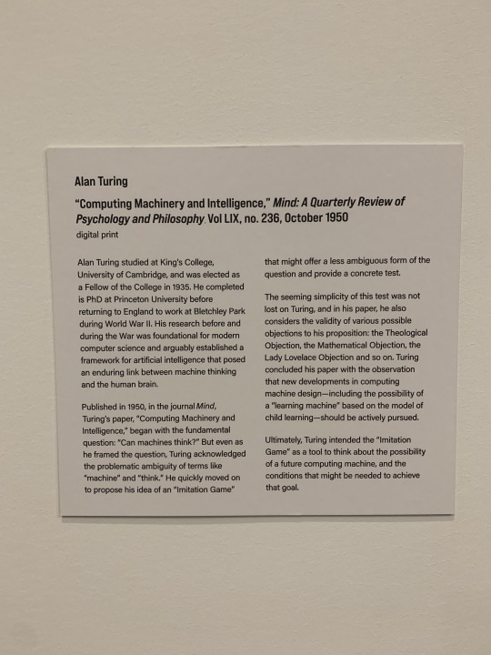
Alan Turing "Computing Machinery and Intelligence," Mind: A Quarterly Review of Psychology and Philosophy Vol LIX, no. 236, October 1950
Series of two images stacked atop each other
0 notes
Text


Experimentation Influenced by Raoul de Keyser
Higher focus on design elements, rather than abstract shapes and expressions
Repeating series; nine different iterations
Different focuses; shape, line, movement, negative space, layering and balance
Black and white monochromatic
Area/s for Improvement
Employ different mediums (like Raoul de Keyser)
More focus on abstracted expressions with medium rather then the design quality?
Upsize scale? Or create a large series based on the mini-canvas outline
Opportunity to employ colour; different inks/pens/canvas-colour etc.
2 notes
·
View notes
Text


Artist Research + Experimentation with Pattern/Design
March 7, 1990, 2022 Pencil, Ink, Gesso Raoul de Keyser
Whilst my current practice hasn't predominantly focused on pattern-based design, I was still drawn to this installation/exhibition for its boldness in visual elements (bold black against stark white).
Abstract design of Keyser contrasted against my more literal approach
Reminiscent of previous work Impressions In Text
Repeating singular grid structure/formatting (more spaced out)
Research of Work
Geometric forms
Focuses on the invigorating action of scribbling (process)
Combination of intention and inadvertency visualised in mark making
Selective and concise iterations of Keyser's bigger body of work
Sharpens senses towards shapes, colours, textures and size
2 notes
·
View notes


Text


Scattered Images | Digital Print
[modification] of previous letter/text-based work
Images taken across installation of MDF letter-based installations
Exhibiting the same/similar design in a different format
Skin-like shades in background tones, reminiscent of tattoos printed on skin
Horizontal and stretched out installation design, as opposed to the wide and vertical install of [Untitled]
Black-lettered pattern
Varying warm shades, suggestive of skin tones
Reminiscent of animal print when viewed from a distance
0 notes
Text
Experimentation | Part 3 | Video 2 of 2
The world as a blur, text as a constant
0 notes
Text
Experimentation | Part 2 (of 3) | Video 1 of 2
Travelling through the studio using text as a lens
0 notes
Text


Experimentation | Part 1 (of 3) | Combining Works
Experimental images combining two previous works
Cut-out text MDF boards used as a lens to view the behind scatter of text
Text within text
Formatting of experimental photography series is inspired by Lukas Quietzsc's gouache on linen series titled 'Parallel Warnings In Simple Arrangements', specifically the panel below:

0 notes
Text


Impressions of Text | Acrylic Paint on Cartridge Paper (A3; Off-White)
Paper used as a base/protective sheet whilst painting the MDF letters seen in previous installations
Organic strokes and brushes of paint contrasted against the mechanical and industrial construction of letters
Stark black and white contrast
Movement and action in paint
Repetition and pattern constructed in the dotted impressions
0 notes
Text


Concept or Construct | Found Material; Functioning Analogue Clocks (11) and Watch (1)
A series of clocks with their own individual and unique characteristics, each presenting a different time
Characteristics based on differing designs and connotations audiences connect with object material (e.g. simplistic design of plastic white wall clock associated with a school classroom)
Observing clocks as a material and/or object, as well as in their functioning setting (a teller/dictator of time)
Exploring concepts of time, whilst psychologically real, it is not fundamentally real
Audio plays a significant element within the work, viewers are consumed by the "ticking" of all twelve clocks, emphasising a sense of and consciousness of time passing
Audiences are consumed by a wall of clocks, each telling an incorrect time to the (socially accepted) "correct" time; viewers are left wondering "what time is it?"
Exploring time as a societal construct; an entirely meaningless manmade concept that we use to create a sense or order and/or structure to our lives
Device instructs us when to wake, go to work/school, eat breakfast/lunch/dinner, go to bed etc.
Highlights an idea of social constructionism
Meaningless concept made to create meaning in our lives, but to what end? For what reason? What is the point?
Promotes an existential train of thought
Area/s for Improvement
Edit and/or change all twelve clocks to resemble a fluidity in visual stimulation. Each is added upon to better reflect/emphasise the manmade aspects to time. E.g. flipping a clock upside down, removing the hands from the device and displaying, or covering the clock in painted numerals.
The concept behind the work is inspired by Joseph Kosuth's solo exhibition Existential Time, addressing the abundance of meaning that surrounds the experience of being in time, past and present. In addition to this, Kosuth also encouraged the idea to utilise and include analogue clocks within my work.
Find images of the installation below:


0 notes
Text


Playful Redaction | Digital Prints 120 x A5 (15x21cm)
PART 2 PREVIOUS WORK REVISITED | MOCK UP
Format/process influenced by previously research artist/work; BANK (2022) by Simon Bedwell, John Russell, Demo Demosthenous
Digitally constructed on Adobe Illustrator
Emphasising a playful process in a redaction/addition based process
Movement, character and fluidity as opposed to the previous Mock-up which exemplified a more solid-based structure (emphasised in the redaction-oriented method of blocking)
Still repeating the action of blocking-out references to the storyline or characters in each of the pages, however, due to the design, this element is only half-achieved (lines were drawn at random)
Black/white monochromatic colour scheme has remained
Whilst visually stimulating, I believe the first mock up of this work (Beginnings: Redacted) achieved the intended message more effectively. However, this repeating pattern of curved lines is an interesting element and I would like to explore this process further in the future.
0 notes
Text


Beginnings: Redacted | Digital Prints; 120 x A5 (15x21cm)
PREVIOUS WORK REVISITED | MOCK UP
Digital scans of the first page/chapter title of each of my own books
Any references to pop culture, religion/beliefs, linguistics, names of cities/countries/capitals and characters (e.g. names, roles such as sister/mother/father, titles such as king/queen), were redacted from the digital prints using Adobe Acrobat as a text-editing software
References were redacted using a black-out/block-out method
Implementing a secrecy to the work.
Plays on a curious nature of audiences to know the words being blocked from view
Blocking out individual and unique characteristics from the respective pages, leaving a strain of seemingly random words.
A series of half/almost-there stories
No inherent or obvious meaning in the written word
Original work removed the first page from its known environment (the book), and suspended its meaning and written word on the gallery wall, which worked towards creating a series of beginnings with no ending.
The revisit builds on this series of suspended beginnings, but adds a sense of incoherence to the work.
No unique identifier to each page (such as character references)
Further highlights (more effectively highlights?) questions of ownership and authorship in the written word. If the page's fundamental details and attributes (unique details that directly connect story to author) are stripped back, are these words any more mine then the authors (and vice versa).
Who owns these words?
The process of "blocking-out" is inspired by Jenny Holzer and her series Top Secret. See version 3 of the work below:

Image sourced from:
0 notes
Text


Cut Out | Detailed Images
Notice: - texture and hexagonal print in the MDF board - shadowed prints on gallery wall made through casted light
0 notes
Text


Cut Out | MDF Board 3mm
Three columns of two MDF boards, featuring the cut out sections of letters used in previous works
Incorporates light and shadow as an element; made with the cut-out lettering
Emphasis on negative space
Tonal values seen in the natural colours of the MDF material, in addition, burn marks and scoring from the laser-cutting machine
Industrial tones/themes; manufactured cut-outs, rather than natural expression (e.g. as opposed to physically carving these letters out)
Straight-cut/edges - solidity in its manufacturing - in regard to the overall boards themselves and the individual lettering
Warm tones in the wooden fibreboard
Height in the double panelling sections, balanced out with the three columns
Space and negative space
Hexagonal print leftover from laser-cutting machines
Texture and depth in hexagonal burn marks
0 notes
Text


[Untitled] | Acrylic Paint on MDF Board
A series/collection of letters exploding/spilling out from a centre point
Corner placement; reminiscent of the cornered structure between two pages in a book
Letters/words falling out of a page
Continuing the Alice in Wonderland theme; literary nonsense presented in a nonsensical way.
Hypnotising and dizzying aspect when viewing up-close
Viewers are consumed by the repetitive black and white pattern in conjunction with the hypnotic aspect of letters repeated
When viewed from a distance, the work appears to employ a stippling technique for depth.
Black and white monochromatic palette
Scale - medium-scaled installation
Shape - the body of work as well as the individual letters/shapes
Space - space between and in letters, inverted space, overall space used for the piece
Repetition of letters
Area/s for Improvement
Larger scale (covering an entire wall, or the majority of, for example)
Range in text/font size
Incorporating capitals
Implementing a word search for an interactive aspect?
0 notes