
Statistics
We looked inside some of the posts by nevin-manimala-blog and here's what we found interesting.
Average Info
Notes Per Post
0
Likes Per Post
0
Reblog Per Post
0
Reply Per Post
0
Time Between Posts
6 days
Number of Posts By Type
Text
17
Last Seen Tumblr Blogs


Fun Fact
Tumblr was the first site to host the blog for President Barack Obama in 2011.
Text
Scientists Discover World's Largest Bird Ever Thanks To Bone Statistics

Vouronpatra, a large bird which haunts the Ampatres (swamps in the central highlands) and lays eggs like the ostrich's; so that the people of these places may not take it, it seeks the most lonely places. Admiral Ètienne de Flacourt in his Histoire de la Grande Isle de Madagascar, 1658. Elephant bird eggs.D.Bressan In 1840 an unnamed explorer sent some remains of a gigantic egg from the African island of Madagascar to the French zoologist Paul Gervais, who identified the fragments as belonging to an ostrich egg. Only in 1851, the existence of a yet unknown giant bird was announced during a meeting of the Académie des Sciences, based on the discovery of a complete egg, six-times as big as an ostrich egg. Fifteen years later the first skeleton of an elephant bird, belonging to the family Aepyornithidae, was discovered. Since then various species were described, based on more or less fragmentary fossils. Aepyornis maximus, described by French naturalist Geoffroy Saint-Hilaire in 1851, has often been considered to be the world's largest bird ever. In 1894, British scientist C.W. Andrews described an even larger species, Aepyornis titan, however as there is often sexual dimorphism to be found in birds, this species was dismissed as a large specimen of A. maximus. Apart from the genus Aepyornis, Aepyornithidae comprises also the genus Mullerornis. However, over time there was much confusion on the exact taxonomy of elephant birds. Some naturalist used very fragmentary material to describe new species. Some reconstructed skeletons were embellished, adding some bones, especially in the neck, to size up the supposed animal. Some proposed species of elephant birds were not even based on skeletal remains, but only on the description of egg fragments. Historical photograph showing the mounted skeletons of a modern ostrich, in the middle an elephant bird of the genus Aepyornis, and to the far right another elephant bird of the genus Mullerornis.FTM Archive Zoologist James Hansford and Samuel Turvey tried to solve this puzzle by measuring hundreds of elephant bird bones from museums across the globe, using also computer models to reconstruct fragmentary bones. Based on the statistical distribution of size and anatomical characteristic of the bones, the team concludes that the family Aepyornithidae comprises three genera and at least four distinct species. Apart Aepyornis (with two species) and Mullerornis (one species), the size distribution suggests that a third genus of elephant birds, larger than the two previously mentioned genera, existed on Madagascar some 1,000 years ago. The new established genus Vorombe, meaning "big bird" in the Malagasy language, comprises also the largest bird ever discovered. Vorombe titan weighed as much as 1,760 lbs (seven-times a modern ostrich), standing 9.8 feet tall. The research describing the discovery is published as a free access paper. Read the full article
0 notes
Text
Comment: The problem with official statistics

What value do statistics really have when it comes to describing events in a country? For most people, statistics are a means to an end, a way to validate their point of view. I’ve heard many politicians, commentators, consultants say: “Give me the statistics that prove my argument.” But if statistics can be twisted and turned to establish almost anything, all the more reason to make sure people know what they mean. Governments and bodies who create official statistics need to minimise the risks of them being abused by making them as clear as possible in the first place. This is currently one of the subjects of the annual conference of the International Association of Official Statistics in Paris, themed “Better Statistics for Better Lives”. As we shall see, there are numerous common problems with official statistics that should give the delegates food for thought.
Mind the margin
One of the most politicised official statistics are employment/unemployment rates. When compiling the figures, the government obviously doesn’t go around asking every person are you employed or unemployed. It asks a small subset of the population and then generalises their unemployment rate. This means the level of unemployment at any given time is a guess – a good guess, but still a guess. That’s statistics in a nutshell. Nothing is certain, but we throw numbers around like they are absolutely certain. To echo an argument that the statistician David Spiegelhalter has made, for example, the Office of National Statistics (ONS) recently reported that the number of unemployed people fell 55,000 between May and July of this year. However, the error around that guess was plus or minus 75,000. In other words, there could have been a decrease in unemployed people of 130,000 or an increase of 20,000. So while we think unemployment went down, we don’t know for sure. But you wouldn’t have known that from how it was reported in the media, with the sort of certainty that nearly always accompanies news about official statistics. News headlines don’t like ambiguity, nor do the first few paragraphs of the stories below them. But before we lay all the blame with journalists, there is an underlying issue with the statistical presentation. The ONS announcement didn’t even mention the uncertainty in the figures until several sections below the headline numbers, and you’d have to do quite a bit more digging than that to find out the +/- 75,000 margin of error. It’s not just the ONS that routinely glosses over such uncertainties, of course. For the UN official climate change statistics, I spent 22 minutes trying to find the variability tables … I gave up. The US Bureau of Labor Statistics recently published a report that began: “Total non-farm payroll employment increased by 201,000 in August, and the unemployment rate was unchanged at 3.9%.” The bureau waited until 4,200 words and nine pages later to add a dense paragraph trying to explain the margin of error. The bureau also includes many different measures of unemployment: U-3 for the total unemployed as a proportion of civilian labour force, for example; and U-6 for the “total unemployed plus all persons marginally attached to the labour force, plus total employed part time for economic reasons, as a percent of the civilian labour force plus all persons marginally attached to the labour force”. I am a statistician and even I have to read this stuff over and over before I understand it. Again, this is a very common phenomenon. Complex statistics have their place, but if there is no clear explanation, they are not helpful to the public and potentially quite damaging.
Best practice
So how do the bodies who produce these figures win? First, they need to do a better job at reporting these uncertainties. In the UK, the Royal Statistical Society and the ONS are working together on how to do this right now (yes, US Bureau of Labor Statistics and the 13 other bodies that produce official statistics for the US, that is a hint). Clarity is key. I mean, this may sound like a crazy approach, but has anyone ever considering saying that unemployment is down 55,000, plus or minus 75,000? We also need, and I know this can sound like a cliche, a better education programme for statistics in schools. Since statistics are being used to drive enormous decisions, our children need to know how to question these numbers. A recent paper found that in the US, for example, while there is a new standard that requires a stronger emphasis on statistics in schools, maths teachers are not well prepared to teach the subject. As for the UK, most people in the stats community will tell you that statistics is poorly taught in schools – crammed into core mathematics, or (in my opinion) even worse, spread out in thin bits to geography and biology. Lastly, politicians needs to stay out of the bodies that produce national statistics. When politicians recently didn’t like the statistics coming out of the independent statistics agency in Puerto Rico, for instance, they dismantled it. In Greece, the chief statistician is being criminally charged for releasing what seems like the truth. The UK has not been immune to this in the past, either: Labour’s decision in the early 2000s to switch the Bank of England’s inflation target from retail price inflation to consumer price inflation is arguably the most obvious example, since it removed house prices from the equation at a time when they were rising rampantly. A great statistician, George Box, once said: “All models are wrong, but some are useful.” In short, there is error any time we model something – or in other words, make a prediction. What statisticians need to be better at explaining, and what the public need to be better at understanding, is that none of these numbers are exact. We also need to make statistics clearer so that anyone can understand them. In an era of fake news, where verifiable facts can seem a rare commodity, statisticians are too often doing us all a disservice. Liberty Vittert, Lecturer, Statistics, University of Glasgow This article is republished from The Conversation under a Creative Commons license. Read the original article. Read the full article
0 notes
Text
New Global Cancer Statistics Released

The International Agency for Research on Cancer (IARC) released new global cancer statistics on Sept. 12. Of the 18 million cancer diagnoses predicted worldwide in 2018, nearly half a million will be pancreatic cancer. “Every day this year, more than 1,200 people – representing all corners of the world – will be told, ‘You have pancreatic cancer,’” said Julie Fleshman, JD, MBA, president and CEO of the Pancreatic Cancer Action Network (PanCAN). “These are not just numbers – they are our friends, neighbors, family members and colleagues – and we must Demand Better for each one of them.” In addition to her leadership role at PanCAN, Fleshman also serves as chair of the World Pancreatic Cancer Coalition (WPCC) steering committee. The WPCC includes more than 70 organizations from over 30 countries on six continents. “Seeing these alarming global stats, which include a prediction of more than 430,000 pancreatic cancer deaths worldwide this year, underscores the importance of coming together through the WPCC,” Fleshman said. “Pancreatic cancer is a global problem that requires a global solution.”

The incidence rate, or number of people per 100,000 who will be diagnosed with pancreatic cancer this year, varies between countries. Data source: GLOBOCAN 2018 Graph production: IARC (http://gco.iarc.fr/today) World Health Organization Worldwide, pancreatic cancer is the seventh leading cause of cancer-related deaths. However, its toll is higher in more developed countries. In the United States, for example, pancreatic cancer is the third leading cause of cancer-related deaths and is predicted to become second around 2020. “The way to reverse these trends and improve pancreatic cancer patient outcomes is through more research and increased awareness of the disease and its symptoms,” Fleshman said. Scientists and clinicians around the world are working tirelessly to solve some of pancreatic cancer’s biggest mysteries: What exact changes take place in a healthy cell of the pancreas to make it turn cancerous? What clues, or biomarkers, may be present that can signify the presence of the disease in its earliest, more treatable, stages? What treatment, or combination of treatments, can selectively and effectively kill the cancer cells and spare healthy cells within the body?

World Pancreatic Cancer Coalition members gathered for their annual meeting earlier this year. “The answers to those questions will come from rigorous laboratory and clinical investigations,” Fleshman added. “Through our work at PanCAN privately funding research and advocating for increased federal resources, and by raising education and awareness with the WPCC, we feel confident that these grave statistics will start improving.” She continued, “It’s timely to learn of these new statistics as we are gearing up for Pancreatic Cancer Awareness Month in November, which includes World Pancreatic Cancer Day on Nov. 15. “Working together, we can and will improve the outlook for pancreatic cancer and, most importantly, help pancreatic cancer patients throughout the world live better, longer lives.”

Donate today to support PanCAN’s urgent mission to advance research, support patients and create hope for everyone affected by pancreatic cancer. Read the full article
0 notes
Text
NFL 2018 Week 1: Eagles-Falcons preview, statistics to know as Philly begins Super Bowl defense
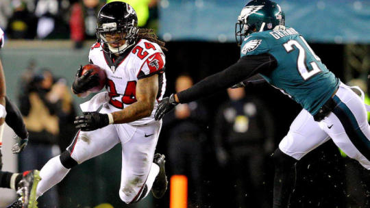
The miraculous Super Bowl run of the 2017 Philadelphia Eagles nearly ended before it ever really began. The Eagles' jaunt through the NFC playoffs began with a 15-10 win over the Atlanta Falcons at home. But things could have gone differently had a leaping interception attempt by Atlanta safety Keanu Neal not gone so disastrously. Late in the second quarter, with the Eagles trailing 10-6, Doug Pederson's team got the ball back to begin a drive at their own 28-yard line. Rather than kneel on the ball and head into halftime trailing by four despite starting a backup quarterback, Pederson elected to let Nick Foles sling it and see if he could get some points. On the second play of the drive, Foles attempted to hit tight end Zach Ertz on a crossing route over the middle of the field. Foles was hit as he threw and completely overshot his target. The ball seriously went about 10 feet over Ertz's head, and it should have been the easiest pick of Neal's career. Instead ... Two plays later, Foles found Alshon Jeffery for a 15-yard gain, pushing the Eagles into field goal range with one second left on the clock. Jake Elliott knocked a 53-yard field goal through the uprights to cut the Falcons' lead to 10-9. The Eagles' defense held serve in the second half, keeping the Falcons off the scoreboard altogether, while Elliott connected on two more field goal attempts. A few weeks later, they were champions. On Thursday night, the Falcons have a chance for revenge, while the Eagles have the opportunity to begin their title defense. Foles is still under center for Philadelphia, which is holding Carson Wentz out for a while longer as he continues his recovery from a torn ACL suffered last December. Jeffery is out for the game as well, still dealing with the effects of a shoulder injury. Stalwarts like Vinny Curry and Beau Allen are gone, replaced by Haloti Ngata and Michael Bennett. The Falcons, meanwhile, have added talent on both sides of the ball, hoping to rebound from last season's disappointment. The Matt Ryan — Julio Jones — Devonta Freeman — Tevin Coleman core of their offense is still in place, but they added former Alabama wideout Calvin Ridley. The defense brought in Terrell McClain to help out against the run, plus rookies Isaiah Oliver in the defensive backfield and Deadrin Senat on the line. Can the Eagles begin their quest for a repeat with a win, or will the Falcons deal the champs an opening-week blow? We'll find out Thursday night. But before the game begins, we'll walk through some of the key things to look out for, from a statistical perspective. When the Eagles have the ball Let's begin with Foles. It makes sense to start there, given that he is replacing an MVP candidate at quarterback, and he is coming off an MVP performance of his own. Foles went 23-for-30 for 246 yards without either a touchdown or a pick in that divisional round game against the Falcons last year. In the following two games, he completed an incredible 54 of 76 passes for 725 yards, six touchdowns and just one interception, while also catching a score on the Philly Special. Everybody remembers those two games when discussing what to expect from Foles when filling in for Wentz. Less talked about are the two-plus regular season games he played after Wentz was initially hurt. Whiling finishing out the game against the Rams and starting against the Giants, Raiders, and Cowboys, Foles completed 54.6 percent of his passes and averaged just 4.96 yards per attempt. During his most recent season as a starter, back in 2015, he was not much better: 56.4 percent completions at 6.1 yards per attempt. With the exception of his utterly spectacular 2013 season (during which he threw 27 touchdowns and only two interceptions) and the NFC title game and Super Bowl last year, Foles has been a perfectly average quarterback. He does, of course, have one of the NFL's great offensive coaches scheming him into position for success, but it's important to remember the bigger picture when debating what to expect from Foles on a game-to-game basis. So who should you back in Week 1 of the NFL season? Visit SportsLine now to see which teams are winning more than 50 percent of simulations, all from the model that has outperformed 98 percent of experts tracked by NFLPickWatch.com the past two seasons. Consider also who Foles will be throwing to in Week 1. The Eagles will be without Alshon Jeffery due to injury, but they also lost Trey Burton and Torrey Smith in free agency, plus Brent Celek to retirement. Of the Eagles' 555 targets last season, Jeffery, Burton, Smith, and Celek accounted for 242 of them, or 43.6 percent. Of the 207 targeted passes Foles threw during the regular season and postseason combined, that foursome was the on the receiving end of the throw on 79 of them, or 38.2 percent. That's a whole lot of missing-in-action pass-catchers. And that's not even accounting for Mack Hollins, who played a small role last year but will have to be more of a contributor this season, and is also out for Thursday's game. Foles still has plenty of returning targets such as Ertz, Nelson Agholor, and running backs Jay Ajayi and Corey Clement, plus new arrival Mike Wallace; but things are going to be a bit different for the Philadelphia passing game than they were a year ago, to say the least. The Falcons, meanwhile, are returning almost their entire defense from last season, plus a few new playmakers. Adrian Clayborn is gone, but he's replaced by 2017 first-rounder Takkarist McKinley, who will line up across from Vic Beasley to form one of the most athletic edge-rusher combinations in the league. Beasley ranked in the 99th percentile of athleticism among NFL edge rushers when he came into the league back in 2015, while McKinley's quick first step around the edge helped him produce 1.67 sacks plus tackles per loss per game across his final two college seasons -- a considerably above-average figure. Atlanta also returns one of the league's top secondaries, with Keanu Neal joined by fellow safeties Ricardo Allen and preseason star Damontae Kazee, plus corners Desmond Trufant and Robert Alford, slot man Brian Poole. Atlanta's entire defense, as we discussed prior to last season, is absolutely stocked with top-flight athletes. Player SPARQ 40 SHUTTLE 3 CONE VERT BROAD Takkarist McKinley 116.4 4.59 4.62 7.48 33.00 10.17 Duke Riley 129.7 4.58 4.21 6.90 37.00 10.17 Keanu Neal 126.7 4.62 4.20 7.09 38.00 11.00 Deion Jones 129.3 4.39 4.26 7.13 35.50 10.00 De'Vondre Campbell 113.3 4.58 4.50 7.07 34.00 9.67 Brian Poole 99.7 4.50 4.43 7.13 29.00 9.33 Vic Beasley 151.5 4.53 4.15 6.91 41.00 10.83 Jalen Collins 118.8 4.48 4.27 6.77 36.00 10.33 Grady Jarrett 126.6 5.06 4.56 7.37 31.00 9.42 Ricardo Allen 112.8 4.51 4.25 7.01 37.00 10.17 Desmond Trufant 115.5 4.38 3.85 N/A 37.50 10.42 Robert Alford N/A 4.39 4.23 6.89 40 11.00 In the running game, it will be interesting to see what kind of plan the Eagles have in store for Ajayi. They acquired him at least year's trade deadline but he was lightly-used over the second half of the regular season, carrying just 70 times over seven games. His usage shot up during the playoffs as he carried 42 times for 184 yards, but only nine of those totes came during their Super Bowl victory over the Patriots. Reports have indicated that the team plans to use him as more of a feature back this season, but Pederson and company will surely want to mix in Clement (who is a better pass-catcher) and possibly Darren Sproles as well. For what it's worth, Ajayi himself tore through the Falcons for 130 yards on 26 carries last season when he was still with the Dolphins. He also now has Pro Football Focus' top run-blocking offensive line clearing the way for him. An under-discussed aspect of Philadelphia's run last season was the performance of rookie kicker Jake Elliott. (At least it's been under-discussed outside Philadelphia.) Elliott nailed 39 of 42 field goal attempts during the regular season and all seven of his tries during the playoffs. That's an absurd 93.8 percent conversion rate -- far better than the league averaged of 83.0 percent. Take away four of his makes to get him down to league average, and you might take the Eagles from 13-3 to 11-5. Knock him down even further to his collegiate conversion rate of 77.9 percent, and their record might fall a bit more. Elliott's follow-up to his spectacular rookie exploits bears watching. When the Falcons have the ball Just as they did on offense, the defending champions lost several contributors from their Super Bowl-winning defense. Philadelphia's defensive line last year was one of the best and deepest in the NFL, consisting of Fletcher Cox, Brandon Graham, Vinny Curry, Timmy Jernigan, Derek Barnett, Chris Long and Beau Allen. Curry was cut. Allen signed with the Buccaneers. Jernigan is injured. That's 40.5 percent of the snaps from last year's group. Luckily, they signed Haloti Ngata to pick up Allen's slack in the running game, and traded for Michael Bennett to play a versatile role all over the line as a pass-rusher and run-stuffing monster. The entire group will have its hands full on Thursday night, as the Falcons sport one of the best offensive lines in the NFL. The Falcons were torn apart on the interior during their two playoff games last season as Andy Levitre sat out due to injury, but he's back at full strength and should be playing alongside Alex Mack at center, Wes Schweitzer at the opposite guard, and Jake Matthews and Ryan Schrader at the tackles. That group's zone-blocking chemistry clears the way for the dynamic duo of Devonta Freeman and Tevin Coleman, one of the league's most well-balanced and versatile running back tandems. Freeman takes the lead role and operates more often between the tackles, but Coleman can just as quickly scoot through a seam and is versatile enough to line up in the slot or out wide and school a linebacker or safety off the line of scrimmage. Freeman has essentially been completely shut down in three career games against the Eagles, however: he has 32 carries for 74 yards and 11 catches for 87 yards in those three contests. That's an average of just 3.74 yards per touch, compared to his career average of 5.18 per touch against all other opponents. Opp Rush Yards Rec Yds Yds/Tch PHI 32 74 11 87 3.74 OTHER 820 3483 209 1779 5.17 Coleman has taken on a larger role in the team's offense with each passing season of his career (89 touches as a rookie, then 149, then 183) but his efficiency has waxed and waned. He averaged 4.6 yards per touch as a rookie, 6.3 as a sophomore, and 5.1 a year ago. The team made a bit more of a concerted effort to get him involved in the running game last season but he did not break as many big plays as he did the year before, and he also saw his catch rate drop off from the sky-high 77.5 percent he posted in 2016. That duo will have to find its way against a defense that allowed a first down on only 17.8 percent of opponents' rushing attempts last season, the eighth-best mark in the NFL, while yielding touchdowns on just 2.08 percent of rush attempts, the fifth-best figure in the league. Complicating things for Philly will be the absence of linebacker Nigel Bradham, as well as the need to work in the replacements for some of their stalwarts on the defensive line. In the passing game, Atlanta's Matt Ryan saw his performance fall off sharply after a career season in 2016. In particular, he struggled to find much of a rhythm with his No. 1 target, Julio Jones. Jones posted the second-lowest catch rate of his career at 59.5 percent, and scored only three touchdowns on the season. Even though he's never been much of a touchdown-producer, that rate of scoring was considerably lower than his career norms. During his five healthy seasons prior to 2017, Jones scored 38 touchdowns on 456 catches and 718 targets. That means 8.3 percent of his catches and 5.3 percent of his targets turned into scores. Last year, however, with just three end zone trips on 88 catches and 148 targets, those rates plummeted to just 3.4 percent (catches) and 2.0 percent (targets). Philadelphia lost an important contributor from last year's secondary in Patrick Robinson, but returns starter Jalen Mills, trade acquisition Ronald Darby (who missed much of last season after dislocating his ankle in the team's first game), and 2017 second-rounder Sidney Jones, who is expected to play a much bigger role this season. We don't yet know if the Eagles will use shadow coverage or play sides, but that trio will have to deal with not just Jones, but also Mohamed Sanu and the shifty rookie, Ridley. That should be a fun matchup all night. Read the full article
0 notes
Text
A look at rate statistics and ice time

In a perfect world, NHL players would be given ice time directly proportional to their skill. Coaches wouldn’t be biased in any way, shape, or form, and the best players on any given team would also get the most ice time for said team. Unfortunately, this does not happen, and there are plenty of times when players are stuck in limited roles simply because their coach has some kind of bias against them, even though they would more than capable of succeeding in a second or first line role. If you’re just looking at raw point totals (or even points per game), these players will look worse than they actually are, because they won’t be getting the playing time they deserve (it’s also possible that lesser players get more ice time, and look better as a result). Analysts have accounted for these differences in opportunity by looking at rate statistics, which calculate the rate at which events occur based on ice time, giving players that don’t get a lot of ice time a level playing field against players that see the ice more often. This isn’t an end-all, be-all statistic, of course, but it does give us a way to identify players that are potentially under (or over) valued by the league due to their point production. Take Adrian Kempe and Alexander Radulov, as an example. Radulov played 1288 minutes at 5v5 last season, while Kempe played just 943. Radulov tallied 40 points, while Kempe tallied 30. This gives Kempe a points per hour of 1.91, and Radulov a points per hour of 1.87. Though Radulov managed 10 more points than Kempe over the course of the season, the two actually produced at a similar rate. Radulov, however, played on Dallas’s first line alongside Jamie Benn and Tyler Seguin. His most frequent teammates are great players, which led to their line facing the opposition’s best players on a nightly basis. Kempe, on the other hand, played a middle six role for Los Angeles, facing weaker opponents as the number two/three center behind Anze Kopitar/Jeff Carter. So, how much does a player’s role impact their point production, especially from a rate statistic perspective? If Kempe and Radulov saw their roles switched, could we still expect them to produce around 1.9 points per hour? In order to answer this question, we first need a baseline to work with. Given the effect that bounces, random variance, and plain old puck luck can have on a player’s production in any given season, there’s no real guarantee that point production per hour is even a repeatable statistic. With that in mind, I pulled all forward seasons from 2007-2018, and compared each player to their previous season’s production. To keep small sample sizes from playing a role, I only kept players that played at least 500 minutes in both the “current” season and the previous season. To keep secondary assists from creating noise, I only looked at primary points (goals and first assists) Here’s a scatterplot of the numbers.
y = 0.63 + 0.47(x) | R^2 = 0.21 | N = 2789 As we can see, there’s a generally positive trend. This means that the statistic is relatively repeatable - though random variance certainly plays a role, the better players in the league typically have a higher rate of points per hour across multiple seasons, while lesser players stay on the lower end of the spectrum. So, we can assume that primary points per hour is a fairly repeatable metric. Next, let’s test to see if ice time has an impact on how repeatable of a metric primary points per hour actually is. Taking the chart from before, I only looked at players that saw an average ice time per game increase or decrease by one minute. Here’s the updated chart.

y = 0.62 + 0.47(x) | R^2 = 0.19 | N = 989 There’s virtually no change between the two charts. The math backs this up, as the two models are virtually identical, with virtually identical R-squared values (0.19 vs. 0.21). A one minute change in average ice time per game may not be significant enough, however. What if we only look at forwards who had a two minute increase or decrease in ice time?

y = 0.52 + 0.49(x) | R^2 = 0.17 | N = 219 There’s not much change in R-squared between the model for players with a two minute difference and the players with a one minute difference, but there is a slight gap between the model for players with a two minute difference and the model for all players (0.17 vs. 0.21). It seems that there might be a slight impact from ice time, so let’s go one step further and look at players that have a three minute increase or decrease from one season to the next.

y = 0.80 + .23(x) | R^2 = .02 | N = 50 We’re down to just 50 observations, but the data here is pretty clear. With a three minute increase or decrease in ice time per game, there’s virtually no relationship between past season primary points per 60 and current season primary points per 60. Overall, we saw that the correlation between previous season primary points per hour and current season primary points per hour declined the more change a player saw in his average ice time. Changing roles did have an impact on primary point production, though the effect wasn’t necessarily positive or negative. I’ll let Brian MacDonald summarize for us (note: the linked article is behind The Athletic’s paywall). For a guy like , if he’s put in a different situation, ideally, his numbers would stay the same — (that is) his advanced metrics would stay the same if they’re accounting for teammates and opponents. But in reality they’re probably going to change. One thing most of these models ignore chemistry or synergy between players. It’s also most of what people talk about out in the open “Well, this guy is getting this amount of production in only 11 minutes of ice time per game at 5-on-5” and then they basically make the assumption that if you increase playing time that the production rate is going to stay the same. Which is almost certainly not true. There’s no way. That’s a huge assumption. This is something by Brian likely has looked into in the past, but I couldn’t find anything online confirming that it was true, so I investigated. It’s rather clear, I think, that point production rates are prone to change as a player’s ice time changes. It’s likely that there are a huge variety of factors at play here, though I suspect most of them stem from the fact that we’re missing a lot of the context that goes into ice time changes. Here’s a brief and incomplete list of scenarios that come to mind where a player could see his ice time change (and his production change as a result). A young player starts out playing fourth line minutes with unskilled teammates. The next season, he’s bumped up to a second line role alongside two excellent players. His production increases, as he now has skilled teammates to work with. A veteran player signs with a new team, downgrading from a second line role to a third line role. The quality of his teammates doesn’t change much, but he’s now playing against much weaker competition, and his production increases as a result. A skilled player with key flaws finds success on the third line, but is forced to move up to the first line after a player leaves in free agency and another falls to injury. His flaws are exposed when he’s faced with stronger competition, and his production suffers. A veteran player racks up points playing alongside his team’s top center, but an up and coming rookie takes his place on the top line. Between old age and the new teammates, the veteran struggles, and he sees a decline in scoring. Going forward, it would be interesting to dig into the context a bit more, to see if there are specific groups of players more prone to an increase or decrease in point production based on factors such as projected ice time, projected teammates, or even projected opponents. At the end of the day, though, you most likely clicked on this blog post for Panthers analysis, not analysis of the NHL at large. Here’s a look at primary points per hour for Panthers forwards last season. Florida Panthers P1/60 2017-2018 Player GP TOI Goals First Assists TOI/GP P1/60 Player GP TOI Goals First Assists TOI/GP P1/60 Evgenii Dadonov 74 1072.32 20 19 14.49 2.18 Nick Bjugstad 82 1080.13 18 16 13.17 1.89 Aleksander Barkov 79 1222.45 13 17 15.47 1.47 Frank Vatrano 41 410.17 7 3 10.00 1.46 Jonathan Huberdeau 82 1193.83 16 12 14.56 1.41 Jared McCann 68 791.22 7 10 11.64 1.29 Denis Malgin 51 624.20 10 3 12.24 1.25 Jamie McGinn 76 884.98 9 9 11.64 1.22 Connor Brickley 44 475.52 4 5 10.81 1.14 Colton Sceviour 76 807.45 10 5 10.62 1.11 Vincent Trocheck 82 1216.87 9 13 14.84 1.08 Radim Vrbata 42 471.97 3 4 11.24 0.89 Derek MacKenzie 75 660.87 2 6 8.81 0.73 Keith Yandle 82 1440.25 6 11 17.56 0.71 Maxim Mamin 26 267.20 3 0 10.28 0.67 Mike Matheson 81 1424.27 7 6 17.58 0.55 Mark Pysyk 82 1316.87 3 9 16.06 0.55 Micheal Haley 75 575.80 3 2 7.68 0.52 Aaron Ekblad 82 1450.65 9 2 17.69 0.45 Alex Petrovic 67 945.52 2 5 14.11 0.44 Ian McCoshen 38 523.58 3 0 13.78 0.34 MacKenzie Weegar 60 831.22 2 2 13.85 0.29 We can see that player role impacts point production for the Panthers right from the start, with Evgenii Dadonov and Nick Bjugstad coming ahead of Aleksander Barkov. Seeing as Barkov’s usage is very defensive-minded, it’s not surprising to see him after over 15 minutes of 5v5 time per game, but produce points at a lesser rate than his counterparts. Frank Vatrano is also interesting, as he’s averaged about 1.16 primary points per hour over the course of his career. His uptick in production last season is notable, though it’s questionable if he can sustain it. He clearly played a fourth liner’s role last season, averaging just 10 minutes at 5v5 per game, but if he can maintain his rate of production in a third line role next season, it would help the Panthers develop one of the league’s stronger third lines. Vincent Trocheck’s low rate of production at 5v5 was offset by his astounding power play production last season, so people aren’t talking about it. Still, it’s noticeable, and one can’t help but wonder if he would benefit from having less defensive responsibility. Micheal Haley is an enforcer who would have made a great fourth liner... 15-25 years ago. Unfortunately for Haley, the league is changing. If the Panthers want to hang with the juggernauts of the East, they should look into icing a fourth line that has a bit more skill. Again, this isn’t an end-all-be-all statistic, and it only tells part of the story. Still, it’s good to know that context matters, even if that context is something as basic as ice time. Read the full article
0 notes
Text
A milestone for forecasting earthquake hazards


Earthquakes pose a profound danger to people and cities worldwide, but with the right hazard-mitigation efforts, from stricter building requirements to careful zoning, the potential for catastrophic collapses of roads and buildings and loss of human lives can be limited. All of these measures depend on science delivering high-quality seismic hazard models. And yet, current models depend on a list of uncertain assumptions, with predictions that are difficult to test in the real world due to the long intervals between big earthquakes. Now, a team of researchers from Columbia University's Lamont-Doherty Earth Observatory, University of Southern California, University of California at Riverside and the U.S. Geological Survey has come up with a physics-based model that marks a turning point in earthquake forecasting. Their results appear in the new issue of Science Advances. "Whether a big earthquake happens next week or 10 years from now, engineers need to build for the long run," says the study's lead author, Bruce Shaw, a geophysicist at Lamont-Doherty. "We now have a physical model that tells us what the long-term hazards are." Simulating nearly 500,000 years of California earthquakes on a supercomputer, researchers were able to match hazard estimates from the state's leading statistical model based on a hundred years of instrumental data. The mutually validating results add support for California's current hazard projections, which help to set insurance rates and building design standards across the state. The results also suggest a growing role for physics-based models in forecasting earthquake hazard and evaluating competing models in California and other earthquake prone regions. The earthquake simulator used in the study, RSQSim, simplifies California's statistical model by eliminating many of the assumptions that go into estimating the likelihood of an earthquake of a certain size hitting a specific region. The researchers, in fact, were surprised when the simulator, programmed with relatively basic physics, was able to reproduce estimates from a model that has improved steadily for decades. "This shows our simulator is ready for prime time," says Shaw. Seismologists can now use RSQSim to test the statistical model's region-specific predictions. Accurate hazard estimates are especially important to government regulators in high-risk cities like Los Angeles and San Francisco, who write and revise building codes based on the latest science. In a state with a severe housing shortage, regulators are under pressure to make buildings strong enough to withstand heavy shaking while keeping construction costs down. A second tool to confirm hazard estimates gives the numbers added credibility. "If you can get similar results with different techniques, that builds confidence you're doing something right," says study coauthor Tom Jordan, a geophysicist at USC. A hallmark of the simulator is its use of rate and state-dependent friction to approximate how real-world faults break and transfer stress to other faults, sometimes setting off even bigger quakes. Developed at UC Riverside more than a decade ago, and refined further in the current study, RSQSim is the first physics-based model to replicate California's most recent rupture forecast, UCERF3. When results from both models were fed into California's statistical ground-shaking model, they came up with similar hazard profiles. John Vidale, director of the Southern California Earthquake Center, which helped fund the study, says the new model has created a realistic 500,000-year history of earthquakes along California's faults for researchers to explore. Vidale predicted the model would improve as computing power grows and more physics are added to the software. "Details such as earthquakes in unexpected places, the evolution of earthquake faults over geological time, and the viscous flow deep under the tectonic plates are not yet built in," he said. The researchers plan to use the model to learn more about aftershocks, and how they unfold on California's faults, and to study other fault systems globally. They are also working on incorporating the simulator into a physics-based ground-motion model, called CyberShake, to see if it can reproduce shaking estimates from the current statistical model. "As we improve the physics in our simulations and computers become more powerful, we will better understand where and when the really destructive earthquakes are likely to strike," says study coauthor Kevin Milner, a researcher at USC. Story Source: Materials provided by Columbia University. Original written by Kim Martineau. Note: Content may be edited for style and length. Read the full article
0 notes
Text
How statistical information can be used

The Collection of Statistics (Amendment) Act of 2017 authorises the Centre to decide the manner in which statistical information collected can be used. The original Act of 2008 had restricted the data collected to be used only for statistical purposes. The Act passed in August 2017 empowers the Central government to make rules on the powers and duties of a nodal officer who may be designated to coordinate and supervise statistical activities in the Central government or a State government or Union Territory administration. It “empowers the Central Government to make rules relating to the manner of using any information by the statistics officer or any person or agency under Section 6 of the Act for statistical purpose”. The Act also extends the jurisdiction of the Collection of Statistics Act, 2008, to Jammu and Kashmir on statistics relevant to any matters under any of the entries specified in List I (Union List) and List III (Concurrent List) in the Seventh Schedule to the Constitution, as applicable to Jammu and Kashmir under the Constitution (Application to Jammu & Kashmir) Order, 1954. The amendment will strengthen the data collection mechanism in Jammu and Kashmir. The Collection of Statistics Act, 2008, was enacted to facilitate the collection of statistics on economic, demographic, social, scientific and environmental aspects, among others. The Act had originally extended to the whole of India, except Jammu and Kashmir. The Jammu and Kashmir State Legislature enacted the Jammu and Kashmir Collection of Statistics Act, 2010, which extends to the whole of Jammu and Kashmir and is almost a replica of the Central legislation. The Collection of Statistics Act, 2008, and the Jammu and Kashmir Collection of Statistics Act, 2010, were not applicable to statistical subjects falling in the Union List, as applicable to Jammu and Kashmir under the Constitution (Application to Jammu and Kashmir) Order, 1954. This had created a legislative vacuum. Moreover, the concurrent jurisdiction to be exercised by the Centre in Jammu and Kashmir has also not been provided for in the Collection of Statistics Act, 2008. The amendment statute fills the vacuum. Read the full article
0 notes
Text
The impact of cognitive impairment on the physical ageing process.

BACKGROUND: Physical decline and cognitive degeneration characterise the ageing process. AIM: Physical parameters, performance and the functional indexes were studied in relation to age in healthy and cognitively impaired older persons to understand the interactions and changes during normal ageing, cognitive decline and progression to frailty. METHODS: Cross-sectional analysis was performed on a data registry of an ambulatory Memory Diagnosis Centre. The quantitative gait characteristics at usual pace, body composition parameters, disability scales (activity of daily living and instrumental activity of daily living) and Rockwood frailty index were compared in cognitively healthy (CHI), mild cognitively impaired, mildly and moderately demented 80-years old adults. RESULTS: Quality of gait deteriorated with age in CHI and cognitively impaired. Skeletal muscle mass index decreased when cognitive status worsened. Disability and frailty correlated with increasing cognitive impairment. Age, gender, cognitive impairment, body composition and Rockwood's Frailty scale had a combined forecasting effect, as well as the individual effect on the gait characteristics. Disability score, Frailty index, skeletal muscle mass and skeletal muscle mass index, gait speed, normalised mean step length and swing time variability in mildly demented 80-years old. CONCLUSION: Quantitative gait characteristics, muscle mass and disabilities change along with cognitive impairment, frailty and age. A more rapid physical ageing process accompanies cognitive decline. Therefore, gait characteristics should be age-referenced and studies on gait in older persons should include muscle mass, frailty and cognitive parameters. Connect with Nevin Manimala on LinkedIn Nevin Manimala SAS Certificate Read the full article
0 notes
Text
12 intriguing statistics social media users would love to know about their lives

(MIND_AND_I/Getty Images) 12 intriguing statistics social media users would love to know about their lives Independent.ie From years left to live, to number of steps taken, we all have some interesting statistics in our life that would be fascinating to see. https://www.independent.ie/world-news/and-finally/12-intriguing-statistics-social-media-users-would-love-to-know-about-their-lives-37168120.html https://www.independent.ie/world-news/and-finally/article37168101.ece/86230/AUTOCROP/h342/ipanews_68de38dc-cb1d-4c5b-8cdb-18fe63d473b9_1 Email From years left to live, to number of steps taken, we all have some interesting statistics in our life that would be fascinating to see. Reddit user antonionovta asked people on the website for the one statistic they’re itching to find out, and they came up with some interesting ideas. Here are 12 of the very best statistics you should know about your life. 1. How many times you’ve ignored a future spouse? 2. How many times your baby name was off the table…

3. This terrifying statistic. 4. You could see if you were a good or terrible person.

5. How many tourists have got you in the background. 6. Your unit of barbecue measurement.

7. How many hit points you have left. 8. No, no, no.

9. You could see how much of your life you’ve lived. 10. How many people you’ve infected with your germs…

11. This flattering statistic. 12. Lastly, this frightening suggestion.

Press Association Follow @Independent_ie Read the full article
0 notes
Text
Diabetes cases in Saudi Arabia result in 5000 amputations annually - Statistics

Rising diabetes cases in Saudi Arabia result in 5,000 foot amputations annually according to statistics released by the International Diabetes Federation. This statistic was conveyed by the Saudi Society for Diabetes and Endocrinology, where the head of its Health Education Committee, Dr. Bassem Fota, said that there are about three million Saudis who suffer from high blood pressure. “However, there are indicators of improvement in the numbers due to increased awareness, and a reduced number of amputations per year by about 30 percent,” Fota added. Fota said that the Saudi Society for Diabetes and Endocrinology carried out a campaign which involved 6,000 people, 70 percent of whom were men and 30 percent were women. After a bit of testing, it turned out that 35 percent of the participants suffered from obesity, 13 percent suffered from high blood pressure and 600 people had high blood sugar levels. He added that most of them do not exercise and are likely to become diabetic. In 2015, the number of Saudis who suffer from diabetes reached 3.8 million. According to the International Diabetes Federation, the number of those who died due to diabetes is 23,420 while the cost for treating one diabetic patient is $1,145 a year. SHOW MORE Last Update: Sunday, 22 July 2018 KSA 13:07 - GMT 10:07 Read the full article
0 notes
Text
16 statistics that show how Louisiana's children are struggling

Terrapin Flyer, Creative Commons Thousands of children in Louisiana face challenges related to their overall well-being, and the latest Kids Count report from the Annie E. Casey Foundation found Louisiana's disadvantages have only increased since last year. Kids Count determines its rankings by sorting through several federal statistics, including data from the U.S. Department of Education, the National Center for Education Statistics, the Census Bureau, the U.S. Department of Agriculture, and the U.S. Centers for Disease Control and Prevention. The "2018 Kids Count Data Book" ranked Louisiana 49th overall this year, which is a drop from No. 48 in 2017. The organization looked at 16 "indicators of child well-being" that were split into four categories: Economic well-being, education, health, and family and community. Louisiana is 50th in economic well-being and 47th in education for the state's children. The state also ranked 44th in child health and 48th in family and community. Scroll down to see how Louisiana fared in the 16 indicators that affected its rank. Children in poverty Kathleen Flynn, NOLA.com l The Times-Picayune Children in poverty The organization found that 314,000, or 29 percent, of Louisiana's children live in poverty as of 2016. Only 27 percent of Louisiana's youth were impoverished in 2010, so the organization stated things are getting worse for the state's youth. Nationwide, child poverty dropped from 22 percent in 2010 to 19 percent in 2016. Children whose parents lack secure employment AP Photo/Annie Rice Children whose parents lack secure employment Approximately 393,000, or 35 percent, of Louisiana's children have parents who lack secure employment. Like the rest of the nation, Louisiana has seen some positive growth since 2010, when the number of Louisiana children with parents in this situation was 36 percent. Children in households with a high housing cost John McCusker, The Times-Picayune archive Children in households with a high housing cost In Louisiana, 343,000 children live in a house where the cost of housing is a burden on the family. The report stated 31 percent of children in Louisiana struggle with high housing costs, which is a slight decrease from when 32 percent of children lived under those conditions in 2010. Teens neither in school nor employed Matt Rose, Times-Picayune archive Teens neither in school nor employed Fourteen percent of Louisiana's teenagers were not in school or working in 2010. Approximately 29,000, or 11 percent, of the state's teens found themselves in that situation in 2016. Read the full article
0 notes
Text
Economic Advisers Reveal Shocking Statistics of Able-Bodied Medicaid Recipients Refusing To Work

Fifty-three percent of non-disabled working age Medicaid recipients worked an average of zero hours per month while receiving benefits, according to a Thursday report from the White House Council of Economic Advisers. The subset of recipients with the largest percentage of non-workers was adults aged 50-64 without children, according to the report. The subset with the smallest percentage of non-workers was working age recipients with a youngest child aged 1 to 5, with 49 percent of recipients reporting an average of zero work hours per month. Of individuals receiving Supplemental Nutrition Assistance benefits, 54 percent of non-disabled working age adults reported an average of zero hours of work per month while receiving benefits, according to the report. For non-disabled working age adults receiving housing assistance, 45 percent reported an average of zero work hours per month when receiving benefits. “The American work ethic, the motivation that drives Americans to work longer hours each week and more weeks each year than any of our economic peers, is a long-standing contributor to America’s success,” the White House Council of Economic Advisers report states, but “many non-disabled working-age adults do not regularly work, particularly those living in low-income households.” TRENDING: Lib Asks Man ‘When Was America Great,’ Gets 1 of Best Answers We’ve Ever Heard The labor force participation rate for the overall workforce was 62.9 percent in June, according to the Bureau of Labor Statistics. The study comes amidst an executive order from President Donald Trump in April directing federal agencies to “ existing work requirements or work-capable people and new work requirements when legally permissible” in federal safety-net programs. The executive order also directs federal agencies to “reduce the size of the bureaucracy and streamline services to promote the effective use of resources” and “reduce wasteful spending.” This may especially come into play with possible reductions in Medicaid spending that come from work requirements. Medicaid, unlike may other safety-net programs, does not phase out as income rises; if someone qualifies for Medicaid, they qualify for it whether they have no income or the maximum income. Do you think we need to crackdown on welfare abuse? The federal government is expected to spend $280 billion on Medicaid in 2018, according to a May Congressional Budget Office report. That includes an additional $59 million dollars for recipients made eligible though Affordable Care Act Medicaid expansions. A version of this article appeared on The Daily Caller News Foundation website. Content created by The Daily Caller News Foundation is available without charge to any eligible news publisher that can provide a large audience. For licensing opportunities of our original content, please contact [email protected]. Facebook has greatly reduced the distribution of our stories in our readers' newsfeeds and is instead promoting mainstream media sources. When you share to your friends, however, you greatly help distribute our content. Please take a moment and consider sharing this article with your friends and family. Thank you. Read the full article
0 notes
Text
Drowning statistics prompt pool safety warnings

TOPEKA, Kan. (KSNT) - Summer is here and the hot spot for many kids is the swimming pool. But sadly drownings devastate families every year. Safe Kids Worldwide reports, " Drowning is a leading cause of unintentional injury and death among children in the U.S. In 2014, there were 784 deaths for children ages 0-17." Rebecca Witte, a mom in Topeka, takes pool safety seriously.
Copyright 2018 Nexstar Broadcasting, Inc. All rights reserved. This material may not be published, broadcast, rewritten, or redistributed. "The water is dangerous. I don't want them to be afraid of it, but there are still some general concerns," remarks Witte. Safe Kids Shawnee County says, there are many misconceptions parents have on drowning, but the reality is drowning is silent, quick, and it's not necessarily the lifeguard's job to watch your child.

Copyright 2018 Nexstar Broadcasting, Inc. All rights reserved. This material may not be published, broadcast, rewritten, or redistributed. "(The) lifeguard's job is to enforce the pool rules, scan the pool for things, and rescue and resuscitate as needed. Watching your kid is your responsibility as a parent," explains Rachel Ault, a registered nurse at Stormont Vail and a volunteer for Safe Kids Shawnee County. Someone should have eyes on your child at all times, without distractions. "You think you're watching them the whole time but you do, you look away for a second and you just never know what might happen," Witte says. Making sure your kids know how to swim before going to the pool is also important. As for flotation devices, Safe Kids recommends a U.S. Coast Guard approved life jacket, "not using the little arm floaties, or water wings, or whatever you want to call them, because they are not designed to prevent any kind of drowning," explains Ault. Although the high risk age group for pool drownings, is kids under 4, Safe Kids Shawnee County suggests older kids still need to be cautious and should always try to swim with a buddy. The risk of drowning in open water, like in a lake, increases with age. Read the full article
0 notes
Text
Illegal Immigration Statistics

With the controversy over family separations, much of the political rhetoric in recent weeks has focused on illegal immigration. We thought it would be helpful to take a step back and look at some measures of illegal immigration in a larger context. For example, how many immigrants live in the U.S. illegally, and how many are caught each year trying to cross the Southwest border? How many of them are families or unaccompanied children? And how have these statistics changed over time? Let’s take a look at the numbers. How many immigrants are living in the U.S. illegally? There were 12.1 million immigrants living in the country illegally as of January 2014, according to the most recent estimate from the Department of Homeland Security. The estimates from two independent groups are similar: The Pew Research Center estimates the number at 11.1 million in 2014, and the Center for Migration Studies says there were 11 million people in 2015 living in the U.S. illegally (see Table 1 in the full report). That would be about 3.5 percent to 3.8 percent of the total U.S. population in 2014. All three groups use Census Bureau data on the foreign-born or noncitizens and adjust to subtract the legal immigrant population. And all three groups say the population of immigrants living in the country illegally has been relatively stable since about 2008-2009. DHS estimated that the population had increased by 500,000 people total from 2010 to 2014, which “reflects relative stability,” especially when compared with 500,000-person increases each year on average from 2000 to 2007. The Pew Research Center found a peak of 12.2 million in the population in 2007, decreases for 2008 and 2009, and then a “relative stability” since then.
All three groups find Mexicans make up the majority of the undocumented population — 55 percent in 2014, according to DHS — but the number and share of Mexicans among this population has been declining in recent years. Those living in the country illegally also have increasingly been here for 10 years or more. DHS says more than 75 percent in 2014 have lived in the U.S. for more than a decade, and only 5 percent came to the country over the previous five years. The Pew Research Center has slightly different figures, but they show the same trend. “This overall change has been fueled by the decline in new unauthorized immigrants,” it says, “especially those from Mexico.” How many people are crossing the border illegally? There’s no official measure of how many people succeed in illegally crossing the border, but authorities use the number of apprehensions to gauge changes in illegal immigration. Apprehensions on the Southwest border peaked in 2000 at 1.64 million and have generally declined since, totaling 303,916 in 2017. Those numbers, which come from the U.S. Customs and Border Protection, are for fiscal years and date back to 1960.

That’s an 81.5 percent decline in the number of apprehensions between the peak in 2000 and 2017. We can also look at how the figures have changed over the past several years. Under the Obama administration, the yearly apprehensions on the Southwest border declined by 35 percent from calendar year 2008, the year before President Obama took office, through the end of 2016. In President Donald Trump’s first full year in office, the apprehensions declined by 43 percent, from calendar year 2016 to 2017. On a monthly basis, the apprehensions decreased significantly during the first six months of Trump’s tenure and then began to rise back in line with the level of apprehensions from 2016.

What about people overstaying their visas? As border apprehensions have declined, estimates show a growing proportion of the undocumented population legally entered the country on visas but overstayed the time limits on those visas. A Center for Migration Studies report estimates that 44 percent of those in living in the U.S. illegally in 2015 were visa overstays. That’s up from an estimated 41 percent in 2008. The CMS report, written by Robert Warren, a former director of the U.S. Immigration and Naturalization Service’s statistics division, says 65 percent of net arrivals — those joining the undocumented population — from 2008 to 2015 were visa overstays. There are no solid, long-term estimates of the visa overstay problem. When we wrote about this issue in August 2015, DHS told us it didn’t have statistics on visa overstays. But DHS has since issued some estimates. It said that about 629,000 people on visas who were expected to leave in fiscal year 2016 hadn’t done so by the end of that fiscal year (that’s out of 50.4 million arrivals). That number, however, had declined to about 545,000 by January 2017, DHS said, noting that it expected the estimate to “shift over time as additional information is reported.” CMS disputed the DHS estimate, finding that the number was too high. What about families trying to cross the border illegally? The number of family units apprehended has increased since fiscal year 2013, the first year for which we have such data. While 3.6 percent of those apprehended in 2013 were in a family unit, the proportion was 24.9 percent in 2017. In fiscal year 2013, according to Customs and Border Protection data, there were 14,855 people apprehended on the Southwest border who were part of a “family unit” — those are individuals, including children under 18, parents or legal guardians, apprehended with a family member. The number increased significantly in fiscal year 2014 to 68,445. Then, it dropped the following year to 39,838, before increasing again in fiscal year 2016 to 77,674. The figure was similar in 2017, and it’s on track to again top 70,000 this fiscal year.

We asked Customs and Border Protection if it could provide family unit figures for years prior to 2013. We have not received a response. How many unaccompanied children are caught trying to cross the border? Using the same time period that we have for family units, the number of children under age 18 apprehended crossing the border without a parent or legal guardian was about the same in fiscal year 2013 as it was in 2017 — around 40,000. But it fluctuated in the years in between. In 2014, the Obama administration dealt with a surge of unaccompanied minors on the Southwest border, largely due to those fleeing violence and poverty in the “northern triangle” of Guatemala, Honduras and El Salvador and false rumors about “permits” being issued, as we explained at the time. The number of apprehended unaccompanied children rose from 38,759 in fiscal year 2013 to 68,541 in fiscal year 2014. It went back down to just under 40,000 the following year. It’s on track to be similar in fiscal 2018. CBP data for unaccompanied children go back further than the available statistics on family units. In fiscal year 2010, the number of unaccompanied children apprehended was 18,411.

How many unaccompanied children, including children separated from their parents, are being held in shelters in the U.S.? Unaccompanied children are referred to the Department of Health and Human Services’ Office of Refugee Resettlement. HHS said during a conference call on June 26 that there were 11,800 children in ORR shelters, with 2,047 of those being children who had been separated from their parents. The rest — about 83 percent — had crossed the border without a parent or legal guardian. The ORR program houses the children in about 100 shelters in 14 states. In May, an HHS official told Congress that children had spent an average of 57 days in such shelters in fiscal 2018 before being placed with a sponsor, who could be a parent, another relative or a non-family member. About 80 percent or more of the unaccompanied children referred to HHS over the last several years have been age 13 and older, according to HHS statistics, and about 90 percent or more have been from Honduras, Guatemala and El Salvador. Is there recidivism? Yes. Customs and Border Patrol says 10 percent of those apprehended in fiscal year 2017 were caught more than once that year. In 2016, the figure was 12 percent. How many border patrol agents are there? In fiscal year 2017, there were 19,437 border patrol agents. The number peaked in fiscal year 2011 at 21,444, so it has declined a bit since then. But the number of agents is still much larger than it was about two decades ago. The vast majority of agents are assigned to the Southwest border. Back in fiscal year 2000, when apprehensions peaked at 1.64 million, there were 8,580 agents assigned to the border with Mexico. In 2017, when apprehensions were 303,916, there were 16,605 Southwest border agents. How many people are deported each year? The Department of Homeland Security says 340,056 people were removed from the U.S. in fiscal 2016. A “removal” is “the compulsory and confirmed movement of an inadmissible or deportable alien out of the United States based on an order of removal.” (See Table 39 of the 2016 Yearbook of Immigration Statistics.) There are also “returns,” which are “inadmissible or deportable” immigrants who leave voluntarily before a formal removal order is issued. Returns totaled 106,167 that year. The peak for combined removals and returns was 1.86 million in fiscal 2000 — the same year that apprehensions on the Southwest border also peaked. In fact, the bar graph of these statistics mirrors the graph on apprehensions (see above) — generally, when apprehensions were higher, so, too, were removals and returns.

Since fiscal 2011, removals have been higher each year than returns. Before that, the reverse was true. Read the full article
0 notes
Text
Crime epidemic or never had it so good? Drilling into statistics is murder

Britain is in the grip of a crime epidemic, the likes of which we have never seen before. Knife crime. Stabbings. And if you're out after dark, make sure your will is written and posted before you close the front door. Or how about the alternative reality of... we've never had it so good. Violent crime was down last year, down the year before. And this follows a decade of similar reductions. Which is "true"? Well, both. And neither. The issue lies in the statistics: the way we measure "crime" and, more fundamentally, what we mean by crime. Though if you are looking to the popular press for explanation, you can be forgiven for not getting that. As with crime, and pretty much everything else in statistics, measurement is rarely simple, interpretation never is. Crime stats though are a useful illustration of the issues. Where are they pulling this data from? Let's start with that rising epidemic of violence. When reporting on crime, as the Office for National Statistics (ONS) does, two statistical series are regularly referenced. The first, the Crime Survey for England and Wales (CSEW) published late last year, is a survey of households in England and Wales in respect of their experience of crime. It is broad brush. The ONS admits it is not good at drilling down to detailed figures on rarer crimes such as murder or stabbings whose incidence is too low for accurate analysis. That is not the same, as some then imply, as the CSEW being less "accurate" than the other major set of crime figures out there. The Police Recorded Crime and Outcomes (PRC), published in April, captures millions of individual incidents. The CSEW captures trends. These are two different things, providing two different and equally valuable insights into the overall picture. Unfortunately, the public response is not unlike that of the marketing director of one high street retailer, now defunct, who when presented with two different pictures of their customers – one based on attitudinal and behavioural data, the other economic and demographic – demanded to know "which was right". The idea that both could be correct was unthinkable. As marketing, so crime. For many years both CSEW and PRC have been running in the same direction: downwards. But in the last two years they have diverged sharply. PRC shows violent crime up for the last two years, with the last 12 months alone showing a rise of 21 per cent. CSEW, by contrast, showed violent crime continuing to fall, down 5 per cent in 2017 compared to the previous year. While accepting that the PRC stats provide useful insight, the ONS has said that they do not meet the required standard for designation as National Statistics. Of course they would, the cynics declare. After all, as a government body, they have an interest in spreading complacency. That, though, is to ignore the ONS track record across a wide range of issues, including crime, where they have a long history of publishing unpopular figures. It ignores, too, a fundamental issue with PRC, which is that the PRC reports precisely what it claims to report: recorded crime. That is, reports of crime at the point at which someone deems a crime to have been committed and which the police accept is a crime. This is not the same thing as a crime pursued to a (successful) outcome through the criminal law. Matters rejected by the police – "no crime" – are not included. So PRC reflects changes in police policy, as well as public willingness to come forward and report crime. The incidence for recorded sexual offences has increased greatly in recent years, but a constant debate, both in academic and law enforcement circles, is how far that represents a real increase, how far an increase in willingness to report offences, as well as increased police willingness to listen to victims. Change criteria for recording crime, recorded crime figures change One standout fact mostly ignored by press and public is that there have been major changes to the way in which crimes are recorded. Because in 2013/14, Her Majesty's Inspectorate of Constabulary took a look at how police forces were doing, and declared a massive under-recording of violent and sexual crimes. The police needed to do better. Changes in protocols were put in place in 2015, designed to increase reporting of violent crime. And hey presto! In the two years since those changes were instituted, crime rates have "soared". It would not be unreasonable to suggest that sensationalism plays some part. It's the old story that "good news is rarely news". PRC figures are quarterly, while CSEW figures are annual, which means four times as many opportunities for "bad news" on the crime front. Add, too, that players – from politicians to police chiefs opposed to cuts – have an interest in demonstrating a larger issue than is actually the case, and it is not surprising that the focus is on the negative picture. What this illustrates is an issue that anyone who has ever been called upon to measure some critical quantity needs to bear in mind. Few of us, unless we work for the police, relevant government departments or interest groups, are likely to be called upon to generate statistics about crime. Many working in the tech sector will be asked, at some point, to create reports on some critical aspect of business performance. Some questions – how many widgets were sold last month? – are straightforward and the way we answer is often contained in the wording of the question. Though even there is wiggle room. Do we mean how many we sold and weren't returned? Or just how many were sold, period? How do we account for bulk orders? Is a box of nails one sale or dozens? Which is more important, purchases? Or purchasers? Similar questions turn up in the crime stats. Are we, for instance, talking crimes, criminals or victims? Which is a more meaningful representation of crime? Then there are issues with how crime, or sales, have evolved over time. Because if data is heterogeneous – that is, populations, samples or results are based on different data sets or collection methods – comparisons are at best compromised, at worst useless. Is PRC data from 2017 really comparable to PRC data from 2013. Yes. Probably. But with serious caveats, rarely expressed in the press. Are we getting more murderous? Beyond that are questions more philosophical than factual. What do we mean when we talk about crime "getting worse". That is particularly the case when it comes to murder, another favourite topic for press and politicians – but less so for those concerned with analysing crime trends. In fact, even though discussion may be about "murder", the official UK figures record a combined tally for "homicide", which includes infanticide and manslaughter. Teasing out a pure figure for murder is not straightforward. Then there's the issue of how we count mass homicide events, like Dr Shipman (218 victims). In recent years, the ONS has provided two sets of figures: including and excluding those events it considers anomalous, as well as a health warning that the year in which a homicide event gets counted is itself subject to reporting convention and is not necessarily the year it happened. What, though, is the basis for deciding an event, such as a terror attack, anomalous? And just because the ONS does not count it as such does not make it any the less significant for the victim. If, for instance, it is eventually determined that the more than 400 patients who died after inappropriate prescribing of painkillers at the Gosport War Memorial Hospital in Hampshire count as homicide, then this will face the ONS with further challenges. Technically, they should be added to the tally in the year on which such a determination is made. But it does not require a degree in statistics to understand that adding 450 to an annual tally that normally fluctuates between 600 and 700 would be massively distorting. Because murder is both anomaly (it is highly exceptional: around 600 to 700 instances a year compared to around 1.3 million reported instances of violence against the person) and it is quasi-random – accidental, almost – in when and whether it gets committed. That is, as Crown Prosecution Service guidelines make clear, murder happens when a person ends up dead and the perpetrator intended to kill or to inflict grievous bodily harm. Do most murderers "intend to kill"? A good question, since most would claim they did not. What we do know is that the most common method of killing someone in the UK tends to be using a knife or sharp instrument. The recent rise in murder levels has taken place almost exclusively among men and, separately, the police have recorded a significant increase in knife crime. In other words, we have grown marginally more murderous as a country over the last couple of years (but still less so than we were a decade or so ago). But the outcome (more murders) may simply reflect a growing tendency to carry – and use – a knife than any genuine rise in murderous intent among the wider population. So what have we learnt? Crime may or may not be getting worse in the UK. But what remains constant is that in answering such a question we must always dig below the surface to understand not only the data that is being used to provide an answer – but also just what we mean when we ask the question. ® Sponsored: Minds Mastering Machines - Call for papers now open Read the full article
0 notes
Text
China's economic statistics show troubling inconsistencies

BEIJING -- Anomalies have emerged in China's economic statistics. At local government levels, there are signs of potential attempts at bloating figures, while national statistics show inconsistent numbers. Does this portend slowing growth? At the least, a closer monitoring of the economy seems in order. The city government of Tianjin announced in January that its gross regional product -- a localized version of gross domestic product -- was overstated. The real growth rate for the period from January to March was 1.9%, the slowest pace of 31 regions, including provinces, autonomous districts and directly-controlled municipalities. A Tianjin official complained many meetings were called by senior officials who were jittery. Starting in 2019, the central government will take over the job of compiling gross regional product. It appears the Tianjin city government decided to disclose an honest figure for fear of strict penalties if falsification were discovered. But of the 31 regions, five -- Jilin, Yunnan, Qinghai, and Hebei provinces and Inner Mongolia -- reported real growth rates, which remove the impact of price inflation, that exceeded nominal figures. Nominal growth rates for Jilin and Inner Mongolia were even in negative territory. This is unnatural, considering that wholesale prices rose significantly.
This reporter pictures the situation thusly: Local governments this year began to release GRP figures that closely reflect actual situations, but prior, blown-up figures have remained unchanged. They did not correct past figures because doing so would shed light on what their former leaders did. This has resulted in nominal growth rates lower than real figures. It appears local officials are trying to correct the overstated figures behind the scenes as 2019 approaches. Of the 31 regions, the January-March real regional growth rate exceeded the national GDP growth rate of 6.8% in 18, the lowest number in the past decade. By contrast, those whose totals underperformed the national rate totaled 12, the highest number of the last decade. There was an abnormal period in which 90% of all regions produced figures above the national rate. Compared to that, the situation has normalized.

Another notable change is that seasonal trends in GRP figures are fading. In the past, the combined total of GRP for all 31 regions underperformed the national figure in January-March, slightly exceeded it in April-June and July-September, and significantly outperformed it in October-December. The average of the combined GRP for January-March from 2010 to 2016 was 4% below GDP, while the figure for October-December was 14% above GDP. It was as if local officials were making a final push to achieve the annual GRP growth rate targets toward the end of each year. But in October-December 2017, the regional average figure exceeded the national rate by just 5%, and the figure for January-March 2018 was very similar to the national rate. An anomaly in national government statistics is found in monthly retail sales released by the National Bureau of Statistics. The bureau announces retail sales for the month along with a nominal growth rate from the same month a year ago, but the announced growth rate figures have started to diverge from the figures actually calculated. For example, the announced growth rate in retail sales from a year ago was 10.1% in March, but the growth rate calculated from the March retail sales and the year-ago figure is 4.8%. The two diverging figures had matched consistently from 2016 to 2017. The bureau explains that the difference was due to an adjustment in 2017 numbers based on agricultural survey results, and that high growth rates resulted as year-ago figures were revised down. But it has not disclosed the revised statistics. The bureau's monthly corporate income from January to April this year totaled 2.1 trillion yuan ($326 billion), up 15% from a year ago, but down 6.6% if calculated using the figure released for the same months last year. While the apparent overstatement in retail sales numbers could be explained as an error, the reversal from a drop is too large a difference. The bureau explains that its survey is conducted on a different set of subjects each year, while the growth rate is calculated based on the same set. As the survey is conducted on companies earning 20 million yuan or more in revenue, small- and medium-size enterprises in its scope change from year to year.

We calculated year-on-year growth rates for the corporate income figures using year-ago figures for each month since January 2012, and compared them with the announced growth rates. The result is that the two totals largely matched, with slight differences, up to last fall, when they started to diverge. The announced year-over-year corporate income growth rate for January-December 2017 was 21%, compared to 4.5% in our calculation. A favorite theory in online communities at the time was that some local governments reported significantly lower corporate income numbers to the central government as they attempted to rectify the blown-up totals in the past. A similar phenomenon was observed last fall in the growth rates of fixed-asset investment. The inconsistent numbers seem to indicate the statistics bureau may have secretly adjusted past figures, affected by the wave of local government attempts to revise down overstated past figures. The bureau repeatedly said the GDP is not affected by local government adjustments, but the facts call this into doubt. China's economic statistics are sometimes said to have downward rigidity. They appear to accurately reflect reality when growth is robust, but divert from actuality during slowdowns. In a recent example, the growth rate in 2015 remained stable even though trade and production declined. It is possible that China's statistical anomalies may reflect an increasing downward pressure on growth. But it also presents an old but new challenge to those watching the Chinese economy: how to read actual economic situations based on unreliable statistics. Read the full article
0 notes
Text
Why academics cannot be reduced to summary statistics

Rear view of high school teacher questioning students during a lecture in the classroom. (Getty Images/iStock)I have been a professor for more than two decades now. The fruits of technology have made almost all aspects of my day job easier, but there are a few areas where my Luddite instincts have won out. One of those areas is technology in the classroom. Another is the effort to quantify what I do for a living. The meat and potatoes of evaluating college faculty is research and teaching. In evaluations for hiring, tenure, promotion and so forth, departments want to know a professor’s research impact and teaching abilities. Sure, one could go through the trouble of reading the work and observing the classes, but that takes time, effort and a willingness to travel beyond one’s area of expertise. Specialization makes it difficult for, say, an expert on Congress to assess a political theorist’s published paper on Rousseau. Instead, academic units have come to rely on more quantifiable metrics to assess research and teaching. Google Scholar, for example, provides easily accessible data on citation counts (how often someone’s article is cited by others). Similarly, universities have tried to quantify teaching through the use of student evaluations. These evaluations usually ask students to rate their professor on a 1-5 scale on a variety of teaching criteria (course difficulty, teacher feedback on grading, etc.). These evaluations are more sophisticated than RateMyProfessor, but are in the same general ballpark. So far, so understandable. Surely it makes sense to rely on citation metrics and student evals over impressionistic takes on scholarship, right? Two articles this year in PS: Political Science and Politics offer a sobering reminder that just because something is quantified does not mean it is objective. The first one, by Kristina Mitchell and Jonathan Martin, analyzes gender bias in student evaluations of teachers (SETs) by comparing how a male and female professor are rated using the exact same online course. Their results are pretty plain: First, women are evaluated based on different criteria than men, including personality, appearance, and perceptions of intelligence and competency. To test this, we used a novel method: a content analysis of student comments in official open-ended course evaluations and in online anonymous commentary. The evidence from the content analysis suggests that women are evaluated more on personality and appearance, and they are more likely to be labeled a “teacher” than a “professor.” Second, and perhaps more important, we argue that women are rated more poorly than men even in identical courses and when all personality, appearance, and other factors are held constant. We compared the SETs of two instructors, one man and one woman, in identical online courses using the same assignments and course format. In this analysis, we found strong evidence to suggest gender bias in SETs. Their conclusion is not a new finding; it confirms what the prior literature has said. But it is yet another data point showing that relying solely on student evaluations to evaluate a professor’s teaching abilities is not just wrong, it’s potentially discriminatory. The second article by six political scientists is “The Benefits and Pitfalls of Google Scholar.” They take care to note the strengths of the site — it nudges scholars toward more open access of their work, for example. But the flaws of Google Scholar (GS) are very real. To give just one example from the paper: GS counts are biased toward incremental work and away from boldness and innovation. Highly original work that does not fit neatly into an existing literature might establish a new research agenda and expand interest in the topic, but its impact will not be visible in citation counts for many years. According to GS, John Nash’s foundational paper defining Nash equilibrium received only 16 citations in the first five years after publication. … In general, the number of citations that an article or book receives in the five or so years after publication reveals little about its long-term impact. Much as “teaching to the test” has its pedagogical problems, “researching for the citation count” is a recipe for risk-averse scholarship. This is particularly problematic for junior scholars, whose work is usually evaluated for tenure just a few years after publication. So, to sum up: The primary means by which universities measure research impact and teaching excellence rely heavily on flawed metrics. Oh, and they are particularly flawed if you are a woman. Does this mean these measurements should be discarded completely? No, of course not. All metrics are flawed. A scholar’s idiosyncratic take on a colleague’s teaching style is not guaranteed to be free of bias either. If universities are going to continue to use these metrics, however, then they need to do so with their eyes open. The biases in the metrics cannot just be said at the beginning of a meeting and then ignored. They have to be ever-present in the mind when considering tenure and promotion. Otherwise, all quantifiable metrics do is provide senior scholars a false sense of security that they are objectively evaluating a subordinate. Read the full article
0 notes