
Don't wanna be here? Send us removal request.
Statistics
We looked inside some of the posts by newinsight and here's what we found interesting.
Average Info
Notes Per Post
0
Likes Per Post
0
Reblog Per Post
0
Reply Per Post
0
Time Between Posts
3 days
Number of Posts By Type
Photo
16
Link
1
Last Seen Tumblr Blogs


Fun Fact
69% of Tumblr users are millennials.
Photo
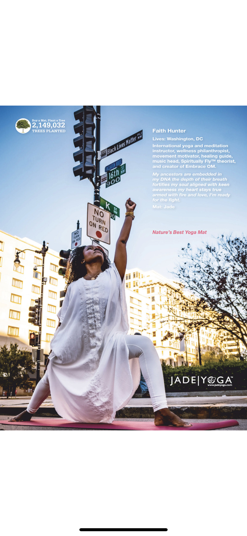
While I appreciate this image and its strength and simplicity - I do think it is a bit cringey to appropriate all that power to sell a yoga mat. I would love the image if there was no product placement involved - it is my main reservation about Yoga Journal as a publication.
0 notes
Photo


Not the proudest moment in American history. But a reflection of a key point in our lives - and I suppose you could call it the bitter fruit of fake news. No pleasure in saying that though. Photo credit goes to Time Magazine
0 notes
Photo


Finally it is sinking in - 1.618 - but not because of the first two images, I wish. No it is canva’s painting by numbers which spelled it out in baby steps for me. Very interesting. Most likely I’ll be sticking to the rule of thirds as I find it easier to apply. But we will see. Onwards and upwards!
You’ll find their article here:https://www.canva.com/learn/what-is-the-golden-ratio/
0 notes
Photo

This image used in You Magazine - is the first time I’ve seen Unsplashed credited in a magazine - Rachael Moran. Collage assets: unsplash.com . But more importantly is the kind of composite image I am thinking about for my film poster. Also curious is the fact that Rachel has a bird top right as I was planning to include an angry bird or two in mine as well.
Original article is here: https://www.you.co.uk/strangers-words-that-saved-my-life/?utm_source=pocket-newtab-global-en-GB
0 notes
Photo


Looking at interesting typefaces and eye catching signage for local brands in Sligo. The elaborate serif typeface on the metal gates for Egans is class, the sign above the gates is completely different - 1980s Egan and Son in Seriif - not beautiful and incongrous, and not really a good match. The Connolly’s logo is a classic and really reflects the ethos of the pub. My favourite though is the Wild Atlantic Wheels - so clever that way they reflecting the Wild Atlantic Way both in name and in the logo mark. I also think that the modifications on the T in trek are really fun - and the Electric Picnic reference is clever and speaks directly to their target market. It is just really satisfying for the eye and I’d be curious to see more of the designers work.
0 notes
Photo


A lot of images in this post albeit all for the same opera, I thought it was interesting to look at all the drafts tried out for the Close typeface. The designer uses a lot of variations on the reflection technique we covered in VC labs. The final one is the version chosen, if the choice was mine I would have gone for the fifth one, the art nouveau typeface centrally placed without the reflection. I suppose that is what keeps it interesting looking at other people’s choices.
0 notes
Photo


Some of the typefaces used for 20 Shots of Opera, each bespoke for the opera in question. The designer went to a lot of trouble to view the films and interpret each opera creating a bespoke font for each. A big job for 20 operas. Some are very literal - like Dust, but the colour matches the palette of the opera design. In La Corbière - about a shipwreck - we see the light stream from a lighthouse. The typeface for A message for Marty matches the instant messaging it portrays. Touch clearly reflects the isolation and separation of the two singers, while A Patient Woman reflects the period of the setting of the opera. Plenty of material to ponder.
0 notes
Photo


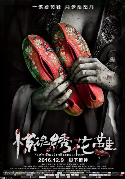


Even though I am thinking more Magic Realism for my film and film poster, I do like the overt drama and suspense in these horror movie posters. A bit cheesy I know, but they are very direct and clear and speak straight to their audience. Who will know that they will get exactly what they expect.
0 notes
Photo
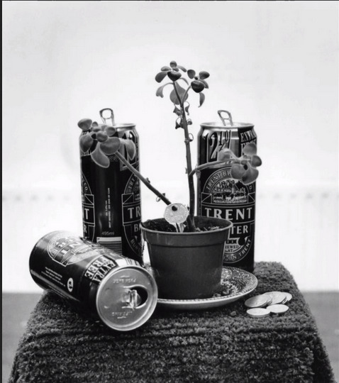
This is a really evocative still life by Simon Piercy created with Ross Boyd as part of a participatory arts project in the UK in 1990. Simon made this piece about moving from a care centre run by Trent Authority into independent community living. Hence the Trent Bitter and and door key ! I think this is a really good example of subtext in images
0 notes
Photo

Don’t forget about the polar bears.Simple but effective ad from the World Wildlife Fund
0 notes
Photo


Some interesting covers from Time Magazine reflecting the state of life in 2020
0 notes
Photo


Still looking at creative packaging ideas - I do like the way these two work. The mandarin oranges by by Koh Siok Yee- when placed in the carrot bag they are strangely satisfying - it is as though their colour is the most important thing about them. Even though the packaging is wrong fruit/vegetable category it looks so right. And the three air fresheners by Good work for me like a Trompe l'oeil and I have to look twice to see what the product actually is. Very innovative.
Spotted them on http://enfuzed.com/16-creative-packaging-examples/
0 notes
Photo


Some more food for thought on the Magic Realism movie posters. I love The Shape of Water poster - but have to say that having recently watched the movie on Film4, they completely edited her skirt in the poster - in the film it billows out giving a sense of the water - but for advertising she looks skinnier when it is flattened towards her body. Have to admit I thought there was a greater sense of freedom and movement in the original shot. Love the typeface too, it really works with the image. Before I Wake leaves a lot to the imagination fed by the rich blood red colour, excellent and there is ambiguity to the typeface which I think works well. I remember when The Company of Wolves was out and how racy and innovative it was - I don’t think this poster reflects that in the slightest. But I do like the typeface they used, I think it is evocative of a different time and place.
0 notes
Photo


Looking at Magic Realism film posters for some inspiration - some really interesting ones around. The Perfume image draws you in instantly. Very storng and great colours. Not so keen on Donnie Darko it is a bit bland. Into the Sky is interesting but actually quite simple for the genre however I do like the typeface.
0 notes
Photo


Now this is serious packaging - a limited edition Bob Dylan print from the Halcyon Gallery in London. First you get the outer packaging a brown cardboard box, inside is a metal flightcase - with bespoke stickers on both sides - the front including a nameplate Dylan “The Beaten Path” the back with a nameplate for the gallery.
Inside the flight case there are two compartments, one includes a hard cover catalogue featuring all the prints in “The Beaten Path” collection, a book stand for displaying the catalog, a certificate with a Dylan signature, a pair of white gloves for handling the print and of course in the second compartment the actual print. True to their attention to detail, the actual print is tucked away carefully in a folder and covered with a sheet of tracing paper to protect it. Pretty impressive packaging - and in this case the gallery threw in a free 200 page hard back Dylan book as an additional gift.
0 notes
Photo

I totally underestimated the amount of time involved in creating an infographic. I thought you just drop a few icons on a page and add text. What I hadn’t realised is that the whole point about summarising content in a visual means collating and condensing that information first. So in this example I had to get the percentages in an excel file, generate and export the doughnut chart, then resize the icon to fit the circle, add the icon to the doughnut in PS then do same for the other stats, add them all to the final image trying to keep the sizes consistent. I will appreciate infographics I come across more thoroughly in future.
0 notes