
Don't wanna be here? Send us removal request.
Statistics
We looked inside some of the posts by nicklynch3 and here's what we found interesting.
Average Info
Notes Per Post
1
Likes Per Post
1
Reblog Per Post
0
Reply Per Post
0
Time Between Posts
7 days
Number of Posts By Type
Text
10
Last Seen Tumblr Blogs


Fun Fact
28.6 is the average number of monthly visits per US mobile user.
Text
Week 11 Presentation - Photography in London
https://docs.google.com/presentation/d/1j73uBW1IEW_De-dYuO3GZV33u65Fpfl_RjEFU0mcHRg/edit?usp=sharing
0 notes
Text
Week 10 - Photography in London
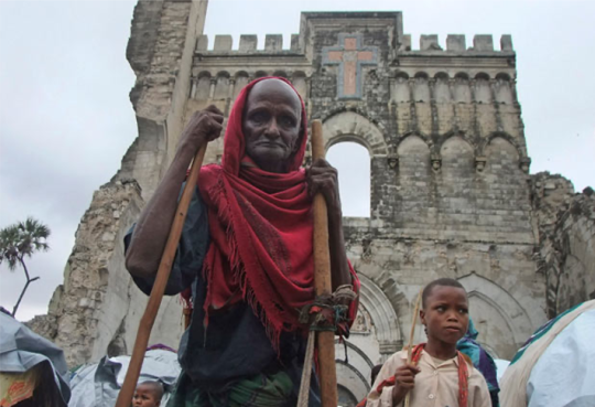
1. “The worst drought in half a century has hit parts of East Africa affecting more than 10 million people.”
I believe that this part of the text best illustrates this photo. The man in the red is shading himself from the hot sun indicating the drought that is occuring. The mood on his face also shows how much of a burden this has been on him and his people. The part about being the worst drought in half a century is really illustrated by the hardships they are facing.
2. The image brings this aspect to life. A photo is worth a thousand words and it is much easier to see the mood and struggle that goes along with this drought. Words are essential in spreading information, but the viewer gets emotionally attached after seeing a photo like this.
3. Everyone interprets things in a photo differently. I think the point of view of the photo and the mood have an impact on how each person views the text. This is because the photo gives you a more in-depth idea of what life is actually like in a drought and how it affects innocent people that are struggling.
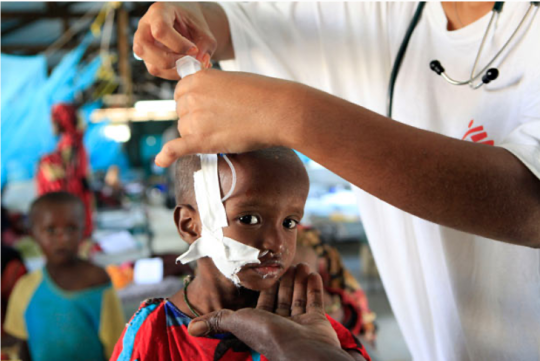
1. “Child refugees from Somalia are dying of causes related to malnutrition either during the journey or very shortly after at aid camps.”
2. The photo looks like it could’ve been taken at an aid camp. The child also looks somewhat malnourished based on his body and mood. The image gives a clear illustration of what could be a child refugee from Somalia and the struggle that occurs for these kids as they try to seek help with their famillies.
3. The point of view of the photo really has a dramatic impact on the photo. The fact that the child is staring right into the camera makes me feel bad for him. The fact that the background is blurred out makes it more intense because it makes the viewer’s eyes look back into the kid’s face because there isn’t much else to look at.
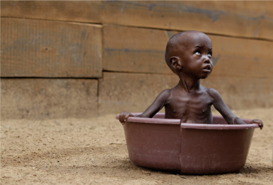
1. “Acute malnutrition has reached 37% in some parts of north east Kenya”
2. This photo is very effective at making the viewer feel empathy for people in this situation. This photo is clearly about malnutrition which links well with the text because the child is clearly not eating enough. He looks so small and unhealthy and the image makes you think of what someone included in the 37% is like.
3. I would say that this photo reminds people that small children are suffering from this drought as well. The fact that children are struggling (and not solely adults) makes people feel more empathetic about the situation and makes it look worse.
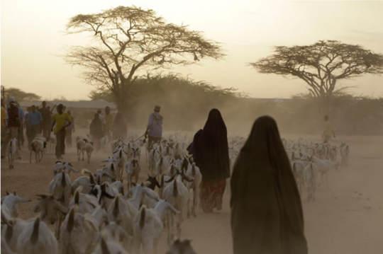
1. Thousands of families have travelled for days across scorched scrubland from Somalia to Kenya, including barefoot children with no food or water after their crops and livestock were destroyed by drought.”
2. The image goes well with this aspect of the text because the image is depicting the families traveling with livestock. The image depicts what is left of the livestock and the quest for safety and comfort that they are on. It also shows the great deal of people who are affected.
3. The image gives a precise idea of how people are traveling. Even though this photo was probably taken around dusk, the dust and and tree coverage emphasize the difficulties of traveling by foot do avoid the drought. The point of view of the photographer makes the viewer feel as if he is included in the photograph.
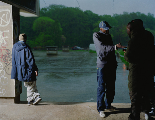
Leader Image - #3
I think that the third photo gives the best depiction of the article. This photo does the best job at showing the impact that the drought has had on the people. The fact that there is nothing significant in the background puts all of the attention on him and makes him look lonely and like he is fending for himself in a time of desperation. It really gets people’s attention when you see something like that.
My Life in the time of Covid19
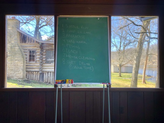


Exhibition Analysis

Slack Power, 2006 by Hank Willis Thomas
Smokin’ Joe Ain’t J’Mama, 2006 by Hank Willis Thomas
The Liberation of T.O.: “I’m not goin’ back to work for massa’ in dat darned field!”, 2005 by Hank Willis Thomas

O.J. Dingo, 2007 by Hank Willis Thomas

Something to Believe In, 2007 by Hank Willis Thomas
Unbranded: Reflections in Black by Corporate America 1968-2008 by Hank Willis Thomas
These are the five photos that are found on the website from the link. There are actually 80 total in the series. There are no dates for each specific photo, but they were all taken between 1968-2008
1. The photos were primarily taken for black people to highlight how corporate advertising agencies visualize black people. The images were originally advertisements targeted at black people, but Thomas eradicated the text and slogans which made people have a different perception of the images.
2. The perception of masculinity has changed dramatically since the 1960s. Before this era, it was a lot less common to see a man that doesn’t choose to embody strength and assertiveness. These photographers were able to document how that stereotype has slowly been eliminated from society. The photos in the exhibit show that there is a spectrum of masculinity and various ways to embrace it. There are many forms of masculinity and that notion has changed over time. When I see some of these images, I think of the courage and fearlessness that goes along with challenging typical appearances of a man. This is more than just standing up for gay people. It examines various aspects of masculinity such as the power of men compared to women, black compared to white, and how age can impact masculinity as well, which is often overlooked.
3. I think that Catherine Opie’s series High School Football (2007-2009) was worthy of praise because it shows a range of masculinity in a fairly recent time and shows how American football players have different appearances. She captures portraits of teen males that are tall and muscular, short and skinny, white and black, buzzed hair and hair down to their chest. I thought that she did a great job of displaying the different types of ways that people present themselves nowadays and still be so similar. The following three photos are examples of some from the series:
Stephen, 2009 by Catherine Opie
Devin, 2008 by Catherine Opie

Rusty, 2008 by Catherine Opie
__________________________
4.
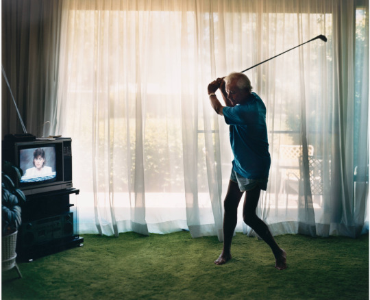
Practicing Golf Swing from the series Pictures from Home (1986) by Larry Sultan
a. In this photo, Sultan most likely cropped out furniture from the rest of the living room to make it more focused on his father (the man in the photo). Also, it emphasizes the fact that the carpet is turf and his father is swinging his golf club in the living room. Golf is commonly perceived as a game for old people and also it’s not physical, showing how he has lost strength. He took the photo from this point of view to show that his father is inside on a sunny day conveying that he is possibly inside because elderly people are more affected by the heat. I think that he took the photo with him posing like that because it gives a clear shot of his skinny arms and legs, while showing the short shorts which are more feminine traits. He is conveying how when men get older, they begin to lose their masculinity because of those reasons.
b. The subject is the photographer’s father. Even without knowing that from research, you would assume they have a personal connection because they’re in a home together.
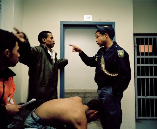
Beaufort West Police Station. Beaufort West, South Africa. 2006. by Mikhael Subotzky.
a. The photographer depicted the two main subjects when one is mad at the other. He does this by capturing the photo as the police officer points at the criminal with a stern look on his face. Also, he chose to include the other person watching the situation to show that the police officer was being very serious. Another thing that I noticed was that the police officer has his hat on up and sideways and ammo across his chest which is different from most cultures so he wanted to document that. The light in the room is coming from above and makes the room look small and trapped. He chose to partially include the cell in the background to indicate that this scene was taking place at a jail. Also, in my opinion, I envision the light coming from the window in the back cell to show that this scene is at night, when most crime happens, so these three guys probably just got back to the station after being arrested at night. They’re all also wearing street clothes rather than jumpsuits which goes along with that point.
b. The photographer is probably just trying to document different scenes that occur at the jail so he probably doesn’t have much of a relationship with these people. He could possibly have met the officer before, but not the criminals.

Untitled from the series Soldiers, 1999 by Adi Nes
a. The photographer left a few things in this photo on purpose. The subjects are the ones sleeping on the bus, but he included the gun to explain the scene better. You know that they are soldiers because the guy standing up is carrying an assault rifle and once you see that, you can understand why they are wearing green (commonly associated with military). He chose this point of view and lighting to signify how tired they all are in the middle of the day. I’m not entirely certain why he cropped the bottom right corner of the photo the way that he did, leaving only a small part of the person’s head in the photo.
b. The photographer probably doesn’t have much of a relationship with these people although the photo is staged so he probably altered the scene somewhat to depict the scene the way that he wanted . He has much experience taking photos of people in the military, but from his point of view, he looks makes you feel like you are a soldier and looking back at your fellow soldiers.
0 notes
Text
Week 9 Photography in London
Activity 1 - Cropping
Before Cropping
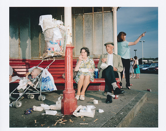
There is a lot going on in this photo. There is the baby in the stroller, the couple on the bench, the trash all over, and the woman on the right pointing to something. Everyone seems to be emotional, alarmed, or somewhat upset based on their face. For example, the baby is crying, the couple is looking at something with a disturbed look on their face, and the woman on the right appears to be on the phone and pointing at something. Although it is hard to tell what they are thinking about, they give the sense that something is wrong. It makes the viewer more curious about what is going on.
This photo could be about anything. The scene appears to be something similar to a bus stop of some sort. It looks like there is three or four groups of people that don’t know each other, which is typical at a public bus stop. The old couple look to be annoyed by the baby and the parent who is cut out from the photo because the baby’s face looks like he/she’s crying. The woman on the right appears to be on the phone, maybe waiting for someone to pick her up. There’s also a group of people in the background circling up together which, in my opinion, gives the impression, they are discussing whatever is going on. The trash in the foreground brings the scene together because it makes it all look messy and no one wants to be there.
After Cropping
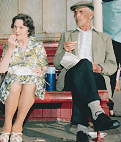
After cropping this photo, it focuses in on one subject: the old couple on the bench. Without previously seeing the original image, there is less to think about. The only question that remains is, what are they staring at? There is no longer trash on the ground or a baby crying so it is easier on the eyes to know what to look at. Even though it is stereotypical to assume that elderly people are upset and annoyed often, that is exactly what this photo shows. It appears to be a sunny day based on the shadows and the natural light of the sun is shining directly on them. You can tell they are older people because of the way that they dress and their faces.
They seem to be calmly enjoying their food, but have abruptly been distracted by something. They seem to be comfortable and keeping to themselves because of the fact that they are eating food on a bench outside. When you look at their faces up close, they look more bewildered than they do upset. This couple is old-fashioned and minding their own business, but something grabbed their attention.
Activity 2 - Captions
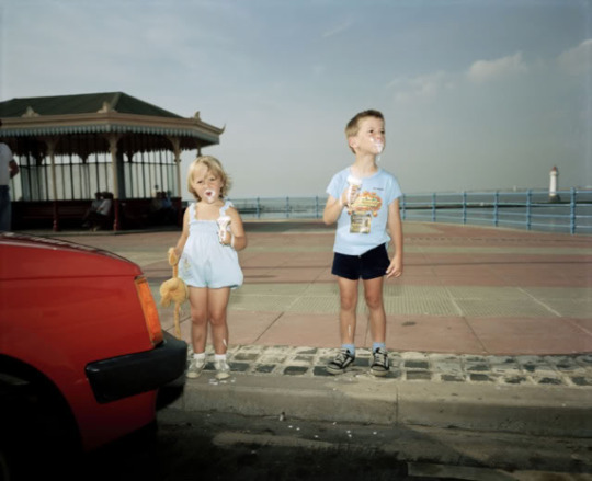
1. Ellie and Jacob on vacation in Florida, 2004.
This caption makes it look like two cute young children are near a pier on the ocean and are on a family vacation. You would assume it was taken by one of their parents to record memories from their childhood.
2. Messy isn’t always a bad thing.
The two children look to be enjoying their ice cream as it falls down their face. Even though they are messy, they seem to be enjoying the ice cream. The caption emphasizes the ice cream.
3. Keep your loved ones close.
From one perspective, it looks like the car is about to hit them. This caption puts attention to the car before the kids get hit by it.
4. Look both ways.
This caption makes sense because they are both nearing the street. The caption puts emphasis on the boy as he looks to the side before he crosses with his little sister.
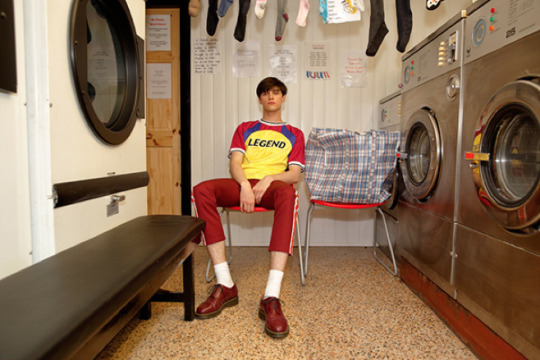
1. Dozing off into space.
This photo could be about the boy who works at the laundromat who is bored out of his mind. “Dozing off” in the caption makes the viewer look at the boy’s posture and facial expression.
2. Just hanging on.
This caption references the boy’s attitude and posture, as well as the socks hanging from above. Which one is it about? The artist leaves it up to the viewer to decide.
3. Chores
Laundry is a common chore done by kids/teenagers so it gives the feel that the boy is just waiting for his laundry to be done. It makes you notice the laundry basket next to the guy and think back to your own personal chores that you had as a kid.
4. All red, everything.
This caption makes you look at everything that is red in the photo and realize that the boy’s entire outfit is featuring red.
Gallery Activity
Mohamed Bourouissa
1. The main message of his work is to convey the societal differences in society and to make people recognize that marginalized people are not given the same attention as others. The premise on most of his work is that these people are not bad, they’re just different. His photos are inspired by a lot of previous art in history.
2. Depending on the photo, there are various techniques that he applies. In most of them, light is a key tool that he uses to create the mood. In the photo of the man getting arrested, he uses hard light, which looks that appears to be glaring in the window from a sunrise, to make it more dramatic. From my perspective, it looks like the man was sleeping and the cops broke in and arrested him. He looks scared and undeserving of this action which ties into the theme. Also, I really like the one where the light from the sun is shining in, but on the other side of the photo it is raining. I would assume it is making a connection between the happiness of the city and the dullness of the banlieues (suburbs). The shadows in this photo do a great job of separating the two sides from one another. Also, he purposely dressed those two guys in all white outfits to show the contrast between their skin colors and outfits. They’re smiling to show that they are good people that aren’t given a chance. In the last photo from the website, he uses the hard light from the sun shining on the man’s face to show the contrasting skin color as well.
This photo by Bourouissa has focus on the entire photo. It is more blurry in the background, but still easy to tell what is shown. The contrast between the sunny day and dreary dark rainy day is unique and is appealing to look at. The light and shadows are the most important part of the photo. The natural hard light from the left creates shadows that separate the dry warm setting from the rainy, dark one. It also separates the one guy from the other group of guys. You would probably need to read the exhibition text to understand the underlying message that Bourouissa is trying to convey. This type of photo really intrigued me because I had seen nothing like it before so I thought it was genius.
Anton Kusters
1. The message that Kusters is trying to convey is the difficulty of representing trauma and sorrow. In The Blue Skies Project, there is a lot of contextual meaning that goes along with the series of photos. He is trying to document the history of the death camps and his personal connection with his grandfather who was a victim of the Holocaust.
2. When you look at the series of photos, you can see how each photo is subtly different. This makes each one unique and makes it aesthetically pleasing to look at as a collection. There is a lot of context behind each photo. For example, the collection is made up of 1078 photos from each last-known location of concentration camps that existed throughout Europe. Also, each one has individuality by using the blind-stamping process and GPS coordinates attached. As far as each photo, I think that he was able to capture a lot of different tones of blue in the sky by taking them at different times of day, slightly different angles, and various shutter speeds. Even though the sky is beautiful in most of them, I think using the color blue represents sadness and dullness, which is what most people feel when thinking about a death camp. The fact that there are so many photos also makes the viewer realize the impact that genocide had on the world and that group of people.
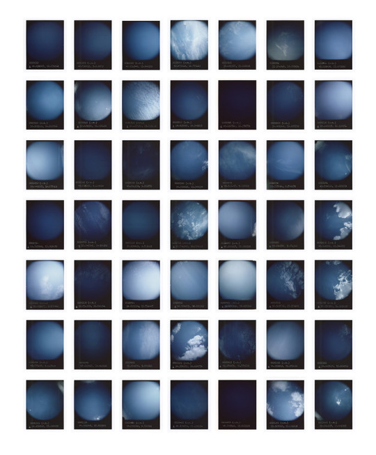
The focus in this photo seems to be inconsistent throughout. Some of them show clear cloud shapes, while others show just a more hazy color of blue. the light influences the mood in each photo. It represents different weather and different times of day. The darker, the more melancholy. The lighter, the more happier. But, when you attach meaning to the work, none of it seems happy. The consistent shape and colors from this piece make it all form as one. The separation by the white lines are essential to individualize one another. You would probably need to read the exhibition text to understand the message and the title doesn’t help the audience understand any better. I feel like I have seen this style done before, but this is unique because there are so many.
Mark Neville
1. The purpose of Neville’s work from this project is to document the town of Guipgang. He was amazed by this small town and the community that lives within it. He states that the town is famous for football and farming and so he incorporates this theme clearly with almost every photo in the project. In an interview, he discusses how photography should have a social ambition
2. He conveys this by putting this collection in a photobook, targeting non-art audiences. He likes the notion of community and he uses many different parts of the community other than football and farming which they are most famous for. He was drawn to the baton twirlers, nuns, beauty pageants, and simple families on an ordinary day that all make up the community. By taking photos of other photos in front of the football stadium and showing community members on the farm in their natural environment, he is touching on all aspects on the community. By having his subjects pose, it makes it more dramatic and appealing to the eye. As they look into the lens of the camera with a straight face, it gives the feeling that the surrounding area is theirs, which draws back to the sense of community.
This photo by Neville is a good representation of the series. The techniques used were probably thought out carefully. The light is coming from the sky, probably behind the camera towards the man’s face and also from the right. You can tell because the right side of the man’s face is lighter than the other side. The contrast between the grey sky and the green trees make the trees appear darker. The foreground seems to be a lot lighter than the background, making the audience focus on what is happening in the foreground. The man’s posture and the fact that he is centered is a great way to make it clear that he is the subject. Also, the angle at which it is taken gives the feeling that all of the land is his. The lines on the fence and the lines between the dirt and green grass separate one another. The audience would need to read the exhibition text and the title does not help anyone understand. The word “parade” seems like it has nothing to do what is going on in this photo. It reminds me of other photos, but not one in particular.
Clare Strand
1. The message behind Strand’s work is to represent the failure of communication and misinformation that occurs between people. She used a complicated method to work on this piece, which adds to the meaning of it. The work is meant to show her personal struggle with interpreting information and to display the struggles that the audience can relate to. This poor quality of communication leads to confusion and issues between two parties; some of which are miniscule, while others are significant.
2. She conveys this by the way in which she did this work. She made the process complicated on purpose to show how she can relate to the audience and to show how everyone experiences miscommunication. It would be hard to understand the meaning behind this if it were not explained. It is, however, easy to understand the different tones of colors that are put together to create one image. ‘1′ being the lightest tone and ‘10′ being the darkest.
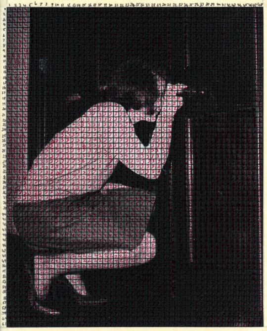
This photo by Strand is done very carefully with different tones. The black and white gives the feel that it is from an older time and the fact that the subject is someone taking a photo circles back around to the message that she is trying to convey. You would probably not know by the title or individual photo what her message is, but after reading the exhibition text, you could understand easily. The red numbers make the photo look raw and natural and bring some color to the black and white. There seems to be a lot of shadow and especially darkness in the background, making the audience’s eyes shift to the woman. The black and white create contrast that separate the pale white woman from the background. Everything is in focus, but the subject is clearly the woman and there doesn’t seem to be anything else going on in the photo. It sort of reminds me of the blue skies photo by Bourouissa because how each little piece on the grid is uniquely different and has a special number, similar to how he stamped numbers on each photo representing the location of the camp that the photo was taken at.
Who should win?
Each of these artists showed incredible works, but I believe that Aston Kusters should win. The way that he was able to capture a photo from 1078 different sites and compile them into one piece of work shows determination and commitment to something he is passionate about. He organized the work very well by making every shot symmetrical to one another and the same size. It is visually appealing to see the different tones of blue from each site and the context behind the work is purposeful and something that everyone is familiar with. Not everyone has a special connection to the Holocaust, but everyone knows the impact that it had on the world. Lastly, using so many photographs is a key approach to conveying the impact that this incident had.
Personal photo about something important
Captions:
1. Friendship
2. Coronavirus quarantine, 2020
3. Get outside!

The captions can drastically change the emphasis on the photo. For the first caption, Friendship, the audience focuses on the three guys and their relationship, gestures, and facial expression toward one another. For the second one, Coronavirus quarantine, 2020, I think about looking back on this photo years from now and thinking about how we all stayed inside to prevent the virus from spreading. The third caption, Get outside!, changes the meaning because it looks like a nice sunny day out with the river in the background and these idiots are sitting on the couch!
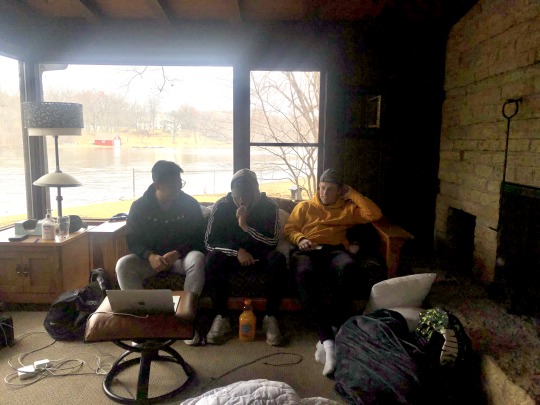
I chose to crop the photo like this because I think that it emphasizes the interaction that they are having with one another. The two on the end appear to be smiling and talking about something while the other has his head down and sucking on his e-cig. Before cropping it, you can tell he isn’t being antisocial or upset, he is just watching something on the laptop in front of him. After cropping it, he looks more antisocial because it looks like he just has his head down. Cropping this photo also erases the huge mess that they’ve made in the living room and therefore there are no assumptions that people can make about their lifestyle and how messy that they are. They just look like they are enjoying themselves rather than camping out in the living room for days. I think when you have a photo like this that is up close, it makes the audience think about each person’s personality and what they are like.
0 notes
Text
Week 8 - Photography in London
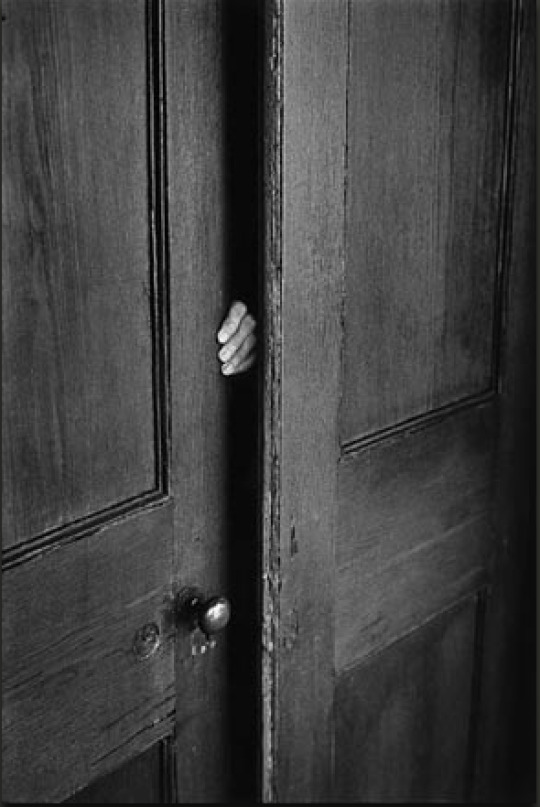
USA. Jacksonville. Florida. 1968. by Elliott Erwitt
1. The door is separated by the wall by the shadow that comes from the room in the background. The black and white colors make it appear a lot darker and make it feel older. The square panes on the wood create depth in the wall and door which makes it more appealing than a flat surface. They also create angles that give the photo structure. The black shadow in the middle of the photo also creates structure by vertically separating the photo in half because of how dark it is. Most of the photo is a similar tone of grey other than the shadow part, but the light does create different tones of white, grey, and black throughout.
2. The shadow is created by a hard light that comes from behind the person taking the photograph. they are probably shifted a little towards the right and up higher. You can tell because the left side of the photo is lighter than the right and the shadow is created by this as well. The light source is probably artificial because it is indoors and coming from a specific angle.
3. The mood is eery. You don’t know who is behind the door and the dark shadow creates mystery. The black and white color pallette also contributes to this.
4. The photo is of a door that is just barely opened a few inches with a hand coming from the other side of the door.
5. This photo came from Erwitt’s collection on “hand pix” so this fits in well with that category. I think the hand gives suspense and feeling of uncertainty mostly because you can’t tell what is going on in the other room because it is pitch dark. I can’t tell if it is a man or woman’s hand, but if it is a man’s then it makes it more scary because men are seen as more threatening.
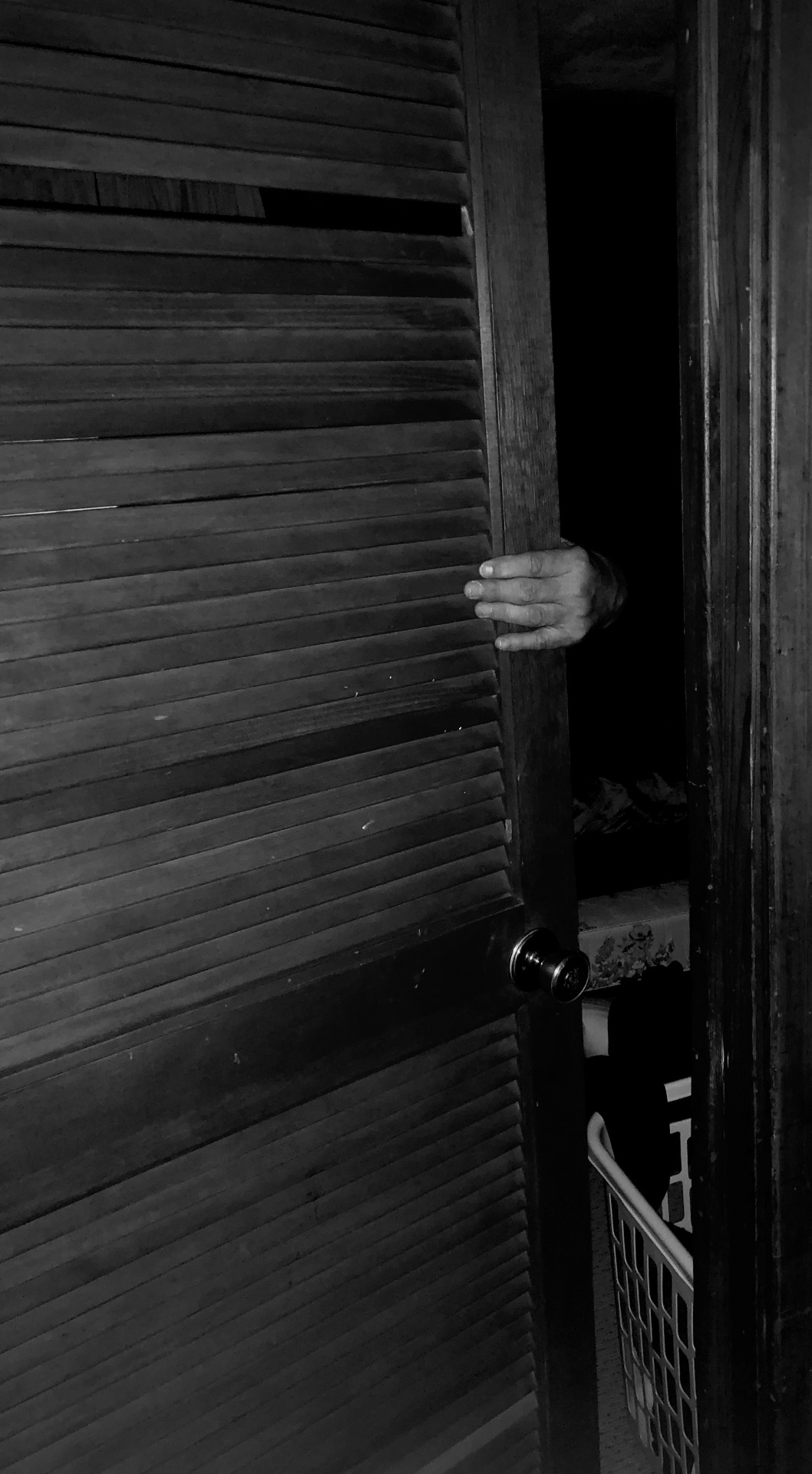
This it the photo that i recreated. It isn’t my best work but the audience should be able to see the resemblance. I took it at night so that there would be shadow, but I also had to use flash in order for it to show up clear. I wish I would have moved the laundry basket and made sure that there was nothing in the doorway that would distract from the dark shadow. This photo has more lines in the door rather than angles, but they have a similar effect. They lead the eyes to the opening of the door and create structure in the image. I had my dad model his hand for this photo and he did a decent job, but he didn’t have it exactly how the other one looked. I tried to have the light shine on a similar part of the photo, but there wasn’t much I could do because the light was coming from the flash on my phone. I think the light creates different tones of black and white and draws your eyes to the darker part of the photo.
This photo doesn’t look as scary because there is stuff in the doorway. It may be confusing because there really seems like there’s no point and just looks like there is someone hiding behind the door. I also feel curious as to why there is a part of the door missing. Maybe that is just from my perspective though because I was the one who took the photo.
I have learned through this process that photography is harder than it looks. It takes time and repetition to have a photo turn out how you like. There are little things that can have a notable impact on how the photo turns out, such as the laundry basket that screwed up my photo. Also the point of view and angle at which the photo is taken can also have an effect on light and color of the photo.

This photo is one that I chose in response to my recreation. It has the same type of shades as that door had. I really like this photo because of the use of lines on the closet doors. I had the closet light on behind the closet doors so that it would be more visually appealing. I took this with no flash so that the shadows around the closet would be present. Even though there is no hand, I thought the main point that I was trying to convey is the use of lines and the pattern of the symmetrical doors. The shapes of the doors and the parallel lines create structure in the image and create a border between each separate door. I chose to do it in black in white because it brought out the light more and made the shadows more prominent. There is also some sort of depth because you know something is behind the doors due to the light.
I missed the brainstorm session, but I have been brainstorming on my own to figure out which theme or story that I can use to show my series. I like to photograph nature and big cities so I’m sure that I can put something together with one of those two themes. I am home now so I won’t be able to create my series in London. There are a ton of options so I’m a bit overwhelmed, but I guess I will just have to dive into my creative side and create something that I am interested in and means something to me. I will also ask questions to my tutor and peers so that I can perfect my series by the due date. I have no background in photography so I instinctively try to look at the content in each photo rather than the composition and photographic attributes. Throughout the semester, I have already gained a new perspective on the art of photography and I have noticed how much I still have to learn. I will continue to use what I have learned in organizing my series and writing my essay.
0 notes
Text
Week 7 Group Photographic Series
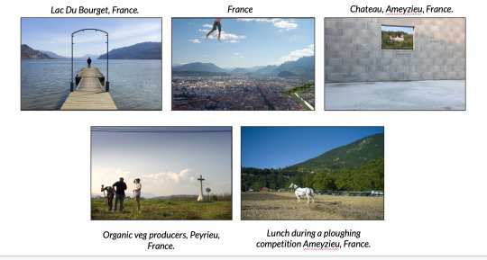
The French - Nick Turpin
Personal Reflection on Series
My group and I really enjoyed this series because of the unusual perspectives from which the photos were shot. The more I look at each photo, the more I notice. I am always curious how long it took him to capture each photo and how he chose one photo over the tens or hundreds that he probably took. Also, he probably considered a lot more aspects than I would when taking photos.
I learned so much when my group members analysed each photo. For example, I noticed how Lac Du Bourget and Chateau Ameyzieu are similar. The subject is small and in a “frame” created by other objects in the photo. In the first one, the poles from the dock surround the person, creating a frame-like effect at the small subject in the background. In the second one, the wall almost makes the manor house look like it could be a framed photo on the wall! Also, the series made me question things that were atypical to photos that I would normally see. In France, why would he choose a photo with only half of the man’s body in it? Also, what is the story behind all of these? I don’t have the answer to all of these, but after doing research on the artist’s biography and each individual photo that we chose, I learned more aspects about the context behind each photo. This series was created by Turpin to challenge the French laws that prohibit the publishing photos without the subject’s consent. I would have never known that without doing research. Without knowing that, I would have thought that all of these subjects were posing to be honest. I also learned what a ploughing competition is. Without the photo’s caption and my personal research, I would have no idea what Lunch during a ploughing competition is about. Contextual analysis is what keeps this series together. Individually, they don’t have many compositional aspects that are similar, however, when they are put together, makes Turpin look like an awesome story teller.
In terms of the presentation, I felt like my group worked well together. Everyone did their part well and on time. We didn’t collaborate as much as we could have, but we all had different personalities which made it more interesting because one person would see something in a photo that others wouldn’t. For example, Alex seems to have a lot more experience in photography than I do, so she was able to pick out compositional aspects much faster and easier than I am. Since the beginning of the semester, I have come a long ways in just noticing how photos are taken and how there is a lot more that goes into a photo than clicking a button at the top of a camera.
0 notes
Text
Week 5 - Photography in London
Photo Exhibition Analysis
Naoya Hatakeyama
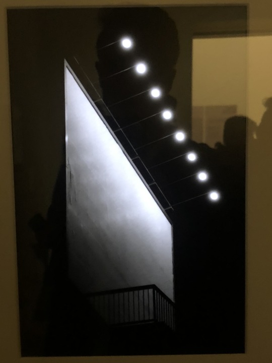


1. He is trying to show the different patterns of lights, primarily on apartment buildings.
2. The series is full of photos with high contrast in order to show the bright lights that light up the dark building. Also, he is emphasizing the unique pattern of lights from each building. He uses different points of view to get the angle that best depicts the scene.
3. Yes. If we use three common aspects such as light, shapes, and angles, these photos are great. The light is similar in each photo. Some photos are darker than others, but they are all using hard light, making the lights on each building stand out. The use of contrast in this photo makes the shapes appear very nicely. It is easy to distinguish the shape of each building along with the architecture of each subject. The angles of the lights shift the viewer’s attention based on how the building is shaped. The lights make up so many different patterns depending on how each person chooses to view it.
4. Yes. He purposely took the photos in this way to show the beauty of unique patterns of the lights.
5. It shows how structures can be similar in so many ways, but also different at the same time. Each pattern of lights is different, but they are all in similar settings and being used in the same way.
6. It makes it more special because the information shares how much time and effort the photographer put in to make this series perfect. Also, it makes the viewer notice the importance of the verticality that he intentionally used.
Stephen Shore - American Surfaces


1. The author is trying to illustrate typical scenes that are found in America on any given day, specifically pertaining to someone who
2. He uses completely different photos to give the viewer a broad explanation of how things were in that time and different locations. The photos are not staged and very realistic to make the viewer recognize typical scenes that they have experienced themselves.
3. Because it is put in a series that is meaningful, I believe that these are good photos. If they were not in a series together, I would say that anyone could take them.
4. Yes, the series as a whole gives a great depiction of traditional scenes in America. Each photo makes the viewer think about the culture in America. For example, leaving the tip on the table with American dollars and leaving makes me think of a small family-owned diner on Route 66. He gives the viewer room to create their own story and relate it to their own lives.
5. Putting photos of different objects or scenes makes it feel like you’re on the journey yourself. Making pitstops at local gas stations, restaurants, and hotels emphasizes the road trip theme.
6. It brings all of the photos together and makes you think about what is different in each culture. If this series was taken in a different country, there would be different photos that relate to that culture.
Reading a Photographic Series
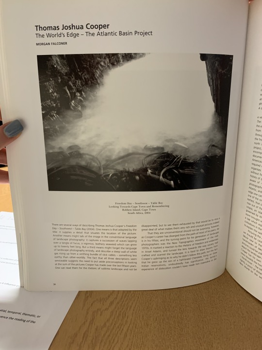
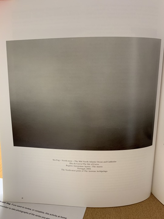
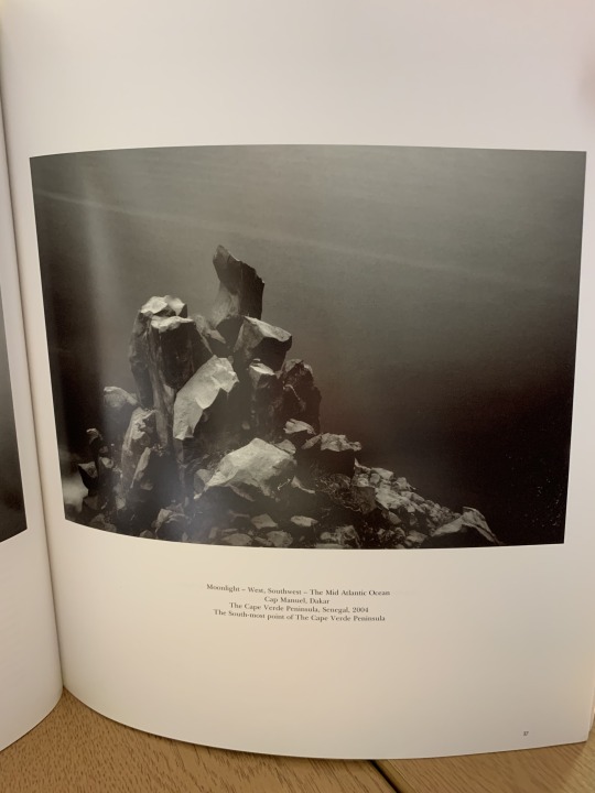
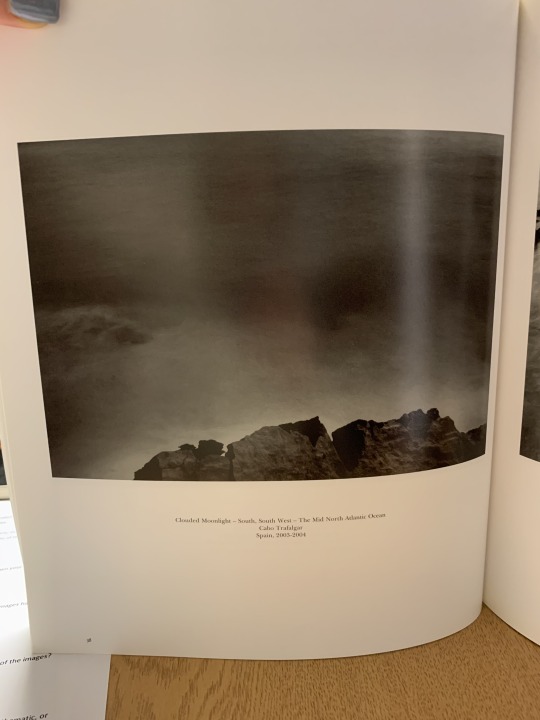

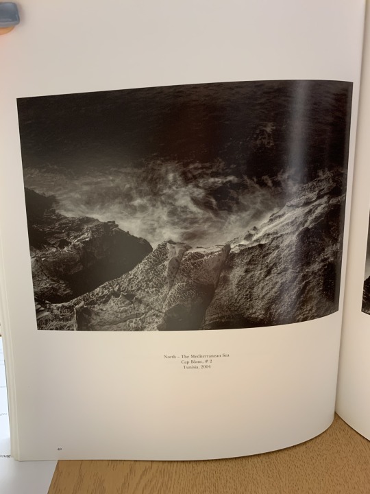
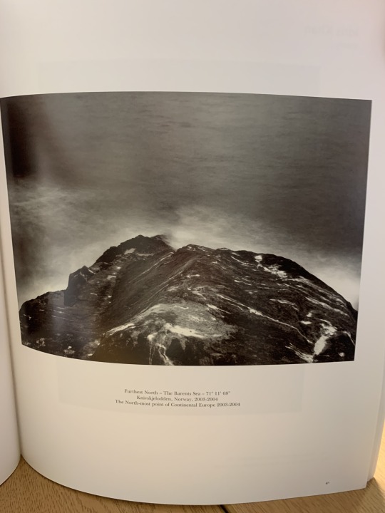
1. My first impression of this series is how beautiful the photos are. I noticed the fog in each photo immediately, which made them connected in a sense. The fog makes it look mysteriously beautiful because it makes the viewer think about what the background would look like if the fog was not present.
2. Most of the photos are from a similar point of view. They are also all black and white. All of the photos but one are also of rocks that appear to be on the edge of the coast, hence the title, “The World’s Edge”. Also, the fog is an important aspect of each photo.
3. The title helps the viewer understand what connects the series together. Without any background knowledge, titles, or description, it would be less interesting. But, with these components, it makes the series more interesting and notable. Photos taken from completely different continents on the coast is cooler than photos taken all in one place on the same day.
4. The photos are sequenced by the location in which they were taken. The first photo in the series was in Cape Town South Africa, the southernmost tip of Africa, all the way up to the northernmost tip of Norway in the last photo. The viewer probably wouldn’t have any idea where the photos were taken if there were no description, but the way it is arranged emphasizes that extreme weather at the coast happens throughout the world.
5. After deepening my understanding of the series, one would assume that the photographer put a lot of time and thought into this. It states in the reading that it took him 14 years to complete this. Taking photos of similar subjects in different angles is a great way to showcase these amazing landscapes.
Personal Series
One Piece at a Time - Nick Lynch


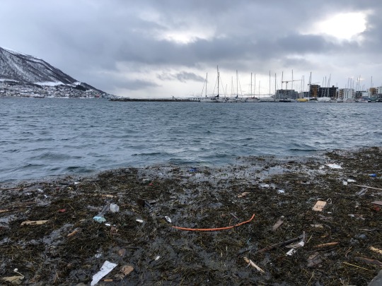
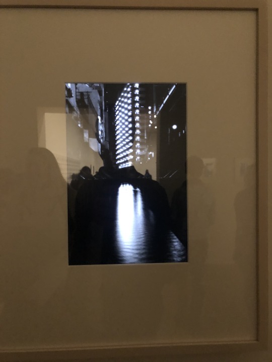
This series reflects beautiful photos of something ugly. They are taken carefully to show how one piece of trash (something ugly) can amount to something much larger. I chose to do this series because it is meaningful and tells a story with each photo. The first three photos are just one piece of trash, which makes it seem like not a big deal, but the last photo is supposed to make the viewer think about the bigger picture, which is ocean pollution and the effect that it can have on the animals and plants that are affected by this. I used portrait mode on my phone for the first three photos to emphasize the subject as one simple item that amounts to a much larger problem. If I were to write a caption or description for the series, I would include the fact that 10% of plastic that is produced and sold around the world ends up in the ocean. This series is intended to document the problem and spread awareness. These photos were taken in Tromsø, Norway, which is a relatively sustainable region in terms of recycling and ocean pollution, but I would assume that there are issues that people are not even aware of, like how most of this rubbish in the last photo will end up in the bottom of the ocean and kill animals who think it is food. As far as the objects in the photos, the point of taking beautiful photos of ugly subjects is obscure and uncommon. People usually would take photos like that of beautiful flowers or animals up close, but it is puzzling and even comical to take a photo of something so useless, like a used piece of trash on the street. In the end, however, hopefully the viewer understands the meaning behind the series.
0 notes
Text
Week 4 Photography in London
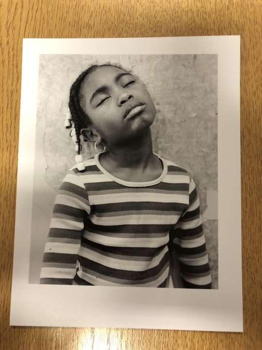
1. Yes, the photo helps express the girl’s personality. Her face, earrings, and hair accessories, and shirt define who she is. The photo captures her attitude and identity. The focus emphasizes the girl and the background is more blurry.
2. There is a different tone of white, grey, and black throughout the photo. Different shades make the photo look more appealing even though its just black and white. The pattern of the girl’s shirt also is a compositional aspect. Also, the texture of the wall in the background is important to note.
3. The light was probably naturally coming from the left side. It appears to be lighter on the left and a bit darker on the right especially near the girl’s arm.
4. The focus is sharper on the foreground, putting emphasis on the subject to make her stand out, and it is more blurry in the background.
5. Emotional - she could just be tired, or maybe upset, or annoyed, sad, etc.
6. since, the photo is up close, there appears to only be a foregound (the girl) and background (the wall).
7. The mood is dramatic and somewhat negative. It’s difficult to understand exactly how she is feeling, partially because her eyes are closed, but just by looking at her other body language and facial expressions, she looks to be acting dramatic or emotional.
Exhibition Analysis
The Hubbucks, by Garrod Kirkwood

Eha, by Sirli Raitma, 2015

In our group, we decided to evaluate two photos based on the criteria of best lighting, colour, and focus.The two photos above were the ones that we chose as our favorite. We ultimately chose the photo of the car because it was visually appealing, and so colorful. The color was used well in the other photo as well, but the background of the woman is black so that helped us make our decision. This also had an impact of the lighting aspect. The fact that the photo of the family car is brighter and shows how the sun is shining directly at the people’s faces was nicely done. In terms of focus, they were both done very well. The portrait of the woman may have been a bit better because she was clearly the center of attention while the other photo had a bit too much to look at. In conclusion, the Hubbucks photo won 2 out of 3 aspects, so it was the winner.
Mayotte Magnus
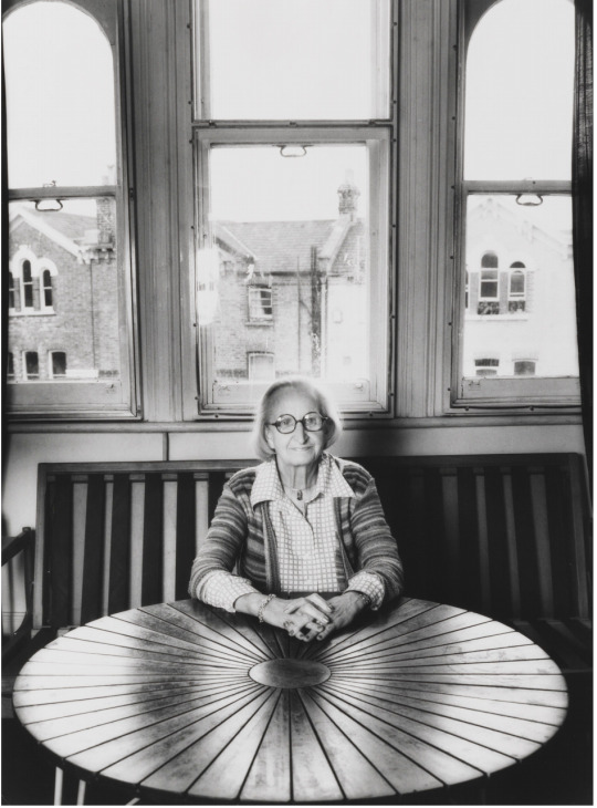

This is a photo that I took of my friend Savanna in Barcelona last weekend. What makes this portrait similar to the portrait by Mayotte Magnus is the use of lines. The horizontal lines on the walls of the background create structure in the background. Along with that, they both are wearing a checkered patterned shirt. Also, the seam line down the side of her pants provides balance, figuratively splitting her leg down the middle. Both photos have natural light, but the first one has more of a hard light coming from behind the subject, while the second photo has the sun shining from the left side. Both women in each photo give a bright, positive mood based on their facial expressions and outfits. I chose to photograph this girl because I thought it would be easy to display her personality through a portrait. I chose to do this photo in color because her pink hair is a large part of her identity. I think it symbolizes that she is free-spirited, bold, and expressive. I probably could’ve taken this photo a little more straight, as some people may notice how the camera might have been slanted towards the left when this photo was captured. Also, the corner of the roof is pointed out on the top of the photo. I tried to crop it out because I believe it’s distracting and irrelevant, but it looked bad because then her head was nearly cut off from the photo.
0 notes
Text
Photography in London Week 3
Exhibition Analysis
Series: Settlements (2004-2015) by David Spero

Rooh’s, May 2008 by David Spero
Exterior Communal Kitchen, August 2004 by David Spero

Communal Portrait, November 2004 by David Spero
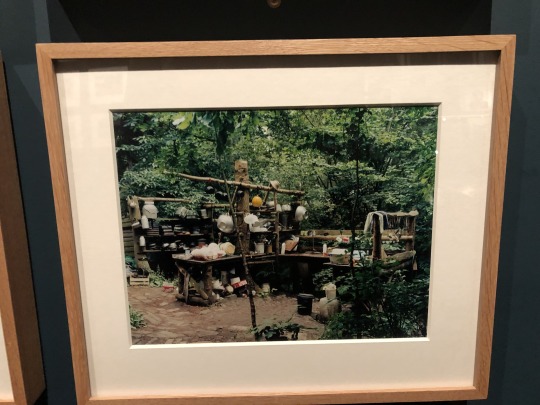
1. This photographic series is of a community in the woods that is made up of at least one family. When analysing the images, it looks like they have basically nothing. I see a group of people living in a forest. Most of their structures are made by wood. It doesn't look like a typical community.
2. By looking at the images, one can assume that they have little money, but they seem to be happy, judging by their faces in the Communal Portrait. It’s odd that they are living in a small community like that, mostly because the photo was taken in 2004. The photos show the messy, outdated community they live in. It looks habitable, but not ideal. Because their structures are made by wood, it’s likely that they created by the people who live there.
3. In the first photo, the photographer purposely allowed the natural light to shine in through the window. This brings attention to that area and also lights up the rest of the room. The other two photos were using natural light as well, most likely taken in midday. It is interesting how there is not focus on one specific object or person, rather a group of things that make up the subject. The photographer used framing in each photo to put focus on what is in the foreground of the photo.
4. What unites them is the color and mood. The nature aspect brings it all together and makes them a series. Also, the fact that everything was faw and unorganized gives the viewer a real sense of how they live.
____________________
True Color by Mark Cohen (1974-87)

1. The use of color in this photo is the most important aspect of this photo. The dark background puts focus on the boys’ colorful outfits that are in the foreground. The colors of the clothing complement each other and also form a type of pattern because similar colours are found in one another’s outfits.
2. Colour can create a vibrant mood in the photo. The bright colors go well with the kids smiling and make it look like they are having a good time. It’s also important how the point of view is very close to the subjects because it is more appealing to the viewer and puts focus on the bright colors.
3. This photograph was taken with a small aperture. You can tell because the entire photo is in focus, including the background, covering a large depth of field. It may not be a very clear photo, but it it not intentionally more blurry in the background.
0 notes
Text
Photography in London Week 2
Exhibition Analysis

Untitled (Beggar Woman, Barcelona), 1933
1. I was attracted to this photo because I am always curious of the untold story behind every homeless person. In this case, the economic depression of the 30s could have been the case.
2. This photo would fit under the genre of fine art and possibly documentary.
3. Lighting - the lighting appears to be natural. It is soft lighting, but hard to tell because it is in black and white.
Angle - on the upper half of the photo, there is one long horizontal line going across and a sequence of vertical lines adjacent to it.
4. The mood and angle put focus on the subject (the woman).
5. This photo is of a homeless woman. It is about hardship and sadness of this era. They are different because the fact that it was taken in this decade makes it seem like more people were homeless and makes you feel bad for the woman.

The Years Lie in Wait for You, 1935
1. I chose this photo because it was appealing to the eye.
2. Advertising, portrait, and fine art
3. Framing - The photographer uses the web as framing around the woman’s face, focusing on the spider in between the woman’s eyes. This makes it visually pleasing to the viewer.
Lines - This photo uses circular lines from the web that revolve around the spider. The web is more bold on the outside, but then gets thinner near the center.
4. It is aesthetically pleasing to see the web revolve around the woman’s face.
5. The photograph is of a woman behind a spider web.
The photo is about a woman waiting, possibly using the full spider web to communicate that she is waiting a long time.
They’re different because the photo has meaning.
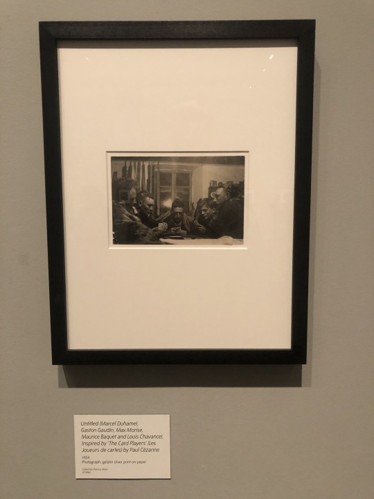
Untitled, 1934
1. I chose this photo because it reminded me of my friends and the closely-knit relationship we have together, similar to the men in this photo.
2. This photo could fit under the genre of “personal photo album” or “still life”.
3. Point of view - The point of view of the photo is important because it shows that the photographer is probably sitting at the same table as the men, but probably not playing in the game of cards.
Lighting - It appears that the lighting is hard. It is artificial, probably being a light on the ceiling or lamp that is behind the photographer. You can see it in the reflection of the window.
4. It makes the photo look like ordinary and genuine. Adding special effects and lighting would change the mood of the photo.
5. It is of people playing cards.
The photo is about a few friends unwinding and hanging out together in a casual setting, making the viewer relate to the group of friends.

Shooting from Above
I took this photo from above because it shows the best angle of the food inside of the bowl. The salad grabs your attention because it is inside a plain white bowl, but there are so many colorful ingredients inside of it. I took it with flash so that the colors would pop and it so that it could be seen clearly. The light comes from the flash on my phone camera which was shot directly above the bowl.

Shooting From Eye Level
I took this photo from eye level because I liked how the bus lights were pointed directly at me while I was taking the picture. London is always lit up, but the bus lights stand out the most in the picture because they are in the middle and also the brightest. I also edited it to make the background darker so that the lights would be more in focus.

Shooting from Below
I took this photo from below because it shows how tall the big bright sign is. It is tall enough so that people can see from a block away and find the tube easily. I like this photo because the sign in the foreground has bright colors, and the colors of the background are a very similar beige, which makes the underground sign look even more noticeable. It would've been very difficult to take this from any other point of view with my phone camera.

Becoming the Subject
I took this photo because I felt as if many people have been in this position before. Enjoying a cup of hot tea is how many people begin their morning. Also, by including my hands in the picture, it makes the viewer think of themselves as the subject. The mug and my hands are both resting on my kitchen plaid table cover, giving the scene a relaxing mood.
0 notes
Text
Photography in London Week 1
sf
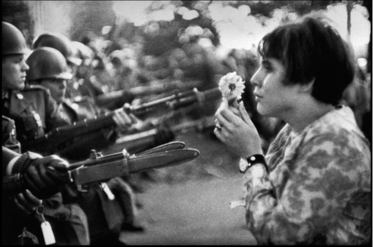
What do you notice about the image?
What stands out is that the woman on the right is holding a single flower, while on the left, there are soldiers holding weapons in her face.
What might the story be telling?
The soldiers on the left look they are ready to battle, but the woman is using nonviolent protest. It is depicting courage and sadness in the woman.
What decisions has the photographer made to convey that story?
The photographer had a good angle of the action by showing how the weapons are just inches away from the woman. He does this to convey that they are not afrai. Also, the faces of the soldiers look serious and the woman looks sad. The point of view of the photographer shows that he is neutral because he is standing between the soldiers and the woman. He puts most of the focus on the woman and less focus on the background.
What do you think is happening beyond the frame of the photograph?
There are a group of protestors in the background behind the woman, but she has the courage to stand up front and speak to the soldiers.
What do you think happened directly after the photo was taken?
Nothing happened. It was a peaceful protest and the woman may have been seen as a hero for standing up to the soldiers. The soldiers probably retreated eventually.
What is it in the photo that makes you think that?
The soldiers don’t look like they want to hurt her. The ones that you see in the photo don’t even have their eyes on her. They are rather acting as a barrier because they’re standing in a line like that.
__________________________
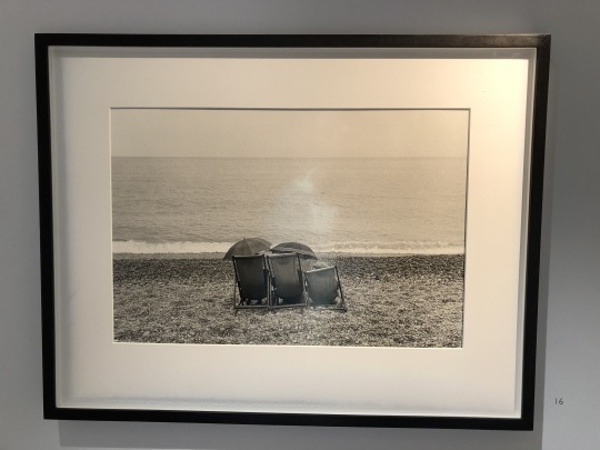
Couple on Beach, England, 1960
1. What first drew me to the photo was the ocean. Then, after I analysed it, I thought about how the people are using the umbrellas to cover themselves from the sun, and how everyone here uses umbrellas for rain.
2. The point of view really stood out to me in this picture. I like it because the people in chairs are the main focus, but the scenery makes it look relaxing and casual.
3. This photo was taken in the 60s, but without knowing that, it is probably hard to guess when this photo was taken because of the scenery. There is nothing that stands out in this picture that screams “60s”.
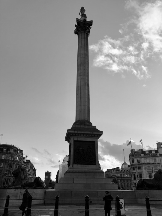
This is a photo that I took at Trafalgar Square. I thought this photo would be cool because the top half of the photo is the sky, similar to the one by Bruce Davidson. Also, this photo was taken in black and white like all of his at the gallery. The monument is somewhat close to the camera, similar to the people in beach chairs in the first photo.

Boy Wearing a Mask, Wales, 1965
1. What drew me to this photo was the boy wearing the mask. I don’t necessarily like the picture, but it intrigued me. The picture made me feel confused because I’m not really sure why he’s wearing the mask and why he’s posing there while the other people are in the background. He looks like he’s about to rob a bank or it’s just really cold.
2. What is special about this photo is the camera angle and the focus on the boy wearing the mask. There is a big tree in the background, but the focus is on the boy. It is also interesting how the boy is caught swinging in midair in the photo.
3. Kids dressed different and did things differently for fun. For example, the family in the picture is in the middle of nowhere while the child in the background is swinging. This doesn’t happen often anymore because of technology.
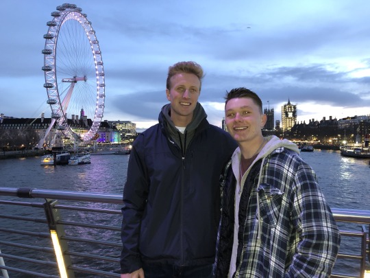
This is a photo of my roommate and I. It reminded me of “Boy Wearing a Mask, Wales, 1965″ because of where the focus is aimed towards. In Davidson’s photo, the boy is up close while the tree is in the background. In my photo, it shows me and my friend up close, and the London Eye in the background.
_________________________
England, 1960
1. What drew me to this photo was the boy at the tube/train station all by himself. He is pretty young, but he is by himself with no parents by his side.That could be his friends behind him, but their attention is the opposite way.
2. This photo is special because the photo is focused on the boy and the background is blurred. The only clear part is the bottom right corner where the boy is standing, putting the emphasis on the boy. The point of view of the photographer is somewhat close to the boy.
3. If he’s by himself, this photo shows that kids were more independent at a young age. Also, I feel like there aren’t many kids that dress like that, but he looks like he’s pretty dressed up because of the trenchcoat and hat on which was interesting.
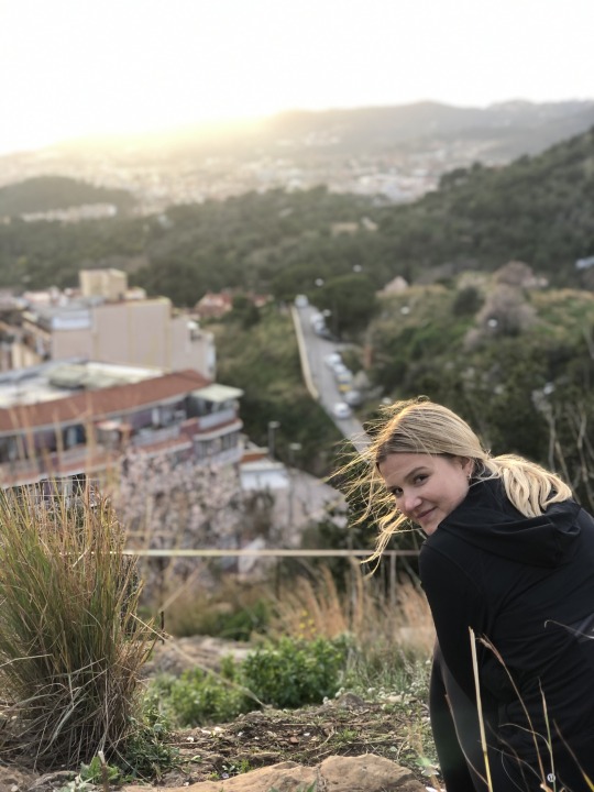
This is a photo of my girlfriend in Barcelona this past weekend. The mood is a lot different, but the camera angle is the same. Also, you can tell that in both photos, the focus is on one person and the background is blurred.
________________________
1 note
·
View note