♇ Hi, I'm Noche. Inspired by Bogleech, I'm here to review EVERY SINGLE POKEMON EVER and talk about what I like about them and what I don't! My BYF does not apply to this blog. Mobile links
Don't wanna be here? Send us removal request.
Statistics
We looked inside some of the posts by nochepokes and here's what we found interesting.
Average Info
Notes Per Post
6
Likes Per Post
4
Reblog Per Post
2
Reply Per Post
0
Time Between Posts
27 days
Number of Posts By Type
Text
15
Last Seen Tumblr Blogs


Fun Fact
There are dozens of funny blogs to kill time on Tumblr.
Text
The Squirtle Line RE-REVIEW
So looking back on my old reviews back on the old blog (silviepokes-archive), I’m still pretty satisfied with most of them, but there are definitely things that I would change about them. Most of them I’m cool with, but my worst is definitely the Squirtle line. It’s just embarrassing to go back and re-read that thing; I clearly had no idea what I was doing yet and my opinions on the line were much more extreme on paper than I actually feel about them now.
So, to satisfy my adult brain and stop myself from anxiously dwelling upon that time that someone lowkey called me out for being too obsessed with Wartortle, I’m going to re-review the line! The link to the old one will be replaced on the index.

I’m kind of conflicted about the Squirtle line as a whole, and Squirtle is the one that I feel the least about. I’m firmly neutral to this little turtle; its design isn’t particularly notable, but it’s aesthetically pleasing. My one complaint is the color scheme, but honestly it’s not really thaaat big a deal. I love the little curl in the tail.

Cute, but pretty unremarkable.

The curious case of Wartortle still baffles me. I love Wartortle; I think it’s adorable and it follows up nicely from Squirtle, with the big tail feeling like a natural exaggeration of the tiny swirl in Squirtle’s tail, and the color scheme feels like a perfectly natural change as well. It’s like, okay, I can follow with this, it’s got a theme, right? And then things get weird.

I do still love this turtle, though. What a cutie.

I look at Blastoise, and I’m just...confused. I don’t hate this turret-turtle, not by any means, I just have to question why this. It’s so jarring when compared to what came before it; it almost feels like Blastoise was originally supposed to be completely different, but then the line got tweaked and they just...forgot to change Wartortle, or something? I’d love to have some insight as to what the hell happened here.
Judging Blastoise entirely on its own, though, it’s...hm. You know what, I don’t think I like this design, actually. The more I stare at it, the more...clunky and unwieldy it feels. Blastoise’s head is very cute, but from the neck down, everything feels...weirdly off-balance, if that makes any sense. It almost feels like it’s not supposed to be bipedal.

This is actually why my favorite sprite of Blastoise has to be the Silver sprite- just by putting Blastoise on four legs, it immediately looks so much better. I wish it could’ve always been like this.

Hmmmmm...nnnnnnah.

...Yikes. You know what I was saying about Blastoise’s design feeling unbalanced just a second ago? Mega Blastoise somehow manages to take that unbalanced feeling and make it even worse. It still feels like it shouldn’t be upright, but the two back-turrets merging into a single one just makes it even worse. Mega Blastoise looks like it should be falling over onto its face at all times.
Also, the arm-shell-cannons? No, just...no. I do still like its face, though. At least it’s got that going for it.

Huh! My rankings appear to be pretty much the same as last time, but I think I got my feelings across considerably more accurately this time around. Man, that’s a weight off my back.
0 notes
Text
The Meowth Line
My mind is a bit foggy at the time of writing this due to some mental health related stuff, so apologies if this review and the others I wrote today are a bit messy. I’m okay, don’t worry.

I’ve never been a huge fan of Meowth. Its concept is a lot of fun, essentially a living maneki-neko/lucky cat whose signature attack, Pay Day, essentially generates money out of thin air, but...I dunno, man, its design just fails to strike a chord with me, and I can’t even quite place why. I guess it just feels...noodly and weird?

No sir, I don’t like it.

And then Generation 7 came down from the heavens and said, “Let there be a way better Meowth!” And so it was. Alolan Meowth is a breed of Meowth that came down from a line of royalty, brought to Alola as a gift to a now-destroyed monarchy.
I love Alolan Meowth. Something about the new lavender color, curved whiskers and perpetual half-lidded smug expression just makes this a lot more pleasing of a design to me, and again, I just can’t place why.


Like most of the rest of the Gen 1 ‘dex, Persian is quite plain. It’s simply a big cat; a pretty anatomically correct one, at that. You could probably compare it most accurately to a mountain lion. That said, I think the much less cartoony appearance works wonders for Persian; I’ve always liked this design a lot more than its prevo, it feels more reserved and nuanced than Meowth does and that helps a lot.

That said, I’m still only going to give it a three-ball, as it’s far from a favorite.

Oh, my god. The pure spectacular hilarity that is Alolan Persian is still one of my favorite things to have been introduced in Gen 7; I still remember the waves of disbelief and hysterical laughter that consumed the Internet the day that this utterly marvelous design got leaked. Funny as it is, there’s definitely a reason for Alolan Persian to look the way it does- it’s supposed to invoke an appearance similar to cat breeds like British Shorthairs, which have large, round faces and a bit of a natural “smile” to them.

(This particular British Shorthair looks pretty peeved about its situation, though.)
I really do love this design, from its intended resemblance to the pure humor factor of putting a big bulbous head on an otherwise-normal Persian body. The nice purple color helps, too.

Would have 4 1/2 balls if I were doing half-balls, but I’m not, so four it is.
0 notes
Text
The Diglett Line

I didn’t think much about it before I got here, but now that I’m here, I’m kind of dreading talking about these Pokemon. They’re a cute concept (you only ever see the head, not what’s below the ground), but...good god, are they ever bland. I can hardly even think of anything to say about Diglett.

Alolan Diglett isn’t much better, just being a darker brown with a little sprout of hair on its head. It’s so barely different that its Sugimori art even appears to be traced from the original art. Yyyyyeah.

Dugtrio does very little to improve the horrible blandness of the Diglett line, being simply just...three Digletts. Apparently they share one body? That’s kinda neat. But I still can’t think of anything to say. At least they have a nice anime voice.

The Pokemon equivalent of a piece of cardboard.

Alolan Dugtrio is at least mildly interesting in a humorous sort of way, with the alolan Diglett’s little sprout growing into full manes of hair for the evolved form. Each head even has a different haircut! That’s actually kind of cute. The Sugi art’s STILL TRACED though, which is like...WHY.

Alright, I’ll give you some credit for this one, Game Freak.
0 notes
Text
The Venonat Line

You may remember that I mentioned this little stinker back in the Caterpie line review, in a throwaway line about the theory in which Butterfree was originally intended as the evolution for Venonat, and Venomoth the evolution for Caterpie. You can definitely see it if you compare the two:


Their mouthparts, antennae and color schemes are extremely similar, making the fact that things got swapped around late in development a definite possibility.
Unfortunately, that’s pretty much the only interesting thing about Venonat. It’s decently cute, but much like Oddish, it’s a bland first act to an evolutionary line that gets nicer looking as it evolves.

Okay, maybe that Oddish comparison wasn’t quite so accurate, because the jump from Venonat to Venomoth isn’t as big as the jump from, say, Oddish to Vileplume. It’s definitely a more interesting Pokemon, with a cool lilac color scheme and a very interestingly-shaped head, but...I still can’t think of anything to say about it, and that’s kind of sad.

Mmmmmeh.
0 notes
Text
The Paras Line
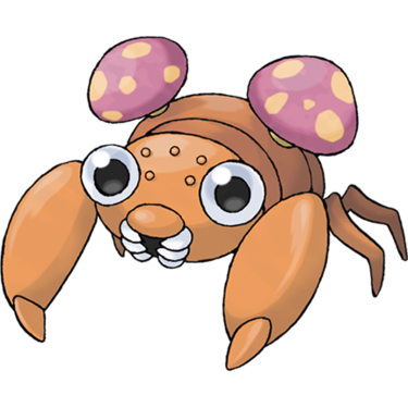
Now this is a good line. Paras is a cicada nymph that drains sap from tree roots and lives primarily in very damp forests or caves. But this isn’t for its own benefit, oh no- it actually does this for the pair of tokuchaso mushrooms growing from its back, a species of fungus that shares a parasitic relationship with the Paras- though, strangely, they can apparently be taken off. The rooting must be very shallow.
This is a very nice design, definitely putting more focus on the parasitic fungi than the bug itself, but Paras itself is still a fine looking bug. I like the inclusion of what appear to be ocelli on its head! Nice touch.
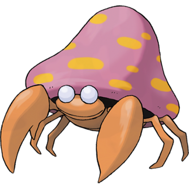
The evolved Parasect is essentially what happens when the parasitic shrooms finish their growth. They kill off the host, suck out its nutrients, and plant roots firmly inside the body, leaving an empty husk under the complete control of its fungal parasite. There’s no taking off the mushrooms now- Parasect is the mushroom. It’s like some kind of monster movie where the monster is a parasite. I love it.
Beyond the incredibly grim concept, the design is pretty solid! The Paras body has grown a bit (and lost its mouthparts for some reason) but is otherwise not much different from its original form- save for those lifeless, blank eyes, of course. Oh, and the giant, fully-grown mushroom completely consuming its back. It’s not much, but it’s definitely a cool design.

THERE IS NO PARAS ONLY FUNGUS
0 notes
Text
The Oddish Line
HI IT’S BEEN A MONTH here’s more of me talking about Pokemon.

Oddish was never a design I particularly liked. It’s a nice concept- from what I can tell, it’s supposed to be based on the folklore surrounding mandrake roots, which were supposedly plant-creatures that buried themselves during the day, and if uprooted, they’d scream so awfully that it could kill you. Oddish behaves in effectively the same way, minus the part about its screaming being able to kill you and whatnot.
Unfortunately, its folkloric basis is the only “interesting” thing about Oddish. Beyond that, it’s just a blue blob with a crown of leaves for a head. Not horrible by any means, but...very boring.

Yawn.

Things get a bit more interesting when we move on up to Gloom. It’s got much more personality now and a nicer color scheme to boot; the blue and orange looks a lot better than the blue and green. I like the way the leaves curl as well.
The mandrake thing has been pretty much dropped with this design, instead making a connection to certain flowers like rafflesia and stapelia, which smell absolutely rancid in order to attract flies. Likewise, Gloom drools out a thick, sticky nectar that smells absolutely horrendous- probably like rotten meat, considering the rafflesia origins.

More personality is always good. I’m still not a big fan, though.

Now things are starting to get interesting! While Vileplume has slightly less personality than the very endearing Gloom, this shady little poison-puffer is still very endearing and I actually like it quite a lot more, with its massive rafflesia bloom giving off the impression of a forward-tilted hat, casting a shadow on its face. Its Sugimori art and B/W sprite show this the best; unfortunately this impression is lost if you see it from any other angle.

I really like this design! Not enough for a five-ball, but it’s definitely my favorite of this line.
Also, please look at Vileplume’s Yellow sprite. It’s hilarious.

VILEPLUME WILL DESTROY US ALL.
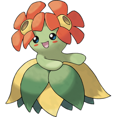
The Oddish line gained a second final evolution in Gen 2 (of course), and I always consistently forget that Bellossom is even part of this evolution line because it feels nothing like the rest of it. Maybe if it had a blue body?
Bellossom is what happens if you give your Gloom a Sun Stone instead of a Leaf Stone, and I guess being exposed to the light energy causes it to evolve into a more friendly and less smelly flower. It’s a fine design on its own, i just wish it tied in better to the rest of the line.

Eh.
2 notes
·
View notes
Text
The Zubat Line

I’m sure we’re all familiar with Zubat, the little pests that’ll swing out and bug you ‘till they drop fainted the second you step into a cave. Setting aside their extremely annoying reputation, the blue bat actually has a pretty alright design going for it, definitely not one of the worst Gen 1 designs but far from the best.
Because it lives in a cave and navigates via echolocation, Zubat has no eyes at all, and its mouth and ears are very large- it doesn’t need to be able to see, does it? They’re a great exaggeration of animals evolved to live in perpetually dark cave conditions, and as a biology nerd (as you all probably know), I quite appreciate that. It’s just a shame its body isn’t super pale like a lot of cave animals’ bodies are.

Things don’t really change too terribly much when Zubat evolves into Golbat. It appears that Golbat is essentially a Zubat that’s beginning to regain sight and rely a bit less on echolocation, as it’s gained some eyes and its ears are considerably smaller, but the mouth is even larger than Zubat’s, taking up a large majority of the mon’s body.
Unlike Zubat, whose diet is never mentioned (I would assume it’s insects), wild Golbat feed primarily on blood, much like a vampire bat (who have wonderful little goblin faces, by the way). I would assume this is probably the reason for the larger mouth, and you can tell I’ve run out of things to say about this Pokemon because I’m rabbling on about biology again.

I’m flatly neutral towards both of these Pokemon.

The Zubat line gains a third and final evolution in the form of Crobat in Gen 2, who seems to have finished an evolutionary transition from echolocation to eyesight. Golbat cannot normally evolve in the wild, as they have to have high friendship to do so, and as such they are encountered in the wild only rarely, which sort of explains why they appear to rely more on their vision now.
I like this design quite a bit, actually! The addition of a second pair of wings feels a bit extraneous and neither helps nor hurts the design, but this design doesn’t need much helping or hurting. I just love that face, it’s great.

A good bat.
Oh, and once more, I have to sidetrack to discuss this mon’s shiny:

Yeah.
0 notes
Text
The Igglybuff Line
(I am currently very sick with a sore throat. Please excuse any drop in writing quality.)

I mentioned back in the Cleffa Line review that I see the Cleffa and Igglybuff lines as counterparts/parallels to each other, which is further helped by how close to each other they are in the National Dex. I’m not sure how clear this was in the other review, but it’ll be clear here- the Jigglypuff line is by far my least favorite of the two. The designs just aren’t as good and aren’t nearly as charming.
Igglybuff here was the precise reason why this review took so much longer to come out than the other ones I made yesterday (other than that I’m sick). I really don’t like this design, to the point that I outright didn’t want to review it. But, with the exception of one line far in the future that I’m definitely not reviewing for highly personal reasons, I have to do all of them.

Igglybuff reminds me of a Beanie Boo, the newer line of plushies out by the same people that made Beanie Babies, and not in a good way. Don’t get me wrong, I like Beanie Boos on a base level, but Igglybuff has the same sort of expressionless, glassy eyes on a much less interesting body, and it just doesn’t look nice. The weird forehead swirl doesn’t help either.

Ew.
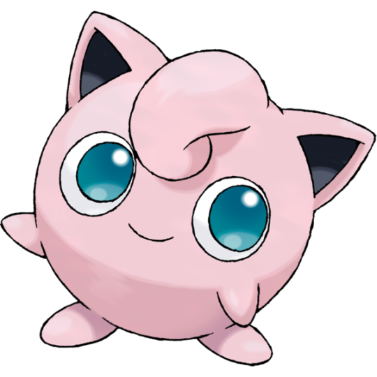
Things get a little better when Igglybuff evolves into Jigglypuff. The design remains fairly simple and fixes a lot of the problems I had with Igglybuff by having ears and a forehead curl like Clefairy’s, but my problem still lies in the eyes. I know, I know, it’s probably to differentiate it more from Clefairy, but unless you’re actually making a Beanie Boo it’s really hard to make big, watery eyes work on a pink-blob design like this.

I don’t hate it, though. Sure as hell better than Igglybuff.

I think we’re witnessing a bit of an exponential curve here. Compared to its pre-evolutions, I actually quite like Wigglytuff. Shocking, I know. The little pink blob’s body elongates and takes on an almost rabbit-like physique with longer ears and feet, and the addition of a white underbelly actually helps quite a lot. The big eyes actually kind of work on this particular design, since they don’t take up such a large chunk of the body this time. Overall I think this is a pretty big improvement on what was established before (and after), and my only complaint is that the forehead curl doesn’t look like it’s attached to the body- but it’s not a very big complaint.

Good job, tuff puffs, you sure have improved.
One more thing, PLEASE look at this picture of Wigglytuff from the anime:
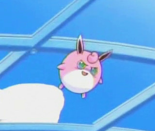
This is lightly cursed and I love it.
0 notes
Text
The Cleffa Line

Now we’re hopping off the badass giant lizard train right into Cute-N’-Fuzzy-Town, and honestly, I’m not complaining. As much as I love poisonous destructo-kaijus, I’ve also got a place in my heart for little pink squishy things.
Cleffa is very cute. It sort of resembles a mix between Kirby and Starfy with its own little bit of Pokemon charm, and its design is very simple to boot- just a squishy pink whatzit with big brown ears. Like Pichu, Cleffa was introduced in Gen 2 as a baby for this line.

Ah, my heart needs this. On to the next 'mon!

Oh. My gosh. You guys, my heart is melting. Clefairy is an absolutely adorable little tyke, with ears that look more like ears now and a more noticeably curled tail, and this is definitely the kind of Pokemon you’d just love to pick up and snuggle. I mean, that’s probably why the Poke Doll item has consistently been shown as a plush Clefairy (except in PokePark- it was a Cleffa there), but I digress.

This was originally going to be the mascot for the Pokemon series, instead of Pikachu, and honestly, I can see why.
Thank god it’s not, though.

Ah, Clefable- not quite as adorable of a Pokemon as Clefairy, but the grown-up fairies definitely have their own sort of charm, sort of looking like perpetually-anxious marshmallows. Their wings are much more noticeable from the front now, and their ears are much larger and much more sensitive, able to hear a pin drop from miles away. For this reason it chooses to hide out in quiet locations. As an autistic person, I can relate.
You’ve probably noticed a couple things by now. I like to think of this line as sort of a parallel to Jigglypuff, as they’re both round, pink Pokemon that evolve into larger, more elongate forms, both have a curly hair tuft, and both got a baby form in gen 2. But another thing you probably already know about is the Clefable’s Shadow theory- that Gengar is a Clefable’s shadow, specifically, which people picked up on due to their noticeably similar designs. I can buy it, but I doubt it was completely intentional.

Cuuuuute.
Oh, also, I need to derail to talk about this line’s shinies.


Perfection.
0 notes
Text
The Nidoran♂ Line

I’m already getting sick of copypasting these names.
So anyway, Nidoran♂! This design has a lot more appeal to it than the female Nidoran, kind of feeling like a highly exaggerated mirror to what the female looked like. It still has a rather ratlike physique, but the ears and spines on its body are much larger and it has a cool purple skintone instead of baby blue.

This is actually quite reminiscent of how male animals of many species, but most frequently birds, will often have noticeably more extravagant colors and features than their female counterparts. The closest comparison I can draw is to the American house finch, in which the physique between the male and the female isn’t all that different, but the male (that’s him in the background) is much brighter in coloration.

I really gotta stop getting sidetracked into half-relevant biology trivia while doing these. Makes these reviews way longer than they have to be.

Like Nidorina, Nidorino is essentially just a larger and angrier Nidoran♂, and unlike Nidorina, whose angry face begets a more relaxed personality, Nidorino actually is as violent and aggressive as those tough, black slit-eyes let on.
You might be noticing a bit of a similarity to something in this design, and that something isn’t Rhyhorn (even though they do resemble each other a bit). We’ll get to that when we get to that, though.

Nothing special, but it’s not bad.

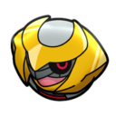
AW, HELL YEAH! Along with Charizard, the tyrannical king of the crowd was one of the token Badass Pokemon™ of Gen 1, one of the ones you just had to have on your team at some point because it was just so damn cool and so damn good, and with one look at this beast, you can definitely see why. Funnily enough, Nidoking is actually quite a small Pokemon, being only 4′07′, even though it looks like it would be MUCH larger.
And that appearance of being larger than it actually is is not at all unfounded...

If you know a thing or two about kaijus, you’ve probably noticed by now that Nidoking bears a VERY striking resemblance to big bad Baragon! It’s not clear if this was intentional, and Bulbapedia makes no mention of it, but it sure is noticeable, and I wouldn’t be surprised if series creator Satoshi Tajiri took any inspiration from Baragon while designing Nidoking.

Now THIS is a sweet design!
0 notes
Text
The Nidoran♀ Line

I’m reviewing these two lines separately for the sake of brevity and keeping things short, and since even though they’re the same species lorewise, they are (technically) two different evolutionary lines, I feel I can get away with that. So on to the Nidorans!
Nidoran♀ was always my least favorite of these two; she’s just overall not nearly as nice to look at as her masculine counterpart, with a baby-blue color scheme, a ratlike face (and I’m not knockin’ rats), and a much less streamlined and aesthetically pleasing design than Nidoran♂.

Nidorina I don’t like much more or much less than Nidoran♀ (god, copy-pasting that is going to get annoying), as the design follows the typical Gen 1 philosophy of “just make the middle evolution a bigger and angrier first form”. I don’t have a lot to say about this relatively chill little teenager, but I do like that she lost her whiskers. Helps the aesthetic.

Meh.

Now, Nidoqueen is where this line gets interesting. As I’ve said a couple times already, I don’t like the queen of the nidos as much as I like her male counterpart, but this lovely lady is still a great design- big, blue, and ready to kick some butt.
She’s got a very nice blue-and-tan color scheme and a more relaxed and rounded design than the king, giving off more of a turtle-like feel. Comparisons could be drawn to Blastoise, but I think she handles this sort of body structure a lot better.
Oh, and accentuated shell tits on a lizard, too? Also?

I’m sorry. I couldn’t go without mentioning that.
Oh, speaking of things I can’t go without mentioning- there’s a noticeable inconsistency between Nidoqueen’s Pokedex entries and how she behaves in-game. The ‘dex mentions that she’ll protect her young with her life, but Nidoqueen is in the Undiscovered egg group, meaning she’s not able to breed with anything at all.
Maybe she’s like a capybara and she’s SUCH a good mom that she’ll just adopt anything regardless of what it is.
0 notes
Text
The Sandshrew Line
OH LORDY, it’s been a good while now, hasn't it? I haven’t done a Pokemon review in...um...five months now, by the looks of things. Five months. Holy shit, I’m bad at responsibilities.
Well, nonetheless, this past week has been...very hard for me, to say the least, and I’m kind of still reeling from a panic attack at the moment, and I think that’s a perfect opportunity to get off my ass and talk about some pocket monsters. Need to distract myself somehow, eh?

Sandshrew is one of those Pokemon you don’t really appreciate when you first see it, but come to like later on. Not love, just like. It’s a cute, simple design that’s meant to represent a pangolin (NO idea why its name references shrews), and it does its job well enough. I’ve always loved those big beady eyes this ‘mon has, and I’ve gotta say the color scheme is nice, too. Kudos to Sandshrew for making yellow work.

I find it hard to muster any different feelings for Alolan Sandshrew than I have for the regular deal. It’s very cute and meant to resemble an igloo, with the front “door” of the igloo curling around Sandshrew’s face and also resembling a thick winter parka, but really, it’s not all that much more spectacular than the regular Sandshrew is.

Pretty cute, I like it, but I don’t really love it.

I’ve never liked Sandslash as much as I do Sandshrew. It’s very different, which, of course, it has to be, but none of the differences really make much of an improvement in my eyes. Sandshrew ditches the pangolin scales for more of a spiny look, which may resemble a hedgehog at first glance, but the long, strong front claws bring an echidna to mind more.

It’s still got a bit of charm, but it’s really nothing special.

...Oof. Um, okay. Alolan Sandslash is...well, it’s not very good. Without a direct comparison to the regular Sandslash, it’s passable, and in fact I think they had a good idea going here- switch out Sandslash’s spines with icicles! Yeah, that could work. But in the end, the way it was handled here brings to mind the highly artificial and toylike designs of Gen 4. (Which we will be getting to. Oh, BOY, we’ll be getting to that.) Nothing about this Alolan form has the same fluidity and pleasance to its design that the regular form does, and I say that as a person that doesn’t really like regular Sandslash.

I see what you were going for, but....yikes.
#txt#pokemon reviews#gen 1#i'm doing these on my laptop which doesnt have xkit atm pls bear with me#also NEW THEME COMING SOON i didnt realize until recently that u cant see the tags at ALL on this theme
0 notes
Text
The Pichu Line

OH BOY, we’re up to THAT line from Generation 1. I’ll hold off on the bitching about Pokemon marketing until we actually get to Pikachu; let’s talk about Pichu first. Pichu was introduced in Generation 2 among several other “baby” Pokemon; ‘mons that you can’t get unless you breed two of its evolved form together in the Daycare.
Pichu is a charming little tyke, a tiny yellow rodent with big, diamond-shaped ears and a black marking on its chest that kind of invokes a bowtie or a fancy collar if you squint. There are a lot of traits of Pichu that I’m rather fond of, but it’s never been a big favorite of mine.

Pichu is also unique in that it has an alternate form, technically a single entity, a female Pichu with a tuft of fur on her left ear. Known as Spiky-eared Pichu, you might also notice that her fur color is slightly different from a normal Pichu, being oh-so-slightly darker- presumably caused by the same mutation that caused the ear tuft. Aside from her unusual fur alterations, she’s nothing special as a Pokemon; her stats are the same as a normal Pichu’s. I, personally, quite dislike her as she brings back bad memories, but we’re not going to dwell on that.

When talking about Pikachu, it’s extremely hard for me to be unbiased. Pikachu is the golden calf of the Pokemon franchise, the series mascot, getting something new to its name in just about every game. I am one of the people on the “I’m absolutely sick of this banana mouse” side of the fence; it’s very hard for me to find any merit in its design anymore since it’s so hideously oversaturated. This isn’t really Pikachu’s fault, it’s just an inevitability of character-focused marketing, but it’s still frustrating regardless. At least it isn’t as bad as Minions, dear god.

If I were to put my marketing bias aside just for a second, though, I’d say that Pikachu’s design is...okay. Not great, not terrible, just okay. It’s definitely the most marketable mon in gen 1, but there are so many designs that are better than this one. I’m sure I would’ve liked it as a kid, but it’s really nothing to write home about.

I’m so sorry this had to happen to you, Pikachu.

Raichu, on the other hand, is a huge improvement over Pikachu. Everything about Raichu’s design is a lot more appealing than that of Pikachu, from the much easier-on-the-eyes color scheme to the neat whiplike tail, even to its anime voice. Raichu’s a much more fun ‘mon and it’s such a shame that it constantly gets shoved out of the spotlight by its prevo. If I had to find one thing to complain about when it comes to Raichu, it’s that white underbelly. It kinda throws off the flow of the design in my opinion, but it’s not a big issue.

Oh, that’s why the belly didn’t work! Alolan Raichu has a lot of similar traits to its Kanto counterpart, but it includes lots of new traits as well, with shiny blue eues, a different, almost pastry-like ear structure, and white pawtips instead of dark brown ones, which massively improves the inclusion of the underbelly. Charmingly, its tailtip is large enough for it to stand on and surf in the air with, an ability that it gains thanks to its Electric/Psychic typing! My one single complaint about this design is that the ears don’t feel natural; they just sort of look pasted onto the body. They’re cute ears, though.

Also, Alolan Raichu looks like it’s T-posing. Just had to point that out.
0 notes
Text
The Ekans Line

Ekans is a wonderful Pokemon. I never appreciated it that much as a kid, but it’s a cutie. As the first pure Poison-type in the ‘dex, Ekans is a rattlesnake, of course, since snakes are commonly what humans tend to associate with poison. If it isn’t spiders, it’s snakes. This has been a thing since pretty early in human civilization, and while I, a snake lover, think it’s an absolute travesty that snakes are so often seen as evil, at least it gives us some pretty neat character designs from time to time.
Ekans’s purple and gold color scheme is really nice to look at. I like its big expressionless eyes; that’s a nice touch. Strangely enough, I googled snakes holding their mouths open like Ekans does, and the results suggest that this is a sign of breathing problems, rather than a threat display like I thought it was. Oops.

A very good snake.
One more thing before I bounce to the next ‘mon, I just need to show you this picture of Ekans from the anime, because it had me giggling incoherently for a good 30 seconds or so.


Okay, moving on. I just needed to get that out of my system.

Arbok’s a good design on its own merits, a big, purple snake with some awesome markings on its hood. These are an exaggeration of the warning markings a king cobra has on the back of its hood, which are equally neat-looking. The Pokedex entries for Arbok mention that its markings vary depending on the region, which was a thing that the games represented for a while, up until Gen 4 which switched back to the original design. I assume this was just for simplicity reasons, but I’m sure it’s possible to bring this trait back now that we have 3D models and the different face designs could easily be texture swapped out.


I do like Arbok, but not as much as Ekans. It loses a lot of the charm that Ekans had just by changing the eyes, and the fact that it constantly has its hood open just makes it look so awkward. This is especially apparent in the Sugimori art, where the head just sort of looks like it’s hanging awkwardly off the body.

It’s pretty neat.
And here’s a wonderful Arbok face for your viewing pleasure.

4 notes
·
View notes
Text
The Spearow Line
We’re back in business, baby! I finally found the motivation to remake my Pokemon review blog after moving Tumblr accounts, so we’re going to kick back into gear with a few reviews. All reviews from Rattatta and backward are still hosted on my old blog, so check there for those.

Spearow is a Pokemon I never really found that great when I was young, but as an older person I can appreciate it a fair bit more. With a nice brown and red color scheme, a face that’s just a mass of fluff and feathers and an oddly scaled-looking belly, Spearow is...quite the design. Spearow is meaner and more territorial than Pidgey, a fact that’s pretty well represented in its design, especially the ridiculous fuzz face. Kinda reminds me of Mankey a little.

I like it about as much as I do Pidgey, really. It’s still nothing special, but it’s got its own charm.

NOW we’re talking! The Spearow line does what the Pidgey line doesn’t and actually tries to make each Pokemon look visually distinct from each other, and it’s a massive success in that department. Resembling a vulture crossed with a heron, Fearow’s essentially the “scary” bird of prey of Kanto, and I may be getting a bit sidetracked here but I have to point this out-

Despite their spooky appearance and affinity towards corpses, vultures and condors are actually pretty even-tempered birds and won’t typically be of any threat to humans. They won’t even actually kill anything- they prefer to just hang back and wait for something else to do the work for them.
I mention this because like Rattata, despite being a Pokemon that looks mean and is often described as such, there’s actually very little evidence in the Pokedex that Fearow is an aggressive Pokemon! The ‘dex does mention that it fights using its sharp beak, but there’s no indication that it goes out of its way to fight anything.

I like this big angry lankybird. It’s not a favorite, but it’s nice for what it is.
0 notes